Capturing and retaining users’ attention is paramount for the success of any website. This is where website notifications come into play. Web notifications are powerful tools that can significantly enhance user experience and engagement. They serve as a means to deliver timely and relevant information directly to users, keeping them informed, engaged, and connected. Whether it’s a promotional offer, important updates, or personalized content, notifications have become an integral part of modern web design.
Types of Web Notifications
Website notifications come in various forms, each serving a specific purpose and catering to different communication channels. Let’s explore some of the most common types of website notifications and the benefits they offer:
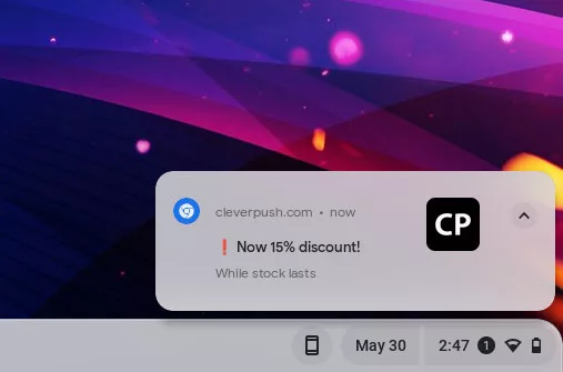
- Push Notifications: Push notifications are real-time messages sent directly to users’ devices, even when they are not actively browsing the website. These notifications appear as toast pop-ups or banners and can deliver important updates, personalized offers, or reminders. The key advantage of push notifications is their instant delivery and ability to engage users even when they are not on the website.
- Email Notifications: Email notifications have long been a staple of online communication. They are sent to users’ email addresses and are effective in delivering personalized messages, transactional updates, or newsletters. Email notifications allow for more detailed and comprehensive content, making them ideal for conveying in-depth information and maintaining ongoing communication with users.
- In-App Notifications: In-app notifications are specifically designed for mobile applications. They appear within the app interface and provide users with relevant information, updates, or interactions. In-app notifications can enhance user engagement, encourage specific actions, and deliver personalized content based on user behavior and preferences.
Each type of notification offers unique benefits and can be strategically employed based on the desired outcome. Push notifications excel at delivering time-sensitive information, email notifications are effective for detailed and personalized communication, and in-app notifications enhance the user experience within mobile applications.
Designing Effective Website Notifications
To make website notifications impactful and engaging, careful attention should be paid to their design and presentation. Here are some best practices for designing effective website notifications:
- Visually Appealing Design: A visually appealing notification catches the user’s attention and encourages them to take action. Use eye-catching colors, attractive typography, and appropriate icons or images that align with your brand identity. Ensure that the design elements are consistent with the overall website aesthetics to maintain a cohesive user experience.
- Clear and Concise Messages: Notifications should deliver the intended message quickly and effectively. Keep the content concise, using short and compelling copy that conveys the purpose of the notification clearly. Users should be able to understand the notification at a glance without having to read lengthy paragraphs.
- Placement and Timing: Consider where and when the notifications should appear to maximize their impact. Place notifications in a prominent location on the screen where users’ attention is naturally drawn. Avoid obstructing important content or causing frustration. Additionally, time the notifications appropriately to avoid interrupting the user’s flow or appearing too frequently, which can lead to annoyance.
- Personalization and Relevance: Tailor your notifications to the user’s preferences and behavior whenever possible. Leverage user data and segmentation to deliver personalized and relevant notifications. By understanding their interests and needs, you can increase the likelihood of users engaging with the notifications.
Implementing Website Notifications
When it comes to implementing website notifications, there are various tools and plugins available that can simplify the process and offer a range of customization options. Here are some considerations for implementing website notifications effectively:
- Notification Plugins and Tools: Depending on your platform, there are dedicated notification plugins and tools that can streamline the integration process. For example, if you are using WordPress, you can explore plugins like “OneSignal” or “PushEngage” that provide comprehensive notification capabilities. If you have an e-commerce website on Shopify, you can leverage built-in notification features or explore Shopify apps like “Firepush” or “PushOwl” for enhanced functionality.
- Integration with Content Management Systems and E-commerce Platforms: Ensure that the chosen notification system integrates seamlessly with your content management system (CMS) or e-commerce platform. This integration allows you to leverage user data, customer behaviors, and events to trigger relevant and personalized notifications. For example, integrating a notification system with a CMS like WordPress or a platform like Magento can provide a unified solution for managing and sending notifications.
- Customization Options: Look for notification systems that offer customization options to align with your branding and design requirements. This includes the ability to customize notification templates, colors, icons, and positioning. The more flexibility you have in customizing the appearance and behavior of your notifications, the better you can tailor them to fit your website’s unique style and user experience.
- Targeting and Segmentation: Effective notification systems allow you to target specific user segments or audience groups with relevant notifications. This targeting can be based on factors such as user preferences, demographics, past behavior, or even geographic location. By delivering notifications that are highly relevant and personalized, you can increase their impact and engagement.
Conversion and Engagement
Website notifications offer a valuable opportunity to drive conversions and increase user engagement. The strategic use of these notifications can encourage users to take desired actions and make the most of their visit to your website. Here are some strategies to optimize conversion and engagement through website notifications:
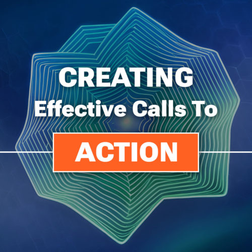
- Effective Call-to-Action Buttons: Incorporate clear and compelling call-to-action buttons within your notifications. Make sure the buttons are visually prominent and use action-oriented language to entice users to click. For example, instead of a generic “Learn More” button, use more specific and persuasive phrases like “Get Your Exclusive Discount” or “Start Your Free Trial Today.” Well-designed and attention-grabbing call-to-action buttons can significantly increase click-through rates and conversions.
- Enticing Offers and Personalization: Use website notifications to deliver exclusive offers, discounts, or personalized recommendations to your users. Tailor these offers based on user preferences, past behavior, or purchase history. Personalized notifications that provide relevant incentives have a higher likelihood of driving engagement and conversions. Experiment with different offers and messaging to determine what resonates best with your audience.
- Tracking and Analyzing Performance: Implement tracking mechanisms to measure the impact of website notifications on user behavior and website performance. Use analytics tools to monitor metrics such as click-through rates, conversion rates, and revenue generated from notification-triggered actions. By analyzing this data, you can gain insights into the effectiveness of your notification strategies and make informed decisions for optimization.
- Balancing Frequency and Relevance: Find the right balance between the frequency of notifications and their relevance to your users. Bombarding users with too many notifications can lead to annoyance and opt-outs, while infrequent notifications may result in missed opportunities. Regularly assess the relevance and value of your notifications to ensure they align with user expectations and interests.
Managing User Preferences and Opt-In/Opt-Out Options
Respecting user preferences and providing them with control over their notification experience is crucial for maintaining a positive user relationship. Here are some strategies for effectively managing user preferences and opt-in/opt-out options:
- Clear and Transparent Notification Settings: Design intuitive and user-friendly notification settings within your website or application. Provide a dedicated section where users can easily manage their preferences, including the types of notifications they wish to receive and the channels through which they prefer to receive them (e.g., email, push notifications). Clearly label each option and provide concise descriptions to help users make informed decisions.
- Granular Notification Customization: Offer fine-tuned customization options that allow users to personalize their notification preferences based on their interests and needs. For example, provide category-specific subscriptions or the ability to choose the frequency of notifications. Tailoring the notification experience to individual preferences helps to enhance user satisfaction and reduce the likelihood of opt-outs.
- Opt-In/Opt-Out Mechanisms: Ensure that users explicitly opt-in to receive notifications, rather than automatically subscribing them. Make the opt-in process clear and transparent, clearly stating the benefits of subscribing to notifications and obtaining user consent. Additionally, provide an easy and accessible opt-out mechanism that allows users to unsubscribe from notifications at any time. Include clear instructions on how to manage notification preferences and make the process hassle-free.
- Compliance with Data Protection Regulations: Adhere to data protection regulations, such as the General Data Protection Regulation (GDPR), when managing user notification preferences. Ensure that you collect and process user data in accordance with applicable laws, and obtain proper consent for storing and using user information for notification purposes. Provide a privacy policy that clearly explains how user data is handled and reassure users that their privacy is protected.
- Communication and Education: Educate users about the benefits and value of your notifications. Clearly communicate how notifications enhance their experience, provide relevant information, or offer exclusive offers. Regularly engage with users through email or other channels to remind them of the value they receive from your notifications and give them the opportunity to update their preferences if needed.
Optimizing Website Notifications for Mobile Devices
With the ever increasing use of mobile devices, it is essential to optimize website notifications for mobile users. Here are some considerations and strategies for delivering effective and engaging notifications on mobile devices:
- Responsive Design: Ensure that your notification design is responsive and adapts well to various mobile screen sizes and orientations. Optimize the layout, font sizes, and button sizes to provide a seamless experience across different devices. Test the appearance and functionality of notifications on multiple mobile devices and browsers to ensure consistent performance.
- Mobile-Friendly Content: Craft notification messages that are concise, clear, and mobile-friendly. Mobile users often have limited attention spans and smaller screens, so it is crucial to deliver your message efficiently. Use simple and engaging language, and consider using visuals, such as icons or images, to make notifications more visually appealing.
- Timing and Frequency: Be mindful of the timing and frequency of notifications on mobile devices. Respect users’ mobile browsing behaviors and consider their time zones and daily routines. Sending notifications at appropriate times and avoiding excessive frequency can help maintain a positive user experience and prevent users from feeling overwhelmed.
- Mobile Push Notifications and In-App Messaging: Explore the use of mobile push notifications and in-app messaging to reach mobile users effectively. Push notifications allow you to deliver messages directly to users’ mobile devices, even when they are not actively using your website or app. In-app messaging provides an opportunity to engage users within the app interface itself, delivering timely and contextual information or updates.
Push Those Notifications
Website notifications play a crucial role in enhancing user experience, driving engagement, and increasing conversions. Implementing effective notification strategies can keep your audience informed, engaged, and connected to your website. Remember, a well-designed and well-executed notification system can significantly impact user behavior and contribute to the overall success of your website. However, it is essential to strike a balance between providing valuable notifications and respecting user preferences and privacy.
Regularly monitor and measure the performance of your notifications using analytics and tracking tools, focusing on key metrics such as click-through rates, conversion rates, and user engagement. Use A/B testing and continuous optimization techniques to refine your notification strategies and improve their effectiveness over time. Additionally, gather user feedback to gain insights into their preferences and experiences, allowing you to make data-driven decisions for further improvement.
As you integrate website notifications into your web design and marketing strategies, strive to create a balance between providing valuable information and maintaining a positive user experience. By following the best practices outlined in this article and continuously optimizing your notification system, you can enhance user engagement, drive conversions, and deliver a seamless and personalized user experience on your website.