
Typography is the art and technique of arranging type to make written language visually appealing and easy to read. It involves selecting the right typeface, font size, and other typographic elements to create a desired effect.
Fonts are the core of typography. They can be used to create a variety of effects, from setting the tone or mood of a piece of text to making it more visually appealing. There are many different types of fonts available, each with its own unique characteristics. But with so many different fonts to choose from, it can be tough to know where to start.
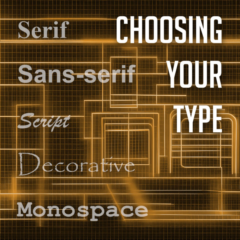
Types of Fonts
There are many different types of fonts, but they can generally be divided into a few categories:
- Serif fonts have small projections or flourishes called serifs at the ends of the main strokes of the letters, which can help guide the reader’s eye along the text. Serifs are thought to help with legibility by providing visual cues that help the eye track from one letter to the next. Serif fonts are often used in print publications like newspapers and books, and are often considered to be more traditional and formal than sans-serif fonts. Some popular serif fonts include Times New Roman, Georgia, and Trajan.
- Sans serif fonts do not have serifs. They are often considered to be more modern and clean-looking than serif fonts. Sans-serif fonts are often used in digital media, such as websites and mobile apps, as they are easier to read on screens. Popular sans serif fonts include Arial, Helvetica, and Tahoma.
- Script fonts are designed to look like handwriting or calligraphy. They often have a flowing, elegant appearance, and can be used to create a more personal or informal tone. Script fonts are often used for invitations, greeting cards, or other creative projects. Some common script fonts include Brush Script, Lobster, and Zapfino.
- Display fonts, or decorative fonts, are more stylized to be eye-catching and attention-grabbing. They can be used for headlines, logos, or other special purposes, as they can add personality and visual interest to a design. The sky’s the limit for display fonts, but some of the most popular decorative fonts include Impact, Papyrus, and Curlz.
- Monospace fonts have a fixed width for each character, and are typically characterized by their blocky appearance. This makes them useful for programming and coding, or other applications where precise alignment is necessary. They often have a simple, utilitarian design, which makes them well-suited for technical applications. Some popular monospace fonts include Courier, Consolas, and Source Code Pro.
Choosing the Right Font
The best way to choose the right font for your project is to consider the overall look and feel you’re trying to achieve, and take into account the context and purpose of the text. If you’re designing a formal document, you might want to use a serif font. If you’re designing a modern website or marketing materials, you might want to use a sans serif font. And if you’re designing a logo or other special piece of artwork, you might want to use a script or decorative font. Different fonts can convey different emotions or tones, and choosing the right font can help enhance the message you’re trying to communicate.
It’s also important to consider the readability of your font. Some fonts are easier to read than others, especially at small sizes. If you’re using a font for body copy, it’s important to choose one that is easy to read on screen or in print.
Using Fonts Effectively
Once you’ve chosen the right font, it’s important to use it effectively. Here are a few tips:
- Use only a few different fonts in a single project. Too many fonts can be overwhelming and distracting.
- Use different fonts for different purposes. For example, you might use a serif font for body copy and a sans serif font for headlines.
- Consider the size and weight of the font when choosing it. A large, bold font will be more eye-catching than a small, light font.
- Use leading (the space between lines of text) and kerning (the space between individual letters) to improve the readability of your text.
- Use a consistent font family throughout a piece of text. This will help to create a cohesive and professional look.
- Use fonts to create visual interest. For example, you could use a decorative font for a call to action or a unique font for a logo.
- Proofread your text carefully before using it in your designs.
- Experiment with different fonts and layouts to find what works best for your project. There are no hard and fast rules in typography, so don’t be afraid to try new things.
When used effectively, fonts can be a powerful tool for creating visually appealing and effective typography. By choosing the right fonts and using them effectively, you can create beautiful and effective designs.