
Color is a crucial and influential element in web design, as it can evoke emotions, convey a brand’s personality, and guide users’ attention. Color theory is the study of how colors interact with each other and how they affect the human eye and brain. It is a complex and fascinating subject, and it can be used to create a wide variety of effects in design. So how does color theory apply to web design and how do you choose the right colors for your website?
The first thing to consider when choosing colors for your website is your brand’s personality and message. Think about the emotions you want to convey to your audience and what your brand stands for. For example, blue is often associated with trust and reliability, while red is associated with energy and excitement. Once you have a clear understanding of your brand’s personality, you can choose colors that align with it.
When choosing colors for a website, it is important to consider the overall mood or atmosphere you want to create. For example, if you want to create a website that is calming and relaxing, you might choose soft, muted colors like blues and greens. If you want to create a website that is exciting and energetic, you might choose brighter, more vibrant colors like reds and oranges.
It is also important to consider the target audience for your website. For example, if your website is aimed at children, you might choose bright, playful colors. If your website is aimed at adults, you might choose more subdued colors.
In addition to the overall mood or atmosphere, you should also take into consideration the specific elements of your website when choosing colors. For example, the text should be easy to read against the background, and the call-to-action buttons should stand out from the rest of the page.
Color theory can be a complex subject, but it is an essential part of web design. By understanding the basics of color theory, you can create websites that are visually appealing and effective.
Color Wheel
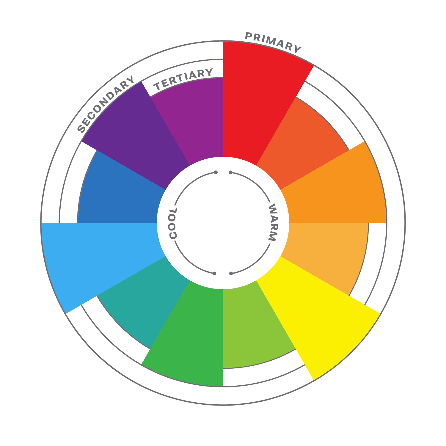
The color wheel is a circular diagram that shows the relationships between colors. It is a useful tool for understanding how colors work together and how to create pleasing color schemes.
The color wheel is divided into three primary colors: red, yellow, and blue. These colors cannot be created by mixing other colors together. When two primary colors are mixed together, they create a secondary color. The secondary colors are orange, green, and purple. When a primary color and a secondary color are mixed together, they create a tertiary color. There are six tertiary colors: red-orange, yellow-orange, yellow-green, green-blue, blue-purple, and red-purple.
The color wheel is often divided into warm colors (like red, orange, and yellow) and cool colors (like blue, green, and violet). Warm colors are associated with passion, energy, and excitement, while cool colors are associated with calmness and peace.
Color Harmony
Another important aspect of color theory is color harmony. This refers to how colors work together to create a visually appealing design. It is a subjective concept, as different people have different preferences for color. However, there are some general principles of color harmony that can be followed to create pleasing color schemes.
There are many different ways to create color harmony, but some of the most common methods include:
- Monochromatic: A monochromatic color scheme uses variations of one color. This can be a very effective way to create a calm and sophisticated look.
- Analogous: Analogous color schemes use three colors that are close to each other on the color wheel. This can be a very harmonious and pleasing color palette.
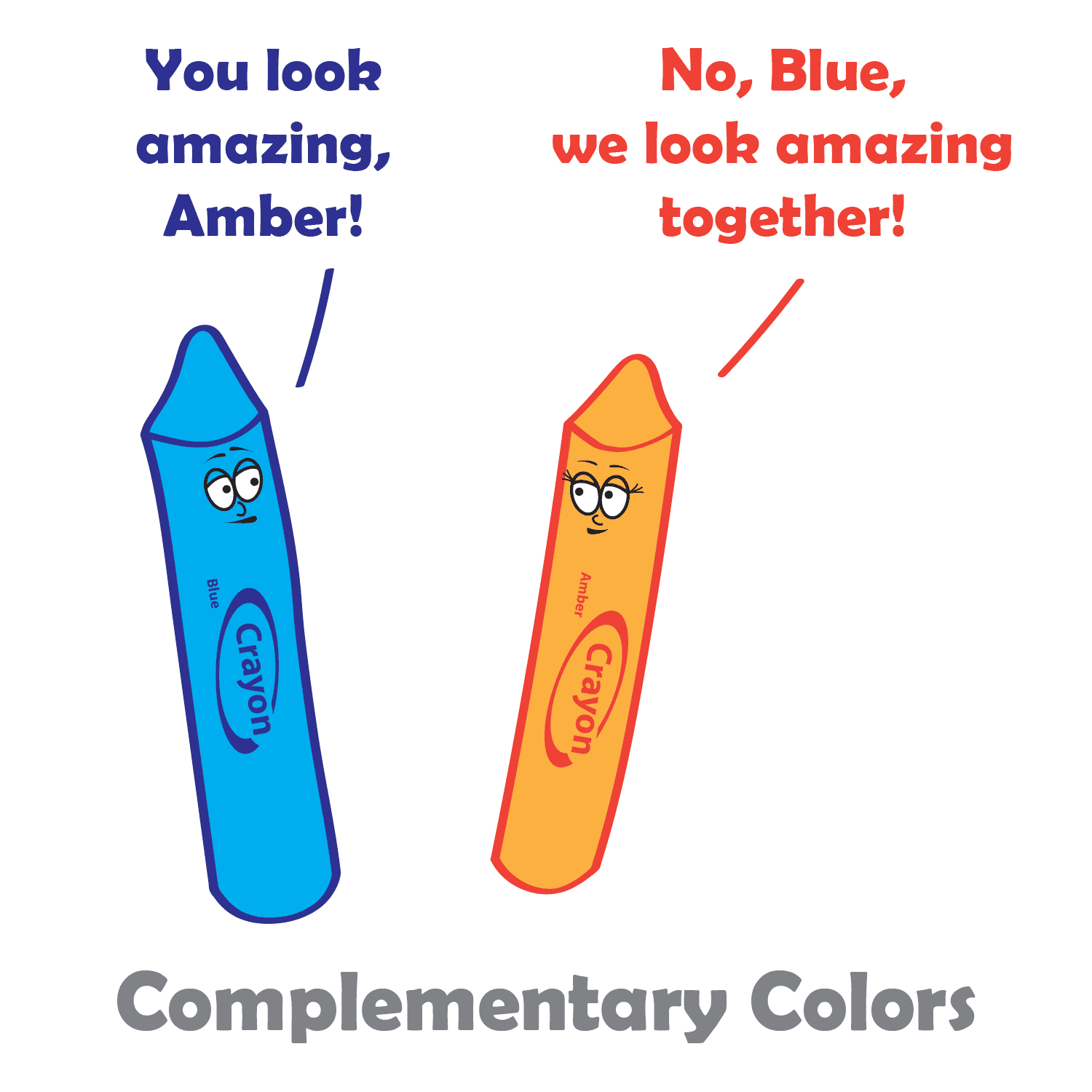
- Complementary: Complementary colors are two colors that are opposite each other on the color wheel. This can be a very striking and eye-catching pair.
- Split-complementary: Split-complementary color schemes use the color opposite the primary color, as well as the two colors on either side of the complementary color. This can be a very sophisticated and elegant color combination.
- Triadic: A triadic color theme uses three colors that are evenly spaced around the color wheel, creating a very balanced and dynamic look.
- Tetradic: Tetradic color schemes use four colors that are evenly spaced around the color wheel. This can be a very complex and interesting way to use color.
When choosing colors in your design process, it is important to consider the overall effect that you want to create. If you want to create a calm and relaxing design, you might want to use a monochromatic or analogous color scheme. If you want to create something more dramatic and eye-catching, you might want to use a complementary or triadic color scheme.
No matter which method you choose, it is important to use colors that you like and that work well together, and to experiment with different color combinations until you find one that you like. And remember, there are no hard and fast rules when it comes to color harmony. The most important thing is to use colors that you find pleasing and that create the effect you want. When you choose colors that are pleasing to the eye, you can create art that is both beautiful and functional.
Color Principles
One of the most important principles of color harmony is contrast. Contrast is the difference between the lightness and darkness, or the warmth and coolness, of colors. A high-contrast color scheme uses colors that are very different from each other, while a low-contrast color scheme uses colors that are similar to each other.
Contrast is important in web design, as it helps guide users’ attention and create visual interest. High contrast colors, such as black and white, create a strong visual impact and are useful for highlighting important information. Low contrast colors, such as pastels, create a softer and more subdued effect.
Another important principle of color harmony is unity. Unity is the feeling that all of the colors in a design work together. There are a number of ways to create unity, such as using a limited color palette, repeating colors throughout a design, or using a color scheme that is based on a natural phenomenon, such as a sunset or a rainbow.
In addition, consider the cultural associations of colors. Different cultures may have different meanings and associations with colors, so it’s important to research the cultural context of your audience. For example, in western cultures, white is often associated with purity and innocence, while in some eastern cultures it is associated with mourning.
Color Psychology
While color theory and color psychology are related, they are not the same thing. Color theory focuses on the principles and concepts of color and how they interact with each other. It is concerned with the visual effects of color combinations, such as contrast, harmony, and balance. On the other hand, color psychology studies the emotional and behavioral effects of colors on human beings. It explores how different colors can affect mood, perception, and behavior, and how they can be used to communicate different messages and create different experiences. While color theory is important in creating effective and visually pleasing designs, color psychology can help to further enhance the message and impact of a design by understanding how colors are perceived and experienced by the audience.
According to color psychology, different colors evoke different emotions and can have different effects on the human brain. For example, red is often associated with excitement and passion, while blue is often associated with calmness and peace. When choosing colors for your website, it’s important to consider the message you want to convey and the emotions you want to evoke in your users.
Here are some additional tips for using color in web design:
- Use a limited color palette. Too many colors can be overwhelming and distracting.
- Use white space to create contrast and make your colors pop.
- Use color to highlight important elements of your website, such as the call to action buttons.
- Use color consistently throughout your website. This will help create a cohesive and professional look.
- Test your colors on different devices and browsers to make sure they look good everywhere.
When used effectively, color can be a powerful tool for web design. Color theory is an important aspect of web design that can greatly impact the success of your website. By understanding the principles of color theory, and considering your brand’s personality, you can choose the right colors to evoke the emotions and convey the message you want to communicate to your audience.