
CSS transitions are a valuable tool that adds a touch of magic to the user experience. These subtle effects bring elements to life, creating smooth and captivating animations that delight visitors and convey information in an engaging way.
Capturing and holding a user’s interest isn’t easy. This is where CSS transitions truly come into their own. They empower designers and developers to transform static web elements into dynamic entities that gracefully respond to user interactions. From a subtle fade-in effect on a button hover to a smooth sliding transition between sections, CSS transitions enable us to create immersive and visually appealing experiences that keep users engaged and intrigued.
Beyond their aesthetic appeal, CSS transitions serve a practical purpose. They allow us to convey information in a more digestible manner, drawing attention to important changes or highlighting relevant content. Whether it’s a subtle color change to signify a status update or a dynamic sliding panel to reveal hidden information, CSS transitions enable us to communicate effectively and improve the overall user experience.
What Are CSS Transitions?
At the core, CSS transitions are a powerful CSS3 feature that allows designers and developers to animate changes in CSS property values over a specified duration. They provide a seamless way to create smooth transitions between different states of an element, adding a touch of elegance and sophistication to the user experience.
The mechanics of CSS transitions are rooted in the concept of interpolation. When a CSS property undergoes a transition, it smoothly interpolates between the starting and ending values, creating a visually pleasing animation. This interpolation effect can be applied to a wide range of CSS properties, such as color, size, position, opacity, and more. By selectively animating these properties, we can guide the user’s attention and enhance the overall aesthetic appeal of a website.
CSS transitions can be used to create a variety of effects, such as:
- Animated elements: You can use transitions to animate the margins, borders, font size, or other properties of elements.
- Responsive design: You can use transitions to make your web pages more responsive. For example, you can use transitions to change the size of elements when the user changes the browser window size.
- User experience: You can use transitions to improve the user experience of your web pages. For example, you can use transitions to make elements appear and disappear more smoothly.
CSS transitions are a powerful tool that can be used to add animation and interactivity to your web pages. They are relatively easy to learn and use, and they can be used to create a wide variety of effects.
How Do CSS Transitions Work?
The power of CSS transitions lies not only in the concept but also in the properties that shape their behavior. Here are some of the main transition properties that allow us to wield control over the duration, timing, delay, and properties involved in our captivating animations.
- Duration: The duration property determines the length of time it takes for a transition to complete its animation. It is specified in seconds (s) or milliseconds (ms). By adjusting the duration, we can create transitions that are swift and snappy or slow and graceful, depending on the desired effect.
- Timing Function: The timing function property defines the rate of change of the transition over its duration. It allows us to create different acceleration and deceleration effects, adding a sense of realism and naturalness to the animation. There are various timing curves available, such as linear, ease-in, ease-out, and ease-in-out, each imparting a unique feel to the transition.
- Delay: The delay property introduces a pause before the transition begins. It allows us to control the timing between the triggering event and the start of the animation. With delays, we can orchestrate a sequence of transitions or synchronize them with other elements on the page.
- Property: The property property (yes, it’s a bit repetitive!) specifies the CSS property(s) to which the transition applies. For example, we can target the color, size, or opacity of an element to seamlessly transform its appearance.
Let’s see these properties in action with an example. Imagine a button that smoothly changes color when hovered over. We can define the transition properties as follows:
.button {
    transition-property: background-color;
    transition-duration: 0.3s;
    transition-timing-function: ease-in-out;
    transition-delay: 0s;
}

.button:hover {
    background-color: #fc0;
}
In this example, when the button is hovered over, the background smoothly transitions to a different color over a duration of 0.3 seconds. The ease-in-out timing function ensures a smooth acceleration and deceleration effect. The delay is set to 0 seconds, resulting in an immediate transition upon hover.
Transition Shorthand
Now it’s time to take our animation skills to the next level by harnessing the magic of the transition shorthand. This handy shorthand notation allows us to define multiple transition properties in a single line, simplifying our code and making our animations more concise and efficient.
To demonstrate the transition shorthand, let’s consider an example where we want to create a subtle animation effect on a navigation menu.
.nav-menu {
    font-size: 16px;
    transition: font-size 0.5s ease-out;
}

.nav-menu:hover {
    font-size: 18px;
}
In this case, we have indicated that we want to animate the font size on hover with a duration of 0.5 seconds, with a smooth ease at the end.
Using the transition shorthand, we can streamline our code and improve readability. It allows us to combine multiple transition properties in a single declaration, reducing redundancy and making our intentions clear.
Advanced Transition Techniques
In the world of CSS transitions, there are advanced techniques that can take your animations to the next level. Let’s explore some of these techniques:
- Multiple Transitions: You can animate multiple properties independently by adding multiple transition declarations to an element, separated by commas.
.my-element {
    transition: width 0.3s, opacity 0.5s, color 1s;
}- Simultaneous Transitions: By specifying the same duration for different properties within a single transition declaration, you can create synchronized animations. For example:
.my-element {
    transition: background-color, color;
    transition-duration: 0.5s;
}- Nested Transitions: Apply transitions to child elements within a parent container for cascading or staggered animations. For example:
.parent-element:hover .child-element {
    transform: translateX(50px);
}
With these advanced transition techniques, you can push the boundaries of your animations and create truly captivating user experiences. Experiment with different combinations, durations, and timing functions to achieve the desired effects for your web designs.
Custom Cubic-Bezier Timing Functions
To elevate your transition effects to the next level, we have custom cubic-bezier timing functions. By creating your own timing curves, you can fine-tune the acceleration and deceleration of transitions, adding a touch of elegance and personality to your web design.
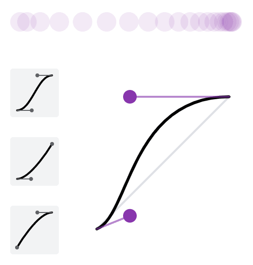
A cubic-bezier timing function defines the pace of a transition by specifying control points that create a custom acceleration curve. This allows you to achieve unique and nuanced effects that align with your design vision. The cubic-bezier function takes four parameters: (x1, y1), (x2, y2), representing the control points of the curve. For example:
.my-element {
    transition-timing-function: cubic-bezier(0.25, 0.1, 0.25, 1);
}
While manually tweaking cubic-bezier values can be a trial-and-error process, there are helpful tools available to simplify the task. One such tool is the inspection panel in Google Chrome. By inspecting an element, accessing the “Styles” panel, and modifying the transition-timing-function property, you can interactively adjust the control points and see the resulting curve in real-time.
Several online tools are specifically designed to assist in creating and visualizing custom cubic-bezier curves. Websites like cubic-bezier.com and easings.net provide intuitive interfaces where you can experiment with control points, preview the curve, and obtain the corresponding cubic-bezier values to use in your CSS code.
Optimizing Performance

With CSS transitions, optimizing performance is crucial to ensure smooth and responsive microinteractions that delight your website visitors. Let’s look at some best practices for optimizing the performance of your transitions:
- Utilize Hardware Acceleration: Take advantage of hardware acceleration to offload the rendering process to the device’s GPU (Graphics Processing Unit). By applying the transform or opacity property to the transitioning elements, you can trigger hardware acceleration, resulting in smoother transitions.
- Minimize Repaints and Reflows: Avoid unnecessary repaints and layout recalculations during transitions, as they can negatively impact performance. Optimize your CSS code by utilizing transforms instead of animating properties like top, left, or width. Additionally, utilize will-change property to inform the browser in advance about the upcoming changes, enabling it to optimize the rendering process.
- Optimize for Mobile Devices: Mobile devices often have limited resources, so it’s crucial to optimize your transitions for smooth performance on these platforms. Consider reducing the number of elements involved in the transition, simplifying complex effects, and utilizing CSS hardware-accelerated properties judiciously.
Optimizing for performance goes hand in hand with delivering an exceptional user experience. By implementing these tips, you can ensure that your transitions are silky-smooth and responsive across a range of devices and browsers.
Cross-Browser Compatibility and Vendor Prefixes
In the world of web development, cross-browser compatibility is paramount to provide a consistent experience for all users, regardless of the browser they use. When it comes to CSS transitions, handling vendor prefixes is an essential aspect of achieving cross-browser compatibility. Here are some key considerations for dealing with cross-browser consistency:
- Vendor Prefixes: Vendor prefixes are a way for browser vendors to implement experimental or proprietary CSS features before they become standardized. These prefixes are typically added to CSS properties to ensure compatibility with specific browsers. Common examples include -webkit- for Safari and Chrome, -moz- for Firefox, and -o- for Opera.
- Autoprefixers or CSS Preprocessors: Manually adding vendor prefixes can be tedious and error-prone. Thankfully, there are tools available that can automate this process for you. CSS preprocessors like Sass or Less offer built-in features or mixins to handle vendor prefixes. Additionally, autoprefixer tools can be integrated into your development workflow to automatically add necessary vendor prefixes based on your specified browser support.
- Progressive Enhancement: When applying vendor prefixes, it’s important to follow a progressive enhancement approach. Start by writing your CSS without any vendor prefixes, utilizing the standard properties. Then, use tools like autoprefixer to add the necessary prefixes based on the targeted browser support. This way, you ensure a graceful degradation for browsers that don’t require prefixes while still accommodating those that do.
- Test and Validate: After adding vendor prefixes, it’s important to thoroughly test your transitions across multiple browsers and devices. Use browser testing tools or services to check how your transitions behave and ensure consistency. Additionally, stay updated with browser vendor announcements and release notes to adapt your prefixing strategy as browser support for certain features evolves.
Smooth Operation
CSS transitions are a powerful tool in your web design arsenal. By incorporating them into your projects, you can elevate user experiences, add visual interest, and create a sense of interactivity that captivates your audience. Whether you’re aiming for subtle animations or bold effects, CSS transitions offer endless possibilities for enhancing the aesthetics, usability, and accessibility of your website.
Remember, the key to mastering CSS transitions lies in practice, experimentation, and continuous learning. Stay up-to-date with emerging techniques and trends, and don’t hesitate to push the boundaries of what’s possible with CSS transitions.