Imagine walking into a library where all the books are stacked in one giant heap. Chaos, right? That’s what a website without well-styled lists feels like. Lists are the librarians of web design, organizing content and guiding users through the maze of information. For creating clear navigation paths or breaking down complex ideas into bite-sized nuggets, lists are essential for a seamless and enjoyable user experience.
Think about it: lists help break down information into digestible chunks, making it easier for users to scan and find what they’re looking for. Navigation menus rely on lists to create a coherent and intuitive structure, ensuring that visitors can effortlessly explore your site.
Basics of HTML Lists
Before we dive into the wonders of CSS, let’s start with the first “order” of business. There are three main types of lists you need to know:
Unordered Lists (<ul>): Think of these as the bullet points of your website. They’re perfect for items that don’t need a specific order.
Ordered Lists (<ol>): Use these when you need to count your items or show them in a specific sequence. Think top ten lists, step-by-step instructions, or rankings.
Definition Lists (<dl>): These are like the glossary section of your website. Use them for terms and their corresponding definitions, making your content more organized and easy to understand.
See what we did there? We used a list to organize the types of lists!
Now let’s take a look at some basic HTML code for each type of list:
Imagine a world of vibrant and captivating web designs, where instead of flat solid solid colors with no depth, colors seamlessly blend and transition, evoking emotions and engaging users. In the modern web, this is made possible and easy with CSS gradients. From subtle fades to bold color combinations, CSS gradients offer endless possibilities for creating visually stunning and dynamic web experiences.
Get ready to dive into the world of colors and gradients as we explore the principles, techniques, and creative applications of CSS gradients. We’ll cover everything from linear and radial gradients to gradient angles and color stops. Discover how CSS gradients can elevate your web designs to new heights.
What Are CSS Gradients?
CSS gradients are powerful tools that allow web designers to create smooth and seamless color transitions within their websites. By specifying a starting and ending color, gradients enable the blending of colors in a gradient pattern, resulting in visually appealing backgrounds and elements. Whether you want to achieve a subtle fade or a striking color combination, CSS gradients provide the means to accomplish it.
Linear gradient, Radial gradient, Conic gradient
There are various types of CSS gradients at your disposal. Linear gradients create a transition along a straight line, allowing you to control the angle and direction of the gradient. Radial gradients, on the other hand, radiate from a central point and create a circular or elliptical color transition. Conic gradients, the newest addition to CSS, produce a radial-like gradient that wraps around a center point, resembling a color wheel. Each gradient type offers unique possibilities for creating captivating visual effects.
The benefits of using CSS gradients extend beyond their aesthetic appeal. Utilizing gradients instead of background images can significantly reduce file sizes, leading to faster loading times and improved website performance. Additionally, CSS gradients provide unparalleled flexibility in design, as they can be easily customized and adjusted to achieve the desired visual effect. With CSS gradients, you have the freedom to experiment with colors, angles, and opacity, allowing for endless creativity and innovation in your web designs.
Creating CSS Gradients
To create CSS gradients, you’ll need to utilize specific properties and syntax. The primary property for applying gradients is background-image, which allows you to specify the gradient type and color stops. Additionally, the background-gradient property can be used for certain gradient variations. By understanding and utilizing these properties effectively, you can bring your gradient visions to life.
Let’s walk through the step-by-step process of creating different types of CSS gradients. To create a linear gradient, you’ll need to specify the gradient angle or direction using the “to” keyword or precise degrees. Radial gradients require defining the shape, size, and position of the gradient. For conic gradients, you can set the starting angle and control the number of color stops.
This creates a simple linear gradient that transitions horizontally from red to green.
Defining color stops is a crucial aspect of CSS gradients. Color stops determine the transition points between colors in the gradient. You can specify color stops using various formats, such as hexadecimal, RGB, HSL, or even color keywords. Additionally, you can use techniques like color interpolation and transparency to achieve more intricate effects within your gradients. Experimentation with color stops and formats will allow you to achieve the desired visual outcome.
Advanced Gradient Techniques
CSS gradients offer a vast array of possibilities beyond basic linear and radial color transitions. With advanced techniques, you can take your gradient game to the next level and create visually stunning and engaging effects. Let’s explore some of these techniques and unleash your creativity in web design.
Creating Gradient Overlays and Blend Modes
One way to enhance the visual impact of gradients is by applying them as overlays on images or other elements using the background-blend-mode property. This allows you to blend gradients with other backgrounds or images to achieve captivating effects. Experiment with different blend modes like overlay, multiply, or screen to create unique and eye-catching compositions.
Gradient Transitions and Animations
Transitions and animations breathe life into web designs, and gradients are no exception. By utilizing CSS transitions and animations, you can smoothly transition between different gradients, creating dynamic and captivating visual effects. For example, you can animate color stops or the direction of gradients to add movement and depth to your designs. These subtle yet engaging transitions can greatly enhance the user experience.
Gradient Patterns and Multiple Gradients
Gradient patterns open up a world of possibilities for creating intricate and complex background designs. With repeating gradient patterns, you can achieve stunning visual effects that go beyond simple linear or radial gradients. Additionally, multiple gradients allow you to layer or blend gradients together, creating unique and visually appealing compositions. These techniques give you the freedom to experiment and create backgrounds that are truly one-of-a-kind.
Future Trends and Innovations
As web design continues to evolve, so do the possibilities and innovations surrounding CSS gradients. Let’s explore some emerging trends and advancements that are shaping the future of gradients in web design.
Gradient Generators and Advanced Effects
With the rise of online gradient generators, creating complex and visually appealing gradients has become more accessible than ever. These tools allow designers to experiment with various color schemes, angles, and shapes to generate unique gradient combinations effortlessly. Furthermore, advancements in CSS and browser capabilities have paved the way for advanced gradient effects, such as animated gradients, gradient transitions, and even 3D gradients. These cutting-edge techniques add a new dimension to the visual storytelling potential of gradients.
Gradient Libraries and Frameworks
To streamline the process of implementing gradients, developers and designers can take advantage of gradient libraries and frameworks. These resources offer pre-designed gradient styles, reusable code snippets, and convenient utilities for easy integration into web projects. Leveraging these libraries and frameworks can save time and effort while maintaining consistency and enhancing productivity in gradient implementation.
As technology advances and creativity knows no bounds, CSS gradients will continue to evolve and inspire new possibilities in web design.
CSS gradients have revolutionized the way we design and style websites, offering a wide range of possibilities for creating visually stunning and engaging user experiences. With the power of CSS gradients, web designers and developers can add depth, richness, and dynamism to their designs.
However, it is important to consider the performance implications of using CSS gradients. While gradients can greatly enhance the aesthetic appeal of a website and are more performant than background images, they can still impact page load times and page rendering, especially if they are complex or used excessively. It is crucial to optimize gradients by keeping them as lightweight as possible, using appropriate color stops, and considering the overall impact on website performance.
As with any design element, it is essential to strike a balance between visual impact and performance. Optimizing gradients and taking performance into consideration can ensure that your website not only looks stunning but also performs optimally across various devices and network conditions.
So, as you dive into the world of CSS gradients, remember to be mindful of performance considerations and strive to find the perfect harmony between creativity, aesthetics, and optimal website performance. With a careful approach, CSS gradients can elevate your web designs to new heights, providing memorable and engaging experiences for your users.
In today’s fast-paced world, where instant gratification is the norm, the need for blazing-fast websites has never been greater. Picture visiting a website, eagerly awaiting its content, only to be greeted by a loading spinner that seems to take ages. Frustrating, right? Well, say goodbye to those days of waiting, because lazy loading is here to save the day!
Lazy loading is like having a personal assistant who knows exactly what you need and delivers it right when you need it. It’s a clever technique that ensures your website loads lightning-fast by loading only the essential content first and deferring the rest until later. With lazy loading, images, videos, and other resource-heavy elements are loaded on-the-fly as users scroll down the page or interact with specific sections. This means your visitors get to experience your website’s magic instantly, without any annoying delays.
But lazy loading isn’t just about speed. It’s a game-changer for user experience. Imagine a seamless browsing experience where your website adapts to the user’s behavior, revealing content precisely when they want it. It’s like unveiling a treasure trove of information as users explore your site, keeping them engaged and hungry. Get ready to transform your website into a nimble and captivating experience that will leave your users craving for more.
What is Lazy Loading?
Lazy loading is a technique in web development that delays the loading of certain website elements, such as images, videos, and scripts, until they are needed. Unlike traditional loading methods where all content is loaded upfront, lazy loading focuses on loading content progressively as users interact with the page. This is achieved by dynamically loading content only when or just before it becomes visible within the user’s viewport.
The primary advantage of lazy loading is its ability to significantly reduce initial page load time. By deferring the loading of non-essential content, lazy loading allows the critical elements of a page to load quickly, providing users with a faster and more responsive browsing experience. This improved performance is particularly noticeable on bandwidth-limited connections or when accessing websites on mobile devices.
Lazy loading also has positive implications for SEO and user engagement. Search engines consider page load time as a ranking factor, and by implementing lazy loading, you can enhance your website’s performance, leading to improved search engine visibility. Additionally, lazy loading can enhance user engagement by allowing users to consume content immediately, without waiting for all elements to load. This can lead to increased page views, longer visit durations, and lower bounce rates, ultimately improving the overall user experience.
Types of Content Suitable for Lazy Loading
When it comes to lazy loading, the possibilities are endless. You can apply this technique to various types of content that tend to slow down page loading times. Let’s explore some of the content types that can benefit from the magic of lazy loading:
Images: Images are often the largest and most resource-intensive elements on a webpage. Lazy loading images ensures that only the images within the viewport or those about to come into view are loaded, while the rest patiently await their turn. This significantly reduces initial page load times and helps conserve precious bandwidth.
Videos: With the popularity of videos skyrocketing, lazy loading them has become essential. Instead of loading all the videos on a page at once, you can lazily load them as users scroll, saving bandwidth and reducing the initial load time. Users can enjoy a seamless video-watching experience without any buffering interruptions.
Iframes: Iframes are commonly used to embed external content like maps, social media feeds, or advertisements. Lazy-loading iframes can prevent them from slowing down the initial page load. Users will only experience the loading delay when they interact with the specific iframe, ensuring a smoother overall browsing experience.
Best Practices for Lazy Loading Different Content Types
While lazy loading offers tremendous benefits, it’s important to implement it correctly for each content type. Here are some best practices to consider:
Images: Optimize your images for the web by compressing them without compromising quality. Use the appropriate image format (e.g., JPEG, PNG, or SVG) based on the content. Consider using placeholder images to maintain the layout before lazy loading the actual images.
Videos: Choose a reliable video hosting platform that supports lazy loading. Use the appropriate video format and ensure the videos are optimized for web playback. Consider adding thumbnail images or placeholders to provide visual cues and improve the overall user experience.
Iframes: Evaluate the necessity of each iframe and consider lazy loading them only when they come into view or when users interact with relevant triggers. Ensure that the iframes are responsive and adjust well to different screen sizes.
Real-World Examples and Use Cases
Let’s explore some real-world examples to showcase the power of lazy loading:
Image Galleries: In a photography portfolio website, lazy loading can be applied to image galleries. As users scroll through the gallery, the images load dynamically, creating a smooth and immersive browsing experience.
News Websites: On news websites, lazy loading can be implemented for articles’ featured images. Only the images in the viewport or those near it are loaded, allowing for faster load times and a seamless reading experience.
Social Media Feeds: Social media platforms often use lazy loading to optimize the loading of images, videos, and iframes within users’ feeds. This ensures that the content loads progressively, providing a seamless scrolling experience.
Implementing Lazy Loading
Implementing lazy loading can be achieved through various methods, including utilizing JavaScript libraries and frameworks specifically designed for this purpose. Additionally, modern browsers provide a native lazy loading attribute, loading="lazy", which offers a simple and efficient way to implement lazy loading without external dependencies.
Intersection Observer API: The Intersection Observer API is a built-in JavaScript API that allows you to efficiently track when an element enters or exits the viewport. It provides a native way to implement lazy loading, making it lightweight and performant.
LazyLoad: LazyLoad is a lightweight JavaScript library that simplifies the process of lazy loading images, videos, and iframes. It offers an easy-to-use implementation, enabling you to add lazy loading functionality to your website with minimal code changes.
lozad.js: lozad.js is another lightweight and dependency-free library specifically designed for lazy loading images. With its simple syntax, you can easily apply lazy loading by adding a specific class to the elements you want to lazily load.
Native lazy loading attribute: Modern browsers support the loading="lazy" attribute, which can be added to image and iframe elements. Adding this attribute tells the browser to automatically lazy load the specified content as it comes into view, without the need for any additional JavaScript or libraries.
Optimizing Lazy Loading Configurations
While implementing lazy loading, it’s essential to optimize the configurations for improved performance and user experience:
Prioritize critical content: Ensure that the essential content is loaded immediately, even before users start scrolling. This guarantees that vital information is promptly displayed to your users.
Fine-tune thresholds: Experiment with the intersection thresholds to determine the ideal point at which lazy loading should initiate. Adjust these thresholds to strike a balance between loading elements in advance and conserving resources.
Consider preloading: Combine lazy loading with preloading techniques, such as using the “preload” attribute, to further optimize the loading process. Preloading hints the browser to fetch the lazy-loaded resources in advance, reducing any potential delay.
Lazy Loading Best Practices
Enhancing Lazy Loading with Placeholders and Loading Animations
To enhance the visual experience during lazy loading, consider the following techniques:
Placeholder images: Use lightweight placeholder images as temporary placeholders while lazy-loaded images are loading. These placeholders provide a visual cue to users and help maintain the overall layout and design of the webpage.
Loading animations: Implement loading animations to provide feedback to users during the lazy loading process. These animations can be simple spinners or progress bars that indicate the loading progress, keeping users engaged and informed.
Testing and Monitoring Lazy Loading Implementations
To ensure optimal performance and identify any potential issues with lazy loading, follow these practices:
Performance testing: Regularly conduct performance tests to measure the impact of lazy loading on page load times. Use tools like Lighthouse, WebPageTest, or Chrome DevTools to assess the performance improvements and identify areas for optimization.
Cross-browser and device testing: Test your lazy loading implementation across various browsers and devices to ensure compatibility and consistent behavior. Pay particular attention to older browsers and devices with limited resources to ensure a seamless experience for all users.
Monitor user feedback and behavior: Analyze user feedback and behavior using tools like Google Analytics to identify any issues or areas for improvement. Monitor metrics such as bounce rate, session duration, and conversion rates to gauge the impact of lazy loading on user engagement.
Implementing lazy loading on your website offers numerous benefits, including improved page load times, enhanced user experience, and reduced bandwidth usage. Selectively loading content as users interact with the page ensures a faster initial load and allows for a smoother browsing experience.
Not only does lazy loading positively impact performance and user engagement, but it also has implications for SEO. By reducing page load times and improving user experience metrics, such as bounce rate and time on page, lazy loading can indirectly contribute to better search engine rankings.
Accessibility is another important consideration when implementing lazy loading. It is crucial to ensure that all users, including those with disabilities, can access and interact with the lazy-loaded content. Implementing appropriate fallback mechanisms and providing alternative access options is essential for inclusive web design.
Looking ahead, the future of lazy loading holds promising advancements. As technologies continue to evolve, we can expect further improvements in lazy loading techniques, including more efficient algorithms and native browser support. Additionally, innovations such as predictive lazy loading, where content is loaded in anticipation of user actions, may further enhance the user experience.
To stay at the forefront of lazy loading trends and advancements, it is essential to keep up with industry developments and explore new tools and techniques. Regularly evaluate your lazy loading implementation, considering performance, SEO, and accessibility factors, and make adjustments as necessary to ensure optimal results.
Wield the power of lazy loading to create websites that not only deliver exceptional performance and engage users effectively but also remain adaptable to the ever-evolving web landscape. Embrace lazy loading as a valuable tool in your web design toolkit, and unlock the potential to create stunning, high-performing websites that leave a lasting impact.
As touch devices continue to dominate the digital landscape, it has become more important than ever for web designers to create touch-friendly websites that provide seamless and intuitive experiences for users. Gone are the days when websites were primarily accessed through desktop computers with a mouse and keyboard. Today, smartphones and tablets have become the go-to devices for browsing the web, making touch interactions a fundamental aspect of user engagement.
Touchscreen-friendly web design requires attention to detail on every aspect of a website, including layout and navigation optimization, enhancing user interaction and feedback, considerations for touch accessibility, testing and optimization, and future trends to keep in mind. Read on to build a solid understanding of the key elements that contribute to a touch-friendly website and the actionable steps you can take to create a more engaging and intuitive user experience.
What is Touch-Friendly Web Design?
Touch-friendly web design refers to the practice of creating websites that are optimized for touch-based interactions on smartphones, tablets, and other touch-enabled devices. Unlike traditional mouse and keyboard interactions, touch-based interactions rely on users’ fingers and gestures to navigate and interact with the website’s content.
In a touch-friendly design, elements such as buttons, menus, and links are thoughtfully sized and spaced to accommodate finger taps and swipes accurately. Additionally, touch-friendly websites offer smooth and responsive feedback to users’ touch inputs, ensuring a seamless and intuitive user experience.
Differences Between Touch and Mouse Interactions
Designing for touch interactions requires a shift in mindset compared to traditional mouse-driven interfaces. While a mouse cursor offers precise pointing and clicking, fingers have a larger contact area, which may lead to accidental taps or touches if the design isn’t touch-friendly.
The lack of hover state on touch devices is another critical difference. Hovering with a mouse can trigger dropdown menus or reveal additional information, but on touch devices, users need a clear and intuitive way to access the same content without relying on hover.
Considering the variations in touch gestures, such as taps, double-taps, swipes, and pinch-zooms, designers must account for different touch actions to ensure a seamless experience across various touch devices.
The Benefits of Touch-Friendly Design
Embracing touch-friendly web design offers several advantages, especially in the context of the growing mobile user base:
Improved Mobile Accessibility: Touch-friendly design enhances accessibility for users with mobility impairments, making it easier for them to navigate and interact with the website using touch gestures.
Enhanced User Engagement: With touch interactions feeling more natural and immediate, users are more likely to engage with your website’s content and spend more time exploring its offerings.
Consistency Across Devices: By designing with touch in mind, you create a consistent experience for users across devices, irrespective of whether they’re using a smartphone or a tablet.
Better User Experience: A touch-friendly website provides a smooth and intuitive user experience, reducing frustration and abandonment rates, which can lead to increased conversions and customer satisfaction.
Optimizing Layout and Navigation for Touch
Embracing Responsive Design and Fluid Layouts
Responsive design and fluid layouts are essential elements in creating touch-friendly web experiences. They enable your website to seamlessly adapt and adjust its layout, ensuring optimal viewing and interaction across different touch devices. Implementing responsive design principles allows your site to dynamically respond to varying screen sizes and orientations, delivering a consistent and user-friendly experience on any device. With fluid layouts, the content can flexibly fill available screen space, maintaining visual appeal and functionality across different touch devices.
Fluid layouts, which use percentages and relative units for sizing elements, allow content to flexibly fill available screen space. This approach ensures that your website’s layout remains visually appealing and functional, regardless of the screen size, whether it’s a small smartphone or a larger tablet.
Designing Touch-Friendly Navigation Menus
When it comes to touch-friendly navigation menus, several techniques can enhance usability and improve the overall touch experience:
Larger Buttons: Opt for larger button sizes to accommodate finger taps accurately. Small, tightly packed links can be challenging to tap accurately, leading to frustration for touch users. Providing ample touch target sizes helps prevent accidental clicks and improves the overall usability.
Ample Spacing: Increase the spacing between menu items to avoid unintended taps. Sufficient spacing between buttons ensures that users can easily distinguish and tap on the desired navigation option without accidentally activating adjacent links.
Intuitive Gestures: Incorporate intuitive touch gestures into your navigation design. For example, implementing swipe gestures to reveal hidden menus or incorporating horizontal swiping to navigate between sections can enhance the user experience and make navigation feel more natural and seamless.
Utilizing Touch-Specific Controls and Interactions
To fully optimize your website for touch, consider implementing touch-specific controls and interactions that take advantage of the unique capabilities of touch devices:
Swipe Gestures: Incorporate swipe gestures for tasks such as scrolling through image carousels, switching between tabs, or navigating through content-rich pages. Swipe gestures offer a familiar and intuitive way for touch users to interact with your website.
Pinch-to-Zoom: Enable pinch-to-zoom functionality for websites that contain images or interactive elements that benefit from zooming in or out. Pinch-to-zoom allows users to have finer control over the content they’re viewing, enhancing the overall browsing experience.
Long-Press Actions: Take advantage of long-press actions to provide additional functionality or context-specific options. For example, long-pressing on an item in a touch-friendly gallery could trigger a preview or reveal a context menu with relevant actions.
Implementing these touch-specific controls and interactions can create an immersive and engaging touch experience that goes beyond simple taps and scrolls, enhancing the overall usability and user satisfaction.
Enhancing User Interaction and Feedback
Providing visual feedback is crucial in touch-friendly web design as it helps users understand and validate their actions. Highlighting tapped elements or displaying loading indicators can provide immediate visual cues that enhance the user’s perception of touch interactions.
Touch gestures and animations can greatly enhance the user experience on touch devices. Incorporating swipe gestures, pinch-to-zoom functionality, and smooth animations can make interactions more intuitive and engaging. These gestures can enable users to navigate through content, zoom in on images, and reveal hidden menus, creating a more immersive and enjoyable touch experience.
Optimizing touch responsiveness is essential for creating a seamless and satisfying user experience. Minimizing the perceptible delay between touch input and system response is crucial. This can be achieved by optimizing code execution, reducing unnecessary animations, and employing hardware acceleration when possible. Ensuring fast and responsive touch interactions can significantly improve user satisfaction and perceived performance of your touch-friendly website.
Future Trends and Considerations
As touch technologies continue to advance, new possibilities are emerging to enhance touch-friendly web design. Technologies such as haptic feedback, which provides tactile sensations in response to touch interactions, can create a more immersive and engaging user experience. Gesture-based interfaces, where users can interact with the website using natural hand movements, offer an intuitive and futuristic way of navigating and interacting with content.
The rise of voice assistants and other non-touch inputs introduces additional considerations for touch-friendly web design. Integrating voice interactions seamlessly into touch interfaces can offer users more flexibility and accessibility options. Designing for multi-modal experiences, where users can switch between touch and voice inputs, can further enhance the usability and convenience of your website.
Creating a touch-friendly website is essential in today’s mobile-driven world. Understanding the principles and best practices of touch-friendly web design enables a seamless and intuitive user experience for touch device users. Remember to optimize your layout and navigation, enhance user interaction and feedback, and prioritize touch accessibility to ensure inclusivity for all users.
Testing plays a crucial role in the touch-friendly design process. Regularly test your website on a variety of touch devices to ensure optimal performance and usability. Pay attention to touch responsiveness and reduce any perceptible delays between touch input and system response.
Additionally, ongoing optimization is key to keeping your touch-friendly design up to date. Stay informed about emerging touch technologies and trends, adapt to changing user expectations, and continually refine your design based on user feedback.
Implementing these strategies and continuously optimizing your touch-friendly design creates a website that delights touch device users and provides them with a seamless and enjoyable browsing experience.
Imagine a website where the background subtly responds to your every move, creating a captivating and immersive experience. As you navigate the page, the background image gracefully pans and follows your mouse cursor or device orientation, adding a touch of cinematic magic to the overall design. This is the power of the cinematic parallax background effect.
Here you will find a step-by-step process of implementing this epic JavaScript effect, as well as the full source code. From understanding the core concepts to the implementation details, this article will provide you with a comprehensive understanding of how to create a cinematic parallax background effect that will leave your visitors in awe.
Here’s what we’re going to create:
What is the Cinematic Parallax 3D Background Effect?
This smooth mouse-following background effect is a visually captivating technique that adds a layer of dynamism and interactivity to web design. It involves the background image of a website smoothly panning and following the movement of the user’s mouse cursor or device orientation. This effect creates a sense of depth and immersion, drawing the user’s attention and enhancing their engagement with the website.
One of the key advantages of this effect is its ability to elevate the overall aesthetic appeal of a website. Incorporating this effect creates a visually stunning experience that leaves a lasting impression on visitors. The subtle movement of the background image adds a touch of elegance and sophistication to the design, making it stand out from static and conventional websites.
This epic background effect is incredibly versatile and can be applied to a wide range of websites and projects. Whether you’re designing a portfolio website, an e-commerce store, a creative agency site, or a blog, this effect has the potential to enhance the user experience and bring a unique element of interactivity. Its adaptability makes it suitable for various design styles, from minimalistic and modern to bold and artistic.
Implementing the Cinematic Mouse-Following Background Effect
To bring the effect to life, you’ll need to follow a few steps to set up the HTML, CSS, and JavaScript components.
Create the HTML structure To begin, you’ll need to add a couple of container elements in the HTML to hold the background image. These containers can be divs with a class or ID that will help you target it in CSS and JavaScript.
Next, you’ll want to style the containers in CSS to define the dimensions, position, and overflow properties. This will ensure that the background image stays within the boundaries of the container and doesn’t affect the rest of your web page layout.
Write the JavaScript code Now that you have the HTML structure in place, it’s time to add the JavaScript code that will capture the mouse movement and adjust the background position accordingly.
document.addEventListener("DOMContentLoaded", function() {
	var background = document.querySelector(".background");
	var initialTiltX = null;
	var initialTiltY = null;
	var isMobile = /iPhone|iPad|iPod|Android/i.test(navigator.userAgent);

	if (isMobile && window.DeviceOrientationEvent) {
		window.addEventListener("deviceorientation", handleOrientationEvent);
	} else {
		window.addEventListener("mousemove", handleMouseEvent);
	}

	function handleOrientationEvent(event) {
		if (initialTiltX === null || initialTiltY === null) {
			initialTiltX = event.gamma;
			initialTiltY = event.beta;
			return;
		}

		var tiltX = event.gamma - initialTiltX;
		var tiltY = event.beta - initialTiltY;

		var tiltScale = isMobile ? 0.7 : 0.05; // Adjust the strength on mobile

		var offsetX = tiltX * tiltScale;
		var offsetY = tiltY * tiltScale;

		background.style.transform = "translate(" + offsetX + "px, " + offsetY + "px)";
	}

	function handleMouseEvent(event) {
		var mouseX = event.clientX;
		var mouseY = event.clientY;

		var windowCenterX = window.innerWidth / 2;
		var windowCenterY = window.innerHeight / 2;

		var mouseOffsetX = (mouseX - windowCenterX) * -0.04; // Adjust the values to control the mouse parallax effect
		var mouseOffsetY = (mouseY - windowCenterY) * -0.04;

		background.style.transform = "translate(" + mouseOffsetX + "px, " + mouseOffsetY + "px)";
	}
});
Set up and integrate the code snippets To integrate the necessary code snippets into your web project, follow these steps:
Copy and paste the HTML structure into your HTML file at the desired location.
Add the CSS styles to your CSS file or within a <style> tag in the <head> section of your HTML file.
Copy and paste the JavaScript code into a JavaScript file or within a <script> tag before the closing </body> tag of your HTML file.
Save your HTML, CSS, and JavaScript files and open the HTML file in a web browser.
Note: Remember to replace the class name ‘background’ with the appropriate class or ID you’ve chosen for your container element.
Customization and Enhancements
Now that you have the basic cinematic parallax background effect in place, let’s explore some customization options and additional techniques to take it to the next level:
One way to customize the effect is by adjusting the speed and range of the background movement. This allows you to control how responsive and pronounced the background follows the mouse.
To modify the speed, you can adjust the transition duration. The longer the duration, the slower and smoother the effect.
To adjust the range of the background movement, you can modify the values of the background class. Increasing the values will expand the range, allowing the background to move further, while decreasing them will restrict the movement to a smaller area.
This effect can give a strong immersive and interactive feel to any website or web app. If you’re looking for something to give your site that “wow” factor, give it a try, customize it, make it your own, and buckle up for the “oohs” and “ahhs”.
Imagine having a beautifully designed website with valuable content, but struggling to attract organic traffic from search engines. For many of us, it doesn’t take much of an imagination. In the ever-evolving world of web design and search engine optimization, it’s crucial to equip your website with the right tools to enhance its visibility and ensure it gets noticed by search engines. One such essential tool is the XML sitemap.
XML sitemaps are like the roadmaps of your website, guiding search engines through its intricate web of pages and content. By providing search engines with a structured and comprehensive overview of your website, XML sitemaps enable them to understand and index your content more effectively. They act as a bridge between your website and search engine crawlers, helping to boost your website’s discoverability and visibility in search results.
What Are XML Sitemaps?
XML sitemaps serve as a map that guides search engines through your website’s content. They act as a structured blueprint, presenting information about your website’s pages, their relationships, and their importance. XML sitemaps provide a concise and organized representation of your website’s architecture, ensuring that search engines can easily navigate and comprehend your content.
Sitemaps adhere to a specific structure and format. They are written in XML (Extensible Markup Language), a language that allows for the structured representation of data. XML sitemaps consist of various elements and tags that convey crucial information to search engines. These include the URL of each page, the date it was last modified, the frequency of changes, and the priority of each page relative to other pages on your website. While some tags are required, such as the <url> and <loc> tags, others are optional, allowing for additional details to be included, such as images, video content, or alternate language versions.
The benefits of using XML sitemaps are numerous. First, they facilitate the discovery and crawling of your website by search engine bots. By providing a comprehensive list of URLs, XML sitemaps ensure that no valuable pages are missed during the crawling process. This is particularly beneficial for large websites with complex structures, as it helps search engines efficiently navigate through the content hierarchy. Additionally, XML sitemaps enable search engines to understand the freshness of your content by indicating the last modification date, thus improving the indexing of your updated pages. And with priority information, you can also guide search engines to prioritize specific pages, emphasizing their importance within your website’s context. Overall, XML sitemaps serve as a powerful tool in enhancing the visibility and accessibility of your website’s content in search engine results.
Here’s an example of what an XML sitemap looks like:
In this example, we have a basic XML sitemap that includes four URLs. Each URL is enclosed within <url> tags, and within each <url>, we have the following elements:
<loc>: This element specifies the URL of the page.
<lastmod>: This element indicates the last modification date of the page in YYYY-MM-DD format.
<changefreq>: This element defines how frequently the page is expected to change. Possible values include “always”, “hourly”, “daily”, “weekly”, “monthly”, “yearly”, and “never”.
<priority>: This element represents the priority of the URL relative to other URLs on the website. The value ranges from 0.0 to 1.0, with 1.0 being the highest priority.
Creating an XML Sitemap
Generating XML sitemaps can be done through various methods, depending on your website’s complexity and your preferred approach. One option is manual creation, where you construct the XML sitemap file from scratch using a text editor or XML editor. This method allows for complete control and customization, but it can be time-consuming and prone to errors, especially for larger websites.
Another approach is to utilize content management system plugins or extensions that automatically generate XML sitemaps for you. Many popular CMS platforms, such as WordPress, Joomla, and Drupal, offer plugins specifically designed for XML sitemap generation. These plugins simplify the process by dynamically generating and updating the XML sitemap based on your website’s content and structure.
For those who prefer an online tool, there are several XML sitemap generators available. These tools typically require you to provide your website’s URL or XML feed, and they will crawl your site to generate the XML sitemap file. Online sitemap generators are especially useful for websites with dynamic content that changes frequently or for large websites that have numerous pages and complex structures. They can handle the task efficiently, ensuring that all relevant pages are included in the XML sitemap.
Considerations for large websites and dynamically generated content should not be overlooked. If your website has a large number of pages, it may be necessary to split the XML sitemap into multiple files to accommodate the search engine’s limitations on file size. Additionally, if your website generates content dynamically or includes pages that are not easily discoverable through regular crawling, such as JavaScript-generated content or paginated pages, you should ensure that these pages are included in your XML sitemap.
XML Sitemap Best Practices
Keeping your XML sitemaps up to date with the latest website content is crucial for maintaining their effectiveness. As you add or remove pages from your website, it’s important to update your XML sitemap accordingly to ensure that search engines have the most accurate and comprehensive view of your website’s structure and content.
Prioritizing and including relevant web pages in your sitemap is another best practice. Focus on including your most important and valuable pages, such as your homepage, key landing pages, and pages with unique or high-quality content.
Including metadata in your XML sitemap, such as last modification dates and change frequencies, provides valuable information to search engines. Specifying when a page was last modified helps search engines understand when to revisit and reindex that page. Similarly, indicating the change frequency (e.g., daily, weekly, monthly) helps search engines understand how often a particular page’s content is likely to change. While these metadata elements are not directly used for ranking purposes, they contribute to search engines’ crawl and indexing strategies.
Submitting your XML sitemaps to search engines is an essential step in ensuring their visibility and accessibility. Most search engines, such as Google and Bing, provide webmaster dashboards where you can submit your sitemap. Submitting your sitemap through these tools notifies search engines of its existence and encourages them to crawl and index your web pages more quickly and effectively.
Remember to update your XML sitemaps whenever significant changes occur on your website, such as the addition of new pages, removal of outdated content, or modifications to existing pages. Regularly reviewing and optimizing your XML sitemap contributes to better search engine visibility, indexing efficiency, and overall website performance.
Advanced XML Sitemap Techniques
Enhancing XML sitemaps with additional features and techniques can further optimize their effectiveness. Consider adding alternate language versions to your XML sitemap to help search engines understand and index your content for different language audiences. Including image and video annotations within your XML sitemap can also improve the visibility of multimedia content in search results, providing an opportunity to attract more targeted traffic.
For large and multi-section websites, XML sitemap index files can be employed to manage the complexity. An XML sitemap index file acts as a directory that references multiple XML sitemaps, each representing a section or category of your website. This technique allows for better organization and scalability, making it easier for search engines to crawl and index your website’s extensive content.
Handling different types of web pages requires careful consideration. When dealing with paginated content, such as articles or product listings spread across multiple pages, it’s important to use pagination markup to indicate the relationship between the pages. This helps search engines understand the structure and order of the paginated content.
Canonical URLs, which are used to address duplicate content issues, should be handled appropriately in XML sitemaps. Ensure that the canonical URLs included in the XML sitemap point to the preferred version of the duplicated pages, consolidating their visibility and avoiding content dilution.
Dynamically generated URLs, often seen in websites with user-generated content or personalized experiences, require special attention. You can use techniques such as parameter handling, URL rewriting, or custom scripts to generate dynamic URLs for inclusion in your XML sitemap. It’s essential to ensure that these dynamic URLs are search engine-friendly and provide accurate and relevant content.
TL;DR
XML sitemaps play a vital role in web design and search engine optimization. They serve as a valuable tool for organizing and presenting website content to search engines, improving visibility, indexation, and crawling. With these best practices, you can create effective XML sitemaps that enhance your website’s performance in search results.
However, it’s crucial to remember that XML sitemaps require regular testing and validation. Ensuring the accuracy and completeness of your sitemaps is essential to maximize their effectiveness. Use online tools and search engine console features to verify the integrity of your XML sitemaps and address any issues that arise.
XML sitemaps should be considered as part of a broader SEO strategy. They work in conjunction with canonical tags, helping consolidate duplicate content and direct search engines to the preferred versions of your web pages. Integrating structured data markup into your XML sitemaps further enhances the understanding and visibility of your content in search results.
Remember to keep your XML sitemaps up to date, monitor search engine console reports for any errors or warnings, and stay informed about the latest developments in XML sitemap best practices. With this knowledge, you can harness the full potential of XML sitemaps to improve your website’s search engine performance, user experience, and overall online visibility.
Are you tired of struggling with rigid and inflexible layouts in your web design projects? Do you wish there was an easier way to create visually stunning and adaptable grids that seamlessly respond to different screen sizes? Look no further! In the dynamic world of web design, the use of a minimal and versatile grid system can be a game-changer.
CSS grid, the cutting-edge layout module in CSS, empowers web designers to craft flexible and responsive grid-based layouts with ease. Gone are the days of relying on cumbersome frameworks or convoluted workarounds. With CSS grid, you have the power to create sophisticated grid structures that adapt flawlessly to various devices and screen resolutions.
What is CSS Grid?
CSS grid is a powerful layout module in CSS that allows designers to create grid-based layouts with precision and flexibility. Unlike older layout methods, such as floats and positioning, CSS grid offers a more intuitive and declarative approach to building grids. It consists of two essential components: the grid container and grid items.
The grid container serves as the parent element that holds the grid items. By applying the display: grid property to the container, we establish a grid context. This allows us to define the structure and behavior of our grid system. We can specify the number of rows and columns, set their dimensions, and create space between them using the grid-template-rows, grid-template-columns, and grid-gap properties, respectively.
CSS grid works by dividing the grid container into a grid of intersecting horizontal and vertical lines, forming a series of cells. Each grid item is placed within these cells, and designers have granular control over their positioning and sizing. Using properties like grid-row, grid-column, and grid-area, we can precisely determine where each item should appear in the grid.
CSS grid also provides powerful alignment and distribution capabilities. We can align items vertically and horizontally using properties like justify-items, align-items, justify-content, and align-content. These properties enable us to control the placement and spacing of items within the grid.
The advantages of using CSS grid for building versatile and adaptable grids are numerous. Firstly, CSS grid offers a high degree of flexibility, allowing us to create complex layouts with ease. Its ability to handle both rows and columns independently gives us the freedom to design grids that adjust dynamically to different screen sizes and orientations.
Moreover, CSS grid simplifies the process of creating responsive designs. With features like media queries, we can modify the grid structure, rearrange items, or change their sizing based on specific breakpoints. This flexibility ensures that our layouts remain visually appealing and functional across a wide range of devices.
Additionally, CSS grid promotes clean and maintainable code. It eliminates the need for excessive markup or reliance on external libraries, as we can achieve complex grid layouts with minimal code. This results in improved performance and easier maintenance, enhancing the overall development process.
Designing a Minimal Grid Structure
To create a minimal grid structure, we start by defining the grid container and setting up the necessary CSS properties, then define the rows and columns of our grid. These properties accept values that determine the size and behavior of the rows and columns. We can specify fixed lengths, percentages, or even use the fr unit to distribute available space proportionally.
Two Column Grid
For example, we can set up a basic two-column grid with equally sized columns like this:
Once we have defined the grid structure, we can specify the size and alignment of our grid items within the grid. We achieve this using the grid-row and grid-column properties. By assigning values to these properties, we can position items in specific cells of the grid.
For instance, to place an item in the first row and the second column, we can use the following code:
.grid-item {
  grid-row: 1;
  grid-column: 2;
}
Row Span
We can also span items across multiple rows or columns by specifying the desired range. For example, to make an item span three rows, we can use:
.grid-item {
  grid-row: 1 / 4;
}
Designing a versatile grid structure provides us with immense flexibility in creating various layouts. By adjusting the number of rows and columns and manipulating the placement of items, we can achieve different grid structures with unique impacts on layout flexibility.
For instance, a grid with a single row and multiple columns allows for a horizontally oriented layout where items flow sequentially. On the other hand, a grid with multiple rows and a single column enables a vertically oriented layout with items stacking on top of each other.
Responsive Grid Design
Creating a responsive grid is essential for ensuring that our grid system adapts seamlessly to different screen sizes and devices. CSS grid provides powerful tools to achieve responsiveness, such as the auto-fit and minmax functions.
The auto-fit function allows the grid items to automatically adjust and fit into the available space while maintaining their specified dimensions. By combining auto-fit with the minmax function, we can set a minimum and maximum size for grid items, creating a flexible and responsive grid.
For example, we can create a responsive grid with a minimum width of 200 pixels and a maximum width of 1fr (i.e., filling the available space) using the following CSS:
Media queries play a crucial role in adapting the grid layout for different screen sizes. With media queries, we can define specific rules that apply only when certain conditions are met, such as the width of the viewport.
For instance, we can modify the grid structure for smaller screens by adjusting the number of columns or changing the layout altogether. By targeting specific breakpoints with media queries, we can create a more optimized and tailored grid design for different devices.
When designing a responsive grid system, it’s crucial to follow best practices to ensure a seamless user experience across various devices. Here are some key tips to consider:
Keep the grid structure simple and flexible, allowing for easy rearrangement of items on smaller screens.
Use relative units like percentages or fr to ensure the grid adapts proportionally to the available space.
Test and iterate your grid design across different devices and screen sizes to ensure optimal responsiveness.
Consider the content hierarchy and prioritize important elements for smaller screens to maintain readability and usability.
Adding Flexibility and Versatility
To enhance the flexibility and control of our grid layout, we can utilize grid areas and named grid lines. Grid areas allow us to designate specific regions within the grid to place our content. By assigning names to these areas, we can easily position and rearrange items across the grid.
Named Grid Areas
For example, we can define named grid areas for the different sections of a website using the grid-template-areas property:
With these techniques, we can create highly adaptable and versatile grid layouts. Grid areas and named grid lines give us precise control over the positioning of our content, while the grid-gap property adds visual breathing space between items.
When customizing your grid system to meet specific design requirements, consider the following tips:
Experiment with different grid configurations to find the most suitable layout for your content.
Use the grid-template-areas property to create complex grid structures by assigning multiple areas to a single grid cell.
Combine CSS grid with other layout techniques, such as flexbox, to achieve even more versatile and dynamic designs.
Consider using CSS variables to define reusable values, such as grid gap sizes or color schemes, making it easier to adjust and maintain your grid system.
With CSS grid, you have full control over the structure and layout of your web pages, allowing you to achieve the desired visual hierarchy and user experience. By harnessing that power, you can unleash your creativity and design beautiful, functional, and responsive websites. Whether you’re building a portfolio, blog, e-commerce site, or any other type of web application, incorporating a minimal and versatile grid system using CSS grid will undoubtedly enhance the visual appeal and user experience.
Have you ever visited a website that took ages to load? Frustrating, isn’t it? As web designers and developers, one of our primary goals is to create websites that deliver exceptional user experiences. And when it comes to optimizing website performance, browser caching plays a crucial role.
When instant gratification is the norm, every second counts. Browser caching, a technique that allows web browsers to store and retrieve website assets, can significantly impact the speed, efficiency, and overall user experience of your website.
What is Browser Caching?
Put simply, browser caching is the mechanism that allows web browsers to store certain website assets locally on a user’s device. When a visitor accesses a website, the browser saves various files, such as HTML, CSS, JavaScript, images, and other resources. These files are stored in a “cache” (pronounced like cash), a temporary storage space on the user’s device.
The browser cache plays a vital role in improving website performance. When a user revisits a website they’ve previously accessed, the browser can retrieve the stored assets from the cache instead of fetching them from the server again. This results in significantly faster load times, as the browser doesn’t need to make round trips to the server for every file.
There are several benefits to implementing browser caching. First and most obviously, quicker page load times lead to enhanced user experiences, reducing the risk of visitor frustration and increasing engagement. Users are more likely to stay on a website that loads quickly and smoothly. Secondly, browser caching reduces server load by minimizing the number of requests made to the server for assets that are already stored locally. This can result in improved server response times and more efficient resource utilization. Lastly, browser caching helps conserve bandwidth, particularly for repeat visitors, as fewer resources need to be downloaded from the server, resulting in cost savings and improved performance for both the user and the website.
How Browser Caching Works
At its core, browser caching relies on HTTP headers, which are response messages sent by the web server to the user’s browser. These headers contain caching directives that instruct the browser on how to handle and store the website assets.
Caching directives, such as “Cache-Control” and “Expires,” play a crucial role in controlling the caching behavior. The “Cache-Control” header allows the server to specify directives like “public” or “private” to determine whether the resource can be cached by intermediate proxies or only by the user’s browser. Meanwhile, the “Expires” header provides an expiration date or a time duration after which the cached resource is considered stale and needs to be revalidated.
It’s important to distinguish between server-side caching and client-side caching. Server-side caching occurs at the web server level, where the server stores pre-generated copies of web pages or dynamic content to serve them quickly to multiple users. On the other hand, client-side caching takes place within the user’s browser, where the browser saves and retrieves specific resources for faster subsequent visits.
Various caching mechanisms are employed by popular web browsers to optimize the caching process. For instance, browsers utilize a caching algorithm that determines whether to fetch a resource from the cache or make a new request to the server. This algorithm typically considers factors such as the expiration date of the cached resource, the freshness of the resource, and whether the user has disabled caching.
Best Practices for Implementing Browser Caching
Setting Cache-Control Headers: When it comes to implementing browser caching, one of the key best practices is setting appropriate cache-control headers. Cache-control headers allow you to control how caching is handled for specific resources on your website. By specifying the right directives in these headers, you can determine whether a resource should be cached by the browser, intermediate proxies, or not at all.
Leveraging Expiration and Validation: Expiration is the process of specifying an expiration date or time duration after which the cached resource is considered old and needs to be refreshed. Setting appropriate expiration times can ensure that the browser fetches updated versions of resources when necessary, avoiding the display of outdated content to users.
Validation involves using conditional requests to check if a cached resource is still valid or if it has been modified since it was last cached. This process helps to minimize unnecessary data transfer by fetching the resource only if it has been modified. With validation techniques such as ETags or Last-Modified headers, you can strike a balance between freshness and bandwidth savings.
Handling Dynamic Content: Caching dynamic content can be more challenging than caching static content. However, it is still possible to cache dynamic content effectively while maintaining its freshness. One approach is to employ a caching strategy that combines server-side and client-side caching. By caching the dynamic content on the server and implementing appropriate cache-control headers, you can balance the need for up-to-date information with the benefits of caching.
Dealing with Cache Invalidation: Cache invalidation is a common challenge when implementing browser caching. It involves managing cache updates and ensuring that users receive the latest versions of resources when changes occur. Several techniques can help address cache invalidation, such as versioning URLs, using cache-busting techniques like query strings or file hashes, or employing CDNs with built-in cache invalidation mechanisms.
Tools and Techniques for Browser Caching
Content Delivery Networks: Content Delivery Networks (CDNs) are powerful tools that can significantly enhance browser caching. CDNs distribute your website’s assets, such as images, CSS files, and JavaScript, across a network of geographically diverse servers. When a user requests your website, these assets are delivered from the server closest to their location, reducing latency and improving load times.
CDNs have built-in caching mechanisms that store your website’s resources on their servers. This means that when a user visits your site, the CDN can serve cached content directly from its edge servers, bypassing the need to retrieve the resources from your origin server. Taking advantage of the caching capabilities of CDNs can further optimize the delivery of your website assets, resulting in faster load times and improved performance.
Cache Plugins and Modules: For popular web platforms and content management systems, there are various caching plugins and modules available. These tools help streamline the implementation of browser caching by providing automated caching configurations and settings. Installing a cache plugin or module specific to your platform can help you easily enable caching and take advantage of its benefits without the need for complex manual configurations.
Browser Cache Testing and Analysis: To ensure the effectiveness of your browser caching implementation, it’s important to test and analyze its behavior on different devices and browsers. There are several tools and techniques available for this purpose. One commonly used tool is the browser developer console, which provides insights into network requests, caching headers, and the caching behavior of your website.
Additionally, there are online tools and browser extensions that specifically focus on cache analysis. These tools allow you to simulate cache scenarios, test different caching configurations, and analyze the caching performance of your website.
Common Mistakes to Avoid
Oversized or Expired Cache-Control Headers: Misconfigured cache-control headers can hinder caching efficiency and increase response times. Keep headers concise and up to date for optimal performance.
Neglecting to Cache Static Assets: Failure to cache static assets like images and CSS files can result in missed opportunities for performance improvement. Cache static resources to reduce server load and enhance page load times.
Ignoring Cache Validation: Neglecting cache validation techniques can lead to serving outdated content. Implement validation mechanisms to ensure fresh and accurate content delivery.
Setting Expiration Too Far into the Future: Setting cache lifetime too far into the future can prevent timely updates to website content and may result in visitors seeing outdated information.
Rake in the Cache
Web developers are encouraged to implement browser caching as an integral part of any web design strategy. By doing so, you can significantly enhance user experience, reduce server load, and improve overall website performance.
Remember, the internet is evolving, and keeping up with the latest techniques and tools for browser caching is essential. Stay informed, continue to explore new advancements, and adapt your caching strategies accordingly. If you can effectively harness the power of browser caching, you can create websites that are not only visually appealing but also lightning-fast and user-friendly.
In the vast world wide web, where countless websites compete for attention, search engine optimization (SEO) is the not-so-secret for achieving online success. It’s the key to unlocking higher visibility, attracting organic traffic, and ultimately standing out amidst the virtual noise. As a web designer or developer, you understand the importance of optimizing your website to appease search engines and captivate your target audience.
But how can you refine your SEO strategies and stay ahead of the curve? Enter Google Search Console, a powerful tool that empowers webmasters and SEO professionals to uncover valuable insights, address technical issues, and fine-tune their websites for optimal performance in search engine rankings.
This article will give you an overview of Google Search Console and show you how to leverage its features to supercharge your website’s SEO potential. From analyzing performance metrics to addressing technical SEO issues, we’ll cover it all, helping you transform your website into an SEO powerhouse.
What is Google Search Console?
Google Search Console serves as an indispensable tool in the arsenal of webmasters and SEO professionals. As a free web service provided by Google, it offers a wealth of features and insights to refine your website’s SEO performance.
Purpose and Functionality: Google Search Console is designed to provide webmasters and SEO professionals with a comprehensive understanding of how their websites are perceived by search engines. It allows you to monitor and manage various aspects of your site’s presence in search results. From indexing status to keyword performance, Google Search Console offers a holistic view of your website’s SEO health.
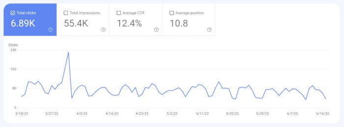
Key Features and Benefits: One of the primary benefits of Google Search Console is the ability to monitor and analyze website performance in search results. It enables you to track key metrics such as impressions, clicks, and average position for specific search queries. This valuable data helps you assess the effectiveness of your SEO strategies and identify areas for improvement.
Another invaluable feature of Google Search Console is its capability to identify and fix issues that may hinder your website’s visibility. It provides alerts and notifications regarding 404 errors, sitemap issues, and mobile usability concerns. Addressing these issues promptly ensures that search engines can access and understand your website’s content effectively.
Additionally, Google Search Console offers insights into user behavior, allowing you to understand how visitors interact with your website. It provides data on CTR, user queries, and the appearance of your site’s pages in search results. Armed with this information, you can optimize meta tags, titles, and descriptions to entice users to click through to your website.
Top Features of Google Search Console
Performance Report: This report provides a comprehensive view of how your website is performing in search results. You’ll gain insights into search queries, impressions, clicks, and average position. Dive into these metrics to uncover hidden opportunities and fine-tune your SEO strategy for maximum impact.
Keyword Optimization and Click-Through Rate: Within the Performance Report, you can identify keyword opportunities and optimize meta tags, titles, and descriptions to improve your website’s organic CTR. With compelling and relevant meta information, you increase the likelihood of enticing users to click through to your website. This optimization not only improves your CTR but also enhances your website’s visibility in search results.
Index Coverage and Crawl Errors: Monitoring your website’s index coverage and identifying crawl errors are crucial for ensuring that search engines properly index your web pages. Search Console provides alerts for any issues that may prevent certain pages from being indexed. By addressing crawl errors promptly, you can ensure that search engines can access and understand your website’s content effectively.
Enhancing Website Usability and Mobile-Friendliness: User experience plays a vital role in SEO. Google Search Console offers the Mobile Usability and Core Web Vitals reports, helping you optimize your website’s usability and mobile experience. These reports provide valuable insights into mobile-friendly issues, loading performance, and interactivity.
Schema Markup and Structured Data: Implementing schema markup and leveraging structured data can greatly enhance your website’s appearance and understanding by search engines. Google Search Console allows you to validate and test your structured data, ensuring that it follows the recommended guidelines. With structured information about your content, you increase the chances of rich snippets, knowledge panels, and other enhanced search result features, boosting your website’s visibility and click-through rates.
Backlink Analysis and Link Building: Backlinks remain a vital aspect of SEO. Google Search Console offers a Link Report that allows you to identify and analyze the backlinks pointing to your website. Understanding the quality and quantity of your backlinks helps you assess your website’s authority and identify potential areas for improvement. Implementing effective link-building strategies, such as reaching out to relevant websites or creating valuable content, can help you acquire high-quality backlinks that strengthen your website’s SEO performance.
Addressing Technical SEO Issues
Exploring the Coverage Report: One of the key aspects of technical SEO is addressing coverage issues within your website. Google Search Console’s Coverage report provides insights into crawl errors, URL submission, and canonicalization. It’s essential to address these issues to ensure that search engines can crawl and index your web pages effectively.
Site Speed and Performance Optimization: Website loading speed is a critical factor in user experience and SEO. With Google Search Console’s Speed report, you can analyze your website’s performance and identify areas for improvement. Slow-loading pages can lead to higher bounce rates and lower search engine rankings. By optimizing your website’s speed, leveraging techniques such as image compression, caching, and minifying code, you create a smoother and faster browsing experience for your users, leading to improved SEO performance.
XML Sitemap Submission and Monitoring: Submitting an XML sitemap to Google Search Console is vital for ensuring that search engines can discover and index your web pages efficiently. Google Search Console provides a convenient way to submit your XML sitemap and monitor its status. Regularly check the sitemap report to ensure that all relevant pages are included, detect any potential issues, and track the indexing status of your website. This helps you ensure that your web pages are appropriately indexed and accessible to search engine users.
Utilizing Google Search Console for SEO Insights and Reporting
Query and Page Reports: Extracting valuable SEO insights is crucial for refining your optimization strategies. With Google Search Console’s Query and Page reports, you can dive deep into keyword performance, impressions, and click-through rates. Analyze this data to gain valuable insights into how users discover and engage with your website in search results. Understanding which keywords are driving traffic and optimizing your content accordingly empowers you to enhance your website’s relevance and visibility.
Analyzing User Behavior with Google Analytics Integration: Integrating Google Search Console with Google Analytics provides a powerful combination of SEO and user behavior data. This integration enables you to gain deeper insights into user behavior, conversions, and engagement metrics. With the combined information from both platforms, you can identify which pages attract the most organic traffic, understand user journeys, and uncover opportunities for improving conversion rates. This integration offers a comprehensive understanding of how your SEO efforts impact user engagement and website performance.
Generating SEO Performance Reports: Tracking the progress and impact of your SEO efforts is crucial for measuring success and making informed decisions. Google Search Console allows you to create custom SEO performance reports using its data. These reports help you track key metrics, identify trends, and evaluate the effectiveness of your optimization strategies. Regularly generate and review these reports to fine-tune your SEO approach and identify areas for improvement.
It is important to emphasize the significance of Google Search Console in refining your SEO approach. By implementing this tool, you gain valuable insights, enhance your website’s visibility, improve search engine rankings, and drive organic traffic. However, it’s crucial to remember that SEO is an ongoing process that requires continuous monitoring and adaptation. The dynamic nature of search engine algorithms necessitates staying ahead of the game. Regularly leveraging Google Search Console allows you to stay informed, identify trends, and make necessary adjustments to maintain and enhance your website’s SEO performance.
Have you ever found yourself in a web design rabbit hole, desperately trying to track down that elusive bug that’s wreaking havoc on your beautifully crafted website? It’s a frustrating experience that can make even the most patient designer want to throw their keyboard out the window. But fear not, for within the world of digital extermination are some valuable tools and techniques to make your bug squashing easier.
Debugging is not just a necessary evil; it is a fundamental skill that separates the novices from the masters in the world of web design. It’s the process of identifying, isolating, and resolving errors that can plague websites, ensuring they function flawlessly and provide a seamless user experience. In fact, mastering the art of debugging can save you countless hours of hair-pulling frustration, improve the functionality of your designs, and elevate your reputation as a skilled designer.
Let’s take a look at the knowledge and tools needed to unravel the tangled web of errors that often lie beneath the surface. From syntax glitches to browser compatibility issues, we’ll explore common errors and their solutions, empowering you to conquer even the trickiest bugs.
Understanding the Debugging Process
What Is Debugging?
When it comes to web design, debugging serves as the crucial process of identifying and resolving errors that can impede the functionality and performance of your website. It involves the systematic exploration and troubleshooting of issues, allowing you to uncover the root causes of problems and implement effective solutions. Debugging is an indispensable skill that empowers web designers to create robust and error-free digital experiences.
The Mindset of a Debugger
Successful bug fixing requires more than technical proficiency—it demands a specific mindset. As a debugger, cultivating a patient, persistent, and curious approach is essential. Patience allows you to persevere through complex issues, knowing that every bug has a solution. Persistence drives you to dig deeper, even when faced with seemingly insurmountable challenges. Curiosity fuels your desire to understand the inner workings of your code, enabling you to uncover hidden bugs and optimize your design.
Developing an Effective Debugging Workflow
Reproduction: Begin by reproducing the error. Identify the specific conditions or actions that trigger the issue, ensuring you can consistently recreate it. This step lays the foundation for understanding the problem’s scope.
Isolation: Isolate the problem by narrowing down its potential causes. Break down your code and test individual components or sections to identify the specific area where the error originates. Isolation helps in pinpointing the source of the problem and prevents unnecessary modifications to unaffected parts of your design.
Hypothesize: Based on the isolated section, formulate hypotheses about what might be causing the error. This step involves analyzing the code, inspecting data structures, and exploring potential logic flaws. Develop multiple hypotheses to consider different scenarios and avenues for investigation.
Testing: Test each hypothesis systematically by implementing changes and observing the effects. Use tools like logging, console output, or debugging frameworks to gather insights into code execution, variable values, and control flow. Iterate through the hypotheses, adapting your testing approach as you gather new information.
Verification and resolution: Once you have identified the root cause of the error, verify the fix by thoroughly testing your modifications. Ensure that the issue is fully resolved and that your changes do not introduce new bugs. Document the steps taken to resolve the problem, creating a record that can aid in future debugging and knowledge sharing.
Understanding the debugging process is the foundation upon which successful bug hunting is built. With a clear definition of bug fixing, a debugger’s mindset, and an effective workflow in place, you are ready to tackle the diverse and often intricate errors that arise in web design.
Common Web Design Errors and Their Solutions
Syntax Errors
Syntax errors, the bane of every developer’s existence, have the power to bring your code execution to a screeching halt. These errors occur when your code violates the rules and structure of the programming language. Fortunately, identifying and fixing syntax errors is relatively straightforward.
To detect syntax errors, pay close attention to error messages provided by your code editor or development environment. These messages often indicate the line number and specific issue causing the error. Reviewing your code line by line and comparing it against the language’s syntax rules can help uncover and rectify these errors.
Logic Errors
Unlike syntax errors, logic errors don’t manifest as glaring mistakes, but rather as faulty program behavior. These bugs can be elusive and challenging to track down, requiring a detective’s mindset to identify and eliminate them. Techniques such as code review, data inspection, and stepping through code are invaluable when tackling logic errors.
Code review involves systematically examining your code for logic flaws. Another pair of eyes may spot a subtle error that you might have missed. Data inspection entails inspecting variables, inputs, and outputs to identify discrepancies or unexpected behavior. Printing or logging variable values at strategic points in your code can shed light on the problem’s source. Stepping through code with a debugger allows you to execute code line by line, observing variable values and the flow of execution, enabling you to pinpoint the exact location of the logic error.
Browser Compatibility Issues
Rendering inconsistencies aren’t as bad as they used to be in the Internet Explorer days, but ensuring cross-browser compatibility is still important to provide a consistent experience for all users. Browser compatibility issues can arise due to differences in rendering engines, CSS support, or JavaScript behavior. To address these challenges, adopt a proactive approach centered around cross-browser testing.
Perform comprehensive testing across different browsers and versions, both on desktop and mobile devices. Utilize browser developer tools to inspect elements, identify rendering inconsistencies, and debug JavaScript errors specific to a particular browser. Additionally, employ tools like BrowserStack or Sauce Labs, which allow you to test your website on a wide range of browsers and operating systems.
Performance-related Issues
Performance issues can significantly impact user experience, leading to slow load times, unresponsive interfaces, and dissatisfied visitors. To diagnose and resolve performance-related problems, employ performance profiling tools and optimization strategies.
Performance profiling tools like Lighthouse, PageSpeed Insights, or WebPageTest can analyze your website’s performance, highlighting potential bottlenecks. These tools measure metrics such as page load times, resource utilization, and network requests, providing insights into areas that require optimization. Optimize your code and assets by compressing images, minifying CSS and JavaScript files, and leveraging browser caching. Implement lazy loading for images and use asynchronous loading for scripts to optimize resource loading. Additionally, consider utilizing content delivery networks (CDNs) to distribute content closer to the user, reducing latency.
Debugging Tools and Techniques
Browser Developer Tools
When it comes to debugging in web design, browser developer tools are your trusted companions. These powerful built-in tools, such as Chrome Developer Tools, offer a range of features to aid in debugging HTML, CSS, and JavaScript issues. They provide a real-time view of your web page’s structure, styles, and functionality, enabling you to inspect and modify elements on the fly.
With browser developer tools, you can diagnose layout issues, debug JavaScript errors, analyze network traffic, and monitor performance metrics. The ability to modify code and see immediate results facilitates rapid experimentation and debugging. Take advantage of features like element inspection, JavaScript console, network analysis, and performance profiling to uncover and resolve issues efficiently.
Logging and Console Output
Logging is a tried and true method for tracking code execution and diagnosing JavaScript bugs. By strategically placing log statements in your code, you can output relevant information to the console during runtime. Console logging allows you to observe variable values, control flow, and error messages, providing valuable insights into the behavior of your code.
To maximize the effectiveness of logging, follow best practices such as using clear and descriptive log messages, organizing logs based on severity or module, and utilizing different log levels (e.g., debug, info, error). Leverage conditional logging to output specific information only when certain conditions are met. Be mindful of performance implications and ensure that logs are properly managed and removed in production environments.
Strategies for Efficient Debugging
Documentation and Organization
In the world of debugging, documentation and organization are paramount. When encountering a bug, it is crucial to document the details of the issue and organize them effectively. This practice not only facilitates efficient debugging for yourself but also aids in collaboration with teammates and ensures long-term maintainability of your web design.
Utilize bug tracking systems like GitHub to log and track bugs. Include essential information such as the bug’s description, steps to reproduce, expected and observed behavior, and relevant screenshots or error messages. By documenting bugs systematically, you create a knowledge base that can be referenced in the future, accelerating the debugging process.
Collaborative Debugging
Debugging doesn’t have to be a solitary endeavor. Collaborative debugging brings a fresh perspective, fosters knowledge sharing, and can lead to more efficient bug resolution. Embrace collaboration through code reviews and seeking help from peers or online communities.
Code reviews involve having a second set of eyes examine your code for potential issues, providing valuable feedback and catching bugs that may have slipped through. Engage in discussions with colleagues or participate in online forums and communities to seek guidance and insights from experienced developers who may have encountered similar issues.
Learning From Previous Debugging Experiences
Reflecting on past debugging experiences is a powerful way to grow as a developer. Every bug encountered provides an opportunity to learn, improve, and refine your debugging and coding skills. Adopt a growth mindset and embrace the lessons learned from previous bug fixing endeavors to become a more proficient debugger.
Review past bugs and consider the steps taken to identify and resolve them. Reflect on the strategies that proved successful and the ones that fell short. Identify patterns or recurring issues that can inform your future debugging efforts. Did you miss any red flags during code reviews? Were there any blind spots in your testing approach? This can help you identify areas for improvement and develop more effective debugging techniques.
Exterminate Those Bugs
Please don’t hurt the good Bugs!
Mastering the art of debugging is not just about fixing errors; it is about honing a valuable skill that saves time, improves functionality, and enhances the user experience. As web designers, we have the opportunity to create digital experiences that delight and inspire. Embracing debugging as an essential part of our toolkit enables us to deliver exceptional results.
So, I encourage you to embrace the world of debugging. Practice diligently, explore new techniques and tools, and seek collaboration and guidance from your peers. Debugging is not just a means to an end; it is a journey of growth, learning, and mastery. With each bug you conquer, you become a more skilled and resilient web designer.
Remember, the challenges you face during debugging are not obstacles, but stepping stones towards excellence. Embrace the bug fixing process with patience, curiosity, and determination. Your dedication to mastering this craft will set you apart and empower you to create remarkable web designs.