Imagine a website where the background subtly responds to your every move, creating a captivating and immersive experience. As you navigate the page, the background image gracefully pans and follows your mouse cursor or device orientation, adding a touch of cinematic magic to the overall design. This is the power of the cinematic parallax background effect.
Here you will find a step-by-step process of implementing this epic JavaScript effect, as well as the full source code. From understanding the core concepts to the implementation details, this article will provide you with a comprehensive understanding of how to create a cinematic parallax background effect that will leave your visitors in awe.
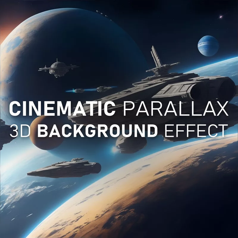
Here’s what we’re going to create:
What is the Cinematic Parallax 3D Background Effect?
This smooth mouse-following background effect is a visually captivating technique that adds a layer of dynamism and interactivity to web design. It involves the background image of a website smoothly panning and following the movement of the user’s mouse cursor or device orientation. This effect creates a sense of depth and immersion, drawing the user’s attention and enhancing their engagement with the website.
One of the key advantages of this effect is its ability to elevate the overall aesthetic appeal of a website. Incorporating this effect creates a visually stunning experience that leaves a lasting impression on visitors. The subtle movement of the background image adds a touch of elegance and sophistication to the design, making it stand out from static and conventional websites.
This epic background effect is incredibly versatile and can be applied to a wide range of websites and projects. Whether you’re designing a portfolio website, an e-commerce store, a creative agency site, or a blog, this effect has the potential to enhance the user experience and bring a unique element of interactivity. Its adaptability makes it suitable for various design styles, from minimalistic and modern to bold and artistic.
Implementing the Cinematic Mouse-Following Background Effect
To bring the effect to life, you’ll need to follow a few steps to set up the HTML, CSS, and JavaScript components.
Create the HTML structure
To begin, you’ll need to add a couple of container elements in the HTML to hold the background image. These containers can be divs with a class or ID that will help you target it in CSS and JavaScript.
<div class="background-container">
	<div class="background"></div>
</div>
Next, you’ll want to style the containers in CSS to define the dimensions, position, and overflow properties. This will ensure that the background image stays within the boundaries of the container and doesn’t affect the rest of your web page layout.
body {
	margin: 0;
}

.background-container {
	position: relative;
	width: 100vw;
	height: 100vh;
	overflow: hidden;
}

.background {
	width: 104vw;
	height: 104vh;
	position: absolute;
	top: -2vh;
	left: -2vw;
	right: -2vw;
	bottom: -2vh;
	background-image: url(background.jpg);
	background-size: cover;
	background-position: center center;
	transition: transform 1.5s ease-out;
}

@media (pointer:none), (pointer:coarse) {
	.background {
		width: 130vw;
		height: 130vh;
		top: -15vh;
		left: -15vw;
		right: -15vw;
		bottom: -15vh;
	}
}
Write the JavaScript code
Now that you have the HTML structure in place, it’s time to add the JavaScript code that will capture the mouse movement and adjust the background position accordingly.
document.addEventListener("DOMContentLoaded", function() {
	var background = document.querySelector(".background");
	var initialTiltX = null;
	var initialTiltY = null;
	var isMobile = /iPhone|iPad|iPod|Android/i.test(navigator.userAgent);

	if (isMobile && window.DeviceOrientationEvent) {
		window.addEventListener("deviceorientation", handleOrientationEvent);
	} else {
		window.addEventListener("mousemove", handleMouseEvent);
	}

	function handleOrientationEvent(event) {
		if (initialTiltX === null || initialTiltY === null) {
			initialTiltX = event.gamma;
			initialTiltY = event.beta;
			return;
		}

		var tiltX = event.gamma - initialTiltX;
		var tiltY = event.beta - initialTiltY;

		var tiltScale = isMobile ? 0.7 : 0.05; // Adjust the strength on mobile

		var offsetX = tiltX * tiltScale;
		var offsetY = tiltY * tiltScale;

		background.style.transform = "translate(" + offsetX + "px, " + offsetY + "px)";
	}

	function handleMouseEvent(event) {
		var mouseX = event.clientX;
		var mouseY = event.clientY;

		var windowCenterX = window.innerWidth / 2;
		var windowCenterY = window.innerHeight / 2;

		var mouseOffsetX = (mouseX - windowCenterX) * -0.04; // Adjust the values to control the mouse parallax effect
		var mouseOffsetY = (mouseY - windowCenterY) * -0.04;

		background.style.transform = "translate(" + mouseOffsetX + "px, " + mouseOffsetY + "px)";
	}
});
Set up and integrate the code snippets
To integrate the necessary code snippets into your web project, follow these steps:
- Copy and paste the HTML structure into your HTML file at the desired location.
- Add the CSS styles to your CSS file or within a
<style>tag in the<head>section of your HTML file. - Copy and paste the JavaScript code into a JavaScript file or within a
<script>tag before the closing</body>tag of your HTML file. - Save your HTML, CSS, and JavaScript files and open the HTML file in a web browser.
Note: Remember to replace the class name ‘background’ with the appropriate class or ID you’ve chosen for your container element.
Customization and Enhancements
Now that you have the basic cinematic parallax background effect in place, let’s explore some customization options and additional techniques to take it to the next level:
One way to customize the effect is by adjusting the speed and range of the background movement. This allows you to control how responsive and pronounced the background follows the mouse.
To modify the speed, you can adjust the transition duration. The longer the duration, the slower and smoother the effect.
To adjust the range of the background movement, you can modify the values of the background class. Increasing the values will expand the range, allowing the background to move further, while decreasing them will restrict the movement to a smaller area.
This effect can give a strong immersive and interactive feel to any website or web app. If you’re looking for something to give your site that “wow” factor, give it a try, customize it, make it your own, and buckle up for the “oohs” and “ahhs”.