In today’s fast-paced world, where instant gratification is the norm, the need for blazing-fast websites has never been greater. Picture visiting a website, eagerly awaiting its content, only to be greeted by a loading spinner that seems to take ages. Frustrating, right? Well, say goodbye to those days of waiting, because lazy loading is here to save the day!
Lazy loading is like having a personal assistant who knows exactly what you need and delivers it right when you need it. It’s a clever technique that ensures your website loads lightning-fast by loading only the essential content first and deferring the rest until later. With lazy loading, images, videos, and other resource-heavy elements are loaded on-the-fly as users scroll down the page or interact with specific sections. This means your visitors get to experience your website’s magic instantly, without any annoying delays.
But lazy loading isn’t just about speed. It’s a game-changer for user experience. Imagine a seamless browsing experience where your website adapts to the user’s behavior, revealing content precisely when they want it. It’s like unveiling a treasure trove of information as users explore your site, keeping them engaged and hungry. Get ready to transform your website into a nimble and captivating experience that will leave your users craving for more.
What is Lazy Loading?
Lazy loading is a technique in web development that delays the loading of certain website elements, such as images, videos, and scripts, until they are needed. Unlike traditional loading methods where all content is loaded upfront, lazy loading focuses on loading content progressively as users interact with the page. This is achieved by dynamically loading content only when or just before it becomes visible within the user’s viewport.
The primary advantage of lazy loading is its ability to significantly reduce initial page load time. By deferring the loading of non-essential content, lazy loading allows the critical elements of a page to load quickly, providing users with a faster and more responsive browsing experience. This improved performance is particularly noticeable on bandwidth-limited connections or when accessing websites on mobile devices.
Lazy loading also has positive implications for SEO and user engagement. Search engines consider page load time as a ranking factor, and by implementing lazy loading, you can enhance your website’s performance, leading to improved search engine visibility. Additionally, lazy loading can enhance user engagement by allowing users to consume content immediately, without waiting for all elements to load. This can lead to increased page views, longer visit durations, and lower bounce rates, ultimately improving the overall user experience.
Types of Content Suitable for Lazy Loading
When it comes to lazy loading, the possibilities are endless. You can apply this technique to various types of content that tend to slow down page loading times. Let’s explore some of the content types that can benefit from the magic of lazy loading:
- Images: Images are often the largest and most resource-intensive elements on a webpage. Lazy loading images ensures that only the images within the viewport or those about to come into view are loaded, while the rest patiently await their turn. This significantly reduces initial page load times and helps conserve precious bandwidth.
- Videos: With the popularity of videos skyrocketing, lazy loading them has become essential. Instead of loading all the videos on a page at once, you can lazily load them as users scroll, saving bandwidth and reducing the initial load time. Users can enjoy a seamless video-watching experience without any buffering interruptions.
- Iframes: Iframes are commonly used to embed external content like maps, social media feeds, or advertisements. Lazy-loading iframes can prevent them from slowing down the initial page load. Users will only experience the loading delay when they interact with the specific iframe, ensuring a smoother overall browsing experience.
Best Practices for Lazy Loading Different Content Types

While lazy loading offers tremendous benefits, it’s important to implement it correctly for each content type. Here are some best practices to consider:
- Images: Optimize your images for the web by compressing them without compromising quality. Use the appropriate image format (e.g., JPEG, PNG, or SVG) based on the content. Consider using placeholder images to maintain the layout before lazy loading the actual images.
- Videos: Choose a reliable video hosting platform that supports lazy loading. Use the appropriate video format and ensure the videos are optimized for web playback. Consider adding thumbnail images or placeholders to provide visual cues and improve the overall user experience.
- Iframes: Evaluate the necessity of each iframe and consider lazy loading them only when they come into view or when users interact with relevant triggers. Ensure that the iframes are responsive and adjust well to different screen sizes.
Real-World Examples and Use Cases
Let’s explore some real-world examples to showcase the power of lazy loading:
- Image Galleries: In a photography portfolio website, lazy loading can be applied to image galleries. As users scroll through the gallery, the images load dynamically, creating a smooth and immersive browsing experience.
- News Websites: On news websites, lazy loading can be implemented for articles’ featured images. Only the images in the viewport or those near it are loaded, allowing for faster load times and a seamless reading experience.
- Social Media Feeds: Social media platforms often use lazy loading to optimize the loading of images, videos, and iframes within users’ feeds. This ensures that the content loads progressively, providing a seamless scrolling experience.
Implementing Lazy Loading
Implementing lazy loading can be achieved through various methods, including utilizing JavaScript libraries and frameworks specifically designed for this purpose. Additionally, modern browsers provide a native lazy loading attribute, loading="lazy", which offers a simple and efficient way to implement lazy loading without external dependencies.
- Intersection Observer API: The Intersection Observer API is a built-in JavaScript API that allows you to efficiently track when an element enters or exits the viewport. It provides a native way to implement lazy loading, making it lightweight and performant.
- LazyLoad: LazyLoad is a lightweight JavaScript library that simplifies the process of lazy loading images, videos, and iframes. It offers an easy-to-use implementation, enabling you to add lazy loading functionality to your website with minimal code changes.
- lozad.js: lozad.js is another lightweight and dependency-free library specifically designed for lazy loading images. With its simple syntax, you can easily apply lazy loading by adding a specific class to the elements you want to lazily load.
- Native lazy loading attribute: Modern browsers support the
loading="lazy"attribute, which can be added to image and iframe elements. Adding this attribute tells the browser to automatically lazy load the specified content as it comes into view, without the need for any additional JavaScript or libraries.
Optimizing Lazy Loading Configurations
While implementing lazy loading, it’s essential to optimize the configurations for improved performance and user experience:
- Prioritize critical content: Ensure that the essential content is loaded immediately, even before users start scrolling. This guarantees that vital information is promptly displayed to your users.
- Fine-tune thresholds: Experiment with the intersection thresholds to determine the ideal point at which lazy loading should initiate. Adjust these thresholds to strike a balance between loading elements in advance and conserving resources.
- Consider preloading: Combine lazy loading with preloading techniques, such as using the “preload” attribute, to further optimize the loading process. Preloading hints the browser to fetch the lazy-loaded resources in advance, reducing any potential delay.
Lazy Loading Best Practices
Enhancing Lazy Loading with Placeholders and Loading Animations
To enhance the visual experience during lazy loading, consider the following techniques:
- Placeholder images: Use lightweight placeholder images as temporary placeholders while lazy-loaded images are loading. These placeholders provide a visual cue to users and help maintain the overall layout and design of the webpage.
- Loading animations: Implement loading animations to provide feedback to users during the lazy loading process. These animations can be simple spinners or progress bars that indicate the loading progress, keeping users engaged and informed.
Testing and Monitoring Lazy Loading Implementations
To ensure optimal performance and identify any potential issues with lazy loading, follow these practices:
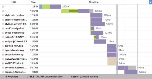
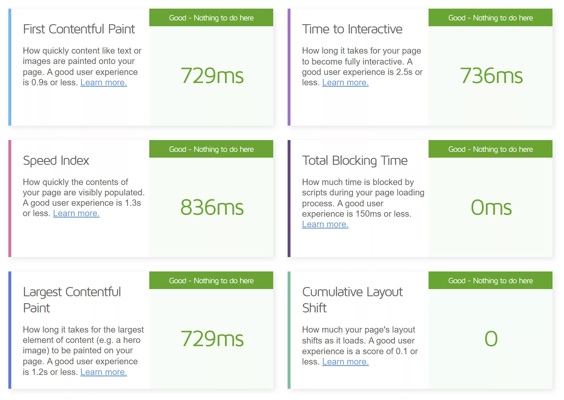
- Performance testing: Regularly conduct performance tests to measure the impact of lazy loading on page load times. Use tools like Lighthouse, WebPageTest, or Chrome DevTools to assess the performance improvements and identify areas for optimization.
- Cross-browser and device testing: Test your lazy loading implementation across various browsers and devices to ensure compatibility and consistent behavior. Pay particular attention to older browsers and devices with limited resources to ensure a seamless experience for all users.
- Monitor user feedback and behavior: Analyze user feedback and behavior using tools like Google Analytics to identify any issues or areas for improvement. Monitor metrics such as bounce rate, session duration, and conversion rates to gauge the impact of lazy loading on user engagement.
Implementing lazy loading on your website offers numerous benefits, including improved page load times, enhanced user experience, and reduced bandwidth usage. Selectively loading content as users interact with the page ensures a faster initial load and allows for a smoother browsing experience.
Not only does lazy loading positively impact performance and user engagement, but it also has implications for SEO. By reducing page load times and improving user experience metrics, such as bounce rate and time on page, lazy loading can indirectly contribute to better search engine rankings.
Accessibility is another important consideration when implementing lazy loading. It is crucial to ensure that all users, including those with disabilities, can access and interact with the lazy-loaded content. Implementing appropriate fallback mechanisms and providing alternative access options is essential for inclusive web design.
Looking ahead, the future of lazy loading holds promising advancements. As technologies continue to evolve, we can expect further improvements in lazy loading techniques, including more efficient algorithms and native browser support. Additionally, innovations such as predictive lazy loading, where content is loaded in anticipation of user actions, may further enhance the user experience.
To stay at the forefront of lazy loading trends and advancements, it is essential to keep up with industry developments and explore new tools and techniques. Regularly evaluate your lazy loading implementation, considering performance, SEO, and accessibility factors, and make adjustments as necessary to ensure optimal results.
Wield the power of lazy loading to create websites that not only deliver exceptional performance and engage users effectively but also remain adaptable to the ever-evolving web landscape. Embrace lazy loading as a valuable tool in your web design toolkit, and unlock the potential to create stunning, high-performing websites that leave a lasting impact.