Schema Markup: Enrich Your Search Engine Appearance With Structured Data

Web designers and SEO professionals are constantly seeking ways to optimize websites for search engines. One powerful technique that has gained significant traction is the implementation of schema markup and structured data. These innovative concepts not only enhance the way search engines understand and index web content but also improve the overall user experience.

Imagine if search engines had a better understanding of your website’s content, allowing them to display rich snippets, knowledge panels, and other visually appealing elements in search results. This is where schema markup comes into play. It provides search engines with structured information, making it easier for them to interpret and present your web content accurately.

What is Schema Markup and Structured Data?

Schema markup is a specific vocabulary or code language that allows webmasters to provide structured information about their web content. It helps search engines understand the meaning and context of the data on a webpage. With it web designers can classify and organize their content into specific categories or types, making it easier for search engines to interpret and present relevant information to users.

Structured data refers to the actual content that is marked up using schema markup. It provides additional context and details about various elements on a webpage, such as products, articles, events, recipes, and more. This data helps web designers supply search engines with specific information about their content, such as titles, descriptions, ratings, prices, and dates, enriching search results with relevant and visually appealing elements.

Implementing structured data brings several advantages. First, it enhances visibility in search results by enabling search engines to display rich snippets, knowledge panels, and other visually appealing elements. This improved visibility can significantly increase click-through rates and drive more targeted traffic to your website. Schema markup also contributes to a better user experience by providing users with accurate and detailed information directly on the search engine results page. Users can quickly find what they’re looking for without having to navigate through multiple web pages.

Types of Schema Markup

Schema markup offers a wide range of types that cater to various formats of web content. Let’s explore some of the most commonly used types:

  1. Organization: This type allows you to provide detailed information about your organization, such as its name, logo, contact details, social media profiles, and more. Implementing organization structured data helps search engines accurately represent your business in search results and knowledge panels.
  2. Local Business: If you have a physical location or operate locally, local business schema markup is crucial. It enables you to provide specific details about your business address, opening hours, phone number, and other relevant information. This helps local searchers find your business more easily.
  3. Product: Product markup allows you to showcase your products with rich snippets in search results. You can provide product details like name, description, price, availability, and even customer reviews. Implementing product schema markup can increase the visibility of your products and improve their chances of appearing in product-related search results.
  4. Article: Article schema markup is ideal for publishers and bloggers. It allows you to provide structured data about your articles, including the headline, author, publication date, and a brief summary.
  5. Review: Review markup helps you display customer reviews and ratings in search results. You can provide information such as the reviewer’s name, rating, review text, and even the product or service being reviewed. This type of data adds credibility to your business and can influence user decisions.

Each type of schema markup comes with its own set of properties and attributes. For example, product markup includes properties like brand, SKU, aggregateRating, and offers, while article schema markup uses properties such as headline, author, datePublished, and articleBody. Understanding these properties and attributes is essential for correctly implementing Schema Markup and ensuring that search engines interpret your data accurately.

Let’s consider some practical examples of structured data implementation. For a business website, you can apply organization markup to provide your company’s name, logo, and contact information. If you offer products, incorporating product schema enables you to display product details like name, price, and availability directly in search results. If you publish articles, utilizing article markup allows search engines to present your article’s headline, author, and publication date in a visually appealing manner. And if your website includes customer reviews, you can implement review markup to allow search engines to display star ratings and review snippets, boosting the credibility of your business.

Implementing Schema Markup

There are several methods you can use to implement schema markup on your website. Let’s explore two common approaches:

  1. Manual Coding: This method involves manually adding structured data to your HTML code. You can insert the appropriate schema markup tags and attributes directly into the relevant sections of your HTML markup. While this method offers more control and customization options, it requires a solid understanding of schema markup syntax and HTML coding.
  2. Schema.org’s Structured Data Tools: Schema.org provides structured data tools that simplify the process of adding schema markup. These tools offer user-friendly interfaces where you can input your data and generate the necessary code. This method is especially helpful if you’re new to schema markup or prefer a more guided and automated approach.

Here’s an example of structured data using schema markup for a business website:

<script type="application/ld+json">
{
  "@context": "http://schema.org",
  "@type": "LocalBusiness",
  "name": "Example Business",
  "address": {
    "@type": "PostalAddress",
    "streetAddress": "123 Main Street",
    "addressLocality": "Cityville",
    "addressRegion": "State",
    "postalCode": "12345",
    "addressCountry": "United States"
  },
  "telephone": "+1-555-123-4567",
  "url": "https://www.example.com",
  "openingHours": "Mo-Fr 09:00-18:00",
  "image": "https://www.example.com/logo.png",
  "priceRange": "$$",
  "description": "Example Business is a leading provider of quality products/services in the industry."
}
</script>

In this example, we’re using the LocalBusiness type to represent a local business entity. The structured data includes the business name, address, telephone number, website URL, opening hours, image/logo, price range, and a brief description.

After implementing your schema markup, it’s essential to validate your markup to ensure it’s correctly structured and error-free. One popular tool for this is Google’s Structured Data Testing Tool. Follow these steps to validate your code:

  1. Open the Google Structured Data Testing Tool in your web browser.
  2. Enter the URL of the page containing the schema markup or paste the markup code directly into the tool.
  3. Click on the “Run Test” button to analyze the markup.
  4. The tool will provide feedback on the validity of the markup, highlighting any errors or warnings that need attention.

The Future of Structured Data

The landscape of structured data continues to evolve, with exciting advancements and emerging trends shaping the future of these technologies:

  • Expanded Schema Types: As the demand for structured information grows, Schema.org continues to expand its vocabulary with new schema types. These additions cater to specific industries, niches, and emerging technologies, allowing website owners to provide more precise and detailed information to search engines.
  • Voice-Activated Assistants: The proliferation of voice-activated assistants presents new opportunities for schema markup. As voice search becomes increasingly prevalent, schema markup will play a vital role in optimizing content for voice queries. Future developments may include schema enhancements specifically tailored to voice search, enabling websites to provide even more contextually relevant information.
  • Artificial Intelligence (AI) Integration: As search engines become more sophisticated with AI and machine learning, schema markup could play a crucial role in helping algorithms better understand and interpret web content. AI-driven algorithms can leverage structured data to improve search relevance, enhance user experiences, and deliver more accurate and personalized results.

Schema markup and structured data offer significant benefits for web designers and SEO professionals. It empowers websites to provide search engines with structured information about their content, leading to improved visibility, higher click-through rates, and enhanced user experiences. Understanding different types of schema markup, implementing it correctly, and staying updated with the latest developments are crucial for harnessing the full potential of structured data. Embrace the power of schema markup and structured data to optimize your website for search engines and deliver exceptional user experiences.

Debugging: Error Resolution and Bug Fixing in Web Design

Have you ever found yourself in a web design rabbit hole, desperately trying to track down that elusive bug that’s wreaking havoc on your beautifully crafted website? It’s a frustrating experience that can make even the most patient designer want to throw their keyboard out the window. But fear not, for within the world of digital extermination are some valuable tools and techniques to make your bug squashing easier.

Debugging is not just a necessary evil; it is a fundamental skill that separates the novices from the masters in the world of web design. It’s the process of identifying, isolating, and resolving errors that can plague websites, ensuring they function flawlessly and provide a seamless user experience. In fact, mastering the art of debugging can save you countless hours of hair-pulling frustration, improve the functionality of your designs, and elevate your reputation as a skilled designer.

Let’s take a look at the knowledge and tools needed to unravel the tangled web of errors that often lie beneath the surface. From syntax glitches to browser compatibility issues, we’ll explore common errors and their solutions, empowering you to conquer even the trickiest bugs.

Understanding the Debugging Process

What Is Debugging?

When it comes to web design, debugging serves as the crucial process of identifying and resolving errors that can impede the functionality and performance of your website. It involves the systematic exploration and troubleshooting of issues, allowing you to uncover the root causes of problems and implement effective solutions. Debugging is an indispensable skill that empowers web designers to create robust and error-free digital experiences.

The Mindset of a Debugger

Successful bug fixing requires more than technical proficiency—it demands a specific mindset. As a debugger, cultivating a patient, persistent, and curious approach is essential. Patience allows you to persevere through complex issues, knowing that every bug has a solution. Persistence drives you to dig deeper, even when faced with seemingly insurmountable challenges. Curiosity fuels your desire to understand the inner workings of your code, enabling you to uncover hidden bugs and optimize your design.

Developing an Effective Debugging Workflow

  1. Reproduction: Begin by reproducing the error. Identify the specific conditions or actions that trigger the issue, ensuring you can consistently recreate it. This step lays the foundation for understanding the problem’s scope.
  2. Isolation: Isolate the problem by narrowing down its potential causes. Break down your code and test individual components or sections to identify the specific area where the error originates. Isolation helps in pinpointing the source of the problem and prevents unnecessary modifications to unaffected parts of your design.
  3. Hypothesize: Based on the isolated section, formulate hypotheses about what might be causing the error. This step involves analyzing the code, inspecting data structures, and exploring potential logic flaws. Develop multiple hypotheses to consider different scenarios and avenues for investigation.
  4. Testing: Test each hypothesis systematically by implementing changes and observing the effects. Use tools like logging, console output, or debugging frameworks to gather insights into code execution, variable values, and control flow. Iterate through the hypotheses, adapting your testing approach as you gather new information.
  5. Verification and resolution: Once you have identified the root cause of the error, verify the fix by thoroughly testing your modifications. Ensure that the issue is fully resolved and that your changes do not introduce new bugs. Document the steps taken to resolve the problem, creating a record that can aid in future debugging and knowledge sharing.

Understanding the debugging process is the foundation upon which successful bug hunting is built. With a clear definition of bug fixing, a debugger’s mindset, and an effective workflow in place, you are ready to tackle the diverse and often intricate errors that arise in web design.

Common Web Design Errors and Their Solutions

Syntax Errors

Syntax errors, the bane of every developer’s existence, have the power to bring your code execution to a screeching halt. These errors occur when your code violates the rules and structure of the programming language. Fortunately, identifying and fixing syntax errors is relatively straightforward.

To detect syntax errors, pay close attention to error messages provided by your code editor or development environment. These messages often indicate the line number and specific issue causing the error. Reviewing your code line by line and comparing it against the language’s syntax rules can help uncover and rectify these errors.

Logic Errors

Unlike syntax errors, logic errors don’t manifest as glaring mistakes, but rather as faulty program behavior. These bugs can be elusive and challenging to track down, requiring a detective’s mindset to identify and eliminate them. Techniques such as code review, data inspection, and stepping through code are invaluable when tackling logic errors.

Code review involves systematically examining your code for logic flaws. Another pair of eyes may spot a subtle error that you might have missed. Data inspection entails inspecting variables, inputs, and outputs to identify discrepancies or unexpected behavior. Printing or logging variable values at strategic points in your code can shed light on the problem’s source. Stepping through code with a debugger allows you to execute code line by line, observing variable values and the flow of execution, enabling you to pinpoint the exact location of the logic error.

Browser Compatibility Issues

Rendering inconsistencies aren’t as bad as they used to be in the Internet Explorer days, but ensuring cross-browser compatibility is still important to provide a consistent experience for all users. Browser compatibility issues can arise due to differences in rendering engines, CSS support, or JavaScript behavior. To address these challenges, adopt a proactive approach centered around cross-browser testing.

Perform comprehensive testing across different browsers and versions, both on desktop and mobile devices. Utilize browser developer tools to inspect elements, identify rendering inconsistencies, and debug JavaScript errors specific to a particular browser. Additionally, employ tools like BrowserStack or Sauce Labs, which allow you to test your website on a wide range of browsers and operating systems.

Performance-related Issues

Performance issues can significantly impact user experience, leading to slow load times, unresponsive interfaces, and dissatisfied visitors. To diagnose and resolve performance-related problems, employ performance profiling tools and optimization strategies.

Performance profiling tools like Lighthouse, PageSpeed Insights, or WebPageTest can analyze your website’s performance, highlighting potential bottlenecks. These tools measure metrics such as page load times, resource utilization, and network requests, providing insights into areas that require optimization. Optimize your code and assets by compressing images, minifying CSS and JavaScript files, and leveraging browser caching. Implement lazy loading for images and use asynchronous loading for scripts to optimize resource loading. Additionally, consider utilizing content delivery networks (CDNs) to distribute content closer to the user, reducing latency.

Debugging Tools and Techniques

Browser Developer Tools

When it comes to debugging in web design, browser developer tools are your trusted companions. These powerful built-in tools, such as Chrome Developer Tools, offer a range of features to aid in debugging HTML, CSS, and JavaScript issues. They provide a real-time view of your web page’s structure, styles, and functionality, enabling you to inspect and modify elements on the fly.

With browser developer tools, you can diagnose layout issues, debug JavaScript errors, analyze network traffic, and monitor performance metrics. The ability to modify code and see immediate results facilitates rapid experimentation and debugging. Take advantage of features like element inspection, JavaScript console, network analysis, and performance profiling to uncover and resolve issues efficiently.

Logging and Console Output

Logging is a tried and true method for tracking code execution and diagnosing JavaScript bugs. By strategically placing log statements in your code, you can output relevant information to the console during runtime. Console logging allows you to observe variable values, control flow, and error messages, providing valuable insights into the behavior of your code.

To maximize the effectiveness of logging, follow best practices such as using clear and descriptive log messages, organizing logs based on severity or module, and utilizing different log levels (e.g., debug, info, error). Leverage conditional logging to output specific information only when certain conditions are met. Be mindful of performance implications and ensure that logs are properly managed and removed in production environments.

Strategies for Efficient Debugging

Documentation and Organization

In the world of debugging, documentation and organization are paramount. When encountering a bug, it is crucial to document the details of the issue and organize them effectively. This practice not only facilitates efficient debugging for yourself but also aids in collaboration with teammates and ensures long-term maintainability of your web design.

Utilize bug tracking systems like GitHub to log and track bugs. Include essential information such as the bug’s description, steps to reproduce, expected and observed behavior, and relevant screenshots or error messages. By documenting bugs systematically, you create a knowledge base that can be referenced in the future, accelerating the debugging process.

Collaborative Debugging

Debugging doesn’t have to be a solitary endeavor. Collaborative debugging brings a fresh perspective, fosters knowledge sharing, and can lead to more efficient bug resolution. Embrace collaboration through code reviews and seeking help from peers or online communities.

Code reviews involve having a second set of eyes examine your code for potential issues, providing valuable feedback and catching bugs that may have slipped through. Engage in discussions with colleagues or participate in online forums and communities to seek guidance and insights from experienced developers who may have encountered similar issues.

Learning From Previous Debugging Experiences

Reflecting on past debugging experiences is a powerful way to grow as a developer. Every bug encountered provides an opportunity to learn, improve, and refine your debugging and coding skills. Adopt a growth mindset and embrace the lessons learned from previous bug fixing endeavors to become a more proficient debugger.

Review past bugs and consider the steps taken to identify and resolve them. Reflect on the strategies that proved successful and the ones that fell short. Identify patterns or recurring issues that can inform your future debugging efforts. Did you miss any red flags during code reviews? Were there any blind spots in your testing approach? This can help you identify areas for improvement and develop more effective debugging techniques.

Exterminate Those Bugs

Please don’t hurt the good Bugs!

Mastering the art of debugging is not just about fixing errors; it is about honing a valuable skill that saves time, improves functionality, and enhances the user experience. As web designers, we have the opportunity to create digital experiences that delight and inspire. Embracing debugging as an essential part of our toolkit enables us to deliver exceptional results.

So, I encourage you to embrace the world of debugging. Practice diligently, explore new techniques and tools, and seek collaboration and guidance from your peers. Debugging is not just a means to an end; it is a journey of growth, learning, and mastery. With each bug you conquer, you become a more skilled and resilient web designer.

Remember, the challenges you face during debugging are not obstacles, but stepping stones towards excellence. Embrace the bug fixing process with patience, curiosity, and determination. Your dedication to mastering this craft will set you apart and empower you to create remarkable web designs.

How to Build a Working Browser-based Game With JavaScript

Browser-based games have gained immense popularity, captivating players of all ages and providing hours of entertainment. These games, accessible directly through web browsers, offer a convenient and engaging experience without the need for additional software installations. One of the key technologies behind the creation of these games is JavaScript, a versatile programming language that powers interactive and dynamic web content. With JavaScript, developers can craft captivating and immersive gaming experiences right within the browser.

Building browser-based games with JavaScript opens up a world of possibilities. It allows developers to leverage the ubiquity of web browsers and reach a wide audience across different devices and platforms. From simple puzzle games to complex multiplayer adventures, the flexibility of JavaScript empowers developers to bring their creative visions to life.

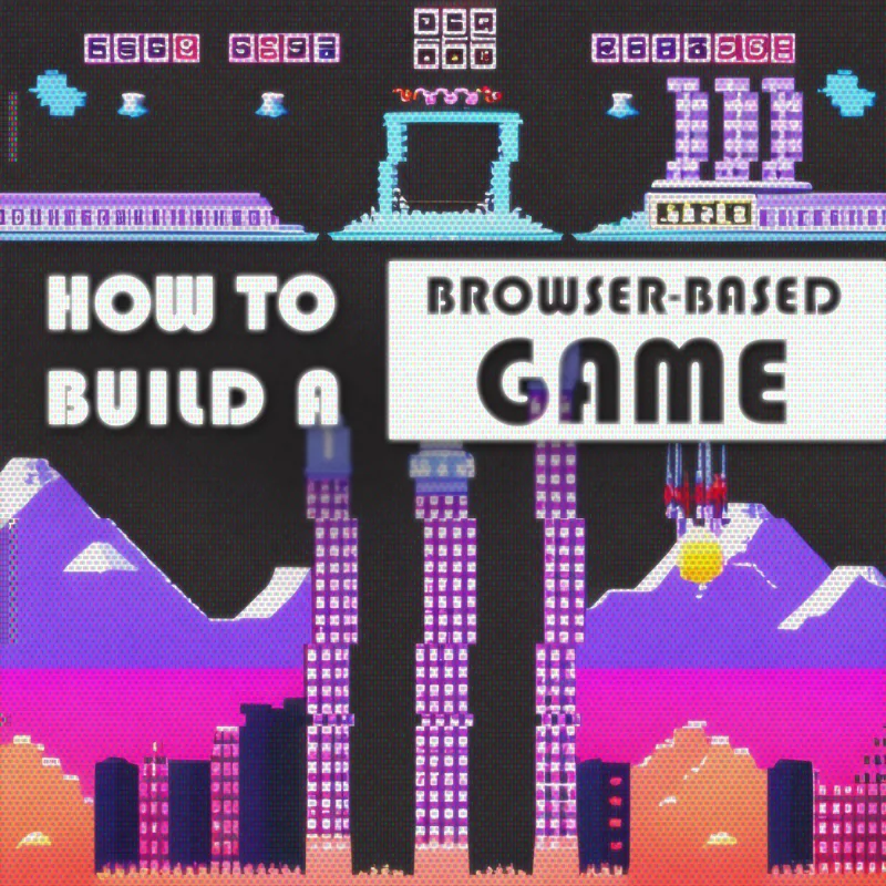
This guide will walk you through the process of building a working browser-based game with JavaScript, from starting with the fundamentals, to implementing game logic. You will even find helpful code examples and a complete working game demo with source code. Whether you’re a seasoned developer looking to venture into the world of browser-based game development or a beginner with a passion for coding, this article will provide you with the essential knowledge and practical techniques to start creating a compelling browser-based game.

Advantages of Browser-based Games

JavaScript

Browser-based games, as the name suggests, are games that can be played directly within a web browser without the need for downloading or installing additional software. They leverage the power of web technologies, such as HTML, CSS, and JavaScript, to deliver interactive and engaging gaming experiences.

One of the key advantages of using JavaScript for browser-based game development is its widespread adoption and compatibility. JavaScript is supported by all major web browsers, making it accessible to a vast number of users across different devices and platforms. This means that your game can reach a wide audience without the need for users to install specific software or plugins.

Moreover, JavaScript offers a rich set of features and functionalities that are well-suited for game development. Its versatility allows developers to handle game logic, user input, animations, and more, all within the browser environment. With the advent of modern web technologies, JavaScript-powered games can achieve impressive visuals, smooth animations, and immersive gameplay.

The popularity of browser-based games continues to soar, thanks to their accessibility and the ease of sharing and playing games directly from a web browser. They provide instant entertainment without the barriers of installation or compatibility issues. Additionally, browser-based games can be seamlessly integrated into websites, making them an effective tool for engaging users and driving traffic to your online platforms.

Setting Up Your Development Environment

Before we dive into browser-based game development with JavaScript, it’s important to set up the right development environment. This will ensure a smooth and efficient workflow as you bring your game ideas to life.

Choose a Code Editor:
To write and manage your JavaScript code, you’ll need a reliable code editor. There are several options available, each with its own set of features and benefits. Popular choices among developers include Visual Studio, Sublime Text, and Atom. These editors provide syntax highlighting, code suggestions, and other helpful features that enhance your coding experience. Choose the code editor that suits your preferences and install it on your machine.

Configure JavaScript Libraries and Frameworks:
JavaScript libraries and frameworks can greatly simplify the development process and enhance the functionality of your game. Depending on the complexity of your game, you may choose to utilize libraries such as jQuery for DOM manipulation or Phaser for game-specific functionalities. Additionally, frameworks like React or Vue.js can be employed for building more complex game interfaces and managing state.

Designing the Game Concept

Now it’s time to get into the creative process of designing your game concept. This is where you define the genre, mechanics, and rules that will shape the gameplay experience. With careful planning and outlining, you can ensure an engaging and immersive game for your players.

Select a Game Genre and Concept:
Consider the type of game you want to create and the interests of your target audience. Are you envisioning a fast-paced action game, a strategic puzzle game, or perhaps an adventurous role-playing game? Think about what excites you as a developer and what will resonate with your players. Once you have a genre in mind, brainstorm unique and captivating concepts that will make your game stand out. Be creative and explore various ideas before settling on one that sparks your passion.

Outline Game Mechanics and Rules:
Game mechanics are the rules, actions, and interactions that define how your game works. Determine the core mechanics that will drive your gameplay, such as jumping, shooting, solving puzzles, or managing resources. Consider how these mechanics will challenge and engage players, ensuring a balance between difficulty and enjoyment. Outline the rules of your game, including win and lose conditions, scoring systems, and any special features or power-ups that will enhance the gameplay experience.

Creating the Game Structure

Now that you have a clear game concept in mind, it’s time to start building the foundation of your browser-based game. This is where we create the game structure, including setting up the game canvas and defining game states and screens.

Build the Game Canvas:
The game canvas is the area where all the game elements will be rendered and displayed. It acts as a visual container for your game graphics and provides the space where players will interact with your game. To create the game canvas, you can use HTML5’s <canvas> element, which provides a drawing surface that you can manipulate using JavaScript. Set the canvas dimensions and position it appropriately within your webpage to ensure optimal visibility and responsiveness.

Set Up Game States and Screens:
Game states represent different stages or screens of your game, such as the main menu, level selection, gameplay, and game over screen. Each state has its own set of functionalities and visual elements. By structuring your game into states, you can easily manage the flow and transitions between different parts of the game. Determine the states your game will have and define the necessary functions and assets for each state. This will allow you to control the logic and visual representation of your game as players progress through different screens.

To create a basic game canvas using HTML5 and JavaScript, follow these steps:

  1. HTML Markup:
<canvas id="gameCanvas" width="400" height="400"></canvas>
  1. JavaScript Code:
const canvas = document.getElementById("gameCanvas");
const ctx = canvas.getContext("2d");

// Draw a background color
ctx.fillStyle = "black";
ctx.fillRect(0, 0, canvas.width, canvas.height);

In this example, we obtain the 2D rendering context (ctx) of the canvas, which allows us to draw on the canvas. We then use the fillRect method to draw a black background color on the entire canvas.

With the game canvas set up, you now have a visual space to bring your game to life.

Implementing Game Logic

With the game structure in place, it’s time to implement some game logic. This is where we set up user input and controls, code game interactions and actions.

Handling User Input and Controls:
User input and controls are crucial for player interaction and gameplay. You can capture user input, such as keyboard or mouse events, and use them to control the game elements. Map key presses or mouse movements to specific actions within your game, such as moving the player character or triggering game events.

Coding Game Interactions and Actions:
Game interactions and actions refer to the various behaviors and functionalities that occur during gameplay. This includes player movement, enemy AI, object interactions, scoring systems, and more. Use JavaScript to define the necessary functions and logic to control these interactions. Implement game rules, physics, animations, and any other game-specific mechanics to make your game dynamic and enjoyable.

To add player movement to your game, we can do something like this:

// Set up the initial player position
let playerX = canvas.width / 2;
let playerY = canvas.height / 2;

// Function to update the game state
function updateGame() {
  // Clear the frame and color the canvas
  context.fillStyle = "black";
  context.fillRect(0, 0, canvas.width, canvas.height);

  // Move the player based on arrow keys
  const arrowKeySpeed = 5;
  if (arrowKeys.left && playerX > 0) playerX -= arrowKeySpeed;
  if (arrowKeys.up && playerY > 0) playerY -= arrowKeySpeed;
  if (arrowKeys.right && playerX < canvas.width - 50) playerX += arrowKeySpeed;
  if (arrowKeys.down && playerY < canvas.height - 50) playerY += arrowKeySpeed;

  // Draw the player
  context.fillStyle = "#fb6";
  context.fillRect(playerX, playerY, 50, 50);

  // Request the next animation frame
  requestAnimationFrame(updateGame);
}

// Function to handle arrow key events
const arrowKeys = {
  left: false,
  up: false,
  right: false,
  down: false,
};

function handleKeyDown(event) {
  event.preventDefault();
  if (event.key === "ArrowLeft") arrowKeys.left = true;
  if (event.key === "ArrowUp") arrowKeys.up = true;
  if (event.key === "ArrowRight") arrowKeys.right = true;
  if (event.key === "ArrowDown") arrowKeys.down = true;
}

function handleKeyUp(event) {
  event.preventDefault();
  if (event.key === "ArrowLeft") arrowKeys.left = false;
  if (event.key === "ArrowUp") arrowKeys.up = false;
  if (event.key === "ArrowRight") arrowKeys.right = false;
  if (event.key === "ArrowDown") arrowKeys.down = false;
}

// Add event listeners for arrow key controls
document.addEventListener("keydown", handleKeyDown);
document.addEventListener("keyup", handleKeyUp);

// Start the game loop
updateGame();

Here we have defined a player object with properties for position, speed, and dimensions. We created a function that checks for specific keyboard input and tracks the state of pressed keys. Depending on the key pressed, the player’s position is updated accordingly. You can modify the movement speed and controls based on your game requirements.

Adding Visuals and Audio

Now we will explore how to enhance your browser-based game by adding visual and audio elements. Integrating graphics, animations, sound effects, and music can help create an immersive and captivating gaming experience for your players.

Integrating Graphics and Animations:
Graphics and animations play a vital role in bringing your game to life. You can use various techniques to incorporate visuals into your game, such as sprite sheets, image rendering, and canvas drawing. Sprite sheets allow you to efficiently manage and animate multiple game elements, including characters, objects, and backgrounds. Utilize JavaScript and CSS to control sprite animation sequences, position them within the game canvas, and handle rendering updates. Experiment with different visual styles and effects to create a visually appealing game environment.

Incorporating Sound Effects and Music:
Sound adds depth and atmosphere to your game. It can evoke emotions, enhance gameplay moments, and provide audio cues for important events. HTML5 offers built-in audio capabilities that enable you to play sound effects and background music. With JavaScript, you can control when and how these audio elements are triggered. Experiment with different sound effects to match specific game actions and transitions. Consider adding background music that complements the game’s theme and setting, immersing players further into the gaming experience.

Let’s take a look at a code example that demonstrates how to display sprites and play sound effects using JavaScript:

// Load sprite image
const spriteImage = new Image();
spriteImage.src = "path/to/sprite.png";

// Draw sprite on the canvas
function drawSprite(sprite, x, y) {
  context.drawImage(
    spriteImage,
    sprite.x,
    sprite.y,
    sprite.width,
    sprite.height,
    x,
    y,
    sprite.width,
    sprite.height
  );
}

// Play sound effect
function playSoundEffect(jump_sound) {
  const audio = new Audio("path/to/sound.wav");
  audio.play();
}

// Usage
const playerSprite = {
  x: 0,
  y: 0,
  width: 32,
  height: 32,
};

// Inside the game loop
drawSprite(playerSprite, player.x, player.y);
playSoundEffect("jump_sound");

In this example, we load a sprite image and define a drawSprite function that draws the sprite on the game canvas at the specified position. You can customize the drawSprite function to handle different animation frames and sprite sequences. Additionally, we implement a playSoundEffect function that plays a sound effect when called. You can associate different sound effects with specific game events or actions.

Testing and Debugging

Once you have implemented the core features of your browser-based game, it’s crucial to thoroughly test and debug it to ensure a smooth and enjoyable gaming experience for your players.

Strategies for Testing Game Functionality

  • Functional Testing: Conduct comprehensive testing of different game scenarios, interactions, and user inputs. Verify that the game mechanics and logic work as intended. Test various game states, transitions, and edge cases to uncover any potential bugs or glitches.
  • Cross-Browser Testing: Test your game on multiple web browsers and versions to ensure compatibility and consistent behavior. Different browsers may interpret JavaScript and HTML5 features differently, so it’s essential to verify that your game functions correctly across a range of popular browsers.
  • Device Testing: Test your game on different devices, including desktops, laptops, tablets, and mobile phones. Ensure that the game’s responsiveness, controls, and visuals adapt well to various screen sizes and orientations.
  • User Testing: Gather feedback from a group of users or beta testers who can play your game and provide valuable insights. Observe their interactions, note any usability issues, and consider their suggestions for improvements.

Utilizing Browser Development Tools for Debugging

Modern web browsers offer powerful developer tools that can assist you in debugging your game. These tools provide features like console logging, breakpoints, network monitoring, and performance profiling. Here are a few commonly used browser development tools for debugging JavaScript games:

  • Chrome DevTools: The DevTools console allows you to log messages, inspect variables, and track runtime errors. You can set breakpoints to pause the execution of your game and examine the state of variables and the call stack. The network panel helps you monitor resource loading and performance.
  • Firefox Developer Tools: Similar to Chrome DevTools, Firefox Developer Tools offer debugging capabilities, including console logging, breakpoints, and network monitoring. The Performance panel provides insights into your game’s performance, highlighting potential bottlenecks.
  • Safari Web Inspector: Safari’s Web Inspector features console logging, JavaScript debugging, and network monitoring. It also includes a timeline tool for performance analysis and resource utilization.
  • Microsoft Edge DevTools: Microsoft Edge DevTools offer similar debugging features, including console logging, breakpoints, and network monitoring. The Performance tool allows you to profile your game’s performance and identify areas for optimization.

Optimizing Performance

To provide players with a seamless and enjoyable gaming experience, it’s important to optimize the performance of your browser-based game.

Techniques for Optimizing Game Speed and Responsiveness

  • Efficient Rendering: Optimize the rendering process by reducing unnecessary redraws and minimizing the number of DOM manipulations. Use techniques like requestAnimationFrame to synchronize animations with the browser’s rendering loop, ensuring smooth visuals.
  • Code Optimization: Review and optimize your game’s JavaScript code to eliminate bottlenecks and improve execution speed. Avoid redundant calculations, minimize the use of expensive operations, and consider using algorithms or data structures that offer better performance for specific tasks.
  • Caching and Preloading: Implement caching techniques to store and reuse frequently accessed game assets, such as images, sounds, and scripts. Preload essential assets during the game’s initialization phase to reduce loading times during gameplay.
  • Minification and Compression: Minify your JavaScript, CSS, and HTML files by removing unnecessary spaces, comments, and line breaks. Compress your assets, such as images and audio files, to reduce their file size without significant quality loss. Smaller file sizes result in faster loading times for your game.
  • Asynchronous Loading: Load game assets asynchronously to prevent blocking the main thread and improve perceived performance. Use techniques like lazy loading or dynamic loading to fetch assets on-demand, reducing the initial loading time.

Managing Memory Usage and Resource Consumption

  • Resource Pooling: Implement resource pooling techniques to reuse and manage resources efficiently. Objects like bullets, enemies, or particles can be pooled and recycled instead of creating and destroying them repeatedly, reducing memory allocation and garbage collection overhead.
  • Memory Management: Be mindful of memory usage throughout your game. Dispose of unused objects, remove event listeners, and release references to allow the garbage collector to reclaim memory. Avoid memory leaks by properly managing object lifecycles.
  • Asset Optimization: Optimize your game’s assets, such as images and sounds, to reduce their memory footprint. Use appropriate image formats and compression techniques to balance file size and visual quality. Consider using audio formats with efficient compression to minimize memory usage.

Finish Your Game

Using these techniques and some more JavaScript magic, we’ve built a simple working browser-based game prototype! We have a player object (orange square) with the objective of hitting a target (grey square). Feel free to use the arrow keys to play around with it:

And if you’re interested, here is the full source code:

// Get the canvas element
const canvas = document.getElementById("gameCanvas");
const context = canvas.getContext("2d");

// Set up the initial player position
let playerX = canvas.width / 2 - 25;
let playerY = canvas.height / 2 - 25;

// Set up the initial target position
let targetX = getRandomPosition(canvas.width - 30);
let targetY = getRandomPosition(canvas.height - 30);

// Keep track of the touch position
let touchX = null;
let touchY = null;

// Function to update the game state
function updateGame() {
  // Clear the frame and color the canvas
  context.fillStyle = "black";
  context.fillRect(0, 0, canvas.width, canvas.height);

  // Move the player based on arrow keys
  const arrowKeySpeed = 5;
  if (arrowKeys.left && playerX > 0) playerX -= arrowKeySpeed;
  if (arrowKeys.up && playerY > 0) playerY -= arrowKeySpeed;
  if (arrowKeys.right && playerX < canvas.width - 50) playerX += arrowKeySpeed;
  if (arrowKeys.down && playerY < canvas.height - 50) playerY += arrowKeySpeed;

  // Move the player based on touch position
  if (touchX !== null && touchY !== null) {
    const touchSpeed = 5;
    if (touchY < playerY) playerY -= touchSpeed;
    if (touchY > playerY) playerY += touchSpeed;
    if (touchX < playerX) playerX -= touchSpeed;
    if (touchX > playerX) playerX += touchSpeed;
  }

  // Draw the player
  context.fillStyle = "#fb6";
  context.fillRect(playerX, playerY, 50, 50);

  // Draw the target
  context.fillStyle = "#ccc";
  context.fillRect(targetX, targetY, 30, 30);

  // Check for collision between player and target
  if (checkCollision(playerX, playerY, 50, 50, targetX, targetY, 30, 30)) {
    // Generate new target position
    targetX = getRandomPosition(canvas.width - 30);
    targetY = getRandomPosition(canvas.height - 30);

    // Play sound effect

    playSoundEffect("pop");
  }

  // Request the next animation frame
  requestAnimationFrame(updateGame);
}

// Function to handle arrow key events
const arrowKeys = {
  left: false,
  up: false,
  right: false,
  down: false,
};

function handleKeyDown(event) {
  event.preventDefault();
  if (event.key === "ArrowLeft") arrowKeys.left = true;
  if (event.key === "ArrowUp") arrowKeys.up = true;
  if (event.key === "ArrowRight") arrowKeys.right = true;
  if (event.key === "ArrowDown") arrowKeys.down = true;
}

function handleKeyUp(event) {
  event.preventDefault();
  if (event.key === "ArrowLeft") arrowKeys.left = false;
  if (event.key === "ArrowUp") arrowKeys.up = false;
  if (event.key === "ArrowRight") arrowKeys.right = false;
  if (event.key === "ArrowDown") arrowKeys.down = false;
}

// Function to handle touch events
function handleTouch(event) {
  event.preventDefault();

  const rect = canvas.getBoundingClientRect();
  touchX = event.touches[0].clientX - rect.left;
  touchY = event.touches[0].clientY - rect.top;
}

function handleTouchEnd() {
  touchX = null;
  touchY = null;
}

// Check for collision between two rectangles
function checkCollision(rect1X, rect1Y, rect1Width, rect1Height, rect2X, rect2Y, rect2Width, rect2Height) {
  return (
    rect1X < rect2X + rect2Width &&
    rect1X + rect1Width > rect2X &&
    rect1Y < rect2Y + rect2Height &&
    rect1Y + rect1Height > rect2Y
  );
}

// Generate a random position within a given range
function getRandomPosition(max) {
  return Math.floor(Math.random() * max);
}

// Add event listeners for arrow key controls
document.addEventListener("keydown", handleKeyDown);
document.addEventListener("keyup", handleKeyUp);

// Add event listeners for touch controls
canvas.addEventListener("touchstart", handleTouch);
canvas.addEventListener("touchmove", handleTouch);
canvas.addEventListener("touchend", handleTouchEnd);

// Play sound effect
function playSoundEffect(pop) {
  const audio = new Audio("https://photricity.com/wp-content/uploads/pop-sound-effect.mp3");
  audio.play();
}

// Start the game loop
updateGame();

Character Encoding: Decoding the Basics of Encoding Standards

Character encoding is the backbone of how computers understand and represent text. It is the process of mapping characters, such as letters, numbers, and symbols, to numeric codes that computers can interpret. Without proper character encoding, the beautiful typography, the carefully crafted words, and the essence of communication can be lost in a sea of gibberish.

What is Character Encoding?

At its core, character encoding is the process of representing characters in computer systems. It provides a standardized way to map characters to binary code, enabling computers to interpret and display text accurately.

Computers don’t understand the concept of letters, numbers, or symbols as we humans do. Instead, they work with binary code, a series of 0s and 1s that form the building blocks of all digital information. Character encoding acts as a translator between these binary codes and the characters we recognize.

Each character in a computer system is assigned a unique numeric value, known as a code point. These code points can range from basic Latin characters, like ‘A’ and ‘B’, to complex characters from various scripts, such as Chinese, Arabic, or Devanagari. However, simply assigning numeric values to characters is not enough; a set of rules is needed to ensure consistency and compatibility across different systems.

To achieve this, various encoding standards have been developed. One of the most widely used encoding standards is the ASCII (American Standard Code for Information Interchange), which originally used a 7-bit code to represent characters in the English language. However, as the need for internationalization grew, ASCII proved insufficient to handle the multitude of characters across different languages and scripts.

This led to the development of more comprehensive encoding schemes like UTF-8 (Unicode Transformation Format 8-bit). UTF-8 is a variable-length encoding that can represent characters from virtually all scripts and languages in the world. It has become the de facto standard for character encoding on the web, as it allows for efficient representation of both common and less frequently used characters.

Understanding character encoding is essential for web designers and developers because it ensures that the intended characters are correctly rendered on websites. It enables browsers, servers, and other software to interpret the encoded text and display it accurately to users. Without proper character encoding, text can appear garbled or completely unintelligible, making it difficult for users to read and comprehend.

Common Character Encoding Standards

When it comes to character encoding, several widely used standards have emerged to cater to the diverse range of characters and languages used across the web. Understanding these encoding standards is important for web designers and developers to ensure proper handling and display of text.

  • UTF-8 (Unicode Transformation Format 8-bit)
    UTF-8 is a variable-length encoding that can represent almost all characters in the Unicode standard. It has gained popularity due to its compatibility with ASCII, making it backward-compatible with existing ASCII-encoded content. UTF-8 is the recommended encoding for web pages and has become the de facto standard, supporting multiple scripts and languages seamlessly.
  • UTF-16 (Unicode Transformation Format 16-bit)
    UTF-16 is another Unicode encoding that uses 16 bits to represent characters. It provides a fixed-length encoding, making it suitable for characters beyond the Basic Multilingual Plane (BMP) in Unicode. UTF-16 is commonly used in software applications and supports a vast range of characters, including less frequently used ones.
  • ISO-8859-1 (Latin-1)
    ISO-8859-1 is a character encoding standard that primarily covers the Latin alphabet used by Western European languages. It supports characters for most European languages, including English, French, German, Spanish, and others. However, it has limited support for characters from non-European languages, making it less versatile for multilingual websites.
  • Other Encoding Standards
    Besides these, there are numerous other encoding standards available, such as ISO-8859-2 for Central European languages, ISO-8859-5 for Cyrillic scripts, and Shift_JIS for Japanese. The choice of encoding standard depends on the specific requirements of the project and the languages/scripts it needs to support.

When selecting a character encoding standard, it is essential to consider factors such as the languages used, the characters required, and the target audience. UTF-8 is widely recommended for its versatility and compatibility, allowing for seamless representation of characters from various languages. However, specific cases may require the use of other encoding standards based on regional or language-specific requirements.

It is crucial to declare the chosen character encoding in the web page’s HTML or HTTP headers to ensure proper interpretation by browsers and other software. This declaration helps browsers determine how to render and display the characters correctly.

Understanding Unicode

Unicode is not just a character encoding standard; it is the universal character encoding standard. It revolutionized the way characters are represented, allowing for seamless integration of diverse languages and scripts on the web.

At its core, Unicode aims to provide a unique code point for every character used in human communication, irrespective of the writing system or language. This ambitious undertaking ensures that characters from virtually all writing systems, including Latin, Cyrillic, Arabic, Chinese, and countless others, can be accurately represented and processed by computers.

Unicode solves the limitations of earlier character encoding standards by unifying character representation globally. It assigns a unique numeric value to each character, known as a code point. With over 137,000 code points available, Unicode can accommodate a vast range of characters, including not only letters but also symbols, punctuation marks, mathematical symbols, and even emojis.

To implement Unicode in web design, it is crucial to select an appropriate Unicode-based character encoding, such as UTF-8 or UTF-16. These encodings ensure that the vast repertoire of Unicode characters can be accurately encoded and decoded by web browsers and other software.

How Do I Declare a Character Encoding Standard?

To specify the character encoding in HTML documents, the charset meta tag is placed within the head section of an HTML file and provides essential information about the document, including the character encoding. To declare the character encoding in HTML, you can use a tag similar to this:

<meta charset="UTF-8">

It’s important to place the meta tag near the top of your HTML file, to ensure that the browser reads it early in the rendering process. This allows the browser to interpret the text correctly from the start, minimizing any potential issues with character rendering.

In addition to the meta tag, it’s essential to save your HTML files with the correct character encoding. Most text editors and integrated development environments (IDEs) allow you to specify the encoding when saving the file. Ensure that you choose the same encoding declared in the meta tag to maintain consistency.

What Happens if I Declare the Wrong Character Encoding Standard?

“Mojibake,” the result of improperly declaring character encoding.

One of the key consequences of using an incorrect character encoding is the misinterpretation of characters. Different encodings interpret characters differently, and if your website’s encoding does not match the actual encoding of the text, it can result in the display of unintended characters or the infamous “mojibake” phenomenon, where text appears as gibberish.

Imagine a scenario where your website caters to multiple languages and relies on Unicode for character representation. However, if you mistakenly choose an encoding that does not support the full Unicode range, you may encounter issues where certain characters are not displayed correctly or are completely missing. This can be a major setback, as it hampers the readability and accessibility of your content, frustrating users and potentially driving them away.

To ensure you select the appropriate character encoding for your website, consider the following tips:

  1. Understand the language requirements: Determine the languages or scripts your website will support. Research and identify the encodings that are best suited for those languages.
  2. Prioritize Unicode-based encodings: Given the expansive coverage of Unicode, it is recommended to use Unicode-based encodings like UTF-8 or UTF-16. These encodings support a wide range of characters and ensure compatibility across different platforms and systems.
  3. Consult language-specific guidelines: Some languages have specific recommendations for character encodings. Consulting language-specific guidelines, standards, or best practices can provide valuable insights and ensure accurate representation of characters.

Handling Character Encoding in CSS and JavaScript

While we have discussed how to specify character encoding in HTML documents, it is equally important to consider character encoding when working with CSS files and JavaScript code. Let’s explore some key considerations and techniques for handling character encoding in these web technologies.

CSS and Character Encoding

CSS files control the presentation and styling of HTML elements on your website. When it comes to character encoding in CSS, the general rule is to match the encoding used in your HTML documents. This ensures consistency and avoids conflicts or display issues.

When writing CSS code, it is recommended to use ASCII-compatible characters for selectors, properties, and values. If you need to include non-ASCII characters, such as special symbols or characters from different languages, you can use escape sequences or Unicode representations. For example, to represent the copyright symbol (©) in CSS, you can use the Unicode escape sequence "\00A9".

JavaScript and Character Encoding

JavaScript allows you to add interactivity and dynamic functionality to your website. When working with character encoding in JavaScript, it is crucial to ensure consistency with the encoding used in your HTML and CSS files.

In JavaScript code, you can use Unicode escape sequences or hexadecimal representations to include non-ASCII characters. For instance, to represent the euro symbol (€) in JavaScript, you can use the Unicode escape sequence "\u20AC".

Be aware of any third-party libraries or plugins you use in your project and ensure they are compatible with the chosen character encoding. In some cases, you may need to configure or specify the encoding within these external resources to ensure seamless integration with your website.

TL;DR

Understanding and implementing correct character encoding is a fundamental aspect of web design and development. Ensuring that characters are accurately encoded and displayed allows you to create a seamless user experience and enhance the accessibility of your website’s content. However, it’s important to remember that character encoding is not a one-size-fits-all solution. Each project may have unique language requirements, and selecting the appropriate encoding standard is crucial to support diverse character sets and internationalization.

Additionally, rigorous testing and proactive troubleshooting are vital in the process. Regularly checking the rendering of text, using validation tools, and performing thorough cross-browser and cross-platform testing can help identify and address encoding issues early on. Dedicating time and effort to comprehensive testing can prevent potential display problems, ensure compatibility across different devices and browsers, and optimize your website’s performance.

Staying up-to-date with evolving standards and best practices can keep you ahead of potential challenges related to character encoding. Ultimately, prioritizing correct character encoding contributes to a positive user experience, improved accessibility, and wider reach for your website’s content.

CSS Transitions: Creating Interactive Websites with Smooth Animations

CSS transitions are a valuable tool that adds a touch of magic to the user experience. These subtle effects bring elements to life, creating smooth and captivating animations that delight visitors and convey information in an engaging way.

Capturing and holding a user’s interest isn’t easy. This is where CSS transitions truly come into their own. They empower designers and developers to transform static web elements into dynamic entities that gracefully respond to user interactions. From a subtle fade-in effect on a button hover to a smooth sliding transition between sections, CSS transitions enable us to create immersive and visually appealing experiences that keep users engaged and intrigued.

Beyond their aesthetic appeal, CSS transitions serve a practical purpose. They allow us to convey information in a more digestible manner, drawing attention to important changes or highlighting relevant content. Whether it’s a subtle color change to signify a status update or a dynamic sliding panel to reveal hidden information, CSS transitions enable us to communicate effectively and improve the overall user experience.

What Are CSS Transitions?

At the core, CSS transitions are a powerful CSS3 feature that allows designers and developers to animate changes in CSS property values over a specified duration. They provide a seamless way to create smooth transitions between different states of an element, adding a touch of elegance and sophistication to the user experience.

The mechanics of CSS transitions are rooted in the concept of interpolation. When a CSS property undergoes a transition, it smoothly interpolates between the starting and ending values, creating a visually pleasing animation. This interpolation effect can be applied to a wide range of CSS properties, such as color, size, position, opacity, and more. By selectively animating these properties, we can guide the user’s attention and enhance the overall aesthetic appeal of a website.

CSS transitions can be used to create a variety of effects, such as:

  • Animated elements: You can use transitions to animate the margins, borders, font size, or other properties of elements.
  • Responsive design: You can use transitions to make your web pages more responsive. For example, you can use transitions to change the size of elements when the user changes the browser window size.
  • User experience: You can use transitions to improve the user experience of your web pages. For example, you can use transitions to make elements appear and disappear more smoothly.

CSS transitions are a powerful tool that can be used to add animation and interactivity to your web pages. They are relatively easy to learn and use, and they can be used to create a wide variety of effects.

How Do CSS Transitions Work?

The power of CSS transitions lies not only in the concept but also in the properties that shape their behavior. Here are some of the main transition properties that allow us to wield control over the duration, timing, delay, and properties involved in our captivating animations.

  • Duration: The duration property determines the length of time it takes for a transition to complete its animation. It is specified in seconds (s) or milliseconds (ms). By adjusting the duration, we can create transitions that are swift and snappy or slow and graceful, depending on the desired effect.
  • Timing Function: The timing function property defines the rate of change of the transition over its duration. It allows us to create different acceleration and deceleration effects, adding a sense of realism and naturalness to the animation. There are various timing curves available, such as linear, ease-in, ease-out, and ease-in-out, each imparting a unique feel to the transition.
  • Delay: The delay property introduces a pause before the transition begins. It allows us to control the timing between the triggering event and the start of the animation. With delays, we can orchestrate a sequence of transitions or synchronize them with other elements on the page.
  • Property: The property property (yes, it’s a bit repetitive!) specifies the CSS property(s) to which the transition applies. For example, we can target the color, size, or opacity of an element to seamlessly transform its appearance.

Let’s see these properties in action with an example. Imagine a button that smoothly changes color when hovered over. We can define the transition properties as follows:

.button {
    transition-property: background-color;
    transition-duration: 0.3s;
    transition-timing-function: ease-in-out;
    transition-delay: 0s;
}

.button:hover {
    background-color: #fc0;
}

In this example, when the button is hovered over, the background smoothly transitions to a different color over a duration of 0.3 seconds. The ease-in-out timing function ensures a smooth acceleration and deceleration effect. The delay is set to 0 seconds, resulting in an immediate transition upon hover.

Transition Shorthand

Now it’s time to take our animation skills to the next level by harnessing the magic of the transition shorthand. This handy shorthand notation allows us to define multiple transition properties in a single line, simplifying our code and making our animations more concise and efficient.

To demonstrate the transition shorthand, let’s consider an example where we want to create a subtle animation effect on a navigation menu.

.nav-menu {
    font-size: 16px;
    transition: font-size 0.5s ease-out;
}

.nav-menu:hover {
    font-size: 18px;
}

In this case, we have indicated that we want to animate the font size on hover with a duration of 0.5 seconds, with a smooth ease at the end.

Using the transition shorthand, we can streamline our code and improve readability. It allows us to combine multiple transition properties in a single declaration, reducing redundancy and making our intentions clear.

Advanced Transition Techniques

In the world of CSS transitions, there are advanced techniques that can take your animations to the next level. Let’s explore some of these techniques:

  1. Multiple Transitions: You can animate multiple properties independently by adding multiple transition declarations to an element, separated by commas.
.my-element {
    transition: width 0.3s, opacity 0.5s, color 1s;
}
  1. Simultaneous Transitions: By specifying the same duration for different properties within a single transition declaration, you can create synchronized animations. For example:
.my-element {
    transition: background-color, color;
    transition-duration: 0.5s;
}
  1. Nested Transitions: Apply transitions to child elements within a parent container for cascading or staggered animations. For example:
.parent-element:hover .child-element {
    transform: translateX(50px);
}

With these advanced transition techniques, you can push the boundaries of your animations and create truly captivating user experiences. Experiment with different combinations, durations, and timing functions to achieve the desired effects for your web designs.

Custom Cubic-Bezier Timing Functions

To elevate your transition effects to the next level, we have custom cubic-bezier timing functions. By creating your own timing curves, you can fine-tune the acceleration and deceleration of transitions, adding a touch of elegance and personality to your web design.

Cubic-bezier timing function curve

A cubic-bezier timing function defines the pace of a transition by specifying control points that create a custom acceleration curve. This allows you to achieve unique and nuanced effects that align with your design vision. The cubic-bezier function takes four parameters: (x1, y1), (x2, y2), representing the control points of the curve. For example:

.my-element {
    transition-timing-function: cubic-bezier(0.25, 0.1, 0.25, 1);
}

While manually tweaking cubic-bezier values can be a trial-and-error process, there are helpful tools available to simplify the task. One such tool is the inspection panel in Google Chrome. By inspecting an element, accessing the “Styles” panel, and modifying the transition-timing-function property, you can interactively adjust the control points and see the resulting curve in real-time.

Several online tools are specifically designed to assist in creating and visualizing custom cubic-bezier curves. Websites like cubic-bezier.com and easings.net provide intuitive interfaces where you can experiment with control points, preview the curve, and obtain the corresponding cubic-bezier values to use in your CSS code.

Optimizing Performance

With CSS transitions, optimizing performance is crucial to ensure smooth and responsive microinteractions that delight your website visitors. Let’s look at some best practices for optimizing the performance of your transitions:

  1. Utilize Hardware Acceleration: Take advantage of hardware acceleration to offload the rendering process to the device’s GPU (Graphics Processing Unit). By applying the transform or opacity property to the transitioning elements, you can trigger hardware acceleration, resulting in smoother transitions.
  2. Minimize Repaints and Reflows: Avoid unnecessary repaints and layout recalculations during transitions, as they can negatively impact performance. Optimize your CSS code by utilizing transforms instead of animating properties like top, left, or width. Additionally, utilize will-change property to inform the browser in advance about the upcoming changes, enabling it to optimize the rendering process.
  3. Optimize for Mobile Devices: Mobile devices often have limited resources, so it’s crucial to optimize your transitions for smooth performance on these platforms. Consider reducing the number of elements involved in the transition, simplifying complex effects, and utilizing CSS hardware-accelerated properties judiciously.

Optimizing for performance goes hand in hand with delivering an exceptional user experience. By implementing these tips, you can ensure that your transitions are silky-smooth and responsive across a range of devices and browsers.

Cross-Browser Compatibility and Vendor Prefixes

In the world of web development, cross-browser compatibility is paramount to provide a consistent experience for all users, regardless of the browser they use. When it comes to CSS transitions, handling vendor prefixes is an essential aspect of achieving cross-browser compatibility. Here are some key considerations for dealing with cross-browser consistency:

  • Vendor Prefixes: Vendor prefixes are a way for browser vendors to implement experimental or proprietary CSS features before they become standardized. These prefixes are typically added to CSS properties to ensure compatibility with specific browsers. Common examples include -webkit- for Safari and Chrome, -moz- for Firefox, and -o- for Opera.
  • Autoprefixers or CSS Preprocessors: Manually adding vendor prefixes can be tedious and error-prone. Thankfully, there are tools available that can automate this process for you. CSS preprocessors like Sass or Less offer built-in features or mixins to handle vendor prefixes. Additionally, autoprefixer tools can be integrated into your development workflow to automatically add necessary vendor prefixes based on your specified browser support.
  • Progressive Enhancement: When applying vendor prefixes, it’s important to follow a progressive enhancement approach. Start by writing your CSS without any vendor prefixes, utilizing the standard properties. Then, use tools like autoprefixer to add the necessary prefixes based on the targeted browser support. This way, you ensure a graceful degradation for browsers that don’t require prefixes while still accommodating those that do.
  • Test and Validate: After adding vendor prefixes, it’s important to thoroughly test your transitions across multiple browsers and devices. Use browser testing tools or services to check how your transitions behave and ensure consistency. Additionally, stay updated with browser vendor announcements and release notes to adapt your prefixing strategy as browser support for certain features evolves.

Smooth Operation

CSS transitions are a powerful tool in your web design arsenal. By incorporating them into your projects, you can elevate user experiences, add visual interest, and create a sense of interactivity that captivates your audience. Whether you’re aiming for subtle animations or bold effects, CSS transitions offer endless possibilities for enhancing the aesthetics, usability, and accessibility of your website.

Remember, the key to mastering CSS transitions lies in practice, experimentation, and continuous learning. Stay up-to-date with emerging techniques and trends, and don’t hesitate to push the boundaries of what’s possible with CSS transitions.

Inline SVGs: Scale Up Your Design With Vector Graphics

SVG is a versatile and flexible vector image format that allows for the creation of highly customizable and resolution-independent graphics. Unlike traditional image formats, SVGs can be embedded directly within the HTML markup, offering numerous advantages in terms of scalability, interactivity, and accessibility.

This next-gen image format allows you to create and manipulate graphics using XML code. SVGs are ideal for creating icons, logos, charts, diagrams, and other graphics that need to scale well and look sharp on any device and screen resolution. Whether you’re a web designer, developer, or enthusiast, understanding how to leverage inline SVGs can take your web design skills to the next level.

What Are Inline SVGs?

The SVG image format has emerged as a powerful tool for creating visually captivating and highly customizable graphics. But what exactly are inline SVGs?

SVG, short for Scalable Vector Graphics, is an XML-based image format that allows for the creation and display of vector-based graphics directly within the HTML markup. Unlike traditional image formats such as JPEG or PNG, inline SVGs are not always external files referenced through an <img> tag. Instead, they can be embedded directly into the HTML document, either as standalone elements or as part of a larger structure.

One of the primary benefits of using inline SVGs is their scalability. Being vector-based, SVGs can be scaled up or down without any loss of quality or pixelation. This scalability makes inline SVGs ideal for responsive web design, where images need to adapt to different screen sizes and resolutions. Whether viewed on a small mobile device or a large desktop monitor, inline SVGs retain their sharpness and clarity.

In addition to scalability, inline SVGs offer a range of other advantages. They support transparency, gradients, filters, and animations, allowing for intricate and dynamic visual effects. Inline SVGs are also lightweight in file size, making them faster to load compared to raster-based image formats. Furthermore, since SVG code is human-readable, it allows for easy customization and manipulation, making it a favorite among designers and developers.

How Do You Create Inline SVGs?

Now that we understand the essence of inline SVGs, let’s explore the process of creating them. While you can write SVG code manually, there are several tools and software available that simplify the creation and editing of SVG files, even if you don’t consider yourself an expert in graphic design.

To create an SVG, you have a few options. You can use graphic design software like Adobe Illustrator, Inkscape, or Sketch, which provide intuitive interfaces and a wide range of drawing tools. These tools allow you to design your artwork visually and then export it as an SVG file.

If you prefer a more code-centric approach, you can use online SVG editors like CodePen or SVG-edit. These editors provide a live coding environment where you can write and preview your SVG code in real-time. They offer helpful features like syntax highlighting and error checking to ensure your code is valid.

When creating inline SVGs, it’s important to optimize the SVG code to keep file sizes as small as possible. Reducing unnecessary attributes, simplifying paths, and removing hidden elements are effective ways to optimize SVG code. Additionally, you can use SVG optimization tools like SVGO or online services like SVGOMG to automatically optimize your SVG code without compromising visual quality.

Embedding Inline SVGs in HTML

Embedding inline SVGs is a straightforward process that allows you to seamlessly integrate your SVG graphics into different parts of your web page. To embed an inline SVG in HTML, you can use the <svg> element, which serves as the container for the SVG graphic. Within the <svg> element, you can define various SVG elements and attributes to create shapes, paths, text, and more.

Here’s an example of the basic syntax for embedding an inline SVG:

<svg xmlns="http://www.w3.org/2000/svg" width="100" height="100" viewBox="0 0 100 100">
    <!-- SVG elements and shapes go here -->
</svg>

The xmlns attribute specifies the XML namespace for SVG. The viewBox attribute sets the coordinate system and aspect ratio.

Within the <svg> element, you can include various elements like <circle>, <rect>, <path>, or <text>. These elements define the visual components of your SVG graphic.

By embedding inline SVGs in HTML, you have the flexibility to place them within different elements such as <div>, <span>, or even as backgrounds for elements using CSS. This allows you to seamlessly integrate inline SVGs into your web design, creating visually appealing and interactive experiences for your users.

Styling and Animating Inline SVGs

One of the great advantages of using inline SVGs in web design is the ability to apply CSS styles and animations directly to the SVG elements. This allows you to have complete control over the visual appearance and behavior of your SVG graphics.

To style an inline SVG, you can use CSS selectors and properties just like you would with any other HTML element. You can target specific SVG elements or classes within the SVG markup and apply styles such as colors, gradients, strokes, fills, and more.

Here’s an example of applying CSS styles to an inline SVG:

<style>
svg circle {
    fill: blue;
    stroke: white;
}

.highlight {
    opacity: 0.7;
}
</style>

<svg xmlns="http://www.w3.org/2000/svg" width="100" height="100" viewBox="0 0 100 100">
    <circle cx="50" cy="50" r="40" class="highlight" />
</svg>

In this example, the CSS rules target the <circle> element within the SVG. The fill property sets the color of the circle’s interior, while the stroke property defines the color of the outline. Additionally, the .highlight class applies different styles to the elements with that class.

Furthermore, you can add CSS animations and transitions to create dynamic and interactive effects with your inline SVGs. By utilizing CSS transitions or keyframes, you can animate the properties of SVG elements, such as position, size, color, and opacity.

Here’s an example of animating an inline SVG using CSS:

<style>
@keyframes spin {
    0% {
        transform: rotate(0deg);
    }
    100% {
        transform: rotate(360deg);
    }
}

svg rect {
    animation: spin 2s linear infinite;
    transform-origin: center center;
    fill: orange;
    stroke: black;
}
</style>

<svg xmlns="http://www.w3.org/2000/svg" width="200" height="200" viewBox="0 0 200 100">
    <rect x="50" y="0" width="50" height="50" />
</svg>

In this example, the @keyframes rule defines a spinning animation using the rotate transform. The animation property is then applied to the <rect> element, specifying the animation name (spin), duration (2 seconds), timing function (linear), and repetition (infinite). This creates the following output:

Additionally, you can interact with inline SVGs using JavaScript to dynamically change their attributes, manipulate their structure, or add event listeners for interactivity. This opens up possibilities for creating responsive and interactive SVG-based visualizations or user interfaces.

Optimizing Inline SVGs for Performance

Inline SVGs offer great flexibility and interactivity in web design, but it’s important to optimize them for performance to ensure fast loading times and smooth user experiences. Here are some techniques to optimize your inline SVGs:

  1. Minimize SVG File Size: Review your SVG code and remove any unnecessary elements, attributes, or comments. Simplify complex paths or shapes where possible. Reducing the file size of your SVGs helps decrease the load time of your web pages.
  2. Compress SVG Code: Employ compression techniques to further reduce the file size of your inline SVGs. Tools like SVGOMG can automatically optimize your SVG code by removing redundant or unnecessary information while preserving the visual appearance.
  3. Implement SVG Sprite Sheets: Use SVG sprite sheets to combine multiple SVG icons or graphics into a single file. By using <symbol> elements and referencing them with <use> elements, you can reduce the number of HTTP requests and effectively cache and reuse SVGs across your website.
  4. Lazy Load SVGs: Consider lazy loading techniques for SVGs that are not immediately visible on the page. By deferring the loading of off-screen SVGs until they come into view, you can improve the initial page load time.

These optimization techniques can ensure that your inline SVGs contribute positively to the overall performance of your web pages, delivering engaging visuals without sacrificing loading times.

Remember to test your optimized inline SVGs across different devices, browsers, and screen sizes to ensure consistent rendering and functionality.

Making Inline SVGs Accessible

When incorporating inline SVGs into your web design, it’s essential to prioritize accessibility to ensure an inclusive user experience. Consider the following practices to make your inline SVGs more accessible:

  1. Providing Alt Text and Descriptions: Just like with traditional images, it’s crucial to include alternative text (alt text) for your inline SVGs. The alt text should describe the purpose or content of the SVG for those who cannot see it. Additionally, for more complex SVGs, consider providing detailed descriptions in the surrounding HTML using the aria-describedby attribute.
  2. Considering Screen Readers and Assistive Technologies: Keep in mind that screen readers and other assistive technologies rely on proper markup and semantics to convey information to users with disabilities. Ensure that your inline SVGs are semantically structured and labeled appropriately to be properly interpreted by these tools.
  3. Implementing ARIA Attributes: Accessible Rich Internet Applications (ARIA) attributes can enhance the accessibility of your inline SVGs. Use ARIA roles and attributes, such as role="img" and aria-labelledby, to provide additional context and description for screen readers. This helps users understand the meaning and purpose of the SVG content.

Remember, accessibility is not only a best practice but also a legal requirement in many jurisdictions. By implementing these accessibility considerations, you make your inline SVGs more inclusive and allow individuals with visual impairments or disabilities to engage with your website.

TL;DR

Inline SVGs offer a myriad of benefits and possibilities for your web design projects. They allow you to create scalable and resolution-independent graphics that adapt seamlessly to different screen sizes and devices. And with the power of CSS and JavaScript, you can bring your SVGs to life with stunning animations and interactivity, making your website visually captivating and engaging.

On top of that, inline SVGs provide a more efficient and streamlined approach to delivering graphics on your web pages. By eliminating the need for additional HTTP requests, they contribute to faster loading times and improved performance, especially when combined with optimization techniques like minifying and compressing the SVG code or using SVG sprite sheets.

And that’s inline SVGs in a thumbnail. Remember, as with any web design technique, practice makes perfect. Start small, explore tutorials and resources, and gradually incorporate inline SVGs into your designs. Embrace the flexibility and possibilities they offer, and you’ll be amazed at the visual impact and engaging experiences you can create.

CSS Resets: A Clean Slate for a Solid Foundation

Have you have ever wondered why your web pages look different across different browsers? Don’t worry, you’re are not alone. One of the reasons for this inconsistency is that browsers have their own default styles for various HTML elements, such as margins, paddings, fonts, colors, etc. These default styles can interfere with your own custom styles and create unwanted effects.

To avoid this problem, many web developers use a CSS reset. A reset is a set of rules that normalize the default styles of all HTML elements to a consistent baseline. This way, you can have more control over the appearance of your web pages and ensure that they look the same across different browsers and devices.

Why Do I Need a CSS Reset?

CSS Resets may sound fancy, but at their core, they are simply a set of styles that aim to reset or normalize the default browser styles applied to HTML elements. In other words, they wipe the slate clean, providing you with a consistent starting point for your web designs.

Now, before we delve into the nitty-gritty of CSS resets, let’s take a quick detour to talk about the CSS box model. Understanding the box model is essential because it forms the foundation of how elements are rendered and positioned on a webpage.

In a nutshell, the box model refers to the way elements are structured and sized in CSS. Each element can be thought of as a box, with four main components: content, padding, border, and margin. These components determine the element’s overall size and spacing.

By default, different browsers have their own unique interpretations of the box model, leading to inconsistencies in how elements are displayed. This is where CSS resets come to the rescue. They help establish a consistent box model across browsers, ensuring that your designs look as intended, regardless of the user’s browser. This can simplify your web design workflow and save you from the headaches of cross-browser inconsistencies.

What’s Wrong With Default Browser Styles?

When it comes to default browser styles, it’s a wild west out there. Different browsers have their own default styles for HTML elements, which means that the same element can look drastically different across various browsers. This poses a significant challenge for web designers who strive for consistency and want their designs to look the same regardless of the browser being used.

Default browser styles can vary in terms of font sizes, colors, margins, paddings, and even how elements like headings or lists are rendered. These inconsistencies can lead to a disjointed and unprofessional appearance, making it difficult to create a cohesive and polished website.

CSS resets help neutralize these default browser styles, providing a level playing field for web designers. By applying a reset, you can start with a clean slate, establishing a consistent baseline across browsers. This ensures that your designs are not at the mercy of default styles and gives you greater control over the visual presentation of your website.

What Are the Benefits of Using CSS Resets?

Using CSS resets offers a range of benefits that can greatly enhance your web design process. Let’s explore some of the key advantages:

  1. Consistent Starting Point: By applying a CSS reset, you establish a consistent starting point for styling across different browsers. This means that you no longer have to worry about browser defaults interfering with your design intentions. Instead, you have full control over how elements are rendered, allowing you to create a consistent and harmonious look and feel across all browsers.
  2. Elimination of Inconsistencies: CSS resets help eliminate unexpected layout and styling issues caused by browser defaults. These defaults can vary significantly, leading to inconsistencies in spacing, font sizes, and other visual aspects. With a CSS reset, you can ensure a level playing field and avoid spending hours trying to figure out why your layout is behaving differently across browsers.
  3. Improved Cross-Browser Compatibility: By neutralizing browser defaults, CSS resets promote improved cross-browser compatibility. They provide a solid foundation for your styles, reducing the likelihood of elements appearing drastically different or breaking in specific browsers. This allows you to reach a broader audience and ensure that your website looks great and functions properly regardless of the browser being used.
  4. Time and Effort Savings: CSS resets can save you valuable time and effort by streamlining your design workflow. Instead of manually overriding default styles for each element, you can rely on a CSS reset to do the heavy lifting. This means less code to write and maintain, allowing you to focus on the creative aspects of your design rather than troubleshooting inconsistencies.

Incorporating a CSS reset into your web design toolkit is a wise choice, especially if you’re a beginner looking to establish a solid foundation. It helps you start on the right foot, ensuring a consistent and predictable styling experience across browsers.

What Does a CSS Reset Look Like?

Now that we understand the importance and benefits of CSS resets, let’s take a closer look at what a CSS reset actually looks like. A CSS reset is essentially a set of CSS rules that aim to remove or reset default browser styles, allowing you to start with a clean slate for your own custom styling.

Here’s an example of a minimal CSS reset:

/* CSS Reset by photricity.com */
html, body, div, span,
h1, h2, h3, h4, h5, h6,
form, label, input, button,
p, a, img, ul, ol, li, blockquote,
article, aside, footer, header, section {
    border: 0;
    margin: 0;
    padding: 0;
    font: inherit;
    font-size: 100%;
    vertical-align: baseline;
}

body {
    line-height: 1;
}

ul, ol {
    list-style: none;
}

img {
    max-width: 100%;
    height: auto;
}

button {
    cursor: pointer;
}

In this example, we’re targeting a range of HTML elements and applying reset styles to them. We remove margins, padding, borders, and set font sizes and families to inherit for consistency. We also handle lists, images, buttons, and some basic form elements.

It’s important to note that this is just a minimal CSS reset, and you can customize it further based on your specific project needs. Some CSS resets may include additional rules to reset more elements or handle specific edge cases. However, remember to use resets judiciously and avoid over-resetting, as it can inadvertently remove necessary styling or functionality.

Once you’ve applied the CSS reset, you can proceed to add your custom styles below it. This way, you have a solid foundation to build on, ensuring your styles are consistent across different browsers and devices.

Feel free to experiment with different CSS resets or use and modify this example to fit your requirements. The goal is to establish a clean slate for your styles and create a more consistent and predictable design experience.

What Are Some Popular CSS Resets?

When it comes to CSS resets, there are a few popular options that have gained recognition and widespread usage among web designers. Let’s take a closer look at two of the most well-known CSS resets.

  1. Eric Meyer Reset
    The Eric Meyer reset is one of the earliest and most widely adopted CSS resets. Created by Eric Meyer, a renowned web design expert, this reset aims to neutralize browser defaults and provide a clean slate for styling. It resets many common elements like margins, paddings, font sizes, and lists, ensuring a consistent starting point for your design.
  2. Normalize.css
    Normalize.css is another popular CSS reset option that focuses on preserving useful browser defaults while normalizing styles across different browsers. It aims to fix inconsistencies in rendering, ensuring a consistent and predictable experience. Normalize.css provides a solid foundation by addressing common issues like font variations, element inconsistencies, and handling of HTML5 elements.

Customizing CSS Resets

Now that you’ve got a solid understanding of popular CSS resets, it’s time to put your personal touch on things. Customizing CSS resets allows you to fine-tune the styles and make them align perfectly with your project’s needs. Let’s explore a couple of ways you can make these resets your own:

  1. Modifying Existing Resets
    If you’ve found a CSS reset that closely matches your requirements but needs a few tweaks, don’t hesitate to make adjustments. You can selectively modify certain styles or properties to retain specific browser defaults while resetting others. This approach allows you to maintain a balance between consistency and preserving the unique characteristics of your design.
  2. Creating Your Own Reset
    For those seeking complete control over their styles, creating a custom CSS reset from scratch is the way to go. By starting with a clean slate, you can meticulously define the exact styles and properties you want to reset. This level of customization ensures that every aspect of your project adheres to your design vision, without any unwanted surprises caused by default browser styles.

Now, before you dive headfirst into customization, it’s important to consider the scope of your project. Not every project requires a full-blown reset. If you’re working on a small-scale project or prefer to keep certain default styles intact, a selective reset might be more suitable. This approach allows you to target specific elements or properties that commonly cause compatibility issues, leaving the rest untouched.

Remember, customization is about finding the right balance. You want to ensure consistency while still embracing the unique character of your design.

Best Practices for Using CSS Resets

Now that you’re familiar with CSS resets and their customization options, let’s discuss some best practices for effectively using them in your web design projects. While CSS resets can be incredibly useful, it’s important to approach them with caution and find the right balance. Here are some recommendations to keep in mind:

  • Assess the Project Needs
    Before diving into a CSS reset, consider the specific requirements of your project. Not every project will benefit from a reset. Simple and lightweight websites may not require a full reset, while complex web apps with intricate styling may greatly benefit from starting with a clean slate. Evaluate the scope and complexity of your project to determine if a reset is necessary.
  • Selective Resets
    Remember, you don’t always need to reset every single style. Opt for selective resets by focusing on elements or properties that commonly cause cross-browser inconsistencies. This approach allows you to address the specific pain points while retaining other default styles that work well for your design. Be mindful of the balance between consistency and preserving the unique aspects of your design.
  • Use Resets as a Foundation
    CSS resets are meant to provide a consistent starting point for styling across different browsers. Treat them as a foundation upon which you build your custom styles. Avoid relying solely on a reset to dictate all your design decisions. Instead, leverage the reset as a starting point and gradually add your own styles to create a unique and visually appealing website.
  • Consider the Drawbacks
    While CSS resets can be advantageous, they also have potential drawbacks. Overusing resets or applying them without careful consideration can lead to unintended consequences and additional maintenance. Resetting styles too aggressively may remove valuable default behaviors or accessibility features. Be mindful of the potential drawbacks and assess the impact of resets on your specific project.
  • Test and Refine
    As with any aspect of web design, testing is crucial. Test your website across different browsers and devices to ensure that the reset is working as intended and producing the desired results. Make adjustments as necessary and refine your reset to strike the right balance between consistency and customization.

Remember, CSS resets are a tool to enhance your design workflow and achieve a more consistent cross-browser experience. With thoughtful consideration and selective use, you’ll be able to create stunning and harmonious designs that captivate your users.

Alternatives to CSS Resets

While CSS resets can be a great solution for achieving consistent styling across browsers, they are not the only approach available.

CSS frameworks, such as Bootstrap, Foundation, and Bulma, offer a comprehensive set of pre-designed styles, components, and layout systems. These frameworks often come with their own reset or normalization styles, eliminating the need for a separate CSS reset. By using a framework, you can start your project with a predefined and consistent design foundation, saving you time and effort. However, keep in mind that using a CSS framework may introduce additional overhead and customization limitations. Evaluate the needs of your project and the level of flexibility required before deciding to incorporate a framework.

When considering alternatives to CSS resets, weigh the benefits and trade-offs of CSS frameworks against your project requirements. Each approach has its own advantages and considerations, so choose the option that aligns best with your design goals and development workflow.

By now, you should have a clear understanding of how CSS resets can save you from unexpected styling issues and help you create a more consistent and predictable design experience. However, it’s important to remember that CSS resets are just one tool in your web design arsenal. They are not a one-size-fits-all solution and should be used judiciously. Evaluate the needs of your project, consider the alternatives, and strike a balance between achieving consistent styling and maintaining flexibility.

Now it’s time to put your newfound knowledge into practice. Experiment with different CSS resets, explore customization options, and fine-tune your approach to suit each unique project. Don’t be afraid to push the boundaries, try alternatives like CSS frameworks, and discover what works best for you.

Implementing Light and Dark Modes on Your Website

Web design is no longer just about aesthetics; it’s about creating an experience that resonates with your audience. One way to do this is by implementing light and dark modes into your website. By offering users a choice between these two themes, you can improve their overall experience while also making your site more accessible.

By the end of this piece, you’ll be empowered to create a visually stunning website that caters to all visitors’ preferences – whether they want their screen bathed in sunlight or prefer moonlit vibes. So let’s dive in!

What Are Light and Dark Modes?

Light and dark modes are themes that alter the color scheme of your website to create either a light or dark background. This feature allows users to switch between two contrasting themes based on their preference or environmental conditions.

Implementing both light and dark modes can be an easy way to enhance user experience while also improving accessibility for individuals with visual impairments or sensitivity to bright screens. For example, if someone is browsing your site in bed at night, they may prefer a darker theme that won’t strain their eyes. Or, if they are out in the sunlight, a bright theme might be easier to see.

Offering dual-modes enables you to cater to your audience’s preferences while providing them with more control over how they view content on your site – ultimately leading to better engagement rates!

Advantages of Having Both Light & Dark Mode

Having both light and dark themes can offer several advantages that benefit both users and website owners. Here are some reasons why it’s essential to include them in your web design:

  • Convenience
    By offering dual-modes, you allow users to switch between themes based on their preference or environmental conditions (e.g., time of day). Users can select which mode they prefer or even set the system preferences for automatic switching.
  • Easier on Eyes
    Light backgrounds with high contrast text can cause eye strain, especially when viewed for long periods. In contrast, darker backgrounds reduce glare and eye strain by reducing the amount of blue light emitted from screens. This effect also enhances readability as it provides better contrast between foreground elements like text and background colors.
  • Improved Accessibility
    Not all individuals have perfect vision; therefore, having two contrasting color schemes increases accessibility for those who suffer from visual impairments such as photophobia (light sensitivity) or color blindness. With more accessible websites comes an increase in engagement rates across various demographics.

Overall these benefits contribute to creating a positive user experience leading to higher dwell times along with reduced bounce rates – making dual-mode one of the most effective ways to boost overall site performance!

How to Incorporate Light & Dark Themes into Your Website

There are several ways to implement light and dark modes into your website. Here are some popular methods that you can use:

Using CSS Variables

One way is by using CSS variables. This method involves defining color schemes for both themes and then setting up elements to change color based on user preference or system preferences.

For example, you could create a button that toggles between light and dark mode when clicked. When the user selects their preferred theme, it would update the relevant CSS variables responsible for colors across all applicable elements of your site.

CSS custom properties allow developers more control over styling as they can modify properties in real-time with minimal code changes resulting in faster development times.

Using JavaScript

Another option is to use JavaScript. With this approach, you have more flexibility in creating automatic switching between themes based on different criteria such as device type or time of day. For instance, if someone visits your site at night, their computer might automatically switch from “light” mode (default) to an alternative darker theme instead!

This feature allows users to experience seamless transitions without having to click buttons manually while adding additional value by providing personalized experiences tailored specifically towards individual needs/preferences.

Overall whichever approach you choose will depend upon factors like project requirements along with developer’s skill level & familiarity with various libraries/frameworks available today!

Using CSS and JavaScript Together

JavaScript and CSS, of course, don’t have to be exclusive. Perhaps the best implementation is to use both in tandem to achieve the best result. Here’s an example, defining light and dark themes in CSS:

/* Define the color scheme for both themes using CSS Variables */
:root {
    --primary-color: #333;
    --secondary-color: #f5f5f5;
}

/* Light mode styles */
body.light-mode {
    background-color: var(--secondary-color);
    color: var(--primary-color);
}

/* Dark mode styles */
body.dark-mode {
    background-color: var(--primary-color);
    color: var(--secondary-color);
}

And a button to toggle between light and dark modes:

<!-- HTML -->
<button id="theme-toggle">Toggle Theme</button>

<script>
const toggleButton = document.getElementById('theme-toggle');
toggleButton.addEventListener('click', function() {
    const bodyElement = document.body;
    if (bodyElement.classList.contains("light-mode")) { // Switch to dark mode
        bodyElement.classList.remove("light-mode");
        bodyElement.classList.add("dark-mode");
    } else { // Switch to light mode 
        bodyElement.classList.remove("dark-mode");
        bodyElement.classList.add("light-mode");        
    }
});
</script>

Finally, here’s an example of how you could use JavaScript to automatically switch between themes based on system preferences:

if(window.matchMedia && window.matchMedia('(prefers-color-scheme: dark)').matches) {
    document.body.classList.add('dark-theme'); // add class "dark-theme" when user prefers the darker theme.
} else {  
    document.body.classList.remove('dark-theme'); // remove class "dark-theme" when user prefers lighter theme.   
}

Consistency Across Both Themes

When designing websites with multiple themes, it’s essential to ensure consistency across both modes. This means that elements like typography, layout structure and color schemes should remain consistent regardless of which theme is selected.

Consistency across both light and dark modes ensures that users don’t experience jarring transitions between different pages or sections. It also makes your website look more professional and polished overall as it creates a strong sense of branding throughout all aspects of design.

To achieve this level of consistency, consider using the same font sizes/styles along with similar layouts while swapping out colors accordingly depending upon user preference or system settings.

Turn to the Light/Dark Side

Creating websites that cater to individual needs and preferences is more important today than ever. By incorporating light and dark modes into your website design, you can provide users with an immersive experience that improves accessibility while enhancing overall engagement rates.

So if you’re looking to create a visually stunning website that caters towards individual preferences, start exploring ways of implementing dual-mode functionality in your designs! With careful consideration toward user preferences , you’ll be sure to deliver an exceptional experience for all visitors no matter their preference when it comes to brightness levels on screens.

Responsive Images: Optimizing Web Design With Adaptive Visuals

Have you ever visited a website on your smartphone and found that the images were either too small, too large, or cropped in a weird way? If so, you have encountered a website that does not use responsive images. Responsive images are images that adjust to different screen sizes, resolutions, positions, and other factors. They are essential for creating websites that work well on devices with widely differing screen sizes, resolutions, and other such features.

In this dynamic world where devices come in various sizes and resolutions, incorporating responsive images has become essential. Ensuring that images adapt seamlessly to different screens is not only crucial for a visually appealing website but also for optimal user experience. In this article, we will explore the concept of responsive images and delve into the techniques and best practices for effectively using them in web design. Whether you’re a seasoned developer or just starting with responsive web design, this guide will equip you with the knowledge to create visually stunning and high-performing websites.

Understanding Responsive Images

Responsive images refer to the practice of optimizing and delivering images that adapt fluidly to different viewport sizes, ensuring they look visually appealing and load efficiently across devices.

To comprehend the significance of responsive images, it’s essential to understand the challenges they address. When a non-responsive image is displayed on a smaller screen, it often appears oversized and can cause layout issues or disrupt the overall user experience. Additionally, non-optimized images can significantly impact page load speed, leading to frustrated users and potential loss of visitors.

The impact of images on page load speed cannot be underestimated. Large, unoptimized images can drastically slow down a website’s performance, leading to increased bounce rates and diminished user engagement. Therefore, optimizing images for responsive design involves not only selecting the appropriate format but also minimizing file sizes through compression techniques and employing responsive image solutions.

However, creating responsive images is not as simple as it sounds. There are several challenges that web designers and developers need to overcome, such as:

  • The art direction problem: This is the problem of displaying different cropped images for different layouts, depending on what part of the image is relevant for each device. For example, a header image that shows a group of people may need to be cropped differently for a mobile device than for a desktop device, so that the faces of the people are still visible.
  • The bandwidth problem: This is the problem of serving different image sizes for different devices, depending on their screen resolution and network speed. For example, a high-resolution image that looks sharp on a 2x display may be too large and slow to load on a 1x display or on a slow network.

Fortunately, there are some tools and techniques that can help us create responsive images using HTML and CSS. In this article, we will explore how to use features like srcset and the picture element to implement responsive image solutions on websites. We will also look at how to use vector graphics as an alternative to raster graphics for responsive images that can scale without losing quality.

Implementing Responsive Images in HTML and CSS

To bring responsive images to life in your web design, you’ll need to understand the HTML and CSS techniques that enable their seamless integration. By using the appropriate HTML markup and CSS rules, you can ensure that your images adapt flawlessly to various screen sizes and resolutions.

CSS media queries play a significant role in adjusting image size and resolution based on the viewport dimensions. By defining specific CSS rules within different media query breakpoints, images can be resized proportionally to fit the available space. For example, you can use the “max-width” property to set a maximum image width and ensure that it scales down proportionally as the viewport size decreases. By combining media queries with CSS properties like “max-width,” “width,” and “height,” web designers can create fluid and adaptive image layouts.

The “srcset” attribute is another valuable tool for delivering responsive images. It allows you to provide multiple image sources and resolutions, enabling the browser to select the most appropriate version based on the device’s capabilities. With the “srcset” attribute, you can include different image files with varying resolutions, sizes, and formats. The browser then selects the most suitable image to display, optimizing both the image quality and page load speed. This attribute is particularly beneficial for devices with high-resolution screens like Retina displays, where crisp and clear images are essential.

Additionally, the “sizes” attribute complements the “srcset” attribute by specifying image sizes based on viewport breakpoints. By using the “sizes” attribute, you can indicate the image’s display size relative to the viewport width. This information helps the browser determine the appropriate image source from the “srcset” based on the available space. The “sizes” attribute uses a syntax that includes media queries and descriptors, allowing you to define different image sizes for specific viewport ranges. This flexibility ensures that images adapt precisely to different screen sizes and resolutions.

To put this into practice, we can use the “srcset” attribute directly on the “img” element to provide multiple image sources with their respective resolutions. Additionally, you can use the “sizes” attribute to specify the image’s display size relative to the viewport width. This combination allows the browser to select the most appropriate image based on the available space.

Here’s an example of how the “img” element can be used with the “srcset” and “sizes” attributes:

<img src="image-default.jpg" srcset="image-small.jpg 480w, image-medium.jpg 768w, image-large.jpg 1200w" sizes="(max-width: 768px) 100vw, 1200px" alt="Image Illustration">

In the example above, we have defined different image sources and specified that the image should occupy 100% of the viewport width for screens up to 768 pixels wide and use a fixed width of 1200 pixels for larger screens.

A more modern option for implementing responsive images is the “picture” element. It provides a flexible and powerful way to define multiple sources for an image based on different conditions. Within the “picture” element, you can specify different “source” elements, each with its own “srcset” and “media” attributes. The “srcset” attribute lists the image sources with their respective resolutions and formats, while the “media” attribute defines the media query conditions for each source. This allows the browser to choose the most suitable image based on the viewport size and other specified criteria. To ensure compatibility with older browsers, it’s important to include a fallback “img” element within the “picture” element that specifies a default image source using the “src” attribute.

Here’s an example of how the “picture” element can be used to implement responsive images:

<picture>
    <source srcset="image-small.jpg" media="(max-width: 480px)">
    <source srcset="image-medium.jpg" media="(max-width: 768px)">
    <source srcset="image-large.jpg" media="(min-width: 769px)">
    <img src="image-default.jpg" alt="Image Illustration">
</picture>

In the example above, we define three different image sources with their respective “srcset” attributes and associated media queries. The browser will choose the appropriate image source based on the viewport width. If none of the media queries match, the “img” element’s source specified by the “src” attribute will be used as a fallback.

To complement the HTML markup, CSS plays a crucial role in setting up breakpoints and media queries for different screen sizes. By using CSS media queries, you can define specific styles for various viewport ranges, ensuring that your images adapt elegantly to each scenario. For example, you might adjust the image size, alignment, or visibility based on the viewport width.

@media (max-width: 480px) {
    /* CSS rules for small screens */
}

@media (max-width: 768px) {
    /* CSS rules for medium screens */
}

@media (min-width: 769px) {
    /* CSS rules for large screens */
}

Here we have defined CSS rules for different screen sizes using media queries. Within each media query block, you can apply specific styles to your images or other elements as needed. By combining HTML markup with the appropriate CSS rules, you can create responsive images that adapt beautifully to various devices and screen sizes.

Image Optimization for Responsiveness

Achieving optimal image performance is a critical aspect of creating responsive web designs. As images play a significant role in both visual appeal and page load speed, it’s essential to implement effective image optimization techniques. By reducing file sizes without compromising quality, web designers can ensure that responsive images load swiftly across devices while maintaining their visual integrity.

One of the primary techniques for optimizing image file sizes is compression. Image compression reduces the file size by eliminating unnecessary data while preserving the image’s visual quality. There are two types of compression: lossy and lossless. Lossy compression selectively discards data, resulting in a smaller file size but a slight reduction in image quality. Lossless compression, on the other hand, reduces the file size without sacrificing quality, making it ideal for images where visual fidelity is crucial.

To enhance image optimization further, leveraging modern image formats can significantly impact file sizes and performance. Formats like WebP and AVIF offer superior compression capabilities compared to traditional formats like JPEG and PNG. WebP, developed by Google, provides impressive compression ratios while maintaining high image quality. AVIF (AV1 Image File Format), based on the AV1 video codec, delivers even better compression efficiency. By adopting these modern formats, web designers can reduce file sizes significantly without sacrificing image clarity.

Fortunately, there are numerous tools and plugins available that streamline the image optimization process. These tools automate compression and conversion tasks, making it easier to optimize images for responsiveness. Popular tools like ImageOptim, Kraken.io, and TinyPNG offer user-friendly interfaces and batch processing capabilities, allowing you to optimize multiple images simultaneously. Content delivery networks (CDNs) and caching plugins also play a vital role in optimizing image delivery, ensuring that responsive images are served efficiently to users.

Best Practices for Responsive Images

To ensure an optimal user experience and efficient performance, it’s important to follow best practices when designing responsive images. By considering image resolutions, loading optimizations, and the specific needs of different devices, you can create responsive designs that deliver fast-loading, visually appealing content across various screen sizes.

  • Selecting Appropriate Image Resolutions and Sizes
    When choosing images for your responsive design, consider the resolution and pixel density needed for each device. Provide different image versions for different breakpoints to ensure sharp and clear visuals on all devices. Use high-resolution images for high-density displays and optimize file sizes to balance quality and performance.
  • Optimizing Image Loading
    Load times play a crucial role in user experience, particularly on mobile devices with limited bandwidth. Implement techniques such as lazy loading, which delays the loading of off-screen images until they are about to be viewed. This approach reduces initial page load times and improves performance. Additionally, leverage modern image formats like WebP or AVIF, which provide better compression and smaller file sizes compared to traditional formats like JPEG or PNG. Use responsive image optimization tools or plugins to automatically generate and serve appropriate image formats based on the user’s device capabilities.
  • Considering Needs of Different Devices
    Each device has unique characteristics and display capabilities that should be considered when designing responsive images. For mobile devices, focus on optimizing image sizes to ensure fast loading and minimize data consumption. Consider the impact of network conditions and prioritize essential visual content for smaller screens. For desktop and larger screens, provide higher-resolution images to take advantage of the available screen real estate. Use CSS media queries to define breakpoints and adjust image sizes and resolutions accordingly. Tailor the visual experience to each device category while maintaining consistency in branding and design.

These best practices can help you create responsive image designs that enhance user experience, improve performance, and adapt seamlessly to different devices. Remember to test your designs across various devices and network conditions to ensure optimal results.

Give It A Try

Responsive images are a crucial component of modern web design, allowing websites to adapt seamlessly to different devices and screen sizes. By implementing responsive image techniques, you can deliver an enhanced user experience, improve page load times, and optimize your website for search engine visibility.

By incorporating these techniques and adhering to best practices, you can ensure a visually appealing and seamless browsing experience for your users across a variety of devices. Responsive images not only enhance user satisfaction but also contribute to improved search engine rankings, as search engines prioritize websites that provide a responsive and mobile-friendly experience.

Embracing responsive image design is essential for staying ahead in the ever-evolving digital landscape. By optimizing image display, loading times, and accessibility, you can create engaging websites that captivate users and drive meaningful interactions. Start implementing responsive image techniques today to unlock the full potential of your web design and provide a superior user experience.

CSS Media Queries: The Powerhouse of Responsive Web Design

Responsive web design has become essential for providing optimal user experiences across a multitude of devices. With the increasing variety of screen sizes and resolutions, it’s crucial to ensure that your website adapts seamlessly to different devices, from desktop computers to smartphones and tablets. This is where CSS media queries come into play. By using media queries, we can apply specific styles and layout adjustments based on the characteristics of the device accessing the website. In this article, we will explore the world of CSS media queries and delve into their functionality, implementation, and best practices. Let’s dive in and discover the power of CSS media queries.

Understanding CSS Media Queries

CSS media queries serve as the backbone of responsive web design, allowing us to adapt our styles and layouts based on the characteristics of the device being used. In simple terms, media queries enable us to apply different styles to different devices, ensuring that our website looks and functions seamlessly across various screen sizes.

At its core, a media query consists of a media type and one or more expressions that evaluate to true or false. The media type specifies the category of the device, such as “screen” for a computer or “print” for printing purposes. The expressions, enclosed in parentheses, define the conditions under which the styles within the media query will be applied.

The syntax of a media query is as follows:

@media media-type and (expressions) {
    /* Styles for this specific condition */
}

With these queries can target various aspects of the device, such as its width, height, orientation, resolution, and more. For example, we can use the “max-width” feature to apply styles when the device’s width is below a certain value.

Here are some commonly used device characteristics:

  • Width and Height: Allows us to target specific device dimensions, ensuring optimal layout adjustments.
  • Orientation: Enables us to differentiate between portrait and landscape orientations, adapting our styles accordingly.
  • Resolution: Helps us apply high-resolution images and styles to devices with high DPI displays.
  • Device Aspect Ratio: Allows us to target specific aspect ratios, accommodating different screen proportions.

We can even combine these values with logical operators like “and,” “or,” and “not,” to create powerful media queries that precisely control the appearance and behavior of our web pages.

Creating Responsive Designs with Media Queries

Designing for different screen sizes and devices is a crucial aspect of modern web development. With media queries, we can tailor our styles and layouts to provide the best user experience across a wide range of devices, from small mobile phones to large desktop monitors. Let’s explore how media queries enable us to create responsive designs.

One approach is to target specific devices or device types using media queries. For example, we can apply different styles to smartphones, tablets, and desktops, ensuring that each device receives an optimized layout. By specifying media features like width or device aspect ratio, we can fine-tune our design to match the characteristics of the targeted devices.

To create responsive designs, we can adapt various aspects of our web page using media queries. This includes adjusting the layout, typography, and images. For instance, we can change the layout from a single column on mobile devices to a multi-column layout on larger screens. We can modify font sizes to ensure legibility across different screen sizes. Additionally, media queries allow us to serve appropriately sized images, reducing page load times and improving page load performance.

Media Query Breakpoints and Best Practices

Chrome developer tools
Google Chrome’s developer tools are enormously helpful for testing your CSS media queries

When it comes to implementing media queries, choosing appropriate breakpoints is essential for achieving seamless responsiveness. Breakpoints determine at which screen sizes or device widths the styles defined in the media queries will be applied. By strategically selecting breakpoints, we can ensure that our designs adapt smoothly across different devices.

The choice of breakpoints depends on factors such as your design layout, content structure, and user experience goals. It’s important to analyze the design and identify natural breakpoints where the content or layout needs to shift to accommodate different screen sizes. For example, breakpoints can be set when transitioning from a mobile layout to a tablet layout, or from a tablet layout to a desktop layout.

While there are no fixed rules for choosing breakpoints, some commonly used breakpoints have emerged based on industry standards and device popularity. For instance, popular mobile-first breakpoints include 320px, 480px, and 768px, which correspond to the widths of smaller smartphones, larger smartphones, and small tablets, respectively. Common desktop breakpoints may include 1024px, 1280px, and 1440px, catering to larger screens.

In addition to choosing breakpoints, it’s important to follow best practices for setting up media queries. Here are a few guidelines to ensure optimal responsiveness:

  • Use a mobile-first approach: Start with the styles for mobile devices and then progressively enhance the design for larger screens by adding media queries.
  • Minimize the number of breakpoints: Too many breakpoints can complicate the design process and make maintenance challenging. Focus on key breakpoints that have a significant impact on the design.
  • Test on real devices: Use actual devices or device simulators to test your responsive design across different screen sizes and orientations. This helps ensure that your media queries are working as intended.
  • Consider fluid and flexible layouts: Instead of relying solely on fixed breakpoints, embrace fluid and flexible layouts that can adapt to various screen sizes without the need for explicit breakpoints.

Advanced Techniques with Media Queries

In addition to the standard usage of media queries based on screen sizes, CSS media queries offer advanced capabilities that allow us to target specific device features, orientations, resolutions, and even user preferences. These advanced techniques enable us to create highly customized and tailored experiences for different devices and user contexts.

One advanced technique involves using media queries to target specific device orientations. By applying different styles based on the screen orientation, we can optimize the layout and presentation of our content when the user switches between landscape and portrait modes. For example, we might want to adjust the positioning of elements or modify the typography to ensure readability in both orientations.

Media queries can also be used to target devices with specific resolutions or pixel densities. By specifying ranges for resolution or pixel density, we can provide higher-quality images or adjust the layout to accommodate devices with high DPI screens, such as Retina displays. This ensures that our designs look crisp and sharp on high-resolution screens while optimizing the file sizes of images for devices with lower resolutions.

Furthermore, media queries allow us to target devices with specific features, such as touch screens. By using feature-specific media queries, we can customize our designs to provide touch-friendly interactions or adjust the styles to enhance the touch experience. This helps create a more intuitive and engaging user interface for touch-enabled devices.

In addition, media queries also support complex conditions using logical operators. By combining multiple media features and using logical operators like AND, OR, and NOT, we can create highly precise and specific targeting. For example, we can apply styles only to devices that have a high resolution, are in portrait mode, and support touch interactions.

Implementing advanced techniques with media queries requires a deeper understanding of the available media features and their syntax. It is important to refer to the CSS specifications and documentation to explore the full range of possibilities. Additionally, testing and experimentation on various devices and user scenarios will help fine-tune and optimize the application of these advanced media queries.

Digging Deeper Into Media Queries

While media queries are enormously useful for creating responsive designs, there are many things to take into consideration, such as performance optimization, search engine optimization (SEO), and accessibility. Understanding these aspects will help us create better experiences for our users across different devices and improve the overall quality of our websites.

One consideration when using media queries is performance optimization. By applying different styles based on screen sizes, we can optimize the delivery of resources, such as images, scripts, and stylesheets. For example, we can load smaller image files or defer the loading of certain scripts for mobile devices with limited bandwidth. This helps to improve the loading speed and overall performance of our website, providing a smoother user experience.

Media queries can also have a negative impact the performance of your website if not used judiciously. Including unnecessary or overly specific media queries can lead to increased CSS file sizes and unnecessary rendering on devices that don’t require those styles. It is crucial to strike a balance between flexibility and performance by optimizing and organizing your media queries.

Media queries also play a role in SEO. As search engines increasingly prioritize mobile-friendly websites, having responsive designs becomes crucial. By using media queries to create responsive layouts, we ensure that our website adapts and displays properly on various devices. This can positively impact our search engine rankings and improve our website’s visibility in search results.

In terms of accessibility, media queries enable us to provide tailored experiences for users with different accessibility needs. By using media queries to adjust font sizes, contrast ratios, and other design elements, we can enhance readability and usability for individuals with visual impairments or other accessibility requirements. It is important to consider accessibility guidelines and best practices when implementing media queries to ensure inclusivity and equal access for all users.

Now Make It Happen

Media queries are powerful tools in the realm of responsive web design. By leveraging media queries, you can create websites that adapt and provide optimal experiences across various devices and screen sizes.

As technology evolves and the range of devices continues to expand, media queries will remain a critical aspect of web development. Embracing the potential of media queries and staying up to date with best practices will enable you to deliver exceptional user experiences and keep your website ahead of the curve.

So, go ahead and experiment with media queries, fine-tune your responsive designs, and create websites that seamlessly adapt to the diverse digital landscape. With media queries as your ally, you can unlock the full potential of responsive web design.