
Let’s face it: the default WordPress search functionality is about as exciting as watching paint dry. Sure, it gets the job done, but in a world where users expect instant, relevant results served with a side of style, the vanilla search template just doesn’t cut it. So, how do we jazz it up? Get comfortable, because we’re about to turn that plain search bar into a powerhouse of user engagement!
Why Upgrade Your Search Experience?
Before we dive into the code, let’s chat about why you should care:
- Enhanced User Experience: A better search helps visitors find what they need quickly.
- Increased Engagement: Relevant results keep users on your site longer.
- Competitive Edge: Stand out from the crowd with a search that doesn’t feel like an afterthought.
In other words, upgrading your search is like giving your website a secret weapon—minus the evil plan.
Tip 1: Customize the Search Form
First impressions matter. The default search form is, well, default. Let’s give it some personality!
Code Example: Custom Search Form Template
Create a searchform.php file in your theme’s root directory with the following code:
<form role="search" method="get" class="search-form" action="<?php echo esc_url( home_url( '/' ) ); ?>">
<label>
<span class="screen-reader-text"><?php echo _x( 'Search for:', 'label', 'your-textdomain' ); ?></span>
<input type="search" class="search-field" placeholder="<?php echo esc_attr_x( 'Search …', 'placeholder', 'your-textdomain' ); ?>" value="<?php echo get_search_query(); ?>" name="s" minlength="3" required />
</label>
<button type="submit" class="search-submit">
<?php echo esc_html_x( 'Search', 'submit button', 'your-textdomain' ); ?>
</button>
</form>Why This Works:
- Accessibility: Proper labels and roles for screen readers.
- Customization: Easy to style with CSS classes.
Now, style away in your style.css file. Make that search form so good-looking, it might just break the internet (not literally, of course).
Tip 2: Limit Search Scope
By default, WordPress searches all post types. Sometimes, less is more.
Code Example: Search Only Posts
Add this snippet to your functions.php file:
function wpb_search_filter( $query ) {
    if ( $query->is_search && !is_admin() ) {
        $query->set( 'post_type', 'post' );
    }
    return $query;
}
add_filter( 'pre_get_posts', 'wpb_search_filter' );
Explanation:
- $query->is_search: Checks if it’s a search query.
- !is_admin(): Ensures it doesn’t affect the admin dashboard.
- Search Only Pages: Change post_type to ‘page’.
Tip 3: Highlight Search Terms in Results
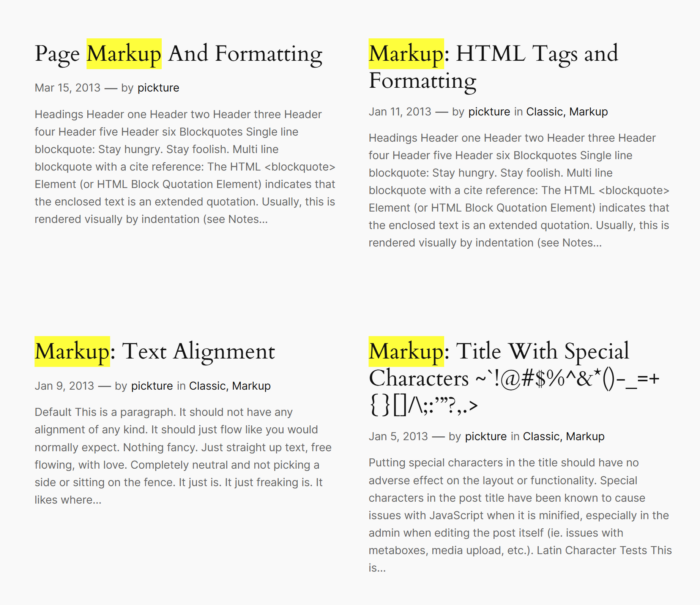
Help users see exactly where their search terms appear.
Code Example: Highlight Function
In your functions.php, add:
function highlight_search_terms( $text ) {
    if ( is_search() ) {
        $search_query = get_query_var( 's' );
        $keys = array_map( 'preg_quote', explode( ' ', $search_query ) );
        $regex = '/(' . implode( '|', $keys ) . ')/iu';
        $text = preg_replace( $regex, '<span class="search-highlight">\0</span>', $text );
    }
    return $text;
}
add_filter( 'the_excerpt', 'highlight_search_terms' );
add_filter( 'the_title', 'highlight_search_terms' );
Add to your style.css:
.search-highlight {
    background-color: yellow;
}
Note: Adjust the highlight color to match your theme. We wouldn’t want any fashion disasters!
Tip 4: Implement AJAX Search for Instant Results
Because waiting for a page reload is so 2005.
Code Example: AJAX Search Implementation
Step 1: Enqueue Scripts
In functions.php:
function enqueue_ajax_search_scripts() {
    wp_enqueue_script( 'ajax-search', get_template_directory_uri() . '/js/ajax-search.js', array( 'jquery' ), null, true );
    wp_localize_script( 'ajax-search', 'ajax_search_params', array(
        'ajax_url' => admin_url( 'admin-ajax.php' ),
    ) );
}
add_action( 'wp_enqueue_scripts', 'enqueue_ajax_search_scripts' );
Step 2: Create JavaScript File
Create ajax-search.js in your theme’s js directory:
jQuery(document).ready(function($) {
    $('.search-field').on('keyup', function() {
        var searchTerm = $(this).val();
        $.ajax({
            url: ajax_search_params.ajax_url,
            type: 'post',
            data: {
                action: 'ajax_search',
                search_term: searchTerm
            },
            success: function(response) {
                $('.search-results').html(response);
            }
        });
    });
});
Step 3: Handle AJAX Request
In functions.php:
function ajax_search_handler() {
    $search_term = sanitize_text_field( $_POST['search_term'] );
    $args = array(
        's' => $search_term,
        'posts_per_page' => 5,
    );
    $search_query = new WP_Query( $args );
    if ( $search_query->have_posts() ) {
        echo '<ul>';
        while ( $search_query->have_posts() ) {
            $search_query->the_post();
            echo '<li><a href="' . get_permalink() . '">' . get_the_title() . '</a></li>';
        }
        echo '</ul>';
    } else {
        echo '<p>No results found</p>';
    }
    wp_die();
}
add_action( 'wp_ajax_nopriv_ajax_search', 'ajax_search_handler' );
add_action( 'wp_ajax_ajax_search', 'ajax_search_handler' );
Step 4: Update Search Form
Ensure your search form has a container for results:
<div class="search-results"></div>Caution: This is a basic implementation. For production sites, consider security and performance optimizations. Or, you know, keep an eye out for any rogue search terms trying to crash the party.
Tip 5: Sort Search Results by Relevance
Make sure the most relevant content surfaces first.
Code Example: Relevance Sorting
In functions.php:
function search_by_relevance( $search, $wp_query ) {
    global $wpdb;
    if ( ! $wp_query->is_search || ! $wp_query->is_main_query() ) {
        return $search;
    }
    $search_terms = get_query_var( 's' );
    $search = '';
    $search = " AND (";
    $search_words = explode( ' ', $search_terms );
    $i = 0;
    foreach ( $search_words as $word ) {
        $search_word = esc_sql( $wpdb->esc_like( $word ) );
        if ( $i > 0 ) {
            $search .= " AND ";
        }
        $search .= "(($wpdb->posts.post_title LIKE '%$search_word%') OR ($wpdb->posts.post_content LIKE '%$search_word%'))";
        $i++;
    }
    $search .= ')';
    return $search;
}
add_filter( 'posts_search', 'search_by_relevance', 10, 2 );
This tells WordPress to prioritize posts where the search term appears in the title or content.
Tip 6: Add a No Results Found Message
Avoid the awkward silence when no results are found.
Code Example: Custom No Results Template
In your search.php template, add:
<?php if ( have_posts() ) : ?>
    <!-- Your loop code here -->
<?php else : ?>
    <h2><?php esc_html_e( 'Nothing Found', 'your-textdomain' ); ?></h2>
    <p><?php esc_html_e( 'Sorry, but nothing matched your search terms. Please try again with different keywords.', 'your-textdomain' ); ?></p>
    <?php get_search_form(); ?>
<?php endif; ?>
Because even when there’s nothing to show, you can still show you care.
Enhancing your WordPress search doesn’t require a magic wand—just a bit of code and a sprinkle of creativity. With these seek-rets of search, you’re well on your way to providing an exceptional user experience.