Ever stared at a webpage and thought, “Why does this feel so flat?” Or flipped it—marveled at a design that practically leaps off the screen? Chances are, shadows are the unsung heroes (or culprits) behind it. CSS shadows—those sneaky little box-shadow and text-shadow properties—are more than just decorative fluff. They’re the secret sauce for depth, hierarchy, and that oh-so-satisfying tactile vibe.
Shadows 101: What Are We Working With?
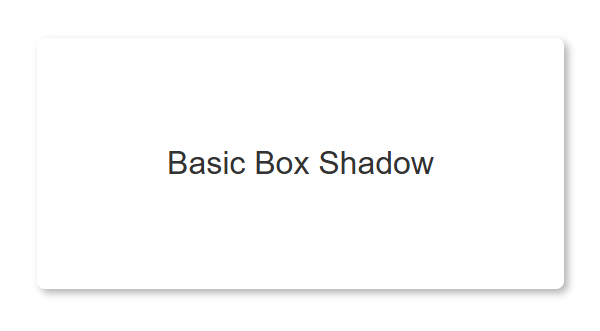
CSS gives us two main tools for shadow-casting: box-shadow for elements and text-shadow for, well, text. Think of them as the salt and pepper of web design—small additions that can transform the flavor of your layout. A basic box-shadow might look like this:
.shadow-box {
  box-shadow: 2px 2px 4px rgba(0, 0, 0, 0.3);
}
That’s a simple shadow—2px right, 2px down, 4px of blur, and a semi-transparent black. Slap it on a <div>, and boom: instant depth. Meanwhile, text-shadow does the same for typography:
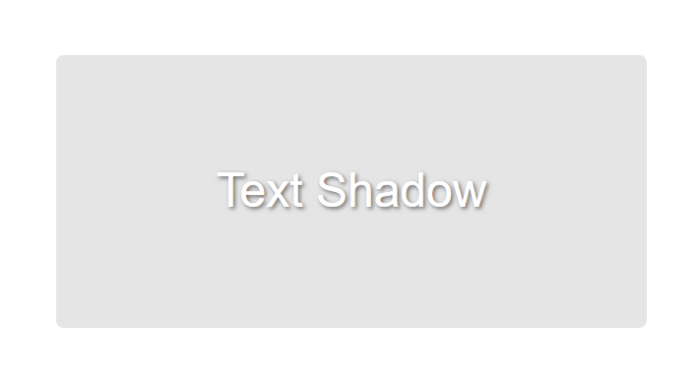
.fancy-text {
  text-shadow: 1px 1px 2px #666;
}
Shadows are like ninjas—quietly enhancing your design without stealing the spotlight. But to wield them effectively, you need to know their anatomy.
Dissecting the Shadow
The box-shadow syntax is a playground of possibilities: offset-x, offset-y, blur-radius, spread-radius, and color. Each piece tweaks the shadow’s behavior. Let’s break it down:
- Offset-x and Offset-y: Where the shadow lands relative to the element—like “2px over, 3px down.”
- Blur-radius: How soft the edges get. Zero is crisp; 10px is a dreamy haze.
- Spread-radius: The shadow’s size. Positive values puff it out; negative ones shrink it inward.
- Color: Pick your poison—hex, RGB, or RGBA for transparency.
Here’s a tweakable example:
.shadow-play {
  box-shadow: 5px 5px 10px 2px rgba(0, 0, 0, 0.4);
}
Mess with those numbers, and you’ll see the shadow stretch, blur, or sharpen. Text-shadow is simpler—same offsets and blur, no spread—but just as powerful. Shadows aren’t static; they’re dynamic tools begging for experimentation.
Everyday CSS Shadows: Practical Wins
Shadows aren’t just for show—they solve real design problems. Here’s where they shine:
Subtle Elevation
Want that Material Design vibe? A light box-shadow lifts buttons and cards off the page. Try this:
.card {
  box-shadow: 0 4px 6px rgba(0, 0, 0, 0.1);
  transition: box-shadow 0.3s ease;
}
.card:hover {
  box-shadow: 0 6px 12px rgba(0, 0, 0, 0.2);
}
It’s subtle, but it screams “click me.” Many sites use this trick to make thumbnails feel grabbable.
Text That Pops
Over a noisy background? Text-shadow saves the day:
.hero-text {
  text-shadow: 0 2px 4px rgba(0, 0, 0, 0.5);
}
Suddenly, your white text on a gradient is legible. No squinting required.
Interactive Feedback
Hover effects with shadows feel alive. Pair them with transition, and you’ve got smooth, delightful motion. It’s the difference between a button that sits there and one that invites you in.
Level Up: Creative CSS Shadow Techniques
Now, let’s push the boundaries. CSS shadows can do more than “slightly raised.” They can dazzle.
Layered Shadows
Stack multiple shadows for a neon glow or realistic depth. Check this out:
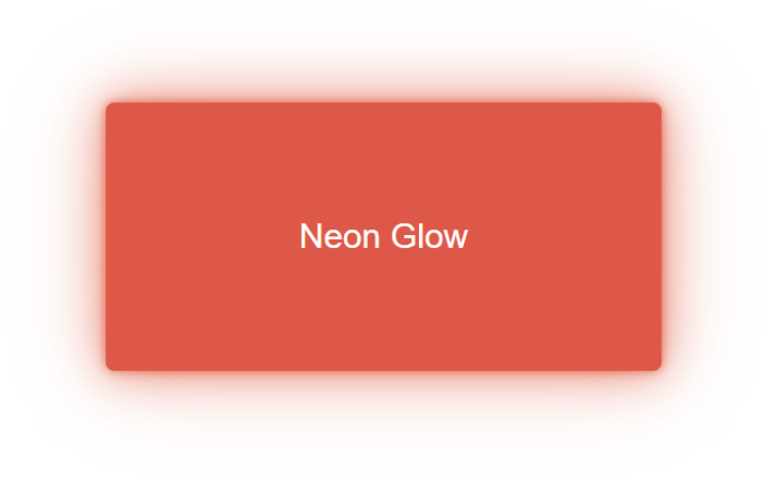
.neon-button {
  box-shadow:
    0 0 5px rgba(255, 0, 0, 0.7),
    0 0 20px rgba(255, 0, 0, 0.5),
    0 0 40px rgba(255, 0, 0, 0.3);
}
That’s a button pulsing with sci-fi energy. Layering is your ticket to wow-factor.
Inner Shadows
Flip the script with inset:
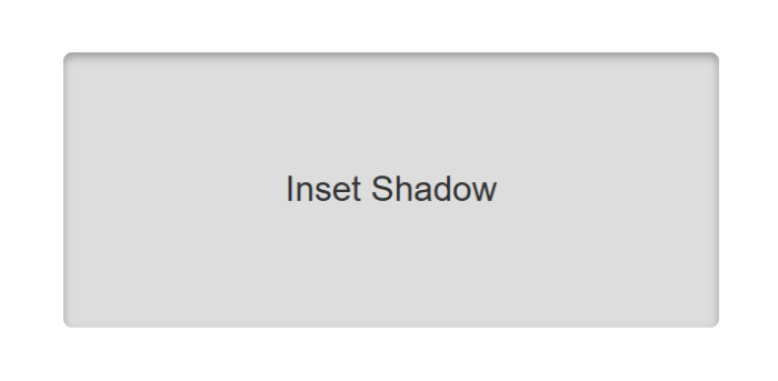
.pressed {
  box-shadow: inset 0 2px 4px rgba(0, 0, 0, 0.3);
}
It’s perfect for a “clicked” effect—think sunken buttons or carved-out panels.
Long Shadows
For a flat-design twist, use multiple shadows to create a diagonal stretched shadow effect:
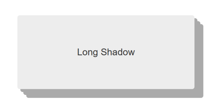
.long-shadow {
  box-shadow: 5px 5px 0 #ccc, 10px 10px 0 #ccc, 15px 15px 0 #ccc;
}
It’s retro, it’s bold, and it’s a conversation starter.
Watch Out: Shadow Pitfalls to Dodge
Shadows are awesome—until they’re not. Here’s how to avoid facepalms:
Performance Hits
A page with 50 elements rocking heavy box-shadows can chug like an old laptop. Blur and spread are GPU-intensive, so keep it lean on large layouts.
Overdesign Syndrome
Piling on too many shadows can make your site look like a haunted house at midnight. Less is often more—use shadows to enhance, not overwhelm.
Accessibility Snags
Text-shadow can muddy contrast. If your text blends into the background, you’ve got an accessibility fail.
Pro Tips: CSS Shadows That Slap
Ready to flex? These tricks will make your shadows stand out:
- RGBA Transparency: Soften edges with
rgba(0, 0, 0, 0.2). It’s gentler than solid black. - CSS Variables: Dynamic shadows for themes? Yes, please:
:root {
  --shadow: 0 4px 6px rgba(0, 0, 0, 0.1);
}
.card {
  box-shadow: var(--shadow);
}
Switch --shadow for dark mode in one line. Efficient and cool.
- Drop-Shadow Filter: For SVGs or irregular shapes,
filter: drop-shadow(2px 2px 4px #000)follows the contours wherebox-shadowcan’t.
Hands-On: Build a Shadow-Powered Card
Let’s put it all together. Here’s a sleek card with hover magic:
.shadow-card {
  width: 300px;
  padding: 20px;
  background: white;
  border-radius: 8px;
  box-shadow:
    0 4px 6px rgba(0, 0, 0, 0.1),
    0 1px 3px rgba(0, 0, 0, 0.08);
  transition: box-shadow 0.3s ease, transform 0.3s ease;
}
.shadow-card:hover {
  box-shadow:
    0 7px 14px rgba(0, 0, 0, 0.1),
    0 3px 6px rgba(0, 0, 0, 0.08);
  transform: translateY(-5px);
}
Pair it with this HTML:
<div class="shadow-card">
  <h2>CSS Shadows Rock</h2>
  <p>Hover me for some depth!</p>
</div>
Shadow Play Is Your Superpower
CSS shadows are deceptively simple yet endlessly versatile. They can whisper “click here” with a soft lift, scream “look at me” with a neon glow, or just make text readable on a chaotic backdrop. Whether you’re a minimalist or a maximalist, shadows are your playground.
So, go experiment. Cast some shadows. Break the rules, then fix them. Next time you’re polishing a design, you’ll know exactly how to make it pop.