CSS Gradients: Elevate Your Web Design with Visual Depth

Imagine a world of vibrant and captivating web designs, where instead of flat solid solid colors with no depth, colors seamlessly blend and transition, evoking emotions and engaging users. In the modern web, this is made possible and easy with CSS gradients. From subtle fades to bold color combinations, CSS gradients offer endless possibilities for creating visually stunning and dynamic web experiences.

Get ready to dive into the world of colors and gradients as we explore the principles, techniques, and creative applications of CSS gradients. We’ll cover everything from linear and radial gradients to gradient angles and color stops. Discover how CSS gradients can elevate your web designs to new heights.

What Are CSS Gradients?

CSS gradients are powerful tools that allow web designers to create smooth and seamless color transitions within their websites. By specifying a starting and ending color, gradients enable the blending of colors in a gradient pattern, resulting in visually appealing backgrounds and elements. Whether you want to achieve a subtle fade or a striking color combination, CSS gradients provide the means to accomplish it.

Linear gradient, Radial gradient, Conic gradient

There are various types of CSS gradients at your disposal. Linear gradients create a transition along a straight line, allowing you to control the angle and direction of the gradient. Radial gradients, on the other hand, radiate from a central point and create a circular or elliptical color transition. Conic gradients, the newest addition to CSS, produce a radial-like gradient that wraps around a center point, resembling a color wheel. Each gradient type offers unique possibilities for creating captivating visual effects.

The benefits of using CSS gradients extend beyond their aesthetic appeal. Utilizing gradients instead of background images can significantly reduce file sizes, leading to faster loading times and improved website performance. Additionally, CSS gradients provide unparalleled flexibility in design, as they can be easily customized and adjusted to achieve the desired visual effect. With CSS gradients, you have the freedom to experiment with colors, angles, and opacity, allowing for endless creativity and innovation in your web designs.

Creating CSS Gradients

To create CSS gradients, you’ll need to utilize specific properties and syntax. The primary property for applying gradients is background-image, which allows you to specify the gradient type and color stops. Additionally, the background-gradient property can be used for certain gradient variations. By understanding and utilizing these properties effectively, you can bring your gradient visions to life.

Let’s walk through the step-by-step process of creating different types of CSS gradients. To create a linear gradient, you’ll need to specify the gradient angle or direction using the “to” keyword or precise degrees. Radial gradients require defining the shape, size, and position of the gradient. For conic gradients, you can set the starting angle and control the number of color stops.

Let’s start with a basic example:

background-image: linear-gradient(to right, red, green);

This creates a simple linear gradient that transitions horizontally from red to green.

Defining color stops is a crucial aspect of CSS gradients. Color stops determine the transition points between colors in the gradient. You can specify color stops using various formats, such as hexadecimal, RGB, HSL, or even color keywords. Additionally, you can use techniques like color interpolation and transparency to achieve more intricate effects within your gradients. Experimentation with color stops and formats will allow you to achieve the desired visual outcome.

Advanced Gradient Techniques

CSS gradients offer a vast array of possibilities beyond basic linear and radial color transitions. With advanced techniques, you can take your gradient game to the next level and create visually stunning and engaging effects. Let’s explore some of these techniques and unleash your creativity in web design.

Creating Gradient Overlays and Blend Modes

One way to enhance the visual impact of gradients is by applying them as overlays on images or other elements using the background-blend-mode property. This allows you to blend gradients with other backgrounds or images to achieve captivating effects. Experiment with different blend modes like overlay, multiply, or screen to create unique and eye-catching compositions.

Gradient Transitions and Animations

Transitions and animations breathe life into web designs, and gradients are no exception. By utilizing CSS transitions and animations, you can smoothly transition between different gradients, creating dynamic and captivating visual effects. For example, you can animate color stops or the direction of gradients to add movement and depth to your designs. These subtle yet engaging transitions can greatly enhance the user experience.

Gradient Patterns and Multiple Gradients

Gradient patterns open up a world of possibilities for creating intricate and complex background designs. With repeating gradient patterns, you can achieve stunning visual effects that go beyond simple linear or radial gradients. Additionally, multiple gradients allow you to layer or blend gradients together, creating unique and visually appealing compositions. These techniques give you the freedom to experiment and create backgrounds that are truly one-of-a-kind.

Future Trends and Innovations

As web design continues to evolve, so do the possibilities and innovations surrounding CSS gradients. Let’s explore some emerging trends and advancements that are shaping the future of gradients in web design.

Gradient Generators and Advanced Effects

With the rise of online gradient generators, creating complex and visually appealing gradients has become more accessible than ever. These tools allow designers to experiment with various color schemes, angles, and shapes to generate unique gradient combinations effortlessly. Furthermore, advancements in CSS and browser capabilities have paved the way for advanced gradient effects, such as animated gradients, gradient transitions, and even 3D gradients. These cutting-edge techniques add a new dimension to the visual storytelling potential of gradients.

Gradient Libraries and Frameworks

To streamline the process of implementing gradients, developers and designers can take advantage of gradient libraries and frameworks. These resources offer pre-designed gradient styles, reusable code snippets, and convenient utilities for easy integration into web projects. Leveraging these libraries and frameworks can save time and effort while maintaining consistency and enhancing productivity in gradient implementation.

As technology advances and creativity knows no bounds, CSS gradients will continue to evolve and inspire new possibilities in web design.

CSS gradients have revolutionized the way we design and style websites, offering a wide range of possibilities for creating visually stunning and engaging user experiences. With the power of CSS gradients, web designers and developers can add depth, richness, and dynamism to their designs.

However, it is important to consider the performance implications of using CSS gradients. While gradients can greatly enhance the aesthetic appeal of a website and are more performant than background images, they can still impact page load times and page rendering, especially if they are complex or used excessively. It is crucial to optimize gradients by keeping them as lightweight as possible, using appropriate color stops, and considering the overall impact on website performance.

As with any design element, it is essential to strike a balance between visual impact and performance. Optimizing gradients and taking performance into consideration can ensure that your website not only looks stunning but also performs optimally across various devices and network conditions.

So, as you dive into the world of CSS gradients, remember to be mindful of performance considerations and strive to find the perfect harmony between creativity, aesthetics, and optimal website performance. With a careful approach, CSS gradients can elevate your web designs to new heights, providing memorable and engaging experiences for your users.

Cinematic Parallax 3D Background Effect

Imagine a website where the background subtly responds to your every move, creating a captivating and immersive experience. As you navigate the page, the background image gracefully pans and follows your mouse cursor or device orientation, adding a touch of cinematic magic to the overall design. This is the power of the cinematic parallax background effect.

Here you will find a step-by-step process of implementing this epic JavaScript effect, as well as the full source code. From understanding the core concepts to the implementation details, this article will provide you with a comprehensive understanding of how to create a cinematic parallax background effect that will leave your visitors in awe.

Here’s what we’re going to create:

What is the Cinematic Parallax 3D Background Effect?

This smooth mouse-following background effect is a visually captivating technique that adds a layer of dynamism and interactivity to web design. It involves the background image of a website smoothly panning and following the movement of the user’s mouse cursor or device orientation. This effect creates a sense of depth and immersion, drawing the user’s attention and enhancing their engagement with the website.

One of the key advantages of this effect is its ability to elevate the overall aesthetic appeal of a website. Incorporating this effect creates a visually stunning experience that leaves a lasting impression on visitors. The subtle movement of the background image adds a touch of elegance and sophistication to the design, making it stand out from static and conventional websites.

This epic background effect is incredibly versatile and can be applied to a wide range of websites and projects. Whether you’re designing a portfolio website, an e-commerce store, a creative agency site, or a blog, this effect has the potential to enhance the user experience and bring a unique element of interactivity. Its adaptability makes it suitable for various design styles, from minimalistic and modern to bold and artistic.

Implementing the Cinematic Mouse-Following Background Effect

To bring the effect to life, you’ll need to follow a few steps to set up the HTML, CSS, and JavaScript components.

Create the HTML structure
To begin, you’ll need to add a couple of container elements in the HTML to hold the background image. These containers can be divs with a class or ID that will help you target it in CSS and JavaScript.

<div class="background-container">
	<div class="background"></div>
</div>

Next, you’ll want to style the containers in CSS to define the dimensions, position, and overflow properties. This will ensure that the background image stays within the boundaries of the container and doesn’t affect the rest of your web page layout.

body {
	margin: 0;
}

.background-container {
	position: relative;
	width: 100vw;
	height: 100vh;
	overflow: hidden;
}

.background {
	width: 104vw;
	height: 104vh;
	position: absolute;
	top: -2vh;
	left: -2vw;
	right: -2vw;
	bottom: -2vh;
	background-image: url(background.jpg);
	background-size: cover;
	background-position: center center;
	transition: transform 1.5s ease-out;
}

@media (pointer:none), (pointer:coarse) {
	.background {
		width: 130vw;
		height: 130vh;
		top: -15vh;
		left: -15vw;
		right: -15vw;
		bottom: -15vh;
	}
}

Write the JavaScript code
Now that you have the HTML structure in place, it’s time to add the JavaScript code that will capture the mouse movement and adjust the background position accordingly.

document.addEventListener("DOMContentLoaded", function() {
	var background = document.querySelector(".background");
	var initialTiltX = null;
	var initialTiltY = null;
	var isMobile = /iPhone|iPad|iPod|Android/i.test(navigator.userAgent);

	if (isMobile && window.DeviceOrientationEvent) {
		window.addEventListener("deviceorientation", handleOrientationEvent);
	} else {
		window.addEventListener("mousemove", handleMouseEvent);
	}

	function handleOrientationEvent(event) {
		if (initialTiltX === null || initialTiltY === null) {
			initialTiltX = event.gamma;
			initialTiltY = event.beta;
			return;
		}

		var tiltX = event.gamma - initialTiltX;
		var tiltY = event.beta - initialTiltY;

		var tiltScale = isMobile ? 0.7 : 0.05; // Adjust the strength on mobile

		var offsetX = tiltX * tiltScale;
		var offsetY = tiltY * tiltScale;

		background.style.transform = "translate(" + offsetX + "px, " + offsetY + "px)";
	}

	function handleMouseEvent(event) {
		var mouseX = event.clientX;
		var mouseY = event.clientY;

		var windowCenterX = window.innerWidth / 2;
		var windowCenterY = window.innerHeight / 2;

		var mouseOffsetX = (mouseX - windowCenterX) * -0.04; // Adjust the values to control the mouse parallax effect
		var mouseOffsetY = (mouseY - windowCenterY) * -0.04;

		background.style.transform = "translate(" + mouseOffsetX + "px, " + mouseOffsetY + "px)";
	}
});

Set up and integrate the code snippets
To integrate the necessary code snippets into your web project, follow these steps:

  1. Copy and paste the HTML structure into your HTML file at the desired location.
  2. Add the CSS styles to your CSS file or within a <style> tag in the <head> section of your HTML file.
  3. Copy and paste the JavaScript code into a JavaScript file or within a <script> tag before the closing </body> tag of your HTML file.
  4. Save your HTML, CSS, and JavaScript files and open the HTML file in a web browser.

Note: Remember to replace the class name ‘background’ with the appropriate class or ID you’ve chosen for your container element.

Customization and Enhancements

Now that you have the basic cinematic parallax background effect in place, let’s explore some customization options and additional techniques to take it to the next level:

One way to customize the effect is by adjusting the speed and range of the background movement. This allows you to control how responsive and pronounced the background follows the mouse.

To modify the speed, you can adjust the transition duration. The longer the duration, the slower and smoother the effect.

To adjust the range of the background movement, you can modify the values of the background class. Increasing the values will expand the range, allowing the background to move further, while decreasing them will restrict the movement to a smaller area.

This effect can give a strong immersive and interactive feel to any website or web app. If you’re looking for something to give your site that “wow” factor, give it a try, customize it, make it your own, and buckle up for the “oohs” and “ahhs”.

Using em and rem Relative Units in Web Design

Typography plays a vital role in web design, shaping the visual appeal and readability of content. As websites continue to evolve and adapt to various devices and screen sizes, the need for flexible and scalable typography becomes increasingly crucial. This is where em and rem relative units come into play.

Em and rem units are relative units of measurement that offer a powerful way to size elements, margins, and typography in a flexible and scalable manner. While both units have their unique characteristics, they share a common goal: to provide a more adaptable and user-friendly experience across different devices.

What Are em and rem Units?

Typography and layout elements on a webpage often require flexible sizing to adapt to different screen sizes and user preferences. Em and rem units offer a dynamic approach to achieve this flexibility, allowing designers to create responsive and accessible designs.

Defining em and rem Units

Em and rem units are relative units of measurement in CSS that enable designers to specify sizes and dimensions relative to other elements. While they share similarities, they have distinct characteristics.

Em units (short for “emphatic”) are relative to their parent element. When you assign a font size or any other property using em units, the value is calculated based on the font size of the element’s parent. For example, if an element has a font size of 1em and its parent has a font size of 16 pixels, the element’s font size will be 16 pixels.

Rem units (short for “root emphatic”) differ from em units in that they are relative to the root element of the HTML document, typically the <html> tag. This means that when you assign a font size or any other property using rem units, the value is calculated based on the root element’s font size. This allows for more consistent sizing across the entire document, regardless of nesting levels.

What’s the Difference Between em and rem?

The key distinction between em and rem units lies in their relative reference points. Em units are influenced by the font size of the parent element, which can lead to compounding effects when nesting elements with different font sizes. On the other hand, rem units provide a more straightforward and predictable approach as they are based on the root element’s font size.

Advantages of Using em and rem Units

  • Scalability: Em and rem units excel in creating scalable designs. Defining sizes in relation to parent or root elements allows you to easily adjust the size of entire sections or even the entire website by modifying a single value. This scalability is particularly valuable for responsive designs that need to adapt across various devices and screen sizes.
  • Accessibility: Em and rem units contribute to improved accessibility by allowing users to adjust font sizes according to their preferences. Users with visual impairments or those who prefer larger or smaller text sizes can rely on browser settings or custom stylesheets to scale the content appropriately.
  • Consistency: Rem units, in particular, promote consistency throughout a website. Since they are based on the root element’s font size, changes to the root font size will uniformly affect all elements that use rem units, ensuring a harmonious typographic hierarchy.

Practical Applications of em and rem Units

Responsive Typography
  • Flexible Typography with em Units
    Em units shine when it comes to creating flexible and adaptable typography. Setting font sizes using em units establishes a typography system that scales seamlessly with its parent element. This enables text to adjust proportionally across different screen sizes, making it more readable and user-friendly. Whether it’s the body text, headings, or any other text elements, utilizing em units allows for more fluid and responsive typography.
  • Consistent Spacing with rem Units
    Rem units offer a straightforward and consistent approach to managing spacing within a design system. By setting margins, padding, and other spacing-related properties using rem units, you can establish a consistent rhythm and spacing hierarchy throughout your website. Changes made to the root font size will cascade down and proportionally adjust all rem-based measurements. This ensures a cohesive and harmonious visual experience, irrespective of the device or screen size.
  • Sizing Elements, Margins, and Padding
    Em and rem units can be applied to various aspects of web design, such as sizing elements, defining margins, and setting padding. When it comes to sizing elements, using em units allows for relative sizing based on the parent element, making it easier to create responsive and scalable designs. Similarly, applying em or rem units to margins and padding ensures consistent spacing around elements, even as the layout adjusts to different viewport sizes.

Best Practices for Using em and rem Units

To make the most of em and rem units in your web design projects, it’s essential to follow some best practices. These guidelines will help you leverage the power of these relative units effectively and ensure a consistent and accessible user experience across different devices and browsers.

Establishing a Baseline Font Size and Using Units Appropriately

Before diving into using em and rem units, it’s crucial to establish a baseline font size for your design. This baseline font size serves as a reference point for all other font sizes defined using em and rem units. Setting the baseline font size using an absolute unit like pixels (px) or points (pt) provides a fallback option and maintains control over the overall visual hierarchy of your design. From there, you can use em and rem units to scale the typography and other elements proportionally.

Handling Nested Elements and Compounding Effects

Nested elements pose a challenge when using em units. To prevent compounding effects and maintain a predictable sizing behavior, it’s recommended to establish a clear structure and limit the use of em units within nested elements. Instead, consider using rem units within nested components to maintain a consistent size relative to the root element.

For example, suppose you have a card component with nested elements like headings and paragraphs. To avoid unintended resizing, set the font sizes of the nested elements using rem units based on the root font size. This ensures that the text within the card maintains a consistent size, regardless of its nesting level.

Considerations for Accessibility and User Experience

When using em and rem units in web design, it’s crucial to consider accessibility and prioritize the user experience. Let’s explore some key considerations to ensure that your designs are accessible and provide an optimal experience for all users:

Impact on Readability and Accessibility

One of the advantages of using em and rem units is their ability to create flexible and scalable designs. However, it’s important to strike a balance between flexibility and readability. Font sizes that are too small or too large can negatively impact the readability of your content, especially for users with visual impairments or those viewing your website on small screens.

Ensure that the font sizes defined using em and rem units are accessible and meet the WCAG (Web Content Accessibility Guidelines) requirements for contrast and legibility. Aim for a minimum font size that allows users to comfortably read the text without straining their eyes. Conduct user testing and gather feedback to validate the readability of your designs across different devices and user scenarios.

Relationship with Responsive Design

Em and rem units play a significant role in creating responsive designs that adapt seamlessly to different devices and screen sizes. By using these relative units, your design elements can scale proportionally, providing a consistent user experience across various devices, from mobile phones to large desktop screens.

When implementing responsive design with em and rem units, consider the breakpoints and media queries that define the layout changes at different screen sizes. Ensure that the font sizes and other elements adapt appropriately to maintain readability and usability on all devices. Testing your designs on various devices and screen sizes can identify any issues and make necessary adjustments to optimize the user experience.

Using em and rem units in web design offers numerous benefits, including flexibility, scalability, and improved user experience. By understanding the differences between em and rem units and applying best practices, you can create designs that adapt seamlessly to different devices and screen sizes while maintaining readability and accessibility. Remember to prioritize the needs of all users, test your designs for keyboard accessibility, and follow established guidelines to ensure an inclusive and engaging experience. Embrace the power of relative units to create visually appealing and responsive designs that captivate and cater to your audience.

Building a Lightweight and Versatile CSS Grid System

Are you tired of struggling with rigid and inflexible layouts in your web design projects? Do you wish there was an easier way to create visually stunning and adaptable grids that seamlessly respond to different screen sizes? Look no further! In the dynamic world of web design, the use of a minimal and versatile grid system can be a game-changer.

CSS grid, the cutting-edge layout module in CSS, empowers web designers to craft flexible and responsive grid-based layouts with ease. Gone are the days of relying on cumbersome frameworks or convoluted workarounds. With CSS grid, you have the power to create sophisticated grid structures that adapt flawlessly to various devices and screen resolutions.

What is CSS Grid?

CSS grid is a powerful layout module in CSS that allows designers to create grid-based layouts with precision and flexibility. Unlike older layout methods, such as floats and positioning, CSS grid offers a more intuitive and declarative approach to building grids. It consists of two essential components: the grid container and grid items.

The grid container serves as the parent element that holds the grid items. By applying the display: grid property to the container, we establish a grid context. This allows us to define the structure and behavior of our grid system. We can specify the number of rows and columns, set their dimensions, and create space between them using the grid-template-rows, grid-template-columns, and grid-gap properties, respectively.

CSS grid works by dividing the grid container into a grid of intersecting horizontal and vertical lines, forming a series of cells. Each grid item is placed within these cells, and designers have granular control over their positioning and sizing. Using properties like grid-row, grid-column, and grid-area, we can precisely determine where each item should appear in the grid.

CSS grid also provides powerful alignment and distribution capabilities. We can align items vertically and horizontally using properties like justify-items, align-items, justify-content, and align-content. These properties enable us to control the placement and spacing of items within the grid.

The advantages of using CSS grid for building versatile and adaptable grids are numerous. Firstly, CSS grid offers a high degree of flexibility, allowing us to create complex layouts with ease. Its ability to handle both rows and columns independently gives us the freedom to design grids that adjust dynamically to different screen sizes and orientations.

Moreover, CSS grid simplifies the process of creating responsive designs. With features like media queries, we can modify the grid structure, rearrange items, or change their sizing based on specific breakpoints. This flexibility ensures that our layouts remain visually appealing and functional across a wide range of devices.

Additionally, CSS grid promotes clean and maintainable code. It eliminates the need for excessive markup or reliance on external libraries, as we can achieve complex grid layouts with minimal code. This results in improved performance and easier maintenance, enhancing the overall development process.

Designing a Minimal Grid Structure

To create a minimal grid structure, we start by defining the grid container and setting up the necessary CSS properties, then define the rows and columns of our grid. These properties accept values that determine the size and behavior of the rows and columns. We can specify fixed lengths, percentages, or even use the fr unit to distribute available space proportionally.

Two Column Grid

For example, we can set up a basic two-column grid with equally sized columns like this:

.grid-container {
  display: grid;
  grid-template-columns: 1fr 1fr;
}

Once we have defined the grid structure, we can specify the size and alignment of our grid items within the grid. We achieve this using the grid-row and grid-column properties. By assigning values to these properties, we can position items in specific cells of the grid.

For instance, to place an item in the first row and the second column, we can use the following code:

.grid-item {
  grid-row: 1;
  grid-column: 2;
}
Row Span

We can also span items across multiple rows or columns by specifying the desired range. For example, to make an item span three rows, we can use:

.grid-item {
  grid-row: 1 / 4;
}

Designing a versatile grid structure provides us with immense flexibility in creating various layouts. By adjusting the number of rows and columns and manipulating the placement of items, we can achieve different grid structures with unique impacts on layout flexibility.

For instance, a grid with a single row and multiple columns allows for a horizontally oriented layout where items flow sequentially. On the other hand, a grid with multiple rows and a single column enables a vertically oriented layout with items stacking on top of each other.

Responsive Grid Design

Creating a responsive grid is essential for ensuring that our grid system adapts seamlessly to different screen sizes and devices. CSS grid provides powerful tools to achieve responsiveness, such as the auto-fit and minmax functions.

The auto-fit function allows the grid items to automatically adjust and fit into the available space while maintaining their specified dimensions. By combining auto-fit with the minmax function, we can set a minimum and maximum size for grid items, creating a flexible and responsive grid.

For example, we can create a responsive grid with a minimum width of 200 pixels and a maximum width of 1fr (i.e., filling the available space) using the following CSS:

.grid-container {
  display: grid;
  grid-template-columns: repeat(auto-fit, minmax(200px, 1fr));
}

Media queries play a crucial role in adapting the grid layout for different screen sizes. With media queries, we can define specific rules that apply only when certain conditions are met, such as the width of the viewport.

For instance, we can modify the grid structure for smaller screens by adjusting the number of columns or changing the layout altogether. By targeting specific breakpoints with media queries, we can create a more optimized and tailored grid design for different devices.

@media (max-width: 768px) {
  .grid-container {
    grid-template-columns: repeat(2, 1fr);
  }
}

When designing a responsive grid system, it’s crucial to follow best practices to ensure a seamless user experience across various devices. Here are some key tips to consider:

  • Keep the grid structure simple and flexible, allowing for easy rearrangement of items on smaller screens.
  • Use relative units like percentages or fr to ensure the grid adapts proportionally to the available space.
  • Test and iterate your grid design across different devices and screen sizes to ensure optimal responsiveness.
  • Consider the content hierarchy and prioritize important elements for smaller screens to maintain readability and usability.

Adding Flexibility and Versatility

To enhance the flexibility and control of our grid layout, we can utilize grid areas and named grid lines. Grid areas allow us to designate specific regions within the grid to place our content. By assigning names to these areas, we can easily position and rearrange items across the grid.

Named Grid Areas

For example, we can define named grid areas for the different sections of a website using the grid-template-areas property:

.grid-container {
  display: grid;
  grid-template-areas:
    "header header"
    "sidebar content"
    "footer footer";
  grid-gap: 20px;
}

.header {
  grid-area: header;
}

.sidebar {
  grid-area: sidebar;
}

.content {
  grid-area: content;
}

.footer {
  grid-area: footer;
}

With these techniques, we can create highly adaptable and versatile grid layouts. Grid areas and named grid lines give us precise control over the positioning of our content, while the grid-gap property adds visual breathing space between items.

When customizing your grid system to meet specific design requirements, consider the following tips:

  • Experiment with different grid configurations to find the most suitable layout for your content.
  • Use the grid-template-areas property to create complex grid structures by assigning multiple areas to a single grid cell.
  • Combine CSS grid with other layout techniques, such as flexbox, to achieve even more versatile and dynamic designs.
  • Consider using CSS variables to define reusable values, such as grid gap sizes or color schemes, making it easier to adjust and maintain your grid system.

With CSS grid, you have full control over the structure and layout of your web pages, allowing you to achieve the desired visual hierarchy and user experience. By harnessing that power, you can unleash your creativity and design beautiful, functional, and responsive websites. Whether you’re building a portfolio, blog, e-commerce site, or any other type of web application, incorporating a minimal and versatile grid system using CSS grid will undoubtedly enhance the visual appeal and user experience.

CSS Transitions: Creating Interactive Websites with Smooth Animations

CSS transitions are a valuable tool that adds a touch of magic to the user experience. These subtle effects bring elements to life, creating smooth and captivating animations that delight visitors and convey information in an engaging way.

Capturing and holding a user’s interest isn’t easy. This is where CSS transitions truly come into their own. They empower designers and developers to transform static web elements into dynamic entities that gracefully respond to user interactions. From a subtle fade-in effect on a button hover to a smooth sliding transition between sections, CSS transitions enable us to create immersive and visually appealing experiences that keep users engaged and intrigued.

Beyond their aesthetic appeal, CSS transitions serve a practical purpose. They allow us to convey information in a more digestible manner, drawing attention to important changes or highlighting relevant content. Whether it’s a subtle color change to signify a status update or a dynamic sliding panel to reveal hidden information, CSS transitions enable us to communicate effectively and improve the overall user experience.

What Are CSS Transitions?

At the core, CSS transitions are a powerful CSS3 feature that allows designers and developers to animate changes in CSS property values over a specified duration. They provide a seamless way to create smooth transitions between different states of an element, adding a touch of elegance and sophistication to the user experience.

The mechanics of CSS transitions are rooted in the concept of interpolation. When a CSS property undergoes a transition, it smoothly interpolates between the starting and ending values, creating a visually pleasing animation. This interpolation effect can be applied to a wide range of CSS properties, such as color, size, position, opacity, and more. By selectively animating these properties, we can guide the user’s attention and enhance the overall aesthetic appeal of a website.

CSS transitions can be used to create a variety of effects, such as:

  • Animated elements: You can use transitions to animate the margins, borders, font size, or other properties of elements.
  • Responsive design: You can use transitions to make your web pages more responsive. For example, you can use transitions to change the size of elements when the user changes the browser window size.
  • User experience: You can use transitions to improve the user experience of your web pages. For example, you can use transitions to make elements appear and disappear more smoothly.

CSS transitions are a powerful tool that can be used to add animation and interactivity to your web pages. They are relatively easy to learn and use, and they can be used to create a wide variety of effects.

How Do CSS Transitions Work?

The power of CSS transitions lies not only in the concept but also in the properties that shape their behavior. Here are some of the main transition properties that allow us to wield control over the duration, timing, delay, and properties involved in our captivating animations.

  • Duration: The duration property determines the length of time it takes for a transition to complete its animation. It is specified in seconds (s) or milliseconds (ms). By adjusting the duration, we can create transitions that are swift and snappy or slow and graceful, depending on the desired effect.
  • Timing Function: The timing function property defines the rate of change of the transition over its duration. It allows us to create different acceleration and deceleration effects, adding a sense of realism and naturalness to the animation. There are various timing curves available, such as linear, ease-in, ease-out, and ease-in-out, each imparting a unique feel to the transition.
  • Delay: The delay property introduces a pause before the transition begins. It allows us to control the timing between the triggering event and the start of the animation. With delays, we can orchestrate a sequence of transitions or synchronize them with other elements on the page.
  • Property: The property property (yes, it’s a bit repetitive!) specifies the CSS property(s) to which the transition applies. For example, we can target the color, size, or opacity of an element to seamlessly transform its appearance.

Let’s see these properties in action with an example. Imagine a button that smoothly changes color when hovered over. We can define the transition properties as follows:

.button {
    transition-property: background-color;
    transition-duration: 0.3s;
    transition-timing-function: ease-in-out;
    transition-delay: 0s;
}

.button:hover {
    background-color: #fc0;
}

In this example, when the button is hovered over, the background smoothly transitions to a different color over a duration of 0.3 seconds. The ease-in-out timing function ensures a smooth acceleration and deceleration effect. The delay is set to 0 seconds, resulting in an immediate transition upon hover.

Transition Shorthand

Now it’s time to take our animation skills to the next level by harnessing the magic of the transition shorthand. This handy shorthand notation allows us to define multiple transition properties in a single line, simplifying our code and making our animations more concise and efficient.

To demonstrate the transition shorthand, let’s consider an example where we want to create a subtle animation effect on a navigation menu.

.nav-menu {
    font-size: 16px;
    transition: font-size 0.5s ease-out;
}

.nav-menu:hover {
    font-size: 18px;
}

In this case, we have indicated that we want to animate the font size on hover with a duration of 0.5 seconds, with a smooth ease at the end.

Using the transition shorthand, we can streamline our code and improve readability. It allows us to combine multiple transition properties in a single declaration, reducing redundancy and making our intentions clear.

Advanced Transition Techniques

In the world of CSS transitions, there are advanced techniques that can take your animations to the next level. Let’s explore some of these techniques:

  1. Multiple Transitions: You can animate multiple properties independently by adding multiple transition declarations to an element, separated by commas.
.my-element {
    transition: width 0.3s, opacity 0.5s, color 1s;
}
  1. Simultaneous Transitions: By specifying the same duration for different properties within a single transition declaration, you can create synchronized animations. For example:
.my-element {
    transition: background-color, color;
    transition-duration: 0.5s;
}
  1. Nested Transitions: Apply transitions to child elements within a parent container for cascading or staggered animations. For example:
.parent-element:hover .child-element {
    transform: translateX(50px);
}

With these advanced transition techniques, you can push the boundaries of your animations and create truly captivating user experiences. Experiment with different combinations, durations, and timing functions to achieve the desired effects for your web designs.

Custom Cubic-Bezier Timing Functions

To elevate your transition effects to the next level, we have custom cubic-bezier timing functions. By creating your own timing curves, you can fine-tune the acceleration and deceleration of transitions, adding a touch of elegance and personality to your web design.

Cubic-bezier timing function curve

A cubic-bezier timing function defines the pace of a transition by specifying control points that create a custom acceleration curve. This allows you to achieve unique and nuanced effects that align with your design vision. The cubic-bezier function takes four parameters: (x1, y1), (x2, y2), representing the control points of the curve. For example:

.my-element {
    transition-timing-function: cubic-bezier(0.25, 0.1, 0.25, 1);
}

While manually tweaking cubic-bezier values can be a trial-and-error process, there are helpful tools available to simplify the task. One such tool is the inspection panel in Google Chrome. By inspecting an element, accessing the “Styles” panel, and modifying the transition-timing-function property, you can interactively adjust the control points and see the resulting curve in real-time.

Several online tools are specifically designed to assist in creating and visualizing custom cubic-bezier curves. Websites like cubic-bezier.com and easings.net provide intuitive interfaces where you can experiment with control points, preview the curve, and obtain the corresponding cubic-bezier values to use in your CSS code.

Optimizing Performance

With CSS transitions, optimizing performance is crucial to ensure smooth and responsive microinteractions that delight your website visitors. Let’s look at some best practices for optimizing the performance of your transitions:

  1. Utilize Hardware Acceleration: Take advantage of hardware acceleration to offload the rendering process to the device’s GPU (Graphics Processing Unit). By applying the transform or opacity property to the transitioning elements, you can trigger hardware acceleration, resulting in smoother transitions.
  2. Minimize Repaints and Reflows: Avoid unnecessary repaints and layout recalculations during transitions, as they can negatively impact performance. Optimize your CSS code by utilizing transforms instead of animating properties like top, left, or width. Additionally, utilize will-change property to inform the browser in advance about the upcoming changes, enabling it to optimize the rendering process.
  3. Optimize for Mobile Devices: Mobile devices often have limited resources, so it’s crucial to optimize your transitions for smooth performance on these platforms. Consider reducing the number of elements involved in the transition, simplifying complex effects, and utilizing CSS hardware-accelerated properties judiciously.

Optimizing for performance goes hand in hand with delivering an exceptional user experience. By implementing these tips, you can ensure that your transitions are silky-smooth and responsive across a range of devices and browsers.

Cross-Browser Compatibility and Vendor Prefixes

In the world of web development, cross-browser compatibility is paramount to provide a consistent experience for all users, regardless of the browser they use. When it comes to CSS transitions, handling vendor prefixes is an essential aspect of achieving cross-browser compatibility. Here are some key considerations for dealing with cross-browser consistency:

  • Vendor Prefixes: Vendor prefixes are a way for browser vendors to implement experimental or proprietary CSS features before they become standardized. These prefixes are typically added to CSS properties to ensure compatibility with specific browsers. Common examples include -webkit- for Safari and Chrome, -moz- for Firefox, and -o- for Opera.
  • Autoprefixers or CSS Preprocessors: Manually adding vendor prefixes can be tedious and error-prone. Thankfully, there are tools available that can automate this process for you. CSS preprocessors like Sass or Less offer built-in features or mixins to handle vendor prefixes. Additionally, autoprefixer tools can be integrated into your development workflow to automatically add necessary vendor prefixes based on your specified browser support.
  • Progressive Enhancement: When applying vendor prefixes, it’s important to follow a progressive enhancement approach. Start by writing your CSS without any vendor prefixes, utilizing the standard properties. Then, use tools like autoprefixer to add the necessary prefixes based on the targeted browser support. This way, you ensure a graceful degradation for browsers that don’t require prefixes while still accommodating those that do.
  • Test and Validate: After adding vendor prefixes, it’s important to thoroughly test your transitions across multiple browsers and devices. Use browser testing tools or services to check how your transitions behave and ensure consistency. Additionally, stay updated with browser vendor announcements and release notes to adapt your prefixing strategy as browser support for certain features evolves.

Smooth Operation

CSS transitions are a powerful tool in your web design arsenal. By incorporating them into your projects, you can elevate user experiences, add visual interest, and create a sense of interactivity that captivates your audience. Whether you’re aiming for subtle animations or bold effects, CSS transitions offer endless possibilities for enhancing the aesthetics, usability, and accessibility of your website.

Remember, the key to mastering CSS transitions lies in practice, experimentation, and continuous learning. Stay up-to-date with emerging techniques and trends, and don’t hesitate to push the boundaries of what’s possible with CSS transitions.

Converting Web Design Mockups into HTML

As a web designer, you know that a visually stunning mockup is just the tip of the iceberg. To bring your design to life and create a fully functional website, you need to dive into the realm of HTML and CSS and start building. It’s the magic that transforms your static design into an interactive digital experience.

Think of this conversion process as the bridge that connects your artistic vision with real-world functionality. It’s the transformation that turns a static design into a living, breathing website that users can interact with. By mastering this process, you’ll have the power to create seamless user experiences, optimize website performance, and unleash your creativity in ways you never thought possible.

Beginning the Mockup Conversion Process

So, you’ve crafted a jaw-dropping web design mockup that’s bound to leave clients and users in awe. But what’s the next step? How do you transform that stunning visual into a fully functional website that users can actually interact with?

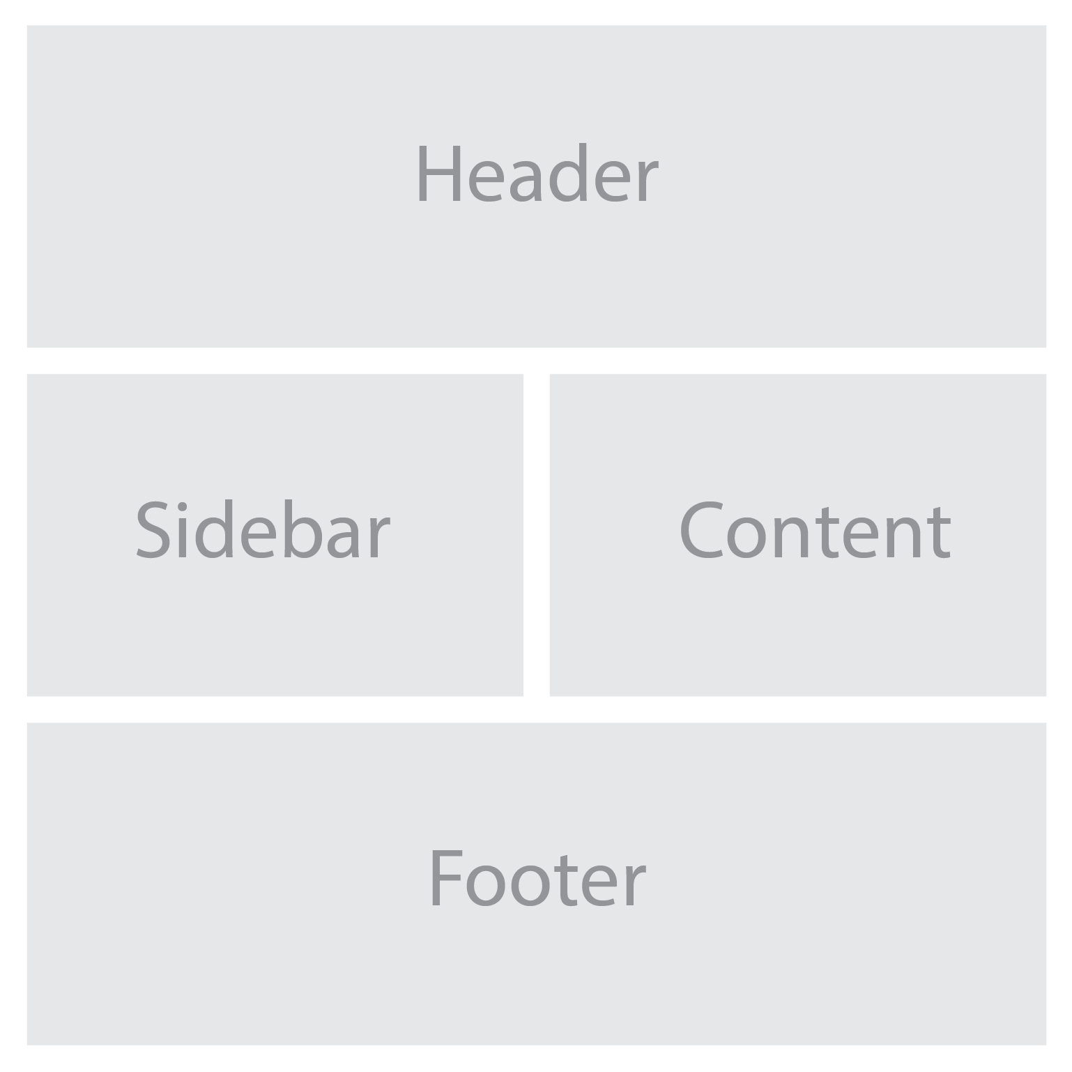
Before we dive into the details, let’s clarify what we mean by a mockup. In simple terms, a mockup or a wireframe is a static representation of a website design. It’s like a blueprint that showcases the visual elements, layout, and overall aesthetics of a web page. Think of it as the design’s first draft, a canvas upon which you’ll breathe life.

Now, here’s where HTML and CSS come into play. HTML is the backbone of any web page. It provides the structure and the building blocks, turning your design into a series of elements that browsers can understand and interpret. CSS, on the other hand, is responsible for the design and presentation aspects. It adds the colors, fonts, spacing, and all those eye-catching styles that make your design pop.

When it comes to the mockup conversion process, the workflow typically involves a series of steps. First, you’ll dissect your mockup into its individual components and identify the different sections and elements that make up the design. Then, armed with your HTML and CSS skills, you’ll start building the structure and styling of each element, ensuring they match the mockup’s visual representation.

Throughout this process, it’s essential to maintain a keen eye for detail and precision. Pixel-perfect accuracy is the name of the game. You want to make sure that your code translates your mockup faithfully, capturing every design element and ensuring a seamless user experience.

Structuring the HTML Markup

Alright, it’s time to bring our mockups to life by structuring the HTML markup. Think of HTML as the skeleton that gives structure and meaning to your web page. With a few well-placed tags, we can create a solid foundation that will support our design and ensure a smooth user experience. So grab your keyboards and let’s dive right in!

First things first, let’s create the basic structure of our HTML file. Every great web page begins with a humble <!DOCTYPE html> declaration, followed by the opening and closing <html> tags. Inside these tags, we’ll find the head and body of our web page, each playing a crucial role in shaping the final result.

In the head section, we can unleash the power of metadata to provide essential information about our web page. From defining the character encoding to setting the viewport for responsive design, these help browsers understand and render our content correctly.

Now let’s venture into the body section, where the real magic happens. This is where we’ll give structure to our content using semantic tags. Instead of relying on plain old divs for everything, let’s embrace the beauty of semantic HTML. Think of it as using the right tool for each job. Need a heading? Use the <h1> to <h6> tags. Paragraphs? Hello, <p> tag! Lists? We’ve got <ul>, <ol>, and <li> tags ready to roll. By using these tags, we not only create a more accessible and well-organized web page but also make it easier for search engines to understand and index our content.

Responsive design is the secret sauce that makes our websites look stunning on any device, from gargantuan desktop screens to pocket-sized smartphones. To achieve this, we need to incorporate responsive design principles into our HTML markup. This means embracing the power of media queries and CSS frameworks that adapt our layout and content based on screen size. With a pinch of CSS magic, we can create a delightful and user-friendly experience for everyone, regardless of the device they use.

Bring in the Style with CSS

CSS is our trusty sidekick in the quest to bring visual harmony and beauty to our designs. With CSS, we can transform the plain HTML structure we built earlier into a captivating work of art.

First we need to translate the visual styles and properties from our mockup into CSS. This is where the true artistry comes into play. We’ll examine every nook and cranny of our mockup, dissecting its colors, fonts, spacing, and everything in between. Armed with this knowledge, we can create CSS rules that breathe life into our design.

To apply styles to specific elements, we’ll harness the power of CSS selectors and classes. Selectors are how we target specific HTML elements, allowing us to style them with precision. Whether it’s targeting all the headings on our page or giving a unique style to a specific paragraph, CSS selectors have got our backs. And by adding classes to our HTML elements, we can give them custom styles and create visual consistency throughout our website.

Handling Images and Media

Images and media elements can breathe life into our websites, captivating visitors with their visual allure and engaging content. But before we go wild with these eye-catching additions, we need to ensure they are optimized for web display and performance. After all, nobody likes a slow-loading website, right?

So let’s start by optimizing those images. Large, uncompressed images can be a drag on our website’s performance, causing frustratingly long load times. But we have some tricks up our sleeves to tackle this issue. First, we need to resize and compress our images without compromising their visual quality. There are fantastic online tools and image editing software that can help us with this mission. By finding the sweet spot between image size and quality, we can strike a balance that keeps our website fast and visually appealing.

Now that we have our optimized images in hand, it’s time to seamlessly integrate them into our HTML and CSS. HTML provides us with the <img> tag, our trusty companion for embedding images into our web pages. We’ll specify the source file, alt text for accessibility purposes, and even add some stylish classes to spice things up. And CSS is how we can fine-tune the appearance of our images—adjusting their size, alignment, and even applying captivating hover effects.

But we can take our web design to the next level by incorporating other media elements like videos and audio players. Videos are a fantastic way to engage our visitors, telling stories, demonstrating products, or simply adding a touch of entertainment. HTML5 has made it super easy to embed videos using the <video> tag, and with some CSS, we can customize the player’s appearance to match our website’s style.

So, let’s optimize our images, embed them seamlessly into our HTML and CSS, and explore the possibilities of videos and audio. Get creative, experiment with different formats and effects, and let your imagination run wild. But remember, always keep an eye on performance to ensure a smooth and enjoyable user experience.

Enhancing Interactivity with JavaScript

JavaScript is like the magic wand of web development. It allows us to sprinkle our websites with interactive features and breathe life into our design. With JavaScript, we can respond to user actions, validate form inputs, create smooth transitions, and so much more. It’s the secret ingredient that turns a basic website into a fully immersive experience.

So, what can we do with JavaScript? Well, the possibilities are virtually endless! We can leverage JavaScript libraries and frameworks like jQuery, React, or Vue.js to supercharge our web design. These powerful tools provide pre-built components and functionalities that can save us time and effort. With just a few lines of code, we can create engaging sliders to showcase our latest products, build dynamic forms that validate user inputs in real-time, and craft navigation menus that seamlessly adapt to different screen sizes.

Forms are another essential part of any website. We want to make sure they’re user-friendly, functional, and error-free. JavaScript allows us to validate form inputs in real-time, providing instant feedback to users and ensuring they submit accurate and complete information. And let’s not forget about navigation menus. We want our visitors to explore our website effortlessly, no matter the device they’re using. JavaScript enables us to create responsive and interactive navigation menus that adapt to different screen sizes. From sticky headers to smooth scrolling, we can enhance the user experience and make navigation a breeze.

Testing and Debugging: Ensuring a Flawless Web Experience

We’ve reached a crucial stage in our web design journey—testing and debugging. We’ve put our heart and soul into crafting a stunning website, but before we unveil it to the world, we need to make sure it shines on every device and browser out there.

First things first, browser testing is non-negotiable. We need to put our website through its paces on various devices, from smartphones to tablets to desktop computers. It’s essential to see how it responds to different screen sizes, orientations, and resolutions.

But testing isn’t just about clicking around and admiring our design. It’s about being meticulous and thorough. We need to scrutinize every element, every feature, and every interaction to ensure they function as intended. We want to create an experience that’s smooth and delightful for every user, no matter their preferred device.

Now, brace yourself for the inevitable—debugging. Even the most seasoned web designers encounter bugs and glitches that can throw a wrench in our plans. But don’t worry, debugging is like solving a puzzle, and with the right mindset and tools, we can crack the code and make everything work like a charm.

When debugging, it’s crucial to approach the task systematically. Start by identifying the issue. Is it a layout problem? Is the functionality behaving unexpectedly? Once you’ve pinpointed the troublemaker, roll up your sleeves and dive into the code. Inspect, analyze, and test different scenarios to uncover the root cause. Remember, persistence and attention to detail are your secret weapons in this battle.

Cross-browser compatibility is another key consideration. With the multitude of browsers available, each with its quirks and idiosyncrasies, we need to ensure our website looks and performs its best everywhere. Test your website on popular browsers like Chrome, Firefox, Safari, and Edge. Pay attention to layout discrepancies, broken features, or any other compatibility issues. By ironing out these wrinkles, we can guarantee a consistent experience for all our visitors, regardless of their browser preferences.

Best Practices and Optimization Techniques

The importance of clean and maintainable code cannot understated. Just like a well-structured masterpiece, our code should be organized, readable, and easy to navigate. By adhering to industry best practices, we ensure that our code remains manageable and future-proof, facilitating collaboration and efficiency. Proper indentation, clear comments, and consistent naming conventions are our allies in this noble quest. Let’s keep our code elegant and our fellow developers eternally grateful.

But it doesn’t end with aesthetics and organization; optimizing website performance is paramount. Our users demand swift, seamless experiences, and we have the power to deliver. Enter CSS and JavaScript, our trusty companions in this endeavor.

When it comes to CSS, two words become our mantra: minification and concatenation. By minimizing the size of our CSS files and combining them into a single, streamlined file, we reduce the number of server requests and expedite loading times. This keeps our visitors engaged and eager for more. And let’s not overlook the advantage of CSS sprites, which merge multiple images into one, reducing server requests and boosting performance.

Now, let’s tap into the prowess of JavaScript. As with any powerful tool, we must wield it judiciously. Minification and compression strip away unnecessary characters and whitespace, optimizing our JavaScript files for efficient execution. And while JavaScript libraries and frameworks can bestow us with accelerated functionality, we should choose them wisely, ensuring they serve our specific needs without bloating our code. Balance is the key to realizing the full potential of JavaScript.

Search engine optimization (SEO) is where our websites become beacons of discovery. By implementing SEO-friendly practices, we elevate our digital presence and attract organic traffic. Begin with comprehensive keyword research, uncovering the terms your target audience seeks. Skillfully incorporate these keywords into your website’s content, headings, meta tags, and URLs, like weaving magic into every strand of code. But remember, search engines value quality content above all. Craft compelling, informative narratives that naturally incorporate your keywords, engaging both users and search engine algorithms.

And don’t forget about meta tags—the bait that entices searchers to click. Craft compelling meta titles and descriptions that act as invitations to explore your website’s wonders. Additionally, optimize your website’s navigation structure and internal linking, enhancing user experience and enabling search engines to traverse your site effortlessly.

From Mockup to Marvelous Website

From structuring HTML markup to styling with CSS, we have witnessed the power of code in shaping the aesthetics and layout of web pages. From interactive forms to dynamic content loaders, the possibilities are boundless, limited only by our imagination and technical expertise.

However, our quest for excellence does not end here. The landscape of web design is ever-evolving, with new technologies, frameworks, and techniques constantly emerging. As aspiring designers and developers, we must stay curious, continuously expand our knowledge, and adapt to the ever-changing demands of the web.

Armed with the ability to transform static designs into fully functional web pages, we possess the tools to bring visions to life and leave lasting impressions on our audience.

Inline SVGs: Scale Up Your Design With Vector Graphics

SVG is a versatile and flexible vector image format that allows for the creation of highly customizable and resolution-independent graphics. Unlike traditional image formats, SVGs can be embedded directly within the HTML markup, offering numerous advantages in terms of scalability, interactivity, and accessibility.

This next-gen image format allows you to create and manipulate graphics using XML code. SVGs are ideal for creating icons, logos, charts, diagrams, and other graphics that need to scale well and look sharp on any device and screen resolution. Whether you’re a web designer, developer, or enthusiast, understanding how to leverage inline SVGs can take your web design skills to the next level.

What Are Inline SVGs?

The SVG image format has emerged as a powerful tool for creating visually captivating and highly customizable graphics. But what exactly are inline SVGs?

SVG, short for Scalable Vector Graphics, is an XML-based image format that allows for the creation and display of vector-based graphics directly within the HTML markup. Unlike traditional image formats such as JPEG or PNG, inline SVGs are not always external files referenced through an <img> tag. Instead, they can be embedded directly into the HTML document, either as standalone elements or as part of a larger structure.

One of the primary benefits of using inline SVGs is their scalability. Being vector-based, SVGs can be scaled up or down without any loss of quality or pixelation. This scalability makes inline SVGs ideal for responsive web design, where images need to adapt to different screen sizes and resolutions. Whether viewed on a small mobile device or a large desktop monitor, inline SVGs retain their sharpness and clarity.

In addition to scalability, inline SVGs offer a range of other advantages. They support transparency, gradients, filters, and animations, allowing for intricate and dynamic visual effects. Inline SVGs are also lightweight in file size, making them faster to load compared to raster-based image formats. Furthermore, since SVG code is human-readable, it allows for easy customization and manipulation, making it a favorite among designers and developers.

How Do You Create Inline SVGs?

Now that we understand the essence of inline SVGs, let’s explore the process of creating them. While you can write SVG code manually, there are several tools and software available that simplify the creation and editing of SVG files, even if you don’t consider yourself an expert in graphic design.

To create an SVG, you have a few options. You can use graphic design software like Adobe Illustrator, Inkscape, or Sketch, which provide intuitive interfaces and a wide range of drawing tools. These tools allow you to design your artwork visually and then export it as an SVG file.

If you prefer a more code-centric approach, you can use online SVG editors like CodePen or SVG-edit. These editors provide a live coding environment where you can write and preview your SVG code in real-time. They offer helpful features like syntax highlighting and error checking to ensure your code is valid.

When creating inline SVGs, it’s important to optimize the SVG code to keep file sizes as small as possible. Reducing unnecessary attributes, simplifying paths, and removing hidden elements are effective ways to optimize SVG code. Additionally, you can use SVG optimization tools like SVGO or online services like SVGOMG to automatically optimize your SVG code without compromising visual quality.

Embedding Inline SVGs in HTML

Embedding inline SVGs is a straightforward process that allows you to seamlessly integrate your SVG graphics into different parts of your web page. To embed an inline SVG in HTML, you can use the <svg> element, which serves as the container for the SVG graphic. Within the <svg> element, you can define various SVG elements and attributes to create shapes, paths, text, and more.

Here’s an example of the basic syntax for embedding an inline SVG:

<svg xmlns="http://www.w3.org/2000/svg" width="100" height="100" viewBox="0 0 100 100">
    <!-- SVG elements and shapes go here -->
</svg>

The xmlns attribute specifies the XML namespace for SVG. The viewBox attribute sets the coordinate system and aspect ratio.

Within the <svg> element, you can include various elements like <circle>, <rect>, <path>, or <text>. These elements define the visual components of your SVG graphic.

By embedding inline SVGs in HTML, you have the flexibility to place them within different elements such as <div>, <span>, or even as backgrounds for elements using CSS. This allows you to seamlessly integrate inline SVGs into your web design, creating visually appealing and interactive experiences for your users.

Styling and Animating Inline SVGs

One of the great advantages of using inline SVGs in web design is the ability to apply CSS styles and animations directly to the SVG elements. This allows you to have complete control over the visual appearance and behavior of your SVG graphics.

To style an inline SVG, you can use CSS selectors and properties just like you would with any other HTML element. You can target specific SVG elements or classes within the SVG markup and apply styles such as colors, gradients, strokes, fills, and more.

Here’s an example of applying CSS styles to an inline SVG:

<style>
svg circle {
    fill: blue;
    stroke: white;
}

.highlight {
    opacity: 0.7;
}
</style>

<svg xmlns="http://www.w3.org/2000/svg" width="100" height="100" viewBox="0 0 100 100">
    <circle cx="50" cy="50" r="40" class="highlight" />
</svg>

In this example, the CSS rules target the <circle> element within the SVG. The fill property sets the color of the circle’s interior, while the stroke property defines the color of the outline. Additionally, the .highlight class applies different styles to the elements with that class.

Furthermore, you can add CSS animations and transitions to create dynamic and interactive effects with your inline SVGs. By utilizing CSS transitions or keyframes, you can animate the properties of SVG elements, such as position, size, color, and opacity.

Here’s an example of animating an inline SVG using CSS:

<style>
@keyframes spin {
    0% {
        transform: rotate(0deg);
    }
    100% {
        transform: rotate(360deg);
    }
}

svg rect {
    animation: spin 2s linear infinite;
    transform-origin: center center;
    fill: orange;
    stroke: black;
}
</style>

<svg xmlns="http://www.w3.org/2000/svg" width="200" height="200" viewBox="0 0 200 100">
    <rect x="50" y="0" width="50" height="50" />
</svg>

In this example, the @keyframes rule defines a spinning animation using the rotate transform. The animation property is then applied to the <rect> element, specifying the animation name (spin), duration (2 seconds), timing function (linear), and repetition (infinite). This creates the following output:

Additionally, you can interact with inline SVGs using JavaScript to dynamically change their attributes, manipulate their structure, or add event listeners for interactivity. This opens up possibilities for creating responsive and interactive SVG-based visualizations or user interfaces.

Optimizing Inline SVGs for Performance

Inline SVGs offer great flexibility and interactivity in web design, but it’s important to optimize them for performance to ensure fast loading times and smooth user experiences. Here are some techniques to optimize your inline SVGs:

  1. Minimize SVG File Size: Review your SVG code and remove any unnecessary elements, attributes, or comments. Simplify complex paths or shapes where possible. Reducing the file size of your SVGs helps decrease the load time of your web pages.
  2. Compress SVG Code: Employ compression techniques to further reduce the file size of your inline SVGs. Tools like SVGOMG can automatically optimize your SVG code by removing redundant or unnecessary information while preserving the visual appearance.
  3. Implement SVG Sprite Sheets: Use SVG sprite sheets to combine multiple SVG icons or graphics into a single file. By using <symbol> elements and referencing them with <use> elements, you can reduce the number of HTTP requests and effectively cache and reuse SVGs across your website.
  4. Lazy Load SVGs: Consider lazy loading techniques for SVGs that are not immediately visible on the page. By deferring the loading of off-screen SVGs until they come into view, you can improve the initial page load time.

These optimization techniques can ensure that your inline SVGs contribute positively to the overall performance of your web pages, delivering engaging visuals without sacrificing loading times.

Remember to test your optimized inline SVGs across different devices, browsers, and screen sizes to ensure consistent rendering and functionality.

Making Inline SVGs Accessible

When incorporating inline SVGs into your web design, it’s essential to prioritize accessibility to ensure an inclusive user experience. Consider the following practices to make your inline SVGs more accessible:

  1. Providing Alt Text and Descriptions: Just like with traditional images, it’s crucial to include alternative text (alt text) for your inline SVGs. The alt text should describe the purpose or content of the SVG for those who cannot see it. Additionally, for more complex SVGs, consider providing detailed descriptions in the surrounding HTML using the aria-describedby attribute.
  2. Considering Screen Readers and Assistive Technologies: Keep in mind that screen readers and other assistive technologies rely on proper markup and semantics to convey information to users with disabilities. Ensure that your inline SVGs are semantically structured and labeled appropriately to be properly interpreted by these tools.
  3. Implementing ARIA Attributes: Accessible Rich Internet Applications (ARIA) attributes can enhance the accessibility of your inline SVGs. Use ARIA roles and attributes, such as role="img" and aria-labelledby, to provide additional context and description for screen readers. This helps users understand the meaning and purpose of the SVG content.

Remember, accessibility is not only a best practice but also a legal requirement in many jurisdictions. By implementing these accessibility considerations, you make your inline SVGs more inclusive and allow individuals with visual impairments or disabilities to engage with your website.

TL;DR

Inline SVGs offer a myriad of benefits and possibilities for your web design projects. They allow you to create scalable and resolution-independent graphics that adapt seamlessly to different screen sizes and devices. And with the power of CSS and JavaScript, you can bring your SVGs to life with stunning animations and interactivity, making your website visually captivating and engaging.

On top of that, inline SVGs provide a more efficient and streamlined approach to delivering graphics on your web pages. By eliminating the need for additional HTTP requests, they contribute to faster loading times and improved performance, especially when combined with optimization techniques like minifying and compressing the SVG code or using SVG sprite sheets.

And that’s inline SVGs in a thumbnail. Remember, as with any web design technique, practice makes perfect. Start small, explore tutorials and resources, and gradually incorporate inline SVGs into your designs. Embrace the flexibility and possibilities they offer, and you’ll be amazed at the visual impact and engaging experiences you can create.

CSS Resets: A Clean Slate for a Solid Foundation

Have you have ever wondered why your web pages look different across different browsers? Don’t worry, you’re are not alone. One of the reasons for this inconsistency is that browsers have their own default styles for various HTML elements, such as margins, paddings, fonts, colors, etc. These default styles can interfere with your own custom styles and create unwanted effects.

To avoid this problem, many web developers use a CSS reset. A reset is a set of rules that normalize the default styles of all HTML elements to a consistent baseline. This way, you can have more control over the appearance of your web pages and ensure that they look the same across different browsers and devices.

Why Do I Need a CSS Reset?

CSS Resets may sound fancy, but at their core, they are simply a set of styles that aim to reset or normalize the default browser styles applied to HTML elements. In other words, they wipe the slate clean, providing you with a consistent starting point for your web designs.

Now, before we delve into the nitty-gritty of CSS resets, let’s take a quick detour to talk about the CSS box model. Understanding the box model is essential because it forms the foundation of how elements are rendered and positioned on a webpage.

In a nutshell, the box model refers to the way elements are structured and sized in CSS. Each element can be thought of as a box, with four main components: content, padding, border, and margin. These components determine the element’s overall size and spacing.

By default, different browsers have their own unique interpretations of the box model, leading to inconsistencies in how elements are displayed. This is where CSS resets come to the rescue. They help establish a consistent box model across browsers, ensuring that your designs look as intended, regardless of the user’s browser. This can simplify your web design workflow and save you from the headaches of cross-browser inconsistencies.

What’s Wrong With Default Browser Styles?

When it comes to default browser styles, it’s a wild west out there. Different browsers have their own default styles for HTML elements, which means that the same element can look drastically different across various browsers. This poses a significant challenge for web designers who strive for consistency and want their designs to look the same regardless of the browser being used.

Default browser styles can vary in terms of font sizes, colors, margins, paddings, and even how elements like headings or lists are rendered. These inconsistencies can lead to a disjointed and unprofessional appearance, making it difficult to create a cohesive and polished website.

CSS resets help neutralize these default browser styles, providing a level playing field for web designers. By applying a reset, you can start with a clean slate, establishing a consistent baseline across browsers. This ensures that your designs are not at the mercy of default styles and gives you greater control over the visual presentation of your website.

What Are the Benefits of Using CSS Resets?

Using CSS resets offers a range of benefits that can greatly enhance your web design process. Let’s explore some of the key advantages:

  1. Consistent Starting Point: By applying a CSS reset, you establish a consistent starting point for styling across different browsers. This means that you no longer have to worry about browser defaults interfering with your design intentions. Instead, you have full control over how elements are rendered, allowing you to create a consistent and harmonious look and feel across all browsers.
  2. Elimination of Inconsistencies: CSS resets help eliminate unexpected layout and styling issues caused by browser defaults. These defaults can vary significantly, leading to inconsistencies in spacing, font sizes, and other visual aspects. With a CSS reset, you can ensure a level playing field and avoid spending hours trying to figure out why your layout is behaving differently across browsers.
  3. Improved Cross-Browser Compatibility: By neutralizing browser defaults, CSS resets promote improved cross-browser compatibility. They provide a solid foundation for your styles, reducing the likelihood of elements appearing drastically different or breaking in specific browsers. This allows you to reach a broader audience and ensure that your website looks great and functions properly regardless of the browser being used.
  4. Time and Effort Savings: CSS resets can save you valuable time and effort by streamlining your design workflow. Instead of manually overriding default styles for each element, you can rely on a CSS reset to do the heavy lifting. This means less code to write and maintain, allowing you to focus on the creative aspects of your design rather than troubleshooting inconsistencies.

Incorporating a CSS reset into your web design toolkit is a wise choice, especially if you’re a beginner looking to establish a solid foundation. It helps you start on the right foot, ensuring a consistent and predictable styling experience across browsers.

What Does a CSS Reset Look Like?

Now that we understand the importance and benefits of CSS resets, let’s take a closer look at what a CSS reset actually looks like. A CSS reset is essentially a set of CSS rules that aim to remove or reset default browser styles, allowing you to start with a clean slate for your own custom styling.

Here’s an example of a minimal CSS reset:

/* CSS Reset by photricity.com */
html, body, div, span,
h1, h2, h3, h4, h5, h6,
form, label, input, button,
p, a, img, ul, ol, li, blockquote,
article, aside, footer, header, section {
    border: 0;
    margin: 0;
    padding: 0;
    font: inherit;
    font-size: 100%;
    vertical-align: baseline;
}

body {
    line-height: 1;
}

ul, ol {
    list-style: none;
}

img {
    max-width: 100%;
    height: auto;
}

button {
    cursor: pointer;
}

In this example, we’re targeting a range of HTML elements and applying reset styles to them. We remove margins, padding, borders, and set font sizes and families to inherit for consistency. We also handle lists, images, buttons, and some basic form elements.

It’s important to note that this is just a minimal CSS reset, and you can customize it further based on your specific project needs. Some CSS resets may include additional rules to reset more elements or handle specific edge cases. However, remember to use resets judiciously and avoid over-resetting, as it can inadvertently remove necessary styling or functionality.

Once you’ve applied the CSS reset, you can proceed to add your custom styles below it. This way, you have a solid foundation to build on, ensuring your styles are consistent across different browsers and devices.

Feel free to experiment with different CSS resets or use and modify this example to fit your requirements. The goal is to establish a clean slate for your styles and create a more consistent and predictable design experience.

What Are Some Popular CSS Resets?

When it comes to CSS resets, there are a few popular options that have gained recognition and widespread usage among web designers. Let’s take a closer look at two of the most well-known CSS resets.

  1. Eric Meyer Reset
    The Eric Meyer reset is one of the earliest and most widely adopted CSS resets. Created by Eric Meyer, a renowned web design expert, this reset aims to neutralize browser defaults and provide a clean slate for styling. It resets many common elements like margins, paddings, font sizes, and lists, ensuring a consistent starting point for your design.
  2. Normalize.css
    Normalize.css is another popular CSS reset option that focuses on preserving useful browser defaults while normalizing styles across different browsers. It aims to fix inconsistencies in rendering, ensuring a consistent and predictable experience. Normalize.css provides a solid foundation by addressing common issues like font variations, element inconsistencies, and handling of HTML5 elements.

Customizing CSS Resets

Now that you’ve got a solid understanding of popular CSS resets, it’s time to put your personal touch on things. Customizing CSS resets allows you to fine-tune the styles and make them align perfectly with your project’s needs. Let’s explore a couple of ways you can make these resets your own:

  1. Modifying Existing Resets
    If you’ve found a CSS reset that closely matches your requirements but needs a few tweaks, don’t hesitate to make adjustments. You can selectively modify certain styles or properties to retain specific browser defaults while resetting others. This approach allows you to maintain a balance between consistency and preserving the unique characteristics of your design.
  2. Creating Your Own Reset
    For those seeking complete control over their styles, creating a custom CSS reset from scratch is the way to go. By starting with a clean slate, you can meticulously define the exact styles and properties you want to reset. This level of customization ensures that every aspect of your project adheres to your design vision, without any unwanted surprises caused by default browser styles.

Now, before you dive headfirst into customization, it’s important to consider the scope of your project. Not every project requires a full-blown reset. If you’re working on a small-scale project or prefer to keep certain default styles intact, a selective reset might be more suitable. This approach allows you to target specific elements or properties that commonly cause compatibility issues, leaving the rest untouched.

Remember, customization is about finding the right balance. You want to ensure consistency while still embracing the unique character of your design.

Best Practices for Using CSS Resets

Now that you’re familiar with CSS resets and their customization options, let’s discuss some best practices for effectively using them in your web design projects. While CSS resets can be incredibly useful, it’s important to approach them with caution and find the right balance. Here are some recommendations to keep in mind:

  • Assess the Project Needs
    Before diving into a CSS reset, consider the specific requirements of your project. Not every project will benefit from a reset. Simple and lightweight websites may not require a full reset, while complex web apps with intricate styling may greatly benefit from starting with a clean slate. Evaluate the scope and complexity of your project to determine if a reset is necessary.
  • Selective Resets
    Remember, you don’t always need to reset every single style. Opt for selective resets by focusing on elements or properties that commonly cause cross-browser inconsistencies. This approach allows you to address the specific pain points while retaining other default styles that work well for your design. Be mindful of the balance between consistency and preserving the unique aspects of your design.
  • Use Resets as a Foundation
    CSS resets are meant to provide a consistent starting point for styling across different browsers. Treat them as a foundation upon which you build your custom styles. Avoid relying solely on a reset to dictate all your design decisions. Instead, leverage the reset as a starting point and gradually add your own styles to create a unique and visually appealing website.
  • Consider the Drawbacks
    While CSS resets can be advantageous, they also have potential drawbacks. Overusing resets or applying them without careful consideration can lead to unintended consequences and additional maintenance. Resetting styles too aggressively may remove valuable default behaviors or accessibility features. Be mindful of the potential drawbacks and assess the impact of resets on your specific project.
  • Test and Refine
    As with any aspect of web design, testing is crucial. Test your website across different browsers and devices to ensure that the reset is working as intended and producing the desired results. Make adjustments as necessary and refine your reset to strike the right balance between consistency and customization.

Remember, CSS resets are a tool to enhance your design workflow and achieve a more consistent cross-browser experience. With thoughtful consideration and selective use, you’ll be able to create stunning and harmonious designs that captivate your users.

Alternatives to CSS Resets

While CSS resets can be a great solution for achieving consistent styling across browsers, they are not the only approach available.

CSS frameworks, such as Bootstrap, Foundation, and Bulma, offer a comprehensive set of pre-designed styles, components, and layout systems. These frameworks often come with their own reset or normalization styles, eliminating the need for a separate CSS reset. By using a framework, you can start your project with a predefined and consistent design foundation, saving you time and effort. However, keep in mind that using a CSS framework may introduce additional overhead and customization limitations. Evaluate the needs of your project and the level of flexibility required before deciding to incorporate a framework.

When considering alternatives to CSS resets, weigh the benefits and trade-offs of CSS frameworks against your project requirements. Each approach has its own advantages and considerations, so choose the option that aligns best with your design goals and development workflow.

By now, you should have a clear understanding of how CSS resets can save you from unexpected styling issues and help you create a more consistent and predictable design experience. However, it’s important to remember that CSS resets are just one tool in your web design arsenal. They are not a one-size-fits-all solution and should be used judiciously. Evaluate the needs of your project, consider the alternatives, and strike a balance between achieving consistent styling and maintaining flexibility.

Now it’s time to put your newfound knowledge into practice. Experiment with different CSS resets, explore customization options, and fine-tune your approach to suit each unique project. Don’t be afraid to push the boundaries, try alternatives like CSS frameworks, and discover what works best for you.

Implementing Light and Dark Modes on Your Website

Web design is no longer just about aesthetics; it’s about creating an experience that resonates with your audience. One way to do this is by implementing light and dark modes into your website. By offering users a choice between these two themes, you can improve their overall experience while also making your site more accessible.

By the end of this piece, you’ll be empowered to create a visually stunning website that caters to all visitors’ preferences – whether they want their screen bathed in sunlight or prefer moonlit vibes. So let’s dive in!

What Are Light and Dark Modes?

Light and dark modes are themes that alter the color scheme of your website to create either a light or dark background. This feature allows users to switch between two contrasting themes based on their preference or environmental conditions.

Implementing both light and dark modes can be an easy way to enhance user experience while also improving accessibility for individuals with visual impairments or sensitivity to bright screens. For example, if someone is browsing your site in bed at night, they may prefer a darker theme that won’t strain their eyes. Or, if they are out in the sunlight, a bright theme might be easier to see.

Offering dual-modes enables you to cater to your audience’s preferences while providing them with more control over how they view content on your site – ultimately leading to better engagement rates!

Advantages of Having Both Light & Dark Mode

Having both light and dark themes can offer several advantages that benefit both users and website owners. Here are some reasons why it’s essential to include them in your web design:

  • Convenience
    By offering dual-modes, you allow users to switch between themes based on their preference or environmental conditions (e.g., time of day). Users can select which mode they prefer or even set the system preferences for automatic switching.
  • Easier on Eyes
    Light backgrounds with high contrast text can cause eye strain, especially when viewed for long periods. In contrast, darker backgrounds reduce glare and eye strain by reducing the amount of blue light emitted from screens. This effect also enhances readability as it provides better contrast between foreground elements like text and background colors.
  • Improved Accessibility
    Not all individuals have perfect vision; therefore, having two contrasting color schemes increases accessibility for those who suffer from visual impairments such as photophobia (light sensitivity) or color blindness. With more accessible websites comes an increase in engagement rates across various demographics.

Overall these benefits contribute to creating a positive user experience leading to higher dwell times along with reduced bounce rates – making dual-mode one of the most effective ways to boost overall site performance!

How to Incorporate Light & Dark Themes into Your Website

There are several ways to implement light and dark modes into your website. Here are some popular methods that you can use:

Using CSS Variables

One way is by using CSS variables. This method involves defining color schemes for both themes and then setting up elements to change color based on user preference or system preferences.

For example, you could create a button that toggles between light and dark mode when clicked. When the user selects their preferred theme, it would update the relevant CSS variables responsible for colors across all applicable elements of your site.

CSS custom properties allow developers more control over styling as they can modify properties in real-time with minimal code changes resulting in faster development times.

Using JavaScript

Another option is to use JavaScript. With this approach, you have more flexibility in creating automatic switching between themes based on different criteria such as device type or time of day. For instance, if someone visits your site at night, their computer might automatically switch from “light” mode (default) to an alternative darker theme instead!

This feature allows users to experience seamless transitions without having to click buttons manually while adding additional value by providing personalized experiences tailored specifically towards individual needs/preferences.

Overall whichever approach you choose will depend upon factors like project requirements along with developer’s skill level & familiarity with various libraries/frameworks available today!

Using CSS and JavaScript Together

JavaScript and CSS, of course, don’t have to be exclusive. Perhaps the best implementation is to use both in tandem to achieve the best result. Here’s an example, defining light and dark themes in CSS:

/* Define the color scheme for both themes using CSS Variables */
:root {
    --primary-color: #333;
    --secondary-color: #f5f5f5;
}

/* Light mode styles */
body.light-mode {
    background-color: var(--secondary-color);
    color: var(--primary-color);
}

/* Dark mode styles */
body.dark-mode {
    background-color: var(--primary-color);
    color: var(--secondary-color);
}

And a button to toggle between light and dark modes:

<!-- HTML -->
<button id="theme-toggle">Toggle Theme</button>

<script>
const toggleButton = document.getElementById('theme-toggle');
toggleButton.addEventListener('click', function() {
    const bodyElement = document.body;
    if (bodyElement.classList.contains("light-mode")) { // Switch to dark mode
        bodyElement.classList.remove("light-mode");
        bodyElement.classList.add("dark-mode");
    } else { // Switch to light mode 
        bodyElement.classList.remove("dark-mode");
        bodyElement.classList.add("light-mode");        
    }
});
</script>

Finally, here’s an example of how you could use JavaScript to automatically switch between themes based on system preferences:

if(window.matchMedia && window.matchMedia('(prefers-color-scheme: dark)').matches) {
    document.body.classList.add('dark-theme'); // add class "dark-theme" when user prefers the darker theme.
} else {  
    document.body.classList.remove('dark-theme'); // remove class "dark-theme" when user prefers lighter theme.   
}

Consistency Across Both Themes

When designing websites with multiple themes, it’s essential to ensure consistency across both modes. This means that elements like typography, layout structure and color schemes should remain consistent regardless of which theme is selected.

Consistency across both light and dark modes ensures that users don’t experience jarring transitions between different pages or sections. It also makes your website look more professional and polished overall as it creates a strong sense of branding throughout all aspects of design.

To achieve this level of consistency, consider using the same font sizes/styles along with similar layouts while swapping out colors accordingly depending upon user preference or system settings.

Turn to the Light/Dark Side

Creating websites that cater to individual needs and preferences is more important today than ever. By incorporating light and dark modes into your website design, you can provide users with an immersive experience that improves accessibility while enhancing overall engagement rates.

So if you’re looking to create a visually stunning website that caters towards individual preferences, start exploring ways of implementing dual-mode functionality in your designs! With careful consideration toward user preferences , you’ll be sure to deliver an exceptional experience for all visitors no matter their preference when it comes to brightness levels on screens.

Front-end Frameworks and Libraries: Level-up Your Web Design Game

Web designers and developers are constantly seeking ways to streamline their workflow and create stunning websites more efficiently. This is where front-end frameworks and libraries come into play, offering a plethora of tools and resources to level up your web design game. By harnessing the power of these versatile tools, you can enhance your productivity, unleash your creativity, and build exceptional websites with ease.

Front-end frameworks and libraries provide a solid foundation for web design projects, allowing you to leverage pre-built components, responsive layouts, and cross-browser compatibility. They offer a wide range of ready-to-use styles, templates, and functionalities, enabling you to rapidly prototype and develop robust websites. Whether you are a seasoned web designer or just starting out, these tools can significantly boost your efficiency and elevate the quality of your work.

By using front-end frameworks and libraries, you no longer need to reinvent the wheel with each project. Instead, you can focus on crafting unique and engaging user experiences, without getting bogged down by repetitive tasks. These tools abstract away the complexities of web development, providing intuitive APIs and comprehensive documentation, making it easier for designers of all levels to create modern, responsive, and visually appealing websites.

Understanding Front-End Frameworks and Libraries

Front-end frameworks are comprehensive, pre-designed libraries of HTML, CSS, and JavaScript components that facilitate rapid web development. They provide a structured and standardized approach to building websites, streamlining the design and coding process. By incorporating a set of reusable UI components, such as buttons, forms, navigation menus, and grids, frameworks offer a solid foundation that promotes consistency and saves valuable development time.

Frameworks and libraries bring numerous advantages to the table. One of the primary benefits is accelerated development speed. By leveraging pre-built components and templates, designers can quickly prototype and assemble interfaces, significantly reducing the time and effort required to create a polished website. Additionally, these tools promote consistency in design and code, ensuring a cohesive user experience across different pages and devices.

Many libraries and frameworks also support responsive web design out of the box. They offer responsive grids, media queries, and CSS classes that automatically adapt the layout and appearance of websites to fit various screen sizes and resolutions. This flexibility is crucial in today’s mobile-dominated landscape, where users access websites from a wide range of devices, from smartphones and tablets to desktop computers.

Additionally, these tools help address cross-browser compatibility issues. Frameworks and libraries implement CSS resets, normalization techniques, and browser-specific workarounds, ensuring consistent rendering across different web browsers. This saves developers from the arduous task of manually fine-tuning their code to work seamlessly across various browser environments.

Exploring Popular Front-End Frameworks and Libraries

When it comes to front-end frameworks, several options have gained significant popularity in the web design community. Let’s dive into some of the most widely used frameworks and explore their features, capabilities, and real-world applications.

  • Bootstrap, developed by Twitter, is arguably the most popular front-end framework to date. It provides a comprehensive set of CSS and JavaScript components, making it easy to build responsive and mobile-first websites. Bootstrap offers a grid system, pre-styled UI components, responsive utilities, and a wealth of customization options. It is suitable for a wide range of projects, from simple landing pages to complex web applications.
  • jQuery is a JavaScript library whose widespread adoption and versatility make it a valuable asset for web designers. jQuery simplifies tasks like DOM manipulation, event handling, and AJAX requests, allowing developers to write concise and efficient code. Its extensive plugin ecosystem further extends its capabilities, offering solutions for various UI components, animations, and interactive features. With its intuitive syntax and wide-ranging support, jQuery remains a valuable tool for web designers seeking to enhance their projects with interactive and dynamic elements.
  • Angular, developed by Google, is a full-featured front-end framework that enables the development of robust and scalable applications. It provides a comprehensive set of tools and features for building complex web projects. Angular follows the component-based architecture and uses TypeScript as its programming language. It offers features like two-way data binding, dependency injection, and powerful routing capabilities.
  • React, developed by Facebook, is a JavaScript library widely known for its component-based architecture. It allows you to build reusable UI components and efficiently manage their state. React’s virtual DOM (Document Object Model) enables faster rendering and efficient updates, making it ideal for building complex and interactive user interfaces.
  • Materialize CSS is inspired by Google’s Material Design principles. It provides a rich set of components, animations, and styles that enable developers to create modern and visually appealing interfaces. Materialize CSS is known for its ease of use and offers a comprehensive documentation.

These are just a few of the front-end frameworks available, but they come equipped with a rich set of features and capabilities, enabling designers to expedite the web development process while maintaining a professional and polished outcome. By leveraging these frameworks, you gain access to a ready-made toolkit of UI components, responsive grids, and CSS styling options, allowing you to focus on crafting engaging user experiences rather than reinventing the wheel.

Front-end libraries such as these offer a wide range of use cases, from building simple interactive elements on a webpage to developing complex single-page applications. They provide the building blocks necessary to create engaging user experiences, streamline development processes, and improve overall productivity.

Streamlining Web Design Workflow with Frameworks and Libraries

Front-end frameworks and libraries are not only powerful tools for creating visually appealing and interactive web designs, but they also offer numerous benefits when it comes to streamlining your web design workflow. In this section, we will explore how these tools can enhance your productivity and make the development process more efficient.

  • Enhancing Productivity
    Front-end frameworks and libraries provide a foundation of pre-built components, styles, and functionality that can significantly reduce development time. Instead of starting from scratch, you can leverage these tools to kickstart your projects and focus more on customizing and fine-tuning the design to meet your specific requirements. By using established patterns and best practices offered by frameworks and libraries, you can avoid reinventing the wheel and speed up the development process.
  • Templating Systems and Component Libraries
    Many front-end frameworks and libraries come with their own templating systems and component libraries. These allow you to create reusable and modular code components, enabling efficient development and easier maintenance. Templating systems provide a structured approach to designing layouts and organizing content, ensuring consistency across your website. Component libraries offer a collection of pre-designed UI elements that can be easily integrated and customized, saving you time and effort in designing and styling common interface elements.
  • Integration with Build Tools and Task Runners
    Front-end frameworks and libraries can seamlessly integrate with popular build tools and task runners such as webpack, Gulp, or Grunt. These tools automate repetitive tasks, such as bundling and minifying CSS and JavaScript files, optimizing image assets, and live-reloading the browser during development. By incorporating frameworks and libraries into your build process, you can harness the power of automation and streamline your workflow, allowing you to focus more on design and functionality.

By utilizing front-end frameworks and libraries, you can simplify your web design workflow, increase productivity, and deliver projects more efficiently. These tools provide a solid foundation and offer a wide range of resources, documentation, and community support, which can further enhance your development experience.

Best Practices for Using Front-End Frameworks and Libraries

To make the most of these powerful tools in your web design projects, it’s important to follow some best practices. These practices will help you choose the right framework or library, balance customization with maintenance and updates, and stay up-to-date with the latest releases and best practices.

  • Choosing the Right Framework or Library
    When selecting a front-end framework or library, consider the specific requirements of your project. Evaluate factors such as the project’s complexity, scalability, and desired functionality. Research and compare different options based on their features, documentation, community support, and compatibility with your existing tech stack. Consider the learning curve associated with each option and the availability of resources and tutorials.
  • Balancing Customization with Maintenance and Updates
    Front-end frameworks and libraries offer a wide range of customization options, allowing you to tailor your design to your specific needs. However, it’s important to strike a balance between customization and the long-term maintenance and updates of your project. Avoid excessive customization that could lead to difficulties in upgrading to newer versions or maintaining compatibility with future releases. Follow best practices and adhere to the established conventions of the framework or library to ensure easier maintenance and smoother updates.
  • Staying Up-to-Date with New Releases and Best Practices
    Frameworks and libraries are continuously evolving, with new features, enhancements, and bug fixes being released regularly. It’s crucial to stay up-to-date with these releases and the best practices associated with them. Subscribe to newsletters, follow relevant blogs and social media accounts, and actively participate in developer communities to stay informed about the latest updates and developments. Regularly update your chosen framework or library to benefit from improved performance, security patches, and new features.

Potential Challenges and Considerations

While front-end libraries offer numerous advantages, there are some challenges and considerations to keep in mind. By addressing these challenges and following best practices, you can optimize performance, minimize code bloat, and ensure accessibility in your web design projects.

When working with frameworks and libraries, some common challenges may arise. These include a steep initial learning curve, potential limitations in customization, and increased file sizes due to the inclusion of framework-specific code. It’s important to allocate time for learning and familiarizing yourself with the chosen tool to maximize its potential.

Strategies for Optimizing Performance and Minimizing Code Bloat
To optimize performance when using front-end frameworks and libraries, consider the following strategies:

  • Evaluate and remove unnecessary dependencies or features to reduce the overall file size and improve loading times.
  • Minify and compress your CSS and JavaScript files to minimize their size.
  • Utilize code splitting and lazy loading techniques to load only the required components and resources.
  • Optimize images and assets by compressing them without compromising quality.
  • Implement caching mechanisms and utilize Content Delivery Networks (CDNs) to improve response times.

Accessibility Considerations when Working with Frameworks and Libraries
Accessibility is a crucial aspect of web design. When using front-end frameworks and libraries, it’s essential to ensure that your designs are accessible to all users. Consider the following:

  • Use semantic HTML elements appropriately and apply proper labeling to make your content accessible to screen readers and assistive technologies.
  • Ensure that interactive elements and components are keyboard accessible and have appropriate focus states.
  • Test your designs for color contrast and provide alternative text for images to accommodate users with visual impairments.
  • Follow accessibility guidelines and best practices provided by the framework or library you’re using.

If you take the time to address these challenges and considerations upfront, you can mitigate potential issues and create web designs that are performant, lightweight, and accessible to all users.

Start Building

As you’ve seen, front-end frameworks and libraries play a vital role in modern web design, offering numerous benefits that can enhance your development process and improve the overall user experience. Using these libraries, you gain access to pre-built components, responsive grids, and powerful JavaScript libraries that expedite development and ensure consistency across projects. These tools empower you to build visually stunning and feature-rich websites while maintaining code organization and scalability.

Now it’s time to explore, experiment, and embrace the vast landscape of front-end frameworks and libraries. By immersing yourself in their features and functionalities, you can elevate your web design projects to new heights. So, dive in, stay curious, and let these tools empower you to create exceptional web experiences.