
In photography, there are rules or guidelines such as the rule of thirds, to assist in composing an image. But what rules are there in web design? There are actually several laws and principles that are commonly used in website design to create aesthetically pleasing and effective websites. Here are some of the most important rules-of-thumb in web design.
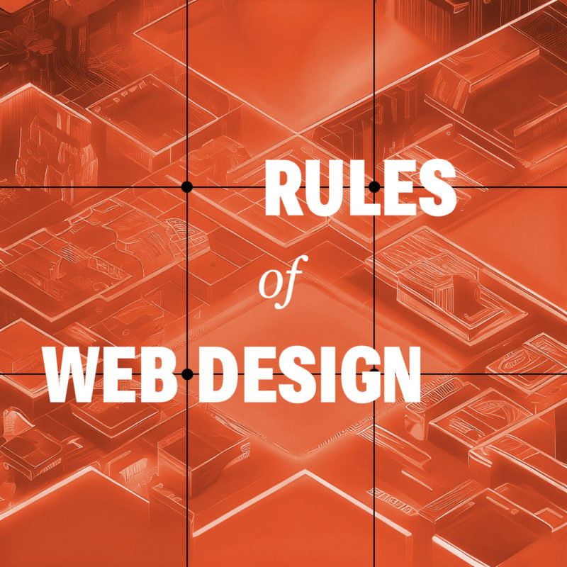
The Rule of Thirds
Believe it or not, the rule of thirds can even apply to web design as well, or any artform where you are composing a frame. The rule of thirds is a compositional guideline that divides an image into nine equal parts by two equally spaced horizontal lines and two equally spaced vertical lines. The important compositional elements of a design should be placed at the intersections of these lines, or along the lines themselves. The idea is that this creates a more balanced and visually appealing composition.
The rule of thirds can be used in web design to improve the aesthetics of your layouts. By placing important elements at the intersections of the rule of thirds grid, you can create a more dynamic and interesting composition.
For example, you could place your logo at the intersection of the top horizontal line and the left vertical line, and your call to action button at the intersection of the bottom horizontal line and the right vertical line. You could also use the rule of thirds to place your navigation bar, header, footer, and other important elements on your website.
Of course, the rule of thirds is just a guideline. You don’t have to follow it slavishly. But if you find that your designs are feeling a bit static or boring, try using the rule of thirds to see if it helps to create a more visually interesting and engaging design.
Use White Space
White space, also known as negative space, refers to the blank areas around and between design elements on a web page. It can be just as important as the content itself, as it can help to create a clean, organized, and visually pleasing design.
One of the benefits of white space is that it can make important content stand out. By leaving some areas of a page empty, the eye is naturally drawn to the content that is present. This can be particularly useful when trying to emphasize a call-to-action or other important information.
Another benefit of white space is that it can improve readability. By spacing out paragraphs, headers, and other text elements, it becomes easier for the reader to distinguish between them and to follow the flow of the content. This can be particularly important on mobile devices where screen space is limited.
When using white space, it’s important to strike a balance between too much and too little. Too much white space can make a page look sparse and unfinished, while too little can make a page look cluttered and overwhelming. It’s important to consider the purpose of the page, the content that will be included, and the overall design aesthetic when deciding how much white space to incorporate.
Be Consistent
Consistency is essential in web design, as it provides the necessary structure and organization to help users navigate through a website with ease. Consistency in design means that similar elements on different pages have the same look and feel, including typography, color, layout, and navigation. This not only makes the website more visually appealing, but it also helps users quickly recognize and understand how to interact with different components on the site.
When designing a website, consistency should be applied not only to the visual design but also to the user experience. This means that the website should be consistent in terms of functionality, such as the placement of navigation menus and buttons, the use of icons and symbols, and the overall flow of the website. Consistency in user experience ensures that users know what to expect from the website and how to navigate it, which leads to a better overall UX.
Another benefit of consistency in web design is that it can help establish a brand identity. A consistent visual style can help users identify and connect with a brand, making it easier for the brand to build brand recognition and loyalty.
Consider Contrast
Contrast is a crucial element of web design that can help to create visual interest and guide users’ attention to the most important content on a page, as well as improve it’s accessibility. Contrast can be achieved through the use of different colors, typography, shapes, and sizes.
One way to use contrast effectively in web design is to create a visual hierarchy. This involves using contrasting elements to differentiate between different levels of information on a page. For example, the use of bold, large typography for headlines can create contrast and draw the user’s attention to important information.
Another way to use contrast is to create a sense of depth and dimensionality in a design. By using contrasting colors and shades, web designers can create the illusion of layers and depth, which can make a design more visually engaging and memorable.
When using contrast in web design, it’s important to be mindful of accessibility. For example, using colors with insufficient contrast can make it difficult for users with visual impairments to read content. Designers should always ensure that their designs meet accessibility guidelines and are accessible to all users.
Limit the Number of Fonts
Using too many different fonts in web design can be a common mistake that can make a website look cluttered and unprofessional. It’s important to remember that typography is an art form and should be treated as such. When using multiple fonts, they should be carefully selected and paired in a way that is visually appealing and harmonious.
One approach to using multiple fonts in web design is to limit the number of fonts used to two or three, with each font serving a distinct purpose. For example, a website might use one font for headlines and another for body text. When selecting fonts, it’s also important to consider their style and how they complement each other. Fonts that are too similar can create confusion and make it difficult for users to distinguish between different sections of a website.
In addition to limiting the number of fonts used, it’s also important to consider font size, spacing, and hierarchy. Proper use of font size and spacing can help guide the user’s eye and make it easier to scan and read content. Hierarchy, or the order of importance of text on a page, can also be communicated through the use of font weight and style.
Using multiple fonts in web design can add visual interest and depth, but it’s important to do so in a thoughtful and intentional way. By limiting the number of fonts used and considering their style, size, spacing, and hierarchy, designers can create a cohesive and professional look for their website.
Don’t Let These Rules Cripple Your Creativity
These principles and rules help web designers create websites that are visually appealing, functional, and user-friendly. But these rules are just guidelines, and there are times when it’s okay to break them. For example, if you have a strong focal point, sometimes you may want to place it in the center of the frame. There is no one right way to build a website. Experiment with different layouts to see what works best for you and your brand. Ultimately, the best way to compose your design is to use your intuition.