6 Tips for Visually Appealing Web Design

Picture a website that instantly grabs your attention with its stunning visuals, seamlessly blending colors, typography, and imagery to create an immersive experience. In web design, aesthetics hold immense power. They can captivate users, communicate brand identity, and leave a lasting impression. It’s no wonder that designing a visually appealing website is a top priority for every web designer.

Here we will explore some of the top tips and best practices that will empower you to craft designs that not only look stunning but also enhance user engagement and create a memorable digital presence. With the perfect blend of aesthetics, functionality, and user experience, your website can leave visitors awestruck and craving for more.

Use a Consistent and Cohesive Color Scheme

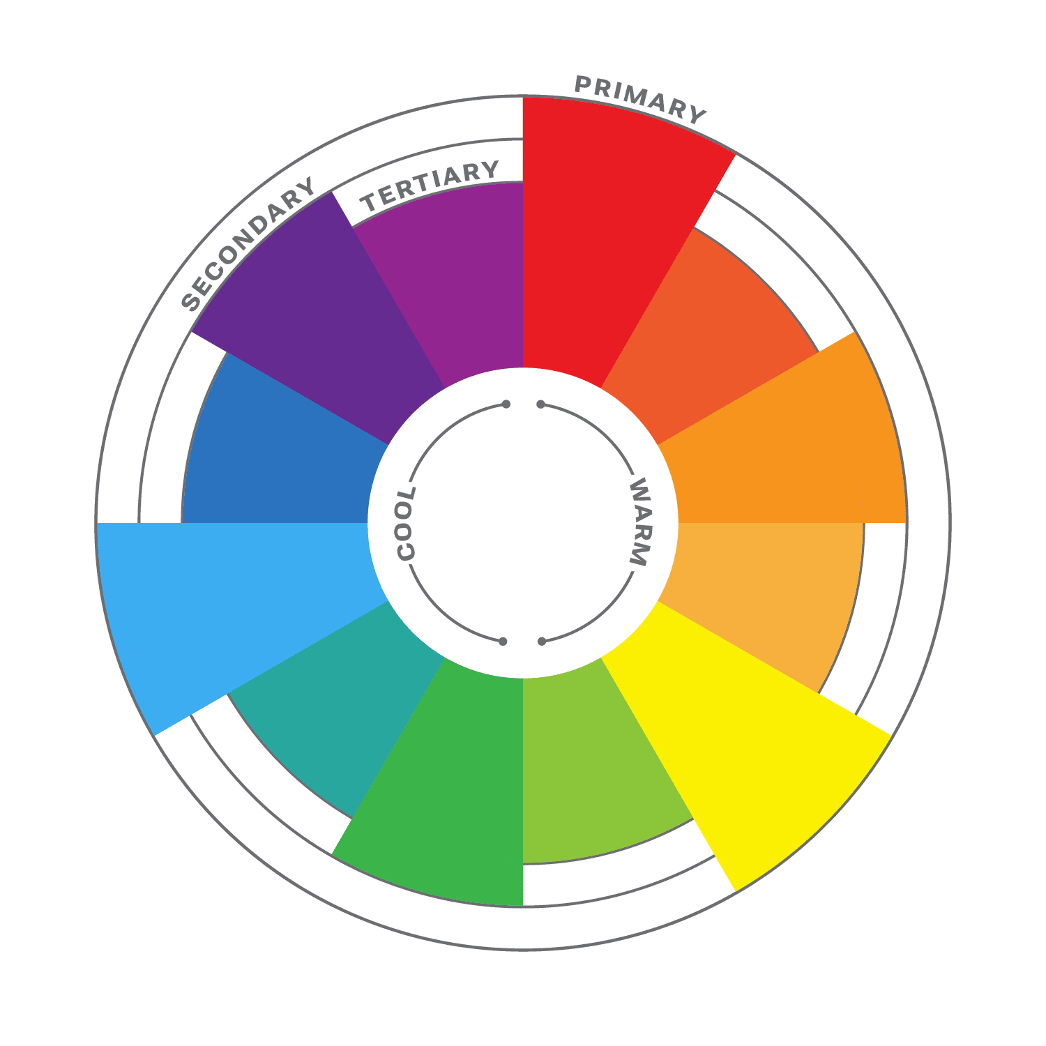
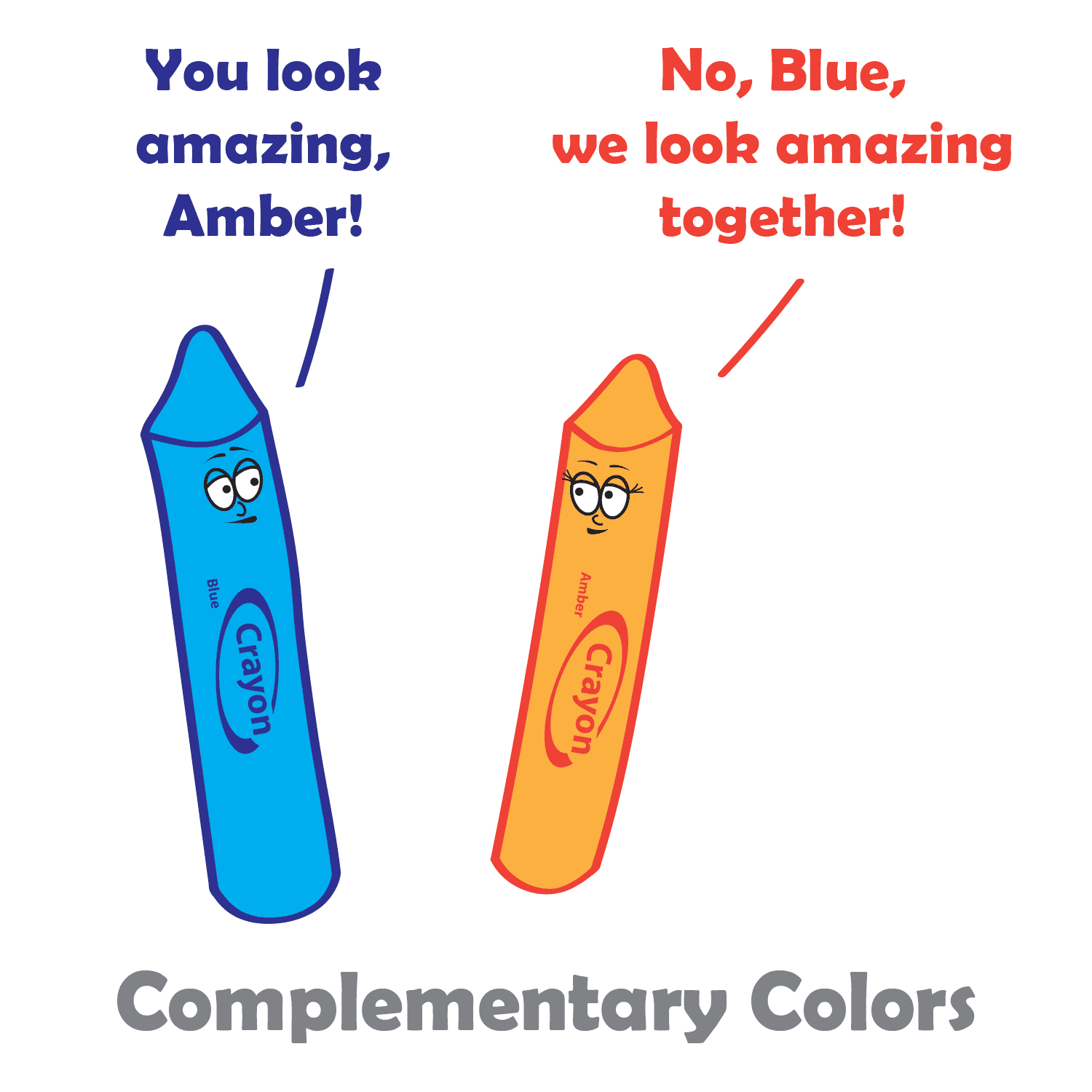
When it comes to creating a visually appealing website, color is a powerful tool that can evoke emotions, convey meaning, and establish a strong brand identity. Choosing a consistent and cohesive color scheme is essential for creating a harmonious visual experience.

Start by understanding your brand’s personality and the emotions you want to evoke in your audience. Are you aiming for a bold and energetic vibe, or perhaps a calm and serene atmosphere? Once you have clarity on your brand’s essence, carefully select a color palette that reflects these qualities.

Consider using colors that complement each other and create a sense of visual harmony. A good rule of thumb is to choose a primary color as the foundation and then select a few complementary or analogous colors to accompany it. Remember to strike a balance between using bold, attention-grabbing colors and more subtle shades that provide balance and contrast.

Use colors strategically to guide users’ attention and create visual hierarchy. For instance, make important elements, such as call-to-action buttons or key headings, stand out by using a contrasting color that draws the eye. Use more subdued colors for secondary elements to ensure they don’t compete for attention.

With a consistent and cohesive color scheme, you not only create an aesthetically pleasing website but also establish a strong brand presence that resonates with your audience. Let your colors speak for your brand and create an immersive visual experience that leaves a lasting impression.

Choose Complementary Fonts

Example font pairing

Fonts play a significant role in web design, as they contribute to the overall look and feel of your website. When selecting fonts, it’s essential to choose ones that are not only legible but also visually appealing and complementary to your design aesthetic.

The first consideration when choosing fonts is legibility. Ensure that the fonts you select are easy to read, even at smaller sizes or on different devices. Legible fonts have clear and distinct letterforms, appropriate spacing between characters, and consistent stroke widths. Test the fonts across various screen sizes and devices to ensure they maintain their readability.

Once you have identified legible fonts, it’s time to think about the visual appeal and creating a harmonious typography scheme. Consider using a combination of fonts to add visual interest and establish a clear hierarchy within your design. One popular approach is to pair a sans-serif font with a serif font.

Sans-serif fonts, with their clean and modern appearance, are often used for headings and titles. They provide a contemporary and straightforward look that grabs attention and makes a bold statement. Serif fonts, on the other hand, have decorative strokes at the ends of characters, giving them a more traditional and elegant feel. They are commonly used for body text as they enhance readability and create a sense of familiarity.

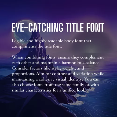
When combining fonts, ensure that they complement each other and create a harmonious balance. Consider their overall style, weight, and proportions. Aim for contrast and variation between the fonts while maintaining a cohesive visual identity. Pairing fonts from the same font family or fonts that share similar characteristics can also create a cohesive and unified look.

Additionally, be mindful of the number of fonts you use on your website. Using too many fonts can lead to visual clutter and confusion. Stick to a limited number of fonts (typically two or three) to maintain consistency and a polished appearance throughout your website.

As with all design choices, it’s crucial to consider your target audience and the message you want to convey. Fonts can evoke different emotions and associations, so choose fonts that align with your brand personality and the overall tone of your website.

Incorporate Whitespace

Whitespace, or negative space, is a powerful yet often underutilized element. It refers to the empty space between elements on a webpage, and it plays a crucial role in creating a visually appealing and user-friendly design.

Whitespace is not just empty space; it is a deliberate design choice that brings balance, clarity, and elegance to your website. Incorporate ample white space to give your content room to breathe, allowing it to stand out and capture the user’s attention. This clean and uncluttered layout creates a sense of organization and makes it easier for visitors to navigate and digest your content.

One of the key benefits of whitespace is enhanced readability. The absence of visual clutter allows users to focus on the important elements and absorb information more easily. Whitespace also helps guide the user’s eye and establish a clear visual hierarchy, making it easier to prioritize content and highlight key messages.

Aesthetically, whitespace creates a sense of elegance and sophistication in your design. It gives your website a modern and spacious feel, conveying a sense of professionalism and attention to detail. When used strategically, whitespace can evoke a sense of luxury, simplicity, and elegance that resonates with your audience.

When incorporating whitespace, consider the overall layout and spacing between elements. Give generous margins around text blocks, images, and buttons. Be mindful of the spacing between different sections and elements on the page. Experiment with different layouts and proportions to find the right balance that suits your content and design aesthetic.

Use High-quality and Relevant Images

Incorporating visually appealing images is a powerful way to enhance the overall aesthetic of your website and captivate your audience. Well-chosen and carefully curated images can communicate your brand message, evoke emotions, and provide valuable context to your content.

First and foremost, prioritize high-quality images. Blurry or pixelated images can significantly impact the visual appeal of your website and create an unprofessional impression. Invest in high-resolution images that are crisp, clear, and vibrant. If you’re using photographs, ensure they are well-lit and properly composed.

Relevance is another crucial aspect to consider when choosing images. Select visuals that are closely aligned with your brand identity, content, and target audience. The images you choose should enhance the message you’re trying to convey and resonate with your visitors. For example, if you’re designing a website for a travel agency, incorporating captivating images of beautiful destinations can inspire and entice potential travelers.

Consider the placement and context of images within your website design. Images should be strategically positioned to support and complement your content. Use them to break up text, highlight key points, or create visual interest. For example, you can use images as background elements or hero banners to make a strong visual statement. The right images have the power to leave a lasting impression on your visitors and make your website truly visually appealing.

Create a Balanced Layout

Creating a balanced layout is crucial in web design as it contributes to the overall visual appeal and user experience of a website. When elements are evenly distributed and placed thoughtfully, they create a sense of visual equilibrium and harmony.

To achieve a balanced layout, consider the placement and arrangement of text, images, and other design elements on the page. Distribute them strategically, ensuring that no single element overpowers or dominates the others. This can be achieved through techniques such as symmetry, asymmetry, or a grid-based layout.

Symmetrical balance involves arranging elements in a mirrored or evenly distributed manner, creating a formal and harmonious feel. It is often used in more traditional and conservative designs. Asymmetrical balance, on the other hand, involves arranging elements in an intentionally unbalanced but visually pleasing way. This approach adds a sense of dynamism and can be used to create more modern and creative designs.

With careful consideration of the placement, size, and visual weight of each element, you can create a balanced layout that guides the user’s eye, communicates hierarchy, and enhances the overall visual appeal. A well-balanced layout not only creates a visually pleasing design but also improves readability and usability, making it easier for visitors to navigate and engage with your website’s content.

Apply Visual Hierarchy

Visual hierarchy is a fundamental principle in web design that helps guide users’ attention and prioritize information effectively. By strategically applying various design elements such as size, color, contrast, and placement, you can establish a clear visual hierarchy on your website.

One of the key aspects of visual hierarchy is utilizing size appropriately. Larger elements tend to attract more attention, so use larger fonts for headings or important sections to make them stand out. Similarly, consider increasing the size of buttons or interactive elements to encourage user engagement. With contrasting sizes, you create a distinction between different elements and help users understand their relative importance.

Color is another powerful tool in establishing visual hierarchy. Use color strategically to draw attention to key elements. Vibrant or contrasting colors can make important elements stand out, while more muted or harmonious colors can be used for less prominent elements. Additionally, consider using color to create consistency and coherence with your brand identity.

Honorable Mentions

Designing a visually appealing website is essential for capturing the attention of users and creating a memorable browsing experience.

While we’ve covered some of the key aspects of visual design, there are some honorable mentions worth talking about. Visual multimedia elements, such as videos, animations, and interactive components, can enhance engagement and add an interactive dimension to your design. However, it’s important to use them judiciously and ensure they contribute to the overall user experience.

Additionally, responsive design deserves a special mention. Ensuring your website is responsive and adapts seamlessly to different screen sizes and devices is crucial in today’s mobile-first era. Responsive design guarantees that your website looks visually appealing and functions optimally across a range of devices, providing a consistent experience for users.

Remember, creating a visually appealing website goes beyond aesthetics—it also contributes to user satisfaction, brand perception, and ultimately, the success of your online presence. Take some time to think about how you can implement these tips into your design workflow. Standing on the shoulders of design giants, you can create a website that not only looks visually stunning but also delivers an exceptional user experience.

Color Theory: Speak the Language of Hue

Color is a crucial and influential element in web design, as it can evoke emotions, convey a brand’s personality, and guide users’ attention. Color theory is the study of how colors interact with each other and how they affect the human eye and brain. It is a complex and fascinating subject, and it can be used to create a wide variety of effects in design. So how does color theory apply to web design and how do you choose the right colors for your website?

The first thing to consider when choosing colors for your website is your brand’s personality and message. Think about the emotions you want to convey to your audience and what your brand stands for. For example, blue is often associated with trust and reliability, while red is associated with energy and excitement. Once you have a clear understanding of your brand’s personality, you can choose colors that align with it.

When choosing colors for a website, it is important to consider the overall mood or atmosphere you want to create. For example, if you want to create a website that is calming and relaxing, you might choose soft, muted colors like blues and greens. If you want to create a website that is exciting and energetic, you might choose brighter, more vibrant colors like reds and oranges.

It is also important to consider the target audience for your website. For example, if your website is aimed at children, you might choose bright, playful colors. If your website is aimed at adults, you might choose more subdued colors.

In addition to the overall mood or atmosphere, you should also take into consideration the specific elements of your website when choosing colors. For example, the text should be easy to read against the background, and the call-to-action buttons should stand out from the rest of the page.

Color theory can be a complex subject, but it is an essential part of web design. By understanding the basics of color theory, you can create websites that are visually appealing and effective.

Color Wheel

Color Wheel
Color Wheel

The color wheel is a circular diagram that shows the relationships between colors. It is a useful tool for understanding how colors work together and how to create pleasing color schemes.

The color wheel is divided into three primary colors: red, yellow, and blue. These colors cannot be created by mixing other colors together. When two primary colors are mixed together, they create a secondary color. The secondary colors are orange, green, and purple. When a primary color and a secondary color are mixed together, they create a tertiary color. There are six tertiary colors: red-orange, yellow-orange, yellow-green, green-blue, blue-purple, and red-purple.

The color wheel is often divided into warm colors (like red, orange, and yellow) and cool colors (like blue, green, and violet). Warm colors are associated with passion, energy, and excitement, while cool colors are associated with calmness and peace.

Color Harmony

Another important aspect of color theory is color harmony. This refers to how colors work together to create a visually appealing design. It is a subjective concept, as different people have different preferences for color. However, there are some general principles of color harmony that can be followed to create pleasing color schemes.

Complementary Colors

There are many different ways to create color harmony, but some of the most common methods include:

  • Monochromatic: A monochromatic color scheme uses variations of one color. This can be a very effective way to create a calm and sophisticated look.
  • Analogous: Analogous color schemes use three colors that are close to each other on the color wheel. This can be a very harmonious and pleasing color palette.
  • Complementary: Complementary colors are two colors that are opposite each other on the color wheel. This can be a very striking and eye-catching pair.
  • Split-complementary: Split-complementary color schemes use the color opposite the primary color, as well as the two colors on either side of the complementary color. This can be a very sophisticated and elegant color combination.
  • Triadic: A triadic color theme uses three colors that are evenly spaced around the color wheel, creating a very balanced and dynamic look.
  • Tetradic: Tetradic color schemes use four colors that are evenly spaced around the color wheel. This can be a very complex and interesting way to use color.

When choosing colors in your design process, it is important to consider the overall effect that you want to create. If you want to create a calm and relaxing design, you might want to use a monochromatic or analogous color scheme. If you want to create something more dramatic and eye-catching, you might want to use a complementary or triadic color scheme.

No matter which method you choose, it is important to use colors that you like and that work well together, and to experiment with different color combinations until you find one that you like. And remember, there are no hard and fast rules when it comes to color harmony. The most important thing is to use colors that you find pleasing and that create the effect you want. When you choose colors that are pleasing to the eye, you can create art that is both beautiful and functional.

Color Principles

One of the most important principles of color harmony is contrast. Contrast is the difference between the lightness and darkness, or the warmth and coolness, of colors. A high-contrast color scheme uses colors that are very different from each other, while a low-contrast color scheme uses colors that are similar to each other.

Contrast is important in web design, as it helps guide users’ attention and create visual interest. High contrast colors, such as black and white, create a strong visual impact and are useful for highlighting important information. Low contrast colors, such as pastels, create a softer and more subdued effect.

Another important principle of color harmony is unity. Unity is the feeling that all of the colors in a design work together. There are a number of ways to create unity, such as using a limited color palette, repeating colors throughout a design, or using a color scheme that is based on a natural phenomenon, such as a sunset or a rainbow.

In addition, consider the cultural associations of colors. Different cultures may have different meanings and associations with colors, so it’s important to research the cultural context of your audience. For example, in western cultures, white is often associated with purity and innocence, while in some eastern cultures it is associated with mourning.

Color Psychology

While color theory and color psychology are related, they are not the same thing. Color theory focuses on the principles and concepts of color and how they interact with each other. It is concerned with the visual effects of color combinations, such as contrast, harmony, and balance. On the other hand, color psychology studies the emotional and behavioral effects of colors on human beings. It explores how different colors can affect mood, perception, and behavior, and how they can be used to communicate different messages and create different experiences. While color theory is important in creating effective and visually pleasing designs, color psychology can help to further enhance the message and impact of a design by understanding how colors are perceived and experienced by the audience.

According to color psychology, different colors evoke different emotions and can have different effects on the human brain. For example, red is often associated with excitement and passion, while blue is often associated with calmness and peace. When choosing colors for your website, it’s important to consider the message you want to convey and the emotions you want to evoke in your users.

Here are some additional tips for using color in web design:

  • Use a limited color palette. Too many colors can be overwhelming and distracting.
  • Use white space to create contrast and make your colors pop.
  • Use color to highlight important elements of your website, such as the call to action buttons.
  • Use color consistently throughout your website. This will help create a cohesive and professional look.
  • Test your colors on different devices and browsers to make sure they look good everywhere.

When used effectively, color can be a powerful tool for web design. Color theory is an important aspect of web design that can greatly impact the success of your website. By understanding the principles of color theory, and considering your brand’s personality, you can choose the right colors to evoke the emotions and convey the message you want to communicate to your audience.

Color Psychology and its Impact on Web Design

Color is a fundamental aspect of web design that can have a significant impact on user experience. Color psychology is the study of how color affects human behavior, mood, and emotion. When used effectively, color can help convey a message, evoke emotions, and guide users through a website.

Color psychology suggests that different colors can evoke different emotions in people. For example, red can symbolize passion, energy, and excitement, while blue is often associated with trust, calmness, and security. By using colors strategically, web designers can create a specific mood or emotion within their website visitors.

One important consideration is to choose colors that are appropriate for the brand and the target audience. Bright and bold colors may work well for a children’s website, but may not be appropriate for a financial institution. Neutral and muted colors may be better suited for a professional website.

Another factor to consider is color contrast. High contrast between background and foreground colors can make it easier for users to read text and navigate the site. It’s important to also consider color accessibility and make sure that the site is accessible to users with visual impairments. Tools like the WCAG color contrast checker can help ensure that color contrast meets accessibility standards.

In addition, it’s also important to consider the overall visual hierarchy of the website. Colors can be used to draw attention to important elements, such as calls to action or navigation menus. Using color consistently throughout the website can also help create a cohesive and memorable brand identity.

Color theory is the study of how colors interact with each other and the human eye. It involves understanding the color wheel, color harmony, and color contrast. By applying color theory principles in web design, designers can create harmonious color palettes that communicate the intended emotions and messages to the users.

Here are some examples of how color can be used in web design:

  • Red: Red is a powerful color that can be used to create a sense of urgency or excitement. It’s often used on websites that sell products or services that people need right away, such as restaurant and delivery websites or emergency services websites.
  • Orange: Orange is a warm and inviting color that can be used to create a sense of excitement or happiness. It’s often used on websites that sell products or services that people want to enjoy, such as recipe or travel websites.
  • Yellow: Yellow is a bright and cheerful color that can be used to grab attention or create a sense of optimism. It’s often used on websites that have products or services that people want to buy, such as retail websites or online stores.
  • Green: Green is a calming and relaxing color that can be used to create a sense of peace or relaxation. It’s popular on environmental and outdoors sites.
  • Blue: Blue is a cool and calming color that can be used to create a sense of trust or reliability. It’s commonly used on websites where people need to feel safe and secure, such as banking websites or government websites.

Color psychology is a powerful tool that can help web designers create an effective and engaging user experience. Remember, too much color can be overwhelming and distracting. It’s important to use color sparingly and to choose colors that complement each other. By choosing appropriate colors, considering contrast and accessibility, and using color strategically, designers can enhance the user experience and create a memorable brand identity.