
Are you tired of struggling with rigid and inflexible layouts in your web design projects? Do you wish there was an easier way to create visually stunning and adaptable grids that seamlessly respond to different screen sizes? Look no further! In the dynamic world of web design, the use of a minimal and versatile grid system can be a game-changer.
CSS grid, the cutting-edge layout module in CSS, empowers web designers to craft flexible and responsive grid-based layouts with ease. Gone are the days of relying on cumbersome frameworks or convoluted workarounds. With CSS grid, you have the power to create sophisticated grid structures that adapt flawlessly to various devices and screen resolutions.
What is CSS Grid?
CSS grid is a powerful layout module in CSS that allows designers to create grid-based layouts with precision and flexibility. Unlike older layout methods, such as floats and positioning, CSS grid offers a more intuitive and declarative approach to building grids. It consists of two essential components: the grid container and grid items.
The grid container serves as the parent element that holds the grid items. By applying the display: grid property to the container, we establish a grid context. This allows us to define the structure and behavior of our grid system. We can specify the number of rows and columns, set their dimensions, and create space between them using the grid-template-rows, grid-template-columns, and grid-gap properties, respectively.
CSS grid works by dividing the grid container into a grid of intersecting horizontal and vertical lines, forming a series of cells. Each grid item is placed within these cells, and designers have granular control over their positioning and sizing. Using properties like grid-row, grid-column, and grid-area, we can precisely determine where each item should appear in the grid.
CSS grid also provides powerful alignment and distribution capabilities. We can align items vertically and horizontally using properties like justify-items, align-items, justify-content, and align-content. These properties enable us to control the placement and spacing of items within the grid.
The advantages of using CSS grid for building versatile and adaptable grids are numerous. Firstly, CSS grid offers a high degree of flexibility, allowing us to create complex layouts with ease. Its ability to handle both rows and columns independently gives us the freedom to design grids that adjust dynamically to different screen sizes and orientations.
Moreover, CSS grid simplifies the process of creating responsive designs. With features like media queries, we can modify the grid structure, rearrange items, or change their sizing based on specific breakpoints. This flexibility ensures that our layouts remain visually appealing and functional across a wide range of devices.
Additionally, CSS grid promotes clean and maintainable code. It eliminates the need for excessive markup or reliance on external libraries, as we can achieve complex grid layouts with minimal code. This results in improved performance and easier maintenance, enhancing the overall development process.
Designing a Minimal Grid Structure
To create a minimal grid structure, we start by defining the grid container and setting up the necessary CSS properties, then define the rows and columns of our grid. These properties accept values that determine the size and behavior of the rows and columns. We can specify fixed lengths, percentages, or even use the fr unit to distribute available space proportionally.

For example, we can set up a basic two-column grid with equally sized columns like this:
.grid-container {
  display: grid;
  grid-template-columns: 1fr 1fr;
}
Once we have defined the grid structure, we can specify the size and alignment of our grid items within the grid. We achieve this using the grid-row and grid-column properties. By assigning values to these properties, we can position items in specific cells of the grid.
For instance, to place an item in the first row and the second column, we can use the following code:
.grid-item {
  grid-row: 1;
  grid-column: 2;
}
We can also span items across multiple rows or columns by specifying the desired range. For example, to make an item span three rows, we can use:
.grid-item {
  grid-row: 1 / 4;
}
Designing a versatile grid structure provides us with immense flexibility in creating various layouts. By adjusting the number of rows and columns and manipulating the placement of items, we can achieve different grid structures with unique impacts on layout flexibility.
For instance, a grid with a single row and multiple columns allows for a horizontally oriented layout where items flow sequentially. On the other hand, a grid with multiple rows and a single column enables a vertically oriented layout with items stacking on top of each other.
Responsive Grid Design
Creating a responsive grid is essential for ensuring that our grid system adapts seamlessly to different screen sizes and devices. CSS grid provides powerful tools to achieve responsiveness, such as the auto-fit and minmax functions.
The auto-fit function allows the grid items to automatically adjust and fit into the available space while maintaining their specified dimensions. By combining auto-fit with the minmax function, we can set a minimum and maximum size for grid items, creating a flexible and responsive grid.
For example, we can create a responsive grid with a minimum width of 200 pixels and a maximum width of 1fr (i.e., filling the available space) using the following CSS:
.grid-container {
  display: grid;
  grid-template-columns: repeat(auto-fit, minmax(200px, 1fr));
}
Media queries play a crucial role in adapting the grid layout for different screen sizes. With media queries, we can define specific rules that apply only when certain conditions are met, such as the width of the viewport.
For instance, we can modify the grid structure for smaller screens by adjusting the number of columns or changing the layout altogether. By targeting specific breakpoints with media queries, we can create a more optimized and tailored grid design for different devices.
@media (max-width: 768px) {
  .grid-container {
    grid-template-columns: repeat(2, 1fr);
  }
}
When designing a responsive grid system, it’s crucial to follow best practices to ensure a seamless user experience across various devices. Here are some key tips to consider:
- Keep the grid structure simple and flexible, allowing for easy rearrangement of items on smaller screens.
- Use relative units like percentages or fr to ensure the grid adapts proportionally to the available space.
- Test and iterate your grid design across different devices and screen sizes to ensure optimal responsiveness.
- Consider the content hierarchy and prioritize important elements for smaller screens to maintain readability and usability.
Adding Flexibility and Versatility
To enhance the flexibility and control of our grid layout, we can utilize grid areas and named grid lines. Grid areas allow us to designate specific regions within the grid to place our content. By assigning names to these areas, we can easily position and rearrange items across the grid.
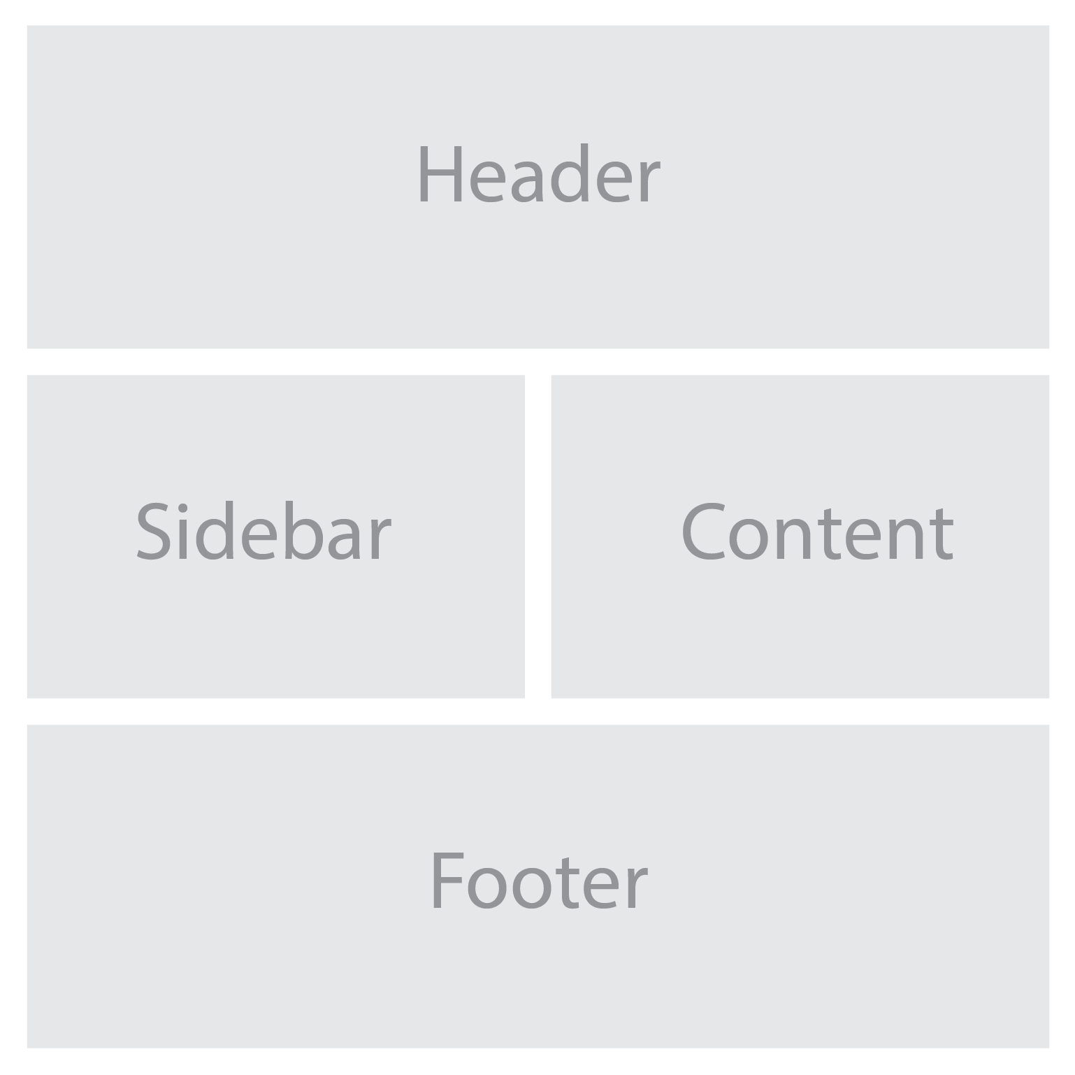
For example, we can define named grid areas for the different sections of a website using the grid-template-areas property:
.grid-container {
  display: grid;
  grid-template-areas:
    "header header"
    "sidebar content"
    "footer footer";
  grid-gap: 20px;
}

.header {
  grid-area: header;
}

.sidebar {
  grid-area: sidebar;
}

.content {
  grid-area: content;
}

.footer {
  grid-area: footer;
}
With these techniques, we can create highly adaptable and versatile grid layouts. Grid areas and named grid lines give us precise control over the positioning of our content, while the grid-gap property adds visual breathing space between items.
When customizing your grid system to meet specific design requirements, consider the following tips:
- Experiment with different grid configurations to find the most suitable layout for your content.
- Use the grid-template-areas property to create complex grid structures by assigning multiple areas to a single grid cell.
- Combine CSS grid with other layout techniques, such as flexbox, to achieve even more versatile and dynamic designs.
- Consider using CSS variables to define reusable values, such as grid gap sizes or color schemes, making it easier to adjust and maintain your grid system.
With CSS grid, you have full control over the structure and layout of your web pages, allowing you to achieve the desired visual hierarchy and user experience. By harnessing that power, you can unleash your creativity and design beautiful, functional, and responsive websites. Whether you’re building a portfolio, blog, e-commerce site, or any other type of web application, incorporating a minimal and versatile grid system using CSS grid will undoubtedly enhance the visual appeal and user experience.