The highly competitive nature of search engine rankings means that having a well-optimized website is crucial for achieving high search engine rankings and providing a seamless user experience. One often overlooked aspect of website search engine optimization is the structure and format of your URLs. SEO-friendly URLs not only make it easier for search engines to understand and index your content, but they also improve the overall user experience by making it simple for visitors to navigate your site and share your content.
What Makes a URL SEO-Friendly?
Creating an SEO-friendly uniform resource locator (URL) involves several key factors that contribute to its effectiveness in both search engine rankings and user experience. Let’s take a closer look at these factors:
Readability and Simplicity An SEO-friendly URL should be easy to read and understand for both search engines and users. A clear and simple URL structure helps search engines accurately index your content and allows users to quickly grasp the topic of the page. Avoid using complex or ambiguous terms, and instead, focus on creating URLs that accurately represent the content of your page.
Keyword Usage Incorporating relevant keywords into your URL can significantly improve your search engine rankings. When search engines crawl your website, they use the keywords in your URL to determine the topic of your content. By including descriptive and relevant keywords, you make it easier for search engines to understand and rank your content. However, it’s essential to avoid keyword stuffing, as this can lead to penalties from search engines.
URL Length Shorter URLs are generally more SEO-friendly than longer ones. Long URLs can be difficult for users to remember and share, and they may also be truncated in search engine results, making them less effective. Aim to keep your URLs concise while still accurately representing the content of the page. As a general rule, try to limit your URLs to around 50-60 characters.
Hyphens and Underscores When creating SEO-friendly URLs, it’s important to separate words with hyphens rather than underscores or spaces. Search engines, like Google, treat hyphens as word separators, making it easier for them to understand and index your content. On the other hand, underscores are not treated as word separators, which can lead to confusion and negatively impact your search engine rankings.
Best Practices for Creating SEO-Friendly URLs
Now that we’ve covered the key elements of an SEO-friendly URL, let’s dive into some best practices for creating effective URLs.
Keep URLs Short and Concise As mentioned earlier, shorter URLs are generally more SEO-friendly than longer ones. Shorter URLs are easier for users to remember and share, and they also tend to be more visually appealing. To keep your URLs short and concise, consider removing unnecessary words, such as articles (a, an, the), prepositions (in, on, at), and conjunctions (and, or, but). Additionally, avoid using dynamic URLs that include session IDs or other parameters, as these can make your URLs unnecessarily long and complex.
Avoid Using Special Characters and Capital Letters Using special characters, such as %, &, and @, in your URLs can cause issues with search engine indexing and user experience. Special characters can be misinterpreted by search engines, leading to indexing errors and lower search engine rankings. Similarly, using capital letters in your URLs can cause confusion and lead to broken links, as URLs are case-sensitive. To avoid these issues, stick to using lowercase letters and hyphens in your URLs.
Use a Consistent URL Structure Using a consistent URL structure across your website can improve both search engine rankings and user experience. A logical and consistent URL structure makes it easier for search engines to crawl and index your content, and it also helps users navigate your site more efficiently. When creating your URL structure, consider using a hierarchical format that reflects the organization of your website. For example, you might use a format like “domain.com/category/subcategory/page” to represent the structure of your site.
Examples of good URL structures include:
domain.com/page/subpage
domain.com/year/month/day/post-title
domain.com/product-category/product-name
These best practices can help you create URLs that are both SEO-friendly and user-friendly, ultimately improving your website’s search engine rankings and overall user experience.
Implementing SEO-Friendly URLs in Popular Content Management Systems
If you’re using a content management system (CMS) like WordPress, Joomla, or Drupal, implementing SEO-friendly URLs can be relatively straightforward. Here are some tips for optimizing your URLs in these popular CMS platforms:
WordPress WordPress offers several options for customizing your URL structure. To access these options, navigate to the “Permalinks” settings in your WordPress dashboard. From here, you can choose from several pre-defined URL structures or create a custom structure that suits your needs. Additionally, there are several plugins available for WordPress that can help optimize your URLs, such as Yoast SEO and All in One SEO Pack.
Joomla Joomla also offers options for customizing your URL structure. To enable search engine friendly (SEF) URLs in Joomla, navigate to the “Global Configuration” settings and select the “SEO Settings” tab. From here, you can enable SEF URLs and customize the URL structure to your liking. Additionally, there are several extensions available for Joomla that can help optimize your URLs, such as SH404SEF and JoomSEF.
Drupal Drupal has built-in support for clean URLs, which are SEO-friendly by default. To enable clean URLs in Drupal, navigate to the “Clean URLs” settings in your Drupal dashboard and ensure that they are enabled. Additionally, you can use the Pathauto module to automatically generate SEO-friendly URLs based on your content’s title or other criteria.
Creating SEO-friendly URLs is an essential aspect of website optimization that can significantly impact your search engine rankings and user experience. If you follow the best practices outlined in this article, such as keeping URLs short and concise, avoiding special characters and capital letters, and using a consistent URL structure, you can create URLs that are both SEO-friendly and user-friendly. This will go a long way in helping to improve your website’s search engine rankings, drive more traffic to your site, and provide a better user experience for your visitors.
Responsive web design has become essential for providing optimal user experiences across a multitude of devices. With the increasing variety of screen sizes and resolutions, it’s crucial to ensure that your website adapts seamlessly to different devices, from desktop computers to smartphones and tablets. This is where CSS media queries come into play. By using media queries, we can apply specific styles and layout adjustments based on the characteristics of the device accessing the website. In this article, we will explore the world of CSS media queries and delve into their functionality, implementation, and best practices. Let’s dive in and discover the power of CSS media queries.
Understanding CSS Media Queries
CSS media queries serve as the backbone of responsive web design, allowing us to adapt our styles and layouts based on the characteristics of the device being used. In simple terms, media queries enable us to apply different styles to different devices, ensuring that our website looks and functions seamlessly across various screen sizes.
At its core, a media query consists of a media type and one or more expressions that evaluate to true or false. The media type specifies the category of the device, such as “screen” for a computer or “print” for printing purposes. The expressions, enclosed in parentheses, define the conditions under which the styles within the media query will be applied.
The syntax of a media query is as follows:
@media media-type and (expressions) {
    /* Styles for this specific condition */
}
With these queries can target various aspects of the device, such as its width, height, orientation, resolution, and more. For example, we can use the “max-width” feature to apply styles when the device’s width is below a certain value.
Here are some commonly used device characteristics:
Width and Height: Allows us to target specific device dimensions, ensuring optimal layout adjustments.
Orientation: Enables us to differentiate between portrait and landscape orientations, adapting our styles accordingly.
Resolution: Helps us apply high-resolution images and styles to devices with high DPI displays.
Device Aspect Ratio: Allows us to target specific aspect ratios, accommodating different screen proportions.
We can even combine these values with logical operators like “and,” “or,” and “not,” to create powerful media queries that precisely control the appearance and behavior of our web pages.
Creating Responsive Designs with Media Queries
Designing for different screen sizes and devices is a crucial aspect of modern web development. With media queries, we can tailor our styles and layouts to provide the best user experience across a wide range of devices, from small mobile phones to large desktop monitors. Let’s explore how media queries enable us to create responsive designs.
One approach is to target specific devices or device types using media queries. For example, we can apply different styles to smartphones, tablets, and desktops, ensuring that each device receives an optimized layout. By specifying media features like width or device aspect ratio, we can fine-tune our design to match the characteristics of the targeted devices.
To create responsive designs, we can adapt various aspects of our web page using media queries. This includes adjusting the layout, typography, and images. For instance, we can change the layout from a single column on mobile devices to a multi-column layout on larger screens. We can modify font sizes to ensure legibility across different screen sizes. Additionally, media queries allow us to serve appropriately sized images, reducing page load times and improving page load performance.
Media Query Breakpoints and Best Practices
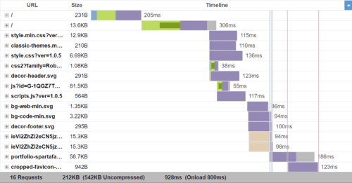
Google Chrome’s developer tools are enormously helpful for testing your CSS media queries
When it comes to implementing media queries, choosing appropriate breakpoints is essential for achieving seamless responsiveness. Breakpoints determine at which screen sizes or device widths the styles defined in the media queries will be applied. By strategically selecting breakpoints, we can ensure that our designs adapt smoothly across different devices.
The choice of breakpoints depends on factors such as your design layout, content structure, and user experience goals. It’s important to analyze the design and identify natural breakpoints where the content or layout needs to shift to accommodate different screen sizes. For example, breakpoints can be set when transitioning from a mobile layout to a tablet layout, or from a tablet layout to a desktop layout.
While there are no fixed rules for choosing breakpoints, some commonly used breakpoints have emerged based on industry standards and device popularity. For instance, popular mobile-first breakpoints include 320px, 480px, and 768px, which correspond to the widths of smaller smartphones, larger smartphones, and small tablets, respectively. Common desktop breakpoints may include 1024px, 1280px, and 1440px, catering to larger screens.
In addition to choosing breakpoints, it’s important to follow best practices for setting up media queries. Here are a few guidelines to ensure optimal responsiveness:
Use a mobile-first approach: Start with the styles for mobile devices and then progressively enhance the design for larger screens by adding media queries.
Minimize the number of breakpoints: Too many breakpoints can complicate the design process and make maintenance challenging. Focus on key breakpoints that have a significant impact on the design.
Test on real devices: Use actual devices or device simulators to test your responsive design across different screen sizes and orientations. This helps ensure that your media queries are working as intended.
Consider fluid and flexible layouts: Instead of relying solely on fixed breakpoints, embrace fluid and flexible layouts that can adapt to various screen sizes without the need for explicit breakpoints.
Advanced Techniques with Media Queries
In addition to the standard usage of media queries based on screen sizes, CSS media queries offer advanced capabilities that allow us to target specific device features, orientations, resolutions, and even user preferences. These advanced techniques enable us to create highly customized and tailored experiences for different devices and user contexts.
One advanced technique involves using media queries to target specific device orientations. By applying different styles based on the screen orientation, we can optimize the layout and presentation of our content when the user switches between landscape and portrait modes. For example, we might want to adjust the positioning of elements or modify the typography to ensure readability in both orientations.
Media queries can also be used to target devices with specific resolutions or pixel densities. By specifying ranges for resolution or pixel density, we can provide higher-quality images or adjust the layout to accommodate devices with high DPI screens, such as Retina displays. This ensures that our designs look crisp and sharp on high-resolution screens while optimizing the file sizes of images for devices with lower resolutions.
Furthermore, media queries allow us to target devices with specific features, such as touch screens. By using feature-specific media queries, we can customize our designs to provide touch-friendly interactions or adjust the styles to enhance the touch experience. This helps create a more intuitive and engaging user interface for touch-enabled devices.
In addition, media queries also support complex conditions using logical operators. By combining multiple media features and using logical operators like AND, OR, and NOT, we can create highly precise and specific targeting. For example, we can apply styles only to devices that have a high resolution, are in portrait mode, and support touch interactions.
Implementing advanced techniques with media queries requires a deeper understanding of the available media features and their syntax. It is important to refer to the CSS specifications and documentation to explore the full range of possibilities. Additionally, testing and experimentation on various devices and user scenarios will help fine-tune and optimize the application of these advanced media queries.
Digging Deeper Into Media Queries
While media queries are enormously useful for creating responsive designs, there are many things to take into consideration, such as performance optimization, search engine optimization (SEO), and accessibility. Understanding these aspects will help us create better experiences for our users across different devices and improve the overall quality of our websites.
One consideration when using media queries is performance optimization. By applying different styles based on screen sizes, we can optimize the delivery of resources, such as images, scripts, and stylesheets. For example, we can load smaller image files or defer the loading of certain scripts for mobile devices with limited bandwidth. This helps to improve the loading speed and overall performance of our website, providing a smoother user experience.
Media queries can also have a negative impact the performance of your website if not used judiciously. Including unnecessary or overly specific media queries can lead to increased CSS file sizes and unnecessary rendering on devices that don’t require those styles. It is crucial to strike a balance between flexibility and performance by optimizing and organizing your media queries.
Media queries also play a role in SEO. As search engines increasingly prioritize mobile-friendly websites, having responsive designs becomes crucial. By using media queries to create responsive layouts, we ensure that our website adapts and displays properly on various devices. This can positively impact our search engine rankings and improve our website’s visibility in search results.
In terms of accessibility, media queries enable us to provide tailored experiences for users with different accessibility needs. By using media queries to adjust font sizes, contrast ratios, and other design elements, we can enhance readability and usability for individuals with visual impairments or other accessibility requirements. It is important to consider accessibility guidelines and best practices when implementing media queries to ensure inclusivity and equal access for all users.
Now Make It Happen
Media queries are powerful tools in the realm of responsive web design. By leveraging media queries, you can create websites that adapt and provide optimal experiences across various devices and screen sizes.
As technology evolves and the range of devices continues to expand, media queries will remain a critical aspect of web development. Embracing the potential of media queries and staying up to date with best practices will enable you to deliver exceptional user experiences and keep your website ahead of the curve.
So, go ahead and experiment with media queries, fine-tune your responsive designs, and create websites that seamlessly adapt to the diverse digital landscape. With media queries as your ally, you can unlock the full potential of responsive web design.
As a web designer, you know how important it is to get more visitors to your website. More traffic means more exposure, more authority, more leads, and more conversions. But how do you get more traffic in the first place? How do you make your website stand out from the millions of other websites on the internet?
The short answer is simple: the first thing is to optimize your website for search engines. Search engines are the main source of traffic for most websites. They help people find what they are looking for online. If your website ranks high on search engines, you will get more visitors who are interested in your services and products.
The longer answer involves topics such as keyword research, compelling content creation, and promotion strategies. If you can make it through this article, you should have a better idea of how to improve your website traffic and grow your online business.
Search Engine Optimization
SEO is the process of improving your website’s quality and relevance for search engines and users. SEO is crucial for improving your website ranking and visibility on search engines because it helps you match your website with the search intent and expectations of your potential customers.
Here are some tips and techniques for optimizing your website for search engines:
Keyword research is the process of finding and analyzing the words and phrases that your potential customers use when they search for something online. Keyword research is essential for getting more traffic to your website because it helps you understand what your audience is looking for and how you can provide them with the best solutions.
Meta tags are snippets of code that provide information about your website to search engines and users. Meta tags include the title tag, which is the title of your web page that appears on search results, and the meta description tag, which is the summary of your web page that appears below the title on search results. You should use meta tags that are relevant, concise, and compelling for your web page.
Alt text is the text that describes an image on your web page. Alt text helps search engines and users understand what the image is about and how it relates to your content. Alt text also helps users who have visual impairments or use screen readers to access your web page. Use alt text that is descriptive, accurate, and keyword-rich for your images.
Internal links are links that connect one page of your website to another page of your same website. Internal links help search engines and users navigate your website and discover more content. Internal links also help distribute the authority and relevance of your web pages across your website. You need to use internal links that are relevant, clear, and natural for your web pages.
SEO tools and plugins are software or online services that help you analyze and improve your website’s SEO performance. Some of the most popular SEO tools and plugins are Google Analytics, Google Search Console, and Yoast SEO. These tools and plugins can help you monitor your website’s traffic, ranking, keywords, errors, speed, etc. and provide you with suggestions and recommendations for improving your website’s SEO performance.
Link building is the process of getting other websites to link to your website. Link building helps search engines and users find your website and trust your website’s authority and relevance. Link building also helps drive more traffic to your website from other sources. You need to use link building strategies that are ethical, relevant, and valuable for your website and your audience. Some of the link building strategies that you can use are guest posting, creating shareable content, and reaching out to influencers.
Content Creation
Content creation is the process of generating topic ideas that appeal to your target audience, creating engaging content around those ideas, and making that information accessible to your audience as a blog, video, infographic, or other content formats.
Content creation is important because it’s an effective mechanism for pulling people into and down your marketing funnel. Content can help you attract, engage, and delight prospects and customers, and ultimately generate revenue for your business.
To create high-quality, original, and useful content for your website, here are some tips and best practices:
Find proven topics. You want to create content that your audience is interested in and searching for. You can use tools like Google Trends to find popular topics and keywords in your niche.
Pick a content type and format. Depending on your goals, audience preferences, and resources, you can choose from different types of content, such as blog posts, podcasts, videos, infographics, ebooks, etc. You can also mix and match different formats to create engaging and diverse content.
Plan, create, and publish. Before you start creating content, you should have a clear plan of what you want to achieve, who you want to reach, and how you want to distribute your content. You should also follow a content creation process that involves researching, outlining, writing or producing, editing, and publishing your content.
Analyze your content. To measure the success of your content creation efforts, you should track and analyze key metrics such as traffic, engagement, conversions, retention, and revenue. You should also use feedback from your audience and data from your analytics tools to optimize and improve your content over time.
Promotion Strategies
Promotion strategies are the methods and tactics you use to spread the word about your website and attract more visitors. Effective promotion strategies are necessary for driving more traffic to your website because they help you increase your online visibility, reach new audiences, and generate leads and sales.
To promote your website online effectively, here are some tips and methods you can use:
Share the latest updates on social media.Social media is a powerful channel for promoting your website and engaging with your audience. You can use social media platforms like Facebook, Twitter, Instagram, and LinkedIn to share your latest blog posts, videos, infographics, ebooks, or any other content you create. You can also use social media to interact with your followers, answer their questions, solicit feedback, and build relationships.
Invest in pay-per-click (PPC) ads. PPC ads are online advertisements that you pay for every time someone clicks on them. PPC ads can help you reach more potential customers who are searching for products or services related to your niche. You can use platforms like Google Ads, Facebook Ads, and Instagram Ads to create and run PPC campaigns. To optimize your PPC ads, you should research your target audience, choose relevant keywords, write compelling ad copy, design attractive landing pages, and track your results.
Create a Google My Business page. Google My Business is a free tool that allows you to create a business profile on Google. Google My Business can help you promote your website locally by showing your business information, location, reviews, and photos on Google Search and Maps. To create a Google My Business page, you should verify your business information, add your website URL, encourage customers to leave reviews, and post regular updates.
Giveaways for better promotion. Giveaways are contests or sweepstakes that offer prizes to participants who enter by performing certain actions. Giveaways can help you promote your website by increasing your brand awareness, generating buzz, growing your email list, driving traffic, and attracting new customers. To run a successful giveaway, you should choose a relevant prize, set clear rules and goals, choose a platform or tool to host the giveaway, promote it on social media and email, and follow up with the winners and participants.
Using Analytics to Optimize Your Strategy
Using analytics to optimize your strategy means using data and insights from various sources and tools to measure and improve your content performance and results. Using analytics can help you understand what works and what doesn’t, what your audience wants and needs, and how to adjust your content strategy accordingly.
To use analytics to optimize your strategy, here are some steps you can follow:
Use Google Analytics.Google Analytics is a free tool that allows you to track and analyze various aspects of your website traffic and performance. You can use Google Analytics to measure metrics such as sessions, users, bounce rate, and conversion rate, and see how they are affected by your content creation and promotion strategies. You can also use Google Analytics to set up goals, track events, create custom reports, and segment your audience to gain deeper insights into your content results.
Use social media analytics. Social media analytics are the data and insights that you can get from monitoring and measuring your social media activities. You can use social media analytics to measure metrics such as impressions, reach, engagement rate, and click-through rate (CTR) to see how they are influenced by your social media promotion strategies. You can also use social media analytics to identify trends, patterns, sentiments, and influencers that can help you optimize your social media promotion strategies.
Use A/B testing. A/B testing is a method of comparing two versions of something (such as a web page or an ad) to see which one performs better. You can use A/B testing to measure metrics such as CTRs or conversion rates for different versions of your content or promotion materials. You can also use A/B testing to experiment with different elements such as headlines, images, colors, and buttons, and see which ones generate more traffic or conversions.
These are just some of the ways to use analytics to optimize your strategy. There are many more tools and methods to explore and experiment with depending on your goals and resources.
Now it’s time to put these tips and strategies into action and start creating and promoting your website content. Remember, content is the key to attracting and engaging your visitors and ultimately generating revenue for your business.
Are you looking to take your website development skills to the next level and build your own WordPress theme? If you’ve already created an HTML prototype page, you’re halfway there! In this guide, we will walk you through the process of converting your static HTML prototype into a fully functional and customizable WordPress theme. By harnessing the flexibility and extensibility of WordPress, you’ll be able to create stunning and dynamic websites with ease. Whether you’re a seasoned developer or just starting out, this article will provide you with the knowledge and tools to craft your very own WordPress theme. Get ready to embark on an exciting journey where your HTML prototype evolves into a powerful and engaging website powered by WordPress.
Understanding the Structure of a WordPress Theme
To successfully transform your HTML prototype into a WordPress theme, it’s essential to grasp the structure and components of a WordPress theme to be able to organize your code effectively and leverage the full potential of WordPress.
Basic Components of a WordPress Theme: At its core, a WordPress theme is build with PHP and consists of various files and directories that define the layout, design, and functionality of your website. The key components include:
style.css: This file holds the essential information about your theme, such as its name, author, version, as well as visual styling.
index.php: Serving as the main template file, it controls the overall structure of your theme.
header.php and footer.php: These files contain the header and footer sections of your theme, providing consistency across multiple pages.
functions.php: This file allows you to add custom functions and modify the default behavior of your theme.
File Structure and Hierarchy: WordPress follows a hierarchical structure for loading template files. Understanding this hierarchy is crucial to ensure that the correct templates are used for different types of content. The primary template file, index.php, serves as the fallback when more specific templates are not available, such as page.php, which would be used to display individual pages instead of the index.php file. Some other commonly used template files include:
single.php: Used for displaying individual posts.
archive.php: Used for displaying date-based archive pages.
category.php: Used for displaying category archive pages.
tag.php: Used for displaying tag archive pages.
search.php: Used for displaying search results.
404.php: Used for displaying the “Page Not Found” error page.
Take some time to study the default themes included with WordPress to see how a theme can be structured and organized. By comprehending the structure and hierarchy of a WordPress theme, you’ll be able to organize your files efficiently and leverage the flexibility offered by the platform. Now it’s time to dive deeper into the process of converting your HTML prototype into a WordPress theme, taking advantage of this structure and hierarchy.
Analyzing and Preparing the HTML Prototype
Part of the process of creating a WordPress theme is analyzing your existing HTML prototype to ensure its compatibility with the WordPress structure. This step will save you time and effort in the long run. Here are a few key considerations:
Review your HTML prototype and identify any WordPress-incompatible elements or features. For example, check if the prototype relies on static file paths or includes hardcoded content that should be dynamic in a WordPress theme. Assessing these factors early on will help you plan the necessary adjustments and modifications.
Look for components or sections within your HTML prototype that can be reused across multiple pages or posts. These could include headers, footers, navigation menus, sidebars, and more. Identifying these reusable elements will allow you to create separate template files, making your theme more modular and easier to manage.
Take note of any design patterns or recurring elements in your HTML prototype. These could include typography styles, color schemes, button designs, or other visual elements. By documenting these common elements, you can create consistent stylesheets and reusable CSS classes, ensuring a cohesive look and feel throughout your WordPress theme.
Analyzing and preparing your HTML prototype for WordPress compatibility sets the stage for a smoother transition into theme development.
Enqueuing Stylesheets and Scripts
To ensure proper loading and management of stylesheets and scripts in your WordPress theme, it’s a best practice to enqueue them using WordPress functions. Enqueuing allows you to add external stylesheets, custom styles, and JavaScript files in a way that is compatible with WordPress and avoids conflicts with other themes or plugins. Let’s explore the process:
Enqueuing Stylesheets: If your HTML prototype includes custom CSS styles, you can create a new stylesheet specifically for your WordPress theme. Name it style.css and place it in the root directory of your theme.
Open the functions.php file of your theme and locate the appropriate section for enqueuing stylesheets. Utilize the wp_enqueue_style() function to enqueue your stylesheets. This function takes parameters such as a handle (a unique ID for your stylesheet), the path to the stylesheet file, and any dependencies if needed. For example:
This enqueues a stylesheet using the get_stylesheet_uri() function, which automatically retrieves the path to the current theme’s default stylesheet.
Enqueuing Scripts: If your HTML prototype includes JavaScript functionality, you can enqueue scripts as well.
Similar to enqueuing stylesheets, open the functions.php file and locate the appropriate section for enqueuing scripts. Use the wp_enqueue_script() function to enqueue your scripts. Enter parameters for the handle, the path to the script file, and any dependencies if necessary. For example:
Now we’ve enqueued a script using the get_template_directory_uri() function to retrieve the path to the theme’s directory and concatenating it with “/js/custom.js”, which specifies the path to the custom JavaScript file. It also specifies “jquery” as a dependency, ensuring that the jQuery JavaScript library is loaded before the custom script. The 1.0 value represents the version number of the script, and the “true” parameter indicates that the script should be placed in the footer for optimal performance.
Properly enqueuing stylesheets and scripts in your WordPress theme ensures that they are loaded efficiently and in the correct order. This practice enhances the performance and compatibility of your theme with various browsers and devices.
Converting HTML Markup into Dynamic WordPress Code
One of the key advantages of WordPress is its ability to dynamically generate and display content. To convert your static HTML prototype into a fully functional WordPress theme, you’ll need to incorporate the WordPress loop and replace static elements with dynamic WordPress functions. Let’s explore the process:
Understanding the WordPress Loop: The WordPress loop is a fundamental concept that retrieves and displays posts or other content from your WordPress database. It iterates through each post, allowing you to customize the display of individual items. Using the loop, you can easily generate dynamic content for your theme.
Replacing Static Elements: Identify the static HTML elements in your prototype that should display dynamic content, such as blog posts, comments, or custom post types. Replace these elements with appropriate WordPress functions that utilize the loop to fetch and display the content.
Displaying Post Content: To display the content of a post, you can use the_content() function within the loop. This function retrieves the main content of the current post and outputs it onto the page. You can place this function within the appropriate location in your theme’s template files to display the post content dynamically.
Listing Posts: If you want to display a list of posts, such as on a blog page or archive page, you can use the have_posts() and the_post() functions in combination with other template tags. The have_posts() function checks if there are any posts to display, while the_post() function sets up the current post for iteration within the loop. You can then use template tags like the_title() or the_excerpt() to output the relevant information for each post.
Customizing Output: WordPress offers a wide range of template tags and functions to customize the output of dynamic content. For example, you can use functions like the_permalink() to generate the URL for a post, the_author() to display the post author’s name, or the_time() to show the publication date.
Here’s an example of a simple WordPress loop that you can use as a starting point:
<?php
if ( have_posts() ) { // If posts are found
    while ( have_posts() ) {
        the_post();
        ?>
        <!-- The template for generating each post -->
        <article <?php post_class(); ?>>
            <h2><a href="<?php the_permalink(); ?>"><?php the_title(); ?></a></h2>
            <div class="entry-content">
                <?php the_content(); ?>
            </div>
        </article>
        <?php
    }
} else { // If no posts are found
    echo 'No posts found.';
}
?>
In this example, we first check if there are any posts available using the have_posts() function. If there are posts, we enter the loop and use the the_post() function to set up the current post. Inside the loop, we can access various template tags to display dynamic content.
This example provides a basic foundation for understanding and implementing the WordPress loop. Feel free to customize it further based on your specific requirements and desired design.
Integrating Custom Fields and Theme Options
The WordPress Theme Customizer
On top of the core functionality of WordPress, you can further enhance the flexibility and customization of your theme by integrating custom fields and theme options. These powerful features allow you to add editable content sections and provide additional control over various aspects of your theme. Two key methods for achieving this are the WordPress Customizer and custom fields.
Using the WordPress Customizer for Theme Options The WordPress Customizer provides a user-friendly interface for managing theme options. It allows users to customize various aspects of the theme, such as site title, logo, colors, and more. By leveraging the Customizer, you can provide users with the ability to personalize their website without touching any code.
To add theme options via the Customizer, you need to register a new section and add controls for each option. The registered options can then be accessed and applied to your theme’s templates. For example, you can create options for selecting a font style, choosing a layout, or even adding custom text.
Implementing Custom Fields for Editable Content Custom fields offer a powerful way to add editable content sections to your theme. With custom fields, you can define specific areas within your theme where users can input dynamic content, such as a featured image, a banner text, or a call-to-action button. These fields provide a seamless way to update and manage content without modifying the theme’s core files.
To easily implement custom fields, you can use WordPress plugins like Advanced Custom Fields or Custom Field Suite. These plugins provide an intuitive interface for creating and managing custom fields. Once defined, you can retrieve the values of these fields within your theme’s templates and display them dynamically. This level of customization goes a long way in creating a unique and tailored experience for your website visitors.
Implementing Navigation Menus and Widgets
To provide seamless navigation and enhance the user experience, it’s essential to implement navigation menus and widget areas in your WordPress theme. Navigation menus allow users to navigate through different sections of your website, while widget areas provide dynamic content placement options. Let’s explore how to incorporate these elements into your theme.
Adding Custom Navigation Menus WordPress provides a built-in functionality for creating custom navigation menus. With custom menus, you can define specific menu locations and assign menu items to them. This gives you full control over the structure and arrangement of your theme’s navigation.
To add a custom navigation menu, you need to register a menu location in your theme’s code and assign it to a specific menu location within the WordPress dashboard. You can then style and customize the menu appearance using CSS to match your theme’s design.
Incorporating Widget Areas Widget areas, or sidebars, are regions within your theme where users can add and arrange various widgets. Widgets are pre-built elements that can display different types of content, such as recent posts, categories, tags, search forms, social media icons, and more.
To incorporate widget areas into your theme, you’ll need to register one or more widget areas in your theme’s functions.php file. Once registered, users can add and customize widgets in these designated areas using the WordPress Widgets settings. Widget areas are often placed in sidebars, footers, or any other section of your theme where you want to provide dynamic content placement options.
Implementing navigation menus and widget areas gives users the ability to navigate your website easily and customize its content placement. This flexibility allows them to personalize their browsing experience and access relevant information efficiently.
Testing and Debugging the WordPress Theme
Browser testing with Chrome’s developer tools
Throughout the development of your WordPress theme, it’s crucial to conduct thorough testing to ensure a seamless user experience across various devices, browsers, and operating systems. Additionally, identifying and resolving any potential issues or bugs will contribute to the overall stability and performance of your theme.
Cross-Device and Cross-Browser Testing To reach a wide audience, your WordPress theme should be responsive and compatible with different devices, including desktops, laptops, tablets, and smartphones. Test your theme on various screen sizes and resolutions to ensure proper rendering and functionality. Pay attention to navigation menus, content layout, and media responsiveness.
Similarly, testing your theme on different browsers (such as Chrome, Firefox, Safari, and Edge) will help identify any browser-specific issues. Ensure that your theme appears consistent and functions correctly across these browsers, considering differences in rendering and CSS support.
Functionality Testing Thoroughly test the functionality of your theme by interacting with all its features, including menus, navigation links, search functionality, forms, and any custom functionality or plugins integrated into the theme. Verify that everything works as expected and that user interactions produce the desired results.
Test different scenarios, such as submitting forms, navigating between pages, and accessing various content types (such as blog posts, archives, and custom post types). Validate that all dynamic elements, such as post excerpts, featured images, and custom fields, display correctly and reflect the intended content.
There are some helpful plugins available that can scan your theme to identify issues, and help you to follow coding best practices. “Theme Check” and “Theme Sniffer” are two that I’ve found enormously helpful.
Error Handling and Debugging During testing, closely monitor for any error messages, warnings, or unexpected behavior. WordPress provides useful debugging tools that can assist in identifying and resolving issues. Enabling WP_DEBUG in your WordPress configuration file (wp-config.php) helps to display error messages and warnings, facilitating the debugging process.
Inspect the browser console for any JavaScript errors and review the PHP error logs to capture any server-side issues. Addressing these errors promptly will ensure a smooth user experience and prevent potential security vulnerabilities.
Launch
Congratulations! You have journeyed through the process of transforming an HTML prototype into a fully functional WordPress theme. Creating your own WordPress theme allows you to unleash your creativity, tailor your website’s appearance and functionality to your specific needs, and provide a unique experience for your visitors. By combining the flexibility of HTML with the power of WordPress, you have the ability to build dynamic, interactive, and personalized websites.
Remember, the key to a successful WordPress theme lies in continuous improvement and refinement. Regularly update and enhance your theme to meet the evolving needs of your website and its users. Stay informed about the latest trends and best practices in WordPress development, and leverage the vast resources and supportive community to expand your knowledge and skills.
Now it’s time to take your newly created WordPress theme and launch your website. Embrace the boundless opportunities that WordPress offers, express your creativity, and make your mark on the world.
Prepare to plunge into the profound paradigm of PHP, a programming powerhouse that presents a plethora of practical and prolific possibilities. In this practical post, we peruse the immense power and potential that PHP provides to programmers of all proportions. From its robust frameworks and seamless integration with databases to its security measures and e-commerce capabilities, PHP prevails as a force to be reckoned with in the realm of web development. Join us as we unravel the many opportunities and unveil the plethora of possibilities that PHP brings to the table. Whether you’re a seasoned developer or a curious beginner, this article will equip you with valuable insights and knowledge to harness the true potential of PHP. So, let’s proceed with this exciting pilgrimage together and explore the multifaceted world of PHP.
Preparing for the Powerhouse of PHP
When it comes to server-side scripting languages, PHP stands tall as a powerhouse that has shaped the modern web. With its versatile and dynamic nature, PHP opens up a world of possibilities for developers and businesses alike. In this part, we dive deeper into understanding the true essence of PHP and the incredible potential it possesses.
PHP, which stands for Hypertext Preprocessor, boasts an array of key features that make it a top choice for web development projects. Its simplicity and ease of use allow developers to quickly grasp its syntax and start building robust applications. Plus, PHP offers extensive database support, enabling seamless integration with popular database management systems like MySQL. This capability empowers developers to create dynamic and data-driven websites and applications.
The popularity of PHP is evident in its usage statistics, with millions of websites and applications powered by this versatile language. From small personal blogs to enterprise-level applications, PHP caters to diverse needs and scales effortlessly. Its compatibility with different operating systems and web servers adds to its flexibility and makes it an ideal choice for various hosting environments.
PHP’s Preeminence in Powering Dynamic Web Pages
When it comes to web development, PHP proves itself as one of the preeminent programming languages. Its versatility and ease of use have made it a go-to choice for building dynamic and interactive web pages. In this pile of paragraphs, we’ll explore how PHP excels in server-side scripting and its compatibility with various databases and content management systems (CMS).
Server-Side Scripting: PHP performs perfectly in the realm of server-side scripting, enabling developers to generate dynamic content and interact with databases and other resources. With PHP, you can seamlessly embed PHP code within HTML, allowing you to mix dynamic functionality with static web pages. This makes it possible to create personalized user experiences, process form data, authenticate users, and perform other server-side tasks.
PHP’s syntax is intuitive and straightforward, making it accessible to developers of all skill levels. It offers a vast array of built-in functions and libraries that simplify common web development tasks, such as handling file uploads, sending email, working with dates and times, and performing string manipulations.
Compatibility with Databases: PHP’s compatibility with various databases is one of its strengths. Whether you’re working with MySQL, MongoDB, SQLite, or other popular database systems, PHP provides robust database connectivity options. It offers APIs and extensions that allow seamless integration and efficient querying of databases, making it easier to store, retrieve, and manipulate data.
Plus, PHP frameworks like Laravel, Symfony, and CodeIgniter provide a solid foundation for building web applications with advanced features and scalability.
By harnessing PHP’s server-side scripting capabilities and its compatibility with databases and CMS platforms, developers have the tools at their disposal to create dynamic, data-driven websites that cater to a variety of needs. Tap into the vast PHP ecosystem and unlock new dimensions of web development prowess.
PHP and Performance Proficiency
In the world of web development, performance is paramount. Visitors expect fast-loading web pages and seamless user experiences. PHP, being a versatile and powerful language, offers various optimization techniques to ensure optimal website performance.
Caching Mechanisms in PHP:Caching is a crucial aspect of performance optimization. By storing frequently accessed data in a cache, you can significantly reduce the load on your server and improve response times. PHP provides several caching mechanisms, including in-memory caching with tools like Memcached and Redis. These caching solutions enable you to store data in memory, eliminating the need for repeated database queries or expensive computations.
Additionally, PHP frameworks and CMS platforms often come with built-in caching features. These caching systems generate static HTML files or cache the output of dynamic pages, serving them to subsequent visitors without the need for extensive processing.
Optimization Practices: Alongside caching, there are various optimization practices you can employ to enhance PHP performance. These include:
Code Optimization: Writing efficient and optimized code plays a crucial role in improving PHP performance. This involves techniques such as minimizing the use of global variables, reducing function calls, and optimizing loops and conditionals.
Database Optimization: When working with databases, optimizing queries, using proper indexing, and minimizing unnecessary database calls can have a significant impact on performance. PHP provides tools and libraries to interact with databases efficiently, allowing you to optimize queries and manage database connections effectively.
Resource Management: Proper resource management is essential to prevent memory leaks and optimize performance. PHP offers features like garbage collection and resource cleanup to ensure efficient memory utilization.
Protecting your Precious Property with PHP’s Prudent Privacy
PHP personified as a powerful protagonist protecting the people
When it comes to web development, security is of paramount importance. PHP provides a range of security measures and best practices to help safeguard your applications and protect your valuable assets.
Common Security Vulnerabilities: Understanding the common security vulnerabilities in PHP is essential for building secure applications. Some of the vulnerabilities you need to be aware of include:
Cross-Site Scripting (XSS): XSS attacks occur when malicious scripts are injected into web pages, compromising the security of users’ browsers. PHP provides built-in functions like htmlspecialchars to sanitize user input and help prevent XSS attacks.
SQL Injection: SQL injection attacks occur when an attacker manipulates SQL queries to gain unauthorized access to a database. Preventing SQL injection involves using parameterized queries or prepared statements and validating user input.
Session Hijacking: Session hijacking involves an attacker stealing a user’s session data to impersonate them. PHP offers session management mechanisms and functions like session_regenerate_id to prevent session hijacking.
Best Practices in PHP Development: Following best practices is crucial for maintaining the security of your PHP applications. Some essential practices to consider include:
Input Validation: Always validate and sanitize user input to prevent malicious data from compromising your application.
Password Hashing: Store passwords securely by using strong hashing algorithms like bcrypt or Argon2. Avoid storing plain text passwords or using weak encryption methods.
Secure File Uploads: Implement measures to prevent unauthorized execution of uploaded files. Validate file types, set appropriate file permissions, and store uploaded files in a secure location.
Error Handling and Logging: Proper error handling and logging help identify and address potential vulnerabilities or security breaches. Displaying detailed error messages to users should be avoided to prevent sensitive information leakage.
Powering the Publishing Populace: PHP for CMS
PHP’s versatility and flexibility have made it a popular choice for developing content management systems (CMS). PHP excels in powering CMS platforms, such as WordPress, Drupal, and Joomla.
PHP-based CMS Platforms: PHP serves as the backbone for several leading CMS platforms, enabling the creation and management of dynamic websites and content. Let’s take a closer look at some popular PHP-based CMS platforms:
WordPress: Known for its user-friendly interface and extensive plugin ecosystem, WordPress powers millions of websites worldwide. Its core functionality, themes, and plugins are built using PHP, allowing users to easily create, publish, and manage content.
Drupal: Drupal is a robust CMS platform that offers powerful content management features and extensive customization capabilities. Built on PHP, Drupal enables the development of highly scalable and flexible websites, making it a preferred choice for complex projects.
Joomla: Another PHP-based CMS, Joomla provides a balance between ease of use and flexibility. It offers a wide range of built-in features, templates, and extensions, making it suitable for both simple websites and more sophisticated applications.
Extending CMS Functionality with PHP: One of the strengths of PHP-based CMS platforms is their ability to be extended and customized through PHP code. This allows developers to tailor CMS functionality to specific requirements. Here are some ways to leverage PHP for extending CMS functionality:
PHP Plugins: CMS platforms offer plugin architectures that allow developers to create and integrate custom PHP plugins. These plugins can add new features, enhance existing functionality, and integrate with external services and APIs.
Theme Development: PHP plays a vital role in developing custom themes for CMS platforms. By writing PHP code within theme templates, developers can control the presentation and behavior of websites, creating unique designs and layouts.
Pool of Proficient Professionals: PHP’s Passionate Public
In addition to its technical capabilities, PHP boasts a vibrant and supportive community that plays a significant role in its continuous growth and evolution. This programming powerhouse possesses a wealth of resources, forums, and developer communities that make PHP a thriving ecosystem for developers.
Accessible Online Resources: The PHP community has contributed to an abundance of online resources that cater to developers of all skill levels. From official documentation to tutorials, blogs, and video courses, there is a wealth of information available to learn and enhance PHP development skills. Online platforms like PHP.net, which serves as the central hub for PHP documentation, provide comprehensive and up-to-date resources.
Developer Forums and Communities: PHP’s popularity has fostered the creation of vibrant online communities and forums where developers can connect, seek guidance, and share knowledge. These platforms, such as Stack Overflow, Reddit’s PHP community, and PHP Freaks, allow developers to ask questions, exchange ideas, and find solutions to coding challenges. Engaging with these communities not only helps developers expand their knowledge but also provides opportunities for collaboration and networking.
The collective knowledge and passion of the PHP community make it an invaluable resource for developers. Whether you are a beginner seeking guidance or an experienced developer looking to stay current with PHP’s evolving landscape, the supportive PHP community ensures you have access to the assistance and resources needed to thrive.
Deploy the Potency of PHP
As you embark on your PHP journey, remember to continually expand your knowledge and stay connected with the thriving PHP community. Take advantage of the numerous learning materials, tutorials, and documentation available to enhance your skills and keep up with the latest trends.
By harnessing the power of PHP, you open yourself to a world of possibilities. From building dynamic web pages to creating custom plugins and extending CMS functionality, PHP empowers you to bring your ideas to life. Its flexibility, performance optimization techniques, and robust security measures ensure that your projects are not only efficient but also safeguarded.
So, ponder the plentiful possibilities that PHP produces. Plunge into its prodigious panorama, partake in the proliferation of frameworks and CMS platforms, and persistently polish your proficiencies. With PHP, you possess the potential to produce captivating web apps, prepare peerless user experiences, and propel towards your paramount development pursuits.
Creating and publishing interesting articles, videos, and imagery is essential for the success of your website. Engaging content captivates your audience, keeps them interested, and encourages them to take action. Whether you’re running a blog, an e-commerce site, or a business website, crafting content that resonates with your visitors is key to driving traffic, increasing conversions, and building a loyal following. In this article, we will explore the art of creating engaging content and provide you with valuable insights and strategies to make your website a captivating destination for your audience. From understanding your target audience to incorporating visual elements, optimizing for search engines, and encouraging interaction, we’ll cover a wide range of techniques to help you create content that stands out and leaves a lasting impact. Get ready to unleash the power of compelling content and take your website to new heights of success.
Understanding Your Target Audience
To create engaging content, it’s crucial to have a deep understanding of your target audience. Conducting thorough audience research and developing buyer personas will provide valuable insight into their demographics, interests, and preferences. By gaining a clear picture of who your viewership is, you can tailor your content to resonate with their specific needs and desires.
Start by collecting data on your existing audience through analytics tools, surveys, and social media insights. This data will help you identify patterns, demographics, and behaviors that define your audience. Dive deeper into their goals, challenges, and pain points. Understanding their motivations and aspirations will enable you to craft content that speaks directly to their needs.
By aligning your content with your audience’s preferences, you can create a strong connection that engages and resonates with them on a personal level. Whether it’s addressing their pain points, providing solutions to their challenges, or offering valuable wisdom and entertainment, content tailored to your audience’s interests will keep them coming back for more.
Forming Compelling Headlines
When it comes to engaging your website visitors, the first impression is crucial. Compelling headlines and introductions play a pivotal role in capturing the attention of your audience and enticing them to explore further. Here are some techniques to help you create captivating titles and descriptions that hook your readers.
Grab attention with powerful headlines: Your headline should be attention-grabbing and pique the curiosity of your audience. Use strong, action-oriented words, pose thought-provoking questions, or make bold statements that promise value or solve a problem. Incorporate relevant keywords naturally while ensuring the headline remains concise and impactful.
Create a compelling introduction: Once you’ve grabbed your readers’ attention with the headline, it’s essential to maintain their interest in the introduction. Start with a captivating opening sentence that immediately hooks the reader. Use storytelling techniques, share intriguing facts or statistics, or highlight a problem that resonates with your audience.
Incorporate relevant keywords: While crafting engaging content, it’s essential to incorporate relevant keywords strategically. Keyword research can help you identify the terms and phrases your target audience is searching for. Integrate these keywords naturally into your headlines and introductions, ensuring they flow seamlessly and enhance the readability of your content.
Remember, the primary goal of your headlines and introductions is to capture your audience’s attention and entice them to continue reading. Learn the art of crafting compelling and attention-grabbing openings to increase the chances of keeping your visitors engaged and interested in exploring the rest of your content.
Utilizing Storytelling Techniques
Stories have a unique power to captivate and engage audiences. Incorporating storytelling techniques can help you leave a lasting impression and forge a deeper connection with your readers. Here are some ways to harness the power of storytelling in your content creation:
Tap into emotions: Emotions are at the core of compelling storytelling. Identify the emotions you want your audience to feel and craft your content around them. Whether it’s joy, inspiration, empathy, or surprise, evoke emotions that resonate with your target audience. This emotional connection will make your content more memorable and relatable.
Share personal experiences: Personal stories have a profound impact on readers. Consider sharing your own experiences, challenges, or triumphs related to your industry or topic. By revealing your authentic self, you create a sense of trust and credibility with your audience. Personal stories also help humanize your brand and make your content more relatable.
Connect with your audience’s values: Stories that align with your audience’s values have a powerful impact. Identify the values that resonate with your target audience and weave them into your storytelling. Highlight how your brand or message aligns with these values and show how your content can make a positive impact on their lives.
Incorporating storytelling techniques into your content can create a memorable and immersive experience for your audience. Through emotional connections, personal experiences, and compelling narratives, you can engage readers on a deeper level, making your content more impactful and shareable. Embrace the power of storytelling and unleash the potential of your website’s content.
Incorporating Visual Content
Visual content plays a crucial role in capturing attention and delivering engaging experiences. By integrating images, infographics, videos, and other visual media into your website’s content, you can enhance its appeal and increase user engagement. Here are some key considerations when incorporating visual content:
Capturing attention: Visual elements have the power to grab and hold the attention of your audience. Use eye-catching images and graphics that are relevant to your content and visually appealing. Compelling visuals help break up the text, making it easier to digest and keeping readers engaged.
Enhancing storytelling: Visual content can complement your storytelling efforts by providing additional context, illustrating concepts, or conveying emotions. Use images or videos that align with your narrative to create a more immersive and impactful experience. Infographics are great for presenting complex information in a visually appealing and digestible format.
Optimizing for performance: While visual content is essential for engagement, it’s crucial to optimize it for fast loading times and responsiveness. Compress images without sacrificing quality to reduce file sizes and improve page load speed. Utilize responsive design techniques to ensure that visual elements adapt seamlessly to different screen sizes, enhancing the user experience across devices.
Incorporating multimedia: Videos, animations, and interactive elements can further enhance the engagement of your content. Multimedia elements add variety and interactivity, making your website more dynamic and memorable.
Remember to balance visual content with textual content, ensuring that both work harmoniously to deliver a cohesive and engaging user experience. By incorporating relevant and optimized visual elements, you can capture attention, enhance storytelling, and create a memorable impression that keeps visitors coming back for more.
Writing Engaging and Scannable Content
Creating engaging content goes beyond just the visual appeal. It’s essential to structure your content in a way that is easy to read, scan, and digest. By employing effective formatting techniques, you can make your content more accessible and engaging for your audience. Here are some strategies to consider:
Formatting for readability: Utilize an appropriate font size and style that is easy on the eyes. Break up large blocks of text into shorter paragraphs to make it more readable. Use ample line spacing and whitespace to give your content room to breathe. Incorporate headings and subheadings to provide structure and guide readers through the content.
Scannable content with subheadings: Many readers scan content rather than reading it word-for-word. Make it easy for them to find what they’re looking for by using descriptive and keyword-rich subheadings. This helps break up the content into digestible sections and allows readers to quickly locate the information they need.
Bullet points and numbered lists: When presenting lists or key points, utilize list formatting elements to make information more scannable and emphasize important details. Bullet points also create visual variation, which aids in maintaining reader interest.
Short and concise paragraphs: Keep paragraphs short and focused to maintain reader engagement. Lengthy paragraphs can be overwhelming and deter readers from engaging with your content. Aim for paragraphs that are 2-3 sentences long to promote readability and flow.
Incorporating visual cues: Use bold or italicized text to emphasize important keywords or phrases. This helps draw the reader’s attention to critical information. Additionally, consider using blockquotes or pullquotes to highlight key insights or snippets, adding visual interest and breaking up the content.
These strategies you can help you make your content more engaging, scannable, and reader-friendly. Remember that many online readers have limited attention spans, so capturing and maintaining their interest is essential. Well-structured and visually appealing content increases the likelihood of readers staying on your website, consuming your message, and taking the desired action.
Encouraging Interaction
Producing engaging content is not just about delivering information; it’s about fostering a two-way conversation with your audience. By encouraging interaction and feedback, you can create a sense of community and deepen the connection between your website and its visitors. Here are some effective strategies to encourage interactivity:
Incorporating interactive elements: Interactive elements such as polls, quizzes, and surveys add an element of fun and participation to your content. They encourage readers to actively contribute and provide feedback, making them feel more engaged.
Adding call-to-action buttons: Including clear and compelling calls-to-action throughout your content can motivate readers to take specific actions. Whether it’s subscribing to a newsletter, downloading a resource, or sharing the content on social media, strategically placed call-to-action buttons can drive engagement and conversions.
Encouraging comments and social shares: At the end of your articles or posts, invite readers to leave comments and share their thoughts. Pose open-ended questions to encourage discussions and create a space for your audience to share their opinions and experiences. Additionally, make it easy for readers to share your content on social media platforms by including social sharing buttons. This expands your reach and encourages others to engage with your content.
Responding to comments and engaging with your audience: Actively monitor and respond to comments and feedback from your audience. Engage in meaningful conversations, answer questions, and express gratitude for their contributions. This shows that you value their input and encourages ongoing engagement.
Remember, engagement is a two-way street. The more you involve your audience and foster interaction, the more invested they become in your website and its content.
Incorporating Relevant and Actionable Information
One of the key elements of creating engaging content is to provide your audience with valuable and actionable information. By offering relevant and practical insights, you not only establish yourself as a reliable source of information but also demonstrate your commitment to helping your audience overcome challenges and achieve their goals. Here are some strategies for incorporating more value into your content:
Providing valuable and up-to-date information: Conduct thorough research and stay informed about the latest trends, developments, and best practices in your industry. This allows you to deliver accurate and valuable information to your audience. Share your expertise, insights, and unique perspectives that can benefit your readers.
Addressing common questions, challenges, or concerns: Put yourself in your audience’s shoes and think about the questions, challenges, or concerns they may have. Use your expertise to offer guidance, tips, and strategies that help your audience overcome obstacles and achieve their objectives.
Offering practical tips, advice, or step-by-step guides: Break down complex topics into manageable pieces and offer practical tips, advice, or step-by-step guides. Make your content actionable by providing clear instructions and actionable takeaways that readers can implement immediately. This empowers your audience to apply the information you provide and see tangible results. Practical content not only engages your audience but also positions you as a valuable resource they can rely on.
Creating engaging content goes beyond simply sharing information. It’s about providing your audience with relevant and actionable insight that they can apply in their lives or businesses. Use these tips to establish a strong connection with your audience and keep them coming back for more.
Optimizing Content for SEO
Crafting compelling content is not only about captivating your audience but also about ensuring maximum visibility and reach. Optimizing your content for search engines plays a vital role in driving organic traffic to your website. Here are some key strategies for optimizing your content for SEO:
Conducting keyword research and incorporating relevant keywords: Identify the terms and phrases your target audience is searching for. Utilize keyword research tools to uncover relevant keywords with a good search volume and moderate competition. Incorporate these keywords strategically throughout your content, including in headings, subheadings, and body text, while ensuring a natural flow and readability.
Writing meta tags, meta descriptions, and optimized URLs: Meta tags and meta descriptions provide important information to search engines and users about the content of your web pages. Craft compelling and descriptive meta titles and descriptions that accurately summarize your content and entice users to click through to your website. Additionally, optimize your URLs by including relevant keywords and keeping them concise and user-friendly.
Ensuring proper internal linking and using descriptive anchor text: Internal linking is an effective way to guide both users and search engines through your website and improve overall website structure. When creating content, incorporate relevant internal links to other pages on your website. Use descriptive anchor text that clearly indicates what users can expect when they click on the link. This helps search engines understand the context and relevance of your content.
Remember that SEO is an ongoing process, and it’s important to continuously monitor and optimize your content based on performance metrics and search engine algorithm updates.
Analyzing and Refining Your Content Strategy
To ensure that your content strategy remains effective and aligned with your goals, it’s important to regularly analyze the performance of your content and make data-driven decisions. Here are some key steps to help you analyze and refine your content strategy:
Monitor content performance and engagement metrics: Utilize analytics tools such as Google Analytics or other tracking plugins to chart key performance metrics. Pay attention to metrics like page views, time on page, bounce rate, and conversion rates. These metrics provide insight into how well your content is performing and how users are engaging with it.
Gather feedback from your audience: Encourage your viewers to provide feedback on your content through comments, surveys, or social media interactions. Take note of their comments, questions, and suggestions, as they can provide valuable insight into what resonates with your audience and what areas can be improved.
Identify top-performing content: Find the content pieces that have performed exceptionally well in terms of traffic, engagement, and conversions. Analyze the characteristics and elements of these successful pieces to understand what makes them stand out.
Content strategy is not a one-size-fits-all approach. It requires continuous adaptation and optimization based on the feedback and knowledge you gather. Keep regularly analyzing your content performance and refining your strategy, and you can create content that consistently engages your audience and helps you achieve your website goals.
Put It Into Practice
Now it’s time to put these strategies into action. Start implementing them on your website, experiment with different approaches, and monitor the results. With dedication and consistency, you can create a captivating website experience that attracts, engages, and delights your audience.
Creating engaging content is a journey that requires continuous effort and adaptation. With some careful planning and consistent execution, you can set your website apart, captivate your audience, and achieve your goals. Embrace the power of engaging content and create an online presence that leaves a lasting impression.
Online marketing and advertising strategies have become an essential component for driving website traffic. However, in the quest for digital dominance, many businesses often overlook the power of offline promotion. By leveraging traditional marketing techniques, businesses can tap into a new and often untapped audience. Let’s delve into the various offline promotion strategies that can help drive website traffic. From utilizing printed materials to harnessing the power of word of mouth and partnering with local businesses, we’ll cover everything you need to know to take your website to new heights. So, let’s dive in and discover how offline promotion can play a vital role in driving traffic to your website.
Utilizing Printed Materials
The tangible nature of printed materials can have a remarkable impact on promoting your website and driving traffic. While online advertisements and social media campaigns have their place, the benefits of utilizing printed materials should not be overlooked.
One of the key advantages of printed materials is their ability to leave a lasting impression. Well-designed business cards, flyers, and brochures can capture attention and make a memorable impact on potential visitors. Make sure to incorporate your website URL prominently on these materials, as it serves as a direct invitation for people to visit your online presence.
In addition to website URLs, consider adding QR codes to your printed materials. These codes provide a quick and convenient way for people to access your website by simply scanning the code with their mobile devices. QR codes can be easily generated online and customized to fit your brand.
To maximize the reach of your printed materials, distribute them strategically. Attend relevant events, conferences, and trade shows where your target audience is likely to be present. Network with other businesses and establishments in your local community to display your materials. By placing your brochures or flyers in coffee shops, libraries, and other high-traffic locations, you increase the chances of people stumbling upon them and being enticed to visit your website. When executed thoughtfully and strategically, paper materials can be powerful tools in driving traffic to your website.
Harnessing the Power of Word of Mouth
Word of mouth has long been recognized as one of the most powerful and influential forms of marketing. People are more likely to trust recommendations from their friends, family, and peers when it comes to discovering new websites and online resources. Exploiting the influence of word of mouth can significantly boost the traffic to your website.
The first step in leveraging word of mouth is to provide an exceptional user experience on your website. Deliver valuable content, intuitive navigation, and a seamless browsing experience that encourages visitors to return and share their positive experiences with others. Satisfied customers are more inclined to recommend your website to their network, expanding your reach organically.
To actively encourage word of mouth promotion, consider implementing referral programs. Incentivize your satisfied customers to refer others to your website by offering rewards or discounts for successful referrals. This not only motivates your existing audience to spread the word, but also attracts new visitors who are interested in benefiting from the referral rewards.
Personal recommendations happen anywhere people communicate. Word of mouth has expanded its reach through social media and online communities. Encourage your visitors and customers to share their positive experiences on social media platforms, leaving reviews, testimonials, and recommendations. Engage with your audience on social media channels to foster a sense of community and encourage discussions around your website and its offerings.
Partnering with Local Businesses and Organizations
Forging partnerships with local businesses and organizations can be a valuable strategy to promote your website offline. By tapping into existing networks and communities, you can extend your reach and attract targeted traffic to your website.
Collaborating with local businesses and organizations offers mutual benefits. Identify complementary businesses or organizations that share a similar target audience or have a related niche. Explore opportunities for cross-promotion, such as featuring each other’s websites or products in your respective marketing materials. This can include sharing links, promoting special offers, or displaying promotional materials at each other’s physical locations.
Sponsoring local events, charities, or community initiatives is another effective way to gain visibility and generate website traffic. Look for events or causes that align with your website’s values and target audience. By sponsoring these activities, you not only contribute to the community but also position your website as a responsible and engaged entity. Make sure to include your website’s URL and branding in any event-related materials, such as banners, signage, or promotional items.
Offline networking events provide valuable opportunities to meet and connect with potential partners, clients, or customers. Attend industry conferences, trade shows, or networking events relevant to your website’s niche. Be prepared to share your website’s value proposition and provide tangible takeaways for attendees.
Offline Advertising and Media Coverage
While online advertising has gained significant prominence, offline advertising still holds value in promoting your website and driving traffic. By leveraging traditional advertising channels and seeking media coverage, you can reach a broader audience and increase your website’s visibility.
Traditional advertising channels such as newspapers, magazines, and radio continue to have a wide reach and can be effective in targeting specific demographics. Consider the audience demographics and interests of the respective medium and choose the ones that align with your website’s target audience. Craft compelling advertisements that effectively communicate your unique value proposition and include a clear call-to-action that directs viewers or listeners to visit your website. Use attention-grabbing visuals, persuasive copy, and memorable slogans to make your advertisement stand out.
In addition to traditional advertising, pursuing media coverage can significantly amplify your website’s exposure. Write and distribute press releases to relevant media outlets, announcing significant updates, new features, or noteworthy achievements of your website. Craft your press releases in a newsworthy format, highlighting the unique aspects of your website that would pique the interest of journalists and their readers. Consider targeting niche-specific publications or local newspapers to enhance the relevance and reach of your media coverage.
When evaluating offline advertising methods, consider their cost-effectiveness and targeting options. Assess the return on investment (ROI) of each channel by analyzing the potential reach, the alignment with your target audience, and the cost of placing advertisements. Some channels may offer more precise targeting options, such as demographic filters or geographical targeting, which can help optimize your ad spend.
Using Branded Merchandise and Giveaways
Branded swag and contests can be powerful tools for offline promotion, creating awareness, and driving traffic to your website. By developing unique and eye-catching items that bear your website’s branding, you can leave a lasting impression on potential visitors and convert them into loyal users.
Consider creating a range of branded merchandise such as t-shirts, pens, stickers, keychains, or tote bags that prominently display your logo and URL. These items can serve as walking advertisements when worn or used by your audience. Opt for high-quality materials and designs that align with your website’s branding and resonate with your target audience. Branded merchandise not only raises awareness but also fosters a sense of connection and loyalty among those who receive or use these items.
Promotional products not only serve as conversation starters but also act as brand ambassadors. When people use or wear your branded merch, they become walking advertisements, sparking conversations and generating interest in your website. Encourage recipients to share photos of themselves with your branded items on social media, using a specific hashtag or tagging your website’s account. This can further amplify the reach of your offline promotions and create a sense of community around your brand.
Organizing contests, giveaways, or sweepstakes can be an effective way to generate interest, engagement, and traffic to your website. Create enticing offers or prizes related to your website’s niche and promote them through various online and offline channels. For example, you can offer exclusive access to premium content, discounts, or even free products or services. Encourage participants to visit your website, subscribe to your newsletter, or follow your social media accounts for a chance to win. Publicize the contest or giveaway through printed materials, local media, and word of mouth to maximize participation.
By using branded merchandise and giveaways, you can leverage the power of tangible items to generate awareness and drive traffic to your website. Develop a range of branded merchandise, distribute them at relevant events, and encourage recipients to become brand ambassadors. These offline strategies complement your online efforts and help create a strong presence for your website.
Tracking Offline Efforts
Google Analytics Report
Measuring the effectiveness of your offline promotion efforts is crucial to understand which strategies are driving traffic to your website and generating results. By implementing specific tracking methods and utilizing web analytics tools, you can gain valuable insight and make data-driven decisions to optimize your offline promotion strategies.
One effective way to track offline campaigns is by using unique URLs, promo codes, or QR codes. When promoting your website offline, create dedicated landing pages with unique URLs that are easy to remember and specific to each campaign. This allows you to track the traffic generated from different offline sources. Similarly, use exclusive promo codes or coupons for offline promotions. When customers redeem these codes on your website, you can attribute the conversions and sales to your offline efforts. Additionally, QR codes can be incorporated into printed materials, enabling users to scan the code with their smartphones and directly access your website.
Optimizing your offline promotion efforts requires flexibility and adaptation based on data and insights. Continuously monitor and track the performance of your offline campaigns, and be open to making adjustments and refinements to achieve the best results. Set up tools like Google Analytics to monitor the performance of your website. Create custom campaigns within your analytics platform to track the traffic from each offline promotion source. By leveraging the data provided by tracking mechanisms and web analytics tools, you can refine your strategies and invest in the most effective offline promotion methods.
Go Offline
Incorporating offline promotion alongside your online marketing efforts can significantly enhance your website’s visibility and attract more visitors. By utilizing traditional marketing techniques, you can reach a diverse audience beyond the confines of the digital space. Moreover, by tracking and measuring your offline campaigns, you can continuously improve and refine your strategies for optimal results.
Offline marketing can even be part of your SEO strategy. Seeing your marketing materials can trigger curiosity and get people searching to find out more. As more and more people start searching for your name and tagline, search engines will see that you have something people want, and will give your domain more authority.
So, don’t limit your website’s growth to online channels alone. Embrace the power of offline promotion and explore the multitude of opportunities it offers. Combine the best of both online and offline worlds to create a comprehensive marketing approach that drives traffic, boosts engagement, and propels your website towards success.
On the fast-paced web, where first impressions are crucial and attention spans are short, ensuring your website is in peak shape is essential. Just as individuals strive to shed excess weight and improve their overall well-being, web designers and developers must embark on a journey to optimize their websites for speed and efficiency. In this “Weight Loss Guide” for the web, we’ll explore the parallels between website optimization and human weight loss, shedding those unnecessary “pounds” from your website to achieve a leaner, faster, and more user-friendly online presence.
Similar to an athlete striving to be in peak condition, optimizing your website begins with recognizing the importance of speed and efficiency. A sluggish website can be just as detrimental as carrying excess weight, leading to frustrated visitors, higher bounce rates, and diminished search engine rankings. By prioritizing website performance, you can create an exceptional user experience that captivates and retains your audience.
So, let’s lace up our virtual sneakers, tighten our digital belts, and get ready to embark on this transformative journey. Prepare to witness the powerful impact of website optimization as we uncover the secrets to a healthier, faster, and more efficient online presence. Are you ready to shed those website pounds? Let’s begin.
Understanding Website Performance
Understanding the importance of website performance is paramount. Just as excess weight can hinder physical performance and overall well-being, the weight of a website—referring to its file sizes, code complexity, and overall efficiency—can significantly impact its performance. In this section, we’ll delve into the crucial connection between website speed, user experience, and search engine optimization (SEO), highlighting the need to shed those unnecessary “pounds” from your website.
The Impact of Website Speed on User Experience: In today’s fast-paced digital landscape, users have little patience for slow-loading websites. Research shows that visitors expect websites to load within a few seconds, and even a slight delay can lead to frustration and abandonment. Just as shedding weight can improve physical agility, a faster website enhances user experience by delivering content swiftly and seamlessly, ensuring visitors can effortlessly navigate through your site.
The Benefits of a Lightweight Website: Similar to the way excess weight affects an individual’s mobility and overall health, a heavy website can hinder performance user engagement. Website weight refers to factors such as large file sizes, unnecessary code, and inefficient resource handling. These factors contribute to slower load times, increased bandwidth consumption, and higher server demands. By shedding website weight, you can enhance performance, reduce load times, and improve overall efficiency.
The Relationship Between Website Speed and SEO: Search engines, like users, prioritize fast-loading websites. In fact, website speed is a significant ranking factor in search engine algorithms. A slow website may experience lower search engine rankings, resulting in reduced visibility and organic traffic. By optimizing your website for speed and efficiency, you not only provide a better user experience but also increase your chances of ranking higher in search engine results pages (SERPs).
Optimizing your website’s performance contributes to an exceptional user experience, improved search engine visibility, and increased engagement. Hopefully, you now have a greater appreciation for website optimization, and recognize the necessity of shedding those excess “pounds” from your website.
In the next sections, we’ll dive deeper into specific techniques and strategies for shedding website weight and achieving optimal performance. Get ready to uncover the secrets of efficient coding, streamlined file sizes, and powerful optimization tools. Let’s trim the excess and make your website a lean, mean, high-performing machine.
Minimizing File Sizes
Regular VS Minified JavaScript
When it comes to optimizing website performance, reducing file sizes plays a vital role in achieving faster load times and improved user experience. Just as individuals strive to shed pounds through diet and exercise, minimizing the size of your website files is crucial for achieving a lean and efficient online presence. In this section, we’ll explore the importance of file size reduction and delve into effective techniques for compressing HTML, CSS, and JavaScript files, as well as provide tips for code minification and removing unnecessary elements.
Importance of File Size Reduction: Similar to how excess weight burdens physical performance, large file sizes are detrimental to website performance. Hefty HTML, CSS, and JavaScript files take longer to download, increasing load times and potentially frustrating users. By minimizing file sizes, you can significantly reduce the time it takes for your website to load, resulting in faster page rendering and improved overall performance.
Techniques for Compressing HTML, CSS, and JavaScript Files: There are various techniques and tools available for compressing HTML, CSS, and JavaScript files, effectively reducing their size without compromising functionality. One common method is minification, which involves removing unnecessary spaces, line breaks, and comments from the code, resulting in a more compact file. Additionally, you can use compression algorithms, such as Gzip, to further reduce file sizes by compressing them before sending them to the user’s browser.
Tips for Code Minification and Removing Unnecessary Elements: Code minification goes beyond compressing files. It involves optimizing the code structure by removing redundant or unused elements, such as unused CSS styles, unused JavaScript functions, or redundant HTML tags. By eliminating unnecessary code, you can significantly reduce file sizes and improve website performance. Additionally, consider removing any unused or unnecessary images, fonts, or media files that contribute to the overall weight of your website.
Implementing these techniques and applying code minification practices can effectively reduce the file sizes of your HTML, CSS, and JavaScript files, promoting faster load times and a more streamlined user experience. Remember, just as shedding excess weight leads to improved physical performance, minimizing file sizes paves the way for a faster, more efficient website.
Image Optimization
Minimizing image file size is a crucial aspect of website dieting. Images often constitute a significant portion of a website’s file size, making them a prime target for optimization. In this section, we’ll explore the significance of image optimization in improving website speed and delve into the world of image compression techniques and formats. We’ll also discuss best practices for resizing, compressing, and selecting the appropriate image format.
Significance of Image Optimization: Images play a vital role in enhancing the visual appeal of a website, but they can also contribute to slower load times if not properly optimized. Large image files can significantly increase the page weight, leading to longer download times and a slower user experience. By optimizing images, you can strike a balance between visual quality and file size, resulting in faster load times and improved website performance.
Image Compression Techniques and Formats: Finding the right balance of image quality and file size is the key to image optimization. There are two primary types of image compression: lossless and lossy. Lossless compression retains all image data while reducing file size, making it ideal for graphics and illustrations. Lossy compression, on the other hand, selectively discards image data to achieve greater file size reduction, making it suitable for photographs and images with subtle details. Carefully consider the various image formats, such as JPEG, PNG, and WebP, as they each offer different compression capabilities and are suited for specific types of images.
Best Practices for Resizing, Compressing, and Choosing Image Formats: To optimize images effectively, it’s crucial to follow best practices. Start by resizing images to the appropriate dimensions needed for your website. Avoid using large images and scaling them down, as this can result in unnecessary file bloat. Next, compress the images using appropriate compression techniques and tools. Experiment with different compression settings to find the optimal balance between file size and visual quality. Lastly, choose the right image format based on the content and purpose of the image. JPEG is commonly used for photographs, PNG for graphics and images with transparency, and WebP for modern browsers that support it. Even better yet, SVG format enables you to use vector graphics for crisp edges and super small file size.
By implementing these image optimization practices, you can significantly reduce the file sizes of your images while maintaining visual quality. Remember, just as shedding excess weight improves physical performance, optimizing images contributes to a faster, more efficient website.
Caching and Content Delivery Networks (CDNs)
Just as maintaining a healthy metabolism aids in maintaining weight loss, leveraging caching and CDNs can further boost your website’s speed and performance. In this section, we’ll explore the power of caching and CDNs in optimizing content delivery, resulting in faster load times and improved user experiences.
Browser caching allows web browsers to store static resources of a website, such as images, CSS files, and JavaScript files, locally on a user’s device. By caching these resources, subsequent visits to the website can be quicker since the browser doesn’t need to download them again. Caching reduces the number of HTTP requests and minimizes the time required to fetch resources, resulting in improved load times and overall website performance.
Content Delivery Networks are globally distributed networks of servers that store cached copies of your website’s static content in multiple locations. When a user requests your website, the CDN serves the content from the server closest to the user, reducing the distance and network latency. CDNs not only improve load times for users located far from your server but also help handle traffic spikes and distribute bandwidth more efficiently.
Set proper cache headers: Ensure that your web server is configured to send appropriate cache headers, such as Cache-Control and Expires, to instruct browsers on how long to cache resources. Use versioning or cache-busting techniques to ensure updated resources are fetched when necessary.
Utilize CDNs: Consider using a reputable CDN provider to distribute your website’s static content globally. Research and compare different CDN options based on performance, coverage, and pricing to find the most suitable solution for your needs.
Implement dynamic caching: If your website has dynamic content that can be cached, implement server-side caching mechanisms to reduce the load on your web server and improve response times. CMS platforms like WordPress have plugins available to set this up.
Regularly monitor and update caching settings: Periodically review and adjust caching settings to accommodate changes in your website’s content and resources. Update cache expiration times when necessary to ensure users receive the latest versions of your content.
Lazy Loading and Deferred Loading
Sometimes being a little lazy can be a good thing, especially when it comes to website performance optimization. In this section, we’ll delve into the benefits of lazy loading and deferred loading techniques, and how they can significantly improve your website’s speed and efficiency.
Benefits of Lazy Loading and Deferred Loading:
Faster Initial Page Load: Lazy loading and deferred loading techniques allow you to load only the essential content when a user first visits your website, reducing the initial page load time.
Improved User Experience: By loading content progressively as users scroll or interact with your website, you can provide a smooth and uninterrupted browsing experience, avoiding long loading times and reducing the risk of visitors bouncing away.
Bandwidth Optimization: Lazy loading helps conserve bandwidth by loading images and other resources only when they are needed, particularly useful for websites with extensive media content.
Reduced Server Load: With lazy loading implemented, your server is given fewer simultaneous requests, reducing the strain on your web hosting infrastructure during peak traffic periods.
How These Techniques Improve Website Performance:
Lazy Loading: Lazy loading is a technique that defers the loading of non-critical resources, such as images, videos, or ads, until they are about to come into the user’s viewport. This approach significantly speeds up the initial page load time by only loading the visible content first, while the rest loads as the user scrolls down the page.
Deferred Loading: Deferred loading involves delaying the loading of certain scripts or assets that are not necessary for the initial rendering of the page. By deferring the loading of these resources until after the critical content has been loaded, you ensure that your website’s core functionality is not affected.
Implementing Lazy Loading Images, Scripts, and Other Assets:
Lazy Loading Images: Use JavaScript libraries or built-in HTML attributes like loading="lazy" to instruct images to lazy load. This allows images below the fold to load only when they are close to becoming visible to the user.
Lazy Loading Scripts: Employ asynchronous loading techniques for non-critical scripts, allowing the browser to continue rendering the page without waiting for the scripts to fully load.
Deferred Loading of Non-Critical Resources: Identify resources that can be loaded after the initial page load, such as social media widgets, external scripts, or third-party integrations. Load them dynamically once the primary content has been rendered.
Remember to test and optimize the lazy loading and deferred loading implementations to ensure they work seamlessly across different browsers and devices. Monitoring your website’s performance and making necessary adjustments will help you strike the right balance between load time and content delivery.
Optimizing Third-Party Scripts and Plugins
While third-party scripts and plugins can enhance the functionality and features of your website, they can also introduce potential bottlenecks and negatively impact performance. In this section, we’ll discuss the importance of evaluating and optimizing third-party scripts and plugins to ensure they don’t hinder your website’s speed and efficiency.
Evaluating and Optimizing Third-Party Scripts and Plugins:
Performance Impact: Third-party scripts and plugins can increase the overall load time of your website, as they often require additional HTTP requests, DNS lookups, and can be resource-intensive.
Dependency Risks: Relying heavily on third-party resources makes your website susceptible to performance issues, downtime, or compatibility conflicts.
User Experience: Slow-loading or malfunctioning third-party components can lead to a poor user experience, frustrating visitors and potentially driving them away.
Reducing Dependencies and Minimizing the Impact of External Resources:
Evaluate the Necessity: Assess how critical each third-party script or plugin is for your website. Remove or replace those that aren’t essential to your website’s core functionality.
Minify and Concatenate: Minify and concatenate multiple scripts and stylesheets to reduce the number of requests and file sizes. This helps optimize the delivery of third-party resources.
Load Asynchronously: Load third-party scripts asynchronously to prevent them from blocking the rendering of your web page. This ensures that the critical content loads first and improves the perceived performance.
Prioritize Critical Resources: Identify critical third-party scripts or plugins required for the initial page rendering and load them first. Load non-essential components later or on-demand as needed.
Monitor Performance: Regularly monitor the performance impact of third-party resources using web performance tools. Identify and address any bottlenecks or issues that may arise.
Remember to keep an eye on updates or alternatives for third-party scripts and plugins. Periodically reassess their performance and consider replacing outdated or poorly performing ones with more efficient options.
Performance Testing and Monitoring
To ensure your website is running at its optimal speed and efficiency, it’s crucial to regularly perform performance testing and monitoring. This section introduces you to valuable tools and techniques that help measure website speed, identify bottlenecks, and make improvements.
Tools for Performance Testing and Monitoring:
Waterfall Chart by GTmetrix
Google PageSpeed Insights: A popular tool that analyzes your website’s performance, providing insights and suggestions for improvement.
GTmetrix: This tool offers detailed performance reports, including page load times, waterfall charts, and recommendations for optimization.
WebPageTest: An advanced testing tool that allows you to simulate real-world browsing scenarios and offers in-depth performance analysis.
Pingdom: Provides performance monitoring, uptime monitoring, and alerts to help you track and improve your website’s speed.
Lighthouse: Built into the Google Chrome browser, Lighthouse audits your website’s performance, accessibility, SEO, and more.
Tips for Measuring Website Speed and Identifying Bottlenecks:
Key Performance Metrics
Conduct Regular Speed Tests: Perform periodic speed tests using various tools to gain insight into your website’s performance.
Analyze Waterfall Charts: Examine waterfall charts provided by performance testing tools to identify resource-heavy elements and potential bottlenecks.
Focus on Key Metrics: Pay attention to metrics like time to first byte (TTFB), first contentful paint (FCP), and largest contentful paint (LCP) to gauge your website’s speed.
Use Browser Developer Tools: Leverage the developer tools built into browsers to analyze network requests, inspect DOM elements, and monitor performance metrics.
Monitor Server Response Time: Keep an eye on your server response time and ensure it’s optimized for quick and efficient handling of requests.
Start Shedding the Kilobytes
In this website weight loss guide, we have explored the importance of optimizing web design for speed and efficiency. Just as shedding excess weight can transform your health and well-being, optimizing your website’s performance can have a significant impact on user experience, SEO rankings, and overall success.
Now, armed with these powerful techniques, it’s time to take action. Implementing these optimizations will help you create a website that loads swiftly, engages visitors, and drives conversions. Remember, a faster website not only enhances user experience but also improves search engine rankings, leading to increased visibility and traffic.
So, go forth and optimize! Your users will thank you, search engines will reward you, and your online presence will shine brighter than ever before. Here’s to a fast, efficient, and successful website!
Choosing the right web designer is a crucial decision that can greatly impact the success of your online presence. A well-designed website not only attracts visitors but also engages and converts them into customers. With countless web designers available in the market, it’s essential to understand how to navigate through the options and find the perfect match for your project. From defining your project requirements to evaluating experience, communication skills, pricing, and more, here you will gain the knowledge and insights to make an informed decision. So, let’s dive in and discover the key elements that will help you choose the ideal web designer for your specific needs.
Defining Your Project Requirements
Before embarking on the journey of finding the right web designer, it’s crucial to have a clear understanding of your project requirements. This involves assessing your website needs and goals to ensure you find a designer who can effectively meet your expectations. Start by identifying the purpose of your website. Is it an e-commerce platform, a portfolio site, a blog, or something else entirely? Understanding the intended functionality and scope of your website will help you narrow down your search for a web designer with expertise in that particular area.
In addition to the overall purpose, it’s important to pinpoint specific features and requirements that your website should have. Consider aspects such as responsive design, SEO optimization, content management system (CMS) integration, e-commerce capabilities, and any other unique functionalities that are essential for your project. By defining these requirements upfront, you’ll be better equipped to evaluate potential web designers and ensure they have the necessary skills and experience to deliver on your vision. So take the time to assess your project needs thoroughly and make a detailed list of the features and functionalities you expect from your website.
Researching Potential Web Designers
Once you have a clear understanding of your project requirements, it’s time to start researching potential web designers who can bring your vision to life. There are several avenues you can explore to find suitable candidates.
Online Platforms and Directories: Start by searching on reputable online platforms and directories that connect businesses with web designers. Websites like Behance and Dribbble showcase portfolios of talented designers, allowing you to browse through their work and get a sense of their style and expertise. Additionally, directories specific to web design, such as Clutch or Upwork, can provide you with a list of qualified professionals along with client reviews and ratings.
Portfolio and Case Study Review: Take the time to review the portfolios and case studies of potential web designers. Look for examples of their previous work that align with your project requirements. Pay attention to the design aesthetics, functionality, and user experience of the websites they have developed. This will give you an insight into their capabilities and whether their style matches your preferences.
Recommendations and Referrals: Reach out to peers, colleagues, and industry professionals for recommendations. Ask for referrals from individuals who have had positive experiences working with web designers in the past. Their firsthand feedback can provide valuable insights and help you gauge the reliability and professionalism of potential candidates.
As you conduct your research, make a list of promising web designers who align with your project requirements. Note their contact information, portfolio links, and any additional details that will aid in your evaluation process. Remember, thorough research is key to finding a web designer who can deliver the results you desire.
Evaluating Experience and Expertise
Once you have compiled a list of potential web designers, it’s essential to evaluate their experience and expertise to ensure they are well-equipped to handle your project. Here are some key factors to consider during the evaluation process:
Industry Experience: Assess the web designer’s experience in the industry. Look for professionals who have worked on a diverse range of projects and have a proven track record of delivering successful websites. Experience within your specific niche or industry can be advantageous as they will be familiar with the unique requirements and challenges it presents.
Technological Knowledge: Verify the web designer’s knowledge of relevant technologies and tools. Inquire about their proficiency in web development languages such as HTML, CSS, and JavaScript. Additionally, consider their familiarity with content management systems (CMS) like WordPress, e-commerce platforms, responsive design techniques, and other tools that may be essential for your project.
Client Testimonials and References: Request client testimonials or references from the web designer. Reach out to their previous clients and inquire about their experience working with the designer. Ask about their communication, project management skills, adherence to deadlines, and overall satisfaction with the end result. This feedback can provide valuable insights into the designer’s professionalism and client satisfaction.
Evaluating the experience and expertise of potential web designers can give you the assurance that they have the necessary skills and knowledge to meet your project requirements. This process will help you narrow down your options and select a web designer who can deliver a high-quality website that aligns with your vision.
Considering Budget and Pricing
When choosing a web designer, it’s essential to consider your budget and pricing options. Web design pricing can vary depending on factors such as the complexity of the project, the scope of work, and the experience and reputation of the designer. Here are some key points to keep in mind when evaluating the budget and pricing aspects:
Pricing Models: Web designers may use different pricing models for their services. The most common models include fixed pricing, hourly rates, and project-based pricing. Fixed pricing provides a set cost for the entire project, while hourly rates charge based on the time spent on the project. Project-based pricing offers a customized quote based on the specific requirements. Understand the pricing models used by the web designers you are considering to determine which one aligns best with your project and budget.
Requesting Quotes: Contact multiple web designers and request quotes for your project. Provide them with detailed project requirements and ask for a breakdown of costs. This will help you understand what is included in the pricing and make an informed comparison among the different options. Keep in mind that the lowest price doesn’t always indicate the best value, so consider the overall value proposition and the designer’s capabilities along with the cost.
Value-added Services: Consider the value-added services offered by the web designer within the proposed budget. These may include ongoing support, maintenance packages, training, or additional features. Assess the overall value proposition and consider the long-term benefits and return on investment that the designer can provide.
Remember, the budget should be viewed as an investment in your online presence and business growth. While it’s important to be mindful of costs, prioritize quality, expertise, and a good working relationship with the web designer. A well-executed web design project can yield significant returns and contribute to the success of your online presence.
Ongoing Support and Maintenance
After your website is launched, it’s important to consider the ongoing support and maintenance provided by the web designer. A well-maintained website is crucial for its optimal performance, security, and longevity. Here are some key factors to consider when assessing the web designer’s ongoing support and maintenance:
Post-Launch Support: Inquire about the web designer’s post-launch support services. Will they be available to address any issues or questions that arise after the website is live? It’s important to have a reliable point of contact who can assist you in case of technical difficulties or updates.
Website Maintenance and Updates: Discuss the web designer’s approach to ongoing maintenance and updates. Will they offer regular backups, performance optimizations, and address security vulnerabilities? Understanding how they proactively maintain and update websites will give you confidence in the long-term stability and security of your online presence.
Communication Channels: Clarify the communication channels and response times for ongoing support and maintenance. Ensure that you have a clear understanding of how to reach the web designer in case of emergencies or urgent issues.
Ongoing support and maintenance are essential for a successful web design project. Choosing a web designer who offers reliable and efficient support services will give you peace of mind, knowing that your website is in good hands even after the initial development phase.
Checking for these services can ensure that the web designer is committed to the long-term success and smooth operation of your website. This level of support contributes to the overall value and satisfaction of your web design investment.
Additional Services and Specializations
When choosing a web designer, it’s important to consider their range of additional services and products. While their primary focus may be web design and development, many web designers offer supplementary services that can enhance your online presence. Here are some key points to consider:
Search Engine Optimization (SEO): A well-designed website is only effective if it can be easily discovered by search engines. Inquire whether the web designer offers SEO services or collaborates with SEO professionals. Having a website that is optimized for search engines can significantly improve its visibility and organic traffic.
Content Creation: Compelling and engaging content plays a vital role in attracting and retaining website visitors. Check if the web designer provides content creation services, such as copywriting, graphic design, photography, or multimedia production. Having a unified approach to both design and content creation can result in a cohesive and impactful online presence.
Branding and Identity: Consider whether the web designer has expertise in branding and identity development. A strong brand identity is essential for creating a memorable and recognizable online presence. Assess if the web designer can help you establish a consistent brand image through the design elements and visual aesthetics of your website.
Depending on your specific needs and goals, these supplementary services can provide added value, convenience, and expertise to elevate your website’s performance and impact.
Making the Final Decision
After conducting thorough research, evaluating different aspects, and considering various factors, it’s time to make the final decision on choosing the right web designer for your project. Here are some key steps to help you make an informed decision:
Process the Data: Review all the information you have gathered throughout the evaluation process. Consider factors such as experience, expertise, client reviews, communication skills, pricing, additional services, and specializations. Determine which web designer aligns best with your project requirements, goals, and budget.
Conducting Interviews or Consultations: If possible, schedule interviews or consultations with the shortlisted web designers. This provides an opportunity to discuss your project in detail, ask specific questions, and gauge their understanding of your needs. Use this interaction to assess their communication skills, responsiveness, and ability to translate your vision into a tangible website.
Evaluating Proposals or Quotes: Review the proposals or quotes provided by the web designers. Pay attention to the scope of work, deliverables, timelines, and pricing details. Compare the proposals based on the value they offer and their alignment with your project requirements.
Seeking Referrals or Recommendations: If you’re having difficulty making a decision, consider seeking referrals or recommendations from clients or colleagues who have worked with the web designers you are considering. Their firsthand experiences and feedback can provide valuable insight to help you make a more informed choice.
By weighing all the factors, conducting interviews or consultations, evaluating proposals or quotes, seeking referrals, and trusting your instincts, you can confidently make the final decision on choosing the right web designer. Remember, selecting the right web designer is a critical step in ensuring the success of your website project and achieving your online goals.
While it’s important to analyze all the objective factors, don’t underestimate the power of your instincts. Trust your gut feeling when it comes to assessing the compatibility, trustworthiness, and enthusiasm of the web designer. A good working relationship and mutual understanding are crucial for a successful collaboration.
Once you have made your decision, communicate your choice to the selected web designer and initiate the project kick-off process. Maintain open lines of communication throughout the project to ensure a smooth and collaborative working relationship.
Good luck with your web designer selection journey, and may you find a skilled and reliable professional who can transform your ideas into a stunning website that exceeds your expectations.
CSS calculations allow web developers to perform arithmetic calculations directly within CSS. This capability allows for more flexible and responsive web design, where styles can be adapted based on the dimensions of the viewport or other factors. In this article, we will explore this powerful CSS3 feature and provide code examples to demonstrate their use. Topics to be covered include various types of calculations, units of measurement, and browser compatibility. By the time you’re done reading, you will have a better understanding of how CSS calculations can be used to create dynamic and engaging web designs.
Understanding CSS Units
CSS calculations require an understanding of the different units of measurement used in CSS. These units can be divided into two categories: absolute units and relative units.
Absolute units, as the name implies, are fixed values that don’t change regardless of the context. Common examples of absolute units include pixels (px), points (pt), inches (in), and centimeters (cm).
Relative units, on the other hand, are values that are calculated based on the context in which they are used. This means that they can change depending on the size and properties of the parent element or browser window. Examples of relative units include em, rem, and percentage (%).
Two more essential relative units worth mentioning are viewport width (vw) and viewport height (vh). These units represent 1% of the viewport width and height, respectively. They allow elements to be sized relative to the dimensions of the viewport. For example, using “50vw” sets the width of an element to be 50% of the viewport width, or the browser window. Similarly, “50vh” sets the height to be 50% of the viewport height. These units are useful for creating responsive designs that adapt to different screen sizes and devices.
It’s important to choose the appropriate unit for your calculations based on the context and the desired result. For example, if you’re designing for print, using absolute units like inches or centimeters may be more appropriate. However, for web design, using relative units like em or rem can provide more flexibility and responsiveness.
Basic CSS Calculations
CSS calculations involve basic arithmetic operations like addition, subtraction, multiplication, and division. These calculations should be enclosed inside a calc() function and can be performed on any numerical CSS property value, such as length, width, margin, and padding. For example, if you want to subtract a padding of 5 pixels from the width of an element, you can write it in CSS using the subtraction operator as follows:
width: calc(100% - 5px);
Multiplication and division can also be used in CSS calculations. For instance, if you want to increase the font size of an element by 20%, you can write it in CSS using the multiplication operator as follows:
font-size: calc(16px * 1.2);
It’s important to note that calculations in CSS follow the same order of operations as in mathematics. To control the order of operations, you can use parentheses to group the operations as needed. For example:
width: calc((100% - 20px) / 2);
This code first subtracts 20 pixels from 100%, and then divides the result by 2.
Advanced CSS Calculations
CSS offers more advanced calculations beyond basic arithmetic. These calculations involve the use of trigonometric functions, logarithmic functions, and other mathematical operations. For instance, you can use sin(), cos(), and tan() functions to calculate values based on angles, or use log(), exp(), and sqrt() functions to perform logarithmic, exponential, and square root operations respectively.
Here’s an example of using the calc() function to perform an advanced CSS calculation:
.element {
    width: calc(sqrt(25) * 20px);
}
In this example, the width property of an element is set using the calc() function. The sqrt() function is used to calculate the square root of 25, and the resulting value is multiplied by 20px. This can be used for creating dynamic width calculations based on square root values.
CSS variables can also be used in calculations. This is particularly useful when you need to perform calculations based on dynamic values. Here’s an example of using CSS variables in a calculation:
In the example above, we’re using a CSS variable named --base-size to set the base font size to 16px. We’re then using calc() to multiply var(--base-size) by 1.5 to determine the font size of a div element.
When using advanced CSS calculations, it’s important to be mindful of performance implications. Complex calculations can slow down page load times and negatively impact user experience. It’s best to keep calculations as simple as possible and test them thoroughly to ensure they work as expected.
Common Use Cases for CSS Calculations
CSS calculations can be used in a variety of ways to make web design more efficient and responsive. Here are some common use cases:
Responsive Design: CSS calculations are particularly useful for creating responsive design that adapts to different screen sizes and resolutions. With calculations, designers can create flexible layouts that adjust to the available space, without needing to define specific pixel widths for each element. For example, calculations can be used to specify the width of a container as a percentage of the available screen width, or to adjust font sizes based on the viewport size.
.container {
    width: calc(50% - 20px);
    /* the container will be half of the available space, minus 20 pixels */
}

@media screen and (max-width: 768px) {
    .container {
        width: calc(100% - 40px);
        /* the container will take up all available space, minus 40 pixels */
    }
}
Grid Systems: CSS calculations can also be used to create flexible grid systems, where the column widths are determined by calculations rather than fixed pixel values. For example, a three-column layout could be created using calc(33.33% - 20px) for the column width, with 20 pixels of gutter space between each column.
Typography: CSS calculations can be used to create dynamic typography that scales based on the size of the browser window. For example, the vw unit can be combined with calculations to create font sizes that adjust to the screen width.
h1 {
    font-size: calc(4vw + 20px);
    /* the font size will be 4% of the viewport width, plus 20 pixels */
}

p {
    font-size: calc(1em + 0.5vw);
    /* the font size will be 1em plus 0.5% of the viewport width */
}
By using CSS calculations in these and other ways, designers can create more efficient and flexible layouts that adapt to the needs of the user and the device.
Performance Considerations
While CSS calculations can be useful for creating dynamic and responsive web designs, they can also impact website performance if not used appropriately. This is because the browser needs to perform each calculation before the page can be rendered.
To optimize CSS calculations for performance, it’s important to avoid unnecessary calculations and minimize the number of times they are used. This can be achieved by simplifying the calculations and reducing the number of elements that use them.
To identify performance bottlenecks with CSS calculations, there are several tools available. The Chrome DevTools Performance panel, for example, can be used to measure the performance of a website and identify areas that need improvement. Other tools like PageSpeed Insights and WebPageTest can also provide insights into website performance and offer suggestions for optimization.
Unleash the Power of CSS Calculations
CSS calculations are a powerful tool that can improve the flexibility and responsiveness of your website design. By understanding the different CSS units and basic arithmetic calculations, you can create more dynamic and engaging layouts. Advanced CSS calculations offer even more possibilities, allowing you to create complex animations and interactions on your website. However, it’s important to consider performance implications and optimize your CSS calculations for faster page load times. With the right tools and best practices, you can take advantage of CSS calculations to create more compelling and effective web designs.
To continue learning about CSS calculations and improving your web design skills, there are many resources available online. Some recommended resources include CSS Tricks and W3Schools. These websites offer tutorials, examples, and documentation on CSS calculations and other web design topics.
I encourage you to experiment with CSS calculations and try incorporating them into your own web design projects. By utilizing the power of CSS calculations, you can create websites that are more responsive, dynamic, and engaging for your users.