The Website Weight Loss Guide

On the fast-paced web, where first impressions are crucial and attention spans are short, ensuring your website is in peak shape is essential. Just as individuals strive to shed excess weight and improve their overall well-being, web designers and developers must embark on a journey to optimize their websites for speed and efficiency. In this “Weight Loss Guide” for the web, we’ll explore the parallels between website optimization and human weight loss, shedding those unnecessary “pounds” from your website to achieve a leaner, faster, and more user-friendly online presence.

Similar to an athlete striving to be in peak condition, optimizing your website begins with recognizing the importance of speed and efficiency. A sluggish website can be just as detrimental as carrying excess weight, leading to frustrated visitors, higher bounce rates, and diminished search engine rankings. By prioritizing website performance, you can create an exceptional user experience that captivates and retains your audience.

So, let’s lace up our virtual sneakers, tighten our digital belts, and get ready to embark on this transformative journey. Prepare to witness the powerful impact of website optimization as we uncover the secrets to a healthier, faster, and more efficient online presence. Are you ready to shed those website pounds? Let’s begin.

Understanding Website Performance

Understanding the importance of website performance is paramount. Just as excess weight can hinder physical performance and overall well-being, the weight of a website—referring to its file sizes, code complexity, and overall efficiency—can significantly impact its performance. In this section, we’ll delve into the crucial connection between website speed, user experience, and search engine optimization (SEO), highlighting the need to shed those unnecessary “pounds” from your website.

  • The Impact of Website Speed on User Experience:
    In today’s fast-paced digital landscape, users have little patience for slow-loading websites. Research shows that visitors expect websites to load within a few seconds, and even a slight delay can lead to frustration and abandonment. Just as shedding weight can improve physical agility, a faster website enhances user experience by delivering content swiftly and seamlessly, ensuring visitors can effortlessly navigate through your site.
  • The Benefits of a Lightweight Website:
    Similar to the way excess weight affects an individual’s mobility and overall health, a heavy website can hinder performance user engagement. Website weight refers to factors such as large file sizes, unnecessary code, and inefficient resource handling. These factors contribute to slower load times, increased bandwidth consumption, and higher server demands. By shedding website weight, you can enhance performance, reduce load times, and improve overall efficiency.
  • The Relationship Between Website Speed and SEO:
    Search engines, like users, prioritize fast-loading websites. In fact, website speed is a significant ranking factor in search engine algorithms. A slow website may experience lower search engine rankings, resulting in reduced visibility and organic traffic. By optimizing your website for speed and efficiency, you not only provide a better user experience but also increase your chances of ranking higher in search engine results pages (SERPs).

Optimizing your website’s performance contributes to an exceptional user experience, improved search engine visibility, and increased engagement. Hopefully, you now have a greater appreciation for website optimization, and recognize the necessity of shedding those excess “pounds” from your website.

In the next sections, we’ll dive deeper into specific techniques and strategies for shedding website weight and achieving optimal performance. Get ready to uncover the secrets of efficient coding, streamlined file sizes, and powerful optimization tools. Let’s trim the excess and make your website a lean, mean, high-performing machine.

Minimizing File Sizes

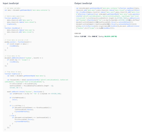
Regular VS Minified JavaScript

When it comes to optimizing website performance, reducing file sizes plays a vital role in achieving faster load times and improved user experience. Just as individuals strive to shed pounds through diet and exercise, minimizing the size of your website files is crucial for achieving a lean and efficient online presence. In this section, we’ll explore the importance of file size reduction and delve into effective techniques for compressing HTML, CSS, and JavaScript files, as well as provide tips for code minification and removing unnecessary elements.

  • Importance of File Size Reduction:
    Similar to how excess weight burdens physical performance, large file sizes are detrimental to website performance. Hefty HTML, CSS, and JavaScript files take longer to download, increasing load times and potentially frustrating users. By minimizing file sizes, you can significantly reduce the time it takes for your website to load, resulting in faster page rendering and improved overall performance.
  • Techniques for Compressing HTML, CSS, and JavaScript Files:
    There are various techniques and tools available for compressing HTML, CSS, and JavaScript files, effectively reducing their size without compromising functionality. One common method is minification, which involves removing unnecessary spaces, line breaks, and comments from the code, resulting in a more compact file. Additionally, you can use compression algorithms, such as Gzip, to further reduce file sizes by compressing them before sending them to the user’s browser.
  • Tips for Code Minification and Removing Unnecessary Elements:
    Code minification goes beyond compressing files. It involves optimizing the code structure by removing redundant or unused elements, such as unused CSS styles, unused JavaScript functions, or redundant HTML tags. By eliminating unnecessary code, you can significantly reduce file sizes and improve website performance. Additionally, consider removing any unused or unnecessary images, fonts, or media files that contribute to the overall weight of your website.

Implementing these techniques and applying code minification practices can effectively reduce the file sizes of your HTML, CSS, and JavaScript files, promoting faster load times and a more streamlined user experience. Remember, just as shedding excess weight leads to improved physical performance, minimizing file sizes paves the way for a faster, more efficient website.

Image Optimization

Minimizing image file size is a crucial aspect of website dieting. Images often constitute a significant portion of a website’s file size, making them a prime target for optimization. In this section, we’ll explore the significance of image optimization in improving website speed and delve into the world of image compression techniques and formats. We’ll also discuss best practices for resizing, compressing, and selecting the appropriate image format.

  • Significance of Image Optimization:
    Images play a vital role in enhancing the visual appeal of a website, but they can also contribute to slower load times if not properly optimized. Large image files can significantly increase the page weight, leading to longer download times and a slower user experience. By optimizing images, you can strike a balance between visual quality and file size, resulting in faster load times and improved website performance.
  • Image Compression Techniques and Formats:
    Finding the right balance of image quality and file size is the key to image optimization. There are two primary types of image compression: lossless and lossy. Lossless compression retains all image data while reducing file size, making it ideal for graphics and illustrations. Lossy compression, on the other hand, selectively discards image data to achieve greater file size reduction, making it suitable for photographs and images with subtle details. Carefully consider the various image formats, such as JPEG, PNG, and WebP, as they each offer different compression capabilities and are suited for specific types of images.
  • Best Practices for Resizing, Compressing, and Choosing Image Formats:
    To optimize images effectively, it’s crucial to follow best practices. Start by resizing images to the appropriate dimensions needed for your website. Avoid using large images and scaling them down, as this can result in unnecessary file bloat. Next, compress the images using appropriate compression techniques and tools. Experiment with different compression settings to find the optimal balance between file size and visual quality. Lastly, choose the right image format based on the content and purpose of the image. JPEG is commonly used for photographs, PNG for graphics and images with transparency, and WebP for modern browsers that support it. Even better yet, SVG format enables you to use vector graphics for crisp edges and super small file size.

By implementing these image optimization practices, you can significantly reduce the file sizes of your images while maintaining visual quality. Remember, just as shedding excess weight improves physical performance, optimizing images contributes to a faster, more efficient website.

Caching and Content Delivery Networks (CDNs)

Just as maintaining a healthy metabolism aids in maintaining weight loss, leveraging caching and CDNs can further boost your website’s speed and performance. In this section, we’ll explore the power of caching and CDNs in optimizing content delivery, resulting in faster load times and improved user experiences.

Browser caching allows web browsers to store static resources of a website, such as images, CSS files, and JavaScript files, locally on a user’s device. By caching these resources, subsequent visits to the website can be quicker since the browser doesn’t need to download them again. Caching reduces the number of HTTP requests and minimizes the time required to fetch resources, resulting in improved load times and overall website performance.

Content Delivery Networks are globally distributed networks of servers that store cached copies of your website’s static content in multiple locations. When a user requests your website, the CDN serves the content from the server closest to the user, reducing the distance and network latency. CDNs not only improve load times for users located far from your server but also help handle traffic spikes and distribute bandwidth more efficiently.

Tips for Implementing Caching and Utilizing CDNs Effectively:

  • Set proper cache headers: Ensure that your web server is configured to send appropriate cache headers, such as Cache-Control and Expires, to instruct browsers on how long to cache resources. Use versioning or cache-busting techniques to ensure updated resources are fetched when necessary.
  • Utilize CDNs: Consider using a reputable CDN provider to distribute your website’s static content globally. Research and compare different CDN options based on performance, coverage, and pricing to find the most suitable solution for your needs.
  • Implement dynamic caching: If your website has dynamic content that can be cached, implement server-side caching mechanisms to reduce the load on your web server and improve response times. CMS platforms like WordPress have plugins available to set this up.
  • Regularly monitor and update caching settings: Periodically review and adjust caching settings to accommodate changes in your website’s content and resources. Update cache expiration times when necessary to ensure users receive the latest versions of your content.

Lazy Loading and Deferred Loading

Sometimes being a little lazy can be a good thing, especially when it comes to website performance optimization. In this section, we’ll delve into the benefits of lazy loading and deferred loading techniques, and how they can significantly improve your website’s speed and efficiency.

Benefits of Lazy Loading and Deferred Loading:

  • Faster Initial Page Load: Lazy loading and deferred loading techniques allow you to load only the essential content when a user first visits your website, reducing the initial page load time.
  • Improved User Experience: By loading content progressively as users scroll or interact with your website, you can provide a smooth and uninterrupted browsing experience, avoiding long loading times and reducing the risk of visitors bouncing away.
  • Bandwidth Optimization: Lazy loading helps conserve bandwidth by loading images and other resources only when they are needed, particularly useful for websites with extensive media content.
  • Reduced Server Load: With lazy loading implemented, your server is given fewer simultaneous requests, reducing the strain on your web hosting infrastructure during peak traffic periods.

How These Techniques Improve Website Performance:

  • Lazy Loading: Lazy loading is a technique that defers the loading of non-critical resources, such as images, videos, or ads, until they are about to come into the user’s viewport. This approach significantly speeds up the initial page load time by only loading the visible content first, while the rest loads as the user scrolls down the page.
  • Deferred Loading: Deferred loading involves delaying the loading of certain scripts or assets that are not necessary for the initial rendering of the page. By deferring the loading of these resources until after the critical content has been loaded, you ensure that your website’s core functionality is not affected.

Implementing Lazy Loading Images, Scripts, and Other Assets:

  • Lazy Loading Images: Use JavaScript libraries or built-in HTML attributes like loading="lazy" to instruct images to lazy load. This allows images below the fold to load only when they are close to becoming visible to the user.
  • Lazy Loading Scripts: Employ asynchronous loading techniques for non-critical scripts, allowing the browser to continue rendering the page without waiting for the scripts to fully load.
  • Deferred Loading of Non-Critical Resources: Identify resources that can be loaded after the initial page load, such as social media widgets, external scripts, or third-party integrations. Load them dynamically once the primary content has been rendered.

Remember to test and optimize the lazy loading and deferred loading implementations to ensure they work seamlessly across different browsers and devices. Monitoring your website’s performance and making necessary adjustments will help you strike the right balance between load time and content delivery.

Optimizing Third-Party Scripts and Plugins

While third-party scripts and plugins can enhance the functionality and features of your website, they can also introduce potential bottlenecks and negatively impact performance. In this section, we’ll discuss the importance of evaluating and optimizing third-party scripts and plugins to ensure they don’t hinder your website’s speed and efficiency.

Evaluating and Optimizing Third-Party Scripts and Plugins:

  • Performance Impact: Third-party scripts and plugins can increase the overall load time of your website, as they often require additional HTTP requests, DNS lookups, and can be resource-intensive.
  • Dependency Risks: Relying heavily on third-party resources makes your website susceptible to performance issues, downtime, or compatibility conflicts.
  • User Experience: Slow-loading or malfunctioning third-party components can lead to a poor user experience, frustrating visitors and potentially driving them away.

Reducing Dependencies and Minimizing the Impact of External Resources:

  • Evaluate the Necessity: Assess how critical each third-party script or plugin is for your website. Remove or replace those that aren’t essential to your website’s core functionality.
  • Minify and Concatenate: Minify and concatenate multiple scripts and stylesheets to reduce the number of requests and file sizes. This helps optimize the delivery of third-party resources.
  • Load Asynchronously: Load third-party scripts asynchronously to prevent them from blocking the rendering of your web page. This ensures that the critical content loads first and improves the perceived performance.
  • Prioritize Critical Resources: Identify critical third-party scripts or plugins required for the initial page rendering and load them first. Load non-essential components later or on-demand as needed.
  • Monitor Performance: Regularly monitor the performance impact of third-party resources using web performance tools. Identify and address any bottlenecks or issues that may arise.

Remember to keep an eye on updates or alternatives for third-party scripts and plugins. Periodically reassess their performance and consider replacing outdated or poorly performing ones with more efficient options.

Performance Testing and Monitoring

To ensure your website is running at its optimal speed and efficiency, it’s crucial to regularly perform performance testing and monitoring. This section introduces you to valuable tools and techniques that help measure website speed, identify bottlenecks, and make improvements.

Tools for Performance Testing and Monitoring:

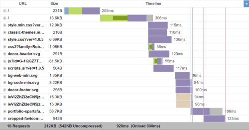
Waterfall Chart by GTmetrix
  • Google PageSpeed Insights: A popular tool that analyzes your website’s performance, providing insights and suggestions for improvement.
  • GTmetrix: This tool offers detailed performance reports, including page load times, waterfall charts, and recommendations for optimization.
  • WebPageTest: An advanced testing tool that allows you to simulate real-world browsing scenarios and offers in-depth performance analysis.
  • Pingdom: Provides performance monitoring, uptime monitoring, and alerts to help you track and improve your website’s speed.
  • Lighthouse: Built into the Google Chrome browser, Lighthouse audits your website’s performance, accessibility, SEO, and more.

Tips for Measuring Website Speed and Identifying Bottlenecks:

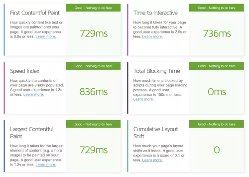
Key Performance Metrics
  • Conduct Regular Speed Tests: Perform periodic speed tests using various tools to gain insight into your website’s performance.
  • Analyze Waterfall Charts: Examine waterfall charts provided by performance testing tools to identify resource-heavy elements and potential bottlenecks.
  • Focus on Key Metrics: Pay attention to metrics like time to first byte (TTFB), first contentful paint (FCP), and largest contentful paint (LCP) to gauge your website’s speed.
  • Use Browser Developer Tools: Leverage the developer tools built into browsers to analyze network requests, inspect DOM elements, and monitor performance metrics.
  • Monitor Server Response Time: Keep an eye on your server response time and ensure it’s optimized for quick and efficient handling of requests.

Start Shedding the Kilobytes

In this website weight loss guide, we have explored the importance of optimizing web design for speed and efficiency. Just as shedding excess weight can transform your health and well-being, optimizing your website’s performance can have a significant impact on user experience, SEO rankings, and overall success.

Now, armed with these powerful techniques, it’s time to take action. Implementing these optimizations will help you create a website that loads swiftly, engages visitors, and drives conversions. Remember, a faster website not only enhances user experience but also improves search engine rankings, leading to increased visibility and traffic.

So, go forth and optimize! Your users will thank you, search engines will reward you, and your online presence will shine brighter than ever before. Here’s to a fast, efficient, and successful website!

How to Choose the Best Web Designer for You

Choosing the right web designer is a crucial decision that can greatly impact the success of your online presence. A well-designed website not only attracts visitors but also engages and converts them into customers. With countless web designers available in the market, it’s essential to understand how to navigate through the options and find the perfect match for your project. From defining your project requirements to evaluating experience, communication skills, pricing, and more, here you will gain the knowledge and insights to make an informed decision. So, let’s dive in and discover the key elements that will help you choose the ideal web designer for your specific needs.

Defining Your Project Requirements

Before embarking on the journey of finding the right web designer, it’s crucial to have a clear understanding of your project requirements. This involves assessing your website needs and goals to ensure you find a designer who can effectively meet your expectations. Start by identifying the purpose of your website. Is it an e-commerce platform, a portfolio site, a blog, or something else entirely? Understanding the intended functionality and scope of your website will help you narrow down your search for a web designer with expertise in that particular area.

In addition to the overall purpose, it’s important to pinpoint specific features and requirements that your website should have. Consider aspects such as responsive design, SEO optimization, content management system (CMS) integration, e-commerce capabilities, and any other unique functionalities that are essential for your project. By defining these requirements upfront, you’ll be better equipped to evaluate potential web designers and ensure they have the necessary skills and experience to deliver on your vision. So take the time to assess your project needs thoroughly and make a detailed list of the features and functionalities you expect from your website.

Researching Potential Web Designers

Once you have a clear understanding of your project requirements, it’s time to start researching potential web designers who can bring your vision to life. There are several avenues you can explore to find suitable candidates.

  1. Online Platforms and Directories: Start by searching on reputable online platforms and directories that connect businesses with web designers. Websites like Behance and Dribbble showcase portfolios of talented designers, allowing you to browse through their work and get a sense of their style and expertise. Additionally, directories specific to web design, such as Clutch or Upwork, can provide you with a list of qualified professionals along with client reviews and ratings.
  2. Portfolio and Case Study Review: Take the time to review the portfolios and case studies of potential web designers. Look for examples of their previous work that align with your project requirements. Pay attention to the design aesthetics, functionality, and user experience of the websites they have developed. This will give you an insight into their capabilities and whether their style matches your preferences.
  3. Recommendations and Referrals: Reach out to peers, colleagues, and industry professionals for recommendations. Ask for referrals from individuals who have had positive experiences working with web designers in the past. Their firsthand feedback can provide valuable insights and help you gauge the reliability and professionalism of potential candidates.

As you conduct your research, make a list of promising web designers who align with your project requirements. Note their contact information, portfolio links, and any additional details that will aid in your evaluation process. Remember, thorough research is key to finding a web designer who can deliver the results you desire.

Evaluating Experience and Expertise

Once you have compiled a list of potential web designers, it’s essential to evaluate their experience and expertise to ensure they are well-equipped to handle your project. Here are some key factors to consider during the evaluation process:

  1. Industry Experience: Assess the web designer’s experience in the industry. Look for professionals who have worked on a diverse range of projects and have a proven track record of delivering successful websites. Experience within your specific niche or industry can be advantageous as they will be familiar with the unique requirements and challenges it presents.
  2. Technological Knowledge: Verify the web designer’s knowledge of relevant technologies and tools. Inquire about their proficiency in web development languages such as HTML, CSS, and JavaScript. Additionally, consider their familiarity with content management systems (CMS) like WordPress, e-commerce platforms, responsive design techniques, and other tools that may be essential for your project.
  3. Client Testimonials and References: Request client testimonials or references from the web designer. Reach out to their previous clients and inquire about their experience working with the designer. Ask about their communication, project management skills, adherence to deadlines, and overall satisfaction with the end result. This feedback can provide valuable insights into the designer’s professionalism and client satisfaction.

Evaluating the experience and expertise of potential web designers can give you the assurance that they have the necessary skills and knowledge to meet your project requirements. This process will help you narrow down your options and select a web designer who can deliver a high-quality website that aligns with your vision.

Considering Budget and Pricing

When choosing a web designer, it’s essential to consider your budget and pricing options. Web design pricing can vary depending on factors such as the complexity of the project, the scope of work, and the experience and reputation of the designer. Here are some key points to keep in mind when evaluating the budget and pricing aspects:

  1. Pricing Models: Web designers may use different pricing models for their services. The most common models include fixed pricing, hourly rates, and project-based pricing. Fixed pricing provides a set cost for the entire project, while hourly rates charge based on the time spent on the project. Project-based pricing offers a customized quote based on the specific requirements. Understand the pricing models used by the web designers you are considering to determine which one aligns best with your project and budget.
  2. Requesting Quotes: Contact multiple web designers and request quotes for your project. Provide them with detailed project requirements and ask for a breakdown of costs. This will help you understand what is included in the pricing and make an informed comparison among the different options. Keep in mind that the lowest price doesn’t always indicate the best value, so consider the overall value proposition and the designer’s capabilities along with the cost.
  3. Value-added Services: Consider the value-added services offered by the web designer within the proposed budget. These may include ongoing support, maintenance packages, training, or additional features. Assess the overall value proposition and consider the long-term benefits and return on investment that the designer can provide.

Remember, the budget should be viewed as an investment in your online presence and business growth. While it’s important to be mindful of costs, prioritize quality, expertise, and a good working relationship with the web designer. A well-executed web design project can yield significant returns and contribute to the success of your online presence.

Ongoing Support and Maintenance

After your website is launched, it’s important to consider the ongoing support and maintenance provided by the web designer. A well-maintained website is crucial for its optimal performance, security, and longevity. Here are some key factors to consider when assessing the web designer’s ongoing support and maintenance:

  1. Post-Launch Support: Inquire about the web designer’s post-launch support services. Will they be available to address any issues or questions that arise after the website is live? It’s important to have a reliable point of contact who can assist you in case of technical difficulties or updates.
  2. Website Maintenance and Updates: Discuss the web designer’s approach to ongoing maintenance and updates. Will they offer regular backups, performance optimizations, and address security vulnerabilities? Understanding how they proactively maintain and update websites will give you confidence in the long-term stability and security of your online presence.
  3. Communication Channels: Clarify the communication channels and response times for ongoing support and maintenance. Ensure that you have a clear understanding of how to reach the web designer in case of emergencies or urgent issues.

Ongoing support and maintenance are essential for a successful web design project. Choosing a web designer who offers reliable and efficient support services will give you peace of mind, knowing that your website is in good hands even after the initial development phase.

Checking for these services can ensure that the web designer is committed to the long-term success and smooth operation of your website. This level of support contributes to the overall value and satisfaction of your web design investment.

Additional Services and Specializations

When choosing a web designer, it’s important to consider their range of additional services and products. While their primary focus may be web design and development, many web designers offer supplementary services that can enhance your online presence. Here are some key points to consider:

  1. Search Engine Optimization (SEO): A well-designed website is only effective if it can be easily discovered by search engines. Inquire whether the web designer offers SEO services or collaborates with SEO professionals. Having a website that is optimized for search engines can significantly improve its visibility and organic traffic.
  2. Content Creation: Compelling and engaging content plays a vital role in attracting and retaining website visitors. Check if the web designer provides content creation services, such as copywriting, graphic design, photography, or multimedia production. Having a unified approach to both design and content creation can result in a cohesive and impactful online presence.
  3. Branding and Identity: Consider whether the web designer has expertise in branding and identity development. A strong brand identity is essential for creating a memorable and recognizable online presence. Assess if the web designer can help you establish a consistent brand image through the design elements and visual aesthetics of your website.

Depending on your specific needs and goals, these supplementary services can provide added value, convenience, and expertise to elevate your website’s performance and impact.

Making the Final Decision

After conducting thorough research, evaluating different aspects, and considering various factors, it’s time to make the final decision on choosing the right web designer for your project. Here are some key steps to help you make an informed decision:

  • Process the Data: Review all the information you have gathered throughout the evaluation process. Consider factors such as experience, expertise, client reviews, communication skills, pricing, additional services, and specializations. Determine which web designer aligns best with your project requirements, goals, and budget.
  • Conducting Interviews or Consultations: If possible, schedule interviews or consultations with the shortlisted web designers. This provides an opportunity to discuss your project in detail, ask specific questions, and gauge their understanding of your needs. Use this interaction to assess their communication skills, responsiveness, and ability to translate your vision into a tangible website.
  • Evaluating Proposals or Quotes: Review the proposals or quotes provided by the web designers. Pay attention to the scope of work, deliverables, timelines, and pricing details. Compare the proposals based on the value they offer and their alignment with your project requirements.
  • Seeking Referrals or Recommendations: If you’re having difficulty making a decision, consider seeking referrals or recommendations from clients or colleagues who have worked with the web designers you are considering. Their firsthand experiences and feedback can provide valuable insight to help you make a more informed choice.

By weighing all the factors, conducting interviews or consultations, evaluating proposals or quotes, seeking referrals, and trusting your instincts, you can confidently make the final decision on choosing the right web designer. Remember, selecting the right web designer is a critical step in ensuring the success of your website project and achieving your online goals.

While it’s important to analyze all the objective factors, don’t underestimate the power of your instincts. Trust your gut feeling when it comes to assessing the compatibility, trustworthiness, and enthusiasm of the web designer. A good working relationship and mutual understanding are crucial for a successful collaboration.

Once you have made your decision, communicate your choice to the selected web designer and initiate the project kick-off process. Maintain open lines of communication throughout the project to ensure a smooth and collaborative working relationship.

Good luck with your web designer selection journey, and may you find a skilled and reliable professional who can transform your ideas into a stunning website that exceeds your expectations.

Multiply Your Web Design Skills Exponentially With CSS Calculations

CSS calculations allow web developers to perform arithmetic calculations directly within CSS. This capability allows for more flexible and responsive web design, where styles can be adapted based on the dimensions of the viewport or other factors. In this article, we will explore this powerful CSS3 feature and provide code examples to demonstrate their use. Topics to be covered include various types of calculations, units of measurement, and browser compatibility. By the time you’re done reading, you will have a better understanding of how CSS calculations can be used to create dynamic and engaging web designs.

Understanding CSS Units

CSS calculations require an understanding of the different units of measurement used in CSS. These units can be divided into two categories: absolute units and relative units.

Absolute units, as the name implies, are fixed values that don’t change regardless of the context. Common examples of absolute units include pixels (px), points (pt), inches (in), and centimeters (cm).

Relative units, on the other hand, are values that are calculated based on the context in which they are used. This means that they can change depending on the size and properties of the parent element or browser window. Examples of relative units include em, rem, and percentage (%).

Two more essential relative units worth mentioning are viewport width (vw) and viewport height (vh). These units represent 1% of the viewport width and height, respectively. They allow elements to be sized relative to the dimensions of the viewport. For example, using “50vw” sets the width of an element to be 50% of the viewport width, or the browser window. Similarly, “50vh” sets the height to be 50% of the viewport height. These units are useful for creating responsive designs that adapt to different screen sizes and devices.

It’s important to choose the appropriate unit for your calculations based on the context and the desired result. For example, if you’re designing for print, using absolute units like inches or centimeters may be more appropriate. However, for web design, using relative units like em or rem can provide more flexibility and responsiveness.

Basic CSS Calculations

CSS calculations involve basic arithmetic operations like addition, subtraction, multiplication, and division. These calculations should be enclosed inside a calc() function and can be performed on any numerical CSS property value, such as length, width, margin, and padding. For example, if you want to subtract a padding of 5 pixels from the width of an element, you can write it in CSS using the subtraction operator as follows:

width: calc(100% - 5px);

Multiplication and division can also be used in CSS calculations. For instance, if you want to increase the font size of an element by 20%, you can write it in CSS using the multiplication operator as follows:

font-size: calc(16px * 1.2);

It’s important to note that calculations in CSS follow the same order of operations as in mathematics. To control the order of operations, you can use parentheses to group the operations as needed. For example:

width: calc((100% - 20px) / 2);

This code first subtracts 20 pixels from 100%, and then divides the result by 2.

Advanced CSS Calculations

CSS offers more advanced calculations beyond basic arithmetic. These calculations involve the use of trigonometric functions, logarithmic functions, and other mathematical operations. For instance, you can use sin(), cos(), and tan() functions to calculate values based on angles, or use log(), exp(), and sqrt() functions to perform logarithmic, exponential, and square root operations respectively.

Here’s an example of using the calc() function to perform an advanced CSS calculation:

.element {
    width: calc(sqrt(25) * 20px);
}

In this example, the width property of an element is set using the calc() function. The sqrt() function is used to calculate the square root of 25, and the resulting value is multiplied by 20px. This can be used for creating dynamic width calculations based on square root values.

CSS variables can also be used in calculations. This is particularly useful when you need to perform calculations based on dynamic values. Here’s an example of using CSS variables in a calculation:

:root {
    --base-size: 16px;
}

div {
    font-size: calc(var(--base-size) * 1.5);
}

In the example above, we’re using a CSS variable named --base-size to set the base font size to 16px. We’re then using calc() to multiply var(--base-size) by 1.5 to determine the font size of a div element.

When using advanced CSS calculations, it’s important to be mindful of performance implications. Complex calculations can slow down page load times and negatively impact user experience. It’s best to keep calculations as simple as possible and test them thoroughly to ensure they work as expected.

Common Use Cases for CSS Calculations

CSS calculations can be used in a variety of ways to make web design more efficient and responsive. Here are some common use cases:

Responsive Design: CSS calculations are particularly useful for creating responsive design that adapts to different screen sizes and resolutions. With calculations, designers can create flexible layouts that adjust to the available space, without needing to define specific pixel widths for each element. For example, calculations can be used to specify the width of a container as a percentage of the available screen width, or to adjust font sizes based on the viewport size.

.container {
    width: calc(50% - 20px);
    /* the container will be half of the available space, minus 20 pixels */
}

@media screen and (max-width: 768px) {
    .container {
        width: calc(100% - 40px);
        /* the container will take up all available space, minus 40 pixels */
    }
}

Grid Systems: CSS calculations can also be used to create flexible grid systems, where the column widths are determined by calculations rather than fixed pixel values. For example, a three-column layout could be created using calc(33.33% - 20px) for the column width, with 20 pixels of gutter space between each column.

.col {
    float: left;
    margin-right: 20px;
    width: calc(33.33% - 20px);
}

.col:last-child {
    margin-right: 0;
}

Typography: CSS calculations can be used to create dynamic typography that scales based on the size of the browser window. For example, the vw unit can be combined with calculations to create font sizes that adjust to the screen width.

h1 {
    font-size: calc(4vw + 20px);
    /* the font size will be 4% of the viewport width, plus 20 pixels */
}

p {
    font-size: calc(1em + 0.5vw);
    /* the font size will be 1em plus 0.5% of the viewport width */
}

By using CSS calculations in these and other ways, designers can create more efficient and flexible layouts that adapt to the needs of the user and the device.

Performance Considerations

While CSS calculations can be useful for creating dynamic and responsive web designs, they can also impact website performance if not used appropriately. This is because the browser needs to perform each calculation before the page can be rendered.

To optimize CSS calculations for performance, it’s important to avoid unnecessary calculations and minimize the number of times they are used. This can be achieved by simplifying the calculations and reducing the number of elements that use them.

To identify performance bottlenecks with CSS calculations, there are several tools available. The Chrome DevTools Performance panel, for example, can be used to measure the performance of a website and identify areas that need improvement. Other tools like PageSpeed Insights and WebPageTest can also provide insights into website performance and offer suggestions for optimization.

Unleash the Power of CSS Calculations

CSS calculations are a powerful tool that can improve the flexibility and responsiveness of your website design. By understanding the different CSS units and basic arithmetic calculations, you can create more dynamic and engaging layouts. Advanced CSS calculations offer even more possibilities, allowing you to create complex animations and interactions on your website. However, it’s important to consider performance implications and optimize your CSS calculations for faster page load times. With the right tools and best practices, you can take advantage of CSS calculations to create more compelling and effective web designs.

To continue learning about CSS calculations and improving your web design skills, there are many resources available online. Some recommended resources include CSS Tricks and W3Schools. These websites offer tutorials, examples, and documentation on CSS calculations and other web design topics.

I encourage you to experiment with CSS calculations and try incorporating them into your own web design projects. By utilizing the power of CSS calculations, you can create websites that are more responsive, dynamic, and engaging for your users.

Protecting Your WordPress Site From Hackers

Securing your WordPress website is crucial for protecting your online presence, data, and reputation. With over 40% of websites using WordPress, it is a popular target for hackers looking to exploit vulnerabilities and gain unauthorized access. The consequences of a security breach can be severe, ranging from data theft and website defacement to reputation damage and legal liabilities. In this article, we will provide an overview of the common types of attacks and outline actionable steps to help you protect your WordPress website from attackers.

Types of Attacks

WordPress websites are often targeted by hackers due to their popularity and the vast number of websites built on the platform. Common types of attacks include:

  • Brute Force Attacks: In this type of attack, hackers use automated tools to guess usernames and passwords to gain access to the site.
  • SQL Injection Attacks: This type of attack targets the site’s database, allowing the hacker to manipulate, delete, or extract data.
  • Cross-Site Scripting (XSS) Attacks: This type of attack injects malicious code into a website, which can then be executed by unsuspecting users who visit the site.
  • Malware Infections: Hackers can use malware to gain access to the site or infect visitors’ devices with viruses or other malicious software.
  • Denial of Service (DoS) Attacks: These attacks overwhelm a website with traffic, making it inaccessible to legitimate users.

It is important to take steps to protect your website from these and other types of attacks.

Keep WordPress and Plugins Updated

Keeping your WordPress website and its plugins updated is one of the most important ways to protect it from potential vulnerabilities. Hackers can easily exploit known security weaknesses in outdated software to gain access to your website and sensitive data. It’s essential to update your WordPress core, themes, and plugins regularly to avoid security breaches.

To update WordPress, simply go to the Dashboard and click on the “Updates” menu. From there, you can update your WordPress core, themes, and plugins. Before updating, it’s a good idea to backup your website to ensure that you can restore it in case of any issues.

It’s also essential to make sure that your plugins and themes are compatible with the latest version of WordPress. Incompatible plugins or themes can cause website crashes or even create security vulnerabilities, so be sure to check compatibility before updating.

Strengthen Login Credentials

One of the first things to do to protect your WordPress site from hacking attempts is to ensure that you have strong login credentials. Here are some best practices to follow:

Choose strong passwords. A strong password should be at least 12 characters long and include a mix of upper and lowercase letters, numbers, and symbols. Avoid using easily guessable information, such as your name or birthdate, and don’t reuse passwords across different accounts.

Use two-factor authentication (2FA). 2FA provides an additional layer of security to your login credentials by requiring a second form of authentication beyond your username and password. This can be in the form of a unique code sent to your phone or a biometric scan.

WordPress has several plugins that enable 2FA. Two popular options are Google Authenticator and Authy. You can also use security plugins such as Wordfence or iThemes Security, which offer a range of security features including 2FA. Once you have enabled 2FA, you will be prompted to enter the additional code every time you log in.

Protect your login page with a captcha. A captcha is a security feature that requires the user to prove they are a human and not an automated script. This can help prevent brute force attacks and other automated login attempts. Some of the most trusted captcha services are reCAPTCHA by Google and Turnstile by Cloudflare. There are several WordPress plugins available that can help you add a captcha to your login page automatically. This is a great extra layer of security for your website to help keep it safe from malicious attacks.

Limit Login Attempts

One of the most common ways hackers attempt to gain access to a WordPress site is through brute force attacks, in which they try a multitude of username and password combinations until they get in. To protect your site against this type of attack, it’s important to limit login attempts.

Limiting login attempts means that after a certain number of failed attempts to log in to the site, the user is locked out. This makes it much more difficult for hackers to gain access.

There are a few ways to limit login attempts. One is to use a plugin that is specifically designed to limit login attempts. Another is to edit your site’s .htaccess file to block certain IP addresses after a certain number of failed login attempts.

Using a plugin is usually the easiest option, and there are several available in the WordPress plugin repository. Some popular options include Login Lockdown, WP Limit Login Attempts, and Limit Login Attempts Reloaded. These plugins allow you to set the number of failed login attempts that will trigger a lockout, as well as the duration of the lockout.

By limiting login attempts, you can greatly reduce the risk of your site being hacked through brute force attacks.

Use Security Plugins

One of the easiest ways to secure your WordPress website is to use security plugins. There are many security plugins available that can help protect your site from common attacks. Some of the popular security plugins include Wordfence, iThemes Security, and Sucuri.

Security plugins typically offer features like malware scanning, brute-force attack prevention, and login protection. They can also monitor your website for suspicious activity and send you alerts if anything seems amiss.

When choosing a security plugin, it’s important to consider factors like the level of protection it offers, ease of use, and cost. Some plugins offer basic protection for free, while others may require a subscription or one-time fee for more advanced features.

It’s also important to regularly update your security plugin to ensure that it is providing optimal protection against new and emerging threats.

Use HTTPS and SSL Certificates

HTTPS Security

HTTPS (HyperText Transfer Protocol Secure) and SSL (Secure Sockets Layer) certificates are security protocols that encrypt communication between a web server and a user’s browser. Using HTTPS and SSL helps to protect sensitive information that may be transmitted between a user and a website, such as login credentials or payment information.

Encrypting your website not only adds an extra layer of security, but it also enhances the credibility of your website in the eyes of your visitors. Most web hosting providers offer free SSL certificates or easy integration with third-party SSL providers.

To implement HTTPS and SSL on your website, you can start by acquiring an SSL certificate and installing it on your web server. Some web hosting providers offer a one-click SSL installation process, while others require manual installation. Once installed, you can configure your WordPress site to use HTTPS by updating the site URL in the WordPress settings or by using a plugin to force HTTPS.

Backup Your Website

Backups are critical to protecting your WordPress website from data loss in the event of a hack or another issue. There are many ways to backup your website, including using plugins or backing up manually. Here are some key points to keep in mind:

  • Why it’s important to backup your website: A backup is like an insurance policy for your website. If your website is hacked or otherwise damaged, a backup ensures that you can restore your website to its previous state quickly and easily.
  • How to backup your website: You can backup your website manually by exporting your website’s files and database or by using a plugin that automates the process. Many hosting providers also offer backup services.
  • Tips for ensuring successful backups: Make sure to backup your website regularly, preferably daily or weekly. Test your backups to ensure that they are working correctly and that you can successfully restore your website from them. Keep your backups in a secure location, such as a cloud storage service or an external hard drive, separate from your website’s server.

With a backup plan in place, you can rest easy knowing that you can quickly restore your site should something go wrong.

Monitor Your Website for Suspicious Activity

Keeping an eye on your website for suspicious activity is essential to prevent or recover from a possible security breach. Some common signs of suspicious activity include unfamiliar user accounts, failed login attempts, changes in file size or permissions, and malware warnings from search engines.

To monitor your website for suspicious activity, you can use various tools such as security plugins or monitoring services. For instance, plugins like Sucuri or Wordfence can scan your website for vulnerabilities and send you alerts for potential threats. Additionally, Google Search Console can notify you if your website is hacked or infected with malware.

It’s also prudent to set up notifications for any suspicious activity. You can do this by configuring your website’s security plugin or using a monitoring service that provides alerts via email, text message, or push notification.

Remember to check your website regularly and address any suspicious activity immediately. Ignoring it could lead to significant damage to your website’s security and reputation.

Don’t Wait Until It’s Too Late

Protecting your WordPress website from hackers should be a top priority. By following the tips outlined in this article, you can significantly reduce the risk of a security breach. By implementing these security measures, you can help ensure the safety and security of your website and its users. Additionally, there are many resources available for learning more about website security, such as online tutorials, forums, and security experts. Don’t wait until it’s too late; take action now to protect your WordPress website from potential security threats.

How To Create and Use QR Codes in Your Marketing

QR codes, also known as Quick Response codes, have become increasingly popular over the past decade. Originally developed for the automotive industry, they have now become a versatile tool for businesses and individuals alike. QR codes are two-dimensional barcodes that can store a variety of information, such as URLs, contact information, and product details. They are scanned using a smartphone camera and a QR code reader app, making them an effective and universal way to share information digitally. In this article, we will discuss how to create and use QR codes, as well as some best practices to get the most out of them.

Capabilities of QR Codes

QR codes have become increasingly popular in recent years due to their versatility and effectiveness as a marketing tool. Here are some of the key benefits of using QR codes:

  • Easy to use: QR codes are easy to scan and use, making them a convenient way for customers to quickly access information or promotions.
  • Cost-effective: QR codes are free or inexpensive to create and can be printed on a wide range of materials, making them a cost-effective way to promote your business or products.
  • Versatile: QR codes can be used in a variety of ways, from directing customers to a website or social media page to providing product information or coupons.
  • Trackable: Many QR code generators include tracking capabilities, allowing you to monitor the number and the location of scans, providing valuable data for marketing analysis.
  • Innovative: Using QR codes can help to give your brand a modern and innovative image, particularly when used in creative ways.
Basic QR Code
Basic QR Code

Here are a few examples of how businesses can use QR codes effectively:

  • Restaurants can include QR codes on their menus that direct customers to nutrition information, online ordering, or reservation systems.
  • Retailers can include QR codes on product packaging that lead customers to product videos, reviews, or special promotions.
  • Real estate agents can include QR codes on their flyers and signage that direct potential buyers to virtual tours of properties.
  • Event organizers can include QR codes on tickets that provide event details, directions, and links to social media pages.
  • Business cards can feature a QR code in vCard format containing contact information.

QR codes provide an easy, cost-effective, and versatile way for businesses and marketers to engage with customers and promote their products or services.

Creating QR Codes

QR codes can be easily generated using a variety of online tools, both free and paid. Here’s a look at how you can create your own QR codes:

  1. Choose a QR code generator: There are many QR code generators available online, some free, some paid. Some popular ones include QR Code Monkey, Scanova, and QR Stuff.
  2. Select the type of content: QR codes most commonly link to a URL, but they can also contain other information, such as plain text, location coordinates, or contact information. Consider the purpose of the code and enter the right type accordingly.
  3. Customize the design: While basic QR codes are black and white, many generators allow you to customize the design of the code, such as changing the colors, adding a logo, or other design elements. This customization makes your codes more recognizable and helps them stand out from the competition.
  4. Deploy the QR code: Once you’re satisfied with the design, download or export the QR code in a high-quality image format such as SVG, EPS, or PNG.

It’s important to test the QR code before using it to ensure that it works properly. You can do this by scanning it with a QR code reader app on your smartphone. Creating your own QR codes is easy and cost-effective, making it a great tool for businesses of all sizes.

Using QR Codes

Branded and Stylish QR Code

QR codes can be a powerful marketing tool when used correctly. Here are some best practices for incorporating QR codes into your marketing strategy:

  • Make it easy to scan: QR codes should be placed in a location that is easily accessible and scannable for customers. Avoid placing them in areas with poor lighting or where it may be difficult to reach.
  • Offer value: QR codes should provide something of value to the customer, such as a discount or special offer. This will encourage them to scan the code and take action.
  • Customization: Consider customizing your QR codes to fit your brand. You can change the color, add a logo, or even create a custom shape to make your code more visually appealing.
  • Test, test, test: Before launching any QR code campaign, be sure to test the code to ensure that it works properly. You can use free online tools to test the code, or scan it yourself with multiple devices to ensure compatibility.

Examples of successful QR code campaigns include:

  • Nike: The company used QR codes in a recent campaign to promote their new soccer cleats. Scanning the code took users to a mobile-optimized site where they could view product information, watch videos, and even purchase the cleats directly from their mobile device.
  • Starbucks: The coffee chain used QR codes to promote their mobile payment app. Scanning the code took customers to the app download page, where they could easily download and install the app on their smartphone.
  • Heinz: The ketchup brand used QR codes on their product packaging to provide customers with recipe ideas and cooking tips. Scanning the code took users to a mobile site with a variety of recipe options that included Heinz ketchup as an ingredient.

Error correction is a key feature of QR codes that ensures readability even if the code is partially damaged, distorted, or obscured. This feature is what allows for the inclusion of a logo or other graphic elements within the code itself without affecting its functionality.

Tracking and measuring the success of your QR code campaigns is important for evaluating their effectiveness. You can use tools such as Google Analytics to track the number of hits, the location of scans, and even the time of day the code was scanned. This data can help you make informed decisions about future campaigns and optimize your marketing strategy for maximum impact.

QR codes can be a powerful tool for businesses and marketers to engage with their audience and track their marketing campaigns. With free online tools and paid software available, it’s easy to create custom QR codes that align with your brand and business goals. With some creative planning and thoughtful execution, you can effectively leverage this technology to drive engagement and conversions.

The Best Web Design Tools and Resources

Discovering the right tools and resources can be incredibly helpful for anyone looking to create a website, regardless of their experience level. With the help of the industry’s best creation tools, you can create a website that looks professional, functions seamlessly, and provides an exceptional user experience. In this article, we will explore some of the best web design software and services that are available today. We’ll cover everything from design software and frameworks to online resources and stock photos. By the end of this article, you’ll have a better understanding of what’s available to help you create a stunning website.

Graphic Design Software

Graphic design is a crucial aspect of web design, and there are several tools available to help designers create stunning visuals. In this section, we’ll explore some of the most popular graphic design tools for web design, including:

  • Adobe Creative Cloud is a suite of applications that includes Photoshop, Illustrator, and InDesign. These tools are widely used by designers to create graphics and images for websites.
  • Canva is a user-friendly graphic design tool that offers a wide range of templates, images, and fonts. It’s a great option for designers who don’t have extensive graphic design experience.
  • Sketch is a vector graphics editor that’s specifically developed for web designers. It offers a wide range of tools and features, including grids and guides, that make it easy to create responsive designs.
  • Figma is a cloud-based design tool that allows designers to collaborate in real-time. It offers a range of features for creating responsive designs and supports plugins that can be used to extend its functionality.
  • GIMP is a free and open-source image editor that’s similar to Photoshop. It’s a great option for designers who don’t have the budget for expensive software.

These tools can help designers create stunning graphics and visuals for their websites, making them an essential part of any web design toolkit.

Graphics Resources

Having the right resources for graphic design can make a big difference in the quality of the final product. Here are some of the best graphic design resources to consider:

Stock Photo and Video Websites

  • Pexels: offers high-quality, free stock photos and videos that can be used for personal or commercial projects.
  • Unsplash: a large community-driven platform for free stock photos and videos.
  • Shutterstock: one of the most popular and widely-used stock photo and video websites, offering a massive library of high-quality content for a fee.

Icon Libraries

  • Font Awesome: a popular icon library that offers both free and premium icon sets that can be easily integrated into websites or other design projects.
  • Flaticon: a platform that offers a wide variety of free and premium vector icons, with over 3 million options to choose from.

Color Scheme Generators

  • Coolors: a popular color theme generator that allows users to create custom color palettes or explore pre-made palettes.
  • Adobe Color: a tool that allows users to create and save custom color schemes, as well as explore a vast library of pre-made color palettes.

Typography Resources

  • Google Fonts: a library of free and open-source fonts that can be easily integrated into web projects.
  • Typekit: a font library that offers both free and paid options for web designers looking to expand their typography options.

Having access to these resources can make it easier for designers to create high-quality graphic design elements that will enhance the look and feel of a website.

Wireframing and Prototyping Tools

Wireframing and prototyping are essential steps in the web design process that allow designers to plan and visualize the layout and functionality of a website before development. Here are some of the best wireframing and prototyping tools:

  • Adobe XD is an all-in-one design tool that includes features for wireframing, prototyping, and design. It also includes integrations with other Adobe products, such as Photoshop and Illustrator.
  • InVision is a popular prototyping tool that allows designers to create interactive prototypes and animations. It includes a variety of features for collaboration and testing, making it a great choice for larger teams.
  • Balsamiq is a simple and intuitive wireframing tool that is ideal for quickly creating low-fidelity wireframes. It includes a library of pre-made components and templates, making it easy to create professional-looking wireframes in no time.
  • Axure is a powerful prototyping tool that is popular among UX designers. It includes a variety of features for creating interactive prototypes, including animations, conditional logic, and dynamic content.

When choosing a wireframing or prototyping tool, consider your design needs, team size, and budget. Each tool has its own strengths and weaknesses, so it’s important to choose the one that best fits your specific project requirements.

Front-end Development Resources

Front-end development refers to the coding and design work involved in building the part of a website that users see and interact with. It involves writing code in HTML, CSS, and JavaScript to create the structure, layout, and functionality of a website’s user interface.

HTML and CSS frameworks can be extremely useful for front-end development because they provide pre-designed components and styles that can be easily customized and integrated into a website. Some popular frameworks include Bootstrap, Foundation, and Materialize.

JavaScript libraries and frameworks can also be extremely helpful for front-end development, as they provide pre-written code that can be used to add complex functionality to a website. Some popular libraries and frameworks include jQuery, React, and Vue.js.

Browser development tools are essential for front-end developers because they allow for debugging and testing of website code in real time. These tools can help identify errors and provide insights into how a website is functioning in different browsers and on different devices.

Overall, there are many tools and resources available to front-end developers, and it’s important to choose the right ones for your project and skill level. By utilizing these tools and resources, front-end developers can create beautiful and functional websites that meet the needs of their users.

Back-end Development Resources

Web development requires a combination of front-end and back-end development. While front-end development is all about creating the user interface, back-end development is focused on server-side programming, server management, and database management. Here are some of the best back-end development resources:

  • Node.js – An open-source, cross-platform, back-end JavaScript runtime environment that allows developers to build fast, scalable network applications.
  • PHP – A server-side scripting language that is widely used for web development. It is easy to learn and has a large community of developers.
  • MySQL – An open-source relational database management system that is widely used with web applications.
  • Apache – A web server software that is used to host websites and serve web pages.
  • NGINX – A web server software that is designed to handle high traffic websites and improve website performance.
  • Git – A version control system that is used to track changes in code and collaborate with other developers.

Using these back-end development resources, developers can create robust, scalable, and secure web applications that are easy to maintain and manage.

Collaboration and Project Management Tools

Collaboration and project management tools play a vital role in keeping web design projects organized and on track. These tools help teams communicate, share files, assign tasks, and track progress. Some popular collaboration and project management tools for web design projects include:

  • Asana: A web-based tool that helps teams track tasks and projects in one place. It also includes a calendar view and customizable project boards.
  • Trello: A popular visual project management tool that uses cards and boards to organize tasks and projects. It’s great for team collaboration and includes features like checklists, due dates, and file attachments.
  • Basecamp: A project management tool that helps teams communicate, collaborate, and stay organized. It includes tools for project management, team collaboration, and client communication.
  • Slack: A messaging and collaboration tool that helps teams communicate in real-time. It includes features like channels, direct messaging, and file sharing.
  • Google Drive: A cloud-based storage and collaboration tool that allows teams to share and collaborate on documents, spreadsheets, and presentations.

By using collaboration and project management tools, web design teams can streamline their workflows and ensure that projects are completed on time and within budget.

Content Management Systems

Content Management Systems (CMS) allow you to create, manage and publish your website content without requiring you to have extensive coding knowledge. Here are some of the best CMS options available:

  • WordPress is one of the most popular CMS platforms available. It offers a wide range of themes, plugins, and widgets that can be used to customize your website to meet your specific needs.
  • Joomla is another popular CMS platform that is easy to use and customize. It offers a range of templates and extensions that can be used to add functionality to your website.
  • Drupal is a powerful CMS that is widely used by large organizations and businesses. It offers a wide range of modules and themes that can be used to create highly customized websites.
  • Squarespace is a popular website builder that offers an all-in-one solution for building and hosting websites. It offers a range of templates and customization options, making it a great option for small businesses and individuals.
  • Wix is another all-in-one website builder that is popular among small businesses and individuals. It offers a range of templates and customization options, as well as a drag-and-drop editor that makes it easy to create a professional-looking website.

When choosing a CMS, it’s important to consider factors such as ease of use, customization options, and available support. Additionally, it’s important to keep your website’s purpose and goals in mind when choosing a CMS, as different platforms may be better suited for different types of websites.

Start Creating

Web design and development requires a variety of tools and resources to achieve success. It’s important to note that there are many other great tools and resources available, and choosing the right ones for your project will depend on your specific needs and preferences.

Whether you are a beginner or an experienced web designer or developer, it’s always beneficial to stay up-to-date with the latest trends and technologies. Here are some additional resources to help you continue your learning journey:

By utilizing the right tools and resources and staying up-to-date with industry trends, you can create effective and visually stunning websites that will stand out in the crowded digital landscape.

Mastering The WordPress Block Editor

WordPress is one of the most popular content management systems (CMS) on the internet. It powers over 40% of websites globally, and the introduction of the WordPress Block Editor in version 5.0 has made website creation and design even easier. The Block Editor, also known as Gutenberg, allows users to create content using modules that can be easily customized and arranged to create unique page layouts. In this guide, we will explore the Block Editor and its features, and provide tips on how to use it effectively to create visually appealing and functional websites.

Block Editor VS Classic Editor

The block editor provides a number of benefits over the classic editor. First and foremost, it makes creating and designing content much easier and more intuitive. With the block editor, users have greater control over the layout of their content, with the ability to add, move, and resize blocks as needed. Additionally, the block editor provides a wide range of pre-built blocks and templates that can be used to quickly create professional-looking pages and posts.

The block editor also offers better support for multimedia content, with built-in options for adding images, videos, and audio files. Finally, the block editor is designed to be more mobile-friendly, with responsive design options that ensure your content looks great on any device.

If you’re been putting off switching to the new editor experience, now is a great time to give it another try. The block editor has greatly improved over the last few years, adding excellent new features and refining the interface and controls.

Overview of the Block Editor Interface

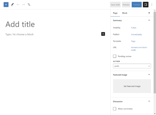
WordPress Block Editor Screen

The WordPress Block Editor interface provides a modern and user-friendly editing experience. The Block Editor is built around the idea of blocks, which are individual units of content such as paragraphs, headings, images, videos, and more. Blocks can be easily manipulated, moved around, and customized to create beautiful and engaging web pages or blog posts.

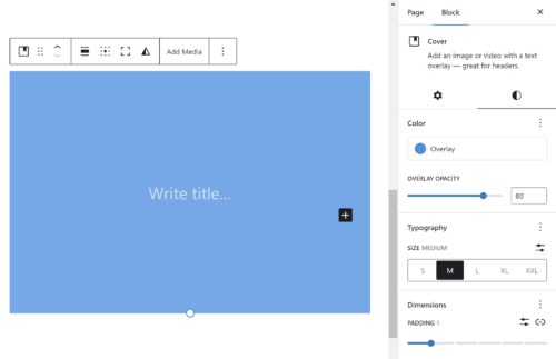
The Block Editor is divided into two main areas: the content area and the sidebar. The content area is where you can create and edit your blocks, while the sidebar provides additional options and settings for each block. The sidebar is context-sensitive, which means that it changes depending on the block you have selected. This allows you to easily customize each block without having to search through a lot of options.

How to Create Content with Blocks

The block editor allows you to create content in a modular way using various blocks. Here are the steps to create content with blocks:

  1. Click on the “Add Block” button (+ icon) in the top left corner of the editor or use the forward slash command “/” to search for a block type.
  2. Select the type of block you want to use. There are various types of blocks available such as paragraphs, headings, images, videos, and more.
  3. Customize the block settings as per your requirements using the options available in the block toolbar. For example, you can change the font size, text color, add a link, etc.
  4. To move a block up or down, click on the block and use the up and down arrow icons that appear at the top of the block.
  5. To delete a block, click on the three dots icon in the top right corner of the block and select “Remove Block”.
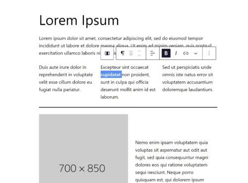
Block Toolbar
Block Toolbar

Most people find the block editor to be intuitive and easy to use, even for those who are not familiar with WordPress. In the WordPress block editor, each block comes with its own set of formatting options and settings that allow you to customize the appearance and behavior of the block. These options can usually be found in the right-hand sidebar when the block is selected.

For example, a paragraph block allows you to change the font size and style, text alignment, and background color. You can also add hyperlinks, drop caps, and inline code snippets.

Similarly, an image block lets you choose the image file, adjust its size and alignment, add a caption, and link the image to a URL. You can also add alternative text and choose how the image behaves on different screen sizes.

Other blocks, such as the heading block or the list block, have their own unique formatting options as well. Overall, the block editor offers a wide range of settings and options for creating rich, dynamic content with ease.

Advanced Block Editing Techniques

Once you become comfortable with the basics of the block editor, you can start exploring some advanced techniques that can help you create more complex and dynamic layouts.

  • Customizing block styles: The block editor allows you to customize the style of each block. You can change the font size, color, background, and more. You can also create your own custom styles that can be reused across different blocks.
  • Creating custom blocks: If you have some coding knowledge, you can create your own custom blocks. This allows you to create blocks that are tailored to your specific needs and can include advanced features and functionality.
  • Adding custom CSS: The block editor also allows you to add custom classes or CSS to individual blocks or the entire page. This can be useful if you want to apply some custom styling that is not available through the block editor’s interface.
  • Using third-party plugins: There are many third-party plugins available that extend the functionality of the block editor. These plugins can add new blocks, customize existing blocks, and provide additional features and functionality.

Mastering these advanced techniques can help you create more complex and dynamic layouts with the block editor and unlock its full potential.

Reusable Blocks

Another advanced feature available in the WordPress block editor is the ability to create reusable blocks. Reusable blocks are pre-made block designs that you can save and reuse throughout your website, which can save you time and streamline your content creation process.

To create a reusable block, first, create the block you want to reuse. Once you have the block set up the way you want it, select it and click on the three dots options icon in the block toolbar. From there, click “Create Reusable block”. You’ll be prompted to give the block a name, and once you do, it will be saved as a reusable block.

To use a reusable block, simply go to the block inserter and select the “Reusable” tab. You’ll see all of your saved reusable blocks, and you can insert them just like any other block. If you need to make changes to a reusable block, simply edit the block, and the changes will be applied to all instances of the block on your website.

Using reusable blocks can save you a lot of time and effort, especially if you have a lot of similar content to create. It also helps ensure consistency throughout your website, as you can reuse the same design elements in multiple places.

Groups

Using groups in the WordPress block editor can be a powerful tool for organizing and managing your content. With groups, you can link together multiple blocks and then easily move, copy, or delete them as a unit. This can be especially helpful when working with complex layouts or when you need to make changes to multiple blocks at once.

To create a group, select the blocks you want to group together, then click the “Group” option in the block toolbar or use the keyboard shortcut (Ctrl + G on Windows, Cmd + G on Mac). You can then customize the group’s settings by clicking on the group block and adjusting the options in the sidebar.

Using groups can also help to keep your content more organized and easier to manage. For example, you can use groups to separate different sections of a page or to group together related content. This can be particularly helpful for larger websites or blogs with a lot of content. Grouping your content together can make it easier for visitors to navigate your site and find the information they’re looking for.

Tips for Using the Block Editor Effectively

Cover Block
Cover Block

While the Block Editor is a powerful tool for creating engaging and dynamic content, it can also be overwhelming at first. Here are some tips to help you use the Block Editor more effectively:

  • Use keyboard shortcuts: Keyboard shortcuts can save a lot of time and speed up your workflow. Some popular shortcuts include Ctrl + C to copy, Ctrl + V to paste, and Ctrl + Z to undo.
  • Take advantage of block patterns: Block patterns are pre-designed layouts that you can use to quickly create engaging content. WordPress includes several block patterns by default, and you can also create your own.
  • Customize your toolbar: The Block Editor toolbar can be customized to include only the tools you use most often. This can help reduce clutter and make it easier to find the tools you need.
  • Use the document outline: The document outline in the Block Editor sidebar can help you keep track of your content’s structure and hierarchy. Use headings and subheadings to organize your content and make it more accessible.
  • Preview your content: The Block Editor includes a preview mode that lets you see how your content will look on the front end of your website. Use this feature to make sure your content looks great and functions properly.
  • Eliminate distractions: Improve your focus by enabling distraction free mode and making the editor fullscreen.

Following these tips can help you use the Block Editor to create beautiful, engaging content more efficiently.

Best Practices for Using the Block Editor

While the block editor can be a powerful tool for creating content, there are some best practices you should keep in mind to make the most of it. Here are some tips for using the block editor effectively:

  1. Organize your content: Use headings, subheadings, and bullet points to make your content easy to read and understand. Add a Table of Contents to help readers navigate through longer articles.
  2. Optimize for SEO: Use the Yoast SEO plugin to optimize your content for search engines. Use keywords in your headings, meta descriptions, and rich content to improve your search rankings.
  3. Avoid common mistakes: Be mindful of using too many blocks, which can slow down your website. Also, avoid using too many font styles and sizes, which can make your content look cluttered and unprofessional.
  4. Keep it simple: Use the block editor to simplify your content creation process. Don’t get bogged down with too many settings and formatting options. Stick to the basics and keep your content easy to read and understand.

By following these best practices, you can make the most of the block editor and create high-quality content that engages your readers and improves your search rankings.

Troubleshooting Issues With The Block Editor

While the block editor is generally user-friendly, there are some common issues that may arise while using it. For example, you may experience difficulty moving blocks or encounter unexpected formatting issues.

One way to troubleshoot these issues is to disable any third-party plugins that may be interfering with the editor. It’s also a good idea to ensure that your WordPress installation and all plugins are up-to-date, as older versions can sometimes cause compatibility issues. Additionally, you can try switching to a different browser or clearing your browser cache to see if that resolves the issue. If you’re still having trouble, you can consult the WordPress support forums or contact your web host for further assistance.

Start Using It!

The WordPress block editor is a powerful tool for creating engaging and visually appealing content. With its intuitive interface, advanced editing features, and reusable block functionality, it offers a more streamlined and efficient way to create content than the classic editor. By taking advantage of the many formatting and customization options available for each block, you can create content that stands out and resonates with your audience.

To use the block editor effectively, it’s important to follow best practices for organizing your content, optimizing for SEO, and avoiding common mistakes. And if you encounter any issues while using the block editor, there are many resources available online for troubleshooting and getting help.

Overall, the block editor is an essential tool for any WordPress user looking to create engaging and professional-looking content. With some practice and experimentation, you can master the block editor and take your content creation to the next level.

Earn Passive Income From Your Website With Ads

If you have a website with a good amount of traffic, you can earn passive income by displaying ads on your site. Earning passive income from your website is a great way to monetize your online presence, and one of the most popular methods to do this is through the use of ads. Ads allow website owners to earn revenue without actively selling products or services, and can be a great source of ongoing income.

Getting Started

To get started with earning passive income from ads, you will need to sign up for an ad network or program. There are several options to choose from, including Google AdSense, Media.net, and Amazon Native Ads. It’s a good idea to do your own research to find which one is the best fit for you.

Google AdSense is a popular choice for many website owners as it’s easy to use and provides access to a large pool of advertisers. AdSense uses contextual targeting to display relevant ads to your audience. Another option is Media.net, which is a contextual ad network that allows publishers to monetize their content with display ads. It’s particularly popular for websites with a large amount of traffic from the US, Canada, and the UK. Another popular option is Amazon Associates, which allows you to earn a commission by promoting Amazon products on your website. It’s particularly useful for websites that focus on product reviews or recommendations. Ultimately, the best ad network for you will depend on your website’s niche and audience, as well as your personal preferences and goals for monetization.

Another way to use ads to earn passive income is to sell ad space directly to advertisers. This can be a more profitable option than using an ad network, but it requires more work. You will need to find advertisers who are interested in advertising on your site and negotiate a price.

Placing Ads

Once you’re set up with an ad platform, you will be able to generate ad code to place on your website. It’s important to carefully consider where and how you place ads on your website. You want to make sure that ads are not intrusive or distracting to your visitors, but still visible enough to be noticed.

Ideally, you want to place ads in areas where they can be seen easily without being too intrusive or disruptive to the user experience. Placing ads above the fold, meaning the area of a web page that is visible without scrolling, tends to perform better than placing them below the fold. It’s also important to consider the type of content on your website and match the ad content accordingly. For example, placing fitness-related ads on a health and wellness website would likely perform better than placing car-related ads. Ultimately, finding the right balance of ad placement is crucial in maximizing ad revenue without negatively affecting the user experience.

Ad Formats

It’s also important to consider the type of ads you want to display. Ads that are relevant to your content and audience will perform better than generic or irrelevant ads. The amount of money you earn from ads will depend on a number of factors, including the type of ads you display, the amount of traffic your website gets, and the click-through rate (CTR) of your ads.

There are several different types of ads that website owners can use. One of the most common types is display ads, which are typically banner ads that appear on a website. These can be static images or animated graphics, and they are most commonly placed in the header, footer, or sidebar of a page. Another type of ad is a text ad, which is a link-based ad that appears within the content of a website. Native ads are another popular option, as they blend in with the rest of the content on the page and are less intrusive than other ad types. Video ads have also become more prevalent in recent years, as online video consumption continues to rise. Finally, there are pop-up ads, which appear in a separate window or tab and can be highly disruptive to the user experience. It’s important to consider the type of ad that will work best for your website and audience, as well as the placement and frequency of the ads to maximize their effectiveness without negatively impacting the user experience.

Auto ads are a feature provided by Google AdSense that helps publishers place ads on their website without needing to manually choose the ad placements. With auto ads, Google uses machine learning algorithms to analyze the content of the website and place ads in the most optimal locations. Auto ads can include a variety of ad formats such as text, display, and in-feed ads. This can save publishers time and effort in managing their ad placements and increase their revenue potential by ensuring that ads are placed in the most effective locations. However, it is important to monitor the performance of auto ads and adjust settings as necessary to ensure that they are providing the desired results.

Optimizing Your Revenue

An important factor to consider when using ads to earn passive income is traffic. The more traffic your website receives, the more potential revenue you can earn from ads. Focus on creating quality content and promoting your website through various channels to increase your traffic and potential earnings. Make sure that your site is properly optimized and targeted for search engines with the keywords and phrases that will be most relevant to your target audience.

To maximize your passive earnings from ads, here are some things to keep in mind:

  • Use a variety of ad sizes and formats. This will help you reach a wider audience and maximize your earnings.
  • Place ads in strategic locations on your website. This will help to ensure that your ads are seen by as many visitors as possible.
  • Use relevant ads. Ads should be related to the content on your website. This will help to increase the CTR and earn you more money.
  • Test different ad networks and advertisers. This will help you find the best deals and maximize your earnings.
  • Track your ad performance. This will help you see what’s working and what’s not, so you can make adjustments to your ad strategy.
  • Promote your website. The more traffic your website gets, the more money you will earn from ads. Promote your website on social media, in forums, and in other online communities.

It’s worth noting that while earning passive income through ads can be lucrative, it may not be the right fit for every website. It’s important to balance a positive cash flow with a positive user experience. If your website is focused on selling products or services, ads may distract from that goal. Additionally, some users may find ads intrusive or annoying, which could negatively impact their experience on your website.

Annoying or intrusive ads can drive users away from your website and hurt your reputation. Some examples of annoying ads include pop-ups, auto-playing videos with sound, and ads that cover up content. Ads that are misleading or try to trick users into clicking can give your site a spammy reputation. To avoid these issues, consider using non-intrusive ad formats such as text-based ads or banner ads that don’t interfere with the user’s browsing experience. It’s also important to limit the number of ads on each page and avoid placing ads too close to important content. By focusing on non-intrusive ad formats and strategic ad placement, you can ensure that your users have a positive experience while still earning passive income from your website.

Earning passive income from ads can be a great way to monetize your website. By carefully choosing the right ad network, placing ads strategically, and focusing on increasing your website’s traffic, you can earn ongoing revenue from your website without the need to actively sell products or services.

The Anatomy of a Website

A website is made up of many components that all work together to create a functional and informative whole. Those components can be compared to the anatomy of a human body. Just like a human body is made up of different organs and systems that each perform specific functions, a website consists of various components that work together to deliver content and functionality to users. Let’s take a closer look at the anatomy of a website and how it compares to human anatomy.

Skeletal System

Just like how the skeletal system is the foundation of the human body, HTML (Hypertext Markup Language) serves as the foundation of a website. HTML provides the structure and organization for the content on a web page, defining the different elements and their relationships to each other. Just as the skeletal system provides support for the body, HTML provides the structure that supports the design, functionality, and usability of a website. Without a solid HTML structure, a website would lack the necessary foundation to be easily navigated and displayed across various devices and browsers.

Muscular System

In the analogy of comparing the parts of a website to human anatomy, the web server can be thought of as the muscular system. Just as the muscles provide movement and structure to the human body, web hosting provides the support and structure for a website to function. It is responsible for delivering the content of a website to its visitors and ensuring that it is always available and accessible. Without web hosting, a website cannot exist and function properly, just as the human body cannot function without its muscles. Therefore, it is crucial to choose a reliable and trustworthy web hosting provider to ensure the smooth functioning of a website.

Nervous System

Just as the nervous system is responsible for controlling and coordinating the body’s responses to stimuli, JavaScript plays a vital role in web development by controlling and coordinating the behavior of a website in response to user interactions. JavaScript is a high-level programming language that is often used to add interactivity, animations, and other dynamic features to a website. By manipulating HTML and CSS, JavaScript can create a rich user experience and improve the functionality of a website. This is what makes it the nerves of a website because it allows it to react and respond to the user’s actions, making it an essential part of modern web development.

A Content Management System (CMS) can be compared to the human brain. It is the control center of the website, where content is created, managed, and published. Just as the human brain is responsible for controlling the body’s functions, a CMS like WordPress is responsible for managing a website’s content.

The MySQL database is like the hippocampus of a website because it is responsible for storing and organizing memories, or in this case, website data. The hippocampus is a part of the human brain responsible for long-term memory storage and retrieval. Similarly, the MySQL database stores all the data for a website, such as user information, product details, and website content. It allows the website to quickly retrieve this information and present it to the user. Without the MySQL database, websites would not be able to store and organize large amounts of data efficiently.

The navigation of a website is like the spinal cord of the human body. Just as the spinal cord connects the various parts of the body, the navigation connects the different pages and sections of a website. It serves as a roadmap for users, guiding them to the content they want to find. A well-designed navigation system can make it easy for users to find what they are looking for and explore the website, while a poorly designed one can cause frustration and confusion. It is important to keep the navigation system simple, intuitive, and consistent throughout the website to ensure a smooth user experience.

Cardiovascular System

PHP (Hypertext Preprocessor) is a server-side programming language used to develop dynamic web pages and web applications such as WordPress. It can be considered as the cardiovascular system of a website as it is responsible for handling the flow of data between the server and client. PHP processes and manages requests, accesses and manipulates databases, and dynamically generates web pages. Just like the cardiovascular system carries blood and nutrients to all parts of the body, PHP handles and delivers information to all parts of the website, making it functional and interactive for the user. Without PHP or a similar architecture, a website would be static and lack the necessary functionalities to make it engaging and interactive.

The server CPU is like the heart of a website because it performs essential functions that keep the site running smoothly. The CPU (Central Processing Unit) is responsible for processing all of the requests made to the server, executing scripts, and handling other system-level tasks. Without a properly functioning CPU, a website may run slowly, suffer from errors, or even crash.

Immune System

Just like our immune system protects our body from viruses and diseases, website security protects the website from various cyber threats such as hacking, malware, and phishing attacks. Security measures include installing SSL certificates, implementing strong passwords, two-factor authentication, and regular software updates. Additionally, security plugins can be installed to further enhance website security. A strong immune system keeps us healthy, and a strong security system keeps the website safe and functional. Just as a disease can affect multiple parts of the body, a security breach can affect different areas of a website, including sensitive data, user information, and website functionality. Therefore, it is crucial to prioritize website security as part of website maintenance.

Skin

In comparing the parts of a website to the human body, CSS can be thought of as the skin. Just like how the skin gives a person’s body a certain look and feel, CSS is responsible for the visual appearance and style of a website. It allows web developers to change the color, font, layout, and overall design of a website, making it more appealing and user-friendly. CSS can also be used to create responsive designs that adjust the layout of the website to fit different screen sizes, making it accessible on a wide range of devices. Without CSS, websites would be limited to a default, plain appearance, making them less engaging and less likely to attract visitors.

Additional Components

  • Face: The homepage can be compared to a human body’s face. It is the first thing users see when they visit a website, and it sets the tone for the rest of the site. Just as a human face is the first thing people see and can leave a lasting impression, the homepage is the first thing users see and can determine whether they stay or leave.
  • Torso: The body of a website can be compared to a human body’s torso. It is the main part of the website that contains the content and functionality. Just as the torso contains the vital organs and performs important functions, the body of a website contains the content and performs the primary functions.
  • Arms: The sidebar can be compared to a human body’s arms. It is the part of the website that supports and enhances the body’s main functions. Just as the arms support and enhance the body’s functions, the sidebar supports and enhances the main content of the website.
  • Name: Just as a child is given a name and ID at birth, any new website requires a domain name. Similarly to how you would use your name to identify yourself, a domain name allows users to find and identify your website.

The same way the human body is made up of various parts that work together to create a cohesive and functional whole, a website is composed of different elements that work together to create a complete and effective online presence. By understanding the different parts of a website and how they relate to one another, website owners can create a site that is both visually appealing and user-friendly, and provides visitors with a positive experience.

Choosing a Web Hosting Provider

Choosing the right web hosting provider is an important decision that can affect the success of your website. The right provider can help you get your website up and running quickly and easily, and it can also help you keep your website secure and reliable. There are many different options available, and each one offers different features and benefits. With so many hosting options available, it can be overwhelming to determine the best choice for your needs. In this article, we will discuss important factors to consider when selecting a web hosting provider.

Types of Web Hosting

There are several different types of web hosting available, each with its own advantages and disadvantages. Some of the most popular types of web hosting include:

  • Shared hosting: Shared hosting is the most affordable type of web hosting. With shared hosting, your website shares resources with other websites on the same server. This can be a good option for small websites with low traffic.
  • VPS hosting: VPS hosting is a more expensive option than shared hosting, but it offers more resources and flexibility. With VPS hosting, your website has its own virtual server, which means it doesn’t share resources with other websites. This can be a good option for medium-sized websites with moderate traffic.
  • Dedicated hosting: Dedicated hosting is the most expensive type of web hosting, but it offers the most resources and flexibility. With dedicated hosting, your website has its own dedicated server, which means it doesn’t share resources with any other websites. This can be a good option for large websites with high traffic.

Speed and Performance

Website speed and performance play a significant role in user experience and search engine optimization. A hosting provider that offers fast loading times, low latency, and high performance can positively impact your website’s search engine rankings.

Solid State Drives (SSD) are a type of storage device that uses flash memory to store data. They are much faster than traditional hard disk drives (HDD) because they have no moving parts, which means they can read and write data much more quickly. SSDs are becoming increasingly popular in web hosting because they provide faster load times for websites, which can improve user experience and search engine rankings. When choosing a web hosting provider, it’s important to consider whether they offer SSD hosting, as this can make a significant difference in website performance.

Security

Web security is essential to protect your website and user data. A hosting provider should offer an array of robust security features to protect your website and it’s visitors from hackers and other bad actors. When shopping for a web host, take a look at their security features to see what they offer.

SSL (Secure Socket Layer) certificates encrypt the data that is transferred between the website and the user’s browser, making it more difficult for hackers to intercept and read the information. This is especially important for websites that collect sensitive information such as login credentials, credit card information, or personal data. Many web hosting providers offer free SSL certificates or make it easy to purchase and install them on your website, so it’s important to consider a host that offers this level of security for your website and your users.

DDoS (Distributed Denial of Service) attacks can cripple a website, making it inaccessible to users. It is important to choose a web hosting provider that offers DDoS protection to safeguard your website from such attacks. A good hosting provider will offer a variety of DDoS mitigation techniques firewalls, such as filtering traffic or blacklisting malicious IP addresses. Some providers may offer DDoS protection as part of their hosting plans, while others may charge extra for it. When choosing a hosting provider, be sure to inquire about their DDoS protection policies and ask for details on how they handle such attacks.

Another important feature to consider when choosing a web hosting provider is daily backups. Backups are critical for protecting your website and its data in case of data loss or a security breach. Daily backups ensure that if anything happens to your website, you can quickly restore it to a previous state without losing much data. Some web hosting providers offer daily backups as a standard feature, while others may charge an additional fee for this service. It is essential to make sure that your web hosting provider offers backups and to understand how they manage and store your backup files. Additionally, you may want to consider how easy it is to access and restore your backups in case you need them.

Pricing and Features

Web hosting providers offer various hosting plans with different features and pricing options. Consider your budget and the features that you need for your website, such as storage, bandwidth, email accounts, and website builder tools. Compare the pricing of different web hosting providers and look for a provider that offers good value for money. Keep in mind that the cheapest option may not always be the best.

Different web hosting providers offer different features, so it’s important to find a provider that offers the features you need. Some of the most important features to consider include:

  • Disk Space: How much storage space do you need for your website?
  • Bandwidth: How much monthly bandwidth will you need for your website?
  • Email Accounts: Some hosts limit the number of email addresses you can create.
  • Installation Wizards: Many providers offer the ability to install software such as WordPress with one click.

Uptime and Reliability

The uptime of a web hosting provider is a critical factor to consider. The hosting provider should offer a reliable service that is available 24/7. A reliable web hosting provider should offer a minimum uptime guarantee of 99.9%. This ensures that your website is available to visitors at all times.

Customer Support

It is essential to choose a hosting provider that offers excellent customer support. In case of any issues, you need to have a reliable support team that can help you promptly. Look for 24/7 support options such as live chat, email, and phone support.

Scalability

Consider how your website may grow over time and choose a web hosting provider that can accommodate your needs. This may include the ability to upgrade your hosting plan, add more resources, or handle increased traffic. Ensure that the hosting provider offers scalable options that allow you to upgrade seamlessly as your website traffic and needs increase.

Reputation

It is essential to research the hosting provider’s reputation to ensure that they offer a reliable and trustworthy service. Look for reviews and testimonials from other users to get an idea of the web hosting provider’s reputation. Check online forums, social media, and review sites to see what others are saying about the provider.

Once you’ve considered all of these factors, you can start comparing web hosting providers. After you’ve found a few providers that you’re interested in, you might consider signing up for a trial. This will give you a chance to test out the provider’s services before you commit to a long-term plan.

Selecting a web hosting provider can be overwhelming, but taking the time to consider these factors can help you make an informed decision. Ultimately, you need to choose a hosting provider that offers reliable uptime, fast performance, robust security, and scalable options at an affordable price.