The Best Web Design Tools and Resources

Discovering the right tools and resources can be incredibly helpful for anyone looking to create a website, regardless of their experience level. With the help of the industry’s best creation tools, you can create a website that looks professional, functions seamlessly, and provides an exceptional user experience. In this article, we will explore some of the best web design software and services that are available today. We’ll cover everything from design software and frameworks to online resources and stock photos. By the end of this article, you’ll have a better understanding of what’s available to help you create a stunning website.

Graphic Design Software

Graphic design is a crucial aspect of web design, and there are several tools available to help designers create stunning visuals. In this section, we’ll explore some of the most popular graphic design tools for web design, including:

  • Adobe Creative Cloud is a suite of applications that includes Photoshop, Illustrator, and InDesign. These tools are widely used by designers to create graphics and images for websites.
  • Canva is a user-friendly graphic design tool that offers a wide range of templates, images, and fonts. It’s a great option for designers who don’t have extensive graphic design experience.
  • Sketch is a vector graphics editor that’s specifically developed for web designers. It offers a wide range of tools and features, including grids and guides, that make it easy to create responsive designs.
  • Figma is a cloud-based design tool that allows designers to collaborate in real-time. It offers a range of features for creating responsive designs and supports plugins that can be used to extend its functionality.
  • GIMP is a free and open-source image editor that’s similar to Photoshop. It’s a great option for designers who don’t have the budget for expensive software.

These tools can help designers create stunning graphics and visuals for their websites, making them an essential part of any web design toolkit.

Graphics Resources

Having the right resources for graphic design can make a big difference in the quality of the final product. Here are some of the best graphic design resources to consider:

Stock Photo and Video Websites

  • Pexels: offers high-quality, free stock photos and videos that can be used for personal or commercial projects.
  • Unsplash: a large community-driven platform for free stock photos and videos.
  • Shutterstock: one of the most popular and widely-used stock photo and video websites, offering a massive library of high-quality content for a fee.

Icon Libraries

  • Font Awesome: a popular icon library that offers both free and premium icon sets that can be easily integrated into websites or other design projects.
  • Flaticon: a platform that offers a wide variety of free and premium vector icons, with over 3 million options to choose from.

Color Scheme Generators

  • Coolors: a popular color theme generator that allows users to create custom color palettes or explore pre-made palettes.
  • Adobe Color: a tool that allows users to create and save custom color schemes, as well as explore a vast library of pre-made color palettes.

Typography Resources

  • Google Fonts: a library of free and open-source fonts that can be easily integrated into web projects.
  • Typekit: a font library that offers both free and paid options for web designers looking to expand their typography options.

Having access to these resources can make it easier for designers to create high-quality graphic design elements that will enhance the look and feel of a website.

Wireframing and Prototyping Tools

Wireframing and prototyping are essential steps in the web design process that allow designers to plan and visualize the layout and functionality of a website before development. Here are some of the best wireframing and prototyping tools:

  • Adobe XD is an all-in-one design tool that includes features for wireframing, prototyping, and design. It also includes integrations with other Adobe products, such as Photoshop and Illustrator.
  • InVision is a popular prototyping tool that allows designers to create interactive prototypes and animations. It includes a variety of features for collaboration and testing, making it a great choice for larger teams.
  • Balsamiq is a simple and intuitive wireframing tool that is ideal for quickly creating low-fidelity wireframes. It includes a library of pre-made components and templates, making it easy to create professional-looking wireframes in no time.
  • Axure is a powerful prototyping tool that is popular among UX designers. It includes a variety of features for creating interactive prototypes, including animations, conditional logic, and dynamic content.

When choosing a wireframing or prototyping tool, consider your design needs, team size, and budget. Each tool has its own strengths and weaknesses, so it’s important to choose the one that best fits your specific project requirements.

Front-end Development Resources

Front-end development refers to the coding and design work involved in building the part of a website that users see and interact with. It involves writing code in HTML, CSS, and JavaScript to create the structure, layout, and functionality of a website’s user interface.

HTML and CSS frameworks can be extremely useful for front-end development because they provide pre-designed components and styles that can be easily customized and integrated into a website. Some popular frameworks include Bootstrap, Foundation, and Materialize.

JavaScript libraries and frameworks can also be extremely helpful for front-end development, as they provide pre-written code that can be used to add complex functionality to a website. Some popular libraries and frameworks include jQuery, React, and Vue.js.

Browser development tools are essential for front-end developers because they allow for debugging and testing of website code in real time. These tools can help identify errors and provide insights into how a website is functioning in different browsers and on different devices.

Overall, there are many tools and resources available to front-end developers, and it’s important to choose the right ones for your project and skill level. By utilizing these tools and resources, front-end developers can create beautiful and functional websites that meet the needs of their users.

Back-end Development Resources

Web development requires a combination of front-end and back-end development. While front-end development is all about creating the user interface, back-end development is focused on server-side programming, server management, and database management. Here are some of the best back-end development resources:

  • Node.js – An open-source, cross-platform, back-end JavaScript runtime environment that allows developers to build fast, scalable network applications.
  • PHP – A server-side scripting language that is widely used for web development. It is easy to learn and has a large community of developers.
  • MySQL – An open-source relational database management system that is widely used with web applications.
  • Apache – A web server software that is used to host websites and serve web pages.
  • NGINX – A web server software that is designed to handle high traffic websites and improve website performance.
  • Git – A version control system that is used to track changes in code and collaborate with other developers.

Using these back-end development resources, developers can create robust, scalable, and secure web applications that are easy to maintain and manage.

Collaboration and Project Management Tools

Collaboration and project management tools play a vital role in keeping web design projects organized and on track. These tools help teams communicate, share files, assign tasks, and track progress. Some popular collaboration and project management tools for web design projects include:

  • Asana: A web-based tool that helps teams track tasks and projects in one place. It also includes a calendar view and customizable project boards.
  • Trello: A popular visual project management tool that uses cards and boards to organize tasks and projects. It’s great for team collaboration and includes features like checklists, due dates, and file attachments.
  • Basecamp: A project management tool that helps teams communicate, collaborate, and stay organized. It includes tools for project management, team collaboration, and client communication.
  • Slack: A messaging and collaboration tool that helps teams communicate in real-time. It includes features like channels, direct messaging, and file sharing.
  • Google Drive: A cloud-based storage and collaboration tool that allows teams to share and collaborate on documents, spreadsheets, and presentations.

By using collaboration and project management tools, web design teams can streamline their workflows and ensure that projects are completed on time and within budget.

Content Management Systems

Content Management Systems (CMS) allow you to create, manage and publish your website content without requiring you to have extensive coding knowledge. Here are some of the best CMS options available:

  • WordPress is one of the most popular CMS platforms available. It offers a wide range of themes, plugins, and widgets that can be used to customize your website to meet your specific needs.
  • Joomla is another popular CMS platform that is easy to use and customize. It offers a range of templates and extensions that can be used to add functionality to your website.
  • Drupal is a powerful CMS that is widely used by large organizations and businesses. It offers a wide range of modules and themes that can be used to create highly customized websites.
  • Squarespace is a popular website builder that offers an all-in-one solution for building and hosting websites. It offers a range of templates and customization options, making it a great option for small businesses and individuals.
  • Wix is another all-in-one website builder that is popular among small businesses and individuals. It offers a range of templates and customization options, as well as a drag-and-drop editor that makes it easy to create a professional-looking website.

When choosing a CMS, it’s important to consider factors such as ease of use, customization options, and available support. Additionally, it’s important to keep your website’s purpose and goals in mind when choosing a CMS, as different platforms may be better suited for different types of websites.

Start Creating

Web design and development requires a variety of tools and resources to achieve success. It’s important to note that there are many other great tools and resources available, and choosing the right ones for your project will depend on your specific needs and preferences.

Whether you are a beginner or an experienced web designer or developer, it’s always beneficial to stay up-to-date with the latest trends and technologies. Here are some additional resources to help you continue your learning journey:

By utilizing the right tools and resources and staying up-to-date with industry trends, you can create effective and visually stunning websites that will stand out in the crowded digital landscape.
Color Theory: Speak the Language of Hue

Color is a crucial and influential element in web design, as it can evoke emotions, convey a brand’s personality, and guide users’ attention. Color theory is the study of how colors interact with each other and how they affect the human eye and brain. It is a complex and fascinating subject, and it can be used to create a wide variety of effects in design. So how does color theory apply to web design and how do you choose the right colors for your website?

The first thing to consider when choosing colors for your website is your brand’s personality and message. Think about the emotions you want to convey to your audience and what your brand stands for. For example, blue is often associated with trust and reliability, while red is associated with energy and excitement. Once you have a clear understanding of your brand’s personality, you can choose colors that align with it.

When choosing colors for a website, it is important to consider the overall mood or atmosphere you want to create. For example, if you want to create a website that is calming and relaxing, you might choose soft, muted colors like blues and greens. If you want to create a website that is exciting and energetic, you might choose brighter, more vibrant colors like reds and oranges.

It is also important to consider the target audience for your website. For example, if your website is aimed at children, you might choose bright, playful colors. If your website is aimed at adults, you might choose more subdued colors.

In addition to the overall mood or atmosphere, you should also take into consideration the specific elements of your website when choosing colors. For example, the text should be easy to read against the background, and the call-to-action buttons should stand out from the rest of the page.

Color theory can be a complex subject, but it is an essential part of web design. By understanding the basics of color theory, you can create websites that are visually appealing and effective.

Color Wheel

Color Wheel
Color Wheel

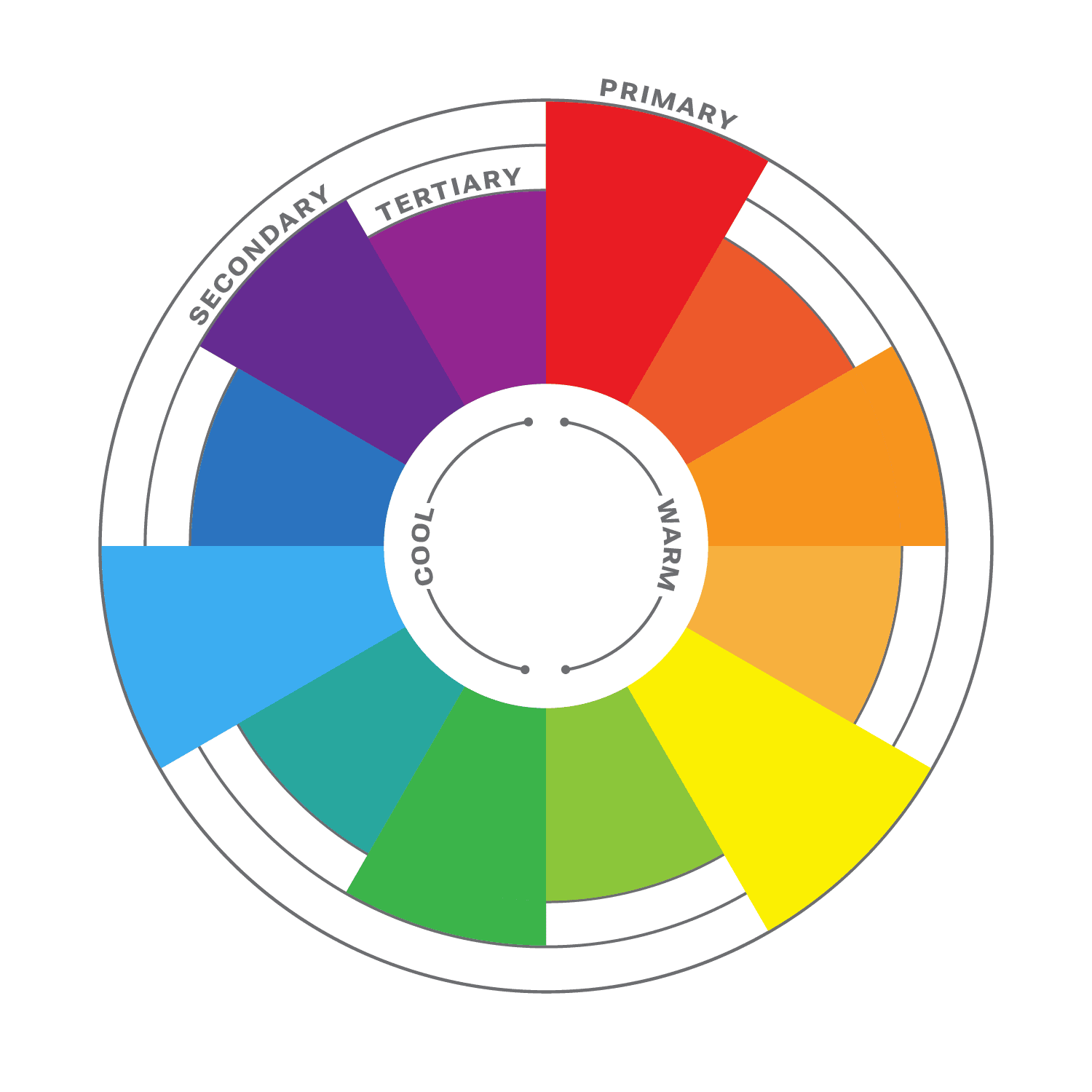
The color wheel is a circular diagram that shows the relationships between colors. It is a useful tool for understanding how colors work together and how to create pleasing color schemes.

The color wheel is divided into three primary colors: red, yellow, and blue. These colors cannot be created by mixing other colors together. When two primary colors are mixed together, they create a secondary color. The secondary colors are orange, green, and purple. When a primary color and a secondary color are mixed together, they create a tertiary color. There are six tertiary colors: red-orange, yellow-orange, yellow-green, green-blue, blue-purple, and red-purple.

The color wheel is often divided into warm colors (like red, orange, and yellow) and cool colors (like blue, green, and violet). Warm colors are associated with passion, energy, and excitement, while cool colors are associated with calmness and peace.

Color Harmony

Another important aspect of color theory is color harmony. This refers to how colors work together to create a visually appealing design. It is a subjective concept, as different people have different preferences for color. However, there are some general principles of color harmony that can be followed to create pleasing color schemes.

Complementary Colors

There are many different ways to create color harmony, but some of the most common methods include:

  • Monochromatic: A monochromatic color scheme uses variations of one color. This can be a very effective way to create a calm and sophisticated look.
  • Analogous: Analogous color schemes use three colors that are close to each other on the color wheel. This can be a very harmonious and pleasing color palette.
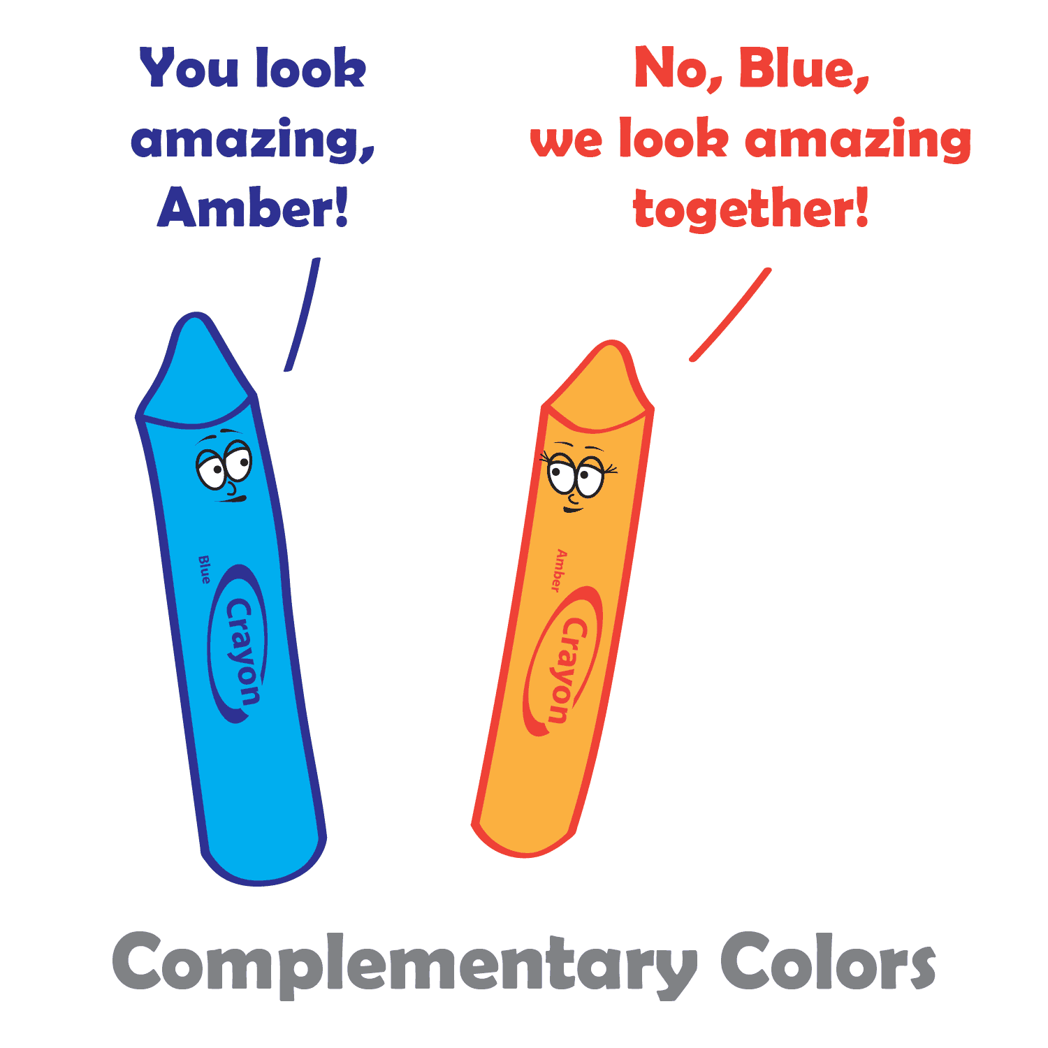
  • Complementary: Complementary colors are two colors that are opposite each other on the color wheel. This can be a very striking and eye-catching pair.
  • Split-complementary: Split-complementary color schemes use the color opposite the primary color, as well as the two colors on either side of the complementary color. This can be a very sophisticated and elegant color combination.
  • Triadic: A triadic color theme uses three colors that are evenly spaced around the color wheel, creating a very balanced and dynamic look.
  • Tetradic: Tetradic color schemes use four colors that are evenly spaced around the color wheel. This can be a very complex and interesting way to use color.

When choosing colors in your design process, it is important to consider the overall effect that you want to create. If you want to create a calm and relaxing design, you might want to use a monochromatic or analogous color scheme. If you want to create something more dramatic and eye-catching, you might want to use a complementary or triadic color scheme.

No matter which method you choose, it is important to use colors that you like and that work well together, and to experiment with different color combinations until you find one that you like. And remember, there are no hard and fast rules when it comes to color harmony. The most important thing is to use colors that you find pleasing and that create the effect you want. When you choose colors that are pleasing to the eye, you can create art that is both beautiful and functional.

Color Principles

One of the most important principles of color harmony is contrast. Contrast is the difference between the lightness and darkness, or the warmth and coolness, of colors. A high-contrast color scheme uses colors that are very different from each other, while a low-contrast color scheme uses colors that are similar to each other.

Contrast is important in web design, as it helps guide users’ attention and create visual interest. High contrast colors, such as black and white, create a strong visual impact and are useful for highlighting important information. Low contrast colors, such as pastels, create a softer and more subdued effect.

Another important principle of color harmony is unity. Unity is the feeling that all of the colors in a design work together. There are a number of ways to create unity, such as using a limited color palette, repeating colors throughout a design, or using a color scheme that is based on a natural phenomenon, such as a sunset or a rainbow.

In addition, consider the cultural associations of colors. Different cultures may have different meanings and associations with colors, so it’s important to research the cultural context of your audience. For example, in western cultures, white is often associated with purity and innocence, while in some eastern cultures it is associated with mourning.

Color Psychology

While color theory and color psychology are related, they are not the same thing. Color theory focuses on the principles and concepts of color and how they interact with each other. It is concerned with the visual effects of color combinations, such as contrast, harmony, and balance. On the other hand, color psychology studies the emotional and behavioral effects of colors on human beings. It explores how different colors can affect mood, perception, and behavior, and how they can be used to communicate different messages and create different experiences. While color theory is important in creating effective and visually pleasing designs, color psychology can help to further enhance the message and impact of a design by understanding how colors are perceived and experienced by the audience.

According to color psychology, different colors evoke different emotions and can have different effects on the human brain. For example, red is often associated with excitement and passion, while blue is often associated with calmness and peace. When choosing colors for your website, it’s important to consider the message you want to convey and the emotions you want to evoke in your users.

Here are some additional tips for using color in web design:

  • Use a limited color palette. Too many colors can be overwhelming and distracting.
  • Use white space to create contrast and make your colors pop.
  • Use color to highlight important elements of your website, such as the call to action buttons.
  • Use color consistently throughout your website. This will help create a cohesive and professional look.
  • Test your colors on different devices and browsers to make sure they look good everywhere.

When used effectively, color can be a powerful tool for web design. Color theory is an important aspect of web design that can greatly impact the success of your website. By understanding the principles of color theory, and considering your brand’s personality, you can choose the right colors to evoke the emotions and convey the message you want to communicate to your audience.

SVG: The Power of Scalable Vector Graphics in Web Design

Scalable Vector Graphics (SVG) is an open vector image format used in web design. It is a widely popular format that is supported by all modern web browsers. SVG graphics are vector images, which means they are made up of paths and shapes. This makes them scalable and resolution-independent, which means they can be scaled up or down without losing any quality or clarity. This is why SVG graphics are an ideal choice for responsive web design.

SVG images are created using XML code. This means that they are easy to edit and manipulate. SVG graphics can be edited using a text editor or a dedicated vector graphics editor like Adobe Illustrator or Inkscape.

Using SVG graphics offers a great benefit in improving website performance. Compared to traditional image formats like JPEG or PNG, SVG files tend to be much smaller in size. This is because SVG graphics are vector-based and can be scaled without losing quality, unlike raster images which can become pixelated when enlarged. SVG graphics can also be compressed without becoming distorted, further reducing their file size. This makes them ideal for websites and web applications where page load speed is crucial. Additionally, because SVG graphics are code-based, they can be cached and reused, reducing server requests and improving overall performance.

CSS can be used to style SVG graphics just like any other HTML element. You can apply styles to the SVG element itself or to its child elements, such as paths, circles, and rectangles. You can use CSS properties like fill, stroke, stroke-width, opacity, and transform to change the appearance of your SVG graphics.

SVG graphics are not only versatile and scalable but can also be animated and interactive, making them an excellent choice for creating engaging and dynamic web designs. With SVG, it’s possible to add animations such as fades, transitions, and rotations, allowing designers to create visually appealing and interactive elements on their web pages. SVG animations can be achieved using CSS or JavaScript, making it easy to incorporate them into any web project. Additionally, web designers can create interactive elements such as clickable buttons, hover states, and more, making their designs even more engaging and user-friendly.

SVG isn’t the only image format you will ever need. For highly detailed images such as photos, you’re better off sticking with a raster format. But here are some areas where SVG’s shine:

  • Icons: SVG graphics are often used to create icons and other small, simple graphics that are used to represent different functions or actions.
  • Logos: SVG’s are great for creating logos and other branding and marketing materials.
  • Illustrations: The SVG format is perfect for colorful illustrations and lineart.
  • Charts and graphs: SVG graphics can be used to create charts, graphs, maps, and infographics, which are a great way to present data in a visually appealing and easy-to-understand way.
  • Decorative elements: Use SVG to add style to your site with decorative designs and shapes.
  • Patterns and backgrounds: Designers can create unique and interesting patterns and backgrounds that add visual interest and depth to a website.
  • Animations: SVG graphics can be used to create animations, and to add interest and interactivity to a website.

When it comes to using SVG graphics in web design, there are a few things to keep in mind. It’s important to optimize the SVG file for web use. This involves removing unnecessary code and compressing the file size. And since SVG’s are code-based rather than pixel-based, you should test your SVG files in all major web browsers to make sure they display correctly.

Another important consideration when using SVG graphics in web design is accessibility. It is important to ensure that the SVG graphics are accessible to all users, including those using assistive technologies like screen readers. This involves providing alternative text descriptions and ensuring that the SVG graphics are properly labeled.

If you are looking for a powerful and versatile tool for creating graphics for the web, then SVG is a great option. It offers many benefits, including smaller file sizes, scalability, and the ability to be animated. However, it is important to properly optimize and embed SVG graphics, as well as ensure their accessibility, to ensure the best user experience for all users.