Modernize Your Website Layouts With CSS Grid

Have you ever struggled with designing a responsive layout for your website? If so, CSS Grid might just be the solution you’re looking for! Here we’ll explore what the CSS grid system is, how it works, and why it’s such a powerful tool for web designers.

CSS Grid is a two-dimensional layout system that allows you to create complex, responsive layouts with ease. Part of the CSS3 standard, it allows you to define a grid of columns and rows, and then place elements anywhere within that grid. This means you can create layouts that adapt to different screen sizes, without having to write complicated media queries or rely on other layout systems.

One of the biggest advantages of CSS Grid is its flexibility. You can define a grid with any number of columns or rows, and you can even define different sized columns and rows. This means you can create layouts that are truly unique, and that stand out from the crowd.

Another plus of CSS Grid is its simplicity. Once you understand the basics of how it works, creating complex layouts becomes much easier. You no longer have to worry about floats, clears, tables, libraries, or other CSS hacks that were necessary in the past.

It’s hard to justify not using CSS Grid

So how does CSS Grid work? There’s a lot to it, but it’s actually quite simple. First, you define a grid container by setting its display property to “grid”. Then, you define the columns and rows of the grid using the “grid-template-columns” and “grid-template-rows” properties. Finally, you place elements within the grid using the “grid-column” and “grid-row” properties.

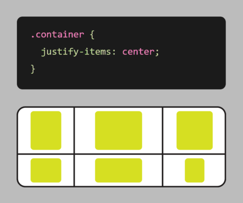
Grid also comes with a number of other useful features, such as the ability to span elements across multiple columns or rows, and the ability to align elements within the grid.

Here’s an example of using CSS grid to create a responsive layout:

.container {
    display: grid;
    grid-template-columns: repeat(auto-fit, minmax(250px, 1fr));
    grid-gap: 20px;
}

In this example, we first define a container element with the display property set to grid. We also set the grid-template-columns property to create a grid with columns that will automatically adjust based on the available space, with a minimum size of 250px and a maximum size of 1fr (which means the column will take up as much available space as possible).

We also use the grid-gap property to add some spacing between the boxes.

With these styles in place, the grid will adjust and reflow as the browser window is resized, ensuring that the items are always displayed in an organized, responsive manner.

It’s worth noting that CSS Grid is different from CSS Flexbox, another popular layout system. While Flexbox is great for laying out elements in a single row or column, Grid is more suited for creating complex, two-dimensional layouts. With Flexbox, you define a row or column, and then place elements within that row or column. With Grid, you define a grid of rows and columns, and then place elements anywhere within that grid. This makes it more powerful for complex layouts, while Flexbox is better suited for simpler, one-dimensional layouts.

CSS Grid is a powerful tool that allows you to create complex, responsive layouts with ease. Its flexibility and simplicity make it an essential tool for any web designer looking to create beautiful, responsive websites. So why not give CSS Grid a try? Your website (and your users) will thank you!

Animation in Web Design: More Than Just Cool Graphics

Animation has become an increasingly popular aspect of web design, adding a level of interactivity and visual interest to websites. From subtle hover effects to complex animations, designers have a variety of tools and techniques at their disposal to create engaging animations for their websites.

One popular animation tool is CSS animations. With CSS3, designers can create animations using keyframes that define the start and end points of an animation, as well as the intermediate steps. This allows for a wide range of animation effects, from simple transitions to more complex motion graphics. CSS animations are simple to create and can be used to animate properties such as position, size, and color.

Another powerful animation tool is JavaScript, which allows for more advanced animations and interactivity. JavaScript can be used to create animations based on user interactions, such as scrolling or clicking, as well as to manipulate the DOM and create complex animations that are difficult to achieve with CSS alone.

SVG image files can be animated using CSS or JavaScript. SVG animations can be used to add interest and interactivity to web pages. They can be used to create buttons, logos, and other graphical elements that can be animated. SVG animations can also be used to create interactive content, such as games and simulations.

Even more immersive and interactive experiences can be created with WebGL. By combining the power of JavaScript and 3D graphics, developers can create stunning visualizations and games that can be played directly in the browser. With WebGL, it’s possible to create complex animations, simulate physics, and even create virtual reality environments. Whether you’re a game developer or just looking to add some interactivity to your website, WebGL is a great tool to have in your arsenal.

Aside from aesthetics, here are some ways animation can add to your UX:

  • Attract attention: Animation can be used to grab the attention of visitors and draw them into your site. For example, you could use a bouncing ball or a rotating image to catch people’s eye.
  • Explain complex concepts: Animation can be used to explain complex concepts in a way that is easy to understand. For example, you could use an animated diagram to show how a product works.
  • Improving usability: Animation can be used to make websites easier to use by providing visual cues and instructions.
  • Create a sense of movement: Animation can be used to create a sense of movement and excitement on your site. For example, you could use a scrolling banner or a parallax effect to make your site more visually appealing.
  • Creating a sense of interactivity: Animation can be used to make websites more interactive by allowing users to interact with elements on the page.
  • Personalize the user experience: Animation can be used to personalize the user experience for each visitor. For example, you could use a welcome message or a personalized recommendation to make each visitor feel like they are the only one on your site.

In addition to creating engaging animations, web designers must also consider the performance implications of animation on a website. Large or complex animations can slow down page load times, leading to a poor user experience. Therefore, it is important to optimize animations and consider factors such as file size, frame rate, and animation duration.

When used effectively, animation can be a powerful tool for improving the user experience of your website. However, it is important to use animation sparingly. Too much animation can be distracting and annoying. It is also important to make sure that your animation is well-designed and executed. Poorly designed animation can make your site look unprofessional and amateurish. Consider hiring a freelance animation designer to step up your animation game.

Here are some tips for using animation effectively in web design:

  • Use animation to highlight important elements: Animation can be used to draw attention to important elements on your site, such as calls to action or product features.
  • Keep animation simple: Simple animation is more effective than complex animation. Complex animation can be distracting and difficult to follow.
  • Use animation sparingly: Too much animation can be overwhelming and annoying. Use animation only when it is necessary to improve the user experience.
  • Test your animation thoroughly: Make sure that your animation works correctly in all major browsers. This will help to ensure that your website is accessible to all users.
  • Optimize your animation: Make sure that your animation is not too large or too complex. This will help to improve the loading time of your site.
  • Use animation to add personality: Animation can be used to add a touch of personality to your website. For example, you could use animation to create a mascot, add a sense of humor, or make your website more visually appealing.
  • Use animation to tell a story. Animation can be used to tell a story or to convey a message.

Overall, animation can be a powerful tool in web design, adding an extra level of engagement and interactivity to a website. By using the right tools and techniques, designers can create animations that enhance the user experience without sacrificing performance.

Get Your App Together with Progressive Web Applications

In the constantly changing world of web development, Progressive Web Apps (PWAs) are becoming increasingly popular. But what exactly are they, and why are they so important? Let’s take a closer look at PWAs and explore their uses and benefits.

What Are Progressive Web Apps?

PWAs are web applications that are designed to work seamlessly across all devices and platforms, from desktop to mobile. They are built using web technologies like HTML, CSS, and JavaScript, and can be accessed through a web browser, just like any other website. They are fast, reliable, and installable on mobile devices, and they can offer a richer user experience than traditional mobile websites.

But what sets PWAs apart is their ability to function like a native mobile app, even without being downloaded from an app store. This is made possible through the use of Service Workers, a powerful web technology that allows PWAs to cache data and work offline, as well as receive push notifications and access device hardware like the camera, microphone, and accelerometer.

Another key advantage of PWAs is their fast and responsive performance. Because they are designed to work offline and load quickly, PWAs can provide a seamless user experience even on slow or unstable network connections.

But perhaps the most compelling reason to consider building a PWA is their ability to engage and retain users. PWAs can be installed directly onto a user’s home screen, just like a native app, and can offer features like push notifications and offline functionality that keep users coming back.

How Do You Develop a PWA?

  1. Start with a responsive web design: Before you can create a PWA, you need to have a responsive web design that works well on all devices and platforms. This means designing your website to automatically adapt to different screen sizes, whether on a desktop, tablet, or mobile device.
  2. Use a Service Worker: A Service Worker is a JavaScript file that runs in the background of a PWA and enables offline functionality, push notifications, and other features. You’ll need to write a Service Worker script that can cache key files, so the app can still function even if the user loses internet connection.
  3. Implement an App Shell: The App Shell is a lightweight HTML, CSS, and JavaScript framework that loads quickly and serves as the foundation of the PWA. It provides the basic layout and design of the app, which can then be updated dynamically with content.
  4. Use HTTPS: HTTPS is required for PWAs to ensure secure and encrypted data transfer. Make sure to install an SSL certificate on your website to enable HTTPS.
  5. Add a Web App Manifest: The manifest is a JSON file that provides metadata about the PWA, including its name, icons, and launch settings. This file helps the browser understand that the app is a PWA and enables installation to the user’s home screen.
  6. Test and Optimize: Finally, you’ll want to test your PWA across different devices and platforms to ensure it works properly and delivers a great user experience. Use tools like Lighthouse or WebPageTest to analyze your app’s performance and identify areas for improvement.

Building a PWA requires a combination of web development skills, including HTML, CSS, JavaScript, and web APIs. However, there are also many frameworks and tools available, such as Google’s Workbox, that can simplify the process and help you create a PWA more quickly and easily.

Overall, PWAs are a powerful and flexible tool in web development, providing the best of both worlds when it comes to web and mobile app functionality. Whether you’re building a new web application or looking to improve an existing one, considering a PWA could be a great way to enhance your user experience and engagement.

Choosing Your Type: Fonts and the Art of Typography

Typography is the art and technique of arranging type to make written language visually appealing and easy to read. It involves selecting the right typeface, font size, and other typographic elements to create a desired effect.

Fonts are the core of typography. They can be used to create a variety of effects, from setting the tone or mood of a piece of text to making it more visually appealing. There are many different types of fonts available, each with its own unique characteristics. But with so many different fonts to choose from, it can be tough to know where to start.

Types of Fonts

There are many different types of fonts, but they can generally be divided into a few categories:

  • Serif fonts have small projections or flourishes called serifs at the ends of the main strokes of the letters, which can help guide the reader’s eye along the text. Serifs are thought to help with legibility by providing visual cues that help the eye track from one letter to the next. Serif fonts are often used in print publications like newspapers and books, and are often considered to be more traditional and formal than sans-serif fonts. Some popular serif fonts include Times New Roman, Georgia, and Trajan.
  • Sans serif fonts do not have serifs. They are often considered to be more modern and clean-looking than serif fonts. Sans-serif fonts are often used in digital media, such as websites and mobile apps, as they are easier to read on screens. Popular sans serif fonts include Arial, Helvetica, and Tahoma.
  • Script fonts are designed to look like handwriting or calligraphy. They often have a flowing, elegant appearance, and can be used to create a more personal or informal tone. Script fonts are often used for invitations, greeting cards, or other creative projects. Some common script fonts include Brush Script, Lobster, and Zapfino.
  • Display fonts, or decorative fonts, are more stylized to be eye-catching and attention-grabbing. They can be used for headlines, logos, or other special purposes, as they can add personality and visual interest to a design. The sky’s the limit for display fonts, but some of the most popular decorative fonts include Impact, Papyrus, and Curlz.
  • Monospace fonts have a fixed width for each character, and are typically characterized by their blocky appearance. This makes them useful for programming and coding, or other applications where precise alignment is necessary. They often have a simple, utilitarian design, which makes them well-suited for technical applications. Some popular monospace fonts include Courier, Consolas, and Source Code Pro.

Choosing the Right Font

11 out of 10 designers agree: Comic Sans is not your type

The best way to choose the right font for your project is to consider the overall look and feel you’re trying to achieve, and take into account the context and purpose of the text. If you’re designing a formal document, you might want to use a serif font. If you’re designing a modern website or marketing materials, you might want to use a sans serif font. And if you’re designing a logo or other special piece of artwork, you might want to use a script or decorative font. Different fonts can convey different emotions or tones, and choosing the right font can help enhance the message you’re trying to communicate.

It’s also important to consider the readability of your font. Some fonts are easier to read than others, especially at small sizes. If you’re using a font for body copy, it’s important to choose one that is easy to read on screen or in print.

Using Fonts Effectively

If the Pebbles font is too thin, try making it a little boulder

Once you’ve chosen the right font, it’s important to use it effectively. Here are a few tips:

  • Use only a few different fonts in a single project. Too many fonts can be overwhelming and distracting.
  • Use different fonts for different purposes. For example, you might use a serif font for body copy and a sans serif font for headlines.
  • Consider the size and weight of the font when choosing it. A large, bold font will be more eye-catching than a small, light font.
  • Use leading (the space between lines of text) and kerning (the space between individual letters) to improve the readability of your text.
  • Use a consistent font family throughout a piece of text. This will help to create a cohesive and professional look.
  • Use fonts to create visual interest. For example, you could use a decorative font for a call to action or a unique font for a logo.
  • Proofread your text carefully before using it in your designs.
  • Experiment with different fonts and layouts to find what works best for your project. There are no hard and fast rules in typography, so don’t be afraid to try new things.

When used effectively, fonts can be a powerful tool for creating visually appealing and effective typography. By choosing the right fonts and using them effectively, you can create beautiful and effective designs.

The Power of CSS3: Creating Stunning Web Designs Without Images or JavaScript

Cascading Style Sheets (CSS) is a fundamental technology of web design. It is used to define the presentation of a web page, including colors, fonts, layout, and more. With the introduction of CSS3, web designers have gained access to a wealth of new tools and features that allow for more creative and efficient designs, while greatly improving page load speeds. Read on to explore some of the things you can do with CSS3 that used to require heavy images or complex JavaScript.

Gradient Backgrounds

CSS3 makes it possible to create gradient backgrounds with just a few lines of code. This means that designers no longer need to use large images to achieve gradient effects. Using the “background-image” and “linear-gradient” properties, designers can create smooth and stylish gradient backgrounds that are customizable and responsive.

Rounded Corners

Example of border-radius CSS code
Border control… Get it?

Previously, rounded corners could only be achieved with multiple images and complex table layouts, but CSS3 now allows designers to create rounded corners with a single property. The “border-radius” property allows designers to easily add rounded corners to any element, from containers to buttons and images and more.

Box Shadows

Box shadows are a popular design element that used to require images or JavaScript to achieve. With CSS3, designers can create box shadows with the “box-shadow” property. This property allows designers to add shadows to elements such as boxes, buttons, and images, creating a subtle and stylish effect.

Animations

CSS3 allows designers to create animations without the need for JavaScript or Adobe Flash. The “animation” property allows designers to define keyframes that specify the animation’s behavior, including timing, duration, and style. This makes it possible to create animated elements such as looping animations, hover effects, and more, all with pure CSS.

Transitions

CSS transitions are another popular design element that can now be achieved with CSS3. The “transition” property allows designers to specify the transition effect between two states of an element, such as changing its color or opacity. This makes it possible to create subtle and smooth state changes that enhance the user experience.

Custom Fonts

Not long ago, custom fonts on the web meant typing your text into a graphics editor and saving it as an image. True text was limited to the standard fonts that come with a user’s computer or device. The “@font-face” rule changes that. With a simple style sheet, designers can specify custom fonts to be used on their website, giving them more flexibility and creative control over typography.

So Much More

In addition to these exciting and useful features, CSS3 has many other tools that allow designers to create more dynamic and visually appealing web designs. Here are just a few other things you can do with CSS3:

  1. Flexbox Layout: Flexbox is a new layout mode introduced in CSS3 that allows designers to create complex layouts with ease. With the “display: flex” property, designers can create responsive layouts that adjust to different screen sizes and orientations. Flexbox is particularly useful for creating layouts with dynamic content, such as image galleries, product listings, and more.
  2. Media Queries: CSS3 introduced media queries, which allow designers to specify different styles for different screen sizes and orientations. With CSS media queries, designers can create responsive designs that adapt to different devices, from desktop computers to smartphones and tablets. This allows designers to create a consistent user experience across all devices.
  3. Transformations: CSS3 allows designers to transform elements on their web pages with the “transform” property. This property can be used to rotate, scale, skew, and translate elements, creating dynamic and engaging effects. Transformations can be applied to a wide range of elements, from images to text and more.
  4. Filters: CSS filters are a powerful tool that allow designers to apply visual effects to HTML elements. Designers can apply effects such as grayscale, sepia, blur, and more, without the need for additional images or JavaScript. This makes it easy for designers to create dynamic and engaging visual effects.
  5. Custom Properties: CSS custom properties, also known as CSS variables, allow designers to define reusable values in their CSS code. This can make it easier to maintain a consistent design across a website by allowing designers to use the same values in multiple places without having to update each instance individually. Custom properties also make it easier to change the values of a design element, as the variable can be updated in one place and the change will be reflected across the entire website. This can save time and reduce the likelihood of errors and inconsistencies in the design process.

We’ve come a long way since the early days of web design! CSS3 has revolutionized web design by providing designers with new a range of new tools and features that eliminate the need for images, JavaScript, or slow and insecure plug-in’s. With CSS3, designers can create gradients, rounded corners, shadows, and animations with just a few lines of code. This makes it easier and more efficient to create beautiful and responsive web designs that enhance the user experience. By staying up-to-date with the latest CSS3 trends and techniques, designers can take their web design skills to the next level and create truly exceptional web designs.

The Importance of Accessibility and Usability in Web Design

Web design accessibility is a crucial aspect of creating websites that can be accessed and enjoyed by everyone, including people with disabilities. Making your website accessible means that it can be used by those with visual, auditory, physical, and cognitive disabilities. Not only is it the right thing to do, but it also makes good business sense. An accessible website can increase your audience and improve the user experience for all visitors.

Accessibility is something not typically considered by novices trying to build a DIY website. This is why it’s important to hire an experienced web designer, or to do the research and learn how to implement these concepts.

There are several steps that can be taken to make a website accessible. One important step is to use descriptive alt text for all images, which helps screen readers and visually impaired users understand the content of your website.

When it comes to design, high-contrast color schemes are essential for making your website accessible to users with visual impairments. This means using colors that have a significant difference in brightness between light and dark areas, so that text and other important elements stand out clearly.

HTML5 is the foundation of web accessibility. By using semantic HTML tags, you can provide context and meaning to your content, making it easier for assistive technologies like screen readers to understand. This includes using headings to structure your content, and using labels and input types to make forms and interactive elements more accessible.

Another important consideration is the use of ARIA (Accessible Rich Internet Applications) attributes. These attributes can be used to provide additional context and information for screen readers, and can help make complex web interfaces more accessible.

In addition, it’s important to consider the usability of your website. This includes making sure that users can navigate your website easily using a keyboard, rather than just a mouse, and ensuring that your website is responsive and works well on different devices and screen sizes. This is especially important for users with physical disabilities that may make using a mouse difficult or impossible.

Lastly, it’s important to test your website for accessibility. There are a variety of tools and resources available that can help you identify areas of your website that may be difficult for users with disabilities. By taking the time to make your website accessible, you can ensure that everyone can enjoy your content and benefit from your website. Focusing on these improvements will also give you an added SEO benefit, as search engines can more easily understand the structure of your site.

Overall, web design accessibility requires a combination of thoughtful design and technical implementation. By focusing on these key factors, you can create a website that is accessible to everyone, regardless of their abilities or disabilities.

The Future of Web Design: Mobile-First Responsive Design Explained

With more and more people accessing the internet on their mobile devices, it has become essential for website owners to design websites that are optimized for mobile. Mobile-first responsive web design is a design approach that prioritizes designing for the smaller screens of mobile devices first, and then scaling up to larger screens like desktops and laptops.

Mobile-first responsive design involves creating a website layout and content structure that is optimized for small screens, with features like easy-to-tap buttons, large fonts, and concise content. This approach ensures that the website is user-friendly and easy to navigate on mobile devices, where users are often on-the-go and looking for quick access to information.

Once the mobile design is established, the layout and content can be scaled up for larger screens using responsive design techniques. Responsive design involves using flexible grid layouts and scalable images and fonts that adjust to fit different screen sizes. This means that the website can be accessed and navigated on a variety of devices without compromising the user experience.

By designing for mobile first, website owners can ensure that their website is accessible to the widest possible audience, including those who primarily access the internet on their mobile devices. Additionally, mobile-first design can improve website loading times and reduce bounce rates, as mobile users are more likely to leave a website that takes too long to load or is difficult to navigate.

Mobile-first design can also improve website search engine rankings. Google’s algorithm prioritizes mobile-friendly websites, meaning that sites that are optimized for mobile are more likely to rank higher in search results.

Before the rise of mobile-first responsive design, web developers often created a separate mobile website to accommodate users accessing their website on mobile devices. However, this approach had several drawbacks. Having a separate mobile website meant that site owners had to maintain two separate websites, which was time-consuming and expensive. Additionally, mobile websites often had limited functionality and content compared to their desktop counterparts, leading to an inconsistent user experience. With mobile-first responsive design, website owners can create one website that is optimized for all devices, providing a consistent user experience and simplifying website maintenance. This approach is much more efficient and effective than creating a separate mobile website, and has become the industry standard for designing websites that work seamlessly across all devices.

Mobile-first responsive web design is a design approach that prioritizes creating a user-friendly and accessible website for mobile devices first, and then scaling up for larger screens. This approach offers numerous benefits, including improved user experience, faster loading times, and improved search engine rankings. By adopting a mobile-first approach, website owners can ensure that their website is optimized for the increasingly mobile-centric online world.

What’s new with the web in 2023?

The web is constantly evolving, and there are always new trends and developments to keep up with. Here are some of the most exciting new things happening on the web in 2023:

The Rise of Artificial Intelligence

AI is already having a major impact on the web, and its influence is only going to grow in the years to come. AI is being used to power everything from chatbots and virtual assistants to personalized recommendations and search results. As AI becomes more sophisticated, it will have an even greater impact on the way we interact with the web.

The Continued Growth of Mobile Devices

Smartphones and tablets are now the primary way that people access the internet, and this trend is only going to continue. This means that web developers need to make sure that their websites are optimized for mobile devices. In addition, mobile devices are opening up new opportunities for businesses to reach their customers. For example, businesses can now use mobile apps to provide customer service, offer loyalty programs, and sell products.

Blockchain

Blockchain is a distributed ledger technology that is used to record transactions in a secure and transparent way. In 2023, we can expect to see more businesses using blockchain to power their online transactions, as it offers a number of advantages over traditional payment methods. Blockchain is enabling new applications, such as decentralized finance (DeFi) and non-fungible tokens (NFTs). Decentralized technology is still in its early stages, but it has the potential to revolutionize the web.

Progressive Web Applications

PWAs are a type of web app that combines the best of both worlds from websites and mobile apps. They are fast, reliable, and work offline, making them a great option for businesses that want to provide their users with a seamless experience across all devices.

Metaverse

The metaverse is a hypothesized iteration of the internet as a single, universal, and immersive virtual world that is facilitated by the use of virtual reality and augmented reality headsets. The metaverse is still in its early stages of development, but it has the potential to change the way we interact with the internet.

New web technologies are constantly being developed, and these technologies are changing the way that we use the web. For example, WebVR is a new technology that allows users to experience virtual reality content on the web. WebGL is growing in popularity, a JavaScript API that enables developers to produce interactive and immersive experiences for the web. The development of new web technology has enabled many features that were previously impossible or prohibitively difficult to implement.

These are just some of the most exciting new things happening on the web in 2023. The web is a constantly evolving platform, and there are always new trends and developments to keep up with. By staying informed about the latest trends, web developers can ensure that their websites are up-to-date and relevant to their users. As technology advances, it will be interesting to see what new trends and technologies emerge in the years to come.

Why would I need HTTPS for a static website?

You might be thinking, “My website doesn’t collect user’s credit cards or other sensitive information, so why is it so important to have SSL/TLS encryption?”

Static websites, also known as flat-file websites, are a popular choice for businesses and individuals looking to create a simple and cost-effective online presence. However, even though static websites may not have complex functionality or collect user data, they can still benefit greatly from the use of HTTPS security.

HTTPS, or Hypertext Transfer Protocol Secure, is a protocol that encrypts data as it travels between a user’s web browser and a website’s server. This encryption makes it much more difficult for third parties to intercept or tamper with data, helping to ensure the privacy and security of user information.

One of the most important reasons to use encryption on static websites is to protect user privacy. Even if a website doesn’t gather personal user data, unsecured connections can still expose information such as IP addresses and browsing history. Additionally, unsecured connections are vulnerable to interception and tampering, which can result in serious security breaches.

Using HTTPS can also help to build trust with website visitors. When users see the “secure” padlock icon in their browser, they know that their data is being protected and that the website they are visiting takes their security seriously. This can help to improve user engagement and conversions, as well as reduce bounce rates and increase user retention.

Furthermore, HTTPS is increasingly becoming a standard for web browsing. Major web browsers such as Google Chrome and Mozilla Firefox are now flagging unsecured connections as “not secure,” which can deter users from visiting a website. By using HTTPS security on static websites, website owners can ensure that their website is accessible to all users, regardless of their browser preferences.

In addition to its security benefits, HTTPS can also offer a speed benefit for static websites. This is because HTTPS connections use the HTTP/2 protocol, which allows for faster and more efficient communication between the user’s web browser and the website’s server. HTTP/2 supports multiplexing, meaning that multiple requests and responses can be sent simultaneously over a single connection, reducing the amount of time it takes to load a webpage. Additionally, HTTPS connections can use server push, a feature that allows the server to proactively send resources to the user’s browser, further improving page load times.

So, while static websites may not have complex functionality or user data, they can still benefit greatly from the use of HTTPS security. By protecting user privacy, building trust with visitors, and keeping up with changing browser standards, website owners can ensure that their static websites are secure, accessible, fast, and trusted by users.

Boost Your Search Engine Rankings with Effective Link Building Strategies

Link building is a crucial component of search engine optimization (SEO). It involves acquiring links from other websites back to your own website, with the aim of improving your search engine rankings. In this article, we will discuss the importance of link building for SEO, the different types of links, and some effective strategies for building high-quality links.

The Importance of Link Building for SEO

Search engines like Google use links as one of the key ranking factors for websites. The more high-quality links a website has pointing back to it, the more likely it is to rank well in search engine results pages (SERPs). However, not all links are created equal. Search engines place more value on links from reputable websites that are relevant to your content. Therefore, it’s essential to focus on building high-quality links that will have a positive impact on your website’s SEO.

Types of Links

You don’t need a chiropractor to fix your back links

There are three main types of links: internal links, outbound links, and inbound links (also known as backlinks). Internal links are links from one page on your website to another. Outbound links are links from your website to other websites. Inbound links are links from other websites back to your website.

Inbound links are the most important type of link for SEO, as they indicate to search engines that other websites consider your content to be valuable and authoritative. However, it’s important to note that not all inbound links are created equal. Links from reputable websites that are relevant to your content are more valuable than links from low-quality or irrelevant websites.

Effective Strategies for Building High-Quality Links

  1. Guest Posting: One of the most effective strategies for building high-quality inbound links is through guest posting. This involves writing an article for another website in your industry or niche, with a link back to your website included in the author bio or within the article itself. By providing valuable content to other websites, you can earn high-quality links and increase your website’s visibility.
  2. Broken Link Building: Another effective strategy is broken link building. This involves finding broken links on other websites in your industry or niche, and then contacting the website owner to suggest a replacement link to your website. This can be a win-win situation for both parties, as the website owner can fix their broken link, and you can earn a valuable inbound link.
  3. Resource Link Building: Resource link building involves creating high-quality, informative content on your website that other websites in your industry or niche are likely to link to as a resource. This could include guides, tutorials, infographics, or other types of content that provide value to your target audience.

Link building is an essential component of SEO that can have a significant impact on your website’s search engine rankings. By focusing on building high-quality inbound links from reputable websites that are relevant to your content, and using effective strategies like guest posting, broken link building, and resource link building, you can improve your website’s visibility and drive more organic traffic to your site.