On the modern web, where attention spans are shorter than a squirrel on a caffeine rush, the power of a well-designed website cannot be underestimated. It’s not enough to have a beautiful virtual storefront; you need a conversion machine that effortlessly guides your visitors down the rabbit hole of irresistible offers and undeniable value.
Picture a website that entices, engages, and compels your target audience to take action. It’s like having a 24/7 salesperson who never sleeps, never tires, and consistently brings in a stampede of eager customers. Today we explore the hidden psychology behind user behavior, dissect the anatomy of high-converting websites, and equip you with a toolkit of actionable strategies to skyrocket your conversion rates.
What is Conversion Rate Optimization?
Today we’re diving headfirst into the world of Conversion Rate Optimization (CRO) – the secret sauce that separates the winners from the wannabes in the digital realm. Imagine having a finely tuned machine that turns casual visitors into raving fans, and potential customers into loyal advocates. That’s the power of CRO.
Let’s break it down. Conversion Rate Optimization is the art and science of maximizing the number of desired actions taken by your website visitors. It’s all about turning clicks into customers, and browsers into buyers. And trust me, when it comes to online success, the name of the game is conversions.
A well-designed website is like a funnel, guiding your visitors through various stages of their journey. From the initial spark of curiosity to the final purchase decision, each step holds the key to unlocking the holy grail of conversions. A website that converts at a high rate is a magnet for revenue, growth, and success. It’s like having a virtual sales team on steroids, working tirelessly to propel your business forward.
Knowing Your Target Audience
Market research and user analysis are the instruments that guide us on this expedition. Take the time to truly understand the desires, pain points, and motivations of your audience. Uncover their hidden needs and aspirations, and you’ll hold the key to capturing their hearts and wallets.
This is where buyer personas come into play. These are like characters in a gripping novel, except they’re based on real data instead of an author’s imagination. By understanding their hopes, dreams, and quirks, you’ll be equipped to tailor your website design to their unique needs.
Imagine, for a moment, stepping into the shoes of your buyer persona. What challenges do they face? What solutions are they seeking? By immersing ourselves in their world, we gain the power to craft a website that speaks directly to their souls. It’s the art of anticipation, and it will set you apart from the countless others who fail to truly know their audience.
Remember, it’s not just about design; it’s about speaking directly to the hearts and minds of those you wish to serve.
User-Friendly Website Design
To make conversions, first we need a user-friendly website where everything is effortless and delightful. Most often, this starts with optimizing website navigation and structure. Think of your website as a well-designed city, with clear road signs and logical pathways. Your visitors should be able to navigate effortlessly, finding what they need without breaking a sweat. No one likes getting lost in a confusing labyrinth of links. So, streamline your menus, organize your content into logical categories, and sprinkle some helpful breadcrumbs along the way.
We’re in the age of smartphones and tablets, and your website needs to be ready for the mobile revolution. Your potential customers are on the go, browsing on their trusty pocket companions. If your website doesn’t adapt to their screens like a chameleon changing colors, they’ll quickly bounce away faster than you can say, “Oops, I forgot about mobile users!” Embrace responsive design, make sure your website looks stunning on any device, and watch your conversion rates dance with joy.
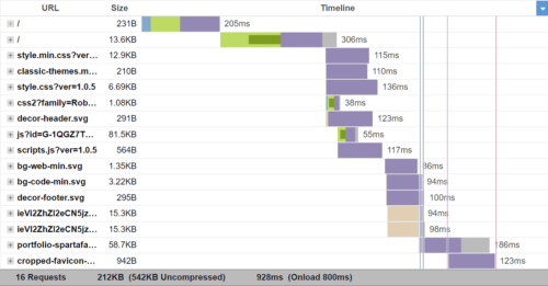
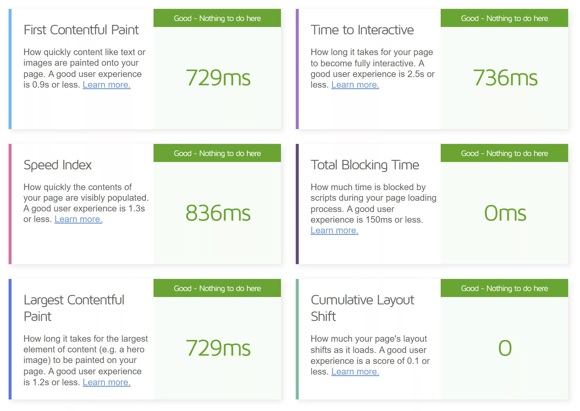
Now, let’s talk about speed. Time is a precious commodity, and your visitors aren’t interested in waiting around for your website to load like it’s stuck in the Stone Age. No, we need to give them the need for speed. Optimize those images, minimize those scripts, and eliminate any unnecessary fluff that slows down your site. A lightning-fast loading speed will make your visitors feel like they’ve stumbled upon a digital oasis of efficiency.
Last but not least, we have the streamlined user interface. Picture it as a Zen garden for your visitors’ eyes. Clean, minimalist, and uncluttered. Every element should have a purpose, guiding your visitors seamlessly towards their desired actions. Say goodbye to overwhelming clutter and confusing layouts. Embrace simplicity and create an interface that sings in harmony with your visitors’ desires.
Compelling and Clear Calls-to-Action
Calls-to-action (CTA) are a little slice of web design magic that holds the power to turn visitors into enthusiastic clickers. Think of them as the charming salespeople of your website, beckoning users with irresistible offers and compelling propositions.
First things first: make those CTAs impossible to resist. They should shine like beacons of temptation, drawing the eyes of your visitors with their captivating colors and tasty designs. But remember, subtlety is key. We don’t want to blind our visitors with an explosion of neon colors. Find that perfect balance between eye-catching and tastefully inviting.
Now, let’s talk about the art of persuasive copywriting. Your CTA copy should be like a smooth-talking charmer, seducing your visitors with words that ignite their curiosity and spark their desire to take action. Use action-oriented language that nudges them to click that button without a second thought. “Get Started Now,” “Claim Your Free Trial,” or “Unlock Exclusive Content”—these are some golden phrases that lure visitors into the land of conversions. And remember, keep it concise and clear. No need for a dissertation—just a few carefully chosen words that speak volumes.
Strategically position your buttons where they’re impossible to miss. We’re talking above the fold, right in the line of sight, and in the middle of the action. Whether it’s at the end of a captivating blog post, within a compelling product description, or even subtly integrated into your website’s navigation, make sure your CTAs are right where the magic happens.
Also, consider adding a sprinkle of urgency or exclusivity to your CTAs. Phrases like “Limited Time Offer,” “Only 3 Spots Left,” or “Join the VIP Club” can ignite a sense of FOMO (Fear Of Missing Out) that propels visitors to take action before it’s too late.
So, let’s create content that captivates, engages, and leaves our visitors hungry for more. Craft stories that ignite their imagination, accompanied by visuals that dazzle their eyes. Embrace interactivity that invites them to play, participate, and connect. And above all, ensure that your content speaks directly to their hearts, minds, and aspirations. Let your website be a treasure trove of engaging and relevant content, and watch as your visitors become lifelong fans and devoted followers.
Building Trust and Credibility
Building credibility is the secret ingredient that transforms mere website visitors into loyal customers. It’s the bridge that connects your brand with their hearts and minds, assuring them that you’re the real deal—the trustworthy companion they’ve been seeking. So, let’s unveil the secrets of building trust and credibility, brick by brick.
First and foremost, let’s talk about the power of customer testimonials and reviews. These tiny nuggets of social proof hold tremendous sway over potential customers. When they see real people, just like them, raving about your product or service, their skepticism starts to crumble. Harness the power of these testimonials by showcasing them prominently on your website. Be it in the form of written quotes, video testimonials, or star ratings, let your satisfied customers be the voice that vouches for your credibility.
Trust signals are the badges of honor that reassure your visitors of your credibility. Showcasing security badges, industry certifications, and affiliations with reputable organizations can go a long way in building trust. These symbols serve as visual cues, signaling that you adhere to strict standards, follow best practices, and prioritize their security and privacy. So, proudly display these trust signals throughout your website, assuring your visitors that their well-being is your top priority.
When it comes to pricing, be clear, be concise, and be upfront. Nothing breaks trust faster than hidden fees, unexpected charges, or an overly complex pricing structure. Lay it all out in plain sight, providing transparent pricing information that leaves no room for ambiguity. Additionally, don’t shy away from highlighting your refund policies and guarantees. By offering reassurance and a safety net, you’re telling your customers, “We stand by our product or service, and we’re here to make it right.”
Remember, trust isn’t built overnight. Every testimonial, every trust signal, and every transparent pricing disclosure adds another layer of credibility. So, sprinkle your website with the voices of satisfied customers, adorn it with trust signals, and let transparent pricing policies be the cornerstone of your credibility. By doing so, you’ll lay the foundation for trust and establish yourself as a reliable and trustworthy brand in the eyes of your audience.
Streamlined Conversion Process
For e-commerce websites, the checkout process is the ultimate make-it-or-break-it moment. Imagine your customer has spent precious minutes filling up their cart with goodies, only to abandon ship at the checkout stage due to a confusing and cumbersome process. To prevent such heart-wrenching scenarios, do everything you can to simplify your checkout process.
First and foremost, minimize the number of steps required to complete the transaction. Each additional page and click is an opportunity for doubt and second-guessing to creep in. Streamline the process by condensing multiple steps into a single, user-friendly page. Offer a progress indicator, so your customers have a clear sense of how far they’ve come and how close they are to completing the purchase.
When it comes to form fields, less is more. Trim down those fields to the essentials. Ask for the necessary information and leave the optional fields for a post-conversion follow-up. Remember, every additional form field is a friction point, and friction is the nemesis of conversions.
Guest checkout options are your secret weapon in the quest for seamless conversions. Not everyone wants to create an account and endure the hassle of password creation and email verifications. By offering a guest checkout option, you eliminate a major barrier and welcome more customers into the conversion fold. Make it a breeze for them to complete their purchase without any unnecessary hoops to jump through.
Or even better, introduce the magic of one-click purchases, where a single button can transform a potential customer into a delighted buyer. By implementing a secure and trusted payment system, you enable customers to save their payment details and enjoy the convenience of one-click purchases. Remember, in the realm of conversions, speed and simplicity reign supreme.
Close Those Sales
Through market research and the creation of detailed buyer personas, you can tailor your website design to perfectly align with the needs and preferences of your audience. Remember, fast loading speed and a streamlined user interface are the secret ingredients to capturing and maintaining your visitors’ attention. And with the incorporation of visuals and interactive elements, you can captivate and delight your audience. By embracing effective storytelling techniques, you will become a master of engaging your visitors and leaving a lasting impression.
But this is not the end. Optimization is an ongoing process. A/B testing different design elements and strategies is your secret weapon to unlocking even higher conversion rates. By tracking and analyzing website performance using analytics tools, you’ll uncover valuable insights to guide your future optimizations. Remember, data is your ally on this quest for conversion greatness.
So be sure to implement these strategies and continuously optimize your website based on data-driven insights. Embrace the power of iteration and experimentation. Keep testing, tweaking, and refining until you achieve the conversion rates you’ve always dreamed of.