Standards Validation: Making Sure Your Code is Up to Snuff

Web development is a constantly evolving field, and there are many standards and best practices to consider when creating a website. One key aspect of web development is standards compliance. This process involves ensuring that a website adheres to established standards and guidelines, such as those put forth by the World Wide Web Consortium (W3C).

Standards validation involves checking the code of a website to make sure it meets the established standards for HTML, CSS, and other web technologies. This process can be done manually, but there are also many automated tools available that can help with this task. By validating a website’s code, developers can ensure that it will work correctly across different devices and browsers, and that it is accessible to all users, including those with disabilities.

One important aspect of standards validation is ensuring that a website’s code is semantically correct. This means using HTML elements in a way that accurately describes the content they contain. For example, using <h1> tags for headings and <p> tags for paragraphs. This not only makes the code easier to read and understand, but also helps with accessibility and search engine optimization.

Another important aspect of standards validation is ensuring that a website is compatible with different browsers and devices. This can be a challenge, as different browsers and devices may interpret code differently. However, by adhering to established standards, developers can help ensure that their websites work correctly across a variety of platforms.

There are a number of benefits to validating your web pages against web standards. These benefits include:

  • Improved accessibility: Ensure that your pages are accessible to all users, regardless of their device or abilities.
  • Greater compatibility: Increase your website’s compatibility with all major browsers and operating systems.
  • Increased performance: Validating your web pages can help to improve page load times and reduce lagginess.
  • Higher search engine ranking: Search engines like Google use standards compliance as a factor in their ranking algorithm.
  • Fewer errors: Greatly lower the number of errors and bugs that occur.
  • Reduced development time: Reduce development time by catching errors early on. This is because standards-compliant code is typically easier to debug and maintain.
  • Stronger website security: Improve the security of your website by identifying potential security vulnerabilities. Standards-compliant code is typically more secure than non-compliant code.
  • Future-proof: Reduce the likelihood of your pages breaking over time.

Validate your code early and often in the development process. This will help to catch any errors early on, before they become more difficult to fix. Of course, no single validation tool is perfect. It is a good idea to use a variety of tools to get a comprehensive view of your code.

In addition to adhering to established standards, there are also best practices that developers can follow to improve the overall quality of their websites. These may include using responsive design to ensure that a website looks good on all devices, optimizing images and other media to reduce load times, and using clear and concise code that is easy to read and maintain.

By validating your code against established web standards and best practices, you can help to ensure that your sites are accessible, compatible, performant, and error-free. This can lead to a better user experience for all of your visitors.

Avoiding Annoyances in Web Design

As web designers, it’s important to focus not only on creating visually appealing and functional websites, but also to ensure a good user experience. This means avoiding any design elements that could be considered annoying or frustrating. There are many common annoyances that can be avoided with some simple design choices.

Auto-Playing Media

One of the most common annoyances in web design is auto-playing media. This can include video, audio, or even ads that start playing automatically when a user lands on a website. It can be especially frustrating if the user is already listening to music or has multiple tabs open.

Not only is auto-playing media annoying, but it can also negatively impact website performance. Videos and audio files are often large, which can slow down page load times and increase data usage for users with limited internet connections.

To avoid auto-playing media, it’s important to give users control over what they want to see and hear. Provide clear and visible controls, such as a play button, and avoid using auto-play as the default setting. You can also consider using muted autoplay, where the media starts playing but without sound, and giving users the option to unmute if they want to hear it.

Pop-ups

Another annoyance is overly aggressive pop-ups or interstitials that interrupt the user’s experience. These can include sign-up forms, ads, or requests to download an app. While these can be useful in certain contexts, it’s important to make sure they don’t interfere with the user’s ability to access the content they came for.

Pop-ups are windows that appear on top of a web page, often to display an advertisement or to request user input. While pop-ups can be useful in some cases, they are often seen as intrusive and annoying by web users.

To avoid annoying pop-ups, consider using alternative methods to display information or gather input from users. For example, instead of using a pop-up to display an advertisement, try placing the advertisement in a less obtrusive location on the page.

If you do need to use a pop-up, make sure that it is relevant and useful to the user. Avoid using pop-ups for advertisements that are not related to the content of the page or for requests that are not necessary for the user to continue using the site. It is also important to make it easy for users to close pop-ups if they choose to do so. Provide a clear and visible close button, and ensure that the button is functional and easy to use.

Clutter

Cluttered designs with too much content can also be overwhelming and frustrating for users. It’s important to prioritize what content is most important and make sure it’s easy to find and read.

One way to achieve a clean layout is to use negative space or white space. This means leaving some areas of the design empty or with minimal elements. This can help to highlight important information and give the website a more spacious and clean feel.

Another way to avoid cluttered layouts is to limit the number of elements on each page. This can be done by focusing on the most important information and minimizing unnecessary elements. It’s also important to use consistent typography, color, and imagery to create a cohesive design and avoid a busy aesthetic.

Using a grid system can also help to create a balanced and organized layout. A grid can help to ensure that elements are aligned properly and evenly spaced, creating a more visually pleasing design.

Speed

In today’s fast-paced world, users expect websites to load quickly. A slow website can be a major annoyance and turn off visitors, leading to a negative user experience. Slow loading times can be caused by a number of factors, including large image or video files, inefficient code, or a slow server.

To avoid this annoyance, it’s important to optimize your website’s performance. You can start by compressing large image files and minimizing the use of high-resolution images or videos. You should also minimize the use of unnecessary code and scripts, which can slow down your website.

Another effective way to improve website speed is to use a content delivery network (CDN). A CDN distributes your website’s files across a network of servers, which can improve loading times for users in different geographic locations.

Lastly, make sure your website is hosted on a fast and reliable server. Choosing a reputable web hosting provider with good server performance can make a big difference in website speed and overall user experience.

Obnoxious Ads

Advertising is an essential part of many websites’ revenue streams, but it can also be a significant source of annoyance for users. Ads that are loud, flashy, or intrusive can be particularly frustrating for users and disrupt their browsing experience. Pop-up ads, auto-playing videos or audio, and ads that take up a significant portion of the screen can be especially obnoxious.

One way to mitigate the annoyance factor of ads is to ensure they are relevant and useful to the user. This can be achieved by using targeted advertising based on the user’s preferences or the content of your site. Ads that blend seamlessly into the website’s design and don’t disrupt the user’s flow can also be less obtrusive.

Another option is to offer users the ability to opt-out of certain types of ads or to pay for an ad-free experience. This approach can be particularly effective for websites with a dedicated and engaged user base who are willing to pay for an ad-free experience.

Ultimately, the goal of advertising on a website should be to enhance the user’s experience, not detract from it. By being mindful of the types of ads used and their placement, website owners can ensure that their advertising doesn’t become a source of annoyance for their users.

Other Annoyances

  • Too Much Animation: While animation can be a great way to add interest to your website, too much animation can be overwhelming and distracting. Use animation sparingly and only when it is truly necessary.
  • Flashing or Blinking Text: Flashing or blinking text is not only annoying, but it can also be harmful to people with epilepsy or other light sensitivity disorders. Avoid using this type of text altogether.
  • Small Text: Tiny text is difficult to read, and it can be a major annoyance for visitors. Make sure that your text is large enough to be easily read, even on small screens.
  • Broken Links: Links that don’t work can lead to frustration and confusion, and they can also damage your website’s reputation. Make sure to check all of your links regularly and fix any that are broken.
  • Desktop-Only Layout: Responsive design ensures that your website looks good on all devices, including desktops, laptops, tablets, and smartphones. If your site is not responsive, users may have a difficult time viewing it on their mobile devices.

By being mindful of these common annoyances and making design choices that prioritize the user experience, web designers can create websites that are not only visually appealing and functional, but also a joy to use.

What Part Do Wireframes Have in the Web Design Process?

Wireframing is an essential step in the web design process. It involves creating a rudimentary visual representation of a website’s layout, structure, and content before any coding or graphic design work begins, and it is used to plan the layout, functionality, and content of the final product. This can help designers and clients get a sense of the site’s overall structure, organization, and flow, and can help you improve the usability of your website by ensuring that the layout and functionality are easy to use and understand.

What is wireframing?

A wireframe is a two-dimensional illustration of a page’s interface that specifically focuses on space allocation and prioritization of content, functionalities available, and intended behaviors. Wireframes are typically created using simple, low-fidelity sketches or digital mockups. They help web designers map out the site’s hierarchy, content blocks, navigation, and other key elements. This can help identify potential usability issues, highlight areas where content might be missing, and ensure that the site’s overall structure is easy to understand.

One of the key benefits of wireframing is that it allows developers and stakeholders to quickly iterate on ideas and experiment with different layouts and structures. This can help ensure that the site’s design is flexible and adaptable, and that it can evolve over time as the project progresses. Wireframes can help you save time and money in the development process by identifying and resolving potential problems early on.

Another advantage of wireframing is that it helps creators focus on the site’s content and functionality, rather than getting bogged down in the details of the visual design. This can help ensure that the site’s structure and organization are solid before moving on to the more detailed work of graphic design and coding.

How To Use Wireframing Effectively

There are many different ways to wireframe. Some people prefer to use pen and paper, while others prefer to use software. There are also many different wireframing tools available, each with its own strengths and weaknesses.

The best way to wireframe is to find a method that works for you and your team. If you have a favorite graphics creation program, that would be a great place to start. There is no right or wrong way to wireframe, as long as you are able to communicate your ideas effectively.

Here are some tips to keep in mind when creating wireframes:

  • Start with a clear understanding of your goals. What do you want your website or app to do? What do you want your users to do?
  • Think about your users. Who are they? What are their needs?
  • Keep it simple. Wireframes are not meant to be beautiful. They are simply a way to communicate the basic structure of a website or app. Use simple shapes and text to create your wireframes. Try not to cram too much into your wireframe, or spend too much time making it visually appealing.
  • Sketch your ideas first. Before you start creating your wireframes in a wireframing tool, it can be helpful to sketch out your ideas on paper. This will help you to get a better understanding of the layout and functionality of your product.
  • Label everything. Make sure to label all of the elements of your wireframe. This will help you and others to understand what each element does.
  • Get feedback early and often. Show your wireframes to others and get their feedback. This will help you to identify any potential problems with the layout or functionality of your product.
  • Iterate. Wireframes are not set in stone. Once you have created a wireframe, you can iterate on it as needed. This will help you to create the best possible user experience for your website.

Overall, wireframing is an important part of the web design process, and can help ensure that the final site is functional, usable, and effective. By taking the time to create a clear, well-structured wireframe, designers can lay the foundation for a successful website that meets the needs of both the client and the end user.

Rules and Guidelines of Web Design

In photography, there are rules or guidelines such as the rule of thirds, to assist in composing an image. But what rules are there in web design? There are actually several laws and principles that are commonly used in website design to create aesthetically pleasing and effective websites. Here are some of the most important rules-of-thumb in web design.

The Rule of Thirds

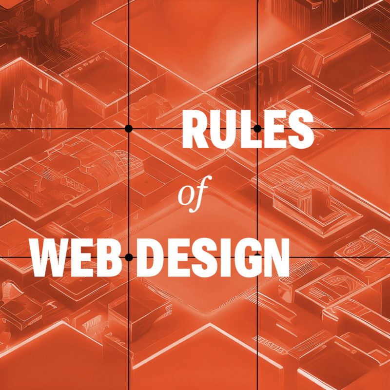
Believe it or not, the rule of thirds can even apply to web design as well, or any artform where you are composing a frame. The rule of thirds is a compositional guideline that divides an image into nine equal parts by two equally spaced horizontal lines and two equally spaced vertical lines. The important compositional elements of a design should be placed at the intersections of these lines, or along the lines themselves. The idea is that this creates a more balanced and visually appealing composition.

The rule of thirds can be used in web design to improve the aesthetics of your layouts. By placing important elements at the intersections of the rule of thirds grid, you can create a more dynamic and interesting composition.

For example, you could place your logo at the intersection of the top horizontal line and the left vertical line, and your call to action button at the intersection of the bottom horizontal line and the right vertical line. You could also use the rule of thirds to place your navigation bar, header, footer, and other important elements on your website.

Of course, the rule of thirds is just a guideline. You don’t have to follow it slavishly. But if you find that your designs are feeling a bit static or boring, try using the rule of thirds to see if it helps to create a more visually interesting and engaging design.

Use White Space

White space, also known as negative space, refers to the blank areas around and between design elements on a web page. It can be just as important as the content itself, as it can help to create a clean, organized, and visually pleasing design.

One of the benefits of white space is that it can make important content stand out. By leaving some areas of a page empty, the eye is naturally drawn to the content that is present. This can be particularly useful when trying to emphasize a call-to-action or other important information.

Another benefit of white space is that it can improve readability. By spacing out paragraphs, headers, and other text elements, it becomes easier for the reader to distinguish between them and to follow the flow of the content. This can be particularly important on mobile devices where screen space is limited.

When using white space, it’s important to strike a balance between too much and too little. Too much white space can make a page look sparse and unfinished, while too little can make a page look cluttered and overwhelming. It’s important to consider the purpose of the page, the content that will be included, and the overall design aesthetic when deciding how much white space to incorporate.

Be Consistent

Consistency is essential in web design, as it provides the necessary structure and organization to help users navigate through a website with ease. Consistency in design means that similar elements on different pages have the same look and feel, including typography, color, layout, and navigation. This not only makes the website more visually appealing, but it also helps users quickly recognize and understand how to interact with different components on the site.

When designing a website, consistency should be applied not only to the visual design but also to the user experience. This means that the website should be consistent in terms of functionality, such as the placement of navigation menus and buttons, the use of icons and symbols, and the overall flow of the website. Consistency in user experience ensures that users know what to expect from the website and how to navigate it, which leads to a better overall UX.

Another benefit of consistency in web design is that it can help establish a brand identity. A consistent visual style can help users identify and connect with a brand, making it easier for the brand to build brand recognition and loyalty.

Consider Contrast

Contrast is a crucial element of web design that can help to create visual interest and guide users’ attention to the most important content on a page, as well as improve it’s accessibility. Contrast can be achieved through the use of different colors, typography, shapes, and sizes.

One way to use contrast effectively in web design is to create a visual hierarchy. This involves using contrasting elements to differentiate between different levels of information on a page. For example, the use of bold, large typography for headlines can create contrast and draw the user’s attention to important information.

Another way to use contrast is to create a sense of depth and dimensionality in a design. By using contrasting colors and shades, web designers can create the illusion of layers and depth, which can make a design more visually engaging and memorable.

When using contrast in web design, it’s important to be mindful of accessibility. For example, using colors with insufficient contrast can make it difficult for users with visual impairments to read content. Designers should always ensure that their designs meet accessibility guidelines and are accessible to all users.

Limit the Number of Fonts

Using too many different fonts in web design can be a common mistake that can make a website look cluttered and unprofessional. It’s important to remember that typography is an art form and should be treated as such. When using multiple fonts, they should be carefully selected and paired in a way that is visually appealing and harmonious.

One approach to using multiple fonts in web design is to limit the number of fonts used to two or three, with each font serving a distinct purpose. For example, a website might use one font for headlines and another for body text. When selecting fonts, it’s also important to consider their style and how they complement each other. Fonts that are too similar can create confusion and make it difficult for users to distinguish between different sections of a website.

In addition to limiting the number of fonts used, it’s also important to consider font size, spacing, and hierarchy. Proper use of font size and spacing can help guide the user’s eye and make it easier to scan and read content. Hierarchy, or the order of importance of text on a page, can also be communicated through the use of font weight and style.

Using multiple fonts in web design can add visual interest and depth, but it’s important to do so in a thoughtful and intentional way. By limiting the number of fonts used and considering their style, size, spacing, and hierarchy, designers can create a cohesive and professional look for their website.

Don’t Let These Rules Cripple Your Creativity

These principles and rules help web designers create websites that are visually appealing, functional, and user-friendly. But these rules are just guidelines, and there are times when it’s okay to break them. For example, if you have a strong focal point, sometimes you may want to place it in the center of the frame. There is no one right way to build a website. Experiment with different layouts to see what works best for you and your brand. Ultimately, the best way to compose your design is to use your intuition.

Homepage Design: Take a Second to Consider Your First Impression

Your website’s homepage is often the first impression a visitor has of your brand, so it’s essential to make it count. A well-designed homepage can capture your visitor’s attention and guide them towards taking the desired action, whether it’s making a purchase, signing up for your newsletter, or browsing your content. Here are some tips and best practices to help you create a functional and eye-catching website homepage.

  • Make a plan with wireframing. Before you start designing and coding your homepage, brainstorm using wireframes and mockups to begin imagining what your final product can be.
  • Start with a strong header. The header is the first thing that visitors will see, so it’s important to make a good impression. Include your logo, a headline or tagline, and a call to action. Your headline should be clear, concise, and attention-grabbing. It should give visitors a good idea of what your website is about and what they can expect to find on it.
  • Create a strong visual identity. Your homepage should be visually appealing and should reflect the overall branding of your website. This means using consistent fonts, colors, and imagery throughout your homepage.
  • Know your audience. Understanding your target audience is crucial when creating a homepage that resonates with them. Consider their interests, values, and pain points and design your homepage accordingly to create a good user experience.
  • Keep it simple. A cluttered homepage can be overwhelming and confusing for visitors. Keep your homepage design simple, with a clear hierarchy of information that guides the visitor’s eye.
  • Use eye-catching visuals. Visuals can help capture your visitor’s attention and make your brand more memorable. Use high-quality images and videos that are relevant to your brand and message.
  • Keep your content organized and easy to scan. Use clear headings, subheadings, and bullet points to make your content easy to read and understand. You can also use white space to create visual breaks and make your content more visually appealing.
  • Make your value proposition clear. Your homepage should communicate your unique selling proposition and what sets your brand apart from the competition. Make sure your message is prominently displayed and easy to understand.
  • Make it easy to navigate. Visitors should be able to easily find the information they’re looking for on your homepage. Use a clear and concise navigation system and make sure all of your links are working properly.
  • Use clear and concise copy. Your homepage copy should be simple and to-the-point. Use clear headlines and subheadings to break up the text and make it easier to scan.
  • Optimize for mobile. With the majority of website traffic coming from mobile devices, it’s essential to optimize your homepage for mobile devices. Make sure your design is responsive and loads quickly on mobile devices.
  • Use calls-to-action (CTAs). Your homepage should encourage visitors to take action, whether it’s signing up for a newsletter or making a purchase. Use a clear and prominent CTA to guide visitors towards the desired action.
  • Optimize for search engines. Your front page is likely the page you want to rank highest in search engines. Use relevant keywords throughout your homepage content. This includes your headline, meta descriptions, and body text. Keep your homepage content fresh and up-to-date. Google loves fresh content, so make sure you’re updating your homepage regularly with new information and updates.
  • Test and iterate. Once you’ve created your homepage, it’s important to test it and iterate on it based on user feedback. This will help you to create a homepage that is both functional and eye-catching.

By taking these guidelines into account, you can create a useful and enticing website homepage that captures your visitor’s attention and guides them towards taking the desired action. Hopefully this translates to closing more sales, or getting more sign-ups. Remember to keep your homepage design simple, communicate your value proposition clearly, and use calls-to-action to funnel visitors through your desired path. And always keep it up-to-date with fresh and engaging content. This will help keep visitors happy and coming back for more.

404 Error Pages: Turning a Bug Into a Feature

A 404 code, or the “page not found” error, is the default error message that is displayed when a user attempts to access a URL that does not exist on the server. While a 404 page can be frustrating for users, it can also be an opportunity for web designers to create a positive user experience. A useful and well designed 404 page should help retain users and improve their experience on your website.

When visitors encounter too many 404 errors on your site, it can cause harm in multiple ways. Not only does it increase the bounce rate and make users less likely to return, but it can also harm your site’s SEO. So your first course of action should be to try to minimize 404’s happening in the first place. Regularly scan your site for broken links, and create redirects for typo links coming from external sites.

Once you’ve mitigated the risk of users encountering these errors, you should prepare for the inevitability that a few will still happen. Here are some things to think about when creating your 404 page.

A-pear-ently this page isn't peeling so grape.
  • Keep it simple. The 404 page should be easy to understand and navigate. It should be clear that the page the user is looking for doesn’t exist, and it should provide clear instructions on how to find the content they are looking for.
  • Apologize and explain. Your site failed to supply the user with the content they were looking for, so it’s important to apologize for the error and explain why it occurred. This can help ease their frustration and provide context for the situation.
  • Provide helpful links. A helpful 404 page should provide links to other pages on your website that may be of interest to the user. This can include links to the homepage, popular pages, or a site map. This can help the user find the content they are looking for, even if it’s not on the exact page they were trying to access.
  • Keep it light-hearted. Humor can be a great way to turn a frustrating situation into a positive experience. Consider using a witty message or image to help lighten the mood.
  • Add a search bar. Including a search box on your error page can be a helpful way for users to find the content they are looking for, even if they don’t know the exact URL.
  • Keep it on-brand. While a 404 page is an error page, it’s still part of your website. Make sure the page is consistent with your brand and website design.
  • Monitor and improve. It’s important to monitor your website for 404 errors and make improvements to your 404 page as needed. Regularly checking for broken links and updating your page can help ensure users have a positive experience.
  • Make it visually appealing. Even though a 404 error page is not a critical part of your website, it is still important to make it visually appealing. This will help to create a positive user experience.
Peas don't cheddar tear, this page has gone to a butter plate.

In addition to providing users with information and links, it’s important to provide them with an easy way to contact you. This is helpful to the user if they still can’t find the page they’re looking for, and it alerts you right away that a page on your site might be missing.

A 404 page is something that many web developers don’t even think about. But creating a helpful and informative one can help retain users and improve their experience on your website. By utilizing some of these tips, you can turn a frustrating situation into a positive experience.

Exploring Navigation: Best Practices for Website Menus

Website navigation is a crucial aspect of web design that can make or break a user’s experience. When done correctly, it helps users find what they are looking for quickly and efficiently. However, when done poorly, it can frustrate users and drive them away from your website. Well formatted navigation is important for search engine optimization, to help web crawlers navigate the flow of your site. In this article, we will discuss website navigation best practices and common mistakes to avoid.

Menu Locations and Their Uses

  • Top navigation: The top global navigation is the most common type of navigation bar. It is typically located at the top or bottom of the website header and contains links to the most important pages on the site. The top navigation is a great way to provide users with quick and easy access to the most important content on your website.
  • Sidebar navigation: The side navigation is a great way to provide users with a more detailed view of the website’s structure, and can help users find specific content on your website. It’s sometimes used to show links related to the main content on the current page.
  • Footer navigation: The footer navigation is located at or near the bottom of the website and contains links to important pages such as the contact page, privacy policy, and terms of service. The footer navigation is a great way to provide users with quick and easy access to this important information.

Website Navigation Best Practices

  • Keep it Simple: One of the key navigation best practices is to keep it simple. Your website’s navigation should be easy to understand and use to improve your UX. Avoid using complex menus or confusing labels. The fewer navigation options you have, the easier it will be for users to find what they are looking for.
  • Be Consistent: Consistency is key when it comes to website navigation. Use the same navigation structure and terminology throughout your website, so users know where they are and how to get where they want to go.
  • Make it Easy to Find: Your website’s navigation should be easy to find and accessible from every page. A common location for navigation is at the top of the page, but you can also include it in the footer or sidebar.
  • Use Descriptive Labels: Use clear and concise labels for your navigation links. Avoid using generic labels like “Links” or “Pages” and instead use more specific and descriptive labels, so that users know what to expect when they click on them.
  • Prioritize Important Pages: Promote the most important pages in your navigation by placing them first or highlighting them with a different color or style.
  • Group Related Items: Placing similar links together can make it easier and quicker for users to find the information they are looking for.
  • Use a Logical Hierarchy: The navigation system should be organized in a logical hierarchy of pages, subpages, and categories. This will help users to understand the relationships between the different pages on the website.
  • Icons: Simple and recognizable icons can help to make your navigation system more visually appealing and easier to use. Just be sure to use images and icons that are relevant to your content and that are easy to understand.
  • Breadcrumbs: Breadcrumb trails are a line of text or links that shows users the hierarchy of the page they are on. Breadcrumbs are a great way to help users understand where they are on a website and how to get back to where they started.
  • Search: If your website has a lot of content, it is important to make it easy for users to search for what they are looking for. Search is also a great way to help users find content that they may not be able to find through the regular navigation system.

Common Mistakes to Avoid

Your navigation is only as strong as your weakest link.

  • Too Many Options: Too many options in your website’s navigation can be overwhelming for users. Limit your navigation options to the most important pages.
  • Poor Organization: Poorly organized navigation can make it difficult for users to find what they are looking for. Organize your navigation based on categories or topics.
  • Hidden Navigation: Hidden navigation, such as hamburger menus, can be confusing for some users. If you use hidden navigation, make sure it is easy to find and use. It should be prominently displayed on all pages of the website.
  • Non-Descriptive Labels: Generic labels like “Click Here” or “Learn More” can be confusing for users. Use clear and descriptive labels for your navigation links.
  • Broken Links: Broken links in your navigation can lead to frustration for users. Regularly check all the links in your navigation for 404 errors or other problems.

By following these tips and avoiding these common mistakes, you can design a website navigation system that is easy to use, intuitive, and consistent. This will help to improve the user experience and make it more likely that users will return to your website.

Color Psychology and its Impact on Web Design

Color is a fundamental aspect of web design that can have a significant impact on user experience. Color psychology is the study of how color affects human behavior, mood, and emotion. When used effectively, color can help convey a message, evoke emotions, and guide users through a website.

Color psychology suggests that different colors can evoke different emotions in people. For example, red can symbolize passion, energy, and excitement, while blue is often associated with trust, calmness, and security. By using colors strategically, web designers can create a specific mood or emotion within their website visitors.

One important consideration is to choose colors that are appropriate for the brand and the target audience. Bright and bold colors may work well for a children’s website, but may not be appropriate for a financial institution. Neutral and muted colors may be better suited for a professional website.

Another factor to consider is color contrast. High contrast between background and foreground colors can make it easier for users to read text and navigate the site. It’s important to also consider color accessibility and make sure that the site is accessible to users with visual impairments. Tools like the WCAG color contrast checker can help ensure that color contrast meets accessibility standards.

In addition, it’s also important to consider the overall visual hierarchy of the website. Colors can be used to draw attention to important elements, such as calls to action or navigation menus. Using color consistently throughout the website can also help create a cohesive and memorable brand identity.

Color theory is the study of how colors interact with each other and the human eye. It involves understanding the color wheel, color harmony, and color contrast. By applying color theory principles in web design, designers can create harmonious color palettes that communicate the intended emotions and messages to the users.

Here are some examples of how color can be used in web design:

  • Red: Red is a powerful color that can be used to create a sense of urgency or excitement. It’s often used on websites that sell products or services that people need right away, such as restaurant and delivery websites or emergency services websites.
  • Orange: Orange is a warm and inviting color that can be used to create a sense of excitement or happiness. It’s often used on websites that sell products or services that people want to enjoy, such as recipe or travel websites.
  • Yellow: Yellow is a bright and cheerful color that can be used to grab attention or create a sense of optimism. It’s often used on websites that have products or services that people want to buy, such as retail websites or online stores.
  • Green: Green is a calming and relaxing color that can be used to create a sense of peace or relaxation. It’s popular on environmental and outdoors sites.
  • Blue: Blue is a cool and calming color that can be used to create a sense of trust or reliability. It’s commonly used on websites where people need to feel safe and secure, such as banking websites or government websites.

Color psychology is a powerful tool that can help web designers create an effective and engaging user experience. Remember, too much color can be overwhelming and distracting. It’s important to use color sparingly and to choose colors that complement each other. By choosing appropriate colors, considering contrast and accessibility, and using color strategically, designers can enhance the user experience and create a memorable brand identity.

User Experience: Tips and Best Practices for UX Design

User experience (UX) design is the process of enhancing user satisfaction with a product by improving the ease of use, efficiency of navigation, and pleasure provided in the user’s interaction with it. It is a critical component of web design, as it can make the difference between a website that is easy to use and navigate, and one that is frustrating and confusing. Good UX design ensures that visitors to a website can find the information they are looking for quickly and easily, and that they have a positive experience while using the site.

There are many different UX design principles, but here are just a few tips and best practices for improving the user experience on your website.

Simplicity

  • Less is More: The user interface should be easy to understand and use, without clutter and overwhelming visuals that don’t add value. Visitors should be able to quickly find what they are looking for and complete their tasks without having to think too much.
  • Clear Navigation: The navigation menu should be easy to locate and use. Make sure the menu items are clear, concise, and organized in a logical order.
  • Clarity of Purpose: The website should have a clear purpose and be easy to understand. Visitors should be able to quickly determine what the website is about and what they can do on it.
  • Clear and Concise Language: Avoid using jargon or technical terms that your users may not understand. Keep your sentences short and to the point.

Functionality

  • Mobile Optimization: With the increasing use of mobile devices, it’s crucial to design websites that are mobile-friendly. The website should be responsive, meaning it should adjust to different screen sizes.
  • Readability: The website should have a legible font and font size, with appropriate spacing and contrast between the text and background. It’s best to avoid using too many fonts and font sizes on the website.
  • Minimize Load Time: The website should load quickly, as users tend to lose interest if a website takes too long to load. Optimize images and videos and use efficient code to minimize load time.
  • Accessibility: Make sure the website is accessible to everyone, including those with disabilities. Use alt tags for images, and provide captions for videos.
  • Feedback: Provide visual feedback to users after they take any action on the website, such as filling out a form or clicking a button. This feedback assures the user that their action was successful.

Aesthetics

  • Attractive Design: The website should be visually appealing. The design should be consistent with the brand identity of the company or organization, and it should be easy on the eyes.
  • Use white space effectively: White space is important for creating a sense of balance and order on your website.
  • Consistent Design: A uniform design language throughout the website is essential to ensure that users can quickly understand the purpose of each page. Use consistent typography, colors, and spacing to maintain a cohesive design.
  • High-quality Media: Images and videos can help to break up text and make your website more visually appealing. They can also help to tell a story or illustrate a point.

A/B testing is a great way to improve UX design. By testing different variations of a website, web designers can see what works best for users and make improvements accordingly. For example, a web designer could test different headline styles, call to action buttons, or landing page layouts to see which one results in the most conversions.

These tips and best practices can help create a better user experience on your website. A good UX design is essential to ensure that users enjoy their experience on your website, and keep coming back for more.

Animation in Web Design: More Than Just Cool Graphics

Animation has become an increasingly popular aspect of web design, adding a level of interactivity and visual interest to websites. From subtle hover effects to complex animations, designers have a variety of tools and techniques at their disposal to create engaging animations for their websites.

One popular animation tool is CSS animations. With CSS3, designers can create animations using keyframes that define the start and end points of an animation, as well as the intermediate steps. This allows for a wide range of animation effects, from simple transitions to more complex motion graphics. CSS animations are simple to create and can be used to animate properties such as position, size, and color.

Another powerful animation tool is JavaScript, which allows for more advanced animations and interactivity. JavaScript can be used to create animations based on user interactions, such as scrolling or clicking, as well as to manipulate the DOM and create complex animations that are difficult to achieve with CSS alone.

SVG image files can be animated using CSS or JavaScript. SVG animations can be used to add interest and interactivity to web pages. They can be used to create buttons, logos, and other graphical elements that can be animated. SVG animations can also be used to create interactive content, such as games and simulations.

Even more immersive and interactive experiences can be created with WebGL. By combining the power of JavaScript and 3D graphics, developers can create stunning visualizations and games that can be played directly in the browser. With WebGL, it’s possible to create complex animations, simulate physics, and even create virtual reality environments. Whether you’re a game developer or just looking to add some interactivity to your website, WebGL is a great tool to have in your arsenal.

Aside from aesthetics, here are some ways animation can add to your UX:

  • Attract attention: Animation can be used to grab the attention of visitors and draw them into your site. For example, you could use a bouncing ball or a rotating image to catch people’s eye.
  • Explain complex concepts: Animation can be used to explain complex concepts in a way that is easy to understand. For example, you could use an animated diagram to show how a product works.
  • Improving usability: Animation can be used to make websites easier to use by providing visual cues and instructions.
  • Create a sense of movement: Animation can be used to create a sense of movement and excitement on your site. For example, you could use a scrolling banner or a parallax effect to make your site more visually appealing.
  • Creating a sense of interactivity: Animation can be used to make websites more interactive by allowing users to interact with elements on the page.
  • Personalize the user experience: Animation can be used to personalize the user experience for each visitor. For example, you could use a welcome message or a personalized recommendation to make each visitor feel like they are the only one on your site.

In addition to creating engaging animations, web designers must also consider the performance implications of animation on a website. Large or complex animations can slow down page load times, leading to a poor user experience. Therefore, it is important to optimize animations and consider factors such as file size, frame rate, and animation duration.

When used effectively, animation can be a powerful tool for improving the user experience of your website. However, it is important to use animation sparingly. Too much animation can be distracting and annoying. It is also important to make sure that your animation is well-designed and executed. Poorly designed animation can make your site look unprofessional and amateurish. Consider hiring a freelance animation designer to step up your animation game.

Here are some tips for using animation effectively in web design:

  • Use animation to highlight important elements: Animation can be used to draw attention to important elements on your site, such as calls to action or product features.
  • Keep animation simple: Simple animation is more effective than complex animation. Complex animation can be distracting and difficult to follow.
  • Use animation sparingly: Too much animation can be overwhelming and annoying. Use animation only when it is necessary to improve the user experience.
  • Test your animation thoroughly: Make sure that your animation works correctly in all major browsers. This will help to ensure that your website is accessible to all users.
  • Optimize your animation: Make sure that your animation is not too large or too complex. This will help to improve the loading time of your site.
  • Use animation to add personality: Animation can be used to add a touch of personality to your website. For example, you could use animation to create a mascot, add a sense of humor, or make your website more visually appealing.
  • Use animation to tell a story. Animation can be used to tell a story or to convey a message.

Overall, animation can be a powerful tool in web design, adding an extra level of engagement and interactivity to a website. By using the right tools and techniques, designers can create animations that enhance the user experience without sacrificing performance.