Color Theory: Speak the Language of Hue

Color is a crucial and influential element in web design, as it can evoke emotions, convey a brand’s personality, and guide users’ attention. Color theory is the study of how colors interact with each other and how they affect the human eye and brain. It is a complex and fascinating subject, and it can be used to create a wide variety of effects in design. So how does color theory apply to web design and how do you choose the right colors for your website?

The first thing to consider when choosing colors for your website is your brand’s personality and message. Think about the emotions you want to convey to your audience and what your brand stands for. For example, blue is often associated with trust and reliability, while red is associated with energy and excitement. Once you have a clear understanding of your brand’s personality, you can choose colors that align with it.

When choosing colors for a website, it is important to consider the overall mood or atmosphere you want to create. For example, if you want to create a website that is calming and relaxing, you might choose soft, muted colors like blues and greens. If you want to create a website that is exciting and energetic, you might choose brighter, more vibrant colors like reds and oranges.

It is also important to consider the target audience for your website. For example, if your website is aimed at children, you might choose bright, playful colors. If your website is aimed at adults, you might choose more subdued colors.

In addition to the overall mood or atmosphere, you should also take into consideration the specific elements of your website when choosing colors. For example, the text should be easy to read against the background, and the call-to-action buttons should stand out from the rest of the page.

Color theory can be a complex subject, but it is an essential part of web design. By understanding the basics of color theory, you can create websites that are visually appealing and effective.

Color Wheel

Color Wheel
Color Wheel

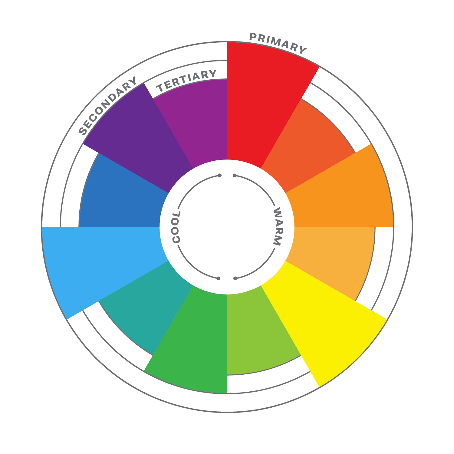
The color wheel is a circular diagram that shows the relationships between colors. It is a useful tool for understanding how colors work together and how to create pleasing color schemes.

The color wheel is divided into three primary colors: red, yellow, and blue. These colors cannot be created by mixing other colors together. When two primary colors are mixed together, they create a secondary color. The secondary colors are orange, green, and purple. When a primary color and a secondary color are mixed together, they create a tertiary color. There are six tertiary colors: red-orange, yellow-orange, yellow-green, green-blue, blue-purple, and red-purple.

The color wheel is often divided into warm colors (like red, orange, and yellow) and cool colors (like blue, green, and violet). Warm colors are associated with passion, energy, and excitement, while cool colors are associated with calmness and peace.

Color Harmony

Another important aspect of color theory is color harmony. This refers to how colors work together to create a visually appealing design. It is a subjective concept, as different people have different preferences for color. However, there are some general principles of color harmony that can be followed to create pleasing color schemes.

Complementary Colors

There are many different ways to create color harmony, but some of the most common methods include:

  • Monochromatic: A monochromatic color scheme uses variations of one color. This can be a very effective way to create a calm and sophisticated look.
  • Analogous: Analogous color schemes use three colors that are close to each other on the color wheel. This can be a very harmonious and pleasing color palette.
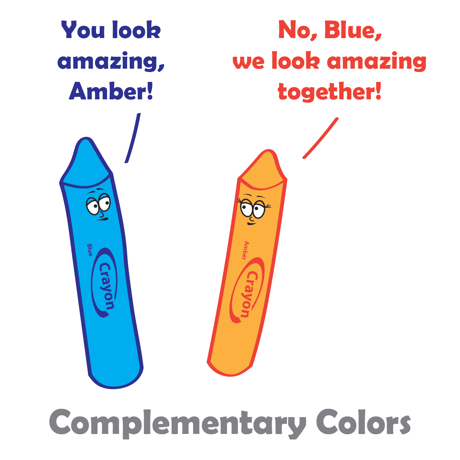
  • Complementary: Complementary colors are two colors that are opposite each other on the color wheel. This can be a very striking and eye-catching pair.
  • Split-complementary: Split-complementary color schemes use the color opposite the primary color, as well as the two colors on either side of the complementary color. This can be a very sophisticated and elegant color combination.
  • Triadic: A triadic color theme uses three colors that are evenly spaced around the color wheel, creating a very balanced and dynamic look.
  • Tetradic: Tetradic color schemes use four colors that are evenly spaced around the color wheel. This can be a very complex and interesting way to use color.

When choosing colors in your design process, it is important to consider the overall effect that you want to create. If you want to create a calm and relaxing design, you might want to use a monochromatic or analogous color scheme. If you want to create something more dramatic and eye-catching, you might want to use a complementary or triadic color scheme.

No matter which method you choose, it is important to use colors that you like and that work well together, and to experiment with different color combinations until you find one that you like. And remember, there are no hard and fast rules when it comes to color harmony. The most important thing is to use colors that you find pleasing and that create the effect you want. When you choose colors that are pleasing to the eye, you can create art that is both beautiful and functional.

Color Principles

One of the most important principles of color harmony is contrast. Contrast is the difference between the lightness and darkness, or the warmth and coolness, of colors. A high-contrast color scheme uses colors that are very different from each other, while a low-contrast color scheme uses colors that are similar to each other.

Contrast is important in web design, as it helps guide users’ attention and create visual interest. High contrast colors, such as black and white, create a strong visual impact and are useful for highlighting important information. Low contrast colors, such as pastels, create a softer and more subdued effect.

Another important principle of color harmony is unity. Unity is the feeling that all of the colors in a design work together. There are a number of ways to create unity, such as using a limited color palette, repeating colors throughout a design, or using a color scheme that is based on a natural phenomenon, such as a sunset or a rainbow.

In addition, consider the cultural associations of colors. Different cultures may have different meanings and associations with colors, so it’s important to research the cultural context of your audience. For example, in western cultures, white is often associated with purity and innocence, while in some eastern cultures it is associated with mourning.

Color Psychology

While color theory and color psychology are related, they are not the same thing. Color theory focuses on the principles and concepts of color and how they interact with each other. It is concerned with the visual effects of color combinations, such as contrast, harmony, and balance. On the other hand, color psychology studies the emotional and behavioral effects of colors on human beings. It explores how different colors can affect mood, perception, and behavior, and how they can be used to communicate different messages and create different experiences. While color theory is important in creating effective and visually pleasing designs, color psychology can help to further enhance the message and impact of a design by understanding how colors are perceived and experienced by the audience.

According to color psychology, different colors evoke different emotions and can have different effects on the human brain. For example, red is often associated with excitement and passion, while blue is often associated with calmness and peace. When choosing colors for your website, it’s important to consider the message you want to convey and the emotions you want to evoke in your users.

Here are some additional tips for using color in web design:

  • Use a limited color palette. Too many colors can be overwhelming and distracting.
  • Use white space to create contrast and make your colors pop.
  • Use color to highlight important elements of your website, such as the call to action buttons.
  • Use color consistently throughout your website. This will help create a cohesive and professional look.
  • Test your colors on different devices and browsers to make sure they look good everywhere.

When used effectively, color can be a powerful tool for web design. Color theory is an important aspect of web design that can greatly impact the success of your website. By understanding the principles of color theory, and considering your brand’s personality, you can choose the right colors to evoke the emotions and convey the message you want to communicate to your audience.

SVG: The Power of Scalable Vector Graphics in Web Design

Scalable Vector Graphics (SVG) is an open vector image format used in web design. It is a widely popular format that is supported by all modern web browsers. SVG graphics are vector images, which means they are made up of paths and shapes. This makes them scalable and resolution-independent, which means they can be scaled up or down without losing any quality or clarity. This is why SVG graphics are an ideal choice for responsive web design.

SVG images are created using XML code. This means that they are easy to edit and manipulate. SVG graphics can be edited using a text editor or a dedicated vector graphics editor like Adobe Illustrator or Inkscape.

Using SVG graphics offers a great benefit in improving website performance. Compared to traditional image formats like JPEG or PNG, SVG files tend to be much smaller in size. This is because SVG graphics are vector-based and can be scaled without losing quality, unlike raster images which can become pixelated when enlarged. SVG graphics can also be compressed without becoming distorted, further reducing their file size. This makes them ideal for websites and web applications where page load speed is crucial. Additionally, because SVG graphics are code-based, they can be cached and reused, reducing server requests and improving overall performance.

CSS can be used to style SVG graphics just like any other HTML element. You can apply styles to the SVG element itself or to its child elements, such as paths, circles, and rectangles. You can use CSS properties like fill, stroke, stroke-width, opacity, and transform to change the appearance of your SVG graphics.

SVG graphics are not only versatile and scalable but can also be animated and interactive, making them an excellent choice for creating engaging and dynamic web designs. With SVG, it’s possible to add animations such as fades, transitions, and rotations, allowing designers to create visually appealing and interactive elements on their web pages. SVG animations can be achieved using CSS or JavaScript, making it easy to incorporate them into any web project. Additionally, web designers can create interactive elements such as clickable buttons, hover states, and more, making their designs even more engaging and user-friendly.

SVG isn’t the only image format you will ever need. For highly detailed images such as photos, you’re better off sticking with a raster format. But here are some areas where SVG’s shine:

  • Icons: SVG graphics are often used to create icons and other small, simple graphics that are used to represent different functions or actions.
  • Logos: SVG’s are great for creating logos and other branding and marketing materials.
  • Illustrations: The SVG format is perfect for colorful illustrations and lineart.
  • Charts and graphs: SVG graphics can be used to create charts, graphs, maps, and infographics, which are a great way to present data in a visually appealing and easy-to-understand way.
  • Decorative elements: Use SVG to add style to your site with decorative designs and shapes.
  • Patterns and backgrounds: Designers can create unique and interesting patterns and backgrounds that add visual interest and depth to a website.
  • Animations: SVG graphics can be used to create animations, and to add interest and interactivity to a website.

When it comes to using SVG graphics in web design, there are a few things to keep in mind. It’s important to optimize the SVG file for web use. This involves removing unnecessary code and compressing the file size. And since SVG’s are code-based rather than pixel-based, you should test your SVG files in all major web browsers to make sure they display correctly.

Another important consideration when using SVG graphics in web design is accessibility. It is important to ensure that the SVG graphics are accessible to all users, including those using assistive technologies like screen readers. This involves providing alternative text descriptions and ensuring that the SVG graphics are properly labeled.

If you are looking for a powerful and versatile tool for creating graphics for the web, then SVG is a great option. It offers many benefits, including smaller file sizes, scalability, and the ability to be animated. However, it is important to properly optimize and embed SVG graphics, as well as ensure their accessibility, to ensure the best user experience for all users.

What Part Do Wireframes Have in the Web Design Process?

Wireframing is an essential step in the web design process. It involves creating a rudimentary visual representation of a website’s layout, structure, and content before any coding or graphic design work begins, and it is used to plan the layout, functionality, and content of the final product. This can help designers and clients get a sense of the site’s overall structure, organization, and flow, and can help you improve the usability of your website by ensuring that the layout and functionality are easy to use and understand.

What is wireframing?

A wireframe is a two-dimensional illustration of a page’s interface that specifically focuses on space allocation and prioritization of content, functionalities available, and intended behaviors. Wireframes are typically created using simple, low-fidelity sketches or digital mockups. They help web designers map out the site’s hierarchy, content blocks, navigation, and other key elements. This can help identify potential usability issues, highlight areas where content might be missing, and ensure that the site’s overall structure is easy to understand.

One of the key benefits of wireframing is that it allows developers and stakeholders to quickly iterate on ideas and experiment with different layouts and structures. This can help ensure that the site’s design is flexible and adaptable, and that it can evolve over time as the project progresses. Wireframes can help you save time and money in the development process by identifying and resolving potential problems early on.

Another advantage of wireframing is that it helps creators focus on the site’s content and functionality, rather than getting bogged down in the details of the visual design. This can help ensure that the site’s structure and organization are solid before moving on to the more detailed work of graphic design and coding.

How To Use Wireframing Effectively

There are many different ways to wireframe. Some people prefer to use pen and paper, while others prefer to use software. There are also many different wireframing tools available, each with its own strengths and weaknesses.

The best way to wireframe is to find a method that works for you and your team. If you have a favorite graphics creation program, that would be a great place to start. There is no right or wrong way to wireframe, as long as you are able to communicate your ideas effectively.

Here are some tips to keep in mind when creating wireframes:

  • Start with a clear understanding of your goals. What do you want your website or app to do? What do you want your users to do?
  • Think about your users. Who are they? What are their needs?
  • Keep it simple. Wireframes are not meant to be beautiful. They are simply a way to communicate the basic structure of a website or app. Use simple shapes and text to create your wireframes. Try not to cram too much into your wireframe, or spend too much time making it visually appealing.
  • Sketch your ideas first. Before you start creating your wireframes in a wireframing tool, it can be helpful to sketch out your ideas on paper. This will help you to get a better understanding of the layout and functionality of your product.
  • Label everything. Make sure to label all of the elements of your wireframe. This will help you and others to understand what each element does.
  • Get feedback early and often. Show your wireframes to others and get their feedback. This will help you to identify any potential problems with the layout or functionality of your product.
  • Iterate. Wireframes are not set in stone. Once you have created a wireframe, you can iterate on it as needed. This will help you to create the best possible user experience for your website.

Overall, wireframing is an important part of the web design process, and can help ensure that the final site is functional, usable, and effective. By taking the time to create a clear, well-structured wireframe, designers can lay the foundation for a successful website that meets the needs of both the client and the end user.

Rules and Guidelines of Web Design

In photography, there are rules or guidelines such as the rule of thirds, to assist in composing an image. But what rules are there in web design? There are actually several laws and principles that are commonly used in website design to create aesthetically pleasing and effective websites. Here are some of the most important rules-of-thumb in web design.

The Rule of Thirds

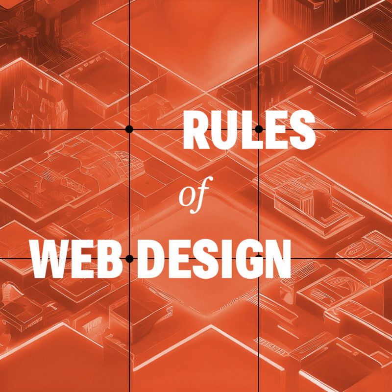
Believe it or not, the rule of thirds can even apply to web design as well, or any artform where you are composing a frame. The rule of thirds is a compositional guideline that divides an image into nine equal parts by two equally spaced horizontal lines and two equally spaced vertical lines. The important compositional elements of a design should be placed at the intersections of these lines, or along the lines themselves. The idea is that this creates a more balanced and visually appealing composition.

The rule of thirds can be used in web design to improve the aesthetics of your layouts. By placing important elements at the intersections of the rule of thirds grid, you can create a more dynamic and interesting composition.

For example, you could place your logo at the intersection of the top horizontal line and the left vertical line, and your call to action button at the intersection of the bottom horizontal line and the right vertical line. You could also use the rule of thirds to place your navigation bar, header, footer, and other important elements on your website.

Of course, the rule of thirds is just a guideline. You don’t have to follow it slavishly. But if you find that your designs are feeling a bit static or boring, try using the rule of thirds to see if it helps to create a more visually interesting and engaging design.

Use White Space

White space, also known as negative space, refers to the blank areas around and between design elements on a web page. It can be just as important as the content itself, as it can help to create a clean, organized, and visually pleasing design.

One of the benefits of white space is that it can make important content stand out. By leaving some areas of a page empty, the eye is naturally drawn to the content that is present. This can be particularly useful when trying to emphasize a call-to-action or other important information.

Another benefit of white space is that it can improve readability. By spacing out paragraphs, headers, and other text elements, it becomes easier for the reader to distinguish between them and to follow the flow of the content. This can be particularly important on mobile devices where screen space is limited.

When using white space, it’s important to strike a balance between too much and too little. Too much white space can make a page look sparse and unfinished, while too little can make a page look cluttered and overwhelming. It’s important to consider the purpose of the page, the content that will be included, and the overall design aesthetic when deciding how much white space to incorporate.

Be Consistent

Consistency is essential in web design, as it provides the necessary structure and organization to help users navigate through a website with ease. Consistency in design means that similar elements on different pages have the same look and feel, including typography, color, layout, and navigation. This not only makes the website more visually appealing, but it also helps users quickly recognize and understand how to interact with different components on the site.

When designing a website, consistency should be applied not only to the visual design but also to the user experience. This means that the website should be consistent in terms of functionality, such as the placement of navigation menus and buttons, the use of icons and symbols, and the overall flow of the website. Consistency in user experience ensures that users know what to expect from the website and how to navigate it, which leads to a better overall UX.

Another benefit of consistency in web design is that it can help establish a brand identity. A consistent visual style can help users identify and connect with a brand, making it easier for the brand to build brand recognition and loyalty.

Consider Contrast

Contrast is a crucial element of web design that can help to create visual interest and guide users’ attention to the most important content on a page, as well as improve it’s accessibility. Contrast can be achieved through the use of different colors, typography, shapes, and sizes.

One way to use contrast effectively in web design is to create a visual hierarchy. This involves using contrasting elements to differentiate between different levels of information on a page. For example, the use of bold, large typography for headlines can create contrast and draw the user’s attention to important information.

Another way to use contrast is to create a sense of depth and dimensionality in a design. By using contrasting colors and shades, web designers can create the illusion of layers and depth, which can make a design more visually engaging and memorable.

When using contrast in web design, it’s important to be mindful of accessibility. For example, using colors with insufficient contrast can make it difficult for users with visual impairments to read content. Designers should always ensure that their designs meet accessibility guidelines and are accessible to all users.

Limit the Number of Fonts

Using too many different fonts in web design can be a common mistake that can make a website look cluttered and unprofessional. It’s important to remember that typography is an art form and should be treated as such. When using multiple fonts, they should be carefully selected and paired in a way that is visually appealing and harmonious.

One approach to using multiple fonts in web design is to limit the number of fonts used to two or three, with each font serving a distinct purpose. For example, a website might use one font for headlines and another for body text. When selecting fonts, it’s also important to consider their style and how they complement each other. Fonts that are too similar can create confusion and make it difficult for users to distinguish between different sections of a website.

In addition to limiting the number of fonts used, it’s also important to consider font size, spacing, and hierarchy. Proper use of font size and spacing can help guide the user’s eye and make it easier to scan and read content. Hierarchy, or the order of importance of text on a page, can also be communicated through the use of font weight and style.

Using multiple fonts in web design can add visual interest and depth, but it’s important to do so in a thoughtful and intentional way. By limiting the number of fonts used and considering their style, size, spacing, and hierarchy, designers can create a cohesive and professional look for their website.

Don’t Let These Rules Cripple Your Creativity

These principles and rules help web designers create websites that are visually appealing, functional, and user-friendly. But these rules are just guidelines, and there are times when it’s okay to break them. For example, if you have a strong focal point, sometimes you may want to place it in the center of the frame. There is no one right way to build a website. Experiment with different layouts to see what works best for you and your brand. Ultimately, the best way to compose your design is to use your intuition.

Homepage Design: Take a Second to Consider Your First Impression

Your website’s homepage is often the first impression a visitor has of your brand, so it’s essential to make it count. A well-designed homepage can capture your visitor’s attention and guide them towards taking the desired action, whether it’s making a purchase, signing up for your newsletter, or browsing your content. Here are some tips and best practices to help you create a functional and eye-catching website homepage.

  • Make a plan with wireframing. Before you start designing and coding your homepage, brainstorm using wireframes and mockups to begin imagining what your final product can be.
  • Start with a strong header. The header is the first thing that visitors will see, so it’s important to make a good impression. Include your logo, a headline or tagline, and a call to action. Your headline should be clear, concise, and attention-grabbing. It should give visitors a good idea of what your website is about and what they can expect to find on it.
  • Create a strong visual identity. Your homepage should be visually appealing and should reflect the overall branding of your website. This means using consistent fonts, colors, and imagery throughout your homepage.
  • Know your audience. Understanding your target audience is crucial when creating a homepage that resonates with them. Consider their interests, values, and pain points and design your homepage accordingly to create a good user experience.
  • Keep it simple. A cluttered homepage can be overwhelming and confusing for visitors. Keep your homepage design simple, with a clear hierarchy of information that guides the visitor’s eye.
  • Use eye-catching visuals. Visuals can help capture your visitor’s attention and make your brand more memorable. Use high-quality images and videos that are relevant to your brand and message.
  • Keep your content organized and easy to scan. Use clear headings, subheadings, and bullet points to make your content easy to read and understand. You can also use white space to create visual breaks and make your content more visually appealing.
  • Make your value proposition clear. Your homepage should communicate your unique selling proposition and what sets your brand apart from the competition. Make sure your message is prominently displayed and easy to understand.
  • Make it easy to navigate. Visitors should be able to easily find the information they’re looking for on your homepage. Use a clear and concise navigation system and make sure all of your links are working properly.
  • Use clear and concise copy. Your homepage copy should be simple and to-the-point. Use clear headlines and subheadings to break up the text and make it easier to scan.
  • Optimize for mobile. With the majority of website traffic coming from mobile devices, it’s essential to optimize your homepage for mobile devices. Make sure your design is responsive and loads quickly on mobile devices.
  • Use calls-to-action (CTAs). Your homepage should encourage visitors to take action, whether it’s signing up for a newsletter or making a purchase. Use a clear and prominent CTA to guide visitors towards the desired action.
  • Optimize for search engines. Your front page is likely the page you want to rank highest in search engines. Use relevant keywords throughout your homepage content. This includes your headline, meta descriptions, and body text. Keep your homepage content fresh and up-to-date. Google loves fresh content, so make sure you’re updating your homepage regularly with new information and updates.
  • Test and iterate. Once you’ve created your homepage, it’s important to test it and iterate on it based on user feedback. This will help you to create a homepage that is both functional and eye-catching.

By taking these guidelines into account, you can create a useful and enticing website homepage that captures your visitor’s attention and guides them towards taking the desired action. Hopefully this translates to closing more sales, or getting more sign-ups. Remember to keep your homepage design simple, communicate your value proposition clearly, and use calls-to-action to funnel visitors through your desired path. And always keep it up-to-date with fresh and engaging content. This will help keep visitors happy and coming back for more.

Color Psychology and its Impact on Web Design

Color is a fundamental aspect of web design that can have a significant impact on user experience. Color psychology is the study of how color affects human behavior, mood, and emotion. When used effectively, color can help convey a message, evoke emotions, and guide users through a website.

Color psychology suggests that different colors can evoke different emotions in people. For example, red can symbolize passion, energy, and excitement, while blue is often associated with trust, calmness, and security. By using colors strategically, web designers can create a specific mood or emotion within their website visitors.

One important consideration is to choose colors that are appropriate for the brand and the target audience. Bright and bold colors may work well for a children’s website, but may not be appropriate for a financial institution. Neutral and muted colors may be better suited for a professional website.

Another factor to consider is color contrast. High contrast between background and foreground colors can make it easier for users to read text and navigate the site. It’s important to also consider color accessibility and make sure that the site is accessible to users with visual impairments. Tools like the WCAG color contrast checker can help ensure that color contrast meets accessibility standards.

In addition, it’s also important to consider the overall visual hierarchy of the website. Colors can be used to draw attention to important elements, such as calls to action or navigation menus. Using color consistently throughout the website can also help create a cohesive and memorable brand identity.

Color theory is the study of how colors interact with each other and the human eye. It involves understanding the color wheel, color harmony, and color contrast. By applying color theory principles in web design, designers can create harmonious color palettes that communicate the intended emotions and messages to the users.

Here are some examples of how color can be used in web design:

  • Red: Red is a powerful color that can be used to create a sense of urgency or excitement. It’s often used on websites that sell products or services that people need right away, such as restaurant and delivery websites or emergency services websites.
  • Orange: Orange is a warm and inviting color that can be used to create a sense of excitement or happiness. It’s often used on websites that sell products or services that people want to enjoy, such as recipe or travel websites.
  • Yellow: Yellow is a bright and cheerful color that can be used to grab attention or create a sense of optimism. It’s often used on websites that have products or services that people want to buy, such as retail websites or online stores.
  • Green: Green is a calming and relaxing color that can be used to create a sense of peace or relaxation. It’s popular on environmental and outdoors sites.
  • Blue: Blue is a cool and calming color that can be used to create a sense of trust or reliability. It’s commonly used on websites where people need to feel safe and secure, such as banking websites or government websites.

Color psychology is a powerful tool that can help web designers create an effective and engaging user experience. Remember, too much color can be overwhelming and distracting. It’s important to use color sparingly and to choose colors that complement each other. By choosing appropriate colors, considering contrast and accessibility, and using color strategically, designers can enhance the user experience and create a memorable brand identity.

User Experience: Tips and Best Practices for UX Design

User experience (UX) design is the process of enhancing user satisfaction with a product by improving the ease of use, efficiency of navigation, and pleasure provided in the user’s interaction with it. It is a critical component of web design, as it can make the difference between a website that is easy to use and navigate, and one that is frustrating and confusing. Good UX design ensures that visitors to a website can find the information they are looking for quickly and easily, and that they have a positive experience while using the site.

There are many different UX design principles, but here are just a few tips and best practices for improving the user experience on your website.

Simplicity

  • Less is More: The user interface should be easy to understand and use, without clutter and overwhelming visuals that don’t add value. Visitors should be able to quickly find what they are looking for and complete their tasks without having to think too much.
  • Clear Navigation: The navigation menu should be easy to locate and use. Make sure the menu items are clear, concise, and organized in a logical order.
  • Clarity of Purpose: The website should have a clear purpose and be easy to understand. Visitors should be able to quickly determine what the website is about and what they can do on it.
  • Clear and Concise Language: Avoid using jargon or technical terms that your users may not understand. Keep your sentences short and to the point.

Functionality

  • Mobile Optimization: With the increasing use of mobile devices, it’s crucial to design websites that are mobile-friendly. The website should be responsive, meaning it should adjust to different screen sizes.
  • Readability: The website should have a legible font and font size, with appropriate spacing and contrast between the text and background. It’s best to avoid using too many fonts and font sizes on the website.
  • Minimize Load Time: The website should load quickly, as users tend to lose interest if a website takes too long to load. Optimize images and videos and use efficient code to minimize load time.
  • Accessibility: Make sure the website is accessible to everyone, including those with disabilities. Use alt tags for images, and provide captions for videos.
  • Feedback: Provide visual feedback to users after they take any action on the website, such as filling out a form or clicking a button. This feedback assures the user that their action was successful.

Aesthetics

  • Attractive Design: The website should be visually appealing. The design should be consistent with the brand identity of the company or organization, and it should be easy on the eyes.
  • Use white space effectively: White space is important for creating a sense of balance and order on your website.
  • Consistent Design: A uniform design language throughout the website is essential to ensure that users can quickly understand the purpose of each page. Use consistent typography, colors, and spacing to maintain a cohesive design.
  • High-quality Media: Images and videos can help to break up text and make your website more visually appealing. They can also help to tell a story or illustrate a point.

A/B testing is a great way to improve UX design. By testing different variations of a website, web designers can see what works best for users and make improvements accordingly. For example, a web designer could test different headline styles, call to action buttons, or landing page layouts to see which one results in the most conversions.

These tips and best practices can help create a better user experience on your website. A good UX design is essential to ensure that users enjoy their experience on your website, and keep coming back for more.

Choosing Your Type: Fonts and the Art of Typography

Typography is the art and technique of arranging type to make written language visually appealing and easy to read. It involves selecting the right typeface, font size, and other typographic elements to create a desired effect.

Fonts are the core of typography. They can be used to create a variety of effects, from setting the tone or mood of a piece of text to making it more visually appealing. There are many different types of fonts available, each with its own unique characteristics. But with so many different fonts to choose from, it can be tough to know where to start.

Types of Fonts

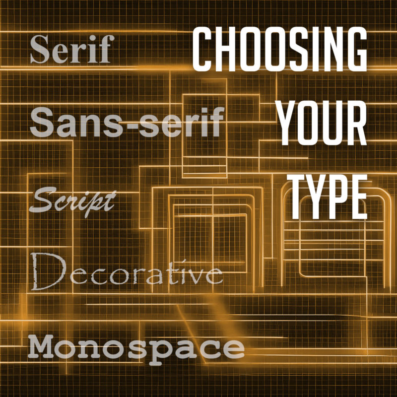
There are many different types of fonts, but they can generally be divided into a few categories:

  • Serif fonts have small projections or flourishes called serifs at the ends of the main strokes of the letters, which can help guide the reader’s eye along the text. Serifs are thought to help with legibility by providing visual cues that help the eye track from one letter to the next. Serif fonts are often used in print publications like newspapers and books, and are often considered to be more traditional and formal than sans-serif fonts. Some popular serif fonts include Times New Roman, Georgia, and Trajan.
  • Sans serif fonts do not have serifs. They are often considered to be more modern and clean-looking than serif fonts. Sans-serif fonts are often used in digital media, such as websites and mobile apps, as they are easier to read on screens. Popular sans serif fonts include Arial, Helvetica, and Tahoma.
  • Script fonts are designed to look like handwriting or calligraphy. They often have a flowing, elegant appearance, and can be used to create a more personal or informal tone. Script fonts are often used for invitations, greeting cards, or other creative projects. Some common script fonts include Brush Script, Lobster, and Zapfino.
  • Display fonts, or decorative fonts, are more stylized to be eye-catching and attention-grabbing. They can be used for headlines, logos, or other special purposes, as they can add personality and visual interest to a design. The sky’s the limit for display fonts, but some of the most popular decorative fonts include Impact, Papyrus, and Curlz.
  • Monospace fonts have a fixed width for each character, and are typically characterized by their blocky appearance. This makes them useful for programming and coding, or other applications where precise alignment is necessary. They often have a simple, utilitarian design, which makes them well-suited for technical applications. Some popular monospace fonts include Courier, Consolas, and Source Code Pro.

Choosing the Right Font

11 out of 10 designers agree: Comic Sans is not your type

The best way to choose the right font for your project is to consider the overall look and feel you’re trying to achieve, and take into account the context and purpose of the text. If you’re designing a formal document, you might want to use a serif font. If you’re designing a modern website or marketing materials, you might want to use a sans serif font. And if you’re designing a logo or other special piece of artwork, you might want to use a script or decorative font. Different fonts can convey different emotions or tones, and choosing the right font can help enhance the message you’re trying to communicate.

It’s also important to consider the readability of your font. Some fonts are easier to read than others, especially at small sizes. If you’re using a font for body copy, it’s important to choose one that is easy to read on screen or in print.

Using Fonts Effectively

If the Pebbles font is too thin, try making it a little boulder

Once you’ve chosen the right font, it’s important to use it effectively. Here are a few tips:

  • Use only a few different fonts in a single project. Too many fonts can be overwhelming and distracting.
  • Use different fonts for different purposes. For example, you might use a serif font for body copy and a sans serif font for headlines.
  • Consider the size and weight of the font when choosing it. A large, bold font will be more eye-catching than a small, light font.
  • Use leading (the space between lines of text) and kerning (the space between individual letters) to improve the readability of your text.
  • Use a consistent font family throughout a piece of text. This will help to create a cohesive and professional look.
  • Use fonts to create visual interest. For example, you could use a decorative font for a call to action or a unique font for a logo.
  • Proofread your text carefully before using it in your designs.
  • Experiment with different fonts and layouts to find what works best for your project. There are no hard and fast rules in typography, so don’t be afraid to try new things.

When used effectively, fonts can be a powerful tool for creating visually appealing and effective typography. By choosing the right fonts and using them effectively, you can create beautiful and effective designs.