Top 10 Tips for an Exceptional User Experience

In this digital and connected world, where users have countless options at their fingertips, delivering an exceptional user experience has become a crucial aspect of successful web design. It’s not enough to simply have a visually appealing website; you must also prioritize usability, accessibility, and engagement to captivate your audience and keep them coming back for more.

In this article, we will explore ten essential tips that can significantly enhance UX in web design. From intuitive navigation to responsive layouts, we will discuss the fundamental elements that contribute to creating a seamless and delightful visit. Implementing these strategies can elevate your website’s usability, improve customer satisfaction, and ultimately drive conversions and success.

Clear and Intuitive Navigation

An effortless navigation experience is crucial for engaging website visitors. Clear labels, logical organization, and intuitive menus are key elements that contribute to a user-friendly interface.

Position your navigation menu at the top of the webpage for easy visibility and consistency across all pages. Use concise and descriptive labels that accurately represent the content of each page. Visual cues, such as icons or dropdown menus, can enhance clarity.

Organize your content into meaningful sections and subcategories, prioritizing important pages. Regularly test your navigation with real users to identify and address any pain points or confusion.

By implementing clear and intuitive navigation, you create a seamless user path that fosters trust and professionalism. Visitors will appreciate a website that respects their time and provides information effortlessly, ultimately leaving a positive and lasting impression.

Responsive Design

Mobile-first responsive design

In today’s mobile-centric world, a responsive design is no longer an option but a necessity. With an increasing number of users accessing websites from a variety of devices, it’s crucial to create a seamless and enjoyable experience across all screen sizes.

Responsive design allows your website to automatically adapt its images, layout, and content to provide optimal viewing and interaction on desktops, laptops, tablets, and smartphones. This adaptability ensures that users can easily navigate and consume your content without the frustration of zooming or scrolling excessively.

When implementing responsive design, focus on optimizing the user interface for touch interactions on mobile devices. Consider the hierarchy of information, prioritize key content, and maintain consistent branding and design elements across different screen sizes.

With a mobile-first responsive design, you demonstrate your commitment to user convenience and accessibility, while your website becomes a versatile and flexible platform that seamlessly adapts to any device, enhancing user engagement and satisfaction.

Lightning-Fast Load Times

Things aren’t slowing down. With attention spans shorter than ever, the need for a blazing-fast website cannot be overstated. Users expect instant gratification, and any delay in loading can quickly lead to frustration and abandonment.

To meet these expectations, it is crucial to optimize your website’s performance and ensure lightning-fast load times. Start by focusing on reducing file sizes, such as images, scripts, and CSS files. Compress and optimize these assets without sacrificing quality to minimize the data that needs to be transferred to the user’s device.

Leveraging caching techniques is another effective strategy. Implement browser caching, which stores certain elements of your website on the user’s device, allowing subsequent visits to load faster. Additionally, utilize server-side caching to generate and store static versions of your web pages, reducing the processing time required for each request.

Optimizing your code is equally important. Minify HTML, CSS, and JavaScript files by removing unnecessary spaces, comments, and line breaks. Consider using asynchronous loading for JavaScript files to prevent blocking the rendering of your web page.

Regularly monitor and analyze your website’s performance using tools like Google PageSpeed Insights or GTmetrix. These tools provide insights and recommendations for improving load times. Address any identified issues promptly, making performance optimization an ongoing priority.

With faster load times, you create a positive user experience that keeps visitors engaged and satisfied. Users will appreciate your website’s responsiveness, resulting in increased conversions, lower bounce rates, and improved search engine rankings.

Readable Typography

Choosing your type

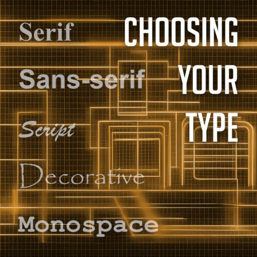
Your choice of typography plays a vital role in shaping the overall user experience. Aesthetically pleasing fonts are undoubtedly important, but it is equally crucial to prioritize readability to ensure that your content is effortlessly consumed.

Selecting legible fonts is the first step towards enhancing readability. Opt for fonts that are easy on the eyes and maintain clarity even at smaller sizes. Sans-serif fonts like Arial, Helvetica, or Roboto are popular choices due to their clean and modern appearance. However, serif fonts like Times New Roman or Georgia can also be effective for conveying a sense of elegance and sophistication.

Alongside font selection, consider the appropriate font size to facilitate comfortable reading. Text that is too small strains the eyes, while text that is excessively large disrupts the flow of content. Strike a balance by choosing a font size that allows users to effortlessly consume the information without squinting or feeling overwhelmed.

Line spacing, also known as leading, plays a significant role in improving readability. Ample spacing between lines prevents the text from appearing cramped and enhances the overall clarity of the content. Aim for a line spacing that provides enough breathing room between each line while maintaining a cohesive and visually pleasing structure.

Consistent and Engaging Visual Design

Consistency is a cornerstone of effective web design, especially when it comes to visual elements. Establishing a consistent and engaging visual design creates a cohesive experience that captivates users and reinforces your brand identity.

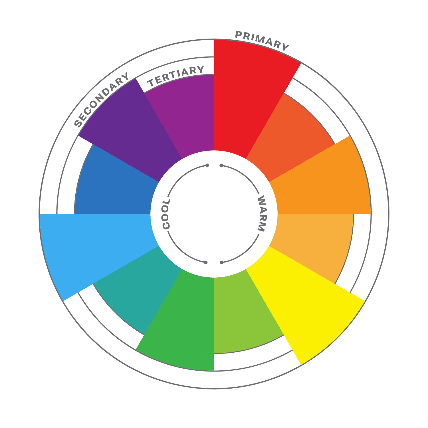
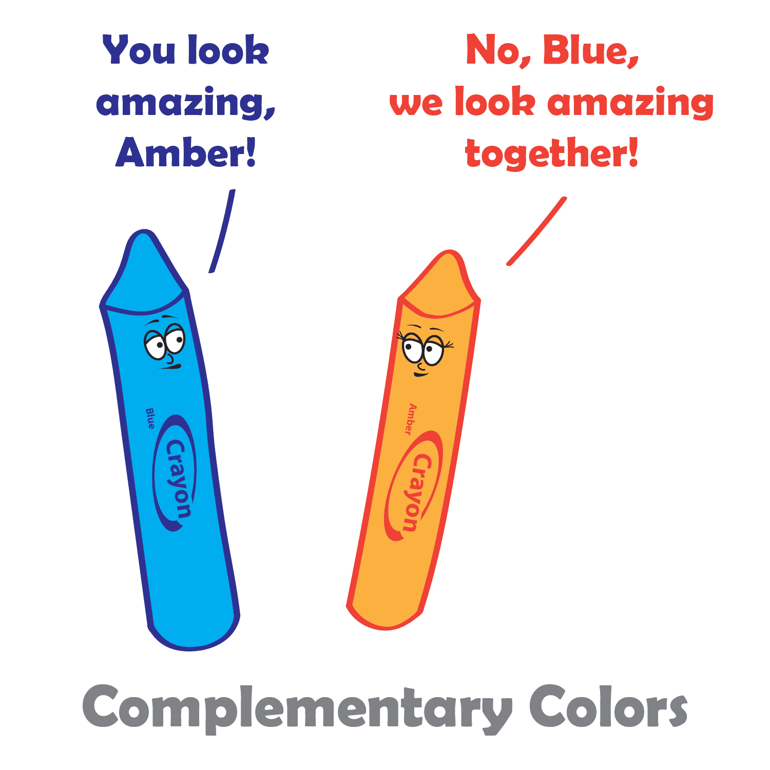
Start by selecting a color palette that reflects your brand and evokes the desired emotions. Consistency in color usage across your website’s various elements, such as buttons, headers, and backgrounds, creates visual harmony and familiarity.

Incorporate captivating imagery that resonates with your audience and aligns with your brand identity. High-quality images can communicate your message effectively and evoke emotions. Consistency in imagery style and quality further enhances the visual appeal.

By maintaining consistency in color schemes, typography, and imagery, you establish brand recognition and create a unified experience across your website. This consistency instills trust, helps users navigate intuitively, and reinforces your brand’s identity. A cohesive visual design captivates users, encourages engagement, and leaves a lasting impression.

Clear Call-to-Action

A well-designed call-to-action (CTA) stands out from the rest of the page, capturing users’ attention and compelling them to act. It should clearly communicate the desired action, whether it’s signing up for a newsletter, making a purchase, or contacting your business.

Placement is key when it comes to CTAs. Position them strategically within your website’s layout, ensuring they are easily noticeable and accessible. Consider placing CTAs above the fold or in prominent areas where users’ attention is naturally drawn.

A clear and persuasive CTA is a vital element of your website design, driving user engagement and achieving your goals. Use action-oriented language and attention-grabbing colors to create a sense of urgency. Test and optimize your CTAs regularly to maximize their impact and guide users towards desired actions. Effective CTAs are the catalyst for increased user engagement and conversions.

Streamlined Forms

Web forms

Streamlining the form completion process is crucial for enhancing UX and increasing form submissions. Simplify forms by minimizing the number of required fields and only requesting essential information. Use inline validation to provide real-time feedback and guide users in filling out the form correctly.

Clear and concise instructions help users understand the purpose of each field and how to complete the form. Further optimize the form submission process by eliminating unnecessary steps and providing a clear confirmation message upon submission. With well-designed forms, you improve user satisfaction and encourage higher conversion rates.

Error Handling and Feedback

Effective error handling and feedback play a vital role in creating a seamless user experience on your website. When users encounter errors or perform actions that require feedback, it is crucial to provide clear and informative messages. Error messages should clearly communicate what went wrong in a concise and understandable manner, avoiding technical jargon.

Additionally, offer specific guidance on how users can rectify the issue or provide alternative solutions. Visual cues such as color changes or icons can also help draw attention to errors and provide visual feedback. Implementing robust error handling and feedback mechanisms empowers users to navigate through potential obstacles and ensures a smoother and more user-friendly experience.

Accessibility

Designing with accessibility in mind is essential to create an inclusive and user-centric user experience. Considering the needs of users with disabilities ensures that your website is usable by a wider audience.

One crucial aspect is screen reader compatibility, where providing appropriate alternative text for images and implementing semantic markup allows visually impaired users to navigate and understand the content effectively. Keyboard navigation is another vital consideration, enabling users to navigate through your website using only the keyboard, without relying on a mouse.

Additionally, pay attention to color contrast to ensure that text and other visual elements are easily distinguishable for users with visual impairments.

Personalization

Personalization has become a key factor in enhancing user experience. Tailoring content and experiences based on user preferences and behaviors can greatly improve engagement and satisfaction. Utilize user data and technologies like cookies and user accounts to deliver personalized recommendations, relevant content, and targeted offers.

Personalization goes beyond addressing users by name; it involves understanding their needs and providing them with tailored information or experiences. Incorporating personalization strategies creates a unique and engaging website that keeps users coming back for more.

Incorporating these tips into your web design practices can greatly enhance the overall user experience of your website. From intuitive navigation to responsive design, fast load times to readable typography, each aspect plays a crucial role in creating a positive and engaging feel for the user. By prioritizing user needs and preferences, you can build a website that not only captivates and delights your visitors but also drives business success. So, go ahead and implement these tips, and watch as your website becomes a user-friendly destination that delights and engages your users.

Brand Identity: Developing a Unique Business Image and Personality

In today’s fiercely competitive business landscape, developing a strong brand image and personality is more important than ever. A brand’s identity goes far beyond just a name and logo – it encompasses the essence of what the business stands for and how it is perceived by customers. A well-defined brand image and personality have the power to differentiate businesses from their competitors and forge a deep emotional connection with their target audience.

When customers interact with a brand, they form perceptions and associations based on various elements, including visual identity, messaging, values, and overall experience. These elements collectively shape the brand’s image and personality. A carefully crafted brand image can convey professionalism, trustworthiness, innovation, or any other desired attribute that resonates with the target market.

A strong brand personality humanizes the business and allows customers to relate to it on a personal level. It creates a distinct voice, tone, and character that set the brand apart and make it memorable. By developing a brand personality, businesses can infuse their communication with authenticity, charm, and relatability, fostering deeper connections and customer loyalty.

What Does it Mean to Have a Brand Image and Personality?

Brand Image: At its core, brand image refers to the overall impression and perception customers have of a brand. It is the collective result of various elements such as the brand’s visual identity, messaging, reputation, and customer experiences. A strong brand image effectively communicates the values, qualities, and unique attributes that distinguish a business from its competitors. It sets the tone for customer interactions and forms the foundation for building brand loyalty.

Brand Personality: Brand personality is the distinctive character and identity that a brand assumes, akin to a human personality. It humanizes the brand, making it relatable and enabling customers to form emotional connections. Just like individuals have different personalities, brands can have their own unique personality traits that align with their target audience. These traits can be communicated through the brand’s tone of voice, messaging style, and visual elements. For example, a brand may be seen as friendly, authoritative, playful, or sophisticated, based on the personality traits it embodies.

To develop a compelling brand image and personality, businesses need to consider several key elements. First, defining the brand’s core values is essential. These values represent what the brand stands for and guide its actions and decisions. Aligning the brand’s values with those of its target audience can help a business establish a deeper connection and build trust.

The brand’s tone of voice is another aspect of its personality. It encompasses the language, style, and attitude used in brand communications. A friendly and conversational tone may appeal to a younger audience, while a professional and authoritative tone may be more suitable for a business targeting a corporate clientele. Consistency in tone of voice across all brand touchpoints reinforces the brand’s personality and enhances brand recognition.

Visual identity also plays a significant role in shaping brand image and personality. Elements such as logos, color palettes, typography, and imagery contribute to the overall visual representation of the brand. Consistency in visual branding fosters recognition and helps convey the brand’s personality visually.

Identifying Your Target Audience

Finding your target audience

Understanding your target audience is significant because it allows you to create a brand identity that aligns with their preferences and needs. It enables you to speak directly to their interests and desires, increasing the likelihood of establishing a meaningful connection. By catering to their specific demographics, such as age, gender, location, and income level, you can develop a brand image that appeals directly to their unique characteristics.

Psychographics, on the other hand, delve into the psychological and emotional aspects of your audience. This includes their attitudes, beliefs, values, and lifestyle choices. Uncovering their motivations, challenges, and aspirations can help you shape your brand personality to align with their desires and create a more authentic connection.

Conducting thorough market research is key to gaining this valuable knowledge about your target audience. Surveys, interviews, and online research can provide a wealth of information about their preferences, behaviors, and pain points. Analyzing data from social media platforms, website analytics, and market research reports can also uncover patterns and trends that further refine your understanding of your audience.

Defining and Refining Your Brand Identity

A strong and distinctive brand identity is the foundation of a successful business. It goes beyond just a logo or a catchy tagline—it encompasses the core values, mission, and unique characteristics that set your brand apart from competitors.

Core Values

To begin, it’s essential to establish your brand’s core values. These are the fundamental beliefs and principles that guide your business and shape its identity. Core values serve as the compass that steers your brand’s decisions, actions, and interactions. Think about what your brand stands for—whether it’s innovation, sustainability, authenticity, or any other values that align with your mission and resonate with your audience. These values become the pillars upon which your brand identity is built.

Mission Statement

Crafting a compelling mission statement is the next step in defining your brand identity. A mission statement encapsulates your brand’s purpose and why it exists. It communicates the impact you aim to make and the value you bring to your customers. A well-crafted mission statement reflects your brand’s passion, vision, and commitment to delivering exceptional products or services. It should be concise, memorable, and aligned with the needs and aspirations of your target audience.

Defining your brand identity is not only about articulating it internally but also about effectively communicating it to your target audience. Ensure that your brand’s visual elements, such as logo, color palette, typography, and imagery, reflect and reinforce your brand identity. Consistency in tone of voice, messaging, and customer interactions also helps to build a cohesive brand image that resonates with your audience.

Developing Visual Brand Elements

Using images and video to enhance your website

Visual brand elements play a deep role in shaping your brand’s image and creating a lasting impression on your audience. They are the tangible elements that visually represent your brand and communicate its personality. When developing your brand’s visual identity, there are several key components to consider:

  1. Designing a memorable logo: Your logo is the face of your brand and often the first thing people associate with your business. It should be distinctive, memorable, and reflect your brand’s personality. A well-designed logo captures the essence of your brand and communicates its values, positioning, and uniqueness. Ensure that it is visually appealing, versatile, and scalable across different platforms and mediums.
  2. Choosing an appropriate color palette: Colors have a powerful impact on human emotions and perceptions. When selecting a color palette for your brand, consider the emotions and associations you want to evoke. Each color has its own meaning and symbolism, so choose colors that align with your brand’s personality and resonate with your target audience. A harmonious color palette not only enhances brand recognition but also conveys a consistent and cohesive brand image.
  3. Selecting typography: Typography plays a vital role in conveying your brand’s voice and tone. Choose fonts that align with your brand’s personality and are legible across various platforms and devices. Consider pairing different font styles to create a visual hierarchy and evoke specific emotions. The typography you choose should be consistent with your brand identity and reinforce the overall message you want to convey.
  4. Incorporating relevant imagery: Images and visuals add depth and personality to your brand. They evoke emotions, tell stories, and capture attention. Choose imagery that aligns with your brand’s values, target audience, and messaging. Whether it’s original photography, illustrations, or curated visuals, ensure that they are high-quality, relevant, and consistent with your brand identity. Visual consistency helps establish a cohesive brand experience across different touchpoints.

When developing your brand’s visual elements, it’s important to strike a balance between creativity and consistency. Your visual identity should be unique and captivating, while also aligning with your brand’s personality and resonating with your target audience. Consistency in design elements across your website, social media profiles, marketing materials, and other touchpoints is key to creating a cohesive and recognizable brand image.

Crafting Your Brand’s Tone of Voice

Your brand’s tone of voice is the way you communicate and express your brand’s personality through written and spoken language. It plays a crucial role in establishing a strong and consistent brand image, connecting with your target audience, and differentiating your brand from competitors.

To effectively craft your brand’s tone of voice, it’s essential to have a deep understanding of your target audience. Research their demographics, values, preferences, and communication styles. Consider their language preferences, the level of formality they respond to, and the emotions and aspirations that resonate with them. This understanding will help you tailor your brand messaging to effectively engage and connect with your audience.

Consistency is vital in maintaining a strong and recognizable brand image. Establish guidelines for your brand’s tone of voice to ensure consistent messaging across various marketing channels. Define the key attributes that reflect your brand’s personality, such as friendly, authoritative, playful, or professional. Consider creating a brand style guide that outlines specific dos and don’ts, preferred vocabulary, sentence structures, and grammar rules. This guide will serve as a reference for anyone creating content or communicating on behalf of your brand.

Additionally, consider these tips to further enhance your brand’s tone of voice:

  • Be authentic: Let your brand’s personality shine through in your communication. Be true to your brand values and avoid sounding generic or overly promotional. Authenticity builds trust and fosters meaningful connections with your audience.
  • Use storytelling: Storytelling is a powerful tool for engaging your audience and conveying your brand’s values and purpose. Incorporate storytelling elements into your brand messaging to create emotional connections and make your content more relatable.
  • Adapt to different channels: Your tone of voice should be adaptable to different marketing channels, including your website, social media, email marketing, and customer support. Tailor your messaging to suit each platform while maintaining consistency in the overall brand personality.
  • Listen to feedback: Pay attention to how your audience responds to your brand’s tone of voice. Monitor feedback, comments, and conversations to understand what resonates with your audience and make adjustments if necessary.

Evoking Emotions through Brand Storytelling

Storytelling is a powerful tool for capturing the hearts and minds of customers. By harnessing the innate human love for stories, brands can create emotional connections that go beyond mere transactions. Effective brand storytelling allows you to engage, inspire, and leave a lasting impact on your audience. Here’s how you can incorporate storytelling into your brand’s communication strategy:

  1. Identify Your Brand Narrative: Start by understanding the essence of your brand and what makes it unique. Uncover the stories behind your brand’s founding, its values, and its journey. These stories form the foundation of your brand narrative, providing a compelling backdrop that resonates with your target audience.
  2. Connect on an Emotional Level: Successful brand storytelling goes beyond facts and figures; it taps into emotions. Craft stories that evoke emotions aligned with your brand identity and values. Whether it’s joy, nostalgia, empathy, or inspiration, the key is to create an emotional connection with your audience. Think about how your brand’s story can evoke those emotions and align them with the aspirations and desires of your target audience.
  3. Show, Don’t Just Tell: Bring your brand’s story to life through visuals, multimedia, and immersive experiences. Consider using videos, images, and interactive content to engage your audience and make your brand story more memorable. Visual elements can amplify the emotional impact of your storytelling and create a deeper connection with your audience.
  4. Make Your Audience the Hero: A powerful storytelling technique involves making your audience the hero of the story. Position your brand as the guide or mentor that helps your audience overcome challenges and achieve their goals. By putting your audience at the center of the narrative, you empower them and create a sense of personal relevance.
  5. Consistency and Authenticity: Ensure that your brand storytelling aligns with your overall brand identity and remains consistent across all channels. Authenticity is key – your audience should feel a genuine connection with your brand’s story. Avoid clichés or contrived narratives and strive for a genuine, honest portrayal of your brand’s values and journey.
  6. Engage and Involve Your Audience: Encourage user-generated content and invite your audience to share their own stories related to your brand. This not only fosters a sense of community but also adds depth and diversity to your brand narrative.

Conclusion

Developing a strong brand image and personality is a continuous journey that requires ongoing tracking, evaluation, and adaptation. As your brand evolves, it’s essential to monitor its performance and make adjustments based on customer feedback, market trends, and emerging opportunities.

Regularly track key performance indicators related to your brand’s perception, customer engagement, and overall business growth. Analyze metrics such as brand recognition, customer satisfaction, social media engagement, website traffic, and sales. This data will provide valuable insights into how your brand image and personality are perceived and how they impact your bottom line.

Developing a compelling brand image and personality is a key driver of success in today’s competitive business landscape. Track your brand’s performance and be willing to adapt to ensure your brand remains relevant and resonates with your audience. With dedication and a thoughtful approach, your brand has the potential to make a lasting impression and drive business success.

Designing a Website for Higher Conversion Rates

On the modern web, where attention spans are shorter than a squirrel on a caffeine rush, the power of a well-designed website cannot be underestimated. It’s not enough to have a beautiful virtual storefront; you need a conversion machine that effortlessly guides your visitors down the rabbit hole of irresistible offers and undeniable value.

Picture a website that entices, engages, and compels your target audience to take action. It’s like having a 24/7 salesperson who never sleeps, never tires, and consistently brings in a stampede of eager customers. Today we explore the hidden psychology behind user behavior, dissect the anatomy of high-converting websites, and equip you with a toolkit of actionable strategies to skyrocket your conversion rates.

What is Conversion Rate Optimization?

Today we’re diving headfirst into the world of Conversion Rate Optimization (CRO) – the secret sauce that separates the winners from the wannabes in the digital realm. Imagine having a finely tuned machine that turns casual visitors into raving fans, and potential customers into loyal advocates. That’s the power of CRO.

Let’s break it down. Conversion Rate Optimization is the art and science of maximizing the number of desired actions taken by your website visitors. It’s all about turning clicks into customers, and browsers into buyers. And trust me, when it comes to online success, the name of the game is conversions.

A well-designed website is like a funnel, guiding your visitors through various stages of their journey. From the initial spark of curiosity to the final purchase decision, each step holds the key to unlocking the holy grail of conversions. A website that converts at a high rate is a magnet for revenue, growth, and success. It’s like having a virtual sales team on steroids, working tirelessly to propel your business forward.

Knowing Your Target Audience

Market research and user analysis are the instruments that guide us on this expedition. Take the time to truly understand the desires, pain points, and motivations of your audience. Uncover their hidden needs and aspirations, and you’ll hold the key to capturing their hearts and wallets.

This is where buyer personas come into play. These are like characters in a gripping novel, except they’re based on real data instead of an author’s imagination. By understanding their hopes, dreams, and quirks, you’ll be equipped to tailor your website design to their unique needs.

Imagine, for a moment, stepping into the shoes of your buyer persona. What challenges do they face? What solutions are they seeking? By immersing ourselves in their world, we gain the power to craft a website that speaks directly to their souls. It’s the art of anticipation, and it will set you apart from the countless others who fail to truly know their audience.

Remember, it’s not just about design; it’s about speaking directly to the hearts and minds of those you wish to serve.

User-Friendly Website Design

To make conversions, first we need a user-friendly website where everything is effortless and delightful. Most often, this starts with optimizing website navigation and structure. Think of your website as a well-designed city, with clear road signs and logical pathways. Your visitors should be able to navigate effortlessly, finding what they need without breaking a sweat. No one likes getting lost in a confusing labyrinth of links. So, streamline your menus, organize your content into logical categories, and sprinkle some helpful breadcrumbs along the way.

We’re in the age of smartphones and tablets, and your website needs to be ready for the mobile revolution. Your potential customers are on the go, browsing on their trusty pocket companions. If your website doesn’t adapt to their screens like a chameleon changing colors, they’ll quickly bounce away faster than you can say, “Oops, I forgot about mobile users!” Embrace responsive design, make sure your website looks stunning on any device, and watch your conversion rates dance with joy.

Now, let’s talk about speed. Time is a precious commodity, and your visitors aren’t interested in waiting around for your website to load like it’s stuck in the Stone Age. No, we need to give them the need for speed. Optimize those images, minimize those scripts, and eliminate any unnecessary fluff that slows down your site. A lightning-fast loading speed will make your visitors feel like they’ve stumbled upon a digital oasis of efficiency.

Last but not least, we have the streamlined user interface. Picture it as a Zen garden for your visitors’ eyes. Clean, minimalist, and uncluttered. Every element should have a purpose, guiding your visitors seamlessly towards their desired actions. Say goodbye to overwhelming clutter and confusing layouts. Embrace simplicity and create an interface that sings in harmony with your visitors’ desires.

Compelling and Clear Calls-to-Action

Calls-to-action (CTA) are a little slice of web design magic that holds the power to turn visitors into enthusiastic clickers. Think of them as the charming salespeople of your website, beckoning users with irresistible offers and compelling propositions.

First things first: make those CTAs impossible to resist. They should shine like beacons of temptation, drawing the eyes of your visitors with their captivating colors and tasty designs. But remember, subtlety is key. We don’t want to blind our visitors with an explosion of neon colors. Find that perfect balance between eye-catching and tastefully inviting.

Now, let’s talk about the art of persuasive copywriting. Your CTA copy should be like a smooth-talking charmer, seducing your visitors with words that ignite their curiosity and spark their desire to take action. Use action-oriented language that nudges them to click that button without a second thought. “Get Started Now,” “Claim Your Free Trial,” or “Unlock Exclusive Content”—these are some golden phrases that lure visitors into the land of conversions. And remember, keep it concise and clear. No need for a dissertation—just a few carefully chosen words that speak volumes.

Strategically position your buttons where they’re impossible to miss. We’re talking above the fold, right in the line of sight, and in the middle of the action. Whether it’s at the end of a captivating blog post, within a compelling product description, or even subtly integrated into your website’s navigation, make sure your CTAs are right where the magic happens.

Also, consider adding a sprinkle of urgency or exclusivity to your CTAs. Phrases like “Limited Time Offer,” “Only 3 Spots Left,” or “Join the VIP Club” can ignite a sense of FOMO (Fear Of Missing Out) that propels visitors to take action before it’s too late.

So, let’s create content that captivates, engages, and leaves our visitors hungry for more. Craft stories that ignite their imagination, accompanied by visuals that dazzle their eyes. Embrace interactivity that invites them to play, participate, and connect. And above all, ensure that your content speaks directly to their hearts, minds, and aspirations. Let your website be a treasure trove of engaging and relevant content, and watch as your visitors become lifelong fans and devoted followers.

Building Trust and Credibility

Building credibility is the secret ingredient that transforms mere website visitors into loyal customers. It’s the bridge that connects your brand with their hearts and minds, assuring them that you’re the real deal—the trustworthy companion they’ve been seeking. So, let’s unveil the secrets of building trust and credibility, brick by brick.

First and foremost, let’s talk about the power of customer testimonials and reviews. These tiny nuggets of social proof hold tremendous sway over potential customers. When they see real people, just like them, raving about your product or service, their skepticism starts to crumble. Harness the power of these testimonials by showcasing them prominently on your website. Be it in the form of written quotes, video testimonials, or star ratings, let your satisfied customers be the voice that vouches for your credibility.

Trust signals are the badges of honor that reassure your visitors of your credibility. Showcasing security badges, industry certifications, and affiliations with reputable organizations can go a long way in building trust. These symbols serve as visual cues, signaling that you adhere to strict standards, follow best practices, and prioritize their security and privacy. So, proudly display these trust signals throughout your website, assuring your visitors that their well-being is your top priority.

When it comes to pricing, be clear, be concise, and be upfront. Nothing breaks trust faster than hidden fees, unexpected charges, or an overly complex pricing structure. Lay it all out in plain sight, providing transparent pricing information that leaves no room for ambiguity. Additionally, don’t shy away from highlighting your refund policies and guarantees. By offering reassurance and a safety net, you’re telling your customers, “We stand by our product or service, and we’re here to make it right.”

Remember, trust isn’t built overnight. Every testimonial, every trust signal, and every transparent pricing disclosure adds another layer of credibility. So, sprinkle your website with the voices of satisfied customers, adorn it with trust signals, and let transparent pricing policies be the cornerstone of your credibility. By doing so, you’ll lay the foundation for trust and establish yourself as a reliable and trustworthy brand in the eyes of your audience.

Streamlined Conversion Process

For e-commerce websites, the checkout process is the ultimate make-it-or-break-it moment. Imagine your customer has spent precious minutes filling up their cart with goodies, only to abandon ship at the checkout stage due to a confusing and cumbersome process. To prevent such heart-wrenching scenarios, do everything you can to simplify your checkout process.

First and foremost, minimize the number of steps required to complete the transaction. Each additional page and click is an opportunity for doubt and second-guessing to creep in. Streamline the process by condensing multiple steps into a single, user-friendly page. Offer a progress indicator, so your customers have a clear sense of how far they’ve come and how close they are to completing the purchase.

When it comes to form fields, less is more. Trim down those fields to the essentials. Ask for the necessary information and leave the optional fields for a post-conversion follow-up. Remember, every additional form field is a friction point, and friction is the nemesis of conversions.

Guest checkout options are your secret weapon in the quest for seamless conversions. Not everyone wants to create an account and endure the hassle of password creation and email verifications. By offering a guest checkout option, you eliminate a major barrier and welcome more customers into the conversion fold. Make it a breeze for them to complete their purchase without any unnecessary hoops to jump through.

Or even better, introduce the magic of one-click purchases, where a single button can transform a potential customer into a delighted buyer. By implementing a secure and trusted payment system, you enable customers to save their payment details and enjoy the convenience of one-click purchases. Remember, in the realm of conversions, speed and simplicity reign supreme.

Close Those Sales

Through market research and the creation of detailed buyer personas, you can tailor your website design to perfectly align with the needs and preferences of your audience. Remember, fast loading speed and a streamlined user interface are the secret ingredients to capturing and maintaining your visitors’ attention. And with the incorporation of visuals and interactive elements, you can captivate and delight your audience. By embracing effective storytelling techniques, you will become a master of engaging your visitors and leaving a lasting impression.

But this is not the end. Optimization is an ongoing process. A/B testing different design elements and strategies is your secret weapon to unlocking even higher conversion rates. By tracking and analyzing website performance using analytics tools, you’ll uncover valuable insights to guide your future optimizations. Remember, data is your ally on this quest for conversion greatness.

So be sure to implement these strategies and continuously optimize your website based on data-driven insights. Embrace the power of iteration and experimentation. Keep testing, tweaking, and refining until you achieve the conversion rates you’ve always dreamed of.

CSS Resets: A Clean Slate for a Solid Foundation

Have you have ever wondered why your web pages look different across different browsers? Don’t worry, you’re are not alone. One of the reasons for this inconsistency is that browsers have their own default styles for various HTML elements, such as margins, paddings, fonts, colors, etc. These default styles can interfere with your own custom styles and create unwanted effects.

To avoid this problem, many web developers use a CSS reset. A reset is a set of rules that normalize the default styles of all HTML elements to a consistent baseline. This way, you can have more control over the appearance of your web pages and ensure that they look the same across different browsers and devices.

Why Do I Need a CSS Reset?

CSS Resets may sound fancy, but at their core, they are simply a set of styles that aim to reset or normalize the default browser styles applied to HTML elements. In other words, they wipe the slate clean, providing you with a consistent starting point for your web designs.

Now, before we delve into the nitty-gritty of CSS resets, let’s take a quick detour to talk about the CSS box model. Understanding the box model is essential because it forms the foundation of how elements are rendered and positioned on a webpage.

In a nutshell, the box model refers to the way elements are structured and sized in CSS. Each element can be thought of as a box, with four main components: content, padding, border, and margin. These components determine the element’s overall size and spacing.

By default, different browsers have their own unique interpretations of the box model, leading to inconsistencies in how elements are displayed. This is where CSS resets come to the rescue. They help establish a consistent box model across browsers, ensuring that your designs look as intended, regardless of the user’s browser. This can simplify your web design workflow and save you from the headaches of cross-browser inconsistencies.

What’s Wrong With Default Browser Styles?

When it comes to default browser styles, it’s a wild west out there. Different browsers have their own default styles for HTML elements, which means that the same element can look drastically different across various browsers. This poses a significant challenge for web designers who strive for consistency and want their designs to look the same regardless of the browser being used.

Default browser styles can vary in terms of font sizes, colors, margins, paddings, and even how elements like headings or lists are rendered. These inconsistencies can lead to a disjointed and unprofessional appearance, making it difficult to create a cohesive and polished website.

CSS resets help neutralize these default browser styles, providing a level playing field for web designers. By applying a reset, you can start with a clean slate, establishing a consistent baseline across browsers. This ensures that your designs are not at the mercy of default styles and gives you greater control over the visual presentation of your website.

What Are the Benefits of Using CSS Resets?

Using CSS resets offers a range of benefits that can greatly enhance your web design process. Let’s explore some of the key advantages:

  1. Consistent Starting Point: By applying a CSS reset, you establish a consistent starting point for styling across different browsers. This means that you no longer have to worry about browser defaults interfering with your design intentions. Instead, you have full control over how elements are rendered, allowing you to create a consistent and harmonious look and feel across all browsers.
  2. Elimination of Inconsistencies: CSS resets help eliminate unexpected layout and styling issues caused by browser defaults. These defaults can vary significantly, leading to inconsistencies in spacing, font sizes, and other visual aspects. With a CSS reset, you can ensure a level playing field and avoid spending hours trying to figure out why your layout is behaving differently across browsers.
  3. Improved Cross-Browser Compatibility: By neutralizing browser defaults, CSS resets promote improved cross-browser compatibility. They provide a solid foundation for your styles, reducing the likelihood of elements appearing drastically different or breaking in specific browsers. This allows you to reach a broader audience and ensure that your website looks great and functions properly regardless of the browser being used.
  4. Time and Effort Savings: CSS resets can save you valuable time and effort by streamlining your design workflow. Instead of manually overriding default styles for each element, you can rely on a CSS reset to do the heavy lifting. This means less code to write and maintain, allowing you to focus on the creative aspects of your design rather than troubleshooting inconsistencies.

Incorporating a CSS reset into your web design toolkit is a wise choice, especially if you’re a beginner looking to establish a solid foundation. It helps you start on the right foot, ensuring a consistent and predictable styling experience across browsers.

What Does a CSS Reset Look Like?

Now that we understand the importance and benefits of CSS resets, let’s take a closer look at what a CSS reset actually looks like. A CSS reset is essentially a set of CSS rules that aim to remove or reset default browser styles, allowing you to start with a clean slate for your own custom styling.

Here’s an example of a minimal CSS reset:

/* CSS Reset by photricity.com */
html, body, div, span,
h1, h2, h3, h4, h5, h6,
form, label, input, button,
p, a, img, ul, ol, li, blockquote,
article, aside, footer, header, section {
    border: 0;
    margin: 0;
    padding: 0;
    font: inherit;
    font-size: 100%;
    vertical-align: baseline;
}

body {
    line-height: 1;
}

ul, ol {
    list-style: none;
}

img {
    max-width: 100%;
    height: auto;
}

button {
    cursor: pointer;
}

In this example, we’re targeting a range of HTML elements and applying reset styles to them. We remove margins, padding, borders, and set font sizes and families to inherit for consistency. We also handle lists, images, buttons, and some basic form elements.

It’s important to note that this is just a minimal CSS reset, and you can customize it further based on your specific project needs. Some CSS resets may include additional rules to reset more elements or handle specific edge cases. However, remember to use resets judiciously and avoid over-resetting, as it can inadvertently remove necessary styling or functionality.

Once you’ve applied the CSS reset, you can proceed to add your custom styles below it. This way, you have a solid foundation to build on, ensuring your styles are consistent across different browsers and devices.

Feel free to experiment with different CSS resets or use and modify this example to fit your requirements. The goal is to establish a clean slate for your styles and create a more consistent and predictable design experience.

What Are Some Popular CSS Resets?

When it comes to CSS resets, there are a few popular options that have gained recognition and widespread usage among web designers. Let’s take a closer look at two of the most well-known CSS resets.

  1. Eric Meyer Reset
    The Eric Meyer reset is one of the earliest and most widely adopted CSS resets. Created by Eric Meyer, a renowned web design expert, this reset aims to neutralize browser defaults and provide a clean slate for styling. It resets many common elements like margins, paddings, font sizes, and lists, ensuring a consistent starting point for your design.
  2. Normalize.css
    Normalize.css is another popular CSS reset option that focuses on preserving useful browser defaults while normalizing styles across different browsers. It aims to fix inconsistencies in rendering, ensuring a consistent and predictable experience. Normalize.css provides a solid foundation by addressing common issues like font variations, element inconsistencies, and handling of HTML5 elements.

Customizing CSS Resets

Now that you’ve got a solid understanding of popular CSS resets, it’s time to put your personal touch on things. Customizing CSS resets allows you to fine-tune the styles and make them align perfectly with your project’s needs. Let’s explore a couple of ways you can make these resets your own:

  1. Modifying Existing Resets
    If you’ve found a CSS reset that closely matches your requirements but needs a few tweaks, don’t hesitate to make adjustments. You can selectively modify certain styles or properties to retain specific browser defaults while resetting others. This approach allows you to maintain a balance between consistency and preserving the unique characteristics of your design.
  2. Creating Your Own Reset
    For those seeking complete control over their styles, creating a custom CSS reset from scratch is the way to go. By starting with a clean slate, you can meticulously define the exact styles and properties you want to reset. This level of customization ensures that every aspect of your project adheres to your design vision, without any unwanted surprises caused by default browser styles.

Now, before you dive headfirst into customization, it’s important to consider the scope of your project. Not every project requires a full-blown reset. If you’re working on a small-scale project or prefer to keep certain default styles intact, a selective reset might be more suitable. This approach allows you to target specific elements or properties that commonly cause compatibility issues, leaving the rest untouched.

Remember, customization is about finding the right balance. You want to ensure consistency while still embracing the unique character of your design.

Best Practices for Using CSS Resets

Now that you’re familiar with CSS resets and their customization options, let’s discuss some best practices for effectively using them in your web design projects. While CSS resets can be incredibly useful, it’s important to approach them with caution and find the right balance. Here are some recommendations to keep in mind:

  • Assess the Project Needs
    Before diving into a CSS reset, consider the specific requirements of your project. Not every project will benefit from a reset. Simple and lightweight websites may not require a full reset, while complex web apps with intricate styling may greatly benefit from starting with a clean slate. Evaluate the scope and complexity of your project to determine if a reset is necessary.
  • Selective Resets
    Remember, you don’t always need to reset every single style. Opt for selective resets by focusing on elements or properties that commonly cause cross-browser inconsistencies. This approach allows you to address the specific pain points while retaining other default styles that work well for your design. Be mindful of the balance between consistency and preserving the unique aspects of your design.
  • Use Resets as a Foundation
    CSS resets are meant to provide a consistent starting point for styling across different browsers. Treat them as a foundation upon which you build your custom styles. Avoid relying solely on a reset to dictate all your design decisions. Instead, leverage the reset as a starting point and gradually add your own styles to create a unique and visually appealing website.
  • Consider the Drawbacks
    While CSS resets can be advantageous, they also have potential drawbacks. Overusing resets or applying them without careful consideration can lead to unintended consequences and additional maintenance. Resetting styles too aggressively may remove valuable default behaviors or accessibility features. Be mindful of the potential drawbacks and assess the impact of resets on your specific project.
  • Test and Refine
    As with any aspect of web design, testing is crucial. Test your website across different browsers and devices to ensure that the reset is working as intended and producing the desired results. Make adjustments as necessary and refine your reset to strike the right balance between consistency and customization.

Remember, CSS resets are a tool to enhance your design workflow and achieve a more consistent cross-browser experience. With thoughtful consideration and selective use, you’ll be able to create stunning and harmonious designs that captivate your users.

Alternatives to CSS Resets

While CSS resets can be a great solution for achieving consistent styling across browsers, they are not the only approach available.

CSS frameworks, such as Bootstrap, Foundation, and Bulma, offer a comprehensive set of pre-designed styles, components, and layout systems. These frameworks often come with their own reset or normalization styles, eliminating the need for a separate CSS reset. By using a framework, you can start your project with a predefined and consistent design foundation, saving you time and effort. However, keep in mind that using a CSS framework may introduce additional overhead and customization limitations. Evaluate the needs of your project and the level of flexibility required before deciding to incorporate a framework.

When considering alternatives to CSS resets, weigh the benefits and trade-offs of CSS frameworks against your project requirements. Each approach has its own advantages and considerations, so choose the option that aligns best with your design goals and development workflow.

By now, you should have a clear understanding of how CSS resets can save you from unexpected styling issues and help you create a more consistent and predictable design experience. However, it’s important to remember that CSS resets are just one tool in your web design arsenal. They are not a one-size-fits-all solution and should be used judiciously. Evaluate the needs of your project, consider the alternatives, and strike a balance between achieving consistent styling and maintaining flexibility.

Now it’s time to put your newfound knowledge into practice. Experiment with different CSS resets, explore customization options, and fine-tune your approach to suit each unique project. Don’t be afraid to push the boundaries, try alternatives like CSS frameworks, and discover what works best for you.

Microinteractions in Web Design: Small Details for a Big Impact

On the web today, where attention spans are fleeting and competition is fierce, it has become imperative for web designers to focus on every detail that can captivate users and elevate their experience. This is where microinteractions come into play. Microinteractions, though seemingly small and subtle, have the power to make a significant impact on user engagement and satisfaction. They are the delightful, interactive moments that occur within a website or web app, providing feedback, guidance, and an overall seamless user experience.

Microinteractions encompass a wide range of actions, from a simple hover effect on a button to a progress indicator during form submission. Each interaction may seem minuscule on its own, but when combined, they contribute to the overall flow and feel of a website. By paying attention to these tiny interactions, web designers can create experiences that are not only visually appealing but also intuitive, engaging, and memorable.

Benefits of Microinteractions

Microinteractions are many small things that play a big role in web design by offering several benefits that contribute to the overall user experience. Let’s explore some of these benefits:

  • Enhancing Usability and Guiding User Interactions
    Microinteractions provide subtle cues and guidance to users, making the website more intuitive and easier to navigate. They can help users understand the purpose and functionality of various elements, leading to a smoother interaction. For example, a microinteraction that visually highlights a selected tab in a navigation menu helps users understand their current location within the website.
  • Providing Feedback and Improving User Engagement
    Feedback is essential for users to feel in control and confident in their actions. Microinteractions can provide instant feedback when users interact with different elements on the website, such as buttons, forms, or checkboxes. Visual cues like animations, color changes, or sound effects can signal successful actions or errors, creating a sense of responsiveness and engagement. For instance, when a user submits a form, a microinteraction can display a loading spinner or a success message, reassuring them that their action was processed.
  • Creating Delightful and Memorable Experiences
    Microinteractions have the power to add personality, surprise, and delight to the user experience. They inject a touch of playfulness and make interactions more enjoyable, leaving a lasting impression on users. For example, a subtle animation when hovering over an element or a playful confirmation message can make the experience more memorable and leave users with a positive perception of the website or brand.

Incorporating well-designed microinteractions into your design can enhance its overall usability, engagement, and memorability. These small but impactful interactions contribute to a more intuitive and delightful user experience, ultimately leading to higher user satisfaction and increased conversions.

Types of Microinteractions

Microinteractions can be categorized into various types, each serving a specific purpose in enhancing user experience and engagement. Let’s explore some common types of microinteractions:

  1. Button microinteractions focus on the interactions and feedback related to buttons or clickable elements. They can include subtle animations, color changes, or hover effects that provide visual cues when users interact with buttons. For example, a button that transforms into a loading spinner when clicked, indicating that an action is in progress, is a type of button microinteraction.
  2. Form microinteractions improve the usability and feedback during form submissions. They can include real-time validation, highlighting input fields with errors or providing instant feedback when a field is successfully completed. These microinteractions make the form-filling process more intuitive and error-proof, ensuring a seamless user experience.
  3. Navigation microinteractions focus on enhancing the interactions and animations related to website navigation. They can include smooth transitions between pages, animated menu interactions, or subtle hover effects on navigation elements. These microinteractions make navigation more engaging and visually appealing, providing users with a clear understanding of the website structure.
  4. Notification microinteractions are used to provide feedback or alerts to users. They can include pop-up notifications, toast messages, or interactive alerts that notify users of important updates or actions. These microinteractions ensure that users are informed about relevant information or events, improving their overall experience on the website.

Implementing Microinteractions in Web Design

Implementing microinteractions in web design requires careful consideration of design principles and the selection of appropriate tools. Here are some best practices to keep in mind:

  • Design Guidelines for Microinteractions
    When designing microinteractions, it’s crucial to adopt a user-centered approach. Understand your target audience and align the microinteractions with their needs and expectations. Keep the interactions simple, intuitive, and seamless to ensure a positive user experience. Consistency in design elements and feedback across the website helps users understand and predict the outcomes of their interactions.
  • Tools and Libraries for Creating Microinteractions
    Various tools and libraries can aid in creating microinteractions efficiently. CSS animation libraries, such as Animate.css and Hover.css, provide a wide range of pre-designed animations that can be easily integrated into your web design. JavaScript libraries like GreenSock Animation Platform (GSAP) offer more advanced animation capabilities for creating custom microinteractions. Additionally, design tools like Adobe XD and Framer allow designers to prototype and animate microinteractions directly within the design workflow.
  • Considerations for Mobile and Responsive Design
    Microinteractions play a crucial role in mobile and responsive design, as they can enhance touch interactions and provide visual feedback on smaller screens. When designing microinteractions for mobile, prioritize simplicity and ease of use. Optimize animations and feedback to ensure smooth performance on mobile devices. Consider the limitations of touch input and design interactions that are easy to tap, swipe, or pinch.

Microinteractions for Conversion and Engagement

Microinteractions play a crucial role in driving conversions and increasing user engagement on websites. Let’s explore how these small but meaningful interactions can have a significant impact on your website’s performance.

  • Leveraging Microinteractions to Drive Conversions
    Microinteractions can be strategically designed to optimize conversion rates and encourage user actions. By adding interactive elements to your call-to-action buttons, such as subtle animations or visual feedback upon interaction, you can create a sense of urgency, draw attention, and increase the likelihood of conversions. For example, an e-commerce website may employ a microinteraction where the “Add to Cart” button changes color or displays a checkmark animation when clicked, providing immediate feedback and reinforcing the action taken.
  • Increasing User Engagement Through Interactive Elements
    Interactive microinteractions can greatly enhance user engagement by providing opportunities for users to actively interact with your website. Incorporating interactive design elements, such as sliders, carousels, or collapsible sections, encourages users to explore and interact with your content, leading to longer session durations and increased user satisfaction. These microinteractions create a sense of playfulness and interactivity, making the user experience more enjoyable and memorable.

Strategically implementing microinteractions throughout your website can not only improve the user experience but also drive conversions and boost user engagement. These small design details can make a significant difference in how users perceive and interact with your website, ultimately contributing to the success of your online presence.

Examples of Effective Microinteractions

To truly understand the power of microinteractions in web design, let’s explore some inspiring hypothetical examples of how websites could implement microinteractions effectively. These examples demonstrate how microinteractions can enhance the user experience and increase user engagement.

  • Example 1: XYZ Clothing’s website features interactive product cards that respond to user interactions. When users hover over a product card, they see a subtle animation that provides feedback and reveals additional details about the product. This microinteraction not only engages users but also helps them make informed decisions by presenting relevant information in a visually appealing manner.
  • Example 2: ABC Bank’s website incorporates microinteractions in its online banking interface. When users successfully complete a transaction, they receive a satisfying confirmation animation. This microinteraction provides instant feedback, reassuring users that their transaction was successful and instilling confidence in the banking platform.
  • Example 3: PQR Travel’s website includes microinteractions in its navigation menu. As users scroll down the page, the menu smoothly transforms into a fixed position, allowing easy access to different sections of the website. This microinteraction simplifies navigation and enhances the overall user experience, especially on long-scrolling pages.

Hopefully these examples can provide some inspiration for how to incorporate helpful and delightful interactions into your real world web designs.

Microinteractions play an enormous role in enhancing user experiences and elevating web design to new heights. Remember, microinteractions are not just decorative elements but essential components of a user-centered design approach. They add a layer of usability, interactivity, and delight to your website, making it more intuitive and engaging for visitors. Whether it’s a subtle hover effect on a button, an animated form validation, or a dynamic menu interaction, every microinteraction contributes to the overall user experience.

As you dive into the world of microinteractions, ensure that you follow best practices, consider mobile and responsive design, and leverage the available tools and libraries to streamline your workflow. Stay updated with emerging trends and technologies, as they offer exciting possibilities for the future of microinteractions.

Implementing Light and Dark Modes on Your Website

Web design is no longer just about aesthetics; it’s about creating an experience that resonates with your audience. One way to do this is by implementing light and dark modes into your website. By offering users a choice between these two themes, you can improve their overall experience while also making your site more accessible.

By the end of this piece, you’ll be empowered to create a visually stunning website that caters to all visitors’ preferences – whether they want their screen bathed in sunlight or prefer moonlit vibes. So let’s dive in!

What Are Light and Dark Modes?

Light and dark modes are themes that alter the color scheme of your website to create either a light or dark background. This feature allows users to switch between two contrasting themes based on their preference or environmental conditions.

Implementing both light and dark modes can be an easy way to enhance user experience while also improving accessibility for individuals with visual impairments or sensitivity to bright screens. For example, if someone is browsing your site in bed at night, they may prefer a darker theme that won’t strain their eyes. Or, if they are out in the sunlight, a bright theme might be easier to see.

Offering dual-modes enables you to cater to your audience’s preferences while providing them with more control over how they view content on your site – ultimately leading to better engagement rates!

Advantages of Having Both Light & Dark Mode

Having both light and dark themes can offer several advantages that benefit both users and website owners. Here are some reasons why it’s essential to include them in your web design:

  • Convenience
    By offering dual-modes, you allow users to switch between themes based on their preference or environmental conditions (e.g., time of day). Users can select which mode they prefer or even set the system preferences for automatic switching.
  • Easier on Eyes
    Light backgrounds with high contrast text can cause eye strain, especially when viewed for long periods. In contrast, darker backgrounds reduce glare and eye strain by reducing the amount of blue light emitted from screens. This effect also enhances readability as it provides better contrast between foreground elements like text and background colors.
  • Improved Accessibility
    Not all individuals have perfect vision; therefore, having two contrasting color schemes increases accessibility for those who suffer from visual impairments such as photophobia (light sensitivity) or color blindness. With more accessible websites comes an increase in engagement rates across various demographics.

Overall these benefits contribute to creating a positive user experience leading to higher dwell times along with reduced bounce rates – making dual-mode one of the most effective ways to boost overall site performance!

How to Incorporate Light & Dark Themes into Your Website

There are several ways to implement light and dark modes into your website. Here are some popular methods that you can use:

Using CSS Variables

One way is by using CSS variables. This method involves defining color schemes for both themes and then setting up elements to change color based on user preference or system preferences.

For example, you could create a button that toggles between light and dark mode when clicked. When the user selects their preferred theme, it would update the relevant CSS variables responsible for colors across all applicable elements of your site.

CSS custom properties allow developers more control over styling as they can modify properties in real-time with minimal code changes resulting in faster development times.

Using JavaScript

Another option is to use JavaScript. With this approach, you have more flexibility in creating automatic switching between themes based on different criteria such as device type or time of day. For instance, if someone visits your site at night, their computer might automatically switch from “light” mode (default) to an alternative darker theme instead!

This feature allows users to experience seamless transitions without having to click buttons manually while adding additional value by providing personalized experiences tailored specifically towards individual needs/preferences.

Overall whichever approach you choose will depend upon factors like project requirements along with developer’s skill level & familiarity with various libraries/frameworks available today!

Using CSS and JavaScript Together

JavaScript and CSS, of course, don’t have to be exclusive. Perhaps the best implementation is to use both in tandem to achieve the best result. Here’s an example, defining light and dark themes in CSS:

/* Define the color scheme for both themes using CSS Variables */
:root {
    --primary-color: #333;
    --secondary-color: #f5f5f5;
}

/* Light mode styles */
body.light-mode {
    background-color: var(--secondary-color);
    color: var(--primary-color);
}

/* Dark mode styles */
body.dark-mode {
    background-color: var(--primary-color);
    color: var(--secondary-color);
}

And a button to toggle between light and dark modes:

<!-- HTML -->
<button id="theme-toggle">Toggle Theme</button>

<script>
const toggleButton = document.getElementById('theme-toggle');
toggleButton.addEventListener('click', function() {
    const bodyElement = document.body;
    if (bodyElement.classList.contains("light-mode")) { // Switch to dark mode
        bodyElement.classList.remove("light-mode");
        bodyElement.classList.add("dark-mode");
    } else { // Switch to light mode 
        bodyElement.classList.remove("dark-mode");
        bodyElement.classList.add("light-mode");        
    }
});
</script>

Finally, here’s an example of how you could use JavaScript to automatically switch between themes based on system preferences:

if(window.matchMedia && window.matchMedia('(prefers-color-scheme: dark)').matches) {
    document.body.classList.add('dark-theme'); // add class "dark-theme" when user prefers the darker theme.
} else {  
    document.body.classList.remove('dark-theme'); // remove class "dark-theme" when user prefers lighter theme.   
}

Consistency Across Both Themes

When designing websites with multiple themes, it’s essential to ensure consistency across both modes. This means that elements like typography, layout structure and color schemes should remain consistent regardless of which theme is selected.

Consistency across both light and dark modes ensures that users don’t experience jarring transitions between different pages or sections. It also makes your website look more professional and polished overall as it creates a strong sense of branding throughout all aspects of design.

To achieve this level of consistency, consider using the same font sizes/styles along with similar layouts while swapping out colors accordingly depending upon user preference or system settings.

Turn to the Light/Dark Side

Creating websites that cater to individual needs and preferences is more important today than ever. By incorporating light and dark modes into your website design, you can provide users with an immersive experience that improves accessibility while enhancing overall engagement rates.

So if you’re looking to create a visually stunning website that caters towards individual preferences, start exploring ways of implementing dual-mode functionality in your designs! With careful consideration toward user preferences , you’ll be sure to deliver an exceptional experience for all visitors no matter their preference when it comes to brightness levels on screens.

Multiply Your Web Design Skills Exponentially With CSS Calculations

CSS calculations allow web developers to perform arithmetic calculations directly within CSS. This capability allows for more flexible and responsive web design, where styles can be adapted based on the dimensions of the viewport or other factors. In this article, we will explore this powerful CSS3 feature and provide code examples to demonstrate their use. Topics to be covered include various types of calculations, units of measurement, and browser compatibility. By the time you’re done reading, you will have a better understanding of how CSS calculations can be used to create dynamic and engaging web designs.

Understanding CSS Units

CSS calculations require an understanding of the different units of measurement used in CSS. These units can be divided into two categories: absolute units and relative units.

Absolute units, as the name implies, are fixed values that don’t change regardless of the context. Common examples of absolute units include pixels (px), points (pt), inches (in), and centimeters (cm).

Relative units, on the other hand, are values that are calculated based on the context in which they are used. This means that they can change depending on the size and properties of the parent element or browser window. Examples of relative units include em, rem, and percentage (%).

Two more essential relative units worth mentioning are viewport width (vw) and viewport height (vh). These units represent 1% of the viewport width and height, respectively. They allow elements to be sized relative to the dimensions of the viewport. For example, using “50vw” sets the width of an element to be 50% of the viewport width, or the browser window. Similarly, “50vh” sets the height to be 50% of the viewport height. These units are useful for creating responsive designs that adapt to different screen sizes and devices.

It’s important to choose the appropriate unit for your calculations based on the context and the desired result. For example, if you’re designing for print, using absolute units like inches or centimeters may be more appropriate. However, for web design, using relative units like em or rem can provide more flexibility and responsiveness.

Basic CSS Calculations

CSS calculations involve basic arithmetic operations like addition, subtraction, multiplication, and division. These calculations should be enclosed inside a calc() function and can be performed on any numerical CSS property value, such as length, width, margin, and padding. For example, if you want to subtract a padding of 5 pixels from the width of an element, you can write it in CSS using the subtraction operator as follows:

width: calc(100% - 5px);

Multiplication and division can also be used in CSS calculations. For instance, if you want to increase the font size of an element by 20%, you can write it in CSS using the multiplication operator as follows:

font-size: calc(16px * 1.2);

It’s important to note that calculations in CSS follow the same order of operations as in mathematics. To control the order of operations, you can use parentheses to group the operations as needed. For example:

width: calc((100% - 20px) / 2);

This code first subtracts 20 pixels from 100%, and then divides the result by 2.

Advanced CSS Calculations

CSS offers more advanced calculations beyond basic arithmetic. These calculations involve the use of trigonometric functions, logarithmic functions, and other mathematical operations. For instance, you can use sin(), cos(), and tan() functions to calculate values based on angles, or use log(), exp(), and sqrt() functions to perform logarithmic, exponential, and square root operations respectively.

Here’s an example of using the calc() function to perform an advanced CSS calculation:

.element {
    width: calc(sqrt(25) * 20px);
}

In this example, the width property of an element is set using the calc() function. The sqrt() function is used to calculate the square root of 25, and the resulting value is multiplied by 20px. This can be used for creating dynamic width calculations based on square root values.

CSS variables can also be used in calculations. This is particularly useful when you need to perform calculations based on dynamic values. Here’s an example of using CSS variables in a calculation:

:root {
    --base-size: 16px;
}

div {
    font-size: calc(var(--base-size) * 1.5);
}

In the example above, we’re using a CSS variable named --base-size to set the base font size to 16px. We’re then using calc() to multiply var(--base-size) by 1.5 to determine the font size of a div element.

When using advanced CSS calculations, it’s important to be mindful of performance implications. Complex calculations can slow down page load times and negatively impact user experience. It’s best to keep calculations as simple as possible and test them thoroughly to ensure they work as expected.

Common Use Cases for CSS Calculations

CSS calculations can be used in a variety of ways to make web design more efficient and responsive. Here are some common use cases:

Responsive Design: CSS calculations are particularly useful for creating responsive design that adapts to different screen sizes and resolutions. With calculations, designers can create flexible layouts that adjust to the available space, without needing to define specific pixel widths for each element. For example, calculations can be used to specify the width of a container as a percentage of the available screen width, or to adjust font sizes based on the viewport size.

.container {
    width: calc(50% - 20px);
    /* the container will be half of the available space, minus 20 pixels */
}

@media screen and (max-width: 768px) {
    .container {
        width: calc(100% - 40px);
        /* the container will take up all available space, minus 40 pixels */
    }
}

Grid Systems: CSS calculations can also be used to create flexible grid systems, where the column widths are determined by calculations rather than fixed pixel values. For example, a three-column layout could be created using calc(33.33% - 20px) for the column width, with 20 pixels of gutter space between each column.

.col {
    float: left;
    margin-right: 20px;
    width: calc(33.33% - 20px);
}

.col:last-child {
    margin-right: 0;
}

Typography: CSS calculations can be used to create dynamic typography that scales based on the size of the browser window. For example, the vw unit can be combined with calculations to create font sizes that adjust to the screen width.

h1 {
    font-size: calc(4vw + 20px);
    /* the font size will be 4% of the viewport width, plus 20 pixels */
}

p {
    font-size: calc(1em + 0.5vw);
    /* the font size will be 1em plus 0.5% of the viewport width */
}

By using CSS calculations in these and other ways, designers can create more efficient and flexible layouts that adapt to the needs of the user and the device.

Performance Considerations

While CSS calculations can be useful for creating dynamic and responsive web designs, they can also impact website performance if not used appropriately. This is because the browser needs to perform each calculation before the page can be rendered.

To optimize CSS calculations for performance, it’s important to avoid unnecessary calculations and minimize the number of times they are used. This can be achieved by simplifying the calculations and reducing the number of elements that use them.

To identify performance bottlenecks with CSS calculations, there are several tools available. The Chrome DevTools Performance panel, for example, can be used to measure the performance of a website and identify areas that need improvement. Other tools like PageSpeed Insights and WebPageTest can also provide insights into website performance and offer suggestions for optimization.

Unleash the Power of CSS Calculations

CSS calculations are a powerful tool that can improve the flexibility and responsiveness of your website design. By understanding the different CSS units and basic arithmetic calculations, you can create more dynamic and engaging layouts. Advanced CSS calculations offer even more possibilities, allowing you to create complex animations and interactions on your website. However, it’s important to consider performance implications and optimize your CSS calculations for faster page load times. With the right tools and best practices, you can take advantage of CSS calculations to create more compelling and effective web designs.

To continue learning about CSS calculations and improving your web design skills, there are many resources available online. Some recommended resources include CSS Tricks and W3Schools. These websites offer tutorials, examples, and documentation on CSS calculations and other web design topics.

I encourage you to experiment with CSS calculations and try incorporating them into your own web design projects. By utilizing the power of CSS calculations, you can create websites that are more responsive, dynamic, and engaging for your users.

The Best Web Design Tools and Resources

Discovering the right tools and resources can be incredibly helpful for anyone looking to create a website, regardless of their experience level. With the help of the industry’s best creation tools, you can create a website that looks professional, functions seamlessly, and provides an exceptional user experience. In this article, we will explore some of the best web design software and services that are available today. We’ll cover everything from design software and frameworks to online resources and stock photos. By the end of this article, you’ll have a better understanding of what’s available to help you create a stunning website.

Graphic Design Software

Graphic design is a crucial aspect of web design, and there are several tools available to help designers create stunning visuals. In this section, we’ll explore some of the most popular graphic design tools for web design, including:

  • Adobe Creative Cloud is a suite of applications that includes Photoshop, Illustrator, and InDesign. These tools are widely used by designers to create graphics and images for websites.
  • Canva is a user-friendly graphic design tool that offers a wide range of templates, images, and fonts. It’s a great option for designers who don’t have extensive graphic design experience.
  • Sketch is a vector graphics editor that’s specifically developed for web designers. It offers a wide range of tools and features, including grids and guides, that make it easy to create responsive designs.
  • Figma is a cloud-based design tool that allows designers to collaborate in real-time. It offers a range of features for creating responsive designs and supports plugins that can be used to extend its functionality.
  • GIMP is a free and open-source image editor that’s similar to Photoshop. It’s a great option for designers who don’t have the budget for expensive software.

These tools can help designers create stunning graphics and visuals for their websites, making them an essential part of any web design toolkit.

Graphics Resources

Having the right resources for graphic design can make a big difference in the quality of the final product. Here are some of the best graphic design resources to consider:

Stock Photo and Video Websites

  • Pexels: offers high-quality, free stock photos and videos that can be used for personal or commercial projects.
  • Unsplash: a large community-driven platform for free stock photos and videos.
  • Shutterstock: one of the most popular and widely-used stock photo and video websites, offering a massive library of high-quality content for a fee.

Icon Libraries

  • Font Awesome: a popular icon library that offers both free and premium icon sets that can be easily integrated into websites or other design projects.
  • Flaticon: a platform that offers a wide variety of free and premium vector icons, with over 3 million options to choose from.

Color Scheme Generators

  • Coolors: a popular color theme generator that allows users to create custom color palettes or explore pre-made palettes.
  • Adobe Color: a tool that allows users to create and save custom color schemes, as well as explore a vast library of pre-made color palettes.

Typography Resources

  • Google Fonts: a library of free and open-source fonts that can be easily integrated into web projects.
  • Typekit: a font library that offers both free and paid options for web designers looking to expand their typography options.

Having access to these resources can make it easier for designers to create high-quality graphic design elements that will enhance the look and feel of a website.

Wireframing and Prototyping Tools

Wireframing and prototyping are essential steps in the web design process that allow designers to plan and visualize the layout and functionality of a website before development. Here are some of the best wireframing and prototyping tools:

  • Adobe XD is an all-in-one design tool that includes features for wireframing, prototyping, and design. It also includes integrations with other Adobe products, such as Photoshop and Illustrator.
  • InVision is a popular prototyping tool that allows designers to create interactive prototypes and animations. It includes a variety of features for collaboration and testing, making it a great choice for larger teams.
  • Balsamiq is a simple and intuitive wireframing tool that is ideal for quickly creating low-fidelity wireframes. It includes a library of pre-made components and templates, making it easy to create professional-looking wireframes in no time.
  • Axure is a powerful prototyping tool that is popular among UX designers. It includes a variety of features for creating interactive prototypes, including animations, conditional logic, and dynamic content.

When choosing a wireframing or prototyping tool, consider your design needs, team size, and budget. Each tool has its own strengths and weaknesses, so it’s important to choose the one that best fits your specific project requirements.

Front-end Development Resources

Front-end development refers to the coding and design work involved in building the part of a website that users see and interact with. It involves writing code in HTML, CSS, and JavaScript to create the structure, layout, and functionality of a website’s user interface.

HTML and CSS frameworks can be extremely useful for front-end development because they provide pre-designed components and styles that can be easily customized and integrated into a website. Some popular frameworks include Bootstrap, Foundation, and Materialize.

JavaScript libraries and frameworks can also be extremely helpful for front-end development, as they provide pre-written code that can be used to add complex functionality to a website. Some popular libraries and frameworks include jQuery, React, and Vue.js.

Browser development tools are essential for front-end developers because they allow for debugging and testing of website code in real time. These tools can help identify errors and provide insights into how a website is functioning in different browsers and on different devices.

Overall, there are many tools and resources available to front-end developers, and it’s important to choose the right ones for your project and skill level. By utilizing these tools and resources, front-end developers can create beautiful and functional websites that meet the needs of their users.

Back-end Development Resources

Web development requires a combination of front-end and back-end development. While front-end development is all about creating the user interface, back-end development is focused on server-side programming, server management, and database management. Here are some of the best back-end development resources:

  • Node.js – An open-source, cross-platform, back-end JavaScript runtime environment that allows developers to build fast, scalable network applications.
  • PHP – A server-side scripting language that is widely used for web development. It is easy to learn and has a large community of developers.
  • MySQL – An open-source relational database management system that is widely used with web applications.
  • Apache – A web server software that is used to host websites and serve web pages.
  • NGINX – A web server software that is designed to handle high traffic websites and improve website performance.
  • Git – A version control system that is used to track changes in code and collaborate with other developers.

Using these back-end development resources, developers can create robust, scalable, and secure web applications that are easy to maintain and manage.

Collaboration and Project Management Tools

Collaboration and project management tools play a vital role in keeping web design projects organized and on track. These tools help teams communicate, share files, assign tasks, and track progress. Some popular collaboration and project management tools for web design projects include:

  • Asana: A web-based tool that helps teams track tasks and projects in one place. It also includes a calendar view and customizable project boards.
  • Trello: A popular visual project management tool that uses cards and boards to organize tasks and projects. It’s great for team collaboration and includes features like checklists, due dates, and file attachments.
  • Basecamp: A project management tool that helps teams communicate, collaborate, and stay organized. It includes tools for project management, team collaboration, and client communication.
  • Slack: A messaging and collaboration tool that helps teams communicate in real-time. It includes features like channels, direct messaging, and file sharing.
  • Google Drive: A cloud-based storage and collaboration tool that allows teams to share and collaborate on documents, spreadsheets, and presentations.

By using collaboration and project management tools, web design teams can streamline their workflows and ensure that projects are completed on time and within budget.

Content Management Systems

Content Management Systems (CMS) allow you to create, manage and publish your website content without requiring you to have extensive coding knowledge. Here are some of the best CMS options available:

  • WordPress is one of the most popular CMS platforms available. It offers a wide range of themes, plugins, and widgets that can be used to customize your website to meet your specific needs.
  • Joomla is another popular CMS platform that is easy to use and customize. It offers a range of templates and extensions that can be used to add functionality to your website.
  • Drupal is a powerful CMS that is widely used by large organizations and businesses. It offers a wide range of modules and themes that can be used to create highly customized websites.
  • Squarespace is a popular website builder that offers an all-in-one solution for building and hosting websites. It offers a range of templates and customization options, making it a great option for small businesses and individuals.
  • Wix is another all-in-one website builder that is popular among small businesses and individuals. It offers a range of templates and customization options, as well as a drag-and-drop editor that makes it easy to create a professional-looking website.

When choosing a CMS, it’s important to consider factors such as ease of use, customization options, and available support. Additionally, it’s important to keep your website’s purpose and goals in mind when choosing a CMS, as different platforms may be better suited for different types of websites.

Start Creating

Web design and development requires a variety of tools and resources to achieve success. It’s important to note that there are many other great tools and resources available, and choosing the right ones for your project will depend on your specific needs and preferences.

Whether you are a beginner or an experienced web designer or developer, it’s always beneficial to stay up-to-date with the latest trends and technologies. Here are some additional resources to help you continue your learning journey:

By utilizing the right tools and resources and staying up-to-date with industry trends, you can create effective and visually stunning websites that will stand out in the crowded digital landscape.

CSS Variables: The Power of Custom Properties in Web Design

CSS custom properties, also known as CSS variables, were introduced in CSS3 as a way to make it easier to reuse and maintain styling across a website. With CSS custom properties, you can define a value once and use it throughout your stylesheet, making it easier to make global changes to your website’s design without having to edit multiple places. In this article, we’ll explore how to use CSS custom properties and some of the benefits they provide.

To create a custom property, you simply define it with a double hyphen prefix, followed by a name and a value:

:root {
    --primary-color: #0088cc;
}

In this example, we’ve defined a variable named “--primary-color” and given it a value of “#0088cc“. We’ve placed this definition in the :root selector to make it global to the entire document.

Once you’ve defined a custom property, you can use it throughout your stylesheet by referencing its name with the var() function:

a {
    color: var(--primary-color);
}

In this example, we’re setting the color of all anchor tags to the value of our custom property, “--primary-color“. This makes it easy to change the color of all links on our website by simply changing the value of the custom property. You can also use this same variable to color other highlighted elements like buttons, borders, and backgrounds.

One of the key benefits of CSS custom properties is that they make it easier to maintain a consistent design across your website. By defining global values in custom properties, you can make sure that your colors, fonts, and other design elements are consistent across all pages.

Custom properties can also make it easier to create responsive designs. Let’s say you have a navigation menu on your website that collapses into a hamburger menu on smaller screens. You want to change the background color of the navigation menu when it’s in its collapsed state to make it more visible. You can use CSS variables to define the background color for different screen sizes.

First, define a custom property for the background color:

--menu-bg-color: #ffffff;

Next, use media queries to change the value of the custom property for different screen sizes:

@media screen and (max-width: 768px) {
    :root {
        --menu-bg-color: #333333;
    }
}

Finally, use the custom property to style the navigation menu:

.nav-menu {
    background-color: var(--menu-bg-color);
}

In this example, the background color of the navigation menu will be white by default, but will change to dark gray when the screen width is 768px or less. This makes the menu more visible and easier to use on smaller screens. By using CSS custom properties and media queries, you can create responsive designs that adapt to different screen sizes and provide a better user experience.

In addition to making it easier to maintain a consistent design and create responsive layouts, CSS custom properties can also help reduce the size of your stylesheets. By using custom properties to define global values, you can avoid repeating the same values throughout your stylesheet, which can help reduce the file size and make your site faster. This is especially beneficial when using long values like gradients and clip paths.

Here’s an example where CSS variables can save a considerable amount of time and file size. Instead of defining your font families on each element, you can define custom properties for each style:

--title-font: Impact, 'Helvetica Neue Condensed', 'Arial Narrow', sans-serif;
--body-font: Helvetica, Tahoma, Arial, sans-serif;

Now you can use the title font variable to style each of your headings, and the body font property to style your paragraphs and list items.

So, instead of entering a long list of font families dozens of times throughout your document, you can define one list to be used any number of times throughout your document. Any time you decide to change your title font or body font, you only have to enter it once.

CSS custom properties can be used to save values for any property, from simple margins, to binary images. They can also be used to store complex values, such as the results of CSS calculations. Here’s an example of using the calc() function in a variable:

--box-width: calc(100vw - 20px);

This custom property can then be used to set the width of any element:

.box {
    width: var(--box-width);
}

This would set the width of all .box elements to 20 pixels smaller than the width of the viewport.

Here are some additional tips and techniques for using CSS custom properties:

  • Use descriptive names. This will make your code more readable and easier to understand down the road.
  • Use consistent naming conventions. This will help you to keep track of your custom properties and make it easier to find them when you need them.
  • Group related variables together. This will help to keep your code organized and easier to read.
  • Use custom properties to store complex values. This can be useful for things like storing the results of calculations or storing data that needs to be reused throughout a stylesheet.
  • Combine with other CSS features. CSS custom properties can be used in conjunction with other advanced CSS features such as calc(), media queries, and animations to create complex and dynamic designs.
  • Use custom properties to create accessible designs. You can use custom properties to store values that can be used to make your designs more accessible, such as the color of text or the contrast between text and background. This can help people with disabilities to use your website more easily.
  • Use fallback values. CSS custom properties can be nested, so it’s possible to set a fallback value for a property in case the browser doesn’t support custom properties. This ensures that the website will still be functional and styled even on browsers that don’t support CSS custom properties.

CSS custom properties are a hugely powerful new web technology that changes the game for web designers. They make it easier to create consistent designs and responsive layouts, as well as reducing the size of your stylesheets. By using custom properties to define global values, you can make it easier to maintain and update your website’s design, saving you time and effort in the long run.

Color Theory: Speak the Language of Hue

Color is a crucial and influential element in web design, as it can evoke emotions, convey a brand’s personality, and guide users’ attention. Color theory is the study of how colors interact with each other and how they affect the human eye and brain. It is a complex and fascinating subject, and it can be used to create a wide variety of effects in design. So how does color theory apply to web design and how do you choose the right colors for your website?

The first thing to consider when choosing colors for your website is your brand’s personality and message. Think about the emotions you want to convey to your audience and what your brand stands for. For example, blue is often associated with trust and reliability, while red is associated with energy and excitement. Once you have a clear understanding of your brand’s personality, you can choose colors that align with it.

When choosing colors for a website, it is important to consider the overall mood or atmosphere you want to create. For example, if you want to create a website that is calming and relaxing, you might choose soft, muted colors like blues and greens. If you want to create a website that is exciting and energetic, you might choose brighter, more vibrant colors like reds and oranges.

It is also important to consider the target audience for your website. For example, if your website is aimed at children, you might choose bright, playful colors. If your website is aimed at adults, you might choose more subdued colors.

In addition to the overall mood or atmosphere, you should also take into consideration the specific elements of your website when choosing colors. For example, the text should be easy to read against the background, and the call-to-action buttons should stand out from the rest of the page.

Color theory can be a complex subject, but it is an essential part of web design. By understanding the basics of color theory, you can create websites that are visually appealing and effective.

Color Wheel

Color Wheel
Color Wheel

The color wheel is a circular diagram that shows the relationships between colors. It is a useful tool for understanding how colors work together and how to create pleasing color schemes.

The color wheel is divided into three primary colors: red, yellow, and blue. These colors cannot be created by mixing other colors together. When two primary colors are mixed together, they create a secondary color. The secondary colors are orange, green, and purple. When a primary color and a secondary color are mixed together, they create a tertiary color. There are six tertiary colors: red-orange, yellow-orange, yellow-green, green-blue, blue-purple, and red-purple.

The color wheel is often divided into warm colors (like red, orange, and yellow) and cool colors (like blue, green, and violet). Warm colors are associated with passion, energy, and excitement, while cool colors are associated with calmness and peace.

Color Harmony

Another important aspect of color theory is color harmony. This refers to how colors work together to create a visually appealing design. It is a subjective concept, as different people have different preferences for color. However, there are some general principles of color harmony that can be followed to create pleasing color schemes.

Complementary Colors

There are many different ways to create color harmony, but some of the most common methods include:

  • Monochromatic: A monochromatic color scheme uses variations of one color. This can be a very effective way to create a calm and sophisticated look.
  • Analogous: Analogous color schemes use three colors that are close to each other on the color wheel. This can be a very harmonious and pleasing color palette.
  • Complementary: Complementary colors are two colors that are opposite each other on the color wheel. This can be a very striking and eye-catching pair.
  • Split-complementary: Split-complementary color schemes use the color opposite the primary color, as well as the two colors on either side of the complementary color. This can be a very sophisticated and elegant color combination.
  • Triadic: A triadic color theme uses three colors that are evenly spaced around the color wheel, creating a very balanced and dynamic look.
  • Tetradic: Tetradic color schemes use four colors that are evenly spaced around the color wheel. This can be a very complex and interesting way to use color.

When choosing colors in your design process, it is important to consider the overall effect that you want to create. If you want to create a calm and relaxing design, you might want to use a monochromatic or analogous color scheme. If you want to create something more dramatic and eye-catching, you might want to use a complementary or triadic color scheme.

No matter which method you choose, it is important to use colors that you like and that work well together, and to experiment with different color combinations until you find one that you like. And remember, there are no hard and fast rules when it comes to color harmony. The most important thing is to use colors that you find pleasing and that create the effect you want. When you choose colors that are pleasing to the eye, you can create art that is both beautiful and functional.

Color Principles

One of the most important principles of color harmony is contrast. Contrast is the difference between the lightness and darkness, or the warmth and coolness, of colors. A high-contrast color scheme uses colors that are very different from each other, while a low-contrast color scheme uses colors that are similar to each other.

Contrast is important in web design, as it helps guide users’ attention and create visual interest. High contrast colors, such as black and white, create a strong visual impact and are useful for highlighting important information. Low contrast colors, such as pastels, create a softer and more subdued effect.

Another important principle of color harmony is unity. Unity is the feeling that all of the colors in a design work together. There are a number of ways to create unity, such as using a limited color palette, repeating colors throughout a design, or using a color scheme that is based on a natural phenomenon, such as a sunset or a rainbow.

In addition, consider the cultural associations of colors. Different cultures may have different meanings and associations with colors, so it’s important to research the cultural context of your audience. For example, in western cultures, white is often associated with purity and innocence, while in some eastern cultures it is associated with mourning.

Color Psychology

While color theory and color psychology are related, they are not the same thing. Color theory focuses on the principles and concepts of color and how they interact with each other. It is concerned with the visual effects of color combinations, such as contrast, harmony, and balance. On the other hand, color psychology studies the emotional and behavioral effects of colors on human beings. It explores how different colors can affect mood, perception, and behavior, and how they can be used to communicate different messages and create different experiences. While color theory is important in creating effective and visually pleasing designs, color psychology can help to further enhance the message and impact of a design by understanding how colors are perceived and experienced by the audience.

According to color psychology, different colors evoke different emotions and can have different effects on the human brain. For example, red is often associated with excitement and passion, while blue is often associated with calmness and peace. When choosing colors for your website, it’s important to consider the message you want to convey and the emotions you want to evoke in your users.

Here are some additional tips for using color in web design:

  • Use a limited color palette. Too many colors can be overwhelming and distracting.
  • Use white space to create contrast and make your colors pop.
  • Use color to highlight important elements of your website, such as the call to action buttons.
  • Use color consistently throughout your website. This will help create a cohesive and professional look.
  • Test your colors on different devices and browsers to make sure they look good everywhere.

When used effectively, color can be a powerful tool for web design. Color theory is an important aspect of web design that can greatly impact the success of your website. By understanding the principles of color theory, and considering your brand’s personality, you can choose the right colors to evoke the emotions and convey the message you want to communicate to your audience.