CSS Variables: The Power of Custom Properties in Web Design

CSS custom properties, also known as CSS variables, were introduced in CSS3 as a way to make it easier to reuse and maintain styling across a website. With CSS custom properties, you can define a value once and use it throughout your stylesheet, making it easier to make global changes to your website’s design without having to edit multiple places. In this article, we’ll explore how to use CSS custom properties and some of the benefits they provide.

To create a custom property, you simply define it with a double hyphen prefix, followed by a name and a value:

:root {
    --primary-color: #0088cc;
}

In this example, we’ve defined a variable named “--primary-color” and given it a value of “#0088cc“. We’ve placed this definition in the :root selector to make it global to the entire document.

Once you’ve defined a custom property, you can use it throughout your stylesheet by referencing its name with the var() function:

a {
    color: var(--primary-color);
}

In this example, we’re setting the color of all anchor tags to the value of our custom property, “--primary-color“. This makes it easy to change the color of all links on our website by simply changing the value of the custom property. You can also use this same variable to color other highlighted elements like buttons, borders, and backgrounds.

One of the key benefits of CSS custom properties is that they make it easier to maintain a consistent design across your website. By defining global values in custom properties, you can make sure that your colors, fonts, and other design elements are consistent across all pages.

Custom properties can also make it easier to create responsive designs. Let’s say you have a navigation menu on your website that collapses into a hamburger menu on smaller screens. You want to change the background color of the navigation menu when it’s in its collapsed state to make it more visible. You can use CSS variables to define the background color for different screen sizes.

First, define a custom property for the background color:

--menu-bg-color: #ffffff;

Next, use media queries to change the value of the custom property for different screen sizes:

@media screen and (max-width: 768px) {
    :root {
        --menu-bg-color: #333333;
    }
}

Finally, use the custom property to style the navigation menu:

.nav-menu {
    background-color: var(--menu-bg-color);
}

In this example, the background color of the navigation menu will be white by default, but will change to dark gray when the screen width is 768px or less. This makes the menu more visible and easier to use on smaller screens. By using CSS custom properties and media queries, you can create responsive designs that adapt to different screen sizes and provide a better user experience.

In addition to making it easier to maintain a consistent design and create responsive layouts, CSS custom properties can also help reduce the size of your stylesheets. By using custom properties to define global values, you can avoid repeating the same values throughout your stylesheet, which can help reduce the file size and make your site faster. This is especially beneficial when using long values like gradients and clip paths.

Here’s an example where CSS variables can save a considerable amount of time and file size. Instead of defining your font families on each element, you can define custom properties for each style:

--title-font: Impact, 'Helvetica Neue Condensed', 'Arial Narrow', sans-serif;
--body-font: Helvetica, Tahoma, Arial, sans-serif;

Now you can use the title font variable to style each of your headings, and the body font property to style your paragraphs and list items.

So, instead of entering a long list of font families dozens of times throughout your document, you can define one list to be used any number of times throughout your document. Any time you decide to change your title font or body font, you only have to enter it once.

CSS custom properties can be used to save values for any property, from simple margins, to binary images. They can also be used to store complex values, such as the results of CSS calculations. Here’s an example of using the calc() function in a variable:

--box-width: calc(100vw - 20px);

This custom property can then be used to set the width of any element:

.box {
    width: var(--box-width);
}

This would set the width of all .box elements to 20 pixels smaller than the width of the viewport.

Here are some additional tips and techniques for using CSS custom properties:

  • Use descriptive names. This will make your code more readable and easier to understand down the road.
  • Use consistent naming conventions. This will help you to keep track of your custom properties and make it easier to find them when you need them.
  • Group related variables together. This will help to keep your code organized and easier to read.
  • Use custom properties to store complex values. This can be useful for things like storing the results of calculations or storing data that needs to be reused throughout a stylesheet.
  • Combine with other CSS features. CSS custom properties can be used in conjunction with other advanced CSS features such as calc(), media queries, and animations to create complex and dynamic designs.
  • Use custom properties to create accessible designs. You can use custom properties to store values that can be used to make your designs more accessible, such as the color of text or the contrast between text and background. This can help people with disabilities to use your website more easily.
  • Use fallback values. CSS custom properties can be nested, so it’s possible to set a fallback value for a property in case the browser doesn’t support custom properties. This ensures that the website will still be functional and styled even on browsers that don’t support CSS custom properties.

CSS custom properties are a hugely powerful new web technology that changes the game for web designers. They make it easier to create consistent designs and responsive layouts, as well as reducing the size of your stylesheets. By using custom properties to define global values, you can make it easier to maintain and update your website’s design, saving you time and effort in the long run.

Create an Online Ecommerce Store With WordPress and WooCommerce

Creating an online ecommerce store can seem daunting, but with WordPress and WooCommerce, it’s easier than ever to get started. WooCommerce is a plugin that can be added to any WordPress site to turn it into a full-fledged ecommerce shop. It’s free to use and comes with a variety of features and customization options to help you create a unique and successful online store.

WordPress is one of the most popular content management systems (CMS) in the world, and WooCommerce is the leading ecommerce plugin for WordPress. Together, they make it easy to create a professional-looking and user-friendly ecommerce store without any coding experience.

Setting Up Your Store

If you don’t already have a WordPress site started, the first step will be to choose a web hosting provider and install WordPress. You can choose a pre-made WordPress theme from the directory, or hire a professional to design and build a custom theme just for you. Once you have your WordPress site up and running, you can install the WooCommerce plugin directly from the WordPress plugin repository. After installation, the setup wizard will guide you through the setup process, including setting up payment and shipping options.

To sell products on your ecommerce store, you’ll need to set up one or more payment gateways. Payment gateways are the services that securely process and authorize credit card payments on your website. WooCommerce supports a wide range of payment gateways, including popular ones like PayPal, Stripe, Square, and Authorize.net. It is important to consider the fees charged by each service, its ease of use, and the level of security provided. You should also ensure that the gateway you choose is compatible with your store’s location and the currencies you plan to accept.

You’ll also need to configure shipping options for your ecommerce store. WooCommerce supports a variety of shipping options, including free shipping, flat rate shipping, and real-time shipping rates based on weight and destination.

In addition to the core WooCommerce plugin, there are many other extensions and add-ons available to further customize your online store. These include integrations with popular payment gateways, inventory management systems, shipping providers, and much more.

Listing Your Products

Now it’s time to add your products to your store. You can do this manually, or you can import products in bulk using a CSV file. Each product should have a title, description, price, and any other relevant information such as variations, product images or videos, and shipping information. WooCommerce makes it easy to add products and categories, set prices, and manage inventory.

With WooCommerce, you can easily set up variations for your products, such as different colors, sizes, or styles. This allows your customers to choose the exact product that fits their needs, increasing the chances of a successful sale. You can also set different prices for each variation, which is useful if some variations are more expensive to produce or require different materials. Additionally, you can set stock levels for each variation, ensuring that you don’t oversell products that you don’t have in stock. Using product variations gives you a lot of flexibility in how you sell your products online.

Product images are an essential aspect of any online store as they help to showcase the products in the best possible way to potential customers. It is crucial to ensure that your product images are of high quality and accurately reflect the product being sold. This means investing in high-quality photography or hiring a professional photographer to take product photos. It is also important to ensure that product images are optimized for the web, as large images can slow down the site’s loading speed. Additionally, having multiple images of each product from different angles can help customers make informed decisions about their purchase. Finally, ensuring that product images are consistent in terms of size, shape, and style can help give the store a cohesive look and feel.

Marketing Your Store

Once your products are added, you can begin marketing your online shop. This may include setting up social media accounts, running targeted ads, and creating email marketing campaigns. It’s important to constantly analyze your store’s performance and make adjustments as needed. WooCommerce provides detailed analytics to help you track sales, traffic, and customer behavior.

Coupon codes are a popular marketing tool used by online retailers to drive sales and reward customer loyalty. With WooCommerce, you can easily create and manage coupon codes for your online store. Codes can be set up to offer a fixed discount, a percentage discount, free shipping, or other benefits. You can also specify the minimum order amount, the number of uses per coupon, and the expiration date. By using coupon codes strategically, you can encourage customers to make a purchase, increase customer loyalty, and drive more sales for your online store.

To ensure your ecommerce store is visible to potential customers, it’s important to optimize it for search engines. This includes adding relevant keywords to your product descriptions, optimizing your website’s structure and layout, and building backlinks to your website.

With WordPress and WooCommerce, creating an online ecommerce store has never been easier. With a bit of effort and dedication, you can attract and retain customers and turn your passion for selling into a successful online business.

Using Social Media in Web Design to Grow Your Audience

Social media has become an integral part of our lives, and as such, it has also become an important element of web design. Integrating social media into a website can provide a variety of benefits, including increased engagement, improved reach, and stronger brand recognition.

Getting Started With Social Media

When it comes to incorporating social media into your website, it’s important to first establish a presence on the platforms that are most relevant to your business. This may include Facebook, Twitter, Instagram, LinkedIn, and others. Not all social media platforms are created equal. Some are better suited for certain businesses than others. Do some research to find out which social media platforms your target audience is using, and focus on those platforms.

Social media can be a powerful tool for promoting your website and connecting with your audience. To get started, it’s important to fill in your profile information on each platform and make sure it accurately reflects your brand. This includes your logo, cover image, bio, and contact information. Once your profiles are set up, you can start engaging with your followers and sharing content. Don’t forget to include links to your website and encourage your followers to visit your site. It may take time to build a following, but consistent updates and engaging content can help you gain traction and grow your online presence.

Using Your Website to Grow Your Social Media Following

Once you have created your profiles, it’s important to include links to your social media accounts on your website. This allows visitors to easily find and follow your business on their preferred social media platform. Many web design platforms and tools offer built-in social media integration options, making it easy to add links to your profiles in a prominent location on your website.

Another way to use social media in web design is by incorporating social media feeds directly into the website. This can be done using widgets or plugins that pull in content from the website’s social media profiles. This provides visitors with a dynamic and constantly updated view of your social media activity, which can help to build trust and engagement. If you’re not updating your site on a regular basis (and you should be), this can help to keep your website from becoming stale.

Consider offering exclusive content or discounts to your social media followers to incentivize them to follow you. You can promote these offers on your website to encourage visitors to follow you on social media.

Using Social Media to Get More Website Traffic

One of the most effective ways to leverage social media in web design is by adding social sharing buttons or icons to the website. These might be placed in the header or footer of the website, or even within individual pages or blog posts. This encourages visitors to easily share the website’s content on their own social media profiles. Each share is like a personal endorsement to all of their friends and followers, which can massively help to expand your website’s reach and attract new visitors.

When you add new content to your website, you can utilize social media to promote it and drive traffic to your site. Share links to your new content on your social media profiles to let your followers know about it. Be sure to craft a compelling headline and include an eye-catching image to make your post stand out. You can also use hashtags related to your industry or topic to reach a broader audience. This can lead to increased website traffic and improved search engine rankings.

Resurfacing old content on social media is a great way to breathe new life into your website and increase traffic. Not all of your followers may have seen your content the first time around, so re-posting or sharing older posts can help you reach a wider audience. To resurface old content, take some time to review your past posts and identify evergreen content that is still relevant and valuable to your audience. Then, create new social media posts promoting that content, and schedule them to be shared on your social media platforms over time. You can also experiment with different messaging and visuals to see what works best to get people to engage with your content. Resurfacing old content is a simple but effective way to keep your social media profiles active and engaging.

Running contests and giveaways on social media can be an effective way to increase engagement and grow your following. To get started, determine what you want to achieve from the contest or giveaway, such as increasing your follower count or promoting a new product. Then, determine the rules, such as how users can enter, the deadline for entry, and the prize. Promote the contest or giveaway on your website and social media channels, and consider using paid social media ads to reach a wider audience. Be sure to comply with platform rules and regulations and disclose any necessary information to participants. Finally, track the results of the contest or giveaway to measure its success and use the insights gained to improve future social media campaigns.

Making the Most of Social Media

Social media can also be used as a tool for customer service and engagement. By responding to comments and questions on social media, businesses can build relationships with their customers and provide them with valuable support and assistance. Also, use social media to gather customer feedback from your most loyal followers. Ask your customers for their thoughts and opinions on your products, services, or website. This feedback can help you make improvements to your business strategy.

Paid promotions can be a powerful tool to reach a wider audience on social media. Platforms like Facebook, Instagram, and Twitter offer a variety of advertising options to target specific demographics and interests. Paid promotions can be in the form of sponsored posts, display ads, or promoted tweets, among others. Before investing in paid promotions, it is important to set clear goals and budget accordingly. Regularly monitor the performance of your ads and adjust your targeting and messaging as necessary to optimize your results.

Being consistent with social media updates is crucial to take full advantage of these powerful platforms. It’s important to have a set schedule for posting content to ensure that your followers are regularly engaged and informed about your brand. This also helps to establish a strong online presence and build a loyal following. Consistency in posting also ensures that your social media profiles stay active, and this can help improve your website’s search engine ranking by demonstrating your website’s credibility and relevance. You can use social media management tools such as Hootsuite, Buffer, or Sprout Social to synchronize your profiles and schedule your posts ahead of time.

Incorporating social media into your web design process can provide a variety of benefits for businesses, including increased engagement, improved reach, and stronger brand recognition. By using social media to its full potential, and engaging with customers on a regular basis, businesses can create a dynamic and engaging online presence to reach a larger audience.

Creating Effective Calls-to-Action in Web Design

Creating effective calls-to-action is a critical part of web design. A call-to-action (CTA) is a marketing message that encourages website visitors to take a specific action, such as subscribing to a newsletter, downloading a white paper, or making a purchase. A well-designed CTA can help increase conversions, drive sales, and improve user engagement. Here is a quick guide for creating effective CTAs in web design.

The first step to creating an enticing CTA is to make it clear what you want visitors to do. What is the specific action you want them to take? Do you want them to sign up for your newsletter, download a white paper, or make a purchase? Once you know what you want visitors to do, make sure your CTA clearly and concisely states that action. Use action-oriented language that tells users exactly what they will get by clicking on the CTA. For example, instead of “Submit,” use something like “Download My Free Guide.” Be sure to use clear and concise language that is easy to understand.

Your call-to-action should use strong, persuasive language that encourages visitors to take action. Avoid using weak or tentative language, such as “maybe” or “consider.” Instead, use language that is clear, direct, and confident. For example, instead of saying “Subscribe to our newsletter,” you could say “Get our latest news and updates delivered straight to your inbox.”

Make it easy for your visitors to take action. Ensure that the button or link is large enough to be easily clicked, and that it stands out from the rest of the page. You may also want to consider using a contrasting color for your CTA button or link to make sure it stands out. Choose colors that complement your website’s color scheme but are different enough to catch the user’s attention. Use bold or larger fonts to make the CTA more prominent.

Your CTA should be placed in a prominent location on your website where visitors are likely to see it. It should be easy to find and should appear on multiple pages if possible. Users should not have to search for your CTAs. Consider placing your CTA above the fold whenever possible, which means that it is visible without visitors having to scroll down the page.

Use urgency to create a sense of immediacy. Encourage users to act now by using phrases like “Limited Time Offer” or “Act Now.” Strong action words like “click,” “buy,” and “sign up” are more likely to get people to take action than vague terms like “learn more” or “explore.”

To write the most effective copy for your CTAs, get to know your target audience. Who are you trying to reach with your CTA? How can your product or service help them? Once you understand your target audience, you can tailor your message to appeal to their specific interests and needs.

Finally, test and optimize your CTAs regularly. There’s no one-size-fits-all approach to creating effective CTAs. Experiment with different language, colors, and placement variations to see what works best for your audience. Analyze your data to determine which CTAs are driving the most conversions and adjust your strategy accordingly.

Hopefully this guide has helped you use CTAs to increase your conversion rate and close more sales. By following these tips, you can create effective CTAs that encourage users to take action and improve your website’s overall performance. Ultimately, this should help you achieve your marketing goals.

Color Theory: Speak the Language of Hue

Color is a crucial and influential element in web design, as it can evoke emotions, convey a brand’s personality, and guide users’ attention. Color theory is the study of how colors interact with each other and how they affect the human eye and brain. It is a complex and fascinating subject, and it can be used to create a wide variety of effects in design. So how does color theory apply to web design and how do you choose the right colors for your website?

The first thing to consider when choosing colors for your website is your brand’s personality and message. Think about the emotions you want to convey to your audience and what your brand stands for. For example, blue is often associated with trust and reliability, while red is associated with energy and excitement. Once you have a clear understanding of your brand’s personality, you can choose colors that align with it.

When choosing colors for a website, it is important to consider the overall mood or atmosphere you want to create. For example, if you want to create a website that is calming and relaxing, you might choose soft, muted colors like blues and greens. If you want to create a website that is exciting and energetic, you might choose brighter, more vibrant colors like reds and oranges.

It is also important to consider the target audience for your website. For example, if your website is aimed at children, you might choose bright, playful colors. If your website is aimed at adults, you might choose more subdued colors.

In addition to the overall mood or atmosphere, you should also take into consideration the specific elements of your website when choosing colors. For example, the text should be easy to read against the background, and the call-to-action buttons should stand out from the rest of the page.

Color theory can be a complex subject, but it is an essential part of web design. By understanding the basics of color theory, you can create websites that are visually appealing and effective.

Color Wheel

Color Wheel
Color Wheel

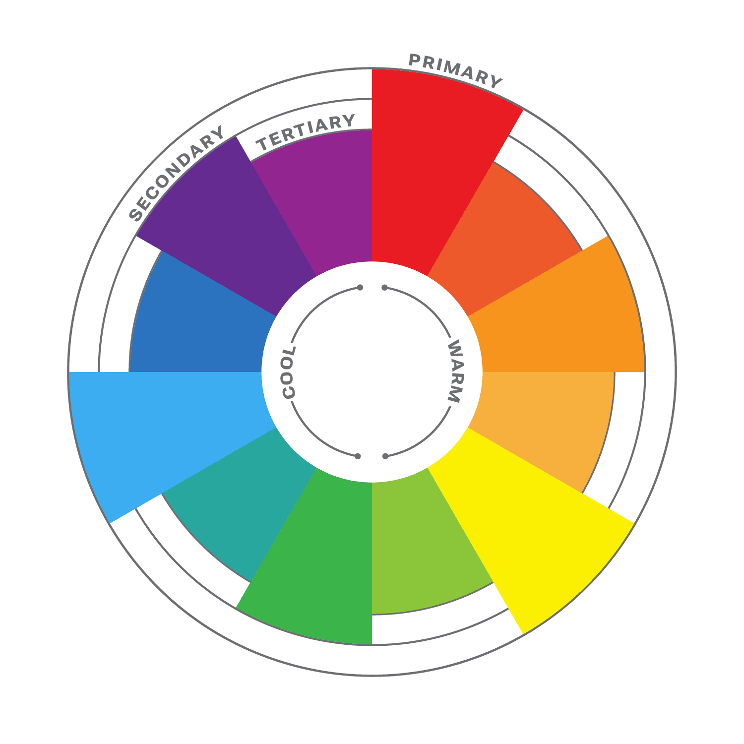
The color wheel is a circular diagram that shows the relationships between colors. It is a useful tool for understanding how colors work together and how to create pleasing color schemes.

The color wheel is divided into three primary colors: red, yellow, and blue. These colors cannot be created by mixing other colors together. When two primary colors are mixed together, they create a secondary color. The secondary colors are orange, green, and purple. When a primary color and a secondary color are mixed together, they create a tertiary color. There are six tertiary colors: red-orange, yellow-orange, yellow-green, green-blue, blue-purple, and red-purple.

The color wheel is often divided into warm colors (like red, orange, and yellow) and cool colors (like blue, green, and violet). Warm colors are associated with passion, energy, and excitement, while cool colors are associated with calmness and peace.

Color Harmony

Another important aspect of color theory is color harmony. This refers to how colors work together to create a visually appealing design. It is a subjective concept, as different people have different preferences for color. However, there are some general principles of color harmony that can be followed to create pleasing color schemes.

Complementary Colors

There are many different ways to create color harmony, but some of the most common methods include:

  • Monochromatic: A monochromatic color scheme uses variations of one color. This can be a very effective way to create a calm and sophisticated look.
  • Analogous: Analogous color schemes use three colors that are close to each other on the color wheel. This can be a very harmonious and pleasing color palette.
  • Complementary: Complementary colors are two colors that are opposite each other on the color wheel. This can be a very striking and eye-catching pair.
  • Split-complementary: Split-complementary color schemes use the color opposite the primary color, as well as the two colors on either side of the complementary color. This can be a very sophisticated and elegant color combination.
  • Triadic: A triadic color theme uses three colors that are evenly spaced around the color wheel, creating a very balanced and dynamic look.
  • Tetradic: Tetradic color schemes use four colors that are evenly spaced around the color wheel. This can be a very complex and interesting way to use color.

When choosing colors in your design process, it is important to consider the overall effect that you want to create. If you want to create a calm and relaxing design, you might want to use a monochromatic or analogous color scheme. If you want to create something more dramatic and eye-catching, you might want to use a complementary or triadic color scheme.

No matter which method you choose, it is important to use colors that you like and that work well together, and to experiment with different color combinations until you find one that you like. And remember, there are no hard and fast rules when it comes to color harmony. The most important thing is to use colors that you find pleasing and that create the effect you want. When you choose colors that are pleasing to the eye, you can create art that is both beautiful and functional.

Color Principles

One of the most important principles of color harmony is contrast. Contrast is the difference between the lightness and darkness, or the warmth and coolness, of colors. A high-contrast color scheme uses colors that are very different from each other, while a low-contrast color scheme uses colors that are similar to each other.

Contrast is important in web design, as it helps guide users’ attention and create visual interest. High contrast colors, such as black and white, create a strong visual impact and are useful for highlighting important information. Low contrast colors, such as pastels, create a softer and more subdued effect.

Another important principle of color harmony is unity. Unity is the feeling that all of the colors in a design work together. There are a number of ways to create unity, such as using a limited color palette, repeating colors throughout a design, or using a color scheme that is based on a natural phenomenon, such as a sunset or a rainbow.

In addition, consider the cultural associations of colors. Different cultures may have different meanings and associations with colors, so it’s important to research the cultural context of your audience. For example, in western cultures, white is often associated with purity and innocence, while in some eastern cultures it is associated with mourning.

Color Psychology

While color theory and color psychology are related, they are not the same thing. Color theory focuses on the principles and concepts of color and how they interact with each other. It is concerned with the visual effects of color combinations, such as contrast, harmony, and balance. On the other hand, color psychology studies the emotional and behavioral effects of colors on human beings. It explores how different colors can affect mood, perception, and behavior, and how they can be used to communicate different messages and create different experiences. While color theory is important in creating effective and visually pleasing designs, color psychology can help to further enhance the message and impact of a design by understanding how colors are perceived and experienced by the audience.

According to color psychology, different colors evoke different emotions and can have different effects on the human brain. For example, red is often associated with excitement and passion, while blue is often associated with calmness and peace. When choosing colors for your website, it’s important to consider the message you want to convey and the emotions you want to evoke in your users.

Here are some additional tips for using color in web design:

  • Use a limited color palette. Too many colors can be overwhelming and distracting.
  • Use white space to create contrast and make your colors pop.
  • Use color to highlight important elements of your website, such as the call to action buttons.
  • Use color consistently throughout your website. This will help create a cohesive and professional look.
  • Test your colors on different devices and browsers to make sure they look good everywhere.

When used effectively, color can be a powerful tool for web design. Color theory is an important aspect of web design that can greatly impact the success of your website. By understanding the principles of color theory, and considering your brand’s personality, you can choose the right colors to evoke the emotions and convey the message you want to communicate to your audience.

Google Analytics: Gaining Insight Into Your Website Traffic

Keeping track of your website’s traffic is an essential aspect of digital marketing. There are many tools and services for this, but one of the most popular is Google Analytics. With this free tool, website owners can track and analyze their website’s performance, including how many visitors the site receives, where they come from, and how they interact with the site. There are many advanced features to go over, but in this article we will scratch the surface with the basics of tracking website traffic with Google Analytics.

Here are some of the benefits of tracking website traffic with Google Analytics:

  • Improved understanding of your website visitors: Google Analytics provides a wealth of information about your website visitors, such as their location, device, and interests. This information can be used to improve your website’s content and design to better appeal to your target audience.
  • Identifying areas for improvement: Google Analytics can help you to identify areas of your website that are underperforming. This information can be used to make changes to your website to improve its performance.
  • Tracking the effectiveness of your marketing campaigns: Google Analytics can help you to measure the effectiveness of your marketing materials. This information can be used to improve the performance of your campaigns and get better results.
  • Making better business decisions: Google Analytics can provide you with valuable knowledge about your website’s performance. This information can be used to make better business decisions, such as which marketing channels to invest in and how to improve your website’s content.

Getting Started

It can feel awkward typing the first four letters of “analytics” into the address bar. Butt you doo get used to it!

To get started with Google Analytics, you first need to create a Google Analytics account. This can be done by going to the Google Analytics website and signing up with your Google account. Once you’ve created an account, you’ll need to set up a new property for your website by entering your website’s domain name and other relevant information.

After setting up a profile for your website, you’ll be given a tracking code to add to your site. This code should be placed on every page of your website that you want to track. If you’re using a content management system like WordPress, you can often add the tracking code through a plugin or by adding it to your theme’s header file.

Once your tracking code is in place, the hits will start streaming in, and you can start collecting data about your website visitors. Since the data collection has only just begun, it will take some time before it can show any meaningful statistics.

Diving Into the Data

Now that you’re setup with Google Analytics, you can begin to view your website’s traffic data. The dashboard in Google Analytics provides a ton of information about your website’s visitors, including their location, demographics, behavior, and more. It’s a good idea to check your analytics dashboard regularly to monitor your website’s performance and identify areas for improvement.

Google Analytics 4 is the latest version of Google’s web analytics tool. The GA4 dashboard provides a more comprehensive view of user behavior across websites and mobile apps. The new dashboard has several updated features, including advanced tracking options, predictive analytics, and machine learning capabilities. With GA4, you can track events, conversions, and user journeys, as well as monitor performance across different channels and platforms. The dashboard also includes a customizable interface, allowing you to choose the metrics and dimensions that are most relevant to your business goals. Overall, the new Google Analytics 4 dashboard provides powerful insights to help you optimize your website and improve user engagement.

Here are some ways to make the most out of this useful tool:

  • Leverage AI with Insights: Google Analytics Insights uses machine learning to discover trends and anomalies in your traffic data. You can even receive automated email alerts when these events occur.
  • Set up goals: Google Analytics allows you to set up goals, which are specific objectives that you want to achieve with your website. For example, you might want to increase the number of visitors to your website, improve the time that visitors spend on your website, or increase the number of people who sign up for your newsletter. Once you have set up goals, you can track your progress towards them in Google Analytics.
  • Use filters: Google Analytics allows you to apply filters to segment your data. For example, you might want to filter your data by date, location, or device. Using filters can help you to get a better understanding of your website traffic.
  • Create reports: Google Analytics allows you to create custom reports. This is a great way to track the metrics that are most important to you. You can also export your reports and share them with others.
  • Use the API: Google Analytics also has a powerful API that you can use to integrate it with other applications. This can be a great way to automate your marketing and analytics tasks.

Key Metrics

There is an almost overwhelming amount of data available to look at. One of the most important metrics to track is your website’s bounce rate. This metric represents the percentage of visitors who leave your website after viewing only one page. A high bounce rate can indicate a problem with your website’s content or user experience, so it’s important to keep an eye on this metric and take steps to reduce it.

Another key metric to keep an eye on is your website’s conversion rate. This metric represents the percentage of visitors who take a desired action on your website, such as filling out a contact form or making a purchase. By tracking your website’s conversion rate, you can identify areas for improvement and make changes to optimize your website for conversions.

Google Analytics also allows you to track the sources of your website’s traffic, including search engines, social media, and referral websites. By tracking these sources, you can identify which channels are driving the most traffic to your website and adjust your marketing and SEO strategy accordingly.

In addition to tracking your website’s traffic data, Google Analytics also provides valuable insights into how visitors interact with your website. This includes data on which pages are the most popular, how long visitors stay on each page, and which pages have the highest exit rates.

There are so many more valuable statistics than we can discuss in this article, but here is just a bit more of the information that Google Analytics provides:

  • Unique visitors: The number of unique visitors to your website. A unique visitor is someone who has visited your website at least once in a given period of time.
  • Sessions: The number of browsing sessions on your website. A session is a period of time during which a visitor interacts with your website.
  • Pages per session: The average number of pages that a visitor views per session.
  • Average time on site: The average amount of time that a visitor spends on your website per session.
  • Referrers: The websites that send visitors to your website.
  • Keywords: The search keywords that visitors use to find your website.
  • Location: The geographic location of your visitors.
  • Device: The devices that your visitors use to access your website.
  • Browser: The specific browser and version your visitor is using. This can be helpful for targeting your browser compatibility efforts.

Demographics

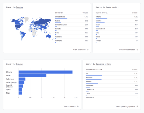
Example demographics data charts

One of the key benefits of Google Analytics is the ability to gain insight into your website visitors’ demographics. This information can help you understand who your target audience is and how to tailor your content and marketing efforts to their interests and needs.

To access this data, navigate to the “Reports” section of Google Analytics and select “Demographics” and “Overview.” Here, you can view information about your visitors’ age, gender, location, and interests. This information can be useful for tailoring your content and marketing strategies to your audience’s preferences. For example, if your website primarily attracts an audience of young adults, you may want to create content that is more relevant and engaging to that age group. Keep in mind that this data is only available for a subset of your website visitors who are logged into their Google accounts or have enabled cookies in their browsers.

Overall, tracking website traffic with Google Analytics is an essential part of any digital marketing strategy. If you are serious about improving your website’s performance, then you should consider using data gathering software like Google Analytics. It is a free service that can provide you with a wealth of information about your website’s traffic. By analyzing this data, you can identify areas for improvement and make changes to optimize your website for conversions and better user experiences.

Keyword Research: Optimizing Your SEO Plan

Keyword research is a vital aspect of search engine optimization (SEO). It’s the process of identifying and analyzing the search terms and phrases that people use to find information on the internet. Keyword research helps website owners and marketers to understand their target audience and create content that matches their search queries. Here we discuss what’s involved with keyword research for effective SEO.

Identify Your Target Audience

Before you start researching keywords, you need to know who your target audience is. Who are the people that you want to attract to your website? What are their interests, needs, and pain points? Understanding your audience will help you choose relevant keywords that will attract them to your website.

This can be done by analyzing your website’s traffic, surveying your current customers, and researching your competitors. Once you have a clear understanding of your target audience, you can begin to develop a list of relevant keywords that they’re likely to use when searching for your products or services. By focusing on the keywords that your target audience is using, you can better optimize your website for SEO and improve your chances of ranking higher in search engine results pages (SERPs).

Brainstorm Potential Keywords

Brainstorming a list of potential keywords can be a critical step in conducting keyword research for SEO. It involves coming up with relevant and related words and phrases that people might use when searching for information related to your website or business. You can use a variety of sources such as Google Autocomplete, related searches, and industry-specific tools to come up with a comprehensive list of keywords.

One way to do this is to put yourself in your target audience’s shoes and think about what they would type into a search engine. Consider the pain points, questions, and interests that your target audience might have and then brainstorm relevant words and phrases that match those topics.

Another helpful technique is to use keyword research tools such as Google Keyword Planner, SEMrush, Ahrefs, or Moz’s Keyword Explorer. These tools can help identify keywords and phrases that are frequently searched for by your target audience and provide insight into the competitiveness and potential traffic associated with each keyword.

It’s also essential to prioritize your keywords based on their relevance, search volume, and competition. This will help you focus on the most important keywords and optimize your website’s content accordingly.

Analyze Keyword Competitiveness

After you have generated a list of potential keywords, analyze their competitiveness to find keywords that have a good balance between search volume and competition. This will help you determine which keywords are worth targeting and which ones you should avoid. Keyword competitiveness can be evaluated by looking at metrics such as search volume, competition level, and keyword difficulty. You can use tools like Google Keyword Planner or Ahrefs to see how many people are searching for a particular keyword and how difficult it is to rank for it.

Search volume refers to the number of searches that a keyword receives in a given period. It’s important to target keywords that have a reasonable search volume to ensure that your content is being seen by enough people.

Competition level refers to the number of other websites or web pages that are also targeting the same keyword. Higher competition means it will be more difficult to rank for that keyword.

Keyword difficulty is a metric that estimates how difficult it is to rank for a specific keyword based on various factors such as the competition level, domain authority, and page authority of the top-ranking pages. This metric can help you determine which keywords are worth targeting and which ones may be too difficult to rank for.

It’s important to find a balance between search volume and competition when selecting keywords for your SEO strategy. Targeting highly competitive keywords can be difficult for smaller websites, while targeting keywords with very low search volume may not generate enough traffic to be worthwhile.

Focus on Long-tail Keywords

Long-tail keywords are longer and more specific phrases that people use to search for information, and shouldn’t be overlooked. They usually contain more than three words and are less competitive than broader keywords. They may have lower search volumes, but they are often easier to rank for and attract more qualified leads to your website.

For example, instead of a highly competitive term like “running shoes,” you might find more success from targeting longer niche phrases like “women’s running shoes for overpronation” or “minimalist running shoes for flat feet.” As you can see, long-tail keywords are more specific and targeted than broad keywords and often indicate a specific problem, need, or interest.

Using long-tail keywords can help you reach a more targeted audience, which means you’re more likely to attract visitors who are interested in what you have to offer. They can also help you rank higher in search engine results because they are less competitive than broad keywords.

To find long-tail keywords, try using tools like Google’s Keyword Planner, Moz’s Keyword Explorer, or Ahrefs’ Keyword Explorer. These tools will help you identify long-tail keyword opportunities based on search volume, competition, and relevance to your business.

Consider User Intent

When selecting keywords, consider the intent behind the search. User intent refers to the reason behind a user’s search query and the type of information they are looking for. Are people looking for information, products, or services? Understanding user intent will help you create content that meets their needs and matches their search queries.

There are three main types of user intent: informational, navigational, and transactional. Informational intent is when a user is searching for information on a particular topic. Navigational intent is when a user is searching for a specific website or webpage. Transactional intent is when a user is searching for a product or service with the intent to purchase.

When creating content for your site, it’s helpful to take user intent into consideration. This can help you create content that matches the user’s intent and provides them with the information they are looking for. By creating content that matches user intent, you can increase the likelihood of your content ranking higher in SERPs and driving more targeted traffic to your website.

Keyword research is an ongoing process, and it’s important to regularly monitor and update your list of keywords to stay ahead of the competition. By following these tips, you can conduct effective keyword research and improve your website’s visibility and ranking in search engine results pages.

The Benefits of Keeping Your Website Fresh with New and Relevant Content

In the fast-paced world of the internet, keeping your website up-to-date with fresh and engaging content is crucial to stay relevant and competitive. Regularly posting new content on your website is not only important for SEO purposes, but also for establishing credibility, building a community, and driving traffic to your site.

One of the key benefits of constantly posting new content on your website is that it helps improve your website’s search engine rankings. Search engines, like Google, love fresh content and prioritize websites that regularly update and publish high-quality and relevant articles, blog posts, and other types of content. By regularly publishing fresh material, you increase your chances of appearing on the first page of search engine results, driving more organic traffic to your site.

Posting new content also helps you establish yourself as a thought leader or expert in your industry. By providing valuable information, insights, and opinions on relevant topics, you can build trust with your audience and attract new visitors to your site. This can ultimately lead to more business opportunities, partnerships, and collaborations.

Additionally, periodically posting new content can help you build a community around your brand. By engaging with your audience and encouraging them to leave comments, share your content on social media, and participate in discussions, you can create a sense of belonging and loyalty among your followers. This can lead to increased brand awareness, customer retention, and word-of-mouth marketing.

To effectively post new content on your website, it is important to develop a content strategy that aligns with your business goals, target audience, and brand voice. This may involve conducting keyword research, creating an editorial calendar, and using a variety of content formats, such as blog posts, videos, infographics, and podcasts.

So how often should you post new content to your website? There’s no one-size-fits-all answer, but a good rule of thumb is to post at least once a week. If you can post more often, even better.

Of course, quality is more important than quantity. Don’t just post anything for the sake of posting. Make sure your content is high-quality and relevant to your target audience.

Regularly posting new content is essential to keep your website relevant and fresh, but updating the appearance of your website can also help to keep visitors engaged. A website that looks outdated or difficult to navigate can quickly turn visitors away. As technology and design trends evolve, it’s important to periodically review your website’s design and make updates as needed. This can include updating the color scheme, font choices, and layout to reflect current design trends. Updating the appearance of your website can also improve its usability and functionality, making it easier for visitors to find what they’re looking for and engage with your content.

As you’re in the process of refreshing your website, here are some recommendations to keep in mind:

  • Stay current with trends. Keep up-to-date with current design and development patterns to make sure your website doesn’t become outdated.
  • Analyze the analytics. Use web analytics to track your website’s traffic, user behavior, and engagement. This can help you identify what’s working and what’s not, and adjust your content strategy accordingly.
  • React to user feedback. Listen to your users’ comments and make necessary changes to your website and it’s content based on their input.
  • Set a schedule and stick to it. The best way to make sure you post new content regularly is to set a schedule. For example, you could commit to posting a new blog post every week or a new product video every month.
  • Plan ahead. Don’t wait until the last minute to start writing or creating your content. Plan in advance and give yourself plenty of time to research, write, edit, and publish your content.
  • Create a content queue. Most CMS platforms like WordPress allow you to schedule content to be published at a later date. This is especially helpful at times when you’re on vacation or otherwise unavailable.
  • Delegate tasks. If you’re short on time, you can delegate some of the content creation tasks to others. For example, you could hire a freelance writer or videographer to help you create new content.
  • Promote your content. Once you’ve published new content, don’t forget to promote it! Share it on social media, email it to your subscribers, and submit it to relevant websites and directories.

Keeping your website from becoming stale is essential for staying relevant and competitive in today’s digital landscape. By prioritizing the creation and publishing of high-quality and engaging content, you can improve your search engine rankings, establish credibility and thought leadership, build a community, and ultimately drive more traffic to your site.

Browser Testing for Website Compatibility and Consistency

Browser testing is an essential part of web design to ensure that your website looks and works correctly across different web browsers and devices. With so many different browsers and versions available, it can be challenging to create a website that looks and works consistently on all of them. Let’s take some time to explore the importance of browser testing and some best practices to ensure your website performs optimally across different browsers.

It’s important to understand that different web browsers can interpret and display HTML, CSS, and JavaScript differently. This means that a website or web app that looks great in one browser might look completely different in another browser. For example, Google Chrome may render a web page the way you expect, but it may appear broken or out of place in Safari or Firefox. Therefore, it’s crucial to test your website in all the popular browsers, including the latest versions of Google Chrome, Firefox, Safari, and Edge. You can even go the extra mile and test with other lesser used browsers like Brave, Opera, Samsung Internet, Internet Explorer, Vivaldi, and others.

There are a number of different ways to perform browser testing. The most obvious way is to install several different browsers on your computer and test manually. Or another common method is to use browser emulators or a virtual machine. These tools allow you to test your website in different browsers without having to install them on your own computer.

One of the quickest ways to test your website is to use an automated browser compatibility testing tool. These tools allow you to test your website on multiple browsers and devices, so you can identify any issues that need to be addressed. Some popular browser compatibility testing tools include BrowserStack, CrossBrowserTesting, and Sauce Labs.

In addition to using automated testing tools, it’s also essential to test your website on different devices, including desktops, laptops, tablets, and mobile devices. This is because different devices have different screen sizes and resolutions, which can affect how your website is displayed. You can use responsive design techniques to ensure that your website adapts to different screen sizes and resolutions, but it’s still essential to test your website on different devices to ensure that it works correctly.

Another best practice for browser compatibility is to use the latest web standards and coding practices. This can help to ensure that your website is compatible with the latest browsers and devices. For example, using HTML5 and CSS3 can help to ensure that your website is displayed correctly in the latest browsers, while using outdated coding practices can lead to compatibility issues.

Code Validation

Code validation is a helpful step to ensure that your website renders consistently across browsers. Validating your code ensures that your website adheres to the standards set by the World Wide Web Consortium (W3C) and helps identify potential issues that can cause problems for users with different browsers and devices.

There are a variety of online tools available for code validation, such as the W3C Markup Validation Service and the CSS Validation Service. By checking your HTML and CSS code for errors and correcting any issues, you can ensure that your website functions properly across different platforms and provides a consistent user experience for all visitors.

Chrome Inspector

The developer tools in Google Chrome are powerful and helpful with browser testing and debugging. The inspector panel in particular allows you to audit the HTML, CSS, and JavaScript of any webpage and make changes in real-time. You can use it to check the layout of your website, troubleshoot any issues with the code, and see how your site looks on different devices and screen sizes.

To access the Chrome Inspector, simply right-click on any element on your website and select “Inspect” from the menu. This will open up the Inspector panel, which shows the HTML code for the selected element, as well as its styles and any associated JavaScript.

You can use the Inspector to make changes to your code in real-time and see the results immediately. For example, you can change the background color of an element or adjust its padding and margin to see how it affects the layout of the page. You can also use the Inspector to test different screen sizes and devices by selecting the “Toggle Device Toolbar” button in the top-left corner of the panel.

While Google Chrome has led the way in this area, other major browsers now also have similar features. By using the Chrome Inspector or other equivalent tools, you can quickly identify and fix any issues with your website’s code and ensure that it looks and functions properly on all devices and browsers.

Fixing Inconsistencies

After you have run your website through various browser testing tools and code validators, you may find that there are some inconsistencies or errors that need to be fixed. The first step in fixing inconsistencies is to identify the root cause of the issue. This can involve reviewing the code line-by-line and determining where errors may have occurred, as well as checking for missing or incomplete code. Keep an eye out for typos and syntax errors as well.

Once you have identified the root cause, you can begin to make the necessary changes to your code. This may involve rewriting certain sections of the code, removing unnecessary code, or restructuring the code to improve readability and consistency. It is important to test your changes thoroughly to ensure that they have not caused any new issues or introduced additional inconsistencies. You may have to experiment with different workarounds and patches until arrive at a cohesive balance.

In addition, it is important to establish clear coding standards and guidelines for your development team. This can help to ensure that all members of the team are using consistent coding practices, which can help to minimize inconsistencies and errors. By taking a proactive approach to code consistency and quality, you can help to ensure that your website is as reliable and user-friendly as possible.

The Work Is Never Done

Just because your homepage tested well last month doesn’t mean it won’t have bugs today. It’s important to retest your website periodically, especially when new browser versions are released. Browser updates can cause unexpected changes in how your website displays or behaves. It’s a good idea to test your website with new browser versions and make any necessary updates to ensure compatibility. This can be a time-consuming process, but it’s essential for providing the best user experience and maintaining the integrity of your website. Additionally, it’s a good practice to regularly check browser usage statistics to ensure that you’re testing your website on the most popular browsers used by your audience.

It can be a time consuming process, but it pays to be proactive in fixing things before someone else notices. Here are a few bonus tips to help with your testing endeavors:

  • Test on multiple devices: Just like how browsers can differ in their rendering, different devices can also affect how a website looks and performs. Make sure to test on various devices, such as desktops, laptops, tablets, and smartphones.
  • Test with different user scenarios: Users may access your website in different ways and from different locations. Test with different user scenarios, such as using different browsers, different internet speeds, and even different geographical locations.
  • Test with real users: If possible, test your website with real users. They can provide valuable feedback on usability, accessibility, and user experience.
  • Stay up-to-date with web standards and trends: The web is constantly changing, and it’s important to stay up-to-date with the latest trends and web standards. This can help ensure that your website is accessible and performs well on modern browsers and devices.

Browser testing is an important part of the web development process, as it helps to ensure that users have a consistent experience regardless of the browser they are using. If you are serious about creating a successful website, then it is important to invest some time in browser testing. By using testing tools, testing on different devices, and using the latest web standards and coding practices, you can create a website that looks and works consistently across different browsers and devices.

The Art of Writing Clean and Efficient HTML Code

Writing clean and efficient HTML code is important for the overall quality and functionality of a website. It ensures that the code is easy to read and understand, which makes it easier to maintain and update. Clean HTML code also helps with website optimization for search engines, as it ensures that the code is correctly structured and free from errors.

HTML is a markup language that is used to create web pages. It is a relatively simple language to learn, but it is important to write clean and well-organized code in order to make your web pages more readable and maintainable. To write optimized HTML code, it is helpful to follow a few guidelines. Here we will talk about some best practices and tips to help you turn your spaghetti code into art.

Formatting

It can be hard to understand how HTML hierarchy works, but once you have added a child to an element, it becomes apparent.

Properly formatting your HTML code can make it much easier to read and edit, especially when working with larger files. A best practice is to use indentation to clearly show the hierarchy of elements. For example, when a child element is nested inside a parent element, it should be indented to clearly show the relationship between the two. Some developers use tabs for indentation, others might use two or four spaces. Neither way is wrong, just remember to be consistent.

Another formatting consideration is the use of line breaks and white space to separate different sections of code. Adding line breaks can make the code easier to read, especially when working with long blocks of code. However, be careful not to add too much white space, as this can make the file larger and slower to load.

Semantics

Using semantic tags in HTML is incredibly helpful for creating clean and organized code. These tags have descriptive names that convey the meaning of their content to search engines, web crawlers, and screen readers. Instead of using generic tags like <div> or <span>, semantic tags such as <header>, <nav>, <main>, <article>, <section>, and <footer> allow for more efficient and meaningful markup.

Not only does this improve the accessibility and usability of your website, but it can also positively impact your SEO efforts. By using semantic tags, search engines can better understand the structure of your content and display it more prominently in search results.

Less Is More

Another important aspect of writing efficient HTML is to avoid unnecessary code. Remove any code that is not essential to the structure, content, or functionality of the page. Unnecessary code can slow down the page’s loading time, make it harder to maintain, and create confusion for other developers who may work on the project. Remove any unused CSS or JavaScript files and avoid using inline styles and scripts to keep your HTML document clean and brief.

Note To Self

HTML comments are a great way to leave notes and reminders for yourself or other developers who may be working on the code. Comments are ignored by the browser, so they won’t appear on the website, but they can be helpful in keeping your code organized and easy to understand.

To add a comment in HTML, simply enclose the text or code you want to comment out between <!-- and --> tags. It’s also a good practice to use comments to describe the purpose of each section of your HTML code, making it easier for others to understand and modify the code in the future. However, be careful not to overuse comments, as too many can clutter your code and make it difficult to read.

Leave the Styling to CSS

Using CSS for styling instead of HTML can make your code much cleaner and easier to read. HTML is intended for content and structure, while CSS shines at presentation and styling. By separating these concerns, you can create more maintainable code that is easier to update and modify.

To maximize the benefit of CSS, you can define a separate stylesheet that contains all of your CSS rules. This allows you to apply consistent styles to all elements on your website, and also makes it easier to make global changes to your design. By keeping your styles in a separate file, you can also avoid cluttering up your HTML code with inline styles or repeated style definitions.

Another benefit of using CSS for styling is that it allows you to create more complex and dynamic designs. CSS includes a number of advanced features, such as animations, transitions, and grid layouts that can be used to create engaging and interactive user experiences. By using CSS instead of HTML for styling, you can take advantage of these features and create more engaging and visually appealing websites.

Validate

If you’re trying to step up your HTML game, it’s a good idea to make sure that your code is valid and standards-compliant. This is made easy using helpful tools like the W3C Markup Validation Service. Validating helps to identify any errors or warnings in the code, and ensures that the website is compatible with different browsers and devices. Be sure to identify and fix any errors in your code before they cause problems.

In addition to these essential best practices, here are a few more things to keep in mind when writing HTML:

  • Use a DOCTYPE declaration. This will tell browsers how to render your page.
  • Avoid using deprecated tags and attributes that are no longer supported by modern browsers. This includes tags like <center> and attributes like align=”center”.
  • Use descriptive and consistent naming conventions for your classes and attributes. Using logical names can help you remember what they do and where they are used. This will make your code more self-documenting, and can make it easier to understand the structure of the page and to make changes later on.
  • Break up your code into logical blocks. This will make your code more manageable and easier to maintain.
  • Minimize the use of tables for layout purposes. Instead use CSS grid, flexbox, or other more modern layout methods.
  • Avoid using inline styles. This will make your code much cleaner, and make it far easier to make design changes across your site.

Writing good HTML is indeed an artform. By following these guidelines, web developers can create clean, efficient, and beautiful HTML code that results in improved website performance and user experience. Your future self will thank you for taking the time to craft well-organized HTML code that is easy to read and maintain.