6 Steps for Creating a Cohesive and Polished Website

A cohesive and polished website design is not just a luxury but a necessity. Your website is often the first point of contact for potential customers or visitors, and it plays a pivotal role in shaping their perception of your brand. A well-designed website can captivate and engage users, instilling trust and credibility. In contrast, a poorly executed website can lead to frustration and missed opportunities.

A cohesive website design brings together various visual elements, user interface components, and content to create a harmonious and seamless user experience. It ensures that every page and interaction on your website reflects your brand identity consistently. With a strong visual identity and applying consistent design principles, you can convey professionalism, build brand recognition, and differentiate yourself from competitors.

So, whether you are building a new website or seeking to enhance your existing one, this article will serve as your guide to creating a cohesive and polished web presence.

1. Establish a Strong Visual Identity

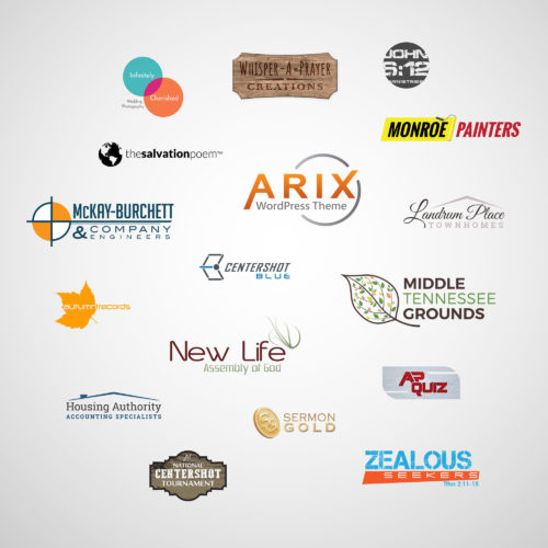
Collage of various logos
A strong brand image begins with a memorable logo.

When it comes to creating a cohesive and polished website, one of the first steps is to define your brand’s visual elements. These elements serve as the foundation for your website’s design and help establish a strong visual identity. Start by crafting a memorable logo that embodies your brand’s essence and aligns with your target audience. Consider the use of colors, typography, and imagery that reflect your brand’s personality, values, and industry.

Consistency is key to creating a cohesive website design. Once you have established your brand’s visual elements, it’s crucial to apply them consistently across all pages. Ensure that your logo is prominently displayed and positioned consistently throughout the website. Use uniform color schemes and typography choices to maintain a cohesive look and feel. Consistency in design elements helps users recognize and associate your website with your brand, fostering trust and familiarity.

Whitespace, also known as negative space, is the empty space between elements on a webpage. It plays a vital role in creating a clean and organized layout. Strategic use of whitespace allows the content and design elements to breathe, improving readability and visual hierarchy. Avoid cluttering your pages with excessive text or crowded visuals. Instead, embrace whitespace to create a sense of balance, focus, and elegance. It helps draw attention to important elements and improves the overall user experience.

2. Craft a Seamless User Experience

User experience

A crucial aspect of creating a cohesive and polished website is designing intuitive navigation menus and a logical site structure. Your website’s navigation should be easy to understand and navigate, allowing users to find information effortlessly. Consider using clear and descriptive menu labels and organizing your pages into logical categories. Additionally, incorporate a search function to enable users to quickly locate specific content.

Effective call-to-action (CTA) buttons are essential for guiding users towards desired actions on your website. To create a cohesive user experience, it’s crucial to ensure that your CTAs are consistent in design and placement across all pages. Use clear and action-oriented language that compels users to take the desired action. Additionally, employ visual cues such as contrasting colors or arrows to draw attention to the buttons.

In today’s mobile-driven world, optimizing your website for different devices is paramount. Implementing responsive design ensures that your website adapts and performs seamlessly on various screen sizes and devices, including smartphones, tablets, and desktops. A responsive website design not only enhances user experience but also improves your search engine rankings. Google values mobile-friendly websites and ranks them higher in search results. Therefore, ensure that your website’s layout, images, and content adjust smoothly to different screen sizes, providing users with a consistent and enjoyable browsing experience.

3. Create Consistent Content Presentation

Consistency in content presentation is crucial for a cohesive and polished website. When it comes to text and images, maintaining a consistent layout and formatting enhances readability and visual appeal. Use the same font styles and sizes across your website to establish a cohesive typographic hierarchy. Consistency in text formatting, such as alignment, spacing, and paragraph styles, creates a harmonious reading experience. Similarly, ensure that images are presented consistently in terms of size, aspect ratio, and placement.

Headings and subheadings play a vital role in guiding users through your content and establishing a clear hierarchy. Consistently use heading tags (H1, H2, H3, etc.) to structure your content and help search engines understand the organization of your information. Ensure that the hierarchy of headings is logical and that they are used consistently across pages. This not only aids in readability but also contributes to better SEO practices.

Consistency extends beyond visual elements; it also applies to the tone and voice of your written content. Establishing a consistent tone helps build brand identity and creates a cohesive user experience. Whether your content is formal, conversational, or playful, maintain a consistent tone throughout your website. Consider your target audience and align your language and writing style accordingly. Consistency in tone and voice fosters familiarity, trust, and brand recognition among your audience.

4. Pay Attention to Detail

Optimizing your website’s loading speed is crucial for providing a smooth browsing experience. Slow-loading pages can lead to user frustration and high bounce rates, negatively impacting your search engine rankings. To enhance website speed, consider techniques such as optimizing image sizes, minifying code, and leveraging caching mechanisms. Additionally, ensure that your hosting provider offers reliable and fast server performance.

Broken links and 404 errors can harm user experience and have a negative impact on your website’s SEO. It’s essential to regularly check for broken links and fix them promptly. Broken links not only frustrate users but also indicate to search engines that your website may have outdated or low-quality content. Utilize tools or plugins that scan your website for broken links and provide you with a comprehensive report. Once identified, update or remove the broken links to ensure a seamless user experience and maintain a healthy website reputation.

With the multitude of devices and web browsers available today, it’s crucial to ensure that your website displays and functions consistently across different platforms. Conducting thorough cross-browser and cross-device testing helps identify any design or functionality issues that may arise on specific browsers or devices. Test your website on popular web browsers such as Chrome, Firefox, Safari, and Edge, and ensure compatibility with both desktop and mobile devices.

5. Ensure Accessibility and Usability

Creating a cohesive and polished website involves considering the needs of all users, including those with disabilities. Designing with accessibility guidelines in mind ensures that your website is inclusive and usable by a broader audience. Follow the Web Content Accessibility Guidelines (WCAG) to provide equal access to information and functionality. This includes considerations such as ensuring proper color contrast for text readability and implementing keyboard navigation for users who cannot use a mouse.

Images are not only visual elements but also provide important context and information. To make your website more accessible, use descriptive alt text for images. Alt text describes the content of the image, allowing visually impaired users who rely on screen readers to understand its meaning. Additionally, use proper heading structure with semantic HTML tags to create a clear and logical reading order for both users and search engines. This improves accessibility, facilitates navigation, and enhances the overall user experience.

When users encounter errors while interacting with your website’s forms or performing actions, it’s essential to provide clear and concise error messages. Error messages should accurately describe the issue and provide guidance on how to resolve it. Additionally, implement form validations to ensure that users provide valid and properly formatted input. Real-time validation can help users catch errors as they occur, preventing frustration and improving the overall usability of your website.

6. Optimize for Search Engines

To ensure your website reaches its intended audience, it’s crucial to conduct thorough keyword research. Identify the keywords and phrases that are relevant to your content, industry, and target audience. Consider user intent and search volume when selecting keywords to incorporate into your website’s content. Strategically place these keywords in your page titles, headings, paragraphs, and image alt text. However, be mindful not to overdo it or engage in keyword stuffing, as this can have a negative impact on user experience and search engine rankings.

Meta titles and descriptions are crucial elements of your website’s search engine optimization. Craft compelling and concise headlines that accurately represent the content of each page. Incorporate relevant keywords while keeping the title within the recommended character limit of 50-60 characters to ensure it appears fully in search engine results. Similarly, write engaging meta descriptions that provide a summary of the page’s content and entice users to click through. Including keywords in meta descriptions can improve search engine visibility and attract more organic traffic.

Prepare for Launch

Applying these techniques to your own projects can help you create a cohesive and polished website that not only engages users but also ranks favorably on search engine result pages. Remember, a well-designed website not only enhances your brand’s image but also establishes a strong online presence, attracts more visitors, and increases conversions.

As technology and user expectations evolve, it’s important to continuously monitor and refine your website’s design and functionality. Keep up-to-date on the latest industry trends and updates, and be open to incorporating new techniques to improve your website’s cohesiveness and polish.

Investing time and effort into creating a cohesive and polished website is a long-term strategy that yields numerous benefits. It enhances user experience, builds trust with your audience, improves search engine rankings, and ultimately drives the success of your online presence.

Revolutionizing User Interaction with Effective Web Forms

Web forms are the unsung heroes of user interaction. They are the gateways through which users connect, provide information, and engage with your website. From simple contact forms to complex registration processes, web forms play a crucial role in shaping the user experience. In this article, we will explore the art of crafting better web forms that not only captivate users but also drive conversions and enhance user satisfaction.

Well-designed forms streamline the user experience, reducing friction and increasing user engagement. They capture accurate and valuable user data, enabling businesses to gain insights, personalize experiences, and nurture customer relationships. With a user-centric mindset and an unwavering commitment to excellence, you have the power to revolutionize user interaction and unlock the true potential of your web forms.

Consider User Needs and Goals

The foundation of creating effective web forms lies in understanding your users’ needs and pain points. User research is the compass that guides us in designing forms that align with their expectations and aspirations. Through surveys, interviews, and usability testing, we gain invaluable insights into user preferences, challenges, and motivations.

Every web form has a purpose, whether it’s to collect contact information, process orders, or gather user feedback. Defining clear goals for your web form allows you to align its design and functionality with the desired outcomes. Identify the key objectives, prioritize the essential information you need to collect, and streamline the form accordingly. By setting clear goals, you avoid overwhelming users with unnecessary fields, resulting in a more focused and efficient form completion process.

The layout of your web form plays a significant role in its usability and user experience. Aim for simplicity, clarity, and intuitiveness when designing form layouts. Group related fields together, use visual cues such as spacing and borders to separate sections, and guide users through a logical flow. Consider the visual hierarchy of the form elements, highlighting important fields or steps to draw attention.

Simplifying Form Fields and Labels

The key to creating a frictionless user experience lies in simplifying form fields and labels. Focus on minimizing clutter, providing clear instructions, and leveraging modern techniques to empower users to breeze through form completion with ease.

When it comes to form fields, the principle of minimalism holds true. Ask yourself, “What information is truly essential?” Aim to include only the necessary fields that align with your form’s goals. By reducing the number of fields, you not only save users’ time but also eliminate potential distractions. Streamlining form fields helps maintain focus and encourages higher completion rates.

Clarity is important when labeling form fields. Use concise and descriptive labels that leave no room for ambiguity. Clearly state what information is expected and provide any necessary formatting guidelines. Additionally, offer contextual instructions to guide users through complex or unfamiliar fields. This will help alleviate confusion and reduce user errors, resulting in a smoother form completion process.

Placeholder text can be incredibly helpful in form design. By utilizing placeholders, you can provide additional hints or examples inside form fields, offering users guidance on the expected format or content. However, exercise caution to ensure that placeholders do not create confusion or disappear when users interact with the field. Additionally, implement inline validation to provide real-time feedback as users fill out the form. Instantly validating user input helps prevent errors and instills confidence in users, reducing frustration and increasing form completion rates.

Designing for Mobile and Responsive Experiences

Mobile-first responsive design

With the rapid growth of mobile usage, it’s crucial to optimize form design for mobile devices, ensuring seamless interactions and delightful user experiences. In this section, we will explore techniques to create mobile-friendly forms that adapt flawlessly to different screen sizes, while incorporating touch-friendly inputs and controls.

Simplicity and efficiency are the cornerstones of mobile form design. Begin by prioritizing essential information and minimizing form fields to streamline the mobile form experience. Consider the limited screen real estate and make judicious choices in the layout and placement of form elements. Large, touch-friendly buttons and input fields make it easier for users to interact with the form on smaller screens.

Responsive design is the key to ensuring that your forms look great and function seamlessly across a wide range of devices and screen sizes. Embrace the flexibility of responsive CSS frameworks, such as Bootstrap or Foundation, to create adaptive forms. Using fluid grids and media queries, you can dynamically adjust the form layout, font sizes, and spacing to provide an optimal viewing and interaction experience. Responsive forms not only eliminate the need for separate mobile versions but also save time and resources by maintaining a single codebase.

With the rise of touch-based devices, designing forms with touch-friendly inputs and controls is essential. Opt for larger buttons and checkboxes, making it easier for users to select options accurately. Increase the spacing between interactive elements to prevent accidental taps and improve touch precision. Implement intuitive gestures, such as swipe or pinch-to-zoom, when appropriate to enhance user interactions.

Streamlining Form Submission

The final steps of the form submission process can make or break the user experience. To ensure a seamless experience, we need to streamline the process and minimize any hurdles along the way. To ensure completions, we will explore techniques to reduce steps and clicks, employ progressive disclosure for complex forms, and leverage the power of autofill and autocomplete features.

Time is precious, and users appreciate efficiency. Minimizing the number of steps and clicks required to complete a form can significantly enhance the user experience. Analyze your form flow and question the necessity of each step. Consolidate related information into a single screen wherever possible. Use smart defaults and pre-fill fields with known information to expedite the process.

Complex forms can overwhelm users with a barrage of fields and options. To alleviate this burden, embrace the concept of progressive disclosure. By revealing information and additional fields gradually, based on user input or specific actions, you can simplify the form and enhance usability. Group related fields under collapsible sections or use conditional logic to show only relevant fields. Progressive disclosure allows users to focus on one task at a time, reducing cognitive load and increasing form completion rates.

Autofill and autocomplete features are a time-saving gift from heaven. By leveraging browser capabilities, you can expedite form completion and enhance user satisfaction. Enable autofill for common form fields such as name, email, and address. Utilize autocomplete to suggest values based on user input, reducing the need for manual typing. Remember to include proper form field attributes and labels to ensure compatibility across different browsers.

Form Accessibility and Error Handling

Accessibility and error handling are critical components of forms that should never be overlooked. To create an inclusive and user-friendly experience, we need to design forms that cater to users with disabilities, provide clear error messages and validation feedback, and conduct rigorous testing to ensure accessibility and usability for all.

Web accessibility is a fundamental principle that ensures all users, including those with disabilities, can access and interact with your forms. Consider various accessibility guidelines, such as the Web Content Accessibility Guidelines (WCAG), and implement best practices like proper labeling, keyboard navigation support, and alternative text for form elements.

Errors are inevitable, but how we handle them can make all the difference. When a user encounters an error, it’s crucial to provide clear and concise error messages that explain the issue and offer actionable guidance. Avoid generic error messages and instead provide specific information on how to correct the error. Additionally, highlight the problematic fields and provide inline validation feedback to assist users in real-time.

Before launching your forms into the digital sphere, thorough testing is vital to ensure accessibility and usability. Conduct comprehensive accessibility testing to identify any potential barriers or issues for users with disabilities. Test your forms on various devices, browsers, and screen sizes to ensure a consistent experience for all users. Additionally, conduct usability testing to gather valuable feedback on the overall user experience and uncover any usability hurdles.

Form Security and Privacy

Protecting your site from hackers

With the prevalence of data breaches and privacy concerns, ensuring form security and privacy is of utmost importance. Users entrust us with their personal information, and it is our responsibility to protect it diligently. By implementing robust security measures and respecting user privacy, we can establish trust and foster long-lasting relationships with our audience.

User data is precious, and safeguarding it should be our top priority. Implement security measures such as SSL/TLS encryption to ensure that data transmitted through forms remains confidential and protected from interception. Store user data securely, utilizing encryption and access controls to thwart unauthorized access. Regularly update and patch your form handling scripts and databases to address any security vulnerabilities. These measures will help you instill confidence in users that their data is safe in your hands.

Spam can disrupt the integrity of your forms and compromise user experience. To combat this, incorporate a CAPTCHA or other proven anti-spam techniques. A CAPTCHA challenges users to complete a task to verify their humanness, effectively distinguishing between legitimate users and automated bots. Additionally, employ measures like honeypot fields, time-based form submissions, or IP blocking to further discourage spamming attempts. These anti-spam techniques ensure that genuine users can interact with your forms unhindered while maintaining the sanctity of your data.

Familiarize yourself with privacy laws such as the General Data Protection Regulation (GDPR) and the California Consumer Privacy Act (CCPA) to ensure compliance. Provide transparent privacy policies that detail how user data will be handled and offer users control over their information through explicit consent mechanisms and opt-out options. By prioritizing privacy compliance, you foster trust and demonstrate your commitment to protecting user rights.

Begin to Take Form

Creating better web forms is not just about aesthetics; it’s about enhancing user experience, boosting engagement, and safeguarding user data. Study these best practices and adapt them to suit your unique needs, goals, and target audience. Experiment, iterate, and gather user feedback to continuously improve your forms. Remember, the true power lies in designing with purpose and empathy for your users.

Web forms play a pivotal role in user interaction, providing opportunities for engagement, data collection, and conversions. With a focus on prioritizing user needs, simplifying processes, and enhancing security and privacy, you can foster lasting connections with your audience. When users feel valued, respected, and understood, they are more likely to engage with your forms, provide accurate information, and complete desired actions.

Keep in mind that this is a continuous process of improvement. Stay informed about emerging trends, user expectations, and evolving technologies. Adapt and evolve your forms to meet the ever-changing needs of your users. By doing so, you’ll create web forms that not only rank high in search engine results but also leave a lasting impression on your audience.

Using Images and Video to Enhance Your Website

On the fast-paced web, the importance of captivating visuals in website design cannot be overstated. Images and videos have the power to engage users, convey your brand’s narrative, and leave a lasting impact.

Visuals are the lifeblood of website design, acting as a magnetic force that draws visitors in and compels them to explore further. They possess a unique ability to communicate complex ideas, evoke emotions, and weave stories that resonate with your audience. A skillful web designer will harness the potential of images and videos to create an immersive user experience, boost engagement, and ultimately drive conversions.

Choosing the Right Images

Before diving into the captivating world of visuals, it’s imperative to understand your target audience. Take a moment to envision the individuals who will visit your website. What are their demographics, interests, and preferences? By developing a deep understanding of your audience, you can curate a visual experience that resonates with their desires and aspirations.

Every image on your website should have a purpose—a reason for being. Whether it’s to showcase your products, highlight your brand’s personality, or evoke specific emotions, clarity on the purpose of each image is paramount. Each visual should contribute to the larger narrative of your website, seamlessly weaving together a cohesive story that captivates your visitors.

When it comes to visuals, quality reigns supreme. Seek out high-resolution images that are sharp, vibrant, and visually appealing. Pixelated or blurry visuals can instantly undermine your credibility and diminish the user experience. Additionally, relevance is key. Choose images that align with your brand identity, resonate with your audience’s interests, and enhance the overall aesthetic of your website.

Incorporating Images Effectively

Images possess the transformative ability to elevate your website’s visual appeal and establish a strong brand identity. Choose images that align with your brand personality, values, and desired tone. Whether it’s bold and adventurous or elegant and refined, let your visuals speak the language of your brand and create a seamless experience that resonates with your audience.

Visuals have the remarkable ability to communicate complex ideas, evoke emotions, and tell stories that linger in the hearts and minds of your visitors. Leverage this power by selecting images that align with your content and enhance your message. Whether it’s a powerful photograph, an expressive illustration, or a carefully crafted infographic, let your visuals captivate and engage your audience on a profound level.

Strategic placement of images is key to crafting an exceptional user experience. Consider the flow of your website and strategically position visuals to guide visitors through your content. Break up lengthy paragraphs with relevant images to provide visual relief and maintain engagement. Utilize images to highlight key points, draw attention to important elements, and create visual signposts that keep users on the right path. A well-placed image can be the difference between a mundane browsing experience and an unforgettable journey.

Background images and sliders have the potential to create an instant wow factor for your website. They set the stage and establish a captivating atmosphere. Opt for images that complement your content, enhance readability, and create a harmonious visual backdrop. Ensure that the text and other elements overlaying the images remain legible, striking the perfect balance between visual appeal and usability. Sliders, when used judiciously, can showcase multiple images that highlight different facets of your brand or key offerings, enticing visitors to explore further.

Optimizing Images for SEO

When it comes to optimizing images for search engine visibility, file names matter. Instead of settling for generic names like “IMG_1234.jpg,” seize the opportunity to provide descriptive and keyword-rich file names. Incorporate relevant keywords that align with your content, helping search engines understand the context and improve your chances of ranking higher in search results. Painting a clear picture with your file names increases the discoverability of your images and enhances your website’s overall SEO performance.

Alt text, or alternative text, is a vital component of image optimization. It serves a dual purpose: enhancing accessibility for visually impaired users and providing valuable information for search engines. Craft concise and descriptive alt text that accurately describes the image’s content and context. Incorporate relevant keywords naturally while ensuring the text remains meaningful and user-friendly.

On today’s web, responsive design is no longer optional—it’s essential. With an increasing number of users accessing websites on mobile devices, ensuring a seamless and visually appealing experience across different screen sizes is paramount. When incorporating images, consider their responsiveness. Optimize images for mobile devices by using CSS techniques or responsive image solutions that dynamically adapt to different screen sizes. This not only enhances user experience but also aligns with search engine preferences for mobile-friendly websites, potentially improving your visibility in mobile search results.

Utilizing Videos for Engaging Content

Videos possess an unmatched power to captivate, educate, and entertain. They create an immersive experience, allowing you to convey complex ideas and emotions in a concise and visually compelling format. With attention spans dwindling, harnessing the power of videos is paramount to keeping your audience engaged, increasing dwell time, and ultimately driving conversions.

Just as every website has its unique story, each video should have a purpose that aligns with your website’s goals and resonates with your audience. Identify suitable video content that complements your brand, captures your audience’s attention, and serves their needs. Whether it’s product demonstrations, tutorials, testimonials, or engaging storytelling, let your videos be the perfect supporting actors in your website’s visual narrative.

To seamlessly incorporate videos into your website, leverage popular video platforms like YouTube or Vimeo. These platforms offer reliable hosting, robust video management features, and wide compatibility across devices. Upload your videos to these platforms and embed them into your website’s pages, ensuring a smooth playback experience for your visitors. Embedding videos also allows you to tap into the vast user bases and social sharing capabilities of these platforms, expanding the reach and visibility of your content.

Enhancing Performance and Accessibility

While visual media can greatly enhance the user experience, it can also impact website loading times. To optimize website performance, implement strategies that ensure swift loading speed without compromising on the visual appeal. Compress and optimize images and videos and leverage caching techniques to deliver a seamless browsing experience. By prioritizing speed, you not only satisfy impatient visitors but also please search engines, which consider loading speed as a ranking factor.

Lazy loading is a technique that prioritizes efficiency by loading images and videos only when they come into view. Rather than loading all visuals at once, lazy loading conserves bandwidth and speeds up initial page load times. As visitors scroll down the page, images and videos are loaded dynamically, reducing the strain on resources and providing a smoother user experience.

In the grand symphony of website design, performance and accessibility harmonize to create a truly exceptional user experience. By optimizing website loading speed, implementing lazy loading, ensuring accessibility, and balancing visual appeal with performance, you orchestrate a seamless blend of efficiency and inclusivity.

Unleash the Power of Visual Media

From images that capture attention to videos that engage and mesmerize, incorporating visual elements effectively can transform your website into a captivating digital masterpiece. They enhance aesthetics, convey messages, and create immersive experiences that leave a lasting impression on your audience. By understanding your target audience, defining the purpose of your visuals, strategically placing them, and optimizing their loading speed and accessibility, you unlock the true power of visuals to captivate, engage, and convert.

As technology advances and design trends evolve, the world of web design will continue to be a canvas for innovation and creativity. Stay informed, and embrace the future of visual experiences. Let your creativity soar, your brand shine, and your audience be captivated.

Converting Web Design Mockups into HTML

As a web designer, you know that a visually stunning mockup is just the tip of the iceberg. To bring your design to life and create a fully functional website, you need to dive into the realm of HTML and CSS and start building. It’s the magic that transforms your static design into an interactive digital experience.

Think of this conversion process as the bridge that connects your artistic vision with real-world functionality. It’s the transformation that turns a static design into a living, breathing website that users can interact with. By mastering this process, you’ll have the power to create seamless user experiences, optimize website performance, and unleash your creativity in ways you never thought possible.

Beginning the Mockup Conversion Process

So, you’ve crafted a jaw-dropping web design mockup that’s bound to leave clients and users in awe. But what’s the next step? How do you transform that stunning visual into a fully functional website that users can actually interact with?

Before we dive into the details, let’s clarify what we mean by a mockup. In simple terms, a mockup or a wireframe is a static representation of a website design. It’s like a blueprint that showcases the visual elements, layout, and overall aesthetics of a web page. Think of it as the design’s first draft, a canvas upon which you’ll breathe life.

Now, here’s where HTML and CSS come into play. HTML is the backbone of any web page. It provides the structure and the building blocks, turning your design into a series of elements that browsers can understand and interpret. CSS, on the other hand, is responsible for the design and presentation aspects. It adds the colors, fonts, spacing, and all those eye-catching styles that make your design pop.

When it comes to the mockup conversion process, the workflow typically involves a series of steps. First, you’ll dissect your mockup into its individual components and identify the different sections and elements that make up the design. Then, armed with your HTML and CSS skills, you’ll start building the structure and styling of each element, ensuring they match the mockup’s visual representation.

Throughout this process, it’s essential to maintain a keen eye for detail and precision. Pixel-perfect accuracy is the name of the game. You want to make sure that your code translates your mockup faithfully, capturing every design element and ensuring a seamless user experience.

Structuring the HTML Markup

Alright, it’s time to bring our mockups to life by structuring the HTML markup. Think of HTML as the skeleton that gives structure and meaning to your web page. With a few well-placed tags, we can create a solid foundation that will support our design and ensure a smooth user experience. So grab your keyboards and let’s dive right in!

First things first, let’s create the basic structure of our HTML file. Every great web page begins with a humble <!DOCTYPE html> declaration, followed by the opening and closing <html> tags. Inside these tags, we’ll find the head and body of our web page, each playing a crucial role in shaping the final result.

In the head section, we can unleash the power of metadata to provide essential information about our web page. From defining the character encoding to setting the viewport for responsive design, these help browsers understand and render our content correctly.

Now let’s venture into the body section, where the real magic happens. This is where we’ll give structure to our content using semantic tags. Instead of relying on plain old divs for everything, let’s embrace the beauty of semantic HTML. Think of it as using the right tool for each job. Need a heading? Use the <h1> to <h6> tags. Paragraphs? Hello, <p> tag! Lists? We’ve got <ul>, <ol>, and <li> tags ready to roll. By using these tags, we not only create a more accessible and well-organized web page but also make it easier for search engines to understand and index our content.

Responsive design is the secret sauce that makes our websites look stunning on any device, from gargantuan desktop screens to pocket-sized smartphones. To achieve this, we need to incorporate responsive design principles into our HTML markup. This means embracing the power of media queries and CSS frameworks that adapt our layout and content based on screen size. With a pinch of CSS magic, we can create a delightful and user-friendly experience for everyone, regardless of the device they use.

Bring in the Style with CSS

CSS is our trusty sidekick in the quest to bring visual harmony and beauty to our designs. With CSS, we can transform the plain HTML structure we built earlier into a captivating work of art.

First we need to translate the visual styles and properties from our mockup into CSS. This is where the true artistry comes into play. We’ll examine every nook and cranny of our mockup, dissecting its colors, fonts, spacing, and everything in between. Armed with this knowledge, we can create CSS rules that breathe life into our design.

To apply styles to specific elements, we’ll harness the power of CSS selectors and classes. Selectors are how we target specific HTML elements, allowing us to style them with precision. Whether it’s targeting all the headings on our page or giving a unique style to a specific paragraph, CSS selectors have got our backs. And by adding classes to our HTML elements, we can give them custom styles and create visual consistency throughout our website.

Handling Images and Media

Images and media elements can breathe life into our websites, captivating visitors with their visual allure and engaging content. But before we go wild with these eye-catching additions, we need to ensure they are optimized for web display and performance. After all, nobody likes a slow-loading website, right?

So let’s start by optimizing those images. Large, uncompressed images can be a drag on our website’s performance, causing frustratingly long load times. But we have some tricks up our sleeves to tackle this issue. First, we need to resize and compress our images without compromising their visual quality. There are fantastic online tools and image editing software that can help us with this mission. By finding the sweet spot between image size and quality, we can strike a balance that keeps our website fast and visually appealing.

Now that we have our optimized images in hand, it’s time to seamlessly integrate them into our HTML and CSS. HTML provides us with the <img> tag, our trusty companion for embedding images into our web pages. We’ll specify the source file, alt text for accessibility purposes, and even add some stylish classes to spice things up. And CSS is how we can fine-tune the appearance of our images—adjusting their size, alignment, and even applying captivating hover effects.

But we can take our web design to the next level by incorporating other media elements like videos and audio players. Videos are a fantastic way to engage our visitors, telling stories, demonstrating products, or simply adding a touch of entertainment. HTML5 has made it super easy to embed videos using the <video> tag, and with some CSS, we can customize the player’s appearance to match our website’s style.

So, let’s optimize our images, embed them seamlessly into our HTML and CSS, and explore the possibilities of videos and audio. Get creative, experiment with different formats and effects, and let your imagination run wild. But remember, always keep an eye on performance to ensure a smooth and enjoyable user experience.

Enhancing Interactivity with JavaScript

JavaScript is like the magic wand of web development. It allows us to sprinkle our websites with interactive features and breathe life into our design. With JavaScript, we can respond to user actions, validate form inputs, create smooth transitions, and so much more. It’s the secret ingredient that turns a basic website into a fully immersive experience.

So, what can we do with JavaScript? Well, the possibilities are virtually endless! We can leverage JavaScript libraries and frameworks like jQuery, React, or Vue.js to supercharge our web design. These powerful tools provide pre-built components and functionalities that can save us time and effort. With just a few lines of code, we can create engaging sliders to showcase our latest products, build dynamic forms that validate user inputs in real-time, and craft navigation menus that seamlessly adapt to different screen sizes.

Forms are another essential part of any website. We want to make sure they’re user-friendly, functional, and error-free. JavaScript allows us to validate form inputs in real-time, providing instant feedback to users and ensuring they submit accurate and complete information. And let’s not forget about navigation menus. We want our visitors to explore our website effortlessly, no matter the device they’re using. JavaScript enables us to create responsive and interactive navigation menus that adapt to different screen sizes. From sticky headers to smooth scrolling, we can enhance the user experience and make navigation a breeze.

Testing and Debugging: Ensuring a Flawless Web Experience

We’ve reached a crucial stage in our web design journey—testing and debugging. We’ve put our heart and soul into crafting a stunning website, but before we unveil it to the world, we need to make sure it shines on every device and browser out there.

First things first, browser testing is non-negotiable. We need to put our website through its paces on various devices, from smartphones to tablets to desktop computers. It’s essential to see how it responds to different screen sizes, orientations, and resolutions.

But testing isn’t just about clicking around and admiring our design. It’s about being meticulous and thorough. We need to scrutinize every element, every feature, and every interaction to ensure they function as intended. We want to create an experience that’s smooth and delightful for every user, no matter their preferred device.

Now, brace yourself for the inevitable—debugging. Even the most seasoned web designers encounter bugs and glitches that can throw a wrench in our plans. But don’t worry, debugging is like solving a puzzle, and with the right mindset and tools, we can crack the code and make everything work like a charm.

When debugging, it’s crucial to approach the task systematically. Start by identifying the issue. Is it a layout problem? Is the functionality behaving unexpectedly? Once you’ve pinpointed the troublemaker, roll up your sleeves and dive into the code. Inspect, analyze, and test different scenarios to uncover the root cause. Remember, persistence and attention to detail are your secret weapons in this battle.

Cross-browser compatibility is another key consideration. With the multitude of browsers available, each with its quirks and idiosyncrasies, we need to ensure our website looks and performs its best everywhere. Test your website on popular browsers like Chrome, Firefox, Safari, and Edge. Pay attention to layout discrepancies, broken features, or any other compatibility issues. By ironing out these wrinkles, we can guarantee a consistent experience for all our visitors, regardless of their browser preferences.

Best Practices and Optimization Techniques

The importance of clean and maintainable code cannot understated. Just like a well-structured masterpiece, our code should be organized, readable, and easy to navigate. By adhering to industry best practices, we ensure that our code remains manageable and future-proof, facilitating collaboration and efficiency. Proper indentation, clear comments, and consistent naming conventions are our allies in this noble quest. Let’s keep our code elegant and our fellow developers eternally grateful.

But it doesn’t end with aesthetics and organization; optimizing website performance is paramount. Our users demand swift, seamless experiences, and we have the power to deliver. Enter CSS and JavaScript, our trusty companions in this endeavor.

When it comes to CSS, two words become our mantra: minification and concatenation. By minimizing the size of our CSS files and combining them into a single, streamlined file, we reduce the number of server requests and expedite loading times. This keeps our visitors engaged and eager for more. And let’s not overlook the advantage of CSS sprites, which merge multiple images into one, reducing server requests and boosting performance.

Now, let’s tap into the prowess of JavaScript. As with any powerful tool, we must wield it judiciously. Minification and compression strip away unnecessary characters and whitespace, optimizing our JavaScript files for efficient execution. And while JavaScript libraries and frameworks can bestow us with accelerated functionality, we should choose them wisely, ensuring they serve our specific needs without bloating our code. Balance is the key to realizing the full potential of JavaScript.

Search engine optimization (SEO) is where our websites become beacons of discovery. By implementing SEO-friendly practices, we elevate our digital presence and attract organic traffic. Begin with comprehensive keyword research, uncovering the terms your target audience seeks. Skillfully incorporate these keywords into your website’s content, headings, meta tags, and URLs, like weaving magic into every strand of code. But remember, search engines value quality content above all. Craft compelling, informative narratives that naturally incorporate your keywords, engaging both users and search engine algorithms.

And don’t forget about meta tags—the bait that entices searchers to click. Craft compelling meta titles and descriptions that act as invitations to explore your website’s wonders. Additionally, optimize your website’s navigation structure and internal linking, enhancing user experience and enabling search engines to traverse your site effortlessly.

From Mockup to Marvelous Website

From structuring HTML markup to styling with CSS, we have witnessed the power of code in shaping the aesthetics and layout of web pages. From interactive forms to dynamic content loaders, the possibilities are boundless, limited only by our imagination and technical expertise.

However, our quest for excellence does not end here. The landscape of web design is ever-evolving, with new technologies, frameworks, and techniques constantly emerging. As aspiring designers and developers, we must stay curious, continuously expand our knowledge, and adapt to the ever-changing demands of the web.

Armed with the ability to transform static designs into fully functional web pages, we possess the tools to bring visions to life and leave lasting impressions on our audience.

Designing a Website for Higher Conversion Rates

On the modern web, where attention spans are shorter than a squirrel on a caffeine rush, the power of a well-designed website cannot be underestimated. It’s not enough to have a beautiful virtual storefront; you need a conversion machine that effortlessly guides your visitors down the rabbit hole of irresistible offers and undeniable value.

Picture a website that entices, engages, and compels your target audience to take action. It’s like having a 24/7 salesperson who never sleeps, never tires, and consistently brings in a stampede of eager customers. Today we explore the hidden psychology behind user behavior, dissect the anatomy of high-converting websites, and equip you with a toolkit of actionable strategies to skyrocket your conversion rates.

What is Conversion Rate Optimization?

Today we’re diving headfirst into the world of Conversion Rate Optimization (CRO) – the secret sauce that separates the winners from the wannabes in the digital realm. Imagine having a finely tuned machine that turns casual visitors into raving fans, and potential customers into loyal advocates. That’s the power of CRO.

Let’s break it down. Conversion Rate Optimization is the art and science of maximizing the number of desired actions taken by your website visitors. It’s all about turning clicks into customers, and browsers into buyers. And trust me, when it comes to online success, the name of the game is conversions.

A well-designed website is like a funnel, guiding your visitors through various stages of their journey. From the initial spark of curiosity to the final purchase decision, each step holds the key to unlocking the holy grail of conversions. A website that converts at a high rate is a magnet for revenue, growth, and success. It’s like having a virtual sales team on steroids, working tirelessly to propel your business forward.

Knowing Your Target Audience

Market research and user analysis are the instruments that guide us on this expedition. Take the time to truly understand the desires, pain points, and motivations of your audience. Uncover their hidden needs and aspirations, and you’ll hold the key to capturing their hearts and wallets.

This is where buyer personas come into play. These are like characters in a gripping novel, except they’re based on real data instead of an author’s imagination. By understanding their hopes, dreams, and quirks, you’ll be equipped to tailor your website design to their unique needs.

Imagine, for a moment, stepping into the shoes of your buyer persona. What challenges do they face? What solutions are they seeking? By immersing ourselves in their world, we gain the power to craft a website that speaks directly to their souls. It’s the art of anticipation, and it will set you apart from the countless others who fail to truly know their audience.

Remember, it’s not just about design; it’s about speaking directly to the hearts and minds of those you wish to serve.

User-Friendly Website Design

To make conversions, first we need a user-friendly website where everything is effortless and delightful. Most often, this starts with optimizing website navigation and structure. Think of your website as a well-designed city, with clear road signs and logical pathways. Your visitors should be able to navigate effortlessly, finding what they need without breaking a sweat. No one likes getting lost in a confusing labyrinth of links. So, streamline your menus, organize your content into logical categories, and sprinkle some helpful breadcrumbs along the way.

We’re in the age of smartphones and tablets, and your website needs to be ready for the mobile revolution. Your potential customers are on the go, browsing on their trusty pocket companions. If your website doesn’t adapt to their screens like a chameleon changing colors, they’ll quickly bounce away faster than you can say, “Oops, I forgot about mobile users!” Embrace responsive design, make sure your website looks stunning on any device, and watch your conversion rates dance with joy.

Now, let’s talk about speed. Time is a precious commodity, and your visitors aren’t interested in waiting around for your website to load like it’s stuck in the Stone Age. No, we need to give them the need for speed. Optimize those images, minimize those scripts, and eliminate any unnecessary fluff that slows down your site. A lightning-fast loading speed will make your visitors feel like they’ve stumbled upon a digital oasis of efficiency.

Last but not least, we have the streamlined user interface. Picture it as a Zen garden for your visitors’ eyes. Clean, minimalist, and uncluttered. Every element should have a purpose, guiding your visitors seamlessly towards their desired actions. Say goodbye to overwhelming clutter and confusing layouts. Embrace simplicity and create an interface that sings in harmony with your visitors’ desires.

Compelling and Clear Calls-to-Action

Calls-to-action (CTA) are a little slice of web design magic that holds the power to turn visitors into enthusiastic clickers. Think of them as the charming salespeople of your website, beckoning users with irresistible offers and compelling propositions.

First things first: make those CTAs impossible to resist. They should shine like beacons of temptation, drawing the eyes of your visitors with their captivating colors and tasty designs. But remember, subtlety is key. We don’t want to blind our visitors with an explosion of neon colors. Find that perfect balance between eye-catching and tastefully inviting.

Now, let’s talk about the art of persuasive copywriting. Your CTA copy should be like a smooth-talking charmer, seducing your visitors with words that ignite their curiosity and spark their desire to take action. Use action-oriented language that nudges them to click that button without a second thought. “Get Started Now,” “Claim Your Free Trial,” or “Unlock Exclusive Content”—these are some golden phrases that lure visitors into the land of conversions. And remember, keep it concise and clear. No need for a dissertation—just a few carefully chosen words that speak volumes.

Strategically position your buttons where they’re impossible to miss. We’re talking above the fold, right in the line of sight, and in the middle of the action. Whether it’s at the end of a captivating blog post, within a compelling product description, or even subtly integrated into your website’s navigation, make sure your CTAs are right where the magic happens.

Also, consider adding a sprinkle of urgency or exclusivity to your CTAs. Phrases like “Limited Time Offer,” “Only 3 Spots Left,” or “Join the VIP Club” can ignite a sense of FOMO (Fear Of Missing Out) that propels visitors to take action before it’s too late.

So, let’s create content that captivates, engages, and leaves our visitors hungry for more. Craft stories that ignite their imagination, accompanied by visuals that dazzle their eyes. Embrace interactivity that invites them to play, participate, and connect. And above all, ensure that your content speaks directly to their hearts, minds, and aspirations. Let your website be a treasure trove of engaging and relevant content, and watch as your visitors become lifelong fans and devoted followers.

Building Trust and Credibility

Building credibility is the secret ingredient that transforms mere website visitors into loyal customers. It’s the bridge that connects your brand with their hearts and minds, assuring them that you’re the real deal—the trustworthy companion they’ve been seeking. So, let’s unveil the secrets of building trust and credibility, brick by brick.

First and foremost, let’s talk about the power of customer testimonials and reviews. These tiny nuggets of social proof hold tremendous sway over potential customers. When they see real people, just like them, raving about your product or service, their skepticism starts to crumble. Harness the power of these testimonials by showcasing them prominently on your website. Be it in the form of written quotes, video testimonials, or star ratings, let your satisfied customers be the voice that vouches for your credibility.

Trust signals are the badges of honor that reassure your visitors of your credibility. Showcasing security badges, industry certifications, and affiliations with reputable organizations can go a long way in building trust. These symbols serve as visual cues, signaling that you adhere to strict standards, follow best practices, and prioritize their security and privacy. So, proudly display these trust signals throughout your website, assuring your visitors that their well-being is your top priority.

When it comes to pricing, be clear, be concise, and be upfront. Nothing breaks trust faster than hidden fees, unexpected charges, or an overly complex pricing structure. Lay it all out in plain sight, providing transparent pricing information that leaves no room for ambiguity. Additionally, don’t shy away from highlighting your refund policies and guarantees. By offering reassurance and a safety net, you’re telling your customers, “We stand by our product or service, and we’re here to make it right.”

Remember, trust isn’t built overnight. Every testimonial, every trust signal, and every transparent pricing disclosure adds another layer of credibility. So, sprinkle your website with the voices of satisfied customers, adorn it with trust signals, and let transparent pricing policies be the cornerstone of your credibility. By doing so, you’ll lay the foundation for trust and establish yourself as a reliable and trustworthy brand in the eyes of your audience.

Streamlined Conversion Process

For e-commerce websites, the checkout process is the ultimate make-it-or-break-it moment. Imagine your customer has spent precious minutes filling up their cart with goodies, only to abandon ship at the checkout stage due to a confusing and cumbersome process. To prevent such heart-wrenching scenarios, do everything you can to simplify your checkout process.

First and foremost, minimize the number of steps required to complete the transaction. Each additional page and click is an opportunity for doubt and second-guessing to creep in. Streamline the process by condensing multiple steps into a single, user-friendly page. Offer a progress indicator, so your customers have a clear sense of how far they’ve come and how close they are to completing the purchase.

When it comes to form fields, less is more. Trim down those fields to the essentials. Ask for the necessary information and leave the optional fields for a post-conversion follow-up. Remember, every additional form field is a friction point, and friction is the nemesis of conversions.

Guest checkout options are your secret weapon in the quest for seamless conversions. Not everyone wants to create an account and endure the hassle of password creation and email verifications. By offering a guest checkout option, you eliminate a major barrier and welcome more customers into the conversion fold. Make it a breeze for them to complete their purchase without any unnecessary hoops to jump through.

Or even better, introduce the magic of one-click purchases, where a single button can transform a potential customer into a delighted buyer. By implementing a secure and trusted payment system, you enable customers to save their payment details and enjoy the convenience of one-click purchases. Remember, in the realm of conversions, speed and simplicity reign supreme.

Close Those Sales

Through market research and the creation of detailed buyer personas, you can tailor your website design to perfectly align with the needs and preferences of your audience. Remember, fast loading speed and a streamlined user interface are the secret ingredients to capturing and maintaining your visitors’ attention. And with the incorporation of visuals and interactive elements, you can captivate and delight your audience. By embracing effective storytelling techniques, you will become a master of engaging your visitors and leaving a lasting impression.

But this is not the end. Optimization is an ongoing process. A/B testing different design elements and strategies is your secret weapon to unlocking even higher conversion rates. By tracking and analyzing website performance using analytics tools, you’ll uncover valuable insights to guide your future optimizations. Remember, data is your ally on this quest for conversion greatness.

So be sure to implement these strategies and continuously optimize your website based on data-driven insights. Embrace the power of iteration and experimentation. Keep testing, tweaking, and refining until you achieve the conversion rates you’ve always dreamed of.

5 Secrets of Writing Effective Headlines for Your Website

In the ever-evolving world of web design, grabbing your visitors’ attention from the get-go is crucial. And guess what? The secret sauce lies in none other than your headlines! Those small but mighty snippets of text can make or break your website’s success. Think of headlines as the gatekeepers of your content, beckoning visitors to explore further and enticing them to stay awhile. In this article, our goal is to equip you with a treasure trove of insights and strategies that will empower you to write compelling headlines that shine. So get ready to level up your headline game as we share a few tricks of the trade to help you craft headlines that will make your website shine.

Understanding the Role of Headlines

Alright, let’s dive into the fascinating world of headlines! These little nuggets of text are the unsung heroes of web content. They may seem small, but their impact is mighty. Headlines are like the flashy neon signs that lure you into a bustling store or the irresistible scent of freshly baked cookies wafting from a bakery. They grab your attention, pique your curiosity, and make you want to dig deeper.

So, what exactly are headlines? Well, they’re the bold, eye-catching phrases that introduce your content and act as a gateway to your website’s wonders. They’re the first thing visitors see, the virtual handshake that welcomes them and entices them to explore further.

Now, here’s where things get interesting. Headlines aren’t just fluff or decorative elements. They play a crucial role in three key areas: SEO, user engagement, and click-through rates (CTR). Let’s break it down.

First up, we have SEO (Search Engine Optimization). Search engines are hungry beasts constantly scouring the web for the juiciest content. And guess what they feast on? You got it—headlines! Crafting keyword-rich headlines that accurately reflect your content can significantly boost your search rankings. It’s like giving your website a shiny beacon that helps it stand out in the vast digital landscape.

Next, we have user engagement. Think of your headlines as the charismatic party hosts who keep guests entertained and craving more. A compelling headline sets the stage for your content, capturing readers’ attention, stirring their emotions, and making them eager to explore further. When users engage with your content, whether it’s reading an article, watching a video, or browsing through your products, they’re more likely to stick around, share your content, and become loyal fans.

Last but not least, we can’t forget about click-through rates. These measure how many people actually click on your headlines and venture into your website. A well-crafted headline can be the game-changer that entices visitors to take that crucial next step and explore what you have to offer. Higher click-through rates mean more visitors, more conversions, and a whole lot more digital success.

Crafting Attention-Grabbing Headlines

First things first, let’s talk about SEO optimization. Keywords are the secret sauce that helps search engines find and rank your content. So, sprinkle those relevant keywords and phrases throughout your headlines like confetti at a party. But remember, it’s not just about stuffing keywords; it’s about seamlessly blending them into engaging and meaningful phrases. It’s like finding the perfect balance between optimizing for search engines and enticing human readers.

Now, let’s move on to the techniques that will make your headlines sparkle like fireworks on a summer night. Curiosity is a powerful force. Tap into it by creating headlines that tease and tantalize. Make readers think, “What’s behind that intriguing headline? I need to find out!” Think of it as the virtual equivalent of a cliffhanger in a thrilling TV series. But remember, don’t give away all the juicy details—leave some room for curiosity to work its magic.

Next up, we have urgency. Nothing gets people moving faster than a sense of urgency. Incorporate words and phrases that create a sense of time sensitivity. Whether it’s a limited-time offer, a time-bound event, or a hot trend that’s sweeping the internet, let your headlines convey that now is the time to act. Urgency taps into our innate fear of missing out (FOMO) and motivates us to take action before it’s too late.

But wait, there’s more! We can’t forget about emotional appeal. Humans are emotional creatures, and our decision-making is heavily influenced by our emotions. So, infuse your headlines with emotion. Trigger joy, curiosity, surprise, or even a touch of nostalgia. Make readers feel something, whether it’s a warm fuzzy feeling or a rush of excitement. Emotional headlines have the power to forge a connection and draw readers in.

Lastly, let’s talk about power words and sensory language. Power words are like the superheroes of headlines. They pack a punch and leave a lasting impact. Incorporate words that evoke strong emotions, trigger curiosity, or create a sense of exclusivity. Additionally, don’t shy away from sensory language. Paint a vivid picture with words that engage the senses. Whether it’s a mouth-watering description of a delicious recipe or a spine-tingling adventure awaiting readers, sensory language can transport them into your content.

Tailoring Headlines to Your Target Audience

To create headlines that truly resonate, we need to understand our target audience inside and out. After all, headlines are like a secret handshake—we want our audience to feel like we’re speaking directly to them.

So, let’s start by diving deep into the minds of our audience. What are their needs, desires, and pain points? What keeps them up at night, anxiously searching for solutions? Conduct some good old-fashioned research. Talk to your audience, survey them, read forums, and immerse yourself in their world. This valuable insight will be the foundation of your headline strategy.

Once you have a solid grasp of your audience’s motivations and challenges, it’s time to personalize those headlines. Remember, one size does not fit all. Your audience is made up of diverse individuals with unique preferences and experiences. Tailor your headlines to speak directly to specific audience segments. Whether it’s age, gender, location, or interests, find those sweet spots where your audience feels seen and understood.

Now this is where keyword research comes in. Dive into the world of keyword tools and explore the phrases and terms your audience is searching for. Align your headlines with user search intent to become the beacon of wisdom they’re seeking.

Formatting and Structure of Effective Headlines

It’s time to talk about the visual appeal of our headlines. We want our words to pack a punch, but they also need to look the part. So, let’s dive into the formatting and structure that will make our headlines shine like a diamond in the vast realm of web content.

In the world of headlines, brevity is our best friend. Keep your headlines concise and to the point. Aim for around 6 to 12 words, but don’t be afraid to break the rules if it serves your purpose. Remember, clarity is key. Your audience should instantly grasp the main idea and know what to expect when they click on that enticing headline.

Now, let’s spice things up with some headline jazz. Numbers, lists, and questions are our secret weapons. Humans have a soft spot for lists and numbers. They promise clear and organized information. So, if your article offers tips, tricks, or steps, don’t be shy about flaunting them in your headline. “10 Ways to Boost Your Productivity” or “7 Must-Try Recipes for Chocolate Lovers” can be irresistible temptations for your audience.

And who doesn’t love a good question? Questions are like a friendly invitation, luring readers in and promising answers. “Are You Making These Common Mistakes in Social Media Marketing?” or “What’s the Secret to Mastering the Art of Public Speaking?” These question-based headlines create curiosity and make readers eager to discover what lies beyond.

Now, let’s shift our focus to the structure of our headlines. In this fast-paced digital world, our audience loves to scan and skim content. So, let’s make their lives easier. Break your headline into chunks, using subheadings or punctuation to guide the reader’s eye. This scannability factor ensures that even the busiest of bees can quickly grasp the main points of your content.

Additionally, make sure your headlines are visually appealing. Use proper capitalization, bold or italicize keywords for emphasis, and choose a font that aligns with your brand’s personality. The visual presentation of your headlines should be as captivating as the words themselves.

Remember, formatting and structure are the icing on the cake. They make your headlines visually appealing, scannable, and irresistible to your audience. So, keep it concise, leverage numbers and questions, and optimize the structure for maximum readability.

Avoiding Common Headline Mistakes

We’ve all fallen victim to those irresistible headlines that promise the world but deliver disappointment. As ethical content creators, we must resist the temptation to resort to clickbait tactics and other annoyances. Instead, let’s focus on crafting headlines that accurately represent the content and provide genuine value to our audience. Remember, trust is the foundation of any successful online relationship.

Another trap to avoid is making misleading claims. It’s tempting to go for the flashy and exaggerated approach, but it can quickly backfire. When your headline promises something extraordinary but fails to deliver, you risk losing credibility and trust. Be authentic, be honest, and ensure your headlines align with the actual content. Your audience deserves nothing less.

TL;DR

Headlines are the gatekeepers to our content, the first impression that can make or break a visitor’s interest. With relevant keywords, attention-grabbing phrases, and audience targeting, we can create a powerful magnetic force that draws readers in.

Now it’s time to put our newfound knowledge into action. Take these techniques, apply them to your own websites, blogs, and social media channels, and watch as your engagement soars and your results flourish. Remember, writing effective headlines is an art form that requires practice and experimentation, so don’t be afraid to test, tweak, and optimize along the way.

So go forth, armed with the power of persuasive headlines. Spark curiosity, evoke emotions, and engage your audience like never before. With these strategies in your arsenal, there’s no limit to what you can achieve.

Inline SVGs: Scale Up Your Design With Vector Graphics

SVG is a versatile and flexible vector image format that allows for the creation of highly customizable and resolution-independent graphics. Unlike traditional image formats, SVGs can be embedded directly within the HTML markup, offering numerous advantages in terms of scalability, interactivity, and accessibility.

This next-gen image format allows you to create and manipulate graphics using XML code. SVGs are ideal for creating icons, logos, charts, diagrams, and other graphics that need to scale well and look sharp on any device and screen resolution. Whether you’re a web designer, developer, or enthusiast, understanding how to leverage inline SVGs can take your web design skills to the next level.

What Are Inline SVGs?

The SVG image format has emerged as a powerful tool for creating visually captivating and highly customizable graphics. But what exactly are inline SVGs?

SVG, short for Scalable Vector Graphics, is an XML-based image format that allows for the creation and display of vector-based graphics directly within the HTML markup. Unlike traditional image formats such as JPEG or PNG, inline SVGs are not always external files referenced through an <img> tag. Instead, they can be embedded directly into the HTML document, either as standalone elements or as part of a larger structure.

One of the primary benefits of using inline SVGs is their scalability. Being vector-based, SVGs can be scaled up or down without any loss of quality or pixelation. This scalability makes inline SVGs ideal for responsive web design, where images need to adapt to different screen sizes and resolutions. Whether viewed on a small mobile device or a large desktop monitor, inline SVGs retain their sharpness and clarity.

In addition to scalability, inline SVGs offer a range of other advantages. They support transparency, gradients, filters, and animations, allowing for intricate and dynamic visual effects. Inline SVGs are also lightweight in file size, making them faster to load compared to raster-based image formats. Furthermore, since SVG code is human-readable, it allows for easy customization and manipulation, making it a favorite among designers and developers.

How Do You Create Inline SVGs?

Now that we understand the essence of inline SVGs, let’s explore the process of creating them. While you can write SVG code manually, there are several tools and software available that simplify the creation and editing of SVG files, even if you don’t consider yourself an expert in graphic design.

To create an SVG, you have a few options. You can use graphic design software like Adobe Illustrator, Inkscape, or Sketch, which provide intuitive interfaces and a wide range of drawing tools. These tools allow you to design your artwork visually and then export it as an SVG file.

If you prefer a more code-centric approach, you can use online SVG editors like CodePen or SVG-edit. These editors provide a live coding environment where you can write and preview your SVG code in real-time. They offer helpful features like syntax highlighting and error checking to ensure your code is valid.

When creating inline SVGs, it’s important to optimize the SVG code to keep file sizes as small as possible. Reducing unnecessary attributes, simplifying paths, and removing hidden elements are effective ways to optimize SVG code. Additionally, you can use SVG optimization tools like SVGO or online services like SVGOMG to automatically optimize your SVG code without compromising visual quality.

Embedding Inline SVGs in HTML

Embedding inline SVGs is a straightforward process that allows you to seamlessly integrate your SVG graphics into different parts of your web page. To embed an inline SVG in HTML, you can use the <svg> element, which serves as the container for the SVG graphic. Within the <svg> element, you can define various SVG elements and attributes to create shapes, paths, text, and more.

Here’s an example of the basic syntax for embedding an inline SVG:

<svg xmlns="http://www.w3.org/2000/svg" width="100" height="100" viewBox="0 0 100 100">
    <!-- SVG elements and shapes go here -->
</svg>

The xmlns attribute specifies the XML namespace for SVG. The viewBox attribute sets the coordinate system and aspect ratio.

Within the <svg> element, you can include various elements like <circle>, <rect>, <path>, or <text>. These elements define the visual components of your SVG graphic.

By embedding inline SVGs in HTML, you have the flexibility to place them within different elements such as <div>, <span>, or even as backgrounds for elements using CSS. This allows you to seamlessly integrate inline SVGs into your web design, creating visually appealing and interactive experiences for your users.

Styling and Animating Inline SVGs

One of the great advantages of using inline SVGs in web design is the ability to apply CSS styles and animations directly to the SVG elements. This allows you to have complete control over the visual appearance and behavior of your SVG graphics.

To style an inline SVG, you can use CSS selectors and properties just like you would with any other HTML element. You can target specific SVG elements or classes within the SVG markup and apply styles such as colors, gradients, strokes, fills, and more.

Here’s an example of applying CSS styles to an inline SVG:

<style>
svg circle {
    fill: blue;
    stroke: white;
}

.highlight {
    opacity: 0.7;
}
</style>

<svg xmlns="http://www.w3.org/2000/svg" width="100" height="100" viewBox="0 0 100 100">
    <circle cx="50" cy="50" r="40" class="highlight" />
</svg>

In this example, the CSS rules target the <circle> element within the SVG. The fill property sets the color of the circle’s interior, while the stroke property defines the color of the outline. Additionally, the .highlight class applies different styles to the elements with that class.

Furthermore, you can add CSS animations and transitions to create dynamic and interactive effects with your inline SVGs. By utilizing CSS transitions or keyframes, you can animate the properties of SVG elements, such as position, size, color, and opacity.

Here’s an example of animating an inline SVG using CSS:

<style>
@keyframes spin {
    0% {
        transform: rotate(0deg);
    }
    100% {
        transform: rotate(360deg);
    }
}

svg rect {
    animation: spin 2s linear infinite;
    transform-origin: center center;
    fill: orange;
    stroke: black;
}
</style>

<svg xmlns="http://www.w3.org/2000/svg" width="200" height="200" viewBox="0 0 200 100">
    <rect x="50" y="0" width="50" height="50" />
</svg>

In this example, the @keyframes rule defines a spinning animation using the rotate transform. The animation property is then applied to the <rect> element, specifying the animation name (spin), duration (2 seconds), timing function (linear), and repetition (infinite). This creates the following output:

Additionally, you can interact with inline SVGs using JavaScript to dynamically change their attributes, manipulate their structure, or add event listeners for interactivity. This opens up possibilities for creating responsive and interactive SVG-based visualizations or user interfaces.

Optimizing Inline SVGs for Performance

Inline SVGs offer great flexibility and interactivity in web design, but it’s important to optimize them for performance to ensure fast loading times and smooth user experiences. Here are some techniques to optimize your inline SVGs:

  1. Minimize SVG File Size: Review your SVG code and remove any unnecessary elements, attributes, or comments. Simplify complex paths or shapes where possible. Reducing the file size of your SVGs helps decrease the load time of your web pages.
  2. Compress SVG Code: Employ compression techniques to further reduce the file size of your inline SVGs. Tools like SVGOMG can automatically optimize your SVG code by removing redundant or unnecessary information while preserving the visual appearance.
  3. Implement SVG Sprite Sheets: Use SVG sprite sheets to combine multiple SVG icons or graphics into a single file. By using <symbol> elements and referencing them with <use> elements, you can reduce the number of HTTP requests and effectively cache and reuse SVGs across your website.
  4. Lazy Load SVGs: Consider lazy loading techniques for SVGs that are not immediately visible on the page. By deferring the loading of off-screen SVGs until they come into view, you can improve the initial page load time.

These optimization techniques can ensure that your inline SVGs contribute positively to the overall performance of your web pages, delivering engaging visuals without sacrificing loading times.

Remember to test your optimized inline SVGs across different devices, browsers, and screen sizes to ensure consistent rendering and functionality.

Making Inline SVGs Accessible

When incorporating inline SVGs into your web design, it’s essential to prioritize accessibility to ensure an inclusive user experience. Consider the following practices to make your inline SVGs more accessible:

  1. Providing Alt Text and Descriptions: Just like with traditional images, it’s crucial to include alternative text (alt text) for your inline SVGs. The alt text should describe the purpose or content of the SVG for those who cannot see it. Additionally, for more complex SVGs, consider providing detailed descriptions in the surrounding HTML using the aria-describedby attribute.
  2. Considering Screen Readers and Assistive Technologies: Keep in mind that screen readers and other assistive technologies rely on proper markup and semantics to convey information to users with disabilities. Ensure that your inline SVGs are semantically structured and labeled appropriately to be properly interpreted by these tools.
  3. Implementing ARIA Attributes: Accessible Rich Internet Applications (ARIA) attributes can enhance the accessibility of your inline SVGs. Use ARIA roles and attributes, such as role="img" and aria-labelledby, to provide additional context and description for screen readers. This helps users understand the meaning and purpose of the SVG content.

Remember, accessibility is not only a best practice but also a legal requirement in many jurisdictions. By implementing these accessibility considerations, you make your inline SVGs more inclusive and allow individuals with visual impairments or disabilities to engage with your website.

TL;DR

Inline SVGs offer a myriad of benefits and possibilities for your web design projects. They allow you to create scalable and resolution-independent graphics that adapt seamlessly to different screen sizes and devices. And with the power of CSS and JavaScript, you can bring your SVGs to life with stunning animations and interactivity, making your website visually captivating and engaging.

On top of that, inline SVGs provide a more efficient and streamlined approach to delivering graphics on your web pages. By eliminating the need for additional HTTP requests, they contribute to faster loading times and improved performance, especially when combined with optimization techniques like minifying and compressing the SVG code or using SVG sprite sheets.

And that’s inline SVGs in a thumbnail. Remember, as with any web design technique, practice makes perfect. Start small, explore tutorials and resources, and gradually incorporate inline SVGs into your designs. Embrace the flexibility and possibilities they offer, and you’ll be amazed at the visual impact and engaging experiences you can create.

CSS Resets: A Clean Slate for a Solid Foundation

Have you have ever wondered why your web pages look different across different browsers? Don’t worry, you’re are not alone. One of the reasons for this inconsistency is that browsers have their own default styles for various HTML elements, such as margins, paddings, fonts, colors, etc. These default styles can interfere with your own custom styles and create unwanted effects.

To avoid this problem, many web developers use a CSS reset. A reset is a set of rules that normalize the default styles of all HTML elements to a consistent baseline. This way, you can have more control over the appearance of your web pages and ensure that they look the same across different browsers and devices.

Why Do I Need a CSS Reset?

CSS Resets may sound fancy, but at their core, they are simply a set of styles that aim to reset or normalize the default browser styles applied to HTML elements. In other words, they wipe the slate clean, providing you with a consistent starting point for your web designs.

Now, before we delve into the nitty-gritty of CSS resets, let’s take a quick detour to talk about the CSS box model. Understanding the box model is essential because it forms the foundation of how elements are rendered and positioned on a webpage.

In a nutshell, the box model refers to the way elements are structured and sized in CSS. Each element can be thought of as a box, with four main components: content, padding, border, and margin. These components determine the element’s overall size and spacing.

By default, different browsers have their own unique interpretations of the box model, leading to inconsistencies in how elements are displayed. This is where CSS resets come to the rescue. They help establish a consistent box model across browsers, ensuring that your designs look as intended, regardless of the user’s browser. This can simplify your web design workflow and save you from the headaches of cross-browser inconsistencies.

What’s Wrong With Default Browser Styles?

When it comes to default browser styles, it’s a wild west out there. Different browsers have their own default styles for HTML elements, which means that the same element can look drastically different across various browsers. This poses a significant challenge for web designers who strive for consistency and want their designs to look the same regardless of the browser being used.

Default browser styles can vary in terms of font sizes, colors, margins, paddings, and even how elements like headings or lists are rendered. These inconsistencies can lead to a disjointed and unprofessional appearance, making it difficult to create a cohesive and polished website.

CSS resets help neutralize these default browser styles, providing a level playing field for web designers. By applying a reset, you can start with a clean slate, establishing a consistent baseline across browsers. This ensures that your designs are not at the mercy of default styles and gives you greater control over the visual presentation of your website.

What Are the Benefits of Using CSS Resets?

Using CSS resets offers a range of benefits that can greatly enhance your web design process. Let’s explore some of the key advantages:

  1. Consistent Starting Point: By applying a CSS reset, you establish a consistent starting point for styling across different browsers. This means that you no longer have to worry about browser defaults interfering with your design intentions. Instead, you have full control over how elements are rendered, allowing you to create a consistent and harmonious look and feel across all browsers.
  2. Elimination of Inconsistencies: CSS resets help eliminate unexpected layout and styling issues caused by browser defaults. These defaults can vary significantly, leading to inconsistencies in spacing, font sizes, and other visual aspects. With a CSS reset, you can ensure a level playing field and avoid spending hours trying to figure out why your layout is behaving differently across browsers.
  3. Improved Cross-Browser Compatibility: By neutralizing browser defaults, CSS resets promote improved cross-browser compatibility. They provide a solid foundation for your styles, reducing the likelihood of elements appearing drastically different or breaking in specific browsers. This allows you to reach a broader audience and ensure that your website looks great and functions properly regardless of the browser being used.
  4. Time and Effort Savings: CSS resets can save you valuable time and effort by streamlining your design workflow. Instead of manually overriding default styles for each element, you can rely on a CSS reset to do the heavy lifting. This means less code to write and maintain, allowing you to focus on the creative aspects of your design rather than troubleshooting inconsistencies.

Incorporating a CSS reset into your web design toolkit is a wise choice, especially if you’re a beginner looking to establish a solid foundation. It helps you start on the right foot, ensuring a consistent and predictable styling experience across browsers.

What Does a CSS Reset Look Like?

Now that we understand the importance and benefits of CSS resets, let’s take a closer look at what a CSS reset actually looks like. A CSS reset is essentially a set of CSS rules that aim to remove or reset default browser styles, allowing you to start with a clean slate for your own custom styling.

Here’s an example of a minimal CSS reset:

/* CSS Reset by photricity.com */
html, body, div, span,
h1, h2, h3, h4, h5, h6,
form, label, input, button,
p, a, img, ul, ol, li, blockquote,
article, aside, footer, header, section {
    border: 0;
    margin: 0;
    padding: 0;
    font: inherit;
    font-size: 100%;
    vertical-align: baseline;
}

body {
    line-height: 1;
}

ul, ol {
    list-style: none;
}

img {
    max-width: 100%;
    height: auto;
}

button {
    cursor: pointer;
}

In this example, we’re targeting a range of HTML elements and applying reset styles to them. We remove margins, padding, borders, and set font sizes and families to inherit for consistency. We also handle lists, images, buttons, and some basic form elements.

It’s important to note that this is just a minimal CSS reset, and you can customize it further based on your specific project needs. Some CSS resets may include additional rules to reset more elements or handle specific edge cases. However, remember to use resets judiciously and avoid over-resetting, as it can inadvertently remove necessary styling or functionality.

Once you’ve applied the CSS reset, you can proceed to add your custom styles below it. This way, you have a solid foundation to build on, ensuring your styles are consistent across different browsers and devices.

Feel free to experiment with different CSS resets or use and modify this example to fit your requirements. The goal is to establish a clean slate for your styles and create a more consistent and predictable design experience.

What Are Some Popular CSS Resets?

When it comes to CSS resets, there are a few popular options that have gained recognition and widespread usage among web designers. Let’s take a closer look at two of the most well-known CSS resets.

  1. Eric Meyer Reset
    The Eric Meyer reset is one of the earliest and most widely adopted CSS resets. Created by Eric Meyer, a renowned web design expert, this reset aims to neutralize browser defaults and provide a clean slate for styling. It resets many common elements like margins, paddings, font sizes, and lists, ensuring a consistent starting point for your design.
  2. Normalize.css
    Normalize.css is another popular CSS reset option that focuses on preserving useful browser defaults while normalizing styles across different browsers. It aims to fix inconsistencies in rendering, ensuring a consistent and predictable experience. Normalize.css provides a solid foundation by addressing common issues like font variations, element inconsistencies, and handling of HTML5 elements.

Customizing CSS Resets

Now that you’ve got a solid understanding of popular CSS resets, it’s time to put your personal touch on things. Customizing CSS resets allows you to fine-tune the styles and make them align perfectly with your project’s needs. Let’s explore a couple of ways you can make these resets your own:

  1. Modifying Existing Resets
    If you’ve found a CSS reset that closely matches your requirements but needs a few tweaks, don’t hesitate to make adjustments. You can selectively modify certain styles or properties to retain specific browser defaults while resetting others. This approach allows you to maintain a balance between consistency and preserving the unique characteristics of your design.
  2. Creating Your Own Reset
    For those seeking complete control over their styles, creating a custom CSS reset from scratch is the way to go. By starting with a clean slate, you can meticulously define the exact styles and properties you want to reset. This level of customization ensures that every aspect of your project adheres to your design vision, without any unwanted surprises caused by default browser styles.

Now, before you dive headfirst into customization, it’s important to consider the scope of your project. Not every project requires a full-blown reset. If you’re working on a small-scale project or prefer to keep certain default styles intact, a selective reset might be more suitable. This approach allows you to target specific elements or properties that commonly cause compatibility issues, leaving the rest untouched.

Remember, customization is about finding the right balance. You want to ensure consistency while still embracing the unique character of your design.

Best Practices for Using CSS Resets

Now that you’re familiar with CSS resets and their customization options, let’s discuss some best practices for effectively using them in your web design projects. While CSS resets can be incredibly useful, it’s important to approach them with caution and find the right balance. Here are some recommendations to keep in mind:

  • Assess the Project Needs
    Before diving into a CSS reset, consider the specific requirements of your project. Not every project will benefit from a reset. Simple and lightweight websites may not require a full reset, while complex web apps with intricate styling may greatly benefit from starting with a clean slate. Evaluate the scope and complexity of your project to determine if a reset is necessary.
  • Selective Resets
    Remember, you don’t always need to reset every single style. Opt for selective resets by focusing on elements or properties that commonly cause cross-browser inconsistencies. This approach allows you to address the specific pain points while retaining other default styles that work well for your design. Be mindful of the balance between consistency and preserving the unique aspects of your design.
  • Use Resets as a Foundation
    CSS resets are meant to provide a consistent starting point for styling across different browsers. Treat them as a foundation upon which you build your custom styles. Avoid relying solely on a reset to dictate all your design decisions. Instead, leverage the reset as a starting point and gradually add your own styles to create a unique and visually appealing website.
  • Consider the Drawbacks
    While CSS resets can be advantageous, they also have potential drawbacks. Overusing resets or applying them without careful consideration can lead to unintended consequences and additional maintenance. Resetting styles too aggressively may remove valuable default behaviors or accessibility features. Be mindful of the potential drawbacks and assess the impact of resets on your specific project.
  • Test and Refine
    As with any aspect of web design, testing is crucial. Test your website across different browsers and devices to ensure that the reset is working as intended and producing the desired results. Make adjustments as necessary and refine your reset to strike the right balance between consistency and customization.

Remember, CSS resets are a tool to enhance your design workflow and achieve a more consistent cross-browser experience. With thoughtful consideration and selective use, you’ll be able to create stunning and harmonious designs that captivate your users.

Alternatives to CSS Resets

While CSS resets can be a great solution for achieving consistent styling across browsers, they are not the only approach available.

CSS frameworks, such as Bootstrap, Foundation, and Bulma, offer a comprehensive set of pre-designed styles, components, and layout systems. These frameworks often come with their own reset or normalization styles, eliminating the need for a separate CSS reset. By using a framework, you can start your project with a predefined and consistent design foundation, saving you time and effort. However, keep in mind that using a CSS framework may introduce additional overhead and customization limitations. Evaluate the needs of your project and the level of flexibility required before deciding to incorporate a framework.

When considering alternatives to CSS resets, weigh the benefits and trade-offs of CSS frameworks against your project requirements. Each approach has its own advantages and considerations, so choose the option that aligns best with your design goals and development workflow.

By now, you should have a clear understanding of how CSS resets can save you from unexpected styling issues and help you create a more consistent and predictable design experience. However, it’s important to remember that CSS resets are just one tool in your web design arsenal. They are not a one-size-fits-all solution and should be used judiciously. Evaluate the needs of your project, consider the alternatives, and strike a balance between achieving consistent styling and maintaining flexibility.

Now it’s time to put your newfound knowledge into practice. Experiment with different CSS resets, explore customization options, and fine-tune your approach to suit each unique project. Don’t be afraid to push the boundaries, try alternatives like CSS frameworks, and discover what works best for you.

Website Notifications: Engaging and Retaining Your Audience

Capturing and retaining users’ attention is paramount for the success of any website. This is where website notifications come into play. Web notifications are powerful tools that can significantly enhance user experience and engagement. They serve as a means to deliver timely and relevant information directly to users, keeping them informed, engaged, and connected. Whether it’s a promotional offer, important updates, or personalized content, notifications have become an integral part of modern web design.

Types of Web Notifications

Website notifications come in various forms, each serving a specific purpose and catering to different communication channels. Let’s explore some of the most common types of website notifications and the benefits they offer:

  1. Push Notifications: Push notifications are real-time messages sent directly to users’ devices, even when they are not actively browsing the website. These notifications appear as toast pop-ups or banners and can deliver important updates, personalized offers, or reminders. The key advantage of push notifications is their instant delivery and ability to engage users even when they are not on the website.
  2. Email Notifications: Email notifications have long been a staple of online communication. They are sent to users’ email addresses and are effective in delivering personalized messages, transactional updates, or newsletters. Email notifications allow for more detailed and comprehensive content, making them ideal for conveying in-depth information and maintaining ongoing communication with users.
  3. In-App Notifications: In-app notifications are specifically designed for mobile applications. They appear within the app interface and provide users with relevant information, updates, or interactions. In-app notifications can enhance user engagement, encourage specific actions, and deliver personalized content based on user behavior and preferences.

Each type of notification offers unique benefits and can be strategically employed based on the desired outcome. Push notifications excel at delivering time-sensitive information, email notifications are effective for detailed and personalized communication, and in-app notifications enhance the user experience within mobile applications.

Designing Effective Website Notifications

An example of website toast notifications

To make website notifications impactful and engaging, careful attention should be paid to their design and presentation. Here are some best practices for designing effective website notifications:

  • Visually Appealing Design: A visually appealing notification catches the user’s attention and encourages them to take action. Use eye-catching colors, attractive typography, and appropriate icons or images that align with your brand identity. Ensure that the design elements are consistent with the overall website aesthetics to maintain a cohesive user experience.
  • Clear and Concise Messages: Notifications should deliver the intended message quickly and effectively. Keep the content concise, using short and compelling copy that conveys the purpose of the notification clearly. Users should be able to understand the notification at a glance without having to read lengthy paragraphs.
  • Placement and Timing: Consider where and when the notifications should appear to maximize their impact. Place notifications in a prominent location on the screen where users’ attention is naturally drawn. Avoid obstructing important content or causing frustration. Additionally, time the notifications appropriately to avoid interrupting the user’s flow or appearing too frequently, which can lead to annoyance.
  • Personalization and Relevance: Tailor your notifications to the user’s preferences and behavior whenever possible. Leverage user data and segmentation to deliver personalized and relevant notifications. By understanding their interests and needs, you can increase the likelihood of users engaging with the notifications.

Implementing Website Notifications

When it comes to implementing website notifications, there are various tools and plugins available that can simplify the process and offer a range of customization options. Here are some considerations for implementing website notifications effectively:

  • Notification Plugins and Tools: Depending on your platform, there are dedicated notification plugins and tools that can streamline the integration process. For example, if you are using WordPress, you can explore plugins like “OneSignal” or “PushEngage” that provide comprehensive notification capabilities. If you have an e-commerce website on Shopify, you can leverage built-in notification features or explore Shopify apps like “Firepush” or “PushOwl” for enhanced functionality.
  • Integration with Content Management Systems and E-commerce Platforms: Ensure that the chosen notification system integrates seamlessly with your content management system (CMS) or e-commerce platform. This integration allows you to leverage user data, customer behaviors, and events to trigger relevant and personalized notifications. For example, integrating a notification system with a CMS like WordPress or a platform like Magento can provide a unified solution for managing and sending notifications.
  • Customization Options: Look for notification systems that offer customization options to align with your branding and design requirements. This includes the ability to customize notification templates, colors, icons, and positioning. The more flexibility you have in customizing the appearance and behavior of your notifications, the better you can tailor them to fit your website’s unique style and user experience.
  • Targeting and Segmentation: Effective notification systems allow you to target specific user segments or audience groups with relevant notifications. This targeting can be based on factors such as user preferences, demographics, past behavior, or even geographic location. By delivering notifications that are highly relevant and personalized, you can increase their impact and engagement.

Conversion and Engagement

Website notifications offer a valuable opportunity to drive conversions and increase user engagement. The strategic use of these notifications can encourage users to take desired actions and make the most of their visit to your website. Here are some strategies to optimize conversion and engagement through website notifications:

  • Effective Call-to-Action Buttons: Incorporate clear and compelling call-to-action buttons within your notifications. Make sure the buttons are visually prominent and use action-oriented language to entice users to click. For example, instead of a generic “Learn More” button, use more specific and persuasive phrases like “Get Your Exclusive Discount” or “Start Your Free Trial Today.” Well-designed and attention-grabbing call-to-action buttons can significantly increase click-through rates and conversions.
  • Enticing Offers and Personalization: Use website notifications to deliver exclusive offers, discounts, or personalized recommendations to your users. Tailor these offers based on user preferences, past behavior, or purchase history. Personalized notifications that provide relevant incentives have a higher likelihood of driving engagement and conversions. Experiment with different offers and messaging to determine what resonates best with your audience.
  • Tracking and Analyzing Performance: Implement tracking mechanisms to measure the impact of website notifications on user behavior and website performance. Use analytics tools to monitor metrics such as click-through rates, conversion rates, and revenue generated from notification-triggered actions. By analyzing this data, you can gain insights into the effectiveness of your notification strategies and make informed decisions for optimization.
  • Balancing Frequency and Relevance: Find the right balance between the frequency of notifications and their relevance to your users. Bombarding users with too many notifications can lead to annoyance and opt-outs, while infrequent notifications may result in missed opportunities. Regularly assess the relevance and value of your notifications to ensure they align with user expectations and interests.

Managing User Preferences and Opt-In/Opt-Out Options

Respecting user preferences and providing them with control over their notification experience is crucial for maintaining a positive user relationship. Here are some strategies for effectively managing user preferences and opt-in/opt-out options:

  • Clear and Transparent Notification Settings: Design intuitive and user-friendly notification settings within your website or application. Provide a dedicated section where users can easily manage their preferences, including the types of notifications they wish to receive and the channels through which they prefer to receive them (e.g., email, push notifications). Clearly label each option and provide concise descriptions to help users make informed decisions.
  • Granular Notification Customization: Offer fine-tuned customization options that allow users to personalize their notification preferences based on their interests and needs. For example, provide category-specific subscriptions or the ability to choose the frequency of notifications. Tailoring the notification experience to individual preferences helps to enhance user satisfaction and reduce the likelihood of opt-outs.
  • Opt-In/Opt-Out Mechanisms: Ensure that users explicitly opt-in to receive notifications, rather than automatically subscribing them. Make the opt-in process clear and transparent, clearly stating the benefits of subscribing to notifications and obtaining user consent. Additionally, provide an easy and accessible opt-out mechanism that allows users to unsubscribe from notifications at any time. Include clear instructions on how to manage notification preferences and make the process hassle-free.
  • Compliance with Data Protection Regulations: Adhere to data protection regulations, such as the General Data Protection Regulation (GDPR), when managing user notification preferences. Ensure that you collect and process user data in accordance with applicable laws, and obtain proper consent for storing and using user information for notification purposes. Provide a privacy policy that clearly explains how user data is handled and reassure users that their privacy is protected.
  • Communication and Education: Educate users about the benefits and value of your notifications. Clearly communicate how notifications enhance their experience, provide relevant information, or offer exclusive offers. Regularly engage with users through email or other channels to remind them of the value they receive from your notifications and give them the opportunity to update their preferences if needed.

Optimizing Website Notifications for Mobile Devices

With the ever increasing use of mobile devices, it is essential to optimize website notifications for mobile users. Here are some considerations and strategies for delivering effective and engaging notifications on mobile devices:

  • Responsive Design: Ensure that your notification design is responsive and adapts well to various mobile screen sizes and orientations. Optimize the layout, font sizes, and button sizes to provide a seamless experience across different devices. Test the appearance and functionality of notifications on multiple mobile devices and browsers to ensure consistent performance.
  • Mobile-Friendly Content: Craft notification messages that are concise, clear, and mobile-friendly. Mobile users often have limited attention spans and smaller screens, so it is crucial to deliver your message efficiently. Use simple and engaging language, and consider using visuals, such as icons or images, to make notifications more visually appealing.
  • Timing and Frequency: Be mindful of the timing and frequency of notifications on mobile devices. Respect users’ mobile browsing behaviors and consider their time zones and daily routines. Sending notifications at appropriate times and avoiding excessive frequency can help maintain a positive user experience and prevent users from feeling overwhelmed.
  • Mobile Push Notifications and In-App Messaging: Explore the use of mobile push notifications and in-app messaging to reach mobile users effectively. Push notifications allow you to deliver messages directly to users’ mobile devices, even when they are not actively using your website or app. In-app messaging provides an opportunity to engage users within the app interface itself, delivering timely and contextual information or updates.

Push Those Notifications

Website notifications play a crucial role in enhancing user experience, driving engagement, and increasing conversions. Implementing effective notification strategies can keep your audience informed, engaged, and connected to your website. Remember, a well-designed and well-executed notification system can significantly impact user behavior and contribute to the overall success of your website. However, it is essential to strike a balance between providing valuable notifications and respecting user preferences and privacy.

Regularly monitor and measure the performance of your notifications using analytics and tracking tools, focusing on key metrics such as click-through rates, conversion rates, and user engagement. Use A/B testing and continuous optimization techniques to refine your notification strategies and improve their effectiveness over time. Additionally, gather user feedback to gain insights into their preferences and experiences, allowing you to make data-driven decisions for further improvement.

As you integrate website notifications into your web design and marketing strategies, strive to create a balance between providing valuable information and maintaining a positive user experience. By following the best practices outlined in this article and continuously optimizing your notification system, you can enhance user engagement, drive conversions, and deliver a seamless and personalized user experience on your website.

Microinteractions in Web Design: Small Details for a Big Impact

On the web today, where attention spans are fleeting and competition is fierce, it has become imperative for web designers to focus on every detail that can captivate users and elevate their experience. This is where microinteractions come into play. Microinteractions, though seemingly small and subtle, have the power to make a significant impact on user engagement and satisfaction. They are the delightful, interactive moments that occur within a website or web app, providing feedback, guidance, and an overall seamless user experience.

Microinteractions encompass a wide range of actions, from a simple hover effect on a button to a progress indicator during form submission. Each interaction may seem minuscule on its own, but when combined, they contribute to the overall flow and feel of a website. By paying attention to these tiny interactions, web designers can create experiences that are not only visually appealing but also intuitive, engaging, and memorable.

Benefits of Microinteractions

Microinteractions are many small things that play a big role in web design by offering several benefits that contribute to the overall user experience. Let’s explore some of these benefits:

  • Enhancing Usability and Guiding User Interactions
    Microinteractions provide subtle cues and guidance to users, making the website more intuitive and easier to navigate. They can help users understand the purpose and functionality of various elements, leading to a smoother interaction. For example, a microinteraction that visually highlights a selected tab in a navigation menu helps users understand their current location within the website.
  • Providing Feedback and Improving User Engagement
    Feedback is essential for users to feel in control and confident in their actions. Microinteractions can provide instant feedback when users interact with different elements on the website, such as buttons, forms, or checkboxes. Visual cues like animations, color changes, or sound effects can signal successful actions or errors, creating a sense of responsiveness and engagement. For instance, when a user submits a form, a microinteraction can display a loading spinner or a success message, reassuring them that their action was processed.
  • Creating Delightful and Memorable Experiences
    Microinteractions have the power to add personality, surprise, and delight to the user experience. They inject a touch of playfulness and make interactions more enjoyable, leaving a lasting impression on users. For example, a subtle animation when hovering over an element or a playful confirmation message can make the experience more memorable and leave users with a positive perception of the website or brand.

Incorporating well-designed microinteractions into your design can enhance its overall usability, engagement, and memorability. These small but impactful interactions contribute to a more intuitive and delightful user experience, ultimately leading to higher user satisfaction and increased conversions.

Types of Microinteractions

Microinteractions can be categorized into various types, each serving a specific purpose in enhancing user experience and engagement. Let’s explore some common types of microinteractions:

  1. Button microinteractions focus on the interactions and feedback related to buttons or clickable elements. They can include subtle animations, color changes, or hover effects that provide visual cues when users interact with buttons. For example, a button that transforms into a loading spinner when clicked, indicating that an action is in progress, is a type of button microinteraction.
  2. Form microinteractions improve the usability and feedback during form submissions. They can include real-time validation, highlighting input fields with errors or providing instant feedback when a field is successfully completed. These microinteractions make the form-filling process more intuitive and error-proof, ensuring a seamless user experience.
  3. Navigation microinteractions focus on enhancing the interactions and animations related to website navigation. They can include smooth transitions between pages, animated menu interactions, or subtle hover effects on navigation elements. These microinteractions make navigation more engaging and visually appealing, providing users with a clear understanding of the website structure.
  4. Notification microinteractions are used to provide feedback or alerts to users. They can include pop-up notifications, toast messages, or interactive alerts that notify users of important updates or actions. These microinteractions ensure that users are informed about relevant information or events, improving their overall experience on the website.

Implementing Microinteractions in Web Design

Implementing microinteractions in web design requires careful consideration of design principles and the selection of appropriate tools. Here are some best practices to keep in mind:

  • Design Guidelines for Microinteractions
    When designing microinteractions, it’s crucial to adopt a user-centered approach. Understand your target audience and align the microinteractions with their needs and expectations. Keep the interactions simple, intuitive, and seamless to ensure a positive user experience. Consistency in design elements and feedback across the website helps users understand and predict the outcomes of their interactions.
  • Tools and Libraries for Creating Microinteractions
    Various tools and libraries can aid in creating microinteractions efficiently. CSS animation libraries, such as Animate.css and Hover.css, provide a wide range of pre-designed animations that can be easily integrated into your web design. JavaScript libraries like GreenSock Animation Platform (GSAP) offer more advanced animation capabilities for creating custom microinteractions. Additionally, design tools like Adobe XD and Framer allow designers to prototype and animate microinteractions directly within the design workflow.
  • Considerations for Mobile and Responsive Design
    Microinteractions play a crucial role in mobile and responsive design, as they can enhance touch interactions and provide visual feedback on smaller screens. When designing microinteractions for mobile, prioritize simplicity and ease of use. Optimize animations and feedback to ensure smooth performance on mobile devices. Consider the limitations of touch input and design interactions that are easy to tap, swipe, or pinch.

Microinteractions for Conversion and Engagement

Microinteractions play a crucial role in driving conversions and increasing user engagement on websites. Let’s explore how these small but meaningful interactions can have a significant impact on your website’s performance.

  • Leveraging Microinteractions to Drive Conversions
    Microinteractions can be strategically designed to optimize conversion rates and encourage user actions. By adding interactive elements to your call-to-action buttons, such as subtle animations or visual feedback upon interaction, you can create a sense of urgency, draw attention, and increase the likelihood of conversions. For example, an e-commerce website may employ a microinteraction where the “Add to Cart” button changes color or displays a checkmark animation when clicked, providing immediate feedback and reinforcing the action taken.
  • Increasing User Engagement Through Interactive Elements
    Interactive microinteractions can greatly enhance user engagement by providing opportunities for users to actively interact with your website. Incorporating interactive design elements, such as sliders, carousels, or collapsible sections, encourages users to explore and interact with your content, leading to longer session durations and increased user satisfaction. These microinteractions create a sense of playfulness and interactivity, making the user experience more enjoyable and memorable.

Strategically implementing microinteractions throughout your website can not only improve the user experience but also drive conversions and boost user engagement. These small design details can make a significant difference in how users perceive and interact with your website, ultimately contributing to the success of your online presence.

Examples of Effective Microinteractions

To truly understand the power of microinteractions in web design, let’s explore some inspiring hypothetical examples of how websites could implement microinteractions effectively. These examples demonstrate how microinteractions can enhance the user experience and increase user engagement.

  • Example 1: XYZ Clothing’s website features interactive product cards that respond to user interactions. When users hover over a product card, they see a subtle animation that provides feedback and reveals additional details about the product. This microinteraction not only engages users but also helps them make informed decisions by presenting relevant information in a visually appealing manner.
  • Example 2: ABC Bank’s website incorporates microinteractions in its online banking interface. When users successfully complete a transaction, they receive a satisfying confirmation animation. This microinteraction provides instant feedback, reassuring users that their transaction was successful and instilling confidence in the banking platform.
  • Example 3: PQR Travel’s website includes microinteractions in its navigation menu. As users scroll down the page, the menu smoothly transforms into a fixed position, allowing easy access to different sections of the website. This microinteraction simplifies navigation and enhances the overall user experience, especially on long-scrolling pages.

Hopefully these examples can provide some inspiration for how to incorporate helpful and delightful interactions into your real world web designs.

Microinteractions play an enormous role in enhancing user experiences and elevating web design to new heights. Remember, microinteractions are not just decorative elements but essential components of a user-centered design approach. They add a layer of usability, interactivity, and delight to your website, making it more intuitive and engaging for visitors. Whether it’s a subtle hover effect on a button, an animated form validation, or a dynamic menu interaction, every microinteraction contributes to the overall user experience.

As you dive into the world of microinteractions, ensure that you follow best practices, consider mobile and responsive design, and leverage the available tools and libraries to streamline your workflow. Stay updated with emerging trends and technologies, as they offer exciting possibilities for the future of microinteractions.