Congrats on the New Website — Now Brace for the Spam

So your website is live, it looks great, and Google has noticed it. Unfortunately, so has everyone else with a mailing list and no conscience.

Within weeks of launching a site (or after a big SEO win), many business owners start getting official-looking letters, urgent emails, and phone calls from people who “just happened” to find their website. They did not just happen to find it. Domain registration data, business directories, and website scrapers make it easy to build a target list, and a fresh, visible site goes straight to the top.

Here is a field guide for what to expect, and what to do about it.

The “Domain Expiration Notice” Letter
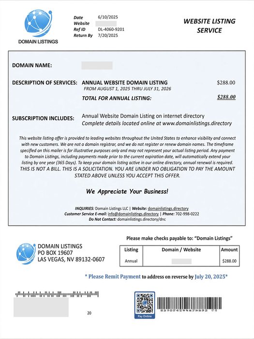
Domain registration solicitation

This one arrives in the mail and looks very official. It lists your real domain name, an expiration date, a deadline, a payment slip, and often a QR code. It warns that you could lose your online identity if you do not act now. Recent versions ask for around $265 for a five-year “renewal.”

Here is the catch: it usually is not from your registrar at all. It is a solicitation to transfer your domain to the sender, often at several times the going rate. The fine print tends to say something like “this is not a bill.” This tactic is called domain slamming, and the FTC went after one of its best-known practitioners years ago. The copycats never left.

How to check: Log in to the registrar where you actually bought your domain (GoDaddy, Namecheap, Squarespace, etc.) and look at the expiration date there. If the sender is not that company, you owe them nothing. Not sure where your domain is registered, or who handles your DNS records? Ask your web developer before you pay anyone.

Bonus move: Turn on registrar lock (transfer lock) and auto-renew for your domain.

The Friendly SEO Email

You know the one:

  • “I took a look at your website and found several issues hurting your ranking.”
  • “We can get you on page one of Google in 30 days. Guaranteed.”
  • “Your competitors are outranking you.”

The tells: The email never mentions anything specific about your site, your town, or your keywords. The list of “problems” is vague jargon (missing meta tags, poor image optimization) that could be pasted into any email to any business. And nobody, anywhere, can guarantee a ranking. Google says so itself.

If you get one, ask two questions: Which keywords, in which city, against which competitors? And can I see a client you have worked for? Real SEO professionals can answer. Mass-mailers go quiet.

Want to know how your site is really doing? You can see it for yourself, for free, in Google Search Console and Google Analytics. No cold email required.

(Quick sanity check: if you search your own business name and you are already on page one, congratulations, that is not a service you need to buy.)

The “Google Listing” Phone Call

Google business listing telemarketing call

The caller says they are with Google, or “Google Business Services,” and that your listing is about to be removed, needs verification, or can be bumped to the top of the map results. A robot voice may tell you to press 1 to continue.

What’s more, the call may even come from your local area code.

Google’s own guidance is clear: they will never ask for payment to keep, verify, or reinstate your Business Profile, and they will never guarantee you a special spot in search or Maps. They also will not ask for a PIN or one-time code.

What to do: Hang up. Do not press any buttons, even if the voice tells you to. If someone insists they work at Google, ask them to email you from an @google.com address. (They will not.)

The Fake Invoice and the “Free” Directory Listing

The FTC warned small businesses about this in May 2026: fake invoices for things you never ordered, like domain registration, SEO, or tech support. Some arrive as “past due.” Some look like they are from big names. Whoever handles your bills is the target, hoping they will just pay it.

A close cousin is the directory listing scam. A call or letter says you are being listed (for free, or as a “renewal”) in a business directory. A bill shows up later, along with a claim that you agreed to it. If you never agreed, do not pay.

Rule of thumb: Do not pay any invoice for a service you cannot connect to a person who actually sold it to you. Search the company name plus “scam,” “review,” or “complaint” first.

Someone Pretending to Be Your Web Designer or Host

Scammers can read a web designer’s portfolio page, collect the contact email from each client’s site, and send messages that look like they came from the designer. They say your site “is not compliant,” your plugins or hosting are “due for renewal,” or your account will be suspended in 48 hours. The goal is payment, or your WordPress or hosting login.

What to do: Do not click the link or call the number in the message. Contact your designer or host using a phone number or email address you already have. And never enter your credentials on a page you reached from an email.

Spoofed email is a big part of this one. It is worth reading up on securing your domain email with SPF, DKIM, and DMARC, and on protecting your WordPress site from hackers. Regular website maintenance also means you will know what is actually due and when.

The Quick Red Flag Checklist

  • Urgency. “Act now,” “final notice,” “48 hours.”
  • Guarantees. Rankings, results, or “priority” with Google.
  • Payment pressure. Gift cards, wire transfers, QR codes, or “pay to avoid suspension.”
  • Vague specifics. No mention of your actual site problems, or generic “errors.”
  • Wrong sender. Not the company you actually do business with.
  • Fine print that contradicts the headline. “This is not a bill.”

What to Do When One Shows Up

  1. Pause. Scammers rely on you reacting before thinking.
  2. Verify independently. Log in to your registrar, host, or Google account directly. Do not use links or phone numbers from the message.
  3. Do not engage. Replying, pressing buttons, and scanning QR codes confirm that your contact info is live.
  4. Tell whoever pays the bills. A one-line policy helps: we never pay anything domain-, SEO-, or Google-related unless it goes through our known vendors.
  5. Report it.
  6. FTC: ReportFraud.ftc.gov (phone scams and fake invoices)
  7. Phishing emails: [email protected]
  8. Scam texts: forward to 7726 (SPAM)
  9. Fake Google calls: report through Google Business Profile Help
  10. Do Not Call Registry: donotcall.gov (it will not stop scammers, but it is worth having)

Not Sure About Something?

When in doubt, do not pay, click, or call back. Send it to your web developer, your IT person, or a trusted friend who knows their way around the internet and ask for a second opinion first. A quick look usually settles it, and it is a lot cheaper than a five-year “renewal” from a company you have never heard of.
Keyboard Accessibility: Navigating Beyond the Mouse

Imagine navigating a website without a mouse or touch screen. For individuals with disabilities or those who rely solely on keyboard input, this is their reality. Keyboard accessibility plays a vital role in ensuring equal access to web content and creating a seamless user experience for all.

Keyboard accessibility refers to designing and developing websites in a way that allows users to navigate, interact, and access content using only their keyboard. This accessibility feature is particularly important for individuals with motor impairments, visual impairments, or those who prefer keyboard-based interactions.

What is Keyboard Accessibility?

Keyboard accessibility is the design and implementation of web content that allows users to navigate, interact, and access all functionalities using only their keyboard. It ensures that individuals with disabilities, motor impairments, or those who rely on keyboard-based interactions can fully engage with and enjoy the digital experience.

Keyboard navigation is particularly crucial for individuals who are unable to use a mouse or other pointing devices, as well as those who prefer using keyboard-only interactions for efficiency or personal preference. Providing robust keyboard support makes websites become more inclusive, enabling a diverse range of users to access and interact with the content.

Various guidelines and standards have been established to ensure keyboard accessibility in web design. One prominent standard is the Web Content Accessibility Guidelines (WCAG) 2.1, which sets forth criteria and techniques to ensure accessibility for individuals with disabilities. WCAG 2.1 places specific emphasis on keyboard accessibility as a fundamental aspect of inclusive design. Adhering to these guidelines helps web designers meet legal requirements and create websites that are accessible to all users, regardless of their input method.

Keyboard Navigation Techniques

Keyboard navigation forms the foundation of a user’s ability to interact with web content using only their keyboard. Understanding the basic keyboard navigation techniques is essential for creating an accessible and user-friendly experience. The primary keys involved in keyboard navigation include the tab key, enter key, and arrow keys. The tab key allows users to navigate between interactive elements, such as links, buttons, and form fields. The enter key is used to activate or submit a selected element. The arrow keys enable users to navigate within menus, dropdowns, and other navigational elements.

In addition to proper key functionality, providing clear visual indications of focused elements is crucial for users who rely on keyboard navigation. Highlighting or outlining the focused element helps users understand their current location and aids in orientation within the web page. This visual focus indicator should be distinct enough to be easily identifiable, ensuring that users can navigate through the website confidently.

Proper keyboard navigation order is essential to maintain a logical and intuitive flow for keyboard users. Elements should be structured in a sequence that makes sense and follows the natural reading order of the content. Using skip links allows users to jump directly to specific sections or areas of the page, bypassing repetitive navigation links. Skip links are particularly useful for users who navigate using screen readers, as they provide shortcuts to essential sections of the page.

Access keys are keyboard shortcuts that provide quick access to specific elements on a webpage. While access keys can enhance keyboard accessibility, their implementation requires careful consideration. It is crucial to avoid conflicts with browser or assistive technology shortcuts, as they can interfere with the user’s ability to navigate effectively. Providing clear instructions and documentation on how to use access keys is also important for users to utilize this functionality efficiently.

Designing for Keyboard Accessibility

Inclusive design is at the core of creating an accessible and user-friendly web experience for all individuals. When it comes to keyboard accessibility, inclusive design principles emphasize the need to consider diverse user needs from the beginning of the design process. Focusing on keyboard accessibility ensures that everyone, regardless of their input method, can navigate and interact with the website effectively.

Visible focus state
Visible focus state

Providing visible focus states is crucial for keyboard users. When an element receives keyboard focus, it should be visually distinguishable from surrounding elements. Clear and prominent focus indicators, such as highlighting or outlining, help users understand which element they are currently interacting with. Proper focus management is equally important, ensuring that focus is transferred in a logical and predictable manner as users navigate through the site.

Semantic HTML and ARIA (Accessible Rich Internet Applications) attributes play a significant role in enhancing keyboard accessibility. Semantic HTML tags, such as <nav>, <main>, and <button>, provide built-in keyboard accessibility features and convey meaning to assistive technologies. ARIA attributes allow for additional customization and refinement of the accessibility properties of elements. Using ARIA attributes, such as aria-label and aria-expanded, provides additional context and information to assistive technologies, making the website more accessible to keyboard users.

Responsive design, which ensures that websites adapt and respond to different screen sizes and devices, also impacts keyboard accessibility. With the increasing use of mobile devices and touchscreens, it’s crucial to consider the needs of users who rely on keyboard navigation. Responsive design should prioritize touch-friendly targets and maintain a consistent and intuitive navigation structure across different screen sizes. Considering the limitations and requirements of keyboard users creates a seamless and accessible experience regardless of the device being used.

Common Challenges and Best Practices

Designing for keyboard accessibility can present challenges, particularly when dealing with complex interactions and custom user interface (UI) components. These elements often require special attention to ensure that keyboard users can navigate and interact with them effectively.

One common challenge is handling complex interactions that rely heavily on mouse-based actions, such as drag-and-drop or hover effects. In these cases, it is crucial to provide alternative keyboard-based methods for performing the same actions. For example, allowing users to move through items and activate them using the keyboard’s arrow keys and enter or spacebar.

Custom UI components, such as sliders, carousels, and dropdown menus, can also pose challenges for keyboard accessibility. It is important to ensure that these components are fully operable using the keyboard alone. This involves providing proper keyboard focus management, allowing users to navigate and interact with individual elements within the components, and providing clear instructions or cues for keyboard interactions.

Accessibility and Usability

To overcome these challenges and ensure keyboard accessibility, several best practices can be followed:

  • Proper Focus Management: Ensure that interactive elements receive keyboard focus and provide clear visual indications of focus states. This helps keyboard users understand their current location within the page and enhances their overall navigation experience.
  • Handling Dynamic Content: When content is dynamically loaded or updated without page refresh, ensure that keyboard focus is appropriately managed and users are notified of the changes. This allows keyboard users to stay aware of content updates and navigate through them seamlessly.
  • Clear and Consistent Keyboard Navigation: Maintain a logical and consistent keyboard navigation order throughout the website. Ensure that keyboard users can navigate through interactive elements, such as links and form controls, in a predictable and intuitive manner.
  • Design for Keyboard Accessibility from the Start: Incorporate keyboard accessibility considerations into the initial design phase of a website or application. Planning and implementing keyboard accessibility early on makes it easier to address potential challenges and ensure a smoother user experience.

Keyboard accessibility is an ongoing effort that requires regular maintenance and audits. As websites evolve and new features are added, it is essential to conduct regular accessibility checks to ensure continued compliance with keyboard accessibility standards. Regular audits help identify any new accessibility issues that may arise and provide an opportunity to make necessary improvements.

Furthermore, staying up to date with evolving web standards and accessibility guidelines is crucial. Web Content Accessibility Guidelines (WCAG) and other relevant accessibility standards continue to evolve, and it is important to incorporate any updates or changes into the design and development process.

Revolutionizing User Interaction with Effective Web Forms

Web forms are the unsung heroes of user interaction. They are the gateways through which users connect, provide information, and engage with your website. From simple contact forms to complex registration processes, web forms play a crucial role in shaping the user experience. In this article, we will explore the art of crafting better web forms that not only captivate users but also drive conversions and enhance user satisfaction.

Well-designed forms streamline the user experience, reducing friction and increasing user engagement. They capture accurate and valuable user data, enabling businesses to gain insights, personalize experiences, and nurture customer relationships. With a user-centric mindset and an unwavering commitment to excellence, you have the power to revolutionize user interaction and unlock the true potential of your web forms.

Consider User Needs and Goals

The foundation of creating effective web forms lies in understanding your users’ needs and pain points. User research is the compass that guides us in designing forms that align with their expectations and aspirations. Through surveys, interviews, and usability testing, we gain invaluable insights into user preferences, challenges, and motivations.

Every web form has a purpose, whether it’s to collect contact information, process orders, or gather user feedback. Defining clear goals for your web form allows you to align its design and functionality with the desired outcomes. Identify the key objectives, prioritize the essential information you need to collect, and streamline the form accordingly. By setting clear goals, you avoid overwhelming users with unnecessary fields, resulting in a more focused and efficient form completion process.

The layout of your web form plays a significant role in its usability and user experience. Aim for simplicity, clarity, and intuitiveness when designing form layouts. Group related fields together, use visual cues such as spacing and borders to separate sections, and guide users through a logical flow. Consider the visual hierarchy of the form elements, highlighting important fields or steps to draw attention.

Simplifying Form Fields and Labels

The key to creating a frictionless user experience lies in simplifying form fields and labels. Focus on minimizing clutter, providing clear instructions, and leveraging modern techniques to empower users to breeze through form completion with ease.

When it comes to form fields, the principle of minimalism holds true. Ask yourself, “What information is truly essential?” Aim to include only the necessary fields that align with your form’s goals. By reducing the number of fields, you not only save users’ time but also eliminate potential distractions. Streamlining form fields helps maintain focus and encourages higher completion rates.

Clarity is important when labeling form fields. Use concise and descriptive labels that leave no room for ambiguity. Clearly state what information is expected and provide any necessary formatting guidelines. Additionally, offer contextual instructions to guide users through complex or unfamiliar fields. This will help alleviate confusion and reduce user errors, resulting in a smoother form completion process.

Placeholder text can be incredibly helpful in form design. By utilizing placeholders, you can provide additional hints or examples inside form fields, offering users guidance on the expected format or content. However, exercise caution to ensure that placeholders do not create confusion or disappear when users interact with the field. Additionally, implement inline validation to provide real-time feedback as users fill out the form. Instantly validating user input helps prevent errors and instills confidence in users, reducing frustration and increasing form completion rates.

Designing for Mobile and Responsive Experiences

Mobile-first responsive design

With the rapid growth of mobile usage, it’s crucial to optimize form design for mobile devices, ensuring seamless interactions and delightful user experiences. In this section, we will explore techniques to create mobile-friendly forms that adapt flawlessly to different screen sizes, while incorporating touch-friendly inputs and controls.

Simplicity and efficiency are the cornerstones of mobile form design. Begin by prioritizing essential information and minimizing form fields to streamline the mobile form experience. Consider the limited screen real estate and make judicious choices in the layout and placement of form elements. Large, touch-friendly buttons and input fields make it easier for users to interact with the form on smaller screens.

Responsive design is the key to ensuring that your forms look great and function seamlessly across a wide range of devices and screen sizes. Embrace the flexibility of responsive CSS frameworks, such as Bootstrap or Foundation, to create adaptive forms. Using fluid grids and media queries, you can dynamically adjust the form layout, font sizes, and spacing to provide an optimal viewing and interaction experience. Responsive forms not only eliminate the need for separate mobile versions but also save time and resources by maintaining a single codebase.

With the rise of touch-based devices, designing forms with touch-friendly inputs and controls is essential. Opt for larger buttons and checkboxes, making it easier for users to select options accurately. Increase the spacing between interactive elements to prevent accidental taps and improve touch precision. Implement intuitive gestures, such as swipe or pinch-to-zoom, when appropriate to enhance user interactions.

Streamlining Form Submission

The final steps of the form submission process can make or break the user experience. To ensure a seamless experience, we need to streamline the process and minimize any hurdles along the way. To ensure completions, we will explore techniques to reduce steps and clicks, employ progressive disclosure for complex forms, and leverage the power of autofill and autocomplete features.

Time is precious, and users appreciate efficiency. Minimizing the number of steps and clicks required to complete a form can significantly enhance the user experience. Analyze your form flow and question the necessity of each step. Consolidate related information into a single screen wherever possible. Use smart defaults and pre-fill fields with known information to expedite the process.

Complex forms can overwhelm users with a barrage of fields and options. To alleviate this burden, embrace the concept of progressive disclosure. By revealing information and additional fields gradually, based on user input or specific actions, you can simplify the form and enhance usability. Group related fields under collapsible sections or use conditional logic to show only relevant fields. Progressive disclosure allows users to focus on one task at a time, reducing cognitive load and increasing form completion rates.

Autofill and autocomplete features are a time-saving gift from heaven. By leveraging browser capabilities, you can expedite form completion and enhance user satisfaction. Enable autofill for common form fields such as name, email, and address. Utilize autocomplete to suggest values based on user input, reducing the need for manual typing. Remember to include proper form field attributes and labels to ensure compatibility across different browsers.

Form Accessibility and Error Handling

Accessibility and error handling are critical components of forms that should never be overlooked. To create an inclusive and user-friendly experience, we need to design forms that cater to users with disabilities, provide clear error messages and validation feedback, and conduct rigorous testing to ensure accessibility and usability for all.

Web accessibility is a fundamental principle that ensures all users, including those with disabilities, can access and interact with your forms. Consider various accessibility guidelines, such as the Web Content Accessibility Guidelines (WCAG), and implement best practices like proper labeling, keyboard navigation support, and alternative text for form elements.

Errors are inevitable, but how we handle them can make all the difference. When a user encounters an error, it’s crucial to provide clear and concise error messages that explain the issue and offer actionable guidance. Avoid generic error messages and instead provide specific information on how to correct the error. Additionally, highlight the problematic fields and provide inline validation feedback to assist users in real-time.

Before launching your forms into the digital sphere, thorough testing is vital to ensure accessibility and usability. Conduct comprehensive accessibility testing to identify any potential barriers or issues for users with disabilities. Test your forms on various devices, browsers, and screen sizes to ensure a consistent experience for all users. Additionally, conduct usability testing to gather valuable feedback on the overall user experience and uncover any usability hurdles.

Form Security and Privacy

Protecting your site from hackers

With the prevalence of data breaches and privacy concerns, ensuring form security and privacy is of utmost importance. Users entrust us with their personal information, and it is our responsibility to protect it diligently. By implementing robust security measures and respecting user privacy, we can establish trust and foster long-lasting relationships with our audience.

User data is precious, and safeguarding it should be our top priority. Implement security measures such as SSL/TLS encryption to ensure that data transmitted through forms remains confidential and protected from interception. Store user data securely, utilizing encryption and access controls to thwart unauthorized access. Regularly update and patch your form handling scripts and databases to address any security vulnerabilities. These measures will help you instill confidence in users that their data is safe in your hands.

Spam can disrupt the integrity of your forms and compromise user experience. To combat this, incorporate a CAPTCHA or other proven anti-spam techniques. A CAPTCHA challenges users to complete a task to verify their humanness, effectively distinguishing between legitimate users and automated bots. Additionally, employ measures like honeypot fields, time-based form submissions, or IP blocking to further discourage spamming attempts. These anti-spam techniques ensure that genuine users can interact with your forms unhindered while maintaining the sanctity of your data.

Familiarize yourself with privacy laws such as the General Data Protection Regulation (GDPR) and the California Consumer Privacy Act (CCPA) to ensure compliance. Provide transparent privacy policies that detail how user data will be handled and offer users control over their information through explicit consent mechanisms and opt-out options. By prioritizing privacy compliance, you foster trust and demonstrate your commitment to protecting user rights.

Begin to Take Form

Creating better web forms is not just about aesthetics; it’s about enhancing user experience, boosting engagement, and safeguarding user data. Study these best practices and adapt them to suit your unique needs, goals, and target audience. Experiment, iterate, and gather user feedback to continuously improve your forms. Remember, the true power lies in designing with purpose and empathy for your users.

Web forms play a pivotal role in user interaction, providing opportunities for engagement, data collection, and conversions. With a focus on prioritizing user needs, simplifying processes, and enhancing security and privacy, you can foster lasting connections with your audience. When users feel valued, respected, and understood, they are more likely to engage with your forms, provide accurate information, and complete desired actions.

Keep in mind that this is a continuous process of improvement. Stay informed about emerging trends, user expectations, and evolving technologies. Adapt and evolve your forms to meet the ever-changing needs of your users. By doing so, you’ll create web forms that not only rank high in search engine results but also leave a lasting impression on your audience.