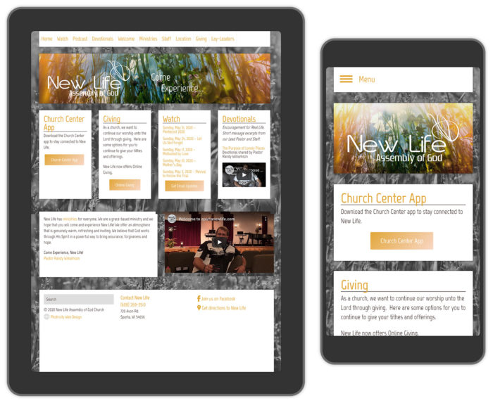
Responsive web design (RWD) is a progressive strategy for designing websites that scale seamlessly across the spectrum of digital devices. Elements on the page have a fluid size and can grow or shrink based on the size of the screen or browser window. Blocks of content are adaptive, and can be reconfigured in stacks or columns to make the best use of available space. Menus and other items can be collapsed into dropdowns, and CSS media queries allow for different style rules with different screen sizes.
Instead of having separate URLs for desktop and mobile sites, with responsive or adaptive design only one address is used. This has advantages for search engine ranking, as well as user experience. It’s frustrating to try and view a mobile webpage from a desktop browser because someone shared a link from their smartphone.
Photricity Web Design uses responsive web design practices on all website projects. Help your website reach maximum voltage with RWD and other best practices for the web.