The Art of Writing Clean and Efficient HTML Code

Writing clean and efficient HTML code is important for the overall quality and functionality of a website. It ensures that the code is easy to read and understand, which makes it easier to maintain and update. Clean HTML code also helps with website optimization for search engines, as it ensures that the code is correctly structured and free from errors.

HTML is a markup language that is used to create web pages. It is a relatively simple language to learn, but it is important to write clean and well-organized code in order to make your web pages more readable and maintainable. To write optimized HTML code, it is helpful to follow a few guidelines. Here we will talk about some best practices and tips to help you turn your spaghetti code into art.

Formatting

It can be hard to understand how HTML hierarchy works, but once you have added a child to an element, it becomes apparent.

Properly formatting your HTML code can make it much easier to read and edit, especially when working with larger files. A best practice is to use indentation to clearly show the hierarchy of elements. For example, when a child element is nested inside a parent element, it should be indented to clearly show the relationship between the two. Some developers use tabs for indentation, others might use two or four spaces. Neither way is wrong, just remember to be consistent.

Another formatting consideration is the use of line breaks and white space to separate different sections of code. Adding line breaks can make the code easier to read, especially when working with long blocks of code. However, be careful not to add too much white space, as this can make the file larger and slower to load.

Semantics

Using semantic tags in HTML is incredibly helpful for creating clean and organized code. These tags have descriptive names that convey the meaning of their content to search engines, web crawlers, and screen readers. Instead of using generic tags like <div> or <span>, semantic tags such as <header>, <nav>, <main>, <article>, <section>, and <footer> allow for more efficient and meaningful markup.

Not only does this improve the accessibility and usability of your website, but it can also positively impact your SEO efforts. By using semantic tags, search engines can better understand the structure of your content and display it more prominently in search results.

Less Is More

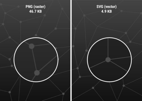
Another important aspect of writing efficient HTML is to avoid unnecessary code. Remove any code that is not essential to the structure, content, or functionality of the page. Unnecessary code can slow down the page’s loading time, make it harder to maintain, and create confusion for other developers who may work on the project. Remove any unused CSS or JavaScript files and avoid using inline styles and scripts to keep your HTML document clean and brief.

Note To Self

HTML comments are a great way to leave notes and reminders for yourself or other developers who may be working on the code. Comments are ignored by the browser, so they won’t appear on the website, but they can be helpful in keeping your code organized and easy to understand.

To add a comment in HTML, simply enclose the text or code you want to comment out between <!-- and --> tags. It’s also a good practice to use comments to describe the purpose of each section of your HTML code, making it easier for others to understand and modify the code in the future. However, be careful not to overuse comments, as too many can clutter your code and make it difficult to read.

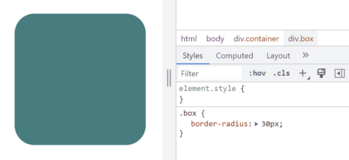
Leave the Styling to CSS

Using CSS for styling instead of HTML can make your code much cleaner and easier to read. HTML is intended for content and structure, while CSS shines at presentation and styling. By separating these concerns, you can create more maintainable code that is easier to update and modify.

To maximize the benefit of CSS, you can define a separate stylesheet that contains all of your CSS rules. This allows you to apply consistent styles to all elements on your website, and also makes it easier to make global changes to your design. By keeping your styles in a separate file, you can also avoid cluttering up your HTML code with inline styles or repeated style definitions.

Another benefit of using CSS for styling is that it allows you to create more complex and dynamic designs. CSS includes a number of advanced features, such as animations, transitions, and grid layouts that can be used to create engaging and interactive user experiences. By using CSS instead of HTML for styling, you can take advantage of these features and create more engaging and visually appealing websites.

Validate

If you’re trying to step up your HTML game, it’s a good idea to make sure that your code is valid and standards-compliant. This is made easy using helpful tools like the W3C Markup Validation Service. Validating helps to identify any errors or warnings in the code, and ensures that the website is compatible with different browsers and devices. Be sure to identify and fix any errors in your code before they cause problems.

In addition to these essential best practices, here are a few more things to keep in mind when writing HTML:

  • Use a DOCTYPE declaration. This will tell browsers how to render your page.
  • Avoid using deprecated tags and attributes that are no longer supported by modern browsers. This includes tags like <center> and attributes like align=”center”.
  • Use descriptive and consistent naming conventions for your classes and attributes. Using logical names can help you remember what they do and where they are used. This will make your code more self-documenting, and can make it easier to understand the structure of the page and to make changes later on.
  • Break up your code into logical blocks. This will make your code more manageable and easier to maintain.
  • Minimize the use of tables for layout purposes. Instead use CSS grid, flexbox, or other more modern layout methods.
  • Avoid using inline styles. This will make your code much cleaner, and make it far easier to make design changes across your site.

Writing good HTML is indeed an artform. By following these guidelines, web developers can create clean, efficient, and beautiful HTML code that results in improved website performance and user experience. Your future self will thank you for taking the time to craft well-organized HTML code that is easy to read and maintain.

Website Maintenance: Keeping Your WordPress Site Healthy

WordPress is by far the most popular content management systems (CMS) in the world, with millions of websites using it to power their online presence. However, building a WordPress website is only the beginning of your journey. Maintaining your website is just as important as building it, as it helps ensure that your website stays secure, up-to-date, and optimized for the best possible user experience. In this article, we’ll explore the essential ongoing maintenance tasks you need to perform on your WordPress website to keep it running smoothly.

Keep WordPress Updated

WordPress regularly releases updates to fix security issues, bugs, and improve functionality. Keeping your WordPress site updated is an essential part of website maintenance, as it helps to ensure that your site remains secure, stable, and performs optimally.

You can update your WordPress site manually or automatically. To update WordPress manually, you need to log in to your WordPress dashboard and navigate to the updates section. Alternatively, you can download the WordPress core files from wordpress.org and upload them to your server manually.

To enable automatic updates, head to the updates page in the WordPress dashboard and choose to enable automatic updates for maintenance and security releases only, or for all new versions of WordPress. This will ensure that your site is always up to date without having to do it manually.

Update Plugins and Themes

Like the WordPress core, updating plugins and themes is also critical for maintaining the security and functionality of a WordPress website. Outdated plugins and themes can potentially introduce security vulnerabilities or compatibility issues with new versions of WordPress.

It is important to regularly check for updates and install them as soon as they become available. Most plugins and WordPress themes will display a notification in the WordPress dashboard when updates are available, and users can also check for updates manually.

Before updating plugins and themes, it is recommended to create a backup of the website to avoid potential data loss or other issues. In addition, it’s important to read the update release notes and check for any compatibility issues or known bugs that may affect the website.

If a plugin or theme is no longer being maintained or updated by the developer, it’s recommended to find an alternative solution or consider removing it from the website to avoid potential security risks.

Backup Your Website

Backing up a WordPress website is an important part of ongoing maintenance. Regular backups can help you restore your website to a previous state if anything goes wrong, such as a hacking attack or accidental deletion of important files.

There are several backup options available for WordPress, including manual backups and automated backup plugins. Manual backups involve downloading a copy of your website files and database to your local computer or cloud storage. This method is more time-consuming and may require technical knowledge, but it gives you complete control over the backup process.

Automated backup plugins, on the other hand, offer a more convenient option for backing up your website. There are several popular backup plugins available for WordPress, including UpdraftPlus, Jetpack Backup, and BackupBuddy. These plugins can schedule regular backups of your website files and database, and store the backups in a secure offsite location such as Dropbox, Google Drive, or Amazon S3.

No matter which backup option you choose, it’s important to test your backups periodically to make sure they are working properly. This can involve restoring your website from a backup and checking that everything is functioning as expected. By taking the time to back up your website regularly, you can ensure that your data is safe and secure, and that your website can be quickly restored in the event of an emergency.

Monitor Website Performance

Website speed is critical to test on a regular basis. Over time, your WordPress website may become slow and sluggish. This can be caused by a number of factors, such as outdated plugins, inefficient code, and too many images. Slow page load times and other performance issues can lead to a poor user experience and lower search engine rankings. There is a plethora of things that affect page speed, so it’s important to optimize your website on a regular basis to keep it running smoothly.

You can use free tools like Google PageSpeed Insights or GTmetrix to analyze your website’s speed and identify any areas for improvement. These utilities can help identify any bottlenecks in website performance, such as slow-loading images or inefficient code. They can also provide reports on page load times, file sizes, and other metrics that can help you optimize your website for better performance. If your website is slow, you can optimize images, use a caching plugin, or upgrade your hosting plan.

Secure Your Website

Securing your WordPress website is essential to protect it from hackers, malware, and other security threats. You can use plugins like Wordfence or Sucuri to monitor your website for suspicious activity, implement two-factor authentication, and add a firewall to your website.

WordPress websites are a common target for malware attacks. Malware is a type of malicious software that can infect your website and steal your visitors’ data. It is important to scan your website for malware regularly using a reputable security plugin. There are a number of free and paid malware scanning tools available.

Keep it Clean

Keeping your WordPress installation clean is an important part of ongoing maintenance. Over time, websites can accumulate and become cluttered with unnecessary data such as spam comments, post revisions, and unused media files, which can slow down the site’s performance and make it harder to manage. It is recommended to regularly clean up your website’s database, remove any unused plugins and themes, and delete any unnecessary files or data. There are even plugins available to help with cleaning up and optimizing your database and removing unnecessary files.

Additionally, optimizing images, using caching plugins, and minimizing the use of external scripts can help improve the speed and performance of your WordPress website. It’s also important to regularly test your website’s functionality and user experience to ensure that everything is working as intended.

Test and Fix

Checking your site for broken pages and incompatibilities with plugins is an important part of regular maintenance for any website. Broken links and display bugs can lead to a poor user experience, and incompatibilities with plugins can cause errors or even crashes on your site.

Every time your site receives a WordPress update or a plugin update, you should give your site a good once-over to make sure everything is still kosher, as often these updates can introduce new issues. If you notice any errors or problems after updating a plugin, you may need to troubleshoot or even uninstall the plugin to prevent further issues. It’s also important to only use well-reviewed and reliable plugins to minimize the risk of incompatibilities or other issues.

To check your site for broken links, you can use a plugin like Broken Link Checker or WP Broken Link Status Checker. These plugins will scan your site and alert you to any broken links so that you can quickly fix them.

In addition to these important maintenance tasks, here are a few other things to keep in mind:

  • Monitor your website traffic. It is important to monitor your website traffic so that you can see how people are interacting with your website. This information can be used to improve your website’s design, content, and functionality.
  • Keep your content fresh. One of the best ways to keep visitors coming back to your website is to keep your content fresh. This means regularly adding new blog posts, products, or services to your website. Don’t be afraid to shuffle things around, reword some of your copy, and add new images to keep it interesting.
  • Monitor your SEO performance. You can use tools like Google Search Console to track how well your site is ranking, which pages are performing well, and to see which are your most successful keywords. It can also help identify many other SEO and UX issues.
  • Moderate your comments. If your site has comments enabled, you will need to take time to approve the good comments, delete the toxic comments, and report the spam comments.

Maintaining a WordPress website is an ongoing process that requires time and effort. Think of a website as a living and breathing organism that requires constant TLC to keep it healthy. By following these essential maintenance tasks, you can ensure that your website stays secure, optimized, and up-to-date. Remember to back up, clean up, and test your website regularly to ensure the best possible user experience for your visitors.

SVG: The Power of Scalable Vector Graphics in Web Design

Scalable Vector Graphics (SVG) is an open vector image format used in web design. It is a widely popular format that is supported by all modern web browsers. SVG graphics are vector images, which means they are made up of paths and shapes. This makes them scalable and resolution-independent, which means they can be scaled up or down without losing any quality or clarity. This is why SVG graphics are an ideal choice for responsive web design.

SVG images are created using XML code. This means that they are easy to edit and manipulate. SVG graphics can be edited using a text editor or a dedicated vector graphics editor like Adobe Illustrator or Inkscape.

Using SVG graphics offers a great benefit in improving website performance. Compared to traditional image formats like JPEG or PNG, SVG files tend to be much smaller in size. This is because SVG graphics are vector-based and can be scaled without losing quality, unlike raster images which can become pixelated when enlarged. SVG graphics can also be compressed without becoming distorted, further reducing their file size. This makes them ideal for websites and web applications where page load speed is crucial. Additionally, because SVG graphics are code-based, they can be cached and reused, reducing server requests and improving overall performance.

CSS can be used to style SVG graphics just like any other HTML element. You can apply styles to the SVG element itself or to its child elements, such as paths, circles, and rectangles. You can use CSS properties like fill, stroke, stroke-width, opacity, and transform to change the appearance of your SVG graphics.

SVG graphics are not only versatile and scalable but can also be animated and interactive, making them an excellent choice for creating engaging and dynamic web designs. With SVG, it’s possible to add animations such as fades, transitions, and rotations, allowing designers to create visually appealing and interactive elements on their web pages. SVG animations can be achieved using CSS or JavaScript, making it easy to incorporate them into any web project. Additionally, web designers can create interactive elements such as clickable buttons, hover states, and more, making their designs even more engaging and user-friendly.

SVG isn’t the only image format you will ever need. For highly detailed images such as photos, you’re better off sticking with a raster format. But here are some areas where SVG’s shine:

  • Icons: SVG graphics are often used to create icons and other small, simple graphics that are used to represent different functions or actions.
  • Logos: SVG’s are great for creating logos and other branding and marketing materials.
  • Illustrations: The SVG format is perfect for colorful illustrations and lineart.
  • Charts and graphs: SVG graphics can be used to create charts, graphs, maps, and infographics, which are a great way to present data in a visually appealing and easy-to-understand way.
  • Decorative elements: Use SVG to add style to your site with decorative designs and shapes.
  • Patterns and backgrounds: Designers can create unique and interesting patterns and backgrounds that add visual interest and depth to a website.
  • Animations: SVG graphics can be used to create animations, and to add interest and interactivity to a website.

When it comes to using SVG graphics in web design, there are a few things to keep in mind. It’s important to optimize the SVG file for web use. This involves removing unnecessary code and compressing the file size. And since SVG’s are code-based rather than pixel-based, you should test your SVG files in all major web browsers to make sure they display correctly.

Another important consideration when using SVG graphics in web design is accessibility. It is important to ensure that the SVG graphics are accessible to all users, including those using assistive technologies like screen readers. This involves providing alternative text descriptions and ensuring that the SVG graphics are properly labeled.

If you are looking for a powerful and versatile tool for creating graphics for the web, then SVG is a great option. It offers many benefits, including smaller file sizes, scalability, and the ability to be animated. However, it is important to properly optimize and embed SVG graphics, as well as ensure their accessibility, to ensure the best user experience for all users.

Avoiding Annoyances in Web Design

As web designers, it’s important to focus not only on creating visually appealing and functional websites, but also to ensure a good user experience. This means avoiding any design elements that could be considered annoying or frustrating. There are many common annoyances that can be avoided with some simple design choices.

Auto-Playing Media

One of the most common annoyances in web design is auto-playing media. This can include video, audio, or even ads that start playing automatically when a user lands on a website. It can be especially frustrating if the user is already listening to music or has multiple tabs open.

Not only is auto-playing media annoying, but it can also negatively impact website performance. Videos and audio files are often large, which can slow down page load times and increase data usage for users with limited internet connections.

To avoid auto-playing media, it’s important to give users control over what they want to see and hear. Provide clear and visible controls, such as a play button, and avoid using auto-play as the default setting. You can also consider using muted autoplay, where the media starts playing but without sound, and giving users the option to unmute if they want to hear it.

Pop-ups

Another annoyance is overly aggressive pop-ups or interstitials that interrupt the user’s experience. These can include sign-up forms, ads, or requests to download an app. While these can be useful in certain contexts, it’s important to make sure they don’t interfere with the user’s ability to access the content they came for.

Pop-ups are windows that appear on top of a web page, often to display an advertisement or to request user input. While pop-ups can be useful in some cases, they are often seen as intrusive and annoying by web users.

To avoid annoying pop-ups, consider using alternative methods to display information or gather input from users. For example, instead of using a pop-up to display an advertisement, try placing the advertisement in a less obtrusive location on the page.

If you do need to use a pop-up, make sure that it is relevant and useful to the user. Avoid using pop-ups for advertisements that are not related to the content of the page or for requests that are not necessary for the user to continue using the site. It is also important to make it easy for users to close pop-ups if they choose to do so. Provide a clear and visible close button, and ensure that the button is functional and easy to use.

Clutter

Cluttered designs with too much content can also be overwhelming and frustrating for users. It’s important to prioritize what content is most important and make sure it’s easy to find and read.

One way to achieve a clean layout is to use negative space or white space. This means leaving some areas of the design empty or with minimal elements. This can help to highlight important information and give the website a more spacious and clean feel.

Another way to avoid cluttered layouts is to limit the number of elements on each page. This can be done by focusing on the most important information and minimizing unnecessary elements. It’s also important to use consistent typography, color, and imagery to create a cohesive design and avoid a busy aesthetic.

Using a grid system can also help to create a balanced and organized layout. A grid can help to ensure that elements are aligned properly and evenly spaced, creating a more visually pleasing design.

Speed

In today’s fast-paced world, users expect websites to load quickly. A slow website can be a major annoyance and turn off visitors, leading to a negative user experience. Slow loading times can be caused by a number of factors, including large image or video files, inefficient code, or a slow server.

To avoid this annoyance, it’s important to optimize your website’s performance. You can start by compressing large image files and minimizing the use of high-resolution images or videos. You should also minimize the use of unnecessary code and scripts, which can slow down your website.

Another effective way to improve website speed is to use a content delivery network (CDN). A CDN distributes your website’s files across a network of servers, which can improve loading times for users in different geographic locations.

Lastly, make sure your website is hosted on a fast and reliable server. Choosing a reputable web hosting provider with good server performance can make a big difference in website speed and overall user experience.

Obnoxious Ads

Advertising is an essential part of many websites’ revenue streams, but it can also be a significant source of annoyance for users. Ads that are loud, flashy, or intrusive can be particularly frustrating for users and disrupt their browsing experience. Pop-up ads, auto-playing videos or audio, and ads that take up a significant portion of the screen can be especially obnoxious.

One way to mitigate the annoyance factor of ads is to ensure they are relevant and useful to the user. This can be achieved by using targeted advertising based on the user’s preferences or the content of your site. Ads that blend seamlessly into the website’s design and don’t disrupt the user’s flow can also be less obtrusive.

Another option is to offer users the ability to opt-out of certain types of ads or to pay for an ad-free experience. This approach can be particularly effective for websites with a dedicated and engaged user base who are willing to pay for an ad-free experience.

Ultimately, the goal of advertising on a website should be to enhance the user’s experience, not detract from it. By being mindful of the types of ads used and their placement, website owners can ensure that their advertising doesn’t become a source of annoyance for their users.

Other Annoyances

  • Too Much Animation: While animation can be a great way to add interest to your website, too much animation can be overwhelming and distracting. Use animation sparingly and only when it is truly necessary.
  • Flashing or Blinking Text: Flashing or blinking text is not only annoying, but it can also be harmful to people with epilepsy or other light sensitivity disorders. Avoid using this type of text altogether.
  • Small Text: Tiny text is difficult to read, and it can be a major annoyance for visitors. Make sure that your text is large enough to be easily read, even on small screens.
  • Broken Links: Links that don’t work can lead to frustration and confusion, and they can also damage your website’s reputation. Make sure to check all of your links regularly and fix any that are broken.
  • Desktop-Only Layout: Responsive design ensures that your website looks good on all devices, including desktops, laptops, tablets, and smartphones. If your site is not responsive, users may have a difficult time viewing it on their mobile devices.

By being mindful of these common annoyances and making design choices that prioritize the user experience, web designers can create websites that are not only visually appealing and functional, but also a joy to use.

User Experience: Tips and Best Practices for UX Design

User experience (UX) design is the process of enhancing user satisfaction with a product by improving the ease of use, efficiency of navigation, and pleasure provided in the user’s interaction with it. It is a critical component of web design, as it can make the difference between a website that is easy to use and navigate, and one that is frustrating and confusing. Good UX design ensures that visitors to a website can find the information they are looking for quickly and easily, and that they have a positive experience while using the site.

There are many different UX design principles, but here are just a few tips and best practices for improving the user experience on your website.

Simplicity

  • Less is More: The user interface should be easy to understand and use, without clutter and overwhelming visuals that don’t add value. Visitors should be able to quickly find what they are looking for and complete their tasks without having to think too much.
  • Clear Navigation: The navigation menu should be easy to locate and use. Make sure the menu items are clear, concise, and organized in a logical order.
  • Clarity of Purpose: The website should have a clear purpose and be easy to understand. Visitors should be able to quickly determine what the website is about and what they can do on it.
  • Clear and Concise Language: Avoid using jargon or technical terms that your users may not understand. Keep your sentences short and to the point.

Functionality

  • Mobile Optimization: With the increasing use of mobile devices, it’s crucial to design websites that are mobile-friendly. The website should be responsive, meaning it should adjust to different screen sizes.
  • Readability: The website should have a legible font and font size, with appropriate spacing and contrast between the text and background. It’s best to avoid using too many fonts and font sizes on the website.
  • Minimize Load Time: The website should load quickly, as users tend to lose interest if a website takes too long to load. Optimize images and videos and use efficient code to minimize load time.
  • Accessibility: Make sure the website is accessible to everyone, including those with disabilities. Use alt tags for images, and provide captions for videos.
  • Feedback: Provide visual feedback to users after they take any action on the website, such as filling out a form or clicking a button. This feedback assures the user that their action was successful.

Aesthetics

  • Attractive Design: The website should be visually appealing. The design should be consistent with the brand identity of the company or organization, and it should be easy on the eyes.
  • Use white space effectively: White space is important for creating a sense of balance and order on your website.
  • Consistent Design: A uniform design language throughout the website is essential to ensure that users can quickly understand the purpose of each page. Use consistent typography, colors, and spacing to maintain a cohesive design.
  • High-quality Media: Images and videos can help to break up text and make your website more visually appealing. They can also help to tell a story or illustrate a point.

A/B testing is a great way to improve UX design. By testing different variations of a website, web designers can see what works best for users and make improvements accordingly. For example, a web designer could test different headline styles, call to action buttons, or landing page layouts to see which one results in the most conversions.

These tips and best practices can help create a better user experience on your website. A good UX design is essential to ensure that users enjoy their experience on your website, and keep coming back for more.

The Power of CSS3: Creating Stunning Web Designs Without Images or JavaScript

Cascading Style Sheets (CSS) is a fundamental technology of web design. It is used to define the presentation of a web page, including colors, fonts, layout, and more. With the introduction of CSS3, web designers have gained access to a wealth of new tools and features that allow for more creative and efficient designs, while greatly improving page load speeds. Read on to explore some of the things you can do with CSS3 that used to require heavy images or complex JavaScript.

Gradient Backgrounds

CSS3 makes it possible to create gradient backgrounds with just a few lines of code. This means that designers no longer need to use large images to achieve gradient effects. Using the “background-image” and “linear-gradient” properties, designers can create smooth and stylish gradient backgrounds that are customizable and responsive.

Rounded Corners

Example of border-radius CSS code
Border control… Get it?

Previously, rounded corners could only be achieved with multiple images and complex table layouts, but CSS3 now allows designers to create rounded corners with a single property. The “border-radius” property allows designers to easily add rounded corners to any element, from containers to buttons and images and more.

Box Shadows

Box shadows are a popular design element that used to require images or JavaScript to achieve. With CSS3, designers can create box shadows with the “box-shadow” property. This property allows designers to add shadows to elements such as boxes, buttons, and images, creating a subtle and stylish effect.

Animations

CSS3 allows designers to create animations without the need for JavaScript or Adobe Flash. The “animation” property allows designers to define keyframes that specify the animation’s behavior, including timing, duration, and style. This makes it possible to create animated elements such as looping animations, hover effects, and more, all with pure CSS.

Transitions

CSS transitions are another popular design element that can now be achieved with CSS3. The “transition” property allows designers to specify the transition effect between two states of an element, such as changing its color or opacity. This makes it possible to create subtle and smooth state changes that enhance the user experience.

Custom Fonts

Not long ago, custom fonts on the web meant typing your text into a graphics editor and saving it as an image. True text was limited to the standard fonts that come with a user’s computer or device. The “@font-face” rule changes that. With a simple style sheet, designers can specify custom fonts to be used on their website, giving them more flexibility and creative control over typography.

So Much More

In addition to these exciting and useful features, CSS3 has many other tools that allow designers to create more dynamic and visually appealing web designs. Here are just a few other things you can do with CSS3:

  1. Flexbox Layout: Flexbox is a new layout mode introduced in CSS3 that allows designers to create complex layouts with ease. With the “display: flex” property, designers can create responsive layouts that adjust to different screen sizes and orientations. Flexbox is particularly useful for creating layouts with dynamic content, such as image galleries, product listings, and more.
  2. Media Queries: CSS3 introduced media queries, which allow designers to specify different styles for different screen sizes and orientations. With CSS media queries, designers can create responsive designs that adapt to different devices, from desktop computers to smartphones and tablets. This allows designers to create a consistent user experience across all devices.
  3. Transformations: CSS3 allows designers to transform elements on their web pages with the “transform” property. This property can be used to rotate, scale, skew, and translate elements, creating dynamic and engaging effects. Transformations can be applied to a wide range of elements, from images to text and more.
  4. Filters: CSS filters are a powerful tool that allow designers to apply visual effects to HTML elements. Designers can apply effects such as grayscale, sepia, blur, and more, without the need for additional images or JavaScript. This makes it easy for designers to create dynamic and engaging visual effects.
  5. Custom Properties: CSS custom properties, also known as CSS variables, allow designers to define reusable values in their CSS code. This can make it easier to maintain a consistent design across a website by allowing designers to use the same values in multiple places without having to update each instance individually. Custom properties also make it easier to change the values of a design element, as the variable can be updated in one place and the change will be reflected across the entire website. This can save time and reduce the likelihood of errors and inconsistencies in the design process.

We’ve come a long way since the early days of web design! CSS3 has revolutionized web design by providing designers with new a range of new tools and features that eliminate the need for images, JavaScript, or slow and insecure plug-in’s. With CSS3, designers can create gradients, rounded corners, shadows, and animations with just a few lines of code. This makes it easier and more efficient to create beautiful and responsive web designs that enhance the user experience. By staying up-to-date with the latest CSS3 trends and techniques, designers can take their web design skills to the next level and create truly exceptional web designs.

The Future of Web Design: Mobile-First Responsive Design Explained

With more and more people accessing the internet on their mobile devices, it has become essential for website owners to design websites that are optimized for mobile. Mobile-first responsive web design is a design approach that prioritizes designing for the smaller screens of mobile devices first, and then scaling up to larger screens like desktops and laptops.

Mobile-first responsive design involves creating a website layout and content structure that is optimized for small screens, with features like easy-to-tap buttons, large fonts, and concise content. This approach ensures that the website is user-friendly and easy to navigate on mobile devices, where users are often on-the-go and looking for quick access to information.

Once the mobile design is established, the layout and content can be scaled up for larger screens using responsive design techniques. Responsive design involves using flexible grid layouts and scalable images and fonts that adjust to fit different screen sizes. This means that the website can be accessed and navigated on a variety of devices without compromising the user experience.

By designing for mobile first, website owners can ensure that their website is accessible to the widest possible audience, including those who primarily access the internet on their mobile devices. Additionally, mobile-first design can improve website loading times and reduce bounce rates, as mobile users are more likely to leave a website that takes too long to load or is difficult to navigate.

Mobile-first design can also improve website search engine rankings. Google’s algorithm prioritizes mobile-friendly websites, meaning that sites that are optimized for mobile are more likely to rank higher in search results.

Before the rise of mobile-first responsive design, web developers often created a separate mobile website to accommodate users accessing their website on mobile devices. However, this approach had several drawbacks. Having a separate mobile website meant that site owners had to maintain two separate websites, which was time-consuming and expensive. Additionally, mobile websites often had limited functionality and content compared to their desktop counterparts, leading to an inconsistent user experience. With mobile-first responsive design, website owners can create one website that is optimized for all devices, providing a consistent user experience and simplifying website maintenance. This approach is much more efficient and effective than creating a separate mobile website, and has become the industry standard for designing websites that work seamlessly across all devices.

Mobile-first responsive web design is a design approach that prioritizes creating a user-friendly and accessible website for mobile devices first, and then scaling up for larger screens. This approach offers numerous benefits, including improved user experience, faster loading times, and improved search engine rankings. By adopting a mobile-first approach, website owners can ensure that their website is optimized for the increasingly mobile-centric online world.

Why would I need HTTPS for a static website?

You might be thinking, “My website doesn’t collect user’s credit cards or other sensitive information, so why is it so important to have SSL/TLS encryption?”

Static websites, also known as flat-file websites, are a popular choice for businesses and individuals looking to create a simple and cost-effective online presence. However, even though static websites may not have complex functionality or collect user data, they can still benefit greatly from the use of HTTPS security.

HTTPS, or Hypertext Transfer Protocol Secure, is a protocol that encrypts data as it travels between a user’s web browser and a website’s server. This encryption makes it much more difficult for third parties to intercept or tamper with data, helping to ensure the privacy and security of user information.

One of the most important reasons to use encryption on static websites is to protect user privacy. Even if a website doesn’t gather personal user data, unsecured connections can still expose information such as IP addresses and browsing history. Additionally, unsecured connections are vulnerable to interception and tampering, which can result in serious security breaches.

Using HTTPS can also help to build trust with website visitors. When users see the “secure” padlock icon in their browser, they know that their data is being protected and that the website they are visiting takes their security seriously. This can help to improve user engagement and conversions, as well as reduce bounce rates and increase user retention.

Furthermore, HTTPS is increasingly becoming a standard for web browsing. Major web browsers such as Google Chrome and Mozilla Firefox are now flagging unsecured connections as “not secure,” which can deter users from visiting a website. By using HTTPS security on static websites, website owners can ensure that their website is accessible to all users, regardless of their browser preferences.

In addition to its security benefits, HTTPS can also offer a speed benefit for static websites. This is because HTTPS connections use the HTTP/2 protocol, which allows for faster and more efficient communication between the user’s web browser and the website’s server. HTTP/2 supports multiplexing, meaning that multiple requests and responses can be sent simultaneously over a single connection, reducing the amount of time it takes to load a webpage. Additionally, HTTPS connections can use server push, a feature that allows the server to proactively send resources to the user’s browser, further improving page load times.

So, while static websites may not have complex functionality or user data, they can still benefit greatly from the use of HTTPS security. By protecting user privacy, building trust with visitors, and keeping up with changing browser standards, website owners can ensure that their static websites are secure, accessible, fast, and trusted by users.

Speed Matters: How to Optimize Your Website for Lightning-Fast Page Load Times

The importance of website page speed cannot be overstated. In today’s fast-paced digital world, users expect websites to load quickly and smoothly. A slow loading website can lead to frustrated users, increased bounce rates, and lower search engine rankings. Research has shown that even a one-second delay in page load time can result in a significant decrease in conversions and user engagement. Therefore, it’s crucial to optimize your website’s page speed to ensure that it loads quickly and efficiently. The good news is that recent advances in web technology have made it much easier to build clean and fast websites. By investing time and effort into optimizing your website’s page speed, you can improve user experience, increase engagement and conversions, and ultimately achieve greater success online.

Minimize and Optimize Code

Writing more efficient code can improve page load speed by reducing the size of files that need to be downloaded by the user’s browser. This might involve minifying your HTML, CSS, and JavaScript files, removing unnecessary white space and comments, and using CSS instead of images wherever possible. One of the key principles of writing efficient code is to keep it simple and concise. Avoid using unnecessary code or scripts that can slow down your website. Make sure to test your code thoroughly to identify any performance bottlenecks or errors, and make the necessary optimizations to ensure that your website is running at its best. By writing efficient code, you can ensure that your website is delivering the best possible user experience to your visitors.

Optimize Images

PNG vs SVG
PNG vs SVG file sizes

Images are often one of the biggest contributors to slow page speed. To optimize images, reduce their file size without sacrificing quality. You can do this by compressing images, reducing their dimensions, and using an efficient image file format. Use tools like Photoshop or online image editors to find the right balance of compression and image quality.

WebP is a relatively new image format designed specifically for the web and offers superior compression compared to JPEG and PNG. WebP supports both lossy and lossless compression, as well as transparency, making it a versatile option for web developers looking to optimize page speed without sacrificing image quality. Even better yet, certain types of graphics can be displayed in SVG format. SVG is a vector format (as opposed to raster) with unlimited resolution, razor sharp edges, and extremely small file size.

Minimize HTTP Requests

HTTP requests are made when a browser requests a resource from your server, such as an image or script. Minimizing the number of HTTP requests can significantly improve page speed. You can do this by reducing the number of resources on a page, combining multiple scripts and stylesheets into one file, merging images into a sprite, or using browser caching to store static resources locally.

Use a Content Delivery Network (CDN)

A Content Delivery Network (CDN) is a network of servers that are distributed around the world to deliver content to users more quickly. By using a CDN, your website’s static resources (such as images, scripts, and stylesheets) are cached on multiple servers around the world. This reduces the distance between your server and the user, resulting in faster load times.

High Performance Web Hosting

Your website’s hosting provider can also make a huge impact on page speed. Choose a web host that offers fast and reliable hosting, with servers located close to your target audience. Consider upgrading to a Virtual Private Server (VPS) or a dedicated server if you’re experiencing slow page speed on shared hosting.

Optimizing your website’s page speed is essential for improving user experience, reducing bounce rates, and increasing search engine rankings. Use the strategies outlined above to ensure that your website is lightning fast and worth visiting. Remember that page speed is a critical factor in the success of your website, and investing time and effort in optimizing it will pay off in the long run.

The Basics of Search Engine Optimization (SEO)

So you have a website, but can your potential customers find it? Having a website is a great start, but it’s not enough to reach your audience. You need to ensure that your site is optimized for search engines, so that people can easily find you online. Search engine optimization (SEO) is the process of optimizing your website to improve its visibility and ranking on search engine results pages (SERPs). Search ranking is a competitive space, so it will take some time and work. Let’s talk a bit about the fundamentals of how to improve your online search presence.

Keyword Research

Keyword research is the foundation of any SEO strategy. It involves identifying the keywords and phrases that your audience is using to search for information related to your business or organization. Once you have identified these keywords, you can use them strategically in your website’s content, including page titles, headlines, body content, image alt text, and meta descriptions. This will help search engines understand the relevance of your website to the keywords your audience is searching for.

KEYWORD STUFFING:
Not a Thanksgiving dish

On-Page Optimization

On-page optimization refers to the process of optimizing individual pages on your website. This includes evaluating and tweaking your website’s content, titles, meta tags, headings, images, and URLs. Ensure that your website’s content is relevant, high-quality, and engaging for your audience. Use keywords naturally throughout your content and optimize your titles, meta descriptions, and headings to include relevant keywords. Use alt tags to describe images, and optimize your URLs for readability and relevance.

Mobile Optimization

With more people using mobile devices to access the internet, mobile optimization is crucial for SEO. Ensure that your website is optimized for mobile devices, with a responsive design that adapts to different screen sizes. A mobile-friendly website will improve your website’s user experience and make it more accessible to your audience, which can lead to improved rankings on search engine results pages. Many search engines also give a ranking boost to sites with mobile compatibility, giving you that extra edge.

Page Speed

Page speed is another important factor in SEO. Ensure that your website loads quickly, with a page speed of three seconds or less. A website that takes forever to load can easily turn people away. Use tools such as Google’s PageSpeed Insights to identify areas where you can optimize your website for faster loading times. Optimizing images, using a content delivery network (CDN), and minimizing HTTP requests are just a few ways to improve your website’s page speed.

Link Building

Link building is the process of getting other websites to link back to your website. Search engines consider backlinks to be a signal of a website’s authority and relevance. However, it’s important to focus on quality over quantity when it comes to link building. Aim to get links from reputable websites in your industry, and avoid spammy or low-quality links.

White Hat vs Black Hat

White hat and black hat SEO are two very different approaches to search engine optimization. White hat SEO refers to techniques that are approved by search engines and focus on improving website rankings through high-quality content, keyword research, and user experience. Examples of white hat SEO include optimizing website content, conducting keyword research, and building high-quality inbound links.

On the other hand, black hat SEO refers to techniques that aim to manipulate search engine algorithms in order to achieve higher rankings, often using techniques that are against search engine guidelines. Examples of black hat SEO include keyword stuffing, cloaking, and link farms. These techniques can result in short-term gains in search engine rankings, but they carry significant risks, including being penalized or banned by search engines.

While black hat SEO techniques may offer quick results, they are not sustainable in the long term, and they can harm your website’s reputation and online presence. It is important for website owners to focus on using white hat SEO techniques that prioritize creating quality content and a positive user experience, while also complying with search engine guidelines.

Optimizing your website for search engines is a crucial component of any digital marketing strategy. By using these strategies, you can improve your website’s visibility, ranking, and ultimately, drive more traffic to your homepage. Remember to keep your audience in mind, and create high-quality, relevant content that meets their needs. With a little effort and attention, you can achieve great results with SEO.