Converting an HTML Page to a WordPress Theme

Are you looking to take your website development skills to the next level and build your own WordPress theme? If you’ve already created an HTML prototype page, you’re halfway there! In this guide, we will walk you through the process of converting your static HTML prototype into a fully functional and customizable WordPress theme. By harnessing the flexibility and extensibility of WordPress, you’ll be able to create stunning and dynamic websites with ease. Whether you’re a seasoned developer or just starting out, this article will provide you with the knowledge and tools to craft your very own WordPress theme. Get ready to embark on an exciting journey where your HTML prototype evolves into a powerful and engaging website powered by WordPress.

Understanding the Structure of a WordPress Theme

To successfully transform your HTML prototype into a WordPress theme, it’s essential to grasp the structure and components of a WordPress theme to be able to organize your code effectively and leverage the full potential of WordPress.

Basic Components of a WordPress Theme:
At its core, a WordPress theme is build with PHP and consists of various files and directories that define the layout, design, and functionality of your website. The key components include:

  • style.css: This file holds the essential information about your theme, such as its name, author, version, as well as visual styling.
  • index.php: Serving as the main template file, it controls the overall structure of your theme.
  • header.php and footer.php: These files contain the header and footer sections of your theme, providing consistency across multiple pages.
  • functions.php: This file allows you to add custom functions and modify the default behavior of your theme.

File Structure and Hierarchy:
WordPress follows a hierarchical structure for loading template files. Understanding this hierarchy is crucial to ensure that the correct templates are used for different types of content. The primary template file, index.php, serves as the fallback when more specific templates are not available, such as page.php, which would be used to display individual pages instead of the index.php file. Some other commonly used template files include:

  • single.php: Used for displaying individual posts.
  • archive.php: Used for displaying date-based archive pages.
  • category.php: Used for displaying category archive pages.
  • tag.php: Used for displaying tag archive pages.
  • search.php: Used for displaying search results.
  • 404.php: Used for displaying the “Page Not Found” error page.

Take some time to study the default themes included with WordPress to see how a theme can be structured and organized. By comprehending the structure and hierarchy of a WordPress theme, you’ll be able to organize your files efficiently and leverage the flexibility offered by the platform. Now it’s time to dive deeper into the process of converting your HTML prototype into a WordPress theme, taking advantage of this structure and hierarchy.

Analyzing and Preparing the HTML Prototype

Part of the process of creating a WordPress theme is analyzing your existing HTML prototype to ensure its compatibility with the WordPress structure. This step will save you time and effort in the long run. Here are a few key considerations:

  • Review your HTML prototype and identify any WordPress-incompatible elements or features. For example, check if the prototype relies on static file paths or includes hardcoded content that should be dynamic in a WordPress theme. Assessing these factors early on will help you plan the necessary adjustments and modifications.
  • Look for components or sections within your HTML prototype that can be reused across multiple pages or posts. These could include headers, footers, navigation menus, sidebars, and more. Identifying these reusable elements will allow you to create separate template files, making your theme more modular and easier to manage.
  • Take note of any design patterns or recurring elements in your HTML prototype. These could include typography styles, color schemes, button designs, or other visual elements. By documenting these common elements, you can create consistent stylesheets and reusable CSS classes, ensuring a cohesive look and feel throughout your WordPress theme.

Analyzing and preparing your HTML prototype for WordPress compatibility sets the stage for a smoother transition into theme development.

Enqueuing Stylesheets and Scripts

To ensure proper loading and management of stylesheets and scripts in your WordPress theme, it’s a best practice to enqueue them using WordPress functions. Enqueuing allows you to add external stylesheets, custom styles, and JavaScript files in a way that is compatible with WordPress and avoids conflicts with other themes or plugins. Let’s explore the process:

Enqueuing Stylesheets:
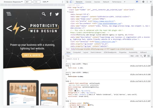
If your HTML prototype includes custom CSS styles, you can create a new stylesheet specifically for your WordPress theme. Name it style.css and place it in the root directory of your theme.

Open the functions.php file of your theme and locate the appropriate section for enqueuing stylesheets. Utilize the wp_enqueue_style() function to enqueue your stylesheets. This function takes parameters such as a handle (a unique ID for your stylesheet), the path to the stylesheet file, and any dependencies if needed. For example:

   function enqueue_theme_stylesheets() {
       wp_enqueue_style( 'theme-style', get_stylesheet_uri() );
   }
   add_action( 'wp_enqueue_scripts', 'enqueue_theme_stylesheets' );

This enqueues a stylesheet using the get_stylesheet_uri() function, which automatically retrieves the path to the current theme’s default stylesheet.

Enqueuing Scripts:
If your HTML prototype includes JavaScript functionality, you can enqueue scripts as well.

Similar to enqueuing stylesheets, open the functions.php file and locate the appropriate section for enqueuing scripts. Use the wp_enqueue_script() function to enqueue your scripts. Enter parameters for the handle, the path to the script file, and any dependencies if necessary. For example:

   function enqueue_theme_scripts() {
       wp_enqueue_script( 'theme-script', get_template_directory_uri() . '/js/scripts.js', array( 'jquery' ), '1.0', true );
   }
   add_action( 'wp_enqueue_scripts', 'enqueue_theme_scripts' );

Now we’ve enqueued a script using the get_template_directory_uri() function to retrieve the path to the theme’s directory and concatenating it with “/js/custom.js”, which specifies the path to the custom JavaScript file. It also specifies “jquery” as a dependency, ensuring that the jQuery JavaScript library is loaded before the custom script. The 1.0 value represents the version number of the script, and the “true” parameter indicates that the script should be placed in the footer for optimal performance.

Properly enqueuing stylesheets and scripts in your WordPress theme ensures that they are loaded efficiently and in the correct order. This practice enhances the performance and compatibility of your theme with various browsers and devices.

Converting HTML Markup into Dynamic WordPress Code

One of the key advantages of WordPress is its ability to dynamically generate and display content. To convert your static HTML prototype into a fully functional WordPress theme, you’ll need to incorporate the WordPress loop and replace static elements with dynamic WordPress functions. Let’s explore the process:

  • Understanding the WordPress Loop:
    The WordPress loop is a fundamental concept that retrieves and displays posts or other content from your WordPress database. It iterates through each post, allowing you to customize the display of individual items. Using the loop, you can easily generate dynamic content for your theme.
  • Replacing Static Elements:
    Identify the static HTML elements in your prototype that should display dynamic content, such as blog posts, comments, or custom post types. Replace these elements with appropriate WordPress functions that utilize the loop to fetch and display the content.
  • Displaying Post Content:
    To display the content of a post, you can use the_content() function within the loop. This function retrieves the main content of the current post and outputs it onto the page. You can place this function within the appropriate location in your theme’s template files to display the post content dynamically.
  • Listing Posts:
    If you want to display a list of posts, such as on a blog page or archive page, you can use the have_posts() and the_post() functions in combination with other template tags. The have_posts() function checks if there are any posts to display, while the_post() function sets up the current post for iteration within the loop. You can then use template tags like the_title() or the_excerpt() to output the relevant information for each post.
  • Customizing Output:
    WordPress offers a wide range of template tags and functions to customize the output of dynamic content. For example, you can use functions like the_permalink() to generate the URL for a post, the_author() to display the post author’s name, or the_time() to show the publication date.

Here’s an example of a simple WordPress loop that you can use as a starting point:

<?php
if ( have_posts() ) { // If posts are found
    while ( have_posts() ) {
        the_post();
        ?>
        <!-- The template for generating each post -->
        <article <?php post_class(); ?>>
            <h2><a href="<?php the_permalink(); ?>"><?php the_title(); ?></a></h2>
            <div class="entry-content">
                <?php the_content(); ?>
            </div>
        </article>
        <?php
    }
} else { // If no posts are found
    echo 'No posts found.';
}
?>

In this example, we first check if there are any posts available using the have_posts() function. If there are posts, we enter the loop and use the the_post() function to set up the current post. Inside the loop, we can access various template tags to display dynamic content.

This example provides a basic foundation for understanding and implementing the WordPress loop. Feel free to customize it further based on your specific requirements and desired design.

Integrating Custom Fields and Theme Options

The WordPress Theme Customizer

On top of the core functionality of WordPress, you can further enhance the flexibility and customization of your theme by integrating custom fields and theme options. These powerful features allow you to add editable content sections and provide additional control over various aspects of your theme. Two key methods for achieving this are the WordPress Customizer and custom fields.

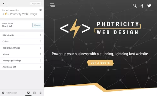
Using the WordPress Customizer for Theme Options
The WordPress Customizer provides a user-friendly interface for managing theme options. It allows users to customize various aspects of the theme, such as site title, logo, colors, and more. By leveraging the Customizer, you can provide users with the ability to personalize their website without touching any code.

To add theme options via the Customizer, you need to register a new section and add controls for each option. The registered options can then be accessed and applied to your theme’s templates. For example, you can create options for selecting a font style, choosing a layout, or even adding custom text.

Implementing Custom Fields for Editable Content
Custom fields offer a powerful way to add editable content sections to your theme. With custom fields, you can define specific areas within your theme where users can input dynamic content, such as a featured image, a banner text, or a call-to-action button. These fields provide a seamless way to update and manage content without modifying the theme’s core files.

To easily implement custom fields, you can use WordPress plugins like Advanced Custom Fields or Custom Field Suite. These plugins provide an intuitive interface for creating and managing custom fields. Once defined, you can retrieve the values of these fields within your theme’s templates and display them dynamically. This level of customization goes a long way in creating a unique and tailored experience for your website visitors.

Implementing Navigation Menus and Widgets

To provide seamless navigation and enhance the user experience, it’s essential to implement navigation menus and widget areas in your WordPress theme. Navigation menus allow users to navigate through different sections of your website, while widget areas provide dynamic content placement options. Let’s explore how to incorporate these elements into your theme.

Adding Custom Navigation Menus
WordPress provides a built-in functionality for creating custom navigation menus. With custom menus, you can define specific menu locations and assign menu items to them. This gives you full control over the structure and arrangement of your theme’s navigation.

To add a custom navigation menu, you need to register a menu location in your theme’s code and assign it to a specific menu location within the WordPress dashboard. You can then style and customize the menu appearance using CSS to match your theme’s design.

Incorporating Widget Areas
Widget areas, or sidebars, are regions within your theme where users can add and arrange various widgets. Widgets are pre-built elements that can display different types of content, such as recent posts, categories, tags, search forms, social media icons, and more.

To incorporate widget areas into your theme, you’ll need to register one or more widget areas in your theme’s functions.php file. Once registered, users can add and customize widgets in these designated areas using the WordPress Widgets settings. Widget areas are often placed in sidebars, footers, or any other section of your theme where you want to provide dynamic content placement options.

Implementing navigation menus and widget areas gives users the ability to navigate your website easily and customize its content placement. This flexibility allows them to personalize their browsing experience and access relevant information efficiently.

Testing and Debugging the WordPress Theme

Browser testing with Chrome’s developer tools

Throughout the development of your WordPress theme, it’s crucial to conduct thorough testing to ensure a seamless user experience across various devices, browsers, and operating systems. Additionally, identifying and resolving any potential issues or bugs will contribute to the overall stability and performance of your theme.

Cross-Device and Cross-Browser Testing
To reach a wide audience, your WordPress theme should be responsive and compatible with different devices, including desktops, laptops, tablets, and smartphones. Test your theme on various screen sizes and resolutions to ensure proper rendering and functionality. Pay attention to navigation menus, content layout, and media responsiveness.

Similarly, testing your theme on different browsers (such as Chrome, Firefox, Safari, and Edge) will help identify any browser-specific issues. Ensure that your theme appears consistent and functions correctly across these browsers, considering differences in rendering and CSS support.

Functionality Testing
Thoroughly test the functionality of your theme by interacting with all its features, including menus, navigation links, search functionality, forms, and any custom functionality or plugins integrated into the theme. Verify that everything works as expected and that user interactions produce the desired results.

Test different scenarios, such as submitting forms, navigating between pages, and accessing various content types (such as blog posts, archives, and custom post types). Validate that all dynamic elements, such as post excerpts, featured images, and custom fields, display correctly and reflect the intended content.

There are some helpful plugins available that can scan your theme to identify issues, and help you to follow coding best practices. “Theme Check” and “Theme Sniffer” are two that I’ve found enormously helpful.

Error Handling and Debugging
During testing, closely monitor for any error messages, warnings, or unexpected behavior. WordPress provides useful debugging tools that can assist in identifying and resolving issues. Enabling WP_DEBUG in your WordPress configuration file (wp-config.php) helps to display error messages and warnings, facilitating the debugging process.

Inspect the browser console for any JavaScript errors and review the PHP error logs to capture any server-side issues. Addressing these errors promptly will ensure a smooth user experience and prevent potential security vulnerabilities.

Launch

Congratulations! You have journeyed through the process of transforming an HTML prototype into a fully functional WordPress theme. Creating your own WordPress theme allows you to unleash your creativity, tailor your website’s appearance and functionality to your specific needs, and provide a unique experience for your visitors. By combining the flexibility of HTML with the power of WordPress, you have the ability to build dynamic, interactive, and personalized websites.

Remember, the key to a successful WordPress theme lies in continuous improvement and refinement. Regularly update and enhance your theme to meet the evolving needs of your website and its users. Stay informed about the latest trends and best practices in WordPress development, and leverage the vast resources and supportive community to expand your knowledge and skills.

Now it’s time to take your newly created WordPress theme and launch your website. Embrace the boundless opportunities that WordPress offers, express your creativity, and make your mark on the world.

Multiply Your Web Design Skills Exponentially With CSS Calculations

CSS calculations allow web developers to perform arithmetic calculations directly within CSS. This capability allows for more flexible and responsive web design, where styles can be adapted based on the dimensions of the viewport or other factors. In this article, we will explore this powerful CSS3 feature and provide code examples to demonstrate their use. Topics to be covered include various types of calculations, units of measurement, and browser compatibility. By the time you’re done reading, you will have a better understanding of how CSS calculations can be used to create dynamic and engaging web designs.

Understanding CSS Units

CSS calculations require an understanding of the different units of measurement used in CSS. These units can be divided into two categories: absolute units and relative units.

Absolute units, as the name implies, are fixed values that don’t change regardless of the context. Common examples of absolute units include pixels (px), points (pt), inches (in), and centimeters (cm).

Relative units, on the other hand, are values that are calculated based on the context in which they are used. This means that they can change depending on the size and properties of the parent element or browser window. Examples of relative units include em, rem, and percentage (%).

Two more essential relative units worth mentioning are viewport width (vw) and viewport height (vh). These units represent 1% of the viewport width and height, respectively. They allow elements to be sized relative to the dimensions of the viewport. For example, using “50vw” sets the width of an element to be 50% of the viewport width, or the browser window. Similarly, “50vh” sets the height to be 50% of the viewport height. These units are useful for creating responsive designs that adapt to different screen sizes and devices.

It’s important to choose the appropriate unit for your calculations based on the context and the desired result. For example, if you’re designing for print, using absolute units like inches or centimeters may be more appropriate. However, for web design, using relative units like em or rem can provide more flexibility and responsiveness.

Basic CSS Calculations

CSS calculations involve basic arithmetic operations like addition, subtraction, multiplication, and division. These calculations should be enclosed inside a calc() function and can be performed on any numerical CSS property value, such as length, width, margin, and padding. For example, if you want to subtract a padding of 5 pixels from the width of an element, you can write it in CSS using the subtraction operator as follows:

width: calc(100% - 5px);

Multiplication and division can also be used in CSS calculations. For instance, if you want to increase the font size of an element by 20%, you can write it in CSS using the multiplication operator as follows:

font-size: calc(16px * 1.2);

It’s important to note that calculations in CSS follow the same order of operations as in mathematics. To control the order of operations, you can use parentheses to group the operations as needed. For example:

width: calc((100% - 20px) / 2);

This code first subtracts 20 pixels from 100%, and then divides the result by 2.

Advanced CSS Calculations

CSS offers more advanced calculations beyond basic arithmetic. These calculations involve the use of trigonometric functions, logarithmic functions, and other mathematical operations. For instance, you can use sin(), cos(), and tan() functions to calculate values based on angles, or use log(), exp(), and sqrt() functions to perform logarithmic, exponential, and square root operations respectively.

Here’s an example of using the calc() function to perform an advanced CSS calculation:

.element {
    width: calc(sqrt(25) * 20px);
}

In this example, the width property of an element is set using the calc() function. The sqrt() function is used to calculate the square root of 25, and the resulting value is multiplied by 20px. This can be used for creating dynamic width calculations based on square root values.

CSS variables can also be used in calculations. This is particularly useful when you need to perform calculations based on dynamic values. Here’s an example of using CSS variables in a calculation:

:root {
    --base-size: 16px;
}

div {
    font-size: calc(var(--base-size) * 1.5);
}

In the example above, we’re using a CSS variable named --base-size to set the base font size to 16px. We’re then using calc() to multiply var(--base-size) by 1.5 to determine the font size of a div element.

When using advanced CSS calculations, it’s important to be mindful of performance implications. Complex calculations can slow down page load times and negatively impact user experience. It’s best to keep calculations as simple as possible and test them thoroughly to ensure they work as expected.

Common Use Cases for CSS Calculations

CSS calculations can be used in a variety of ways to make web design more efficient and responsive. Here are some common use cases:

Responsive Design: CSS calculations are particularly useful for creating responsive design that adapts to different screen sizes and resolutions. With calculations, designers can create flexible layouts that adjust to the available space, without needing to define specific pixel widths for each element. For example, calculations can be used to specify the width of a container as a percentage of the available screen width, or to adjust font sizes based on the viewport size.

.container {
    width: calc(50% - 20px);
    /* the container will be half of the available space, minus 20 pixels */
}

@media screen and (max-width: 768px) {
    .container {
        width: calc(100% - 40px);
        /* the container will take up all available space, minus 40 pixels */
    }
}

Grid Systems: CSS calculations can also be used to create flexible grid systems, where the column widths are determined by calculations rather than fixed pixel values. For example, a three-column layout could be created using calc(33.33% - 20px) for the column width, with 20 pixels of gutter space between each column.

.col {
    float: left;
    margin-right: 20px;
    width: calc(33.33% - 20px);
}

.col:last-child {
    margin-right: 0;
}

Typography: CSS calculations can be used to create dynamic typography that scales based on the size of the browser window. For example, the vw unit can be combined with calculations to create font sizes that adjust to the screen width.

h1 {
    font-size: calc(4vw + 20px);
    /* the font size will be 4% of the viewport width, plus 20 pixels */
}

p {
    font-size: calc(1em + 0.5vw);
    /* the font size will be 1em plus 0.5% of the viewport width */
}

By using CSS calculations in these and other ways, designers can create more efficient and flexible layouts that adapt to the needs of the user and the device.

Performance Considerations

While CSS calculations can be useful for creating dynamic and responsive web designs, they can also impact website performance if not used appropriately. This is because the browser needs to perform each calculation before the page can be rendered.

To optimize CSS calculations for performance, it’s important to avoid unnecessary calculations and minimize the number of times they are used. This can be achieved by simplifying the calculations and reducing the number of elements that use them.

To identify performance bottlenecks with CSS calculations, there are several tools available. The Chrome DevTools Performance panel, for example, can be used to measure the performance of a website and identify areas that need improvement. Other tools like PageSpeed Insights and WebPageTest can also provide insights into website performance and offer suggestions for optimization.

Unleash the Power of CSS Calculations

CSS calculations are a powerful tool that can improve the flexibility and responsiveness of your website design. By understanding the different CSS units and basic arithmetic calculations, you can create more dynamic and engaging layouts. Advanced CSS calculations offer even more possibilities, allowing you to create complex animations and interactions on your website. However, it’s important to consider performance implications and optimize your CSS calculations for faster page load times. With the right tools and best practices, you can take advantage of CSS calculations to create more compelling and effective web designs.

To continue learning about CSS calculations and improving your web design skills, there are many resources available online. Some recommended resources include CSS Tricks and W3Schools. These websites offer tutorials, examples, and documentation on CSS calculations and other web design topics.

I encourage you to experiment with CSS calculations and try incorporating them into your own web design projects. By utilizing the power of CSS calculations, you can create websites that are more responsive, dynamic, and engaging for your users.

CSS Variables: The Power of Custom Properties in Web Design

CSS custom properties, also known as CSS variables, were introduced in CSS3 as a way to make it easier to reuse and maintain styling across a website. With CSS custom properties, you can define a value once and use it throughout your stylesheet, making it easier to make global changes to your website’s design without having to edit multiple places. In this article, we’ll explore how to use CSS custom properties and some of the benefits they provide.

To create a custom property, you simply define it with a double hyphen prefix, followed by a name and a value:

:root {
    --primary-color: #0088cc;
}

In this example, we’ve defined a variable named “--primary-color” and given it a value of “#0088cc“. We’ve placed this definition in the :root selector to make it global to the entire document.

Once you’ve defined a custom property, you can use it throughout your stylesheet by referencing its name with the var() function:

a {
    color: var(--primary-color);
}

In this example, we’re setting the color of all anchor tags to the value of our custom property, “--primary-color“. This makes it easy to change the color of all links on our website by simply changing the value of the custom property. You can also use this same variable to color other highlighted elements like buttons, borders, and backgrounds.

One of the key benefits of CSS custom properties is that they make it easier to maintain a consistent design across your website. By defining global values in custom properties, you can make sure that your colors, fonts, and other design elements are consistent across all pages.

Custom properties can also make it easier to create responsive designs. Let’s say you have a navigation menu on your website that collapses into a hamburger menu on smaller screens. You want to change the background color of the navigation menu when it’s in its collapsed state to make it more visible. You can use CSS variables to define the background color for different screen sizes.

First, define a custom property for the background color:

--menu-bg-color: #ffffff;

Next, use media queries to change the value of the custom property for different screen sizes:

@media screen and (max-width: 768px) {
    :root {
        --menu-bg-color: #333333;
    }
}

Finally, use the custom property to style the navigation menu:

.nav-menu {
    background-color: var(--menu-bg-color);
}

In this example, the background color of the navigation menu will be white by default, but will change to dark gray when the screen width is 768px or less. This makes the menu more visible and easier to use on smaller screens. By using CSS custom properties and media queries, you can create responsive designs that adapt to different screen sizes and provide a better user experience.

In addition to making it easier to maintain a consistent design and create responsive layouts, CSS custom properties can also help reduce the size of your stylesheets. By using custom properties to define global values, you can avoid repeating the same values throughout your stylesheet, which can help reduce the file size and make your site faster. This is especially beneficial when using long values like gradients and clip paths.

Here’s an example where CSS variables can save a considerable amount of time and file size. Instead of defining your font families on each element, you can define custom properties for each style:

--title-font: Impact, 'Helvetica Neue Condensed', 'Arial Narrow', sans-serif;
--body-font: Helvetica, Tahoma, Arial, sans-serif;

Now you can use the title font variable to style each of your headings, and the body font property to style your paragraphs and list items.

So, instead of entering a long list of font families dozens of times throughout your document, you can define one list to be used any number of times throughout your document. Any time you decide to change your title font or body font, you only have to enter it once.

CSS custom properties can be used to save values for any property, from simple margins, to binary images. They can also be used to store complex values, such as the results of CSS calculations. Here’s an example of using the calc() function in a variable:

--box-width: calc(100vw - 20px);

This custom property can then be used to set the width of any element:

.box {
    width: var(--box-width);
}

This would set the width of all .box elements to 20 pixels smaller than the width of the viewport.

Here are some additional tips and techniques for using CSS custom properties:

  • Use descriptive names. This will make your code more readable and easier to understand down the road.
  • Use consistent naming conventions. This will help you to keep track of your custom properties and make it easier to find them when you need them.
  • Group related variables together. This will help to keep your code organized and easier to read.
  • Use custom properties to store complex values. This can be useful for things like storing the results of calculations or storing data that needs to be reused throughout a stylesheet.
  • Combine with other CSS features. CSS custom properties can be used in conjunction with other advanced CSS features such as calc(), media queries, and animations to create complex and dynamic designs.
  • Use custom properties to create accessible designs. You can use custom properties to store values that can be used to make your designs more accessible, such as the color of text or the contrast between text and background. This can help people with disabilities to use your website more easily.
  • Use fallback values. CSS custom properties can be nested, so it’s possible to set a fallback value for a property in case the browser doesn’t support custom properties. This ensures that the website will still be functional and styled even on browsers that don’t support CSS custom properties.

CSS custom properties are a hugely powerful new web technology that changes the game for web designers. They make it easier to create consistent designs and responsive layouts, as well as reducing the size of your stylesheets. By using custom properties to define global values, you can make it easier to maintain and update your website’s design, saving you time and effort in the long run.

Modernize Your Website Layouts With CSS Grid

Have you ever struggled with designing a responsive layout for your website? If so, CSS Grid might just be the solution you’re looking for! Here we’ll explore what the CSS grid system is, how it works, and why it’s such a powerful tool for web designers.

CSS Grid is a two-dimensional layout system that allows you to create complex, responsive layouts with ease. Part of the CSS3 standard, it allows you to define a grid of columns and rows, and then place elements anywhere within that grid. This means you can create layouts that adapt to different screen sizes, without having to write complicated media queries or rely on other layout systems.

One of the biggest advantages of CSS Grid is its flexibility. You can define a grid with any number of columns or rows, and you can even define different sized columns and rows. This means you can create layouts that are truly unique, and that stand out from the crowd.

Another plus of CSS Grid is its simplicity. Once you understand the basics of how it works, creating complex layouts becomes much easier. You no longer have to worry about floats, clears, tables, libraries, or other CSS hacks that were necessary in the past.

It’s hard to justify not using CSS Grid

So how does CSS Grid work? There’s a lot to it, but it’s actually quite simple. First, you define a grid container by setting its display property to “grid”. Then, you define the columns and rows of the grid using the “grid-template-columns” and “grid-template-rows” properties. Finally, you place elements within the grid using the “grid-column” and “grid-row” properties.

Grid also comes with a number of other useful features, such as the ability to span elements across multiple columns or rows, and the ability to align elements within the grid.

Here’s an example of using CSS grid to create a responsive layout:

.container {
    display: grid;
    grid-template-columns: repeat(auto-fit, minmax(250px, 1fr));
    grid-gap: 20px;
}

In this example, we first define a container element with the display property set to grid. We also set the grid-template-columns property to create a grid with columns that will automatically adjust based on the available space, with a minimum size of 250px and a maximum size of 1fr (which means the column will take up as much available space as possible).

We also use the grid-gap property to add some spacing between the boxes.

With these styles in place, the grid will adjust and reflow as the browser window is resized, ensuring that the items are always displayed in an organized, responsive manner.

It’s worth noting that CSS Grid is different from CSS Flexbox, another popular layout system. While Flexbox is great for laying out elements in a single row or column, Grid is more suited for creating complex, two-dimensional layouts. With Flexbox, you define a row or column, and then place elements within that row or column. With Grid, you define a grid of rows and columns, and then place elements anywhere within that grid. This makes it more powerful for complex layouts, while Flexbox is better suited for simpler, one-dimensional layouts.

CSS Grid is a powerful tool that allows you to create complex, responsive layouts with ease. Its flexibility and simplicity make it an essential tool for any web designer looking to create beautiful, responsive websites. So why not give CSS Grid a try? Your website (and your users) will thank you!