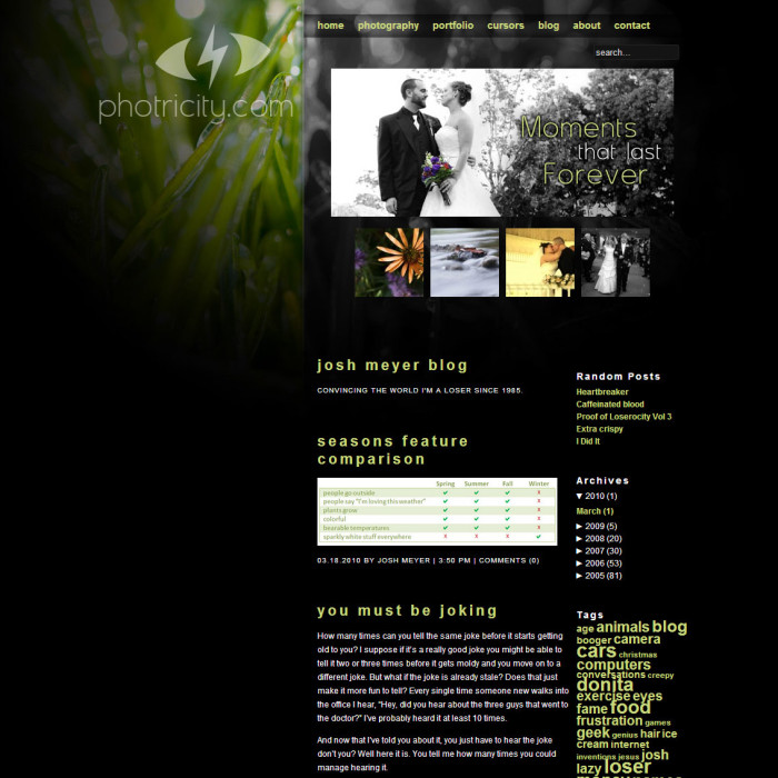
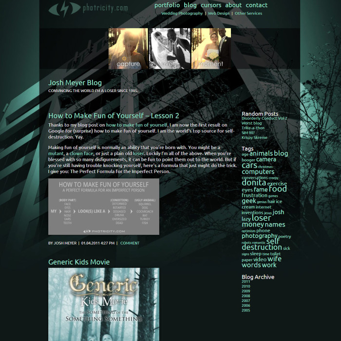
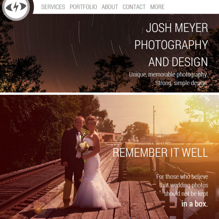
On October 1, 2003 I registered the domain name photricity.com. It’s been more than a decade since then, and the site has gone through many iterations and changes. This is a visual timeline of the major redesigns. Just a fair warning: not everything is going to be pretty.
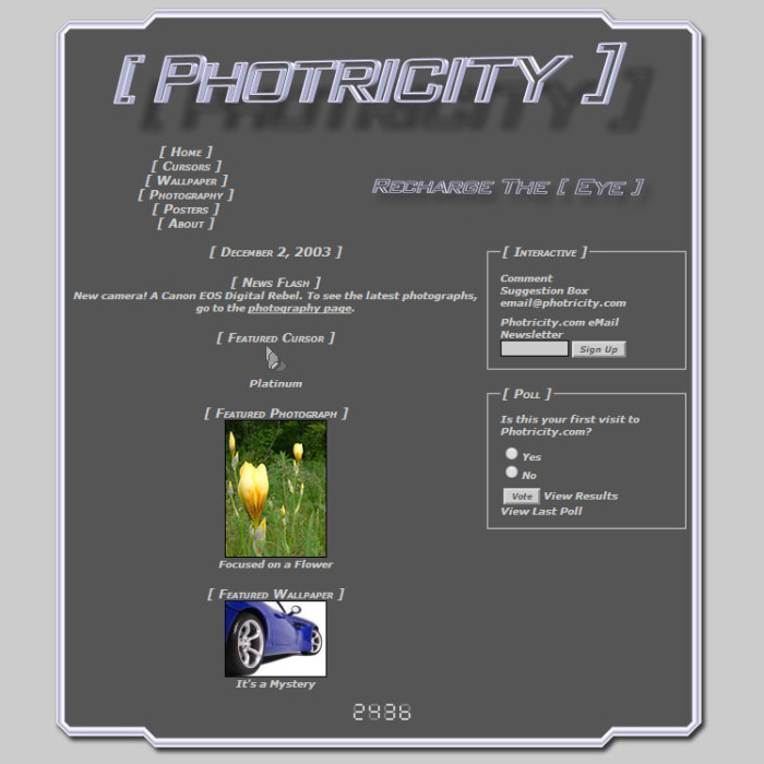
Photricity 1.0
The initial design was very grey and based on lots and lots of html tables. I don’t think I even knew what CSS was at the time. Each individual page was laboriously assembled in Notepad. The images were made using state-of-the-art graphics programs such as Microsoft Paint and some super cool 3D text app.

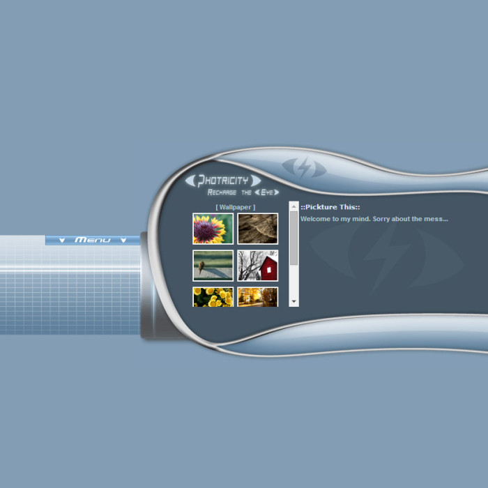
Photricity 2.0
In 2005 I really stepped up the color by adding blue. Lots of blue. I wanted it to look really different from the typical website, and whether for good or bad I believe I accomplished that goal. Who needs usability when you’ve got frames and even more tables! I designed a new Photricity logo icon which has stuck to this day.

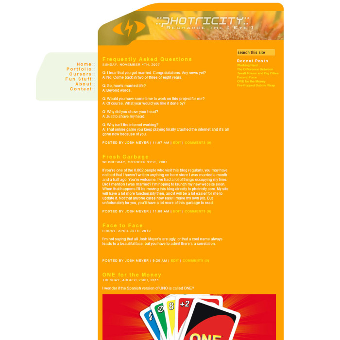
Photricity 3.0
If you wanted more color your wish was granted in 2007 with an eye-melting orange. Finally powered by WordPress, the site became much more useful.

Photricity 4.0
In 2009 I really got down to (photography) business. People started asking me to take their wedding pictures, so I started doing some actual marketing. A bit more sensible design hopefully scared away a few less people.

Photricity 5.0
The evolution continued in 2011 with a few html5 elements and some neat little hover effects. Apparently I can’t seem to decide on any particular color.

Photricity 6.0
And now in 2014 I’ve pulled out all the stops, scraped together all my knowledge of web design and more, and created a site that’s fully responsive, standards compliant, and uses the latest web technologies. Try loading it up on your computer and your smartphone and see what a responsive, mobile optimized website can do.

 Teaching your kids the basics is essential. Numbers, letters, shapes; it’s knowledge that they will use for the rest of their life. Kids just eat that stuff up. But for the love of sanity, please don’t teach your kids colors. From the moment they can tell red from blue, you will never hear the end of, “I wanted the green bowl.” “Why can’t I have the yellow cup?” “She can’t have the blue spoon, she’s a girl.” A boy will lick his food off the floor before he eats from a pink plate. Your padawan will turn to the dark side if you give him the blue lightsaber instead of the green one. My eyes are in pain from pink everything. Parenting isn’t easy, but it’s just a little more tolerable with color blind kids.
