Keyboard Accessibility: Navigating Beyond the Mouse

Imagine navigating a website without a mouse or touch screen. For individuals with disabilities or those who rely solely on keyboard input, this is their reality. Keyboard accessibility plays a vital role in ensuring equal access to web content and creating a seamless user experience for all.

Keyboard accessibility refers to designing and developing websites in a way that allows users to navigate, interact, and access content using only their keyboard. This accessibility feature is particularly important for individuals with motor impairments, visual impairments, or those who prefer keyboard-based interactions.

What is Keyboard Accessibility?

Keyboard accessibility is the design and implementation of web content that allows users to navigate, interact, and access all functionalities using only their keyboard. It ensures that individuals with disabilities, motor impairments, or those who rely on keyboard-based interactions can fully engage with and enjoy the digital experience.

Keyboard navigation is particularly crucial for individuals who are unable to use a mouse or other pointing devices, as well as those who prefer using keyboard-only interactions for efficiency or personal preference. Providing robust keyboard support makes websites become more inclusive, enabling a diverse range of users to access and interact with the content.

Various guidelines and standards have been established to ensure keyboard accessibility in web design. One prominent standard is the Web Content Accessibility Guidelines (WCAG) 2.1, which sets forth criteria and techniques to ensure accessibility for individuals with disabilities. WCAG 2.1 places specific emphasis on keyboard accessibility as a fundamental aspect of inclusive design. Adhering to these guidelines helps web designers meet legal requirements and create websites that are accessible to all users, regardless of their input method.

Keyboard Navigation Techniques

Keyboard navigation forms the foundation of a user’s ability to interact with web content using only their keyboard. Understanding the basic keyboard navigation techniques is essential for creating an accessible and user-friendly experience. The primary keys involved in keyboard navigation include the tab key, enter key, and arrow keys. The tab key allows users to navigate between interactive elements, such as links, buttons, and form fields. The enter key is used to activate or submit a selected element. The arrow keys enable users to navigate within menus, dropdowns, and other navigational elements.

In addition to proper key functionality, providing clear visual indications of focused elements is crucial for users who rely on keyboard navigation. Highlighting or outlining the focused element helps users understand their current location and aids in orientation within the web page. This visual focus indicator should be distinct enough to be easily identifiable, ensuring that users can navigate through the website confidently.

Proper keyboard navigation order is essential to maintain a logical and intuitive flow for keyboard users. Elements should be structured in a sequence that makes sense and follows the natural reading order of the content. Using skip links allows users to jump directly to specific sections or areas of the page, bypassing repetitive navigation links. Skip links are particularly useful for users who navigate using screen readers, as they provide shortcuts to essential sections of the page.

Access keys are keyboard shortcuts that provide quick access to specific elements on a webpage. While access keys can enhance keyboard accessibility, their implementation requires careful consideration. It is crucial to avoid conflicts with browser or assistive technology shortcuts, as they can interfere with the user’s ability to navigate effectively. Providing clear instructions and documentation on how to use access keys is also important for users to utilize this functionality efficiently.

Designing for Keyboard Accessibility

Inclusive design is at the core of creating an accessible and user-friendly web experience for all individuals. When it comes to keyboard accessibility, inclusive design principles emphasize the need to consider diverse user needs from the beginning of the design process. Focusing on keyboard accessibility ensures that everyone, regardless of their input method, can navigate and interact with the website effectively.

Visible focus state
Visible focus state

Providing visible focus states is crucial for keyboard users. When an element receives keyboard focus, it should be visually distinguishable from surrounding elements. Clear and prominent focus indicators, such as highlighting or outlining, help users understand which element they are currently interacting with. Proper focus management is equally important, ensuring that focus is transferred in a logical and predictable manner as users navigate through the site.

Semantic HTML and ARIA (Accessible Rich Internet Applications) attributes play a significant role in enhancing keyboard accessibility. Semantic HTML tags, such as <nav>, <main>, and <button>, provide built-in keyboard accessibility features and convey meaning to assistive technologies. ARIA attributes allow for additional customization and refinement of the accessibility properties of elements. Using ARIA attributes, such as aria-label and aria-expanded, provides additional context and information to assistive technologies, making the website more accessible to keyboard users.

Responsive design, which ensures that websites adapt and respond to different screen sizes and devices, also impacts keyboard accessibility. With the increasing use of mobile devices and touchscreens, it’s crucial to consider the needs of users who rely on keyboard navigation. Responsive design should prioritize touch-friendly targets and maintain a consistent and intuitive navigation structure across different screen sizes. Considering the limitations and requirements of keyboard users creates a seamless and accessible experience regardless of the device being used.

Common Challenges and Best Practices

Designing for keyboard accessibility can present challenges, particularly when dealing with complex interactions and custom user interface (UI) components. These elements often require special attention to ensure that keyboard users can navigate and interact with them effectively.

One common challenge is handling complex interactions that rely heavily on mouse-based actions, such as drag-and-drop or hover effects. In these cases, it is crucial to provide alternative keyboard-based methods for performing the same actions. For example, allowing users to move through items and activate them using the keyboard’s arrow keys and enter or spacebar.

Custom UI components, such as sliders, carousels, and dropdown menus, can also pose challenges for keyboard accessibility. It is important to ensure that these components are fully operable using the keyboard alone. This involves providing proper keyboard focus management, allowing users to navigate and interact with individual elements within the components, and providing clear instructions or cues for keyboard interactions.

Accessibility and Usability

To overcome these challenges and ensure keyboard accessibility, several best practices can be followed:

  • Proper Focus Management: Ensure that interactive elements receive keyboard focus and provide clear visual indications of focus states. This helps keyboard users understand their current location within the page and enhances their overall navigation experience.
  • Handling Dynamic Content: When content is dynamically loaded or updated without page refresh, ensure that keyboard focus is appropriately managed and users are notified of the changes. This allows keyboard users to stay aware of content updates and navigate through them seamlessly.
  • Clear and Consistent Keyboard Navigation: Maintain a logical and consistent keyboard navigation order throughout the website. Ensure that keyboard users can navigate through interactive elements, such as links and form controls, in a predictable and intuitive manner.
  • Design for Keyboard Accessibility from the Start: Incorporate keyboard accessibility considerations into the initial design phase of a website or application. Planning and implementing keyboard accessibility early on makes it easier to address potential challenges and ensure a smoother user experience.

Keyboard accessibility is an ongoing effort that requires regular maintenance and audits. As websites evolve and new features are added, it is essential to conduct regular accessibility checks to ensure continued compliance with keyboard accessibility standards. Regular audits help identify any new accessibility issues that may arise and provide an opportunity to make necessary improvements.

Furthermore, staying up to date with evolving web standards and accessibility guidelines is crucial. Web Content Accessibility Guidelines (WCAG) and other relevant accessibility standards continue to evolve, and it is important to incorporate any updates or changes into the design and development process.

Optimizing Website Crawlability with XML Sitemaps

Imagine having a beautifully designed website with valuable content, but struggling to attract organic traffic from search engines. For many of us, it doesn’t take much of an imagination. In the ever-evolving world of web design and search engine optimization, it’s crucial to equip your website with the right tools to enhance its visibility and ensure it gets noticed by search engines. One such essential tool is the XML sitemap.

XML sitemaps are like the roadmaps of your website, guiding search engines through its intricate web of pages and content. By providing search engines with a structured and comprehensive overview of your website, XML sitemaps enable them to understand and index your content more effectively. They act as a bridge between your website and search engine crawlers, helping to boost your website’s discoverability and visibility in search results.

What Are XML Sitemaps?

XML sitemaps serve as a map that guides search engines through your website’s content. They act as a structured blueprint, presenting information about your website’s pages, their relationships, and their importance. XML sitemaps provide a concise and organized representation of your website’s architecture, ensuring that search engines can easily navigate and comprehend your content.

Sitemaps adhere to a specific structure and format. They are written in XML (Extensible Markup Language), a language that allows for the structured representation of data. XML sitemaps consist of various elements and tags that convey crucial information to search engines. These include the URL of each page, the date it was last modified, the frequency of changes, and the priority of each page relative to other pages on your website. While some tags are required, such as the <url> and <loc> tags, others are optional, allowing for additional details to be included, such as images, video content, or alternate language versions.

The benefits of using XML sitemaps are numerous. First, they facilitate the discovery and crawling of your website by search engine bots. By providing a comprehensive list of URLs, XML sitemaps ensure that no valuable pages are missed during the crawling process. This is particularly beneficial for large websites with complex structures, as it helps search engines efficiently navigate through the content hierarchy. Additionally, XML sitemaps enable search engines to understand the freshness of your content by indicating the last modification date, thus improving the indexing of your updated pages. And with priority information, you can also guide search engines to prioritize specific pages, emphasizing their importance within your website’s context. Overall, XML sitemaps serve as a powerful tool in enhancing the visibility and accessibility of your website’s content in search engine results.

Here’s an example of what an XML sitemap looks like:

<?xml version="1.0" encoding="UTF-8"?>
<urlset xmlns="http://www.sitemaps.org/schemas/sitemap/0.9">
  <url>
    <loc>https://www.example.com/</loc>
    <lastmod>2023-06-01</lastmod>
    <changefreq>weekly</changefreq>
    <priority>1.0</priority>
  </url>
  <url>
    <loc>https://www.example.com/about</loc>
    <lastmod>2023-06-02</lastmod>
    <changefreq>monthly</changefreq>
    <priority>0.8</priority>
  </url>
  <url>
    <loc>https://www.example.com/products</loc>
    <lastmod>2023-06-03</lastmod>
    <changefreq>daily</changefreq>
    <priority>0.6</priority>
  </url>
  <url>
    <loc>https://www.example.com/contact</loc>
    <lastmod>2023-06-04</lastmod>
    <changefreq>yearly</changefreq>
    <priority>0.4</priority>
  </url>
</urlset>

In this example, we have a basic XML sitemap that includes four URLs. Each URL is enclosed within <url> tags, and within each <url>, we have the following elements:

  • <loc>: This element specifies the URL of the page.
  • <lastmod>: This element indicates the last modification date of the page in YYYY-MM-DD format.
  • <changefreq>: This element defines how frequently the page is expected to change. Possible values include “always”, “hourly”, “daily”, “weekly”, “monthly”, “yearly”, and “never”.
  • <priority>: This element represents the priority of the URL relative to other URLs on the website. The value ranges from 0.0 to 1.0, with 1.0 being the highest priority.

Creating an XML Sitemap

Generating XML sitemaps can be done through various methods, depending on your website’s complexity and your preferred approach. One option is manual creation, where you construct the XML sitemap file from scratch using a text editor or XML editor. This method allows for complete control and customization, but it can be time-consuming and prone to errors, especially for larger websites.

Another approach is to utilize content management system plugins or extensions that automatically generate XML sitemaps for you. Many popular CMS platforms, such as WordPress, Joomla, and Drupal, offer plugins specifically designed for XML sitemap generation. These plugins simplify the process by dynamically generating and updating the XML sitemap based on your website’s content and structure.

For those who prefer an online tool, there are several XML sitemap generators available. These tools typically require you to provide your website’s URL or XML feed, and they will crawl your site to generate the XML sitemap file. Online sitemap generators are especially useful for websites with dynamic content that changes frequently or for large websites that have numerous pages and complex structures. They can handle the task efficiently, ensuring that all relevant pages are included in the XML sitemap.

Considerations for large websites and dynamically generated content should not be overlooked. If your website has a large number of pages, it may be necessary to split the XML sitemap into multiple files to accommodate the search engine’s limitations on file size. Additionally, if your website generates content dynamically or includes pages that are not easily discoverable through regular crawling, such as JavaScript-generated content or paginated pages, you should ensure that these pages are included in your XML sitemap.

XML Sitemap Best Practices

Google Search Console

Keeping your XML sitemaps up to date with the latest website content is crucial for maintaining their effectiveness. As you add or remove pages from your website, it’s important to update your XML sitemap accordingly to ensure that search engines have the most accurate and comprehensive view of your website’s structure and content.

Prioritizing and including relevant web pages in your sitemap is another best practice. Focus on including your most important and valuable pages, such as your homepage, key landing pages, and pages with unique or high-quality content.

Including metadata in your XML sitemap, such as last modification dates and change frequencies, provides valuable information to search engines. Specifying when a page was last modified helps search engines understand when to revisit and reindex that page. Similarly, indicating the change frequency (e.g., daily, weekly, monthly) helps search engines understand how often a particular page’s content is likely to change. While these metadata elements are not directly used for ranking purposes, they contribute to search engines’ crawl and indexing strategies.

Submitting your XML sitemaps to search engines is an essential step in ensuring their visibility and accessibility. Most search engines, such as Google and Bing, provide webmaster dashboards where you can submit your sitemap. Submitting your sitemap through these tools notifies search engines of its existence and encourages them to crawl and index your web pages more quickly and effectively.

Remember to update your XML sitemaps whenever significant changes occur on your website, such as the addition of new pages, removal of outdated content, or modifications to existing pages. Regularly reviewing and optimizing your XML sitemap contributes to better search engine visibility, indexing efficiency, and overall website performance.

Advanced XML Sitemap Techniques

Enhancing XML sitemaps with additional features and techniques can further optimize their effectiveness. Consider adding alternate language versions to your XML sitemap to help search engines understand and index your content for different language audiences. Including image and video annotations within your XML sitemap can also improve the visibility of multimedia content in search results, providing an opportunity to attract more targeted traffic.

For large and multi-section websites, XML sitemap index files can be employed to manage the complexity. An XML sitemap index file acts as a directory that references multiple XML sitemaps, each representing a section or category of your website. This technique allows for better organization and scalability, making it easier for search engines to crawl and index your website’s extensive content.

Handling different types of web pages requires careful consideration. When dealing with paginated content, such as articles or product listings spread across multiple pages, it’s important to use pagination markup to indicate the relationship between the pages. This helps search engines understand the structure and order of the paginated content.

Canonical URLs, which are used to address duplicate content issues, should be handled appropriately in XML sitemaps. Ensure that the canonical URLs included in the XML sitemap point to the preferred version of the duplicated pages, consolidating their visibility and avoiding content dilution.

Dynamically generated URLs, often seen in websites with user-generated content or personalized experiences, require special attention. You can use techniques such as parameter handling, URL rewriting, or custom scripts to generate dynamic URLs for inclusion in your XML sitemap. It’s essential to ensure that these dynamic URLs are search engine-friendly and provide accurate and relevant content.

TL;DR

XML sitemaps play a vital role in web design and search engine optimization. They serve as a valuable tool for organizing and presenting website content to search engines, improving visibility, indexation, and crawling. With these best practices, you can create effective XML sitemaps that enhance your website’s performance in search results.

However, it’s crucial to remember that XML sitemaps require regular testing and validation. Ensuring the accuracy and completeness of your sitemaps is essential to maximize their effectiveness. Use online tools and search engine console features to verify the integrity of your XML sitemaps and address any issues that arise.

XML sitemaps should be considered as part of a broader SEO strategy. They work in conjunction with canonical tags, helping consolidate duplicate content and direct search engines to the preferred versions of your web pages. Integrating structured data markup into your XML sitemaps further enhances the understanding and visibility of your content in search results.

Remember to keep your XML sitemaps up to date, monitor search engine console reports for any errors or warnings, and stay informed about the latest developments in XML sitemap best practices. With this knowledge, you can harness the full potential of XML sitemaps to improve your website’s search engine performance, user experience, and overall online visibility.

Responsive Typography: Creating Stunning Designs for Every Screen

Today with websites being accessed on a plethora of devices with varying screen sizes, the need for responsive web design has never been more crucial. One vital aspect of responsive design is responsive typography, which plays a pivotal role in delivering an optimal user experience across different devices. It ensures that text remains legible, visually appealing, and accessible, regardless of the screen size or orientation.

Responsive typography goes beyond simply adjusting font sizes. It involves understanding the principles of typography and implementing techniques that allow text to adapt and flow seamlessly within different layouts. With responsive typography, web designers can create websites that not only look stunning but also provide an exceptional reading experience for users on smartphones, tablets, laptops, and desktops.

Follow as we unravel the principles and best practices that empower designers to craft flexible and visually appealing typographic systems. We will explore the challenges and benefits of responsive typography, delve into the techniques for implementing it effectively, and discuss the accessibility considerations that should underpin every typographic decision. Whether you’re a seasoned designer or new to the field, this article will equip you with the knowledge and tools to optimize your typography for responsiveness and create remarkable user experiences.

What is Responsive Typography?

Responsive typography is the art and science of creating typography systems that seamlessly adapt to different devices and screen sizes. It involves implementing design principles and techniques that allow text to adjust dynamically, ensuring optimal legibility, readability, and aesthetics across various viewing contexts.

In a responsive environment, typography faces unique challenges. Traditional approaches to typography may not suffice when text needs to accommodate different screen resolutions, orientations, and viewing distances. Maintaining legibility and readability becomes crucial, as text must remain clear and easy to consume on devices ranging from small smartphones to large desktop monitors.

Legibility, readability, and aesthetics are key considerations when dealing with typography in a responsive design. Legibility refers to the ease with which individual characters can be distinguished, while readability focuses on the overall comprehension of written content. Achieving these factors across devices requires careful attention to font selection, size, spacing, line length, and contrast.

Additionally, responsive typography must consider the aesthetic aspect, ensuring that the visual harmony of the design is preserved at various screen sizes. Typography plays a significant role in establishing the tone and personality of a website, and it should maintain its visual appeal while adapting to different contexts.

From a design perspective, responsive typography allows for greater flexibility and creativity. It enables designers to experiment with font sizes, line spacing, and typography styles to achieve the desired impact on different screen sizes. Furthermore, responsive typography contributes to the accessibility of a website, ensuring that individuals with varying abilities can access and engage with the content.

Principles of Responsive Typography

Fluid typography is a fundamental principle of responsive design that ensures text scales proportionally with the viewport size. It allows typography to adapt seamlessly to different devices and screen sizes, maintaining optimal legibility and readability. With percentage-based font sizing and viewport-relative units, such as viewport width (vw) or viewport height (vh), typography can dynamically resize based on the available space, creating a harmonious and flexible reading experience.

The concept of a modular scale is key to establishing a consistent typographic hierarchy across various breakpoints. A modular scale is a sequence of harmonious font sizes based on a defined ratio, such as the golden ratio or the Fibonacci sequence. By following a modular scale, designers can create a set of type sizes that maintain visual harmony and hierarchy, regardless of the screen size. This approach ensures a cohesive and balanced typographic system throughout the responsive design.

Breakpoints and media queries play a vital role in responsive typography by enabling different typographic styles to be applied at specific screen sizes. Defining breakpoints in the CSS code enables designers to target different screen widths and adjust typography accordingly. This allows for tailored typography styles, such as font sizes, line heights, and even font choices, to be optimized for specific breakpoints, enhancing legibility and visual impact.

Relative units, such as em (relative to the font size of the parent element) and rem (relative to the font size of the root element), offer advantages in creating scalable and responsive typography. Using relative units can ensure that typography adapts proportionally to changes in the parent or root font size. This allows for more consistent and flexible typography across different elements and breakpoints, as the relative units adjust based on the font size context.

As technology continues to advance, new trends and advancements in responsive typography are shaping the future of web design. One notable development is the emergence of variable fonts. Unlike traditional fonts that offer a fixed set of styles, variable fonts provide a range of adjustable attributes, such as weight, width, and slant, all within a single file. This flexibility allows designers to create dynamic typographic systems that adapt seamlessly to different screen sizes and user preferences. Variable fonts offer the potential for greater efficiency in delivering typographic variety and optimizing performance, ultimately enhancing the responsive nature of typography.

Put Your Type to Work

Responsive typography plays a vital role in creating engaging and accessible web experiences across various devices and screen sizes. By understanding the principles and best practices of responsive typography, designers can ensure their content remains legible, aesthetically pleasing, and adaptable. Remember to consider accessibility guidelines, such as providing sufficient contrast and using appropriate font sizes, to ensure inclusivity for all users.

Testing is also crucial in the implementation of responsive typography. Be sure to examine your typography across different devices, browsers, and screen resolutions to ensure consistent readability and optimal user experience. Conduct user testing and gather feedback to fine-tune your typographic choices and make necessary adjustments.

As web design continues to evolve, staying up to date with emerging trends and advancements in responsive typography will be essential. Embrace new technologies, explore dynamic typographic systems, and continually seek innovative ways to enhance your typographic designs.

Consider prioritizing responsive typography and incorporating it into your web design workflow to create visually stunning and user-friendly experiences that captivate and engage your audience across all devices.

Schema Markup: Enrich Your Search Engine Appearance With Structured Data

Web designers and SEO professionals are constantly seeking ways to optimize websites for search engines. One powerful technique that has gained significant traction is the implementation of schema markup and structured data. These innovative concepts not only enhance the way search engines understand and index web content but also improve the overall user experience.

Imagine if search engines had a better understanding of your website’s content, allowing them to display rich snippets, knowledge panels, and other visually appealing elements in search results. This is where schema markup comes into play. It provides search engines with structured information, making it easier for them to interpret and present your web content accurately.

What is Schema Markup and Structured Data?

Schema markup is a specific vocabulary or code language that allows webmasters to provide structured information about their web content. It helps search engines understand the meaning and context of the data on a webpage. With it web designers can classify and organize their content into specific categories or types, making it easier for search engines to interpret and present relevant information to users.

Structured data refers to the actual content that is marked up using schema markup. It provides additional context and details about various elements on a webpage, such as products, articles, events, recipes, and more. This data helps web designers supply search engines with specific information about their content, such as titles, descriptions, ratings, prices, and dates, enriching search results with relevant and visually appealing elements.

Implementing structured data brings several advantages. First, it enhances visibility in search results by enabling search engines to display rich snippets, knowledge panels, and other visually appealing elements. This improved visibility can significantly increase click-through rates and drive more targeted traffic to your website. Schema markup also contributes to a better user experience by providing users with accurate and detailed information directly on the search engine results page. Users can quickly find what they’re looking for without having to navigate through multiple web pages.

Types of Schema Markup

Schema markup offers a wide range of types that cater to various formats of web content. Let’s explore some of the most commonly used types:

  1. Organization: This type allows you to provide detailed information about your organization, such as its name, logo, contact details, social media profiles, and more. Implementing organization structured data helps search engines accurately represent your business in search results and knowledge panels.
  2. Local Business: If you have a physical location or operate locally, local business schema markup is crucial. It enables you to provide specific details about your business address, opening hours, phone number, and other relevant information. This helps local searchers find your business more easily.
  3. Product: Product markup allows you to showcase your products with rich snippets in search results. You can provide product details like name, description, price, availability, and even customer reviews. Implementing product schema markup can increase the visibility of your products and improve their chances of appearing in product-related search results.
  4. Article: Article schema markup is ideal for publishers and bloggers. It allows you to provide structured data about your articles, including the headline, author, publication date, and a brief summary.
  5. Review: Review markup helps you display customer reviews and ratings in search results. You can provide information such as the reviewer’s name, rating, review text, and even the product or service being reviewed. This type of data adds credibility to your business and can influence user decisions.

Each type of schema markup comes with its own set of properties and attributes. For example, product markup includes properties like brand, SKU, aggregateRating, and offers, while article schema markup uses properties such as headline, author, datePublished, and articleBody. Understanding these properties and attributes is essential for correctly implementing Schema Markup and ensuring that search engines interpret your data accurately.

Let’s consider some practical examples of structured data implementation. For a business website, you can apply organization markup to provide your company’s name, logo, and contact information. If you offer products, incorporating product schema enables you to display product details like name, price, and availability directly in search results. If you publish articles, utilizing article markup allows search engines to present your article’s headline, author, and publication date in a visually appealing manner. And if your website includes customer reviews, you can implement review markup to allow search engines to display star ratings and review snippets, boosting the credibility of your business.

Implementing Schema Markup

There are several methods you can use to implement schema markup on your website. Let’s explore two common approaches:

  1. Manual Coding: This method involves manually adding structured data to your HTML code. You can insert the appropriate schema markup tags and attributes directly into the relevant sections of your HTML markup. While this method offers more control and customization options, it requires a solid understanding of schema markup syntax and HTML coding.
  2. Schema.org’s Structured Data Tools: Schema.org provides structured data tools that simplify the process of adding schema markup. These tools offer user-friendly interfaces where you can input your data and generate the necessary code. This method is especially helpful if you’re new to schema markup or prefer a more guided and automated approach.

Here’s an example of structured data using schema markup for a business website:

<script type="application/ld+json">
{
  "@context": "http://schema.org",
  "@type": "LocalBusiness",
  "name": "Example Business",
  "address": {
    "@type": "PostalAddress",
    "streetAddress": "123 Main Street",
    "addressLocality": "Cityville",
    "addressRegion": "State",
    "postalCode": "12345",
    "addressCountry": "United States"
  },
  "telephone": "+1-555-123-4567",
  "url": "https://www.example.com",
  "openingHours": "Mo-Fr 09:00-18:00",
  "image": "https://www.example.com/logo.png",
  "priceRange": "$$",
  "description": "Example Business is a leading provider of quality products/services in the industry."
}
</script>

In this example, we’re using the LocalBusiness type to represent a local business entity. The structured data includes the business name, address, telephone number, website URL, opening hours, image/logo, price range, and a brief description.

After implementing your schema markup, it’s essential to validate your markup to ensure it’s correctly structured and error-free. One popular tool for this is Google’s Structured Data Testing Tool. Follow these steps to validate your code:

  1. Open the Google Structured Data Testing Tool in your web browser.
  2. Enter the URL of the page containing the schema markup or paste the markup code directly into the tool.
  3. Click on the “Run Test” button to analyze the markup.
  4. The tool will provide feedback on the validity of the markup, highlighting any errors or warnings that need attention.

The Future of Structured Data

The landscape of structured data continues to evolve, with exciting advancements and emerging trends shaping the future of these technologies:

  • Expanded Schema Types: As the demand for structured information grows, Schema.org continues to expand its vocabulary with new schema types. These additions cater to specific industries, niches, and emerging technologies, allowing website owners to provide more precise and detailed information to search engines.
  • Voice-Activated Assistants: The proliferation of voice-activated assistants presents new opportunities for schema markup. As voice search becomes increasingly prevalent, schema markup will play a vital role in optimizing content for voice queries. Future developments may include schema enhancements specifically tailored to voice search, enabling websites to provide even more contextually relevant information.
  • Artificial Intelligence (AI) Integration: As search engines become more sophisticated with AI and machine learning, schema markup could play a crucial role in helping algorithms better understand and interpret web content. AI-driven algorithms can leverage structured data to improve search relevance, enhance user experiences, and deliver more accurate and personalized results.

Schema markup and structured data offer significant benefits for web designers and SEO professionals. It empowers websites to provide search engines with structured information about their content, leading to improved visibility, higher click-through rates, and enhanced user experiences. Understanding different types of schema markup, implementing it correctly, and staying updated with the latest developments are crucial for harnessing the full potential of structured data. Embrace the power of schema markup and structured data to optimize your website for search engines and deliver exceptional user experiences.

Building a Lightweight and Versatile CSS Grid System

Are you tired of struggling with rigid and inflexible layouts in your web design projects? Do you wish there was an easier way to create visually stunning and adaptable grids that seamlessly respond to different screen sizes? Look no further! In the dynamic world of web design, the use of a minimal and versatile grid system can be a game-changer.

CSS grid, the cutting-edge layout module in CSS, empowers web designers to craft flexible and responsive grid-based layouts with ease. Gone are the days of relying on cumbersome frameworks or convoluted workarounds. With CSS grid, you have the power to create sophisticated grid structures that adapt flawlessly to various devices and screen resolutions.

What is CSS Grid?

CSS grid is a powerful layout module in CSS that allows designers to create grid-based layouts with precision and flexibility. Unlike older layout methods, such as floats and positioning, CSS grid offers a more intuitive and declarative approach to building grids. It consists of two essential components: the grid container and grid items.

The grid container serves as the parent element that holds the grid items. By applying the display: grid property to the container, we establish a grid context. This allows us to define the structure and behavior of our grid system. We can specify the number of rows and columns, set their dimensions, and create space between them using the grid-template-rows, grid-template-columns, and grid-gap properties, respectively.

CSS grid works by dividing the grid container into a grid of intersecting horizontal and vertical lines, forming a series of cells. Each grid item is placed within these cells, and designers have granular control over their positioning and sizing. Using properties like grid-row, grid-column, and grid-area, we can precisely determine where each item should appear in the grid.

CSS grid also provides powerful alignment and distribution capabilities. We can align items vertically and horizontally using properties like justify-items, align-items, justify-content, and align-content. These properties enable us to control the placement and spacing of items within the grid.

The advantages of using CSS grid for building versatile and adaptable grids are numerous. Firstly, CSS grid offers a high degree of flexibility, allowing us to create complex layouts with ease. Its ability to handle both rows and columns independently gives us the freedom to design grids that adjust dynamically to different screen sizes and orientations.

Moreover, CSS grid simplifies the process of creating responsive designs. With features like media queries, we can modify the grid structure, rearrange items, or change their sizing based on specific breakpoints. This flexibility ensures that our layouts remain visually appealing and functional across a wide range of devices.

Additionally, CSS grid promotes clean and maintainable code. It eliminates the need for excessive markup or reliance on external libraries, as we can achieve complex grid layouts with minimal code. This results in improved performance and easier maintenance, enhancing the overall development process.

Designing a Minimal Grid Structure

To create a minimal grid structure, we start by defining the grid container and setting up the necessary CSS properties, then define the rows and columns of our grid. These properties accept values that determine the size and behavior of the rows and columns. We can specify fixed lengths, percentages, or even use the fr unit to distribute available space proportionally.

Two Column Grid

For example, we can set up a basic two-column grid with equally sized columns like this:

.grid-container {
  display: grid;
  grid-template-columns: 1fr 1fr;
}

Once we have defined the grid structure, we can specify the size and alignment of our grid items within the grid. We achieve this using the grid-row and grid-column properties. By assigning values to these properties, we can position items in specific cells of the grid.

For instance, to place an item in the first row and the second column, we can use the following code:

.grid-item {
  grid-row: 1;
  grid-column: 2;
}
Row Span

We can also span items across multiple rows or columns by specifying the desired range. For example, to make an item span three rows, we can use:

.grid-item {
  grid-row: 1 / 4;
}

Designing a versatile grid structure provides us with immense flexibility in creating various layouts. By adjusting the number of rows and columns and manipulating the placement of items, we can achieve different grid structures with unique impacts on layout flexibility.

For instance, a grid with a single row and multiple columns allows for a horizontally oriented layout where items flow sequentially. On the other hand, a grid with multiple rows and a single column enables a vertically oriented layout with items stacking on top of each other.

Responsive Grid Design

Creating a responsive grid is essential for ensuring that our grid system adapts seamlessly to different screen sizes and devices. CSS grid provides powerful tools to achieve responsiveness, such as the auto-fit and minmax functions.

The auto-fit function allows the grid items to automatically adjust and fit into the available space while maintaining their specified dimensions. By combining auto-fit with the minmax function, we can set a minimum and maximum size for grid items, creating a flexible and responsive grid.

For example, we can create a responsive grid with a minimum width of 200 pixels and a maximum width of 1fr (i.e., filling the available space) using the following CSS:

.grid-container {
  display: grid;
  grid-template-columns: repeat(auto-fit, minmax(200px, 1fr));
}

Media queries play a crucial role in adapting the grid layout for different screen sizes. With media queries, we can define specific rules that apply only when certain conditions are met, such as the width of the viewport.

For instance, we can modify the grid structure for smaller screens by adjusting the number of columns or changing the layout altogether. By targeting specific breakpoints with media queries, we can create a more optimized and tailored grid design for different devices.

@media (max-width: 768px) {
  .grid-container {
    grid-template-columns: repeat(2, 1fr);
  }
}

When designing a responsive grid system, it’s crucial to follow best practices to ensure a seamless user experience across various devices. Here are some key tips to consider:

  • Keep the grid structure simple and flexible, allowing for easy rearrangement of items on smaller screens.
  • Use relative units like percentages or fr to ensure the grid adapts proportionally to the available space.
  • Test and iterate your grid design across different devices and screen sizes to ensure optimal responsiveness.
  • Consider the content hierarchy and prioritize important elements for smaller screens to maintain readability and usability.

Adding Flexibility and Versatility

To enhance the flexibility and control of our grid layout, we can utilize grid areas and named grid lines. Grid areas allow us to designate specific regions within the grid to place our content. By assigning names to these areas, we can easily position and rearrange items across the grid.

Named Grid Areas

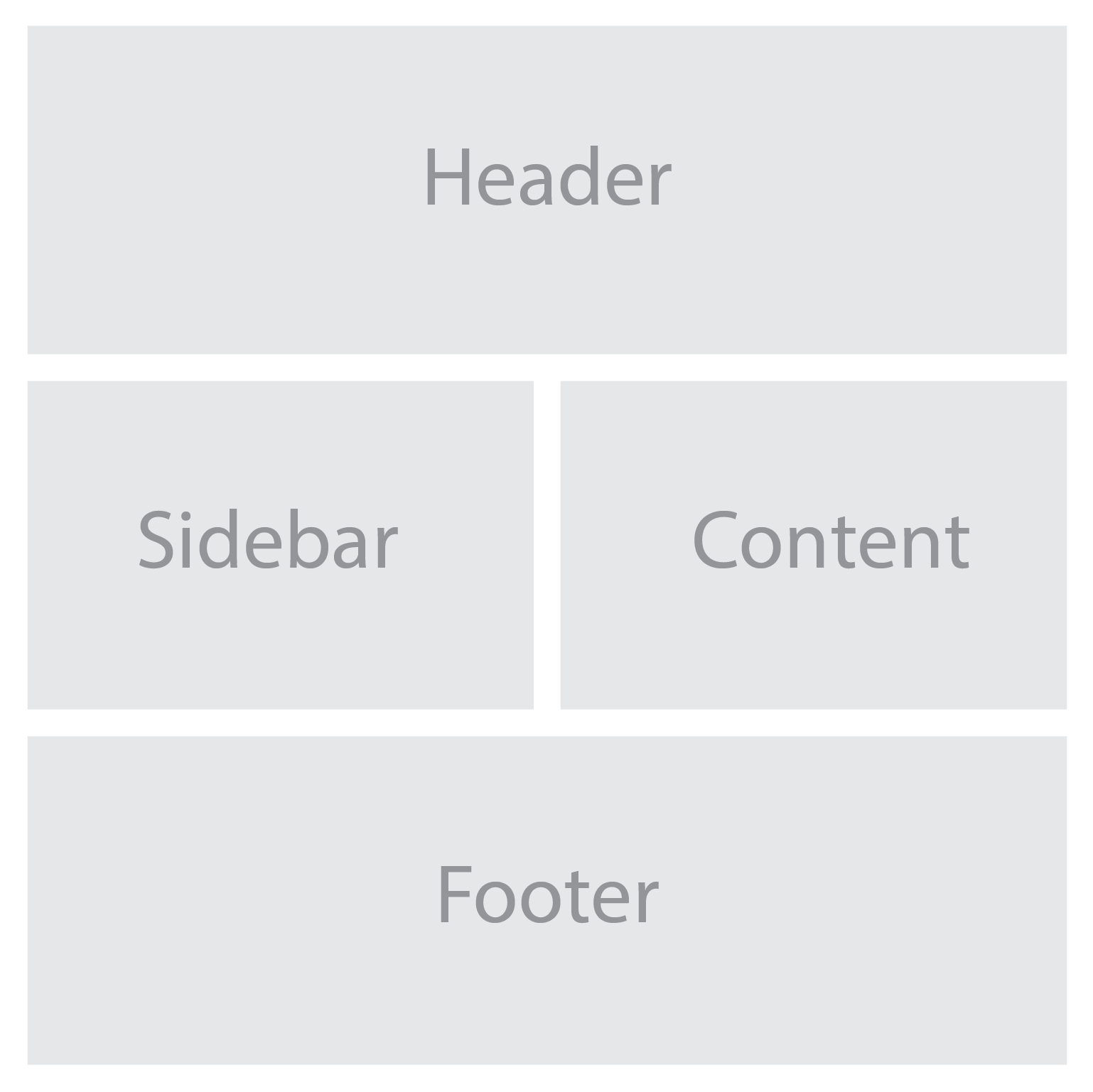
For example, we can define named grid areas for the different sections of a website using the grid-template-areas property:

.grid-container {
  display: grid;
  grid-template-areas:
    "header header"
    "sidebar content"
    "footer footer";
  grid-gap: 20px;
}

.header {
  grid-area: header;
}

.sidebar {
  grid-area: sidebar;
}

.content {
  grid-area: content;
}

.footer {
  grid-area: footer;
}

With these techniques, we can create highly adaptable and versatile grid layouts. Grid areas and named grid lines give us precise control over the positioning of our content, while the grid-gap property adds visual breathing space between items.

When customizing your grid system to meet specific design requirements, consider the following tips:

  • Experiment with different grid configurations to find the most suitable layout for your content.
  • Use the grid-template-areas property to create complex grid structures by assigning multiple areas to a single grid cell.
  • Combine CSS grid with other layout techniques, such as flexbox, to achieve even more versatile and dynamic designs.
  • Consider using CSS variables to define reusable values, such as grid gap sizes or color schemes, making it easier to adjust and maintain your grid system.

With CSS grid, you have full control over the structure and layout of your web pages, allowing you to achieve the desired visual hierarchy and user experience. By harnessing that power, you can unleash your creativity and design beautiful, functional, and responsive websites. Whether you’re building a portfolio, blog, e-commerce site, or any other type of web application, incorporating a minimal and versatile grid system using CSS grid will undoubtedly enhance the visual appeal and user experience.

Cache Handling: Browser Caching for Optimal Website Performance

Have you ever visited a website that took ages to load? Frustrating, isn’t it? As web designers and developers, one of our primary goals is to create websites that deliver exceptional user experiences. And when it comes to optimizing website performance, browser caching plays a crucial role.

When instant gratification is the norm, every second counts. Browser caching, a technique that allows web browsers to store and retrieve website assets, can significantly impact the speed, efficiency, and overall user experience of your website.

What is Browser Caching?

Put simply, browser caching is the mechanism that allows web browsers to store certain website assets locally on a user’s device. When a visitor accesses a website, the browser saves various files, such as HTML, CSS, JavaScript, images, and other resources. These files are stored in a “cache” (pronounced like cash), a temporary storage space on the user’s device.

The browser cache plays a vital role in improving website performance. When a user revisits a website they’ve previously accessed, the browser can retrieve the stored assets from the cache instead of fetching them from the server again. This results in significantly faster load times, as the browser doesn’t need to make round trips to the server for every file.

There are several benefits to implementing browser caching. First and most obviously, quicker page load times lead to enhanced user experiences, reducing the risk of visitor frustration and increasing engagement. Users are more likely to stay on a website that loads quickly and smoothly. Secondly, browser caching reduces server load by minimizing the number of requests made to the server for assets that are already stored locally. This can result in improved server response times and more efficient resource utilization. Lastly, browser caching helps conserve bandwidth, particularly for repeat visitors, as fewer resources need to be downloaded from the server, resulting in cost savings and improved performance for both the user and the website.

How Browser Caching Works

Speed Matters

At its core, browser caching relies on HTTP headers, which are response messages sent by the web server to the user’s browser. These headers contain caching directives that instruct the browser on how to handle and store the website assets.

Caching directives, such as “Cache-Control” and “Expires,” play a crucial role in controlling the caching behavior. The “Cache-Control” header allows the server to specify directives like “public” or “private” to determine whether the resource can be cached by intermediate proxies or only by the user’s browser. Meanwhile, the “Expires” header provides an expiration date or a time duration after which the cached resource is considered stale and needs to be revalidated.

It’s important to distinguish between server-side caching and client-side caching. Server-side caching occurs at the web server level, where the server stores pre-generated copies of web pages or dynamic content to serve them quickly to multiple users. On the other hand, client-side caching takes place within the user’s browser, where the browser saves and retrieves specific resources for faster subsequent visits.

Various caching mechanisms are employed by popular web browsers to optimize the caching process. For instance, browsers utilize a caching algorithm that determines whether to fetch a resource from the cache or make a new request to the server. This algorithm typically considers factors such as the expiration date of the cached resource, the freshness of the resource, and whether the user has disabled caching.

Best Practices for Implementing Browser Caching

Setting Cache-Control Headers:
When it comes to implementing browser caching, one of the key best practices is setting appropriate cache-control headers. Cache-control headers allow you to control how caching is handled for specific resources on your website. By specifying the right directives in these headers, you can determine whether a resource should be cached by the browser, intermediate proxies, or not at all.

Leveraging Expiration and Validation:
Expiration is the process of specifying an expiration date or time duration after which the cached resource is considered old and needs to be refreshed. Setting appropriate expiration times can ensure that the browser fetches updated versions of resources when necessary, avoiding the display of outdated content to users.

Validation involves using conditional requests to check if a cached resource is still valid or if it has been modified since it was last cached. This process helps to minimize unnecessary data transfer by fetching the resource only if it has been modified. With validation techniques such as ETags or Last-Modified headers, you can strike a balance between freshness and bandwidth savings.

Handling Dynamic Content:
Caching dynamic content can be more challenging than caching static content. However, it is still possible to cache dynamic content effectively while maintaining its freshness. One approach is to employ a caching strategy that combines server-side and client-side caching. By caching the dynamic content on the server and implementing appropriate cache-control headers, you can balance the need for up-to-date information with the benefits of caching.

Dealing with Cache Invalidation:
Cache invalidation is a common challenge when implementing browser caching. It involves managing cache updates and ensuring that users receive the latest versions of resources when changes occur. Several techniques can help address cache invalidation, such as versioning URLs, using cache-busting techniques like query strings or file hashes, or employing CDNs with built-in cache invalidation mechanisms.

Tools and Techniques for Browser Caching

Content Delivery Networks (CDN)

Content Delivery Networks:
Content Delivery Networks (CDNs) are powerful tools that can significantly enhance browser caching. CDNs distribute your website’s assets, such as images, CSS files, and JavaScript, across a network of geographically diverse servers. When a user requests your website, these assets are delivered from the server closest to their location, reducing latency and improving load times.

CDNs have built-in caching mechanisms that store your website’s resources on their servers. This means that when a user visits your site, the CDN can serve cached content directly from its edge servers, bypassing the need to retrieve the resources from your origin server. Taking advantage of the caching capabilities of CDNs can further optimize the delivery of your website assets, resulting in faster load times and improved performance.

Cache Plugins and Modules:
For popular web platforms and content management systems, there are various caching plugins and modules available. These tools help streamline the implementation of browser caching by providing automated caching configurations and settings. Installing a cache plugin or module specific to your platform can help you easily enable caching and take advantage of its benefits without the need for complex manual configurations.

Browser Cache Testing and Analysis:
To ensure the effectiveness of your browser caching implementation, it’s important to test and analyze its behavior on different devices and browsers. There are several tools and techniques available for this purpose. One commonly used tool is the browser developer console, which provides insights into network requests, caching headers, and the caching behavior of your website.

Additionally, there are online tools and browser extensions that specifically focus on cache analysis. These tools allow you to simulate cache scenarios, test different caching configurations, and analyze the caching performance of your website.

Common Mistakes to Avoid

  • Oversized or Expired Cache-Control Headers: Misconfigured cache-control headers can hinder caching efficiency and increase response times. Keep headers concise and up to date for optimal performance.
  • Neglecting to Cache Static Assets: Failure to cache static assets like images and CSS files can result in missed opportunities for performance improvement. Cache static resources to reduce server load and enhance page load times.
  • Ignoring Cache Validation: Neglecting cache validation techniques can lead to serving outdated content. Implement validation mechanisms to ensure fresh and accurate content delivery.
  • Setting Expiration Too Far into the Future: Setting cache lifetime too far into the future can prevent timely updates to website content and may result in visitors seeing outdated information.

Rake in the Cache

Web developers are encouraged to implement browser caching as an integral part of any web design strategy. By doing so, you can significantly enhance user experience, reduce server load, and improve overall website performance.

Remember, the internet is evolving, and keeping up with the latest techniques and tools for browser caching is essential. Stay informed, continue to explore new advancements, and adapt your caching strategies accordingly. If you can effectively harness the power of browser caching, you can create websites that are not only visually appealing but also lightning-fast and user-friendly.

6 Tips for Visually Appealing Web Design

Picture a website that instantly grabs your attention with its stunning visuals, seamlessly blending colors, typography, and imagery to create an immersive experience. In web design, aesthetics hold immense power. They can captivate users, communicate brand identity, and leave a lasting impression. It’s no wonder that designing a visually appealing website is a top priority for every web designer.

Here we will explore some of the top tips and best practices that will empower you to craft designs that not only look stunning but also enhance user engagement and create a memorable digital presence. With the perfect blend of aesthetics, functionality, and user experience, your website can leave visitors awestruck and craving for more.

Use a Consistent and Cohesive Color Scheme

When it comes to creating a visually appealing website, color is a powerful tool that can evoke emotions, convey meaning, and establish a strong brand identity. Choosing a consistent and cohesive color scheme is essential for creating a harmonious visual experience.

Start by understanding your brand’s personality and the emotions you want to evoke in your audience. Are you aiming for a bold and energetic vibe, or perhaps a calm and serene atmosphere? Once you have clarity on your brand’s essence, carefully select a color palette that reflects these qualities.

Consider using colors that complement each other and create a sense of visual harmony. A good rule of thumb is to choose a primary color as the foundation and then select a few complementary or analogous colors to accompany it. Remember to strike a balance between using bold, attention-grabbing colors and more subtle shades that provide balance and contrast.

Use colors strategically to guide users’ attention and create visual hierarchy. For instance, make important elements, such as call-to-action buttons or key headings, stand out by using a contrasting color that draws the eye. Use more subdued colors for secondary elements to ensure they don’t compete for attention.

With a consistent and cohesive color scheme, you not only create an aesthetically pleasing website but also establish a strong brand presence that resonates with your audience. Let your colors speak for your brand and create an immersive visual experience that leaves a lasting impression.

Choose Complementary Fonts

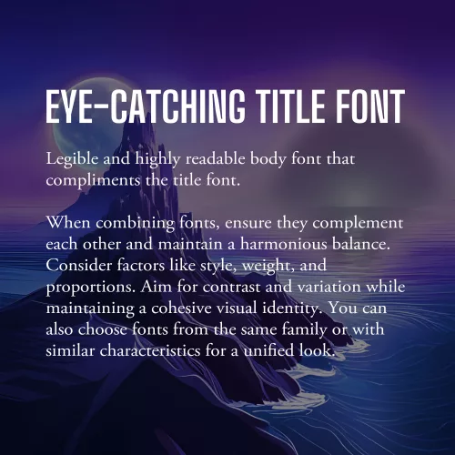
Example font pairing

Fonts play a significant role in web design, as they contribute to the overall look and feel of your website. When selecting fonts, it’s essential to choose ones that are not only legible but also visually appealing and complementary to your design aesthetic.

The first consideration when choosing fonts is legibility. Ensure that the fonts you select are easy to read, even at smaller sizes or on different devices. Legible fonts have clear and distinct letterforms, appropriate spacing between characters, and consistent stroke widths. Test the fonts across various screen sizes and devices to ensure they maintain their readability.

Once you have identified legible fonts, it’s time to think about the visual appeal and creating a harmonious typography scheme. Consider using a combination of fonts to add visual interest and establish a clear hierarchy within your design. One popular approach is to pair a sans-serif font with a serif font.

Sans-serif fonts, with their clean and modern appearance, are often used for headings and titles. They provide a contemporary and straightforward look that grabs attention and makes a bold statement. Serif fonts, on the other hand, have decorative strokes at the ends of characters, giving them a more traditional and elegant feel. They are commonly used for body text as they enhance readability and create a sense of familiarity.

When combining fonts, ensure that they complement each other and create a harmonious balance. Consider their overall style, weight, and proportions. Aim for contrast and variation between the fonts while maintaining a cohesive visual identity. Pairing fonts from the same font family or fonts that share similar characteristics can also create a cohesive and unified look.

Additionally, be mindful of the number of fonts you use on your website. Using too many fonts can lead to visual clutter and confusion. Stick to a limited number of fonts (typically two or three) to maintain consistency and a polished appearance throughout your website.

As with all design choices, it’s crucial to consider your target audience and the message you want to convey. Fonts can evoke different emotions and associations, so choose fonts that align with your brand personality and the overall tone of your website.

Incorporate Whitespace

Whitespace, or negative space, is a powerful yet often underutilized element. It refers to the empty space between elements on a webpage, and it plays a crucial role in creating a visually appealing and user-friendly design.

Whitespace is not just empty space; it is a deliberate design choice that brings balance, clarity, and elegance to your website. Incorporate ample white space to give your content room to breathe, allowing it to stand out and capture the user’s attention. This clean and uncluttered layout creates a sense of organization and makes it easier for visitors to navigate and digest your content.

One of the key benefits of whitespace is enhanced readability. The absence of visual clutter allows users to focus on the important elements and absorb information more easily. Whitespace also helps guide the user’s eye and establish a clear visual hierarchy, making it easier to prioritize content and highlight key messages.

Aesthetically, whitespace creates a sense of elegance and sophistication in your design. It gives your website a modern and spacious feel, conveying a sense of professionalism and attention to detail. When used strategically, whitespace can evoke a sense of luxury, simplicity, and elegance that resonates with your audience.

When incorporating whitespace, consider the overall layout and spacing between elements. Give generous margins around text blocks, images, and buttons. Be mindful of the spacing between different sections and elements on the page. Experiment with different layouts and proportions to find the right balance that suits your content and design aesthetic.

Use High-quality and Relevant Images

Incorporating visually appealing images is a powerful way to enhance the overall aesthetic of your website and captivate your audience. Well-chosen and carefully curated images can communicate your brand message, evoke emotions, and provide valuable context to your content.

First and foremost, prioritize high-quality images. Blurry or pixelated images can significantly impact the visual appeal of your website and create an unprofessional impression. Invest in high-resolution images that are crisp, clear, and vibrant. If you’re using photographs, ensure they are well-lit and properly composed.

Relevance is another crucial aspect to consider when choosing images. Select visuals that are closely aligned with your brand identity, content, and target audience. The images you choose should enhance the message you’re trying to convey and resonate with your visitors. For example, if you’re designing a website for a travel agency, incorporating captivating images of beautiful destinations can inspire and entice potential travelers.

Consider the placement and context of images within your website design. Images should be strategically positioned to support and complement your content. Use them to break up text, highlight key points, or create visual interest. For example, you can use images as background elements or hero banners to make a strong visual statement. The right images have the power to leave a lasting impression on your visitors and make your website truly visually appealing.

Create a Balanced Layout

Creating a balanced layout is crucial in web design as it contributes to the overall visual appeal and user experience of a website. When elements are evenly distributed and placed thoughtfully, they create a sense of visual equilibrium and harmony.

To achieve a balanced layout, consider the placement and arrangement of text, images, and other design elements on the page. Distribute them strategically, ensuring that no single element overpowers or dominates the others. This can be achieved through techniques such as symmetry, asymmetry, or a grid-based layout.

Symmetrical balance involves arranging elements in a mirrored or evenly distributed manner, creating a formal and harmonious feel. It is often used in more traditional and conservative designs. Asymmetrical balance, on the other hand, involves arranging elements in an intentionally unbalanced but visually pleasing way. This approach adds a sense of dynamism and can be used to create more modern and creative designs.

With careful consideration of the placement, size, and visual weight of each element, you can create a balanced layout that guides the user’s eye, communicates hierarchy, and enhances the overall visual appeal. A well-balanced layout not only creates a visually pleasing design but also improves readability and usability, making it easier for visitors to navigate and engage with your website’s content.

Apply Visual Hierarchy

Visual hierarchy is a fundamental principle in web design that helps guide users’ attention and prioritize information effectively. By strategically applying various design elements such as size, color, contrast, and placement, you can establish a clear visual hierarchy on your website.

One of the key aspects of visual hierarchy is utilizing size appropriately. Larger elements tend to attract more attention, so use larger fonts for headings or important sections to make them stand out. Similarly, consider increasing the size of buttons or interactive elements to encourage user engagement. With contrasting sizes, you create a distinction between different elements and help users understand their relative importance.

Color is another powerful tool in establishing visual hierarchy. Use color strategically to draw attention to key elements. Vibrant or contrasting colors can make important elements stand out, while more muted or harmonious colors can be used for less prominent elements. Additionally, consider using color to create consistency and coherence with your brand identity.

Honorable Mentions

Designing a visually appealing website is essential for capturing the attention of users and creating a memorable browsing experience.

While we’ve covered some of the key aspects of visual design, there are some honorable mentions worth talking about. Visual multimedia elements, such as videos, animations, and interactive components, can enhance engagement and add an interactive dimension to your design. However, it’s important to use them judiciously and ensure they contribute to the overall user experience.

Additionally, responsive design deserves a special mention. Ensuring your website is responsive and adapts seamlessly to different screen sizes and devices is crucial in today’s mobile-first era. Responsive design guarantees that your website looks visually appealing and functions optimally across a range of devices, providing a consistent experience for users.

Remember, creating a visually appealing website goes beyond aesthetics—it also contributes to user satisfaction, brand perception, and ultimately, the success of your online presence. Take some time to think about how you can implement these tips into your design workflow. Standing on the shoulders of design giants, you can create a website that not only looks visually stunning but also delivers an exceptional user experience.

Top 10 Best Practices in Web Design

In web design, the key to standing out lies in creating a memorable and impactful user experience. Your website’s design plays a critical role in capturing and retaining the attention of visitors. The secret lies in adhering to the best practices in web design—time-tested principles that elevate your website above the rest and make it shine.

Today we explore the fundamental principles that underpin successful web design, empowering you to craft visually stunning, user-friendly, and high-performing websites. From responsive design and clear navigation to fast loading speeds and engaging call-to-actions, each best practice plays a pivotal role in shaping the user experience. By understanding and implementing these principles, you’ll not only create websites that captivate and delight visitors, but also establish a strong foundation for driving engagement, conversions, and long-term success.

#1: Responsive Design

Responsive design is a fundamental best practice of modern web design. It ensures that your website adapts seamlessly to different screen sizes and devices, providing a consistent and user-friendly experience.

Neglecting mobile-friendliness can result in a loss of potential visitors and customers. Responsive web design showcases your commitment to accessibility and delivers optimal viewing experiences across devices.

Responsive design uses fluid grids, flexible layouts, and media queries to adjust the website’s content and layout dynamically. This approach saves time, ensures consistency, and reduces the need for separate designs for different devices.

Benefits of responsive design:

  1. Improved user experience: Seamless navigation and content adaptation enhance user satisfaction and engagement.
  2. Higher search engine rankings: Mobile-friendliness is a ranking factor, improving visibility and organic traffic.
  3. Cost-effectiveness: Maintaining a single responsive website streamlines resources and simplifies maintenance.

Implementing responsive design:

  1. Fluid grids: Use relative units for defining widths and heights to ensure flexibility.
  2. Flexible images: Optimize and scale images appropriately using CSS media queries.
  3. Media queries: Apply specific styles and layout adjustments based on device characteristics using CSS media queries.

Responsive design future-proofs your website and delivers consistent experiences across devices.

#2: Clear Navigation

Exploring navigation

A user-friendly and intuitive navigation system is crucial for a successful website. It allows visitors to find information easily and enhances their overall browsing experience.

Clear navigation ensures that visitors can quickly locate the desired information without confusion or frustration. It improves usability, engagement, and satisfaction.

Elements of effective navigation:

  1. Clear menu structure: Organize content logically with descriptive labels for easy understanding.
  2. Intuitive placement: Position the navigation menu prominently, preferably at the top, for easy access on every page.
  3. Descriptive labels: Use clear and concise labels that accurately represent the content they link to.
  4. User-friendly patterns: Implement familiar navigation patterns like drop-down menus or breadcrumb navigation for intuitive browsing.

Enhancing navigation usability:

  1. Keep it concise: Limit menu items to essential sections to avoid overwhelming visitors.
  2. Highlight the current page: Use visual cues to indicate the visitor’s location within the website.
  3. Implement search functionality: Include a search bar for direct content or product search.

#3: Consistent Branding

Uniform branding across your website is essential for creating a cohesive and memorable user experience. It reinforces your brand identity, builds trust, and enhances recognition. By maintaining consistency in colors, fonts, and visual elements, you establish a strong and recognizable presence.

Consistent branding helps convey a professional image, fosters trust, and strengthens brand recall. It creates a cohesive visual language that aligns with your brand values and messaging, enhancing the user experience.

Elements of consistent branding:

  1. Colors: Select a primary color palette and use it consistently. Incorporate secondary colors that complement the primary palette.
  2. Fonts: Choose a set of fonts that align with your brand’s personality and use them consistently for headings, subheadings, and body text.
  3. Visual elements: Define and use consistent icons, buttons, and graphical elements that reflect your brand’s style.

Implementing consistent branding:

  1. Create a style guide that outlines your brand’s visual guidelines, including color codes, font usage, and logo placement.
  2. Develop reusable templates and design systems that incorporate your brand elements.
  3. Regularly audit your website to ensure consistent application of branding elements.

#4: Fast Loading Speed

The website weight loss guide

Quick loading speed is vital for a positive user experience and improved search engine rankings. Optimizing your website’s performance ensures quick loading times, reducing bounce rates and increasing engagement.

Significance of fast loading speed:

  • Users expect fast-loading websites, and slow pages can frustrate them.
  • Search engines prioritize fast websites, leading to higher rankings and increased visibility.

Strategies for optimization:

  • Compress files to reduce their size without compromising quality.
  • Enable browser caching to store static files locally.
  • Minify CSS, JavaScript, and HTML files by removing unnecessary elements.
  • Optimize code by eliminating unused or redundant parts.
  • Utilize a Content Delivery Network (CDN) to distribute content globally.

Tools for measuring speed:

  • Google PageSpeed Insights provides recommendations for improvement.
  • GTmetrix and WebPageTest offer detailed performance analysis.

#5: Use of White Space

White space is a key element in web design that improves readability, establishes hierarchy, and creates a clean layout. Incorporating ample white space offers the following benefits:

Readability:

  • Clear content separation for easier comprehension.
  • Improved legibility by reducing visual noise.

Visual Hierarchy:

  • Emphasis on focal points and important elements.
  • Grouping and organizing related content.

Clean Layout:

  • Promotes minimalism and elegance.
  • Directs user focus and reduces distractions.

Strategies for effective use of white space:

  • Maintain balance and proportion.
  • Use appropriate margins and padding.
  • Ensure consistency throughout the design.
  • Experiment and test to find the optimal amount of white space.

Remember, white space is not wasted space. It not only enhances the overall aesthetics of your website, but the user experience as well.

#6: Legible Typography

Choosing your type

Choosing legible typography is essential for ensuring easy readability and accessibility on your website. Consider the following key aspects:

Font selection:

  • Prioritize readability over novelty.
  • Choose fonts that align with your brand identity.

Font size and spacing:

  • Set appropriate font sizes for different screen sizes.
  • Pay attention to line spacing and letter spacing.

Contrast and legibility:

  • Maintain sufficient contrast between text and background.
  • Ensure consistency in contrast throughout the website.

Responsive typography:

#7: Engaging Calls-to-Action (CTAs)

Calls-to-Action play a crucial role in driving user engagement and conversions on your website. By strategically placing clear and visually appealing CTAs throughout your web pages, you can effectively guide visitors towards desired actions, whether it’s making a purchase, subscribing to a newsletter, or filling out a form. Let’s explore the key considerations for creating engaging CTAs.

  • Clear messaging: Use action-oriented language and highlight the benefits users will gain.
  • Visual design: Create eye-catching CTAs with contrasting colors and proper sizing and placement.
  • Responsive and interactive: Optimize CTAs for mobile devices and add hover or animation effects.
  • A/B testing and optimization: Experiment with different variations and continuously optimize based on data.
  • Alignment with user expectations: Place CTAs contextually and ensure consistency with page content.

Implementing engaging CTAs will drive user engagement and motivate visitors to take action, leading to more conversions.

#8: Accessible Design

Accessibility and usability

Designing websites with accessibility in mind is crucial to ensure the widest possible audience and provide equal access to all users. Consider the following guidelines for creating an accessible design:

  • Alt tags for images: Use descriptive alternative text (alt tags) for images to assist visually impaired users in understanding the content.
  • Proper heading structure: Utilize heading tags (h1, h2, h3, etc.) in a logical order to facilitate navigation for screen readers and provide structure to your content.
  • Color contrast: Ensure sufficient contrast between text and background colors to aid users with visual impairments in reading the content.
  • Keyboard accessibility: Make sure all website functions and interactive elements can be accessed and operated using a keyboard alone, without relying solely on a mouse or touch input.
  • Descriptive links: Use descriptive link text instead of vague phrases like “click here” to provide clarity and context to screen reader users.

#9: Optimized Images

Optimizing images is vital for enhancing website performance and delivering a seamless user experience. Consider the following techniques to optimize your images effectively:

  • Image compression: Use tools or plugins to compress images without compromising quality. Reduce file sizes to minimize loading times.
  • Proper file formats: Choose the appropriate image format based on the content. Modern formats like WebP and AVIF offer more efficient compression.
  • Resizing and cropping: Resize images to fit their display dimensions on the website. Crop images to remove unnecessary elements and focus on the subject.
  • Lazy loading: Implement lazy loading techniques to load images only when they come into the user’s view, reducing initial page load time.
  • Image caching: Leverage browser caching to store images temporarily, reducing the need to download them with each page visit.
  • Image optimization plugins: Utilize image optimization plugins or online services that automatically optimize images upon upload.

#10: SEO-Friendly Design

Maximizing keyword density

Incorporating SEO best practices into your web design is essential for maximizing your website’s visibility in search engine results. Consider the following strategies to create an SEO-friendly design:

  • Proper use of headings: Utilize heading tags (h1, h2, h3, etc.) to structure your content and highlight important keywords. This helps search engines understand the hierarchy and relevance of your content.
  • Descriptive meta tags: Craft unique and compelling meta titles and descriptions for each page, incorporating relevant keywords to entice users to click through from search results.
  • Keyword optimization: Conduct keyword research and strategically place relevant keywords throughout your content, including headings, paragraphs, and image alt tags. However, ensure that the keywords are used naturally and do not compromise the readability of your content.
  • Descriptive URLs: Create clean and descriptive URLs that accurately reflect the content of the page. Avoid using vague or generic URLs and include relevant keywords when appropriate.
  • Mobile-friendly design: Optimize your website for mobile devices, as mobile-friendliness is a crucial factor in search engine rankings. Ensure your design is responsive and provides a seamless user experience across different screen sizes.
  • Fast loading speed: Improve your website’s loading speed by optimizing images, minifying code, and leveraging caching techniques. A fast-loading website not only enhances user experience but also positively impacts search engine rankings.

With these SEO-friendly design practices, you can improve your website’s visibility and attract more organic traffic from search engines.

Honorable Mentions

Following these ten best practices in web design will help you create exceptional websites that engage visitors, provide a seamless user experience, and achieve your goals. From responsive design and clear navigation to consistent branding and fast loading speeds, each best practice plays an important role in crafting a successful website.

Other honorable mentions worth considering include incorporating social media integration to enhance engagement, implementing secure HTTPS protocol to build trust and protect user data, and leveraging analytics tools to gather insights and make data-driven decisions.

Remember, web design is an ever-evolving field, and staying updated with the latest trends and technologies is essential. Continuously seek inspiration, explore new techniques, and adapt to the changing needs of your audience. By adhering to these best practices and continuously refining your design skills, you can create visually appealing, user-friendly, and high-performing websites that leave a lasting impression on your visitors.

How to Use Google Search Console to Level-up Your Website’s SEO

In the vast world wide web, where countless websites compete for attention, search engine optimization (SEO) is the not-so-secret for achieving online success. It’s the key to unlocking higher visibility, attracting organic traffic, and ultimately standing out amidst the virtual noise. As a web designer or developer, you understand the importance of optimizing your website to appease search engines and captivate your target audience.

But how can you refine your SEO strategies and stay ahead of the curve? Enter Google Search Console, a powerful tool that empowers webmasters and SEO professionals to uncover valuable insights, address technical issues, and fine-tune their websites for optimal performance in search engine rankings.

This article will give you an overview of Google Search Console and show you how to leverage its features to supercharge your website’s SEO potential. From analyzing performance metrics to addressing technical SEO issues, we’ll cover it all, helping you transform your website into an SEO powerhouse.

What is Google Search Console?

Google Search Console serves as an indispensable tool in the arsenal of webmasters and SEO professionals. As a free web service provided by Google, it offers a wealth of features and insights to refine your website’s SEO performance.

Purpose and Functionality:
Google Search Console is designed to provide webmasters and SEO professionals with a comprehensive understanding of how their websites are perceived by search engines. It allows you to monitor and manage various aspects of your site’s presence in search results. From indexing status to keyword performance, Google Search Console offers a holistic view of your website’s SEO health.

Key Features and Benefits:
One of the primary benefits of Google Search Console is the ability to monitor and analyze website performance in search results. It enables you to track key metrics such as impressions, clicks, and average position for specific search queries. This valuable data helps you assess the effectiveness of your SEO strategies and identify areas for improvement.

Another invaluable feature of Google Search Console is its capability to identify and fix issues that may hinder your website’s visibility. It provides alerts and notifications regarding 404 errors, sitemap issues, and mobile usability concerns. Addressing these issues promptly ensures that search engines can access and understand your website’s content effectively.

Additionally, Google Search Console offers insights into user behavior, allowing you to understand how visitors interact with your website. It provides data on CTR, user queries, and the appearance of your site’s pages in search results. Armed with this information, you can optimize meta tags, titles, and descriptions to entice users to click through to your website.

Top Features of Google Search Console

Performance report

Performance Report:
This report provides a comprehensive view of how your website is performing in search results. You’ll gain insights into search queries, impressions, clicks, and average position. Dive into these metrics to uncover hidden opportunities and fine-tune your SEO strategy for maximum impact.

Keyword Optimization and Click-Through Rate:
Within the Performance Report, you can identify keyword opportunities and optimize meta tags, titles, and descriptions to improve your website’s organic CTR. With compelling and relevant meta information, you increase the likelihood of enticing users to click through to your website. This optimization not only improves your CTR but also enhances your website’s visibility in search results.

Index Coverage and Crawl Errors:
Monitoring your website’s index coverage and identifying crawl errors are crucial for ensuring that search engines properly index your web pages. Search Console provides alerts for any issues that may prevent certain pages from being indexed. By addressing crawl errors promptly, you can ensure that search engines can access and understand your website’s content effectively.

Enhancing Website Usability and Mobile-Friendliness:
User experience plays a vital role in SEO. Google Search Console offers the Mobile Usability and Core Web Vitals reports, helping you optimize your website’s usability and mobile experience. These reports provide valuable insights into mobile-friendly issues, loading performance, and interactivity.

Schema Markup and Structured Data:
Implementing schema markup and leveraging structured data can greatly enhance your website’s appearance and understanding by search engines. Google Search Console allows you to validate and test your structured data, ensuring that it follows the recommended guidelines. With structured information about your content, you increase the chances of rich snippets, knowledge panels, and other enhanced search result features, boosting your website’s visibility and click-through rates.

Backlink Analysis and Link Building:
Backlinks remain a vital aspect of SEO. Google Search Console offers a Link Report that allows you to identify and analyze the backlinks pointing to your website. Understanding the quality and quantity of your backlinks helps you assess your website’s authority and identify potential areas for improvement. Implementing effective link-building strategies, such as reaching out to relevant websites or creating valuable content, can help you acquire high-quality backlinks that strengthen your website’s SEO performance.

Addressing Technical SEO Issues

Exploring the Coverage Report:
One of the key aspects of technical SEO is addressing coverage issues within your website. Google Search Console’s Coverage report provides insights into crawl errors, URL submission, and canonicalization. It’s essential to address these issues to ensure that search engines can crawl and index your web pages effectively.

Site Speed and Performance Optimization:
Website loading speed is a critical factor in user experience and SEO. With Google Search Console’s Speed report, you can analyze your website’s performance and identify areas for improvement. Slow-loading pages can lead to higher bounce rates and lower search engine rankings. By optimizing your website’s speed, leveraging techniques such as image compression, caching, and minifying code, you create a smoother and faster browsing experience for your users, leading to improved SEO performance.

XML Sitemap Submission and Monitoring:
Submitting an XML sitemap to Google Search Console is vital for ensuring that search engines can discover and index your web pages efficiently. Google Search Console provides a convenient way to submit your XML sitemap and monitor its status. Regularly check the sitemap report to ensure that all relevant pages are included, detect any potential issues, and track the indexing status of your website. This helps you ensure that your web pages are appropriately indexed and accessible to search engine users.

Utilizing Google Search Console for SEO Insights and Reporting

Analytics

Query and Page Reports:
Extracting valuable SEO insights is crucial for refining your optimization strategies. With Google Search Console’s Query and Page reports, you can dive deep into keyword performance, impressions, and click-through rates. Analyze this data to gain valuable insights into how users discover and engage with your website in search results. Understanding which keywords are driving traffic and optimizing your content accordingly empowers you to enhance your website’s relevance and visibility.

Analyzing User Behavior with Google Analytics Integration:
Integrating Google Search Console with Google Analytics provides a powerful combination of SEO and user behavior data. This integration enables you to gain deeper insights into user behavior, conversions, and engagement metrics. With the combined information from both platforms, you can identify which pages attract the most organic traffic, understand user journeys, and uncover opportunities for improving conversion rates. This integration offers a comprehensive understanding of how your SEO efforts impact user engagement and website performance.

Generating SEO Performance Reports:
Tracking the progress and impact of your SEO efforts is crucial for measuring success and making informed decisions. Google Search Console allows you to create custom SEO performance reports using its data. These reports help you track key metrics, identify trends, and evaluate the effectiveness of your optimization strategies. Regularly generate and review these reports to fine-tune your SEO approach and identify areas for improvement.

It is important to emphasize the significance of Google Search Console in refining your SEO approach. By implementing this tool, you gain valuable insights, enhance your website’s visibility, improve search engine rankings, and drive organic traffic. However, it’s crucial to remember that SEO is an ongoing process that requires continuous monitoring and adaptation. The dynamic nature of search engine algorithms necessitates staying ahead of the game. Regularly leveraging Google Search Console allows you to stay informed, identify trends, and make necessary adjustments to maintain and enhance your website’s SEO performance.

Debugging: Error Resolution and Bug Fixing in Web Design

Have you ever found yourself in a web design rabbit hole, desperately trying to track down that elusive bug that’s wreaking havoc on your beautifully crafted website? It’s a frustrating experience that can make even the most patient designer want to throw their keyboard out the window. But fear not, for within the world of digital extermination are some valuable tools and techniques to make your bug squashing easier.

Debugging is not just a necessary evil; it is a fundamental skill that separates the novices from the masters in the world of web design. It’s the process of identifying, isolating, and resolving errors that can plague websites, ensuring they function flawlessly and provide a seamless user experience. In fact, mastering the art of debugging can save you countless hours of hair-pulling frustration, improve the functionality of your designs, and elevate your reputation as a skilled designer.

Let’s take a look at the knowledge and tools needed to unravel the tangled web of errors that often lie beneath the surface. From syntax glitches to browser compatibility issues, we’ll explore common errors and their solutions, empowering you to conquer even the trickiest bugs.

Understanding the Debugging Process

What Is Debugging?

When it comes to web design, debugging serves as the crucial process of identifying and resolving errors that can impede the functionality and performance of your website. It involves the systematic exploration and troubleshooting of issues, allowing you to uncover the root causes of problems and implement effective solutions. Debugging is an indispensable skill that empowers web designers to create robust and error-free digital experiences.

The Mindset of a Debugger

Successful bug fixing requires more than technical proficiency—it demands a specific mindset. As a debugger, cultivating a patient, persistent, and curious approach is essential. Patience allows you to persevere through complex issues, knowing that every bug has a solution. Persistence drives you to dig deeper, even when faced with seemingly insurmountable challenges. Curiosity fuels your desire to understand the inner workings of your code, enabling you to uncover hidden bugs and optimize your design.

Developing an Effective Debugging Workflow

  1. Reproduction: Begin by reproducing the error. Identify the specific conditions or actions that trigger the issue, ensuring you can consistently recreate it. This step lays the foundation for understanding the problem’s scope.
  2. Isolation: Isolate the problem by narrowing down its potential causes. Break down your code and test individual components or sections to identify the specific area where the error originates. Isolation helps in pinpointing the source of the problem and prevents unnecessary modifications to unaffected parts of your design.
  3. Hypothesize: Based on the isolated section, formulate hypotheses about what might be causing the error. This step involves analyzing the code, inspecting data structures, and exploring potential logic flaws. Develop multiple hypotheses to consider different scenarios and avenues for investigation.
  4. Testing: Test each hypothesis systematically by implementing changes and observing the effects. Use tools like logging, console output, or debugging frameworks to gather insights into code execution, variable values, and control flow. Iterate through the hypotheses, adapting your testing approach as you gather new information.
  5. Verification and resolution: Once you have identified the root cause of the error, verify the fix by thoroughly testing your modifications. Ensure that the issue is fully resolved and that your changes do not introduce new bugs. Document the steps taken to resolve the problem, creating a record that can aid in future debugging and knowledge sharing.

Understanding the debugging process is the foundation upon which successful bug hunting is built. With a clear definition of bug fixing, a debugger’s mindset, and an effective workflow in place, you are ready to tackle the diverse and often intricate errors that arise in web design.

Common Web Design Errors and Their Solutions

Syntax Errors

Syntax errors, the bane of every developer’s existence, have the power to bring your code execution to a screeching halt. These errors occur when your code violates the rules and structure of the programming language. Fortunately, identifying and fixing syntax errors is relatively straightforward.

To detect syntax errors, pay close attention to error messages provided by your code editor or development environment. These messages often indicate the line number and specific issue causing the error. Reviewing your code line by line and comparing it against the language’s syntax rules can help uncover and rectify these errors.

Logic Errors

Unlike syntax errors, logic errors don’t manifest as glaring mistakes, but rather as faulty program behavior. These bugs can be elusive and challenging to track down, requiring a detective’s mindset to identify and eliminate them. Techniques such as code review, data inspection, and stepping through code are invaluable when tackling logic errors.

Code review involves systematically examining your code for logic flaws. Another pair of eyes may spot a subtle error that you might have missed. Data inspection entails inspecting variables, inputs, and outputs to identify discrepancies or unexpected behavior. Printing or logging variable values at strategic points in your code can shed light on the problem’s source. Stepping through code with a debugger allows you to execute code line by line, observing variable values and the flow of execution, enabling you to pinpoint the exact location of the logic error.

Browser Compatibility Issues

Rendering inconsistencies aren’t as bad as they used to be in the Internet Explorer days, but ensuring cross-browser compatibility is still important to provide a consistent experience for all users. Browser compatibility issues can arise due to differences in rendering engines, CSS support, or JavaScript behavior. To address these challenges, adopt a proactive approach centered around cross-browser testing.

Perform comprehensive testing across different browsers and versions, both on desktop and mobile devices. Utilize browser developer tools to inspect elements, identify rendering inconsistencies, and debug JavaScript errors specific to a particular browser. Additionally, employ tools like BrowserStack or Sauce Labs, which allow you to test your website on a wide range of browsers and operating systems.

Performance-related Issues

Performance issues can significantly impact user experience, leading to slow load times, unresponsive interfaces, and dissatisfied visitors. To diagnose and resolve performance-related problems, employ performance profiling tools and optimization strategies.

Performance profiling tools like Lighthouse, PageSpeed Insights, or WebPageTest can analyze your website’s performance, highlighting potential bottlenecks. These tools measure metrics such as page load times, resource utilization, and network requests, providing insights into areas that require optimization. Optimize your code and assets by compressing images, minifying CSS and JavaScript files, and leveraging browser caching. Implement lazy loading for images and use asynchronous loading for scripts to optimize resource loading. Additionally, consider utilizing content delivery networks (CDNs) to distribute content closer to the user, reducing latency.

Debugging Tools and Techniques

Browser Developer Tools

When it comes to debugging in web design, browser developer tools are your trusted companions. These powerful built-in tools, such as Chrome Developer Tools, offer a range of features to aid in debugging HTML, CSS, and JavaScript issues. They provide a real-time view of your web page’s structure, styles, and functionality, enabling you to inspect and modify elements on the fly.

With browser developer tools, you can diagnose layout issues, debug JavaScript errors, analyze network traffic, and monitor performance metrics. The ability to modify code and see immediate results facilitates rapid experimentation and debugging. Take advantage of features like element inspection, JavaScript console, network analysis, and performance profiling to uncover and resolve issues efficiently.

Logging and Console Output

Logging is a tried and true method for tracking code execution and diagnosing JavaScript bugs. By strategically placing log statements in your code, you can output relevant information to the console during runtime. Console logging allows you to observe variable values, control flow, and error messages, providing valuable insights into the behavior of your code.

To maximize the effectiveness of logging, follow best practices such as using clear and descriptive log messages, organizing logs based on severity or module, and utilizing different log levels (e.g., debug, info, error). Leverage conditional logging to output specific information only when certain conditions are met. Be mindful of performance implications and ensure that logs are properly managed and removed in production environments.

Strategies for Efficient Debugging

Documentation and Organization

In the world of debugging, documentation and organization are paramount. When encountering a bug, it is crucial to document the details of the issue and organize them effectively. This practice not only facilitates efficient debugging for yourself but also aids in collaboration with teammates and ensures long-term maintainability of your web design.

Utilize bug tracking systems like GitHub to log and track bugs. Include essential information such as the bug’s description, steps to reproduce, expected and observed behavior, and relevant screenshots or error messages. By documenting bugs systematically, you create a knowledge base that can be referenced in the future, accelerating the debugging process.

Collaborative Debugging

Debugging doesn’t have to be a solitary endeavor. Collaborative debugging brings a fresh perspective, fosters knowledge sharing, and can lead to more efficient bug resolution. Embrace collaboration through code reviews and seeking help from peers or online communities.

Code reviews involve having a second set of eyes examine your code for potential issues, providing valuable feedback and catching bugs that may have slipped through. Engage in discussions with colleagues or participate in online forums and communities to seek guidance and insights from experienced developers who may have encountered similar issues.

Learning From Previous Debugging Experiences

Reflecting on past debugging experiences is a powerful way to grow as a developer. Every bug encountered provides an opportunity to learn, improve, and refine your debugging and coding skills. Adopt a growth mindset and embrace the lessons learned from previous bug fixing endeavors to become a more proficient debugger.

Review past bugs and consider the steps taken to identify and resolve them. Reflect on the strategies that proved successful and the ones that fell short. Identify patterns or recurring issues that can inform your future debugging efforts. Did you miss any red flags during code reviews? Were there any blind spots in your testing approach? This can help you identify areas for improvement and develop more effective debugging techniques.

Exterminate Those Bugs

Please don’t hurt the good Bugs!

Mastering the art of debugging is not just about fixing errors; it is about honing a valuable skill that saves time, improves functionality, and enhances the user experience. As web designers, we have the opportunity to create digital experiences that delight and inspire. Embracing debugging as an essential part of our toolkit enables us to deliver exceptional results.

So, I encourage you to embrace the world of debugging. Practice diligently, explore new techniques and tools, and seek collaboration and guidance from your peers. Debugging is not just a means to an end; it is a journey of growth, learning, and mastery. With each bug you conquer, you become a more skilled and resilient web designer.

Remember, the challenges you face during debugging are not obstacles, but stepping stones towards excellence. Embrace the bug fixing process with patience, curiosity, and determination. Your dedication to mastering this craft will set you apart and empower you to create remarkable web designs.