Designing for Touch: Creating an Intuitive Touch-friendly User Experience

As touch devices continue to dominate the digital landscape, it has become more important than ever for web designers to create touch-friendly websites that provide seamless and intuitive experiences for users. Gone are the days when websites were primarily accessed through desktop computers with a mouse and keyboard. Today, smartphones and tablets have become the go-to devices for browsing the web, making touch interactions a fundamental aspect of user engagement.

Touchscreen-friendly web design requires attention to detail on every aspect of a website, including layout and navigation optimization, enhancing user interaction and feedback, considerations for touch accessibility, testing and optimization, and future trends to keep in mind. Read on to build a solid understanding of the key elements that contribute to a touch-friendly website and the actionable steps you can take to create a more engaging and intuitive user experience.

What is Touch-Friendly Web Design?

Touch-friendly web design refers to the practice of creating websites that are optimized for touch-based interactions on smartphones, tablets, and other touch-enabled devices. Unlike traditional mouse and keyboard interactions, touch-based interactions rely on users’ fingers and gestures to navigate and interact with the website’s content.

In a touch-friendly design, elements such as buttons, menus, and links are thoughtfully sized and spaced to accommodate finger taps and swipes accurately. Additionally, touch-friendly websites offer smooth and responsive feedback to users’ touch inputs, ensuring a seamless and intuitive user experience.

Differences Between Touch and Mouse Interactions

Designing for touch interactions requires a shift in mindset compared to traditional mouse-driven interfaces. While a mouse cursor offers precise pointing and clicking, fingers have a larger contact area, which may lead to accidental taps or touches if the design isn’t touch-friendly.

The lack of hover state on touch devices is another critical difference. Hovering with a mouse can trigger dropdown menus or reveal additional information, but on touch devices, users need a clear and intuitive way to access the same content without relying on hover.

Considering the variations in touch gestures, such as taps, double-taps, swipes, and pinch-zooms, designers must account for different touch actions to ensure a seamless experience across various touch devices.

The Benefits of Touch-Friendly Design

Embracing touch-friendly web design offers several advantages, especially in the context of the growing mobile user base:

  1. Improved Mobile Accessibility: Touch-friendly design enhances accessibility for users with mobility impairments, making it easier for them to navigate and interact with the website using touch gestures.
  2. Enhanced User Engagement: With touch interactions feeling more natural and immediate, users are more likely to engage with your website’s content and spend more time exploring its offerings.
  3. Consistency Across Devices: By designing with touch in mind, you create a consistent experience for users across devices, irrespective of whether they’re using a smartphone or a tablet.
  4. Better User Experience: A touch-friendly website provides a smooth and intuitive user experience, reducing frustration and abandonment rates, which can lead to increased conversions and customer satisfaction.

Optimizing Layout and Navigation for Touch

Embracing Responsive Design and Fluid Layouts

Responsive design and fluid layouts are essential elements in creating touch-friendly web experiences. They enable your website to seamlessly adapt and adjust its layout, ensuring optimal viewing and interaction across different touch devices. Implementing responsive design principles allows your site to dynamically respond to varying screen sizes and orientations, delivering a consistent and user-friendly experience on any device. With fluid layouts, the content can flexibly fill available screen space, maintaining visual appeal and functionality across different touch devices.

Fluid layouts, which use percentages and relative units for sizing elements, allow content to flexibly fill available screen space. This approach ensures that your website’s layout remains visually appealing and functional, regardless of the screen size, whether it’s a small smartphone or a larger tablet.

Designing Touch-Friendly Navigation Menus

When it comes to touch-friendly navigation menus, several techniques can enhance usability and improve the overall touch experience:

  1. Larger Buttons: Opt for larger button sizes to accommodate finger taps accurately. Small, tightly packed links can be challenging to tap accurately, leading to frustration for touch users. Providing ample touch target sizes helps prevent accidental clicks and improves the overall usability.
  2. Ample Spacing: Increase the spacing between menu items to avoid unintended taps. Sufficient spacing between buttons ensures that users can easily distinguish and tap on the desired navigation option without accidentally activating adjacent links.
  3. Intuitive Gestures: Incorporate intuitive touch gestures into your navigation design. For example, implementing swipe gestures to reveal hidden menus or incorporating horizontal swiping to navigate between sections can enhance the user experience and make navigation feel more natural and seamless.

Utilizing Touch-Specific Controls and Interactions

To fully optimize your website for touch, consider implementing touch-specific controls and interactions that take advantage of the unique capabilities of touch devices:

  1. Swipe Gestures: Incorporate swipe gestures for tasks such as scrolling through image carousels, switching between tabs, or navigating through content-rich pages. Swipe gestures offer a familiar and intuitive way for touch users to interact with your website.
  2. Pinch-to-Zoom: Enable pinch-to-zoom functionality for websites that contain images or interactive elements that benefit from zooming in or out. Pinch-to-zoom allows users to have finer control over the content they’re viewing, enhancing the overall browsing experience.
  3. Long-Press Actions: Take advantage of long-press actions to provide additional functionality or context-specific options. For example, long-pressing on an item in a touch-friendly gallery could trigger a preview or reveal a context menu with relevant actions.

Implementing these touch-specific controls and interactions can create an immersive and engaging touch experience that goes beyond simple taps and scrolls, enhancing the overall usability and user satisfaction.

Enhancing User Interaction and Feedback

Providing visual feedback is crucial in touch-friendly web design as it helps users understand and validate their actions. Highlighting tapped elements or displaying loading indicators can provide immediate visual cues that enhance the user’s perception of touch interactions.

Touch gestures and animations can greatly enhance the user experience on touch devices. Incorporating swipe gestures, pinch-to-zoom functionality, and smooth animations can make interactions more intuitive and engaging. These gestures can enable users to navigate through content, zoom in on images, and reveal hidden menus, creating a more immersive and enjoyable touch experience.

Optimizing touch responsiveness is essential for creating a seamless and satisfying user experience. Minimizing the perceptible delay between touch input and system response is crucial. This can be achieved by optimizing code execution, reducing unnecessary animations, and employing hardware acceleration when possible. Ensuring fast and responsive touch interactions can significantly improve user satisfaction and perceived performance of your touch-friendly website.

Future Trends and Considerations

As touch technologies continue to advance, new possibilities are emerging to enhance touch-friendly web design. Technologies such as haptic feedback, which provides tactile sensations in response to touch interactions, can create a more immersive and engaging user experience. Gesture-based interfaces, where users can interact with the website using natural hand movements, offer an intuitive and futuristic way of navigating and interacting with content.

The rise of voice assistants and other non-touch inputs introduces additional considerations for touch-friendly web design. Integrating voice interactions seamlessly into touch interfaces can offer users more flexibility and accessibility options. Designing for multi-modal experiences, where users can switch between touch and voice inputs, can further enhance the usability and convenience of your website.

Creating a touch-friendly website is essential in today’s mobile-driven world. Understanding the principles and best practices of touch-friendly web design enables a seamless and intuitive user experience for touch device users. Remember to optimize your layout and navigation, enhance user interaction and feedback, and prioritize touch accessibility to ensure inclusivity for all users.

Testing plays a crucial role in the touch-friendly design process. Regularly test your website on a variety of touch devices to ensure optimal performance and usability. Pay attention to touch responsiveness and reduce any perceptible delays between touch input and system response.

Additionally, ongoing optimization is key to keeping your touch-friendly design up to date. Stay informed about emerging touch technologies and trends, adapt to changing user expectations, and continually refine your design based on user feedback.

Implementing these strategies and continuously optimizing your touch-friendly design creates a website that delights touch device users and provides them with a seamless and enjoyable browsing experience.

Keyboard Accessibility: Navigating Beyond the Mouse

Imagine navigating a website without a mouse or touch screen. For individuals with disabilities or those who rely solely on keyboard input, this is their reality. Keyboard accessibility plays a vital role in ensuring equal access to web content and creating a seamless user experience for all.

Keyboard accessibility refers to designing and developing websites in a way that allows users to navigate, interact, and access content using only their keyboard. This accessibility feature is particularly important for individuals with motor impairments, visual impairments, or those who prefer keyboard-based interactions.

What is Keyboard Accessibility?

Keyboard accessibility is the design and implementation of web content that allows users to navigate, interact, and access all functionalities using only their keyboard. It ensures that individuals with disabilities, motor impairments, or those who rely on keyboard-based interactions can fully engage with and enjoy the digital experience.

Keyboard navigation is particularly crucial for individuals who are unable to use a mouse or other pointing devices, as well as those who prefer using keyboard-only interactions for efficiency or personal preference. Providing robust keyboard support makes websites become more inclusive, enabling a diverse range of users to access and interact with the content.

Various guidelines and standards have been established to ensure keyboard accessibility in web design. One prominent standard is the Web Content Accessibility Guidelines (WCAG) 2.1, which sets forth criteria and techniques to ensure accessibility for individuals with disabilities. WCAG 2.1 places specific emphasis on keyboard accessibility as a fundamental aspect of inclusive design. Adhering to these guidelines helps web designers meet legal requirements and create websites that are accessible to all users, regardless of their input method.

Keyboard Navigation Techniques

Keyboard navigation forms the foundation of a user’s ability to interact with web content using only their keyboard. Understanding the basic keyboard navigation techniques is essential for creating an accessible and user-friendly experience. The primary keys involved in keyboard navigation include the tab key, enter key, and arrow keys. The tab key allows users to navigate between interactive elements, such as links, buttons, and form fields. The enter key is used to activate or submit a selected element. The arrow keys enable users to navigate within menus, dropdowns, and other navigational elements.

In addition to proper key functionality, providing clear visual indications of focused elements is crucial for users who rely on keyboard navigation. Highlighting or outlining the focused element helps users understand their current location and aids in orientation within the web page. This visual focus indicator should be distinct enough to be easily identifiable, ensuring that users can navigate through the website confidently.

Proper keyboard navigation order is essential to maintain a logical and intuitive flow for keyboard users. Elements should be structured in a sequence that makes sense and follows the natural reading order of the content. Using skip links allows users to jump directly to specific sections or areas of the page, bypassing repetitive navigation links. Skip links are particularly useful for users who navigate using screen readers, as they provide shortcuts to essential sections of the page.

Access keys are keyboard shortcuts that provide quick access to specific elements on a webpage. While access keys can enhance keyboard accessibility, their implementation requires careful consideration. It is crucial to avoid conflicts with browser or assistive technology shortcuts, as they can interfere with the user’s ability to navigate effectively. Providing clear instructions and documentation on how to use access keys is also important for users to utilize this functionality efficiently.

Designing for Keyboard Accessibility

Inclusive design is at the core of creating an accessible and user-friendly web experience for all individuals. When it comes to keyboard accessibility, inclusive design principles emphasize the need to consider diverse user needs from the beginning of the design process. Focusing on keyboard accessibility ensures that everyone, regardless of their input method, can navigate and interact with the website effectively.

Visible focus state
Visible focus state

Providing visible focus states is crucial for keyboard users. When an element receives keyboard focus, it should be visually distinguishable from surrounding elements. Clear and prominent focus indicators, such as highlighting or outlining, help users understand which element they are currently interacting with. Proper focus management is equally important, ensuring that focus is transferred in a logical and predictable manner as users navigate through the site.

Semantic HTML and ARIA (Accessible Rich Internet Applications) attributes play a significant role in enhancing keyboard accessibility. Semantic HTML tags, such as <nav>, <main>, and <button>, provide built-in keyboard accessibility features and convey meaning to assistive technologies. ARIA attributes allow for additional customization and refinement of the accessibility properties of elements. Using ARIA attributes, such as aria-label and aria-expanded, provides additional context and information to assistive technologies, making the website more accessible to keyboard users.

Responsive design, which ensures that websites adapt and respond to different screen sizes and devices, also impacts keyboard accessibility. With the increasing use of mobile devices and touchscreens, it’s crucial to consider the needs of users who rely on keyboard navigation. Responsive design should prioritize touch-friendly targets and maintain a consistent and intuitive navigation structure across different screen sizes. Considering the limitations and requirements of keyboard users creates a seamless and accessible experience regardless of the device being used.

Common Challenges and Best Practices

Designing for keyboard accessibility can present challenges, particularly when dealing with complex interactions and custom user interface (UI) components. These elements often require special attention to ensure that keyboard users can navigate and interact with them effectively.

One common challenge is handling complex interactions that rely heavily on mouse-based actions, such as drag-and-drop or hover effects. In these cases, it is crucial to provide alternative keyboard-based methods for performing the same actions. For example, allowing users to move through items and activate them using the keyboard’s arrow keys and enter or spacebar.

Custom UI components, such as sliders, carousels, and dropdown menus, can also pose challenges for keyboard accessibility. It is important to ensure that these components are fully operable using the keyboard alone. This involves providing proper keyboard focus management, allowing users to navigate and interact with individual elements within the components, and providing clear instructions or cues for keyboard interactions.

Accessibility and Usability

To overcome these challenges and ensure keyboard accessibility, several best practices can be followed:

  • Proper Focus Management: Ensure that interactive elements receive keyboard focus and provide clear visual indications of focus states. This helps keyboard users understand their current location within the page and enhances their overall navigation experience.
  • Handling Dynamic Content: When content is dynamically loaded or updated without page refresh, ensure that keyboard focus is appropriately managed and users are notified of the changes. This allows keyboard users to stay aware of content updates and navigate through them seamlessly.
  • Clear and Consistent Keyboard Navigation: Maintain a logical and consistent keyboard navigation order throughout the website. Ensure that keyboard users can navigate through interactive elements, such as links and form controls, in a predictable and intuitive manner.
  • Design for Keyboard Accessibility from the Start: Incorporate keyboard accessibility considerations into the initial design phase of a website or application. Planning and implementing keyboard accessibility early on makes it easier to address potential challenges and ensure a smoother user experience.

Keyboard accessibility is an ongoing effort that requires regular maintenance and audits. As websites evolve and new features are added, it is essential to conduct regular accessibility checks to ensure continued compliance with keyboard accessibility standards. Regular audits help identify any new accessibility issues that may arise and provide an opportunity to make necessary improvements.

Furthermore, staying up to date with evolving web standards and accessibility guidelines is crucial. Web Content Accessibility Guidelines (WCAG) and other relevant accessibility standards continue to evolve, and it is important to incorporate any updates or changes into the design and development process.

Optimizing Website Crawlability with XML Sitemaps

Imagine having a beautifully designed website with valuable content, but struggling to attract organic traffic from search engines. For many of us, it doesn’t take much of an imagination. In the ever-evolving world of web design and search engine optimization, it’s crucial to equip your website with the right tools to enhance its visibility and ensure it gets noticed by search engines. One such essential tool is the XML sitemap.

XML sitemaps are like the roadmaps of your website, guiding search engines through its intricate web of pages and content. By providing search engines with a structured and comprehensive overview of your website, XML sitemaps enable them to understand and index your content more effectively. They act as a bridge between your website and search engine crawlers, helping to boost your website’s discoverability and visibility in search results.

What Are XML Sitemaps?

XML sitemaps serve as a map that guides search engines through your website’s content. They act as a structured blueprint, presenting information about your website’s pages, their relationships, and their importance. XML sitemaps provide a concise and organized representation of your website’s architecture, ensuring that search engines can easily navigate and comprehend your content.

Sitemaps adhere to a specific structure and format. They are written in XML (Extensible Markup Language), a language that allows for the structured representation of data. XML sitemaps consist of various elements and tags that convey crucial information to search engines. These include the URL of each page, the date it was last modified, the frequency of changes, and the priority of each page relative to other pages on your website. While some tags are required, such as the <url> and <loc> tags, others are optional, allowing for additional details to be included, such as images, video content, or alternate language versions.

The benefits of using XML sitemaps are numerous. First, they facilitate the discovery and crawling of your website by search engine bots. By providing a comprehensive list of URLs, XML sitemaps ensure that no valuable pages are missed during the crawling process. This is particularly beneficial for large websites with complex structures, as it helps search engines efficiently navigate through the content hierarchy. Additionally, XML sitemaps enable search engines to understand the freshness of your content by indicating the last modification date, thus improving the indexing of your updated pages. And with priority information, you can also guide search engines to prioritize specific pages, emphasizing their importance within your website’s context. Overall, XML sitemaps serve as a powerful tool in enhancing the visibility and accessibility of your website’s content in search engine results.

Here’s an example of what an XML sitemap looks like:

<?xml version="1.0" encoding="UTF-8"?>
<urlset xmlns="http://www.sitemaps.org/schemas/sitemap/0.9">
  <url>
    <loc>https://www.example.com/</loc>
    <lastmod>2023-06-01</lastmod>
    <changefreq>weekly</changefreq>
    <priority>1.0</priority>
  </url>
  <url>
    <loc>https://www.example.com/about</loc>
    <lastmod>2023-06-02</lastmod>
    <changefreq>monthly</changefreq>
    <priority>0.8</priority>
  </url>
  <url>
    <loc>https://www.example.com/products</loc>
    <lastmod>2023-06-03</lastmod>
    <changefreq>daily</changefreq>
    <priority>0.6</priority>
  </url>
  <url>
    <loc>https://www.example.com/contact</loc>
    <lastmod>2023-06-04</lastmod>
    <changefreq>yearly</changefreq>
    <priority>0.4</priority>
  </url>
</urlset>

In this example, we have a basic XML sitemap that includes four URLs. Each URL is enclosed within <url> tags, and within each <url>, we have the following elements:

  • <loc>: This element specifies the URL of the page.
  • <lastmod>: This element indicates the last modification date of the page in YYYY-MM-DD format.
  • <changefreq>: This element defines how frequently the page is expected to change. Possible values include “always”, “hourly”, “daily”, “weekly”, “monthly”, “yearly”, and “never”.
  • <priority>: This element represents the priority of the URL relative to other URLs on the website. The value ranges from 0.0 to 1.0, with 1.0 being the highest priority.

Creating an XML Sitemap

Generating XML sitemaps can be done through various methods, depending on your website’s complexity and your preferred approach. One option is manual creation, where you construct the XML sitemap file from scratch using a text editor or XML editor. This method allows for complete control and customization, but it can be time-consuming and prone to errors, especially for larger websites.

Another approach is to utilize content management system plugins or extensions that automatically generate XML sitemaps for you. Many popular CMS platforms, such as WordPress, Joomla, and Drupal, offer plugins specifically designed for XML sitemap generation. These plugins simplify the process by dynamically generating and updating the XML sitemap based on your website’s content and structure.

For those who prefer an online tool, there are several XML sitemap generators available. These tools typically require you to provide your website’s URL or XML feed, and they will crawl your site to generate the XML sitemap file. Online sitemap generators are especially useful for websites with dynamic content that changes frequently or for large websites that have numerous pages and complex structures. They can handle the task efficiently, ensuring that all relevant pages are included in the XML sitemap.

Considerations for large websites and dynamically generated content should not be overlooked. If your website has a large number of pages, it may be necessary to split the XML sitemap into multiple files to accommodate the search engine’s limitations on file size. Additionally, if your website generates content dynamically or includes pages that are not easily discoverable through regular crawling, such as JavaScript-generated content or paginated pages, you should ensure that these pages are included in your XML sitemap.

XML Sitemap Best Practices

Google Search Console

Keeping your XML sitemaps up to date with the latest website content is crucial for maintaining their effectiveness. As you add or remove pages from your website, it’s important to update your XML sitemap accordingly to ensure that search engines have the most accurate and comprehensive view of your website’s structure and content.

Prioritizing and including relevant web pages in your sitemap is another best practice. Focus on including your most important and valuable pages, such as your homepage, key landing pages, and pages with unique or high-quality content.

Including metadata in your XML sitemap, such as last modification dates and change frequencies, provides valuable information to search engines. Specifying when a page was last modified helps search engines understand when to revisit and reindex that page. Similarly, indicating the change frequency (e.g., daily, weekly, monthly) helps search engines understand how often a particular page’s content is likely to change. While these metadata elements are not directly used for ranking purposes, they contribute to search engines’ crawl and indexing strategies.

Submitting your XML sitemaps to search engines is an essential step in ensuring their visibility and accessibility. Most search engines, such as Google and Bing, provide webmaster dashboards where you can submit your sitemap. Submitting your sitemap through these tools notifies search engines of its existence and encourages them to crawl and index your web pages more quickly and effectively.

Remember to update your XML sitemaps whenever significant changes occur on your website, such as the addition of new pages, removal of outdated content, or modifications to existing pages. Regularly reviewing and optimizing your XML sitemap contributes to better search engine visibility, indexing efficiency, and overall website performance.

Advanced XML Sitemap Techniques

Enhancing XML sitemaps with additional features and techniques can further optimize their effectiveness. Consider adding alternate language versions to your XML sitemap to help search engines understand and index your content for different language audiences. Including image and video annotations within your XML sitemap can also improve the visibility of multimedia content in search results, providing an opportunity to attract more targeted traffic.

For large and multi-section websites, XML sitemap index files can be employed to manage the complexity. An XML sitemap index file acts as a directory that references multiple XML sitemaps, each representing a section or category of your website. This technique allows for better organization and scalability, making it easier for search engines to crawl and index your website’s extensive content.

Handling different types of web pages requires careful consideration. When dealing with paginated content, such as articles or product listings spread across multiple pages, it’s important to use pagination markup to indicate the relationship between the pages. This helps search engines understand the structure and order of the paginated content.

Canonical URLs, which are used to address duplicate content issues, should be handled appropriately in XML sitemaps. Ensure that the canonical URLs included in the XML sitemap point to the preferred version of the duplicated pages, consolidating their visibility and avoiding content dilution.

Dynamically generated URLs, often seen in websites with user-generated content or personalized experiences, require special attention. You can use techniques such as parameter handling, URL rewriting, or custom scripts to generate dynamic URLs for inclusion in your XML sitemap. It’s essential to ensure that these dynamic URLs are search engine-friendly and provide accurate and relevant content.

TL;DR

XML sitemaps play a vital role in web design and search engine optimization. They serve as a valuable tool for organizing and presenting website content to search engines, improving visibility, indexation, and crawling. With these best practices, you can create effective XML sitemaps that enhance your website’s performance in search results.

However, it’s crucial to remember that XML sitemaps require regular testing and validation. Ensuring the accuracy and completeness of your sitemaps is essential to maximize their effectiveness. Use online tools and search engine console features to verify the integrity of your XML sitemaps and address any issues that arise.

XML sitemaps should be considered as part of a broader SEO strategy. They work in conjunction with canonical tags, helping consolidate duplicate content and direct search engines to the preferred versions of your web pages. Integrating structured data markup into your XML sitemaps further enhances the understanding and visibility of your content in search results.

Remember to keep your XML sitemaps up to date, monitor search engine console reports for any errors or warnings, and stay informed about the latest developments in XML sitemap best practices. With this knowledge, you can harness the full potential of XML sitemaps to improve your website’s search engine performance, user experience, and overall online visibility.

Schema Markup: Enrich Your Search Engine Appearance With Structured Data

Web designers and SEO professionals are constantly seeking ways to optimize websites for search engines. One powerful technique that has gained significant traction is the implementation of schema markup and structured data. These innovative concepts not only enhance the way search engines understand and index web content but also improve the overall user experience.

Imagine if search engines had a better understanding of your website’s content, allowing them to display rich snippets, knowledge panels, and other visually appealing elements in search results. This is where schema markup comes into play. It provides search engines with structured information, making it easier for them to interpret and present your web content accurately.

What is Schema Markup and Structured Data?

Schema markup is a specific vocabulary or code language that allows webmasters to provide structured information about their web content. It helps search engines understand the meaning and context of the data on a webpage. With it web designers can classify and organize their content into specific categories or types, making it easier for search engines to interpret and present relevant information to users.

Structured data refers to the actual content that is marked up using schema markup. It provides additional context and details about various elements on a webpage, such as products, articles, events, recipes, and more. This data helps web designers supply search engines with specific information about their content, such as titles, descriptions, ratings, prices, and dates, enriching search results with relevant and visually appealing elements.

Implementing structured data brings several advantages. First, it enhances visibility in search results by enabling search engines to display rich snippets, knowledge panels, and other visually appealing elements. This improved visibility can significantly increase click-through rates and drive more targeted traffic to your website. Schema markup also contributes to a better user experience by providing users with accurate and detailed information directly on the search engine results page. Users can quickly find what they’re looking for without having to navigate through multiple web pages.

Types of Schema Markup

Schema markup offers a wide range of types that cater to various formats of web content. Let’s explore some of the most commonly used types:

  1. Organization: This type allows you to provide detailed information about your organization, such as its name, logo, contact details, social media profiles, and more. Implementing organization structured data helps search engines accurately represent your business in search results and knowledge panels.
  2. Local Business: If you have a physical location or operate locally, local business schema markup is crucial. It enables you to provide specific details about your business address, opening hours, phone number, and other relevant information. This helps local searchers find your business more easily.
  3. Product: Product markup allows you to showcase your products with rich snippets in search results. You can provide product details like name, description, price, availability, and even customer reviews. Implementing product schema markup can increase the visibility of your products and improve their chances of appearing in product-related search results.
  4. Article: Article schema markup is ideal for publishers and bloggers. It allows you to provide structured data about your articles, including the headline, author, publication date, and a brief summary.
  5. Review: Review markup helps you display customer reviews and ratings in search results. You can provide information such as the reviewer’s name, rating, review text, and even the product or service being reviewed. This type of data adds credibility to your business and can influence user decisions.

Each type of schema markup comes with its own set of properties and attributes. For example, product markup includes properties like brand, SKU, aggregateRating, and offers, while article schema markup uses properties such as headline, author, datePublished, and articleBody. Understanding these properties and attributes is essential for correctly implementing Schema Markup and ensuring that search engines interpret your data accurately.

Let’s consider some practical examples of structured data implementation. For a business website, you can apply organization markup to provide your company’s name, logo, and contact information. If you offer products, incorporating product schema enables you to display product details like name, price, and availability directly in search results. If you publish articles, utilizing article markup allows search engines to present your article’s headline, author, and publication date in a visually appealing manner. And if your website includes customer reviews, you can implement review markup to allow search engines to display star ratings and review snippets, boosting the credibility of your business.

Implementing Schema Markup

There are several methods you can use to implement schema markup on your website. Let’s explore two common approaches:

  1. Manual Coding: This method involves manually adding structured data to your HTML code. You can insert the appropriate schema markup tags and attributes directly into the relevant sections of your HTML markup. While this method offers more control and customization options, it requires a solid understanding of schema markup syntax and HTML coding.
  2. Schema.org’s Structured Data Tools: Schema.org provides structured data tools that simplify the process of adding schema markup. These tools offer user-friendly interfaces where you can input your data and generate the necessary code. This method is especially helpful if you’re new to schema markup or prefer a more guided and automated approach.

Here’s an example of structured data using schema markup for a business website:

<script type="application/ld+json">
{
  "@context": "http://schema.org",
  "@type": "LocalBusiness",
  "name": "Example Business",
  "address": {
    "@type": "PostalAddress",
    "streetAddress": "123 Main Street",
    "addressLocality": "Cityville",
    "addressRegion": "State",
    "postalCode": "12345",
    "addressCountry": "United States"
  },
  "telephone": "+1-555-123-4567",
  "url": "https://www.example.com",
  "openingHours": "Mo-Fr 09:00-18:00",
  "image": "https://www.example.com/logo.png",
  "priceRange": "$$",
  "description": "Example Business is a leading provider of quality products/services in the industry."
}
</script>

In this example, we’re using the LocalBusiness type to represent a local business entity. The structured data includes the business name, address, telephone number, website URL, opening hours, image/logo, price range, and a brief description.

After implementing your schema markup, it’s essential to validate your markup to ensure it’s correctly structured and error-free. One popular tool for this is Google’s Structured Data Testing Tool. Follow these steps to validate your code:

  1. Open the Google Structured Data Testing Tool in your web browser.
  2. Enter the URL of the page containing the schema markup or paste the markup code directly into the tool.
  3. Click on the “Run Test” button to analyze the markup.
  4. The tool will provide feedback on the validity of the markup, highlighting any errors or warnings that need attention.

The Future of Structured Data

The landscape of structured data continues to evolve, with exciting advancements and emerging trends shaping the future of these technologies:

  • Expanded Schema Types: As the demand for structured information grows, Schema.org continues to expand its vocabulary with new schema types. These additions cater to specific industries, niches, and emerging technologies, allowing website owners to provide more precise and detailed information to search engines.
  • Voice-Activated Assistants: The proliferation of voice-activated assistants presents new opportunities for schema markup. As voice search becomes increasingly prevalent, schema markup will play a vital role in optimizing content for voice queries. Future developments may include schema enhancements specifically tailored to voice search, enabling websites to provide even more contextually relevant information.
  • Artificial Intelligence (AI) Integration: As search engines become more sophisticated with AI and machine learning, schema markup could play a crucial role in helping algorithms better understand and interpret web content. AI-driven algorithms can leverage structured data to improve search relevance, enhance user experiences, and deliver more accurate and personalized results.

Schema markup and structured data offer significant benefits for web designers and SEO professionals. It empowers websites to provide search engines with structured information about their content, leading to improved visibility, higher click-through rates, and enhanced user experiences. Understanding different types of schema markup, implementing it correctly, and staying updated with the latest developments are crucial for harnessing the full potential of structured data. Embrace the power of schema markup and structured data to optimize your website for search engines and deliver exceptional user experiences.

Top 10 Best Practices in Web Design

In web design, the key to standing out lies in creating a memorable and impactful user experience. Your website’s design plays a critical role in capturing and retaining the attention of visitors. The secret lies in adhering to the best practices in web design—time-tested principles that elevate your website above the rest and make it shine.
Today we explore the fundamental principles that underpin successful web design, empowering you to craft visually stunning, user-friendly, and high-performing websites. From responsive design and clear navigation to fast loading speeds and engaging call-to-actions, each best practice plays a pivotal role in shaping the user experience. By understanding and implementing these principles, you’ll not only create websites that captivate and delight visitors, but also establish a strong foundation for driving engagement, conversions, and long-term success.

#1: Responsive Design

Responsive design is a fundamental best practice of modern web design. It ensures that your website adapts seamlessly to different screen sizes and devices, providing a consistent and user-friendly experience.

Neglecting mobile-friendliness can result in a loss of potential visitors and customers. Responsive web design showcases your commitment to accessibility and delivers optimal viewing experiences across devices.

Responsive design uses fluid grids, flexible layouts, and media queries to adjust the website’s content and layout dynamically. This approach saves time, ensures consistency, and reduces the need for separate designs for different devices.

Benefits of responsive design:

  1. Improved user experience: Seamless navigation and content adaptation enhance user satisfaction and engagement.
  2. Higher search engine rankings: Mobile-friendliness is a ranking factor, improving visibility and organic traffic.
  3. Cost-effectiveness: Maintaining a single responsive website streamlines resources and simplifies maintenance.

Implementing responsive design:

  1. Fluid grids: Use relative units for defining widths and heights to ensure flexibility.
  2. Flexible images: Optimize and scale images appropriately using CSS media queries.
  3. Media queries: Apply specific styles and layout adjustments based on device characteristics using CSS media queries.

Responsive design future-proofs your website and delivers consistent experiences across devices.

#2: Clear Navigation

Exploring navigation

A user-friendly and intuitive navigation system is crucial for a successful website. It allows visitors to find information easily and enhances their overall browsing experience.

Clear navigation ensures that visitors can quickly locate the desired information without confusion or frustration. It improves usability, engagement, and satisfaction.

Elements of effective navigation:

  1. Clear menu structure: Organize content logically with descriptive labels for easy understanding.
  2. Intuitive placement: Position the navigation menu prominently, preferably at the top, for easy access on every page.
  3. Descriptive labels: Use clear and concise labels that accurately represent the content they link to.
  4. User-friendly patterns: Implement familiar navigation patterns like drop-down menus or breadcrumb navigation for intuitive browsing.

Enhancing navigation usability:

  1. Keep it concise: Limit menu items to essential sections to avoid overwhelming visitors.
  2. Highlight the current page: Use visual cues to indicate the visitor’s location within the website.
  3. Implement search functionality: Include a search bar for direct content or product search.

#3: Consistent Branding

Uniform branding across your website is essential for creating a cohesive and memorable user experience. It reinforces your brand identity, builds trust, and enhances recognition. By maintaining consistency in colors, fonts, and visual elements, you establish a strong and recognizable presence.

Consistent branding helps convey a professional image, fosters trust, and strengthens brand recall. It creates a cohesive visual language that aligns with your brand values and messaging, enhancing the user experience.

Elements of consistent branding:

  1. Colors: Select a primary color palette and use it consistently. Incorporate secondary colors that complement the primary palette.
  2. Fonts: Choose a set of fonts that align with your brand’s personality and use them consistently for headings, subheadings, and body text.
  3. Visual elements: Define and use consistent icons, buttons, and graphical elements that reflect your brand’s style.

Implementing consistent branding:

  1. Create a style guide that outlines your brand’s visual guidelines, including color codes, font usage, and logo placement.
  2. Develop reusable templates and design systems that incorporate your brand elements.
  3. Regularly audit your website to ensure consistent application of branding elements.

#4: Fast Loading Speed

The website weight loss guide

Quick loading speed is vital for a positive user experience and improved search engine rankings. Optimizing your website’s performance ensures quick loading times, reducing bounce rates and increasing engagement.

Significance of fast loading speed:

  • Users expect fast-loading websites, and slow pages can frustrate them.
  • Search engines prioritize fast websites, leading to higher rankings and increased visibility.

Strategies for optimization:

  • Compress files to reduce their size without compromising quality.
  • Enable browser caching to store static files locally.
  • Minify CSS, JavaScript, and HTML files by removing unnecessary elements.
  • Optimize code by eliminating unused or redundant parts.
  • Utilize a Content Delivery Network (CDN) to distribute content globally.

Tools for measuring speed:

  • Google PageSpeed Insights provides recommendations for improvement.
  • GTmetrix and WebPageTest offer detailed performance analysis.

#5: Use of White Space

White space is a key element in web design that improves readability, establishes hierarchy, and creates a clean layout. Incorporating ample white space offers the following benefits:

Readability:

  • Clear content separation for easier comprehension.
  • Improved legibility by reducing visual noise.

Visual Hierarchy:

  • Emphasis on focal points and important elements.
  • Grouping and organizing related content.

Clean Layout:

  • Promotes minimalism and elegance.
  • Directs user focus and reduces distractions.

Strategies for effective use of white space:

  • Maintain balance and proportion.
  • Use appropriate margins and padding.
  • Ensure consistency throughout the design.
  • Experiment and test to find the optimal amount of white space.

Remember, white space is not wasted space. It not only enhances the overall aesthetics of your website, but the user experience as well.

#6: Legible Typography

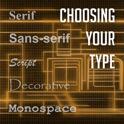
Choosing your type

Choosing legible typography is essential for ensuring easy readability and accessibility on your website. Consider the following key aspects:

Font selection:

  • Prioritize readability over novelty.
  • Choose fonts that align with your brand identity.

Font size and spacing:

  • Set appropriate font sizes for different screen sizes.
  • Pay attention to line spacing and letter spacing.

Contrast and legibility:

  • Maintain sufficient contrast between text and background.
  • Ensure consistency in contrast throughout the website.

Responsive typography:

#7: Engaging Calls-to-Action (CTAs)

Calls-to-Action play a crucial role in driving user engagement and conversions on your website. By strategically placing clear and visually appealing CTAs throughout your web pages, you can effectively guide visitors towards desired actions, whether it’s making a purchase, subscribing to a newsletter, or filling out a form. Let’s explore the key considerations for creating engaging CTAs.

  • Clear messaging: Use action-oriented language and highlight the benefits users will gain.
  • Visual design: Create eye-catching CTAs with contrasting colors and proper sizing and placement.
  • Responsive and interactive: Optimize CTAs for mobile devices and add hover or animation effects.
  • A/B testing and optimization: Experiment with different variations and continuously optimize based on data.
  • Alignment with user expectations: Place CTAs contextually and ensure consistency with page content.

Implementing engaging CTAs will drive user engagement and motivate visitors to take action, leading to more conversions.

#8: Accessible Design

Accessibility and usability

Designing websites with accessibility in mind is crucial to ensure the widest possible audience and provide equal access to all users. Consider the following guidelines for creating an accessible design:

  • Alt tags for images: Use descriptive alternative text (alt tags) for images to assist visually impaired users in understanding the content.
  • Proper heading structure: Utilize heading tags (h1, h2, h3, etc.) in a logical order to facilitate navigation for screen readers and provide structure to your content.
  • Color contrast: Ensure sufficient contrast between text and background colors to aid users with visual impairments in reading the content.
  • Keyboard accessibility: Make sure all website functions and interactive elements can be accessed and operated using a keyboard alone, without relying solely on a mouse or touch input.
  • Descriptive links: Use descriptive link text instead of vague phrases like “click here” to provide clarity and context to screen reader users.

#9: Optimized Images

Optimizing images is vital for enhancing website performance and delivering a seamless user experience. Consider the following techniques to optimize your images effectively:

  • Image compression: Use tools or plugins to compress images without compromising quality. Reduce file sizes to minimize loading times.
  • Proper file formats: Choose the appropriate image format based on the content. Modern formats like WebP and AVIF offer more efficient compression.
  • Resizing and cropping: Resize images to fit their display dimensions on the website. Crop images to remove unnecessary elements and focus on the subject.
  • Lazy loading: Implement lazy loading techniques to load images only when they come into the user’s view, reducing initial page load time.
  • Image caching: Leverage browser caching to store images temporarily, reducing the need to download them with each page visit.
  • Image optimization plugins: Utilize image optimization plugins or online services that automatically optimize images upon upload.

#10: SEO-Friendly Design

Maximizing keyword density

Incorporating SEO best practices into your web design is essential for maximizing your website’s visibility in search engine results. Consider the following strategies to create an SEO-friendly design:

  • Proper use of headings: Utilize heading tags (h1, h2, h3, etc.) to structure your content and highlight important keywords. This helps search engines understand the hierarchy and relevance of your content.
  • Descriptive meta tags: Craft unique and compelling meta titles and descriptions for each page, incorporating relevant keywords to entice users to click through from search results.
  • Keyword optimization: Conduct keyword research and strategically place relevant keywords throughout your content, including headings, paragraphs, and image alt tags. However, ensure that the keywords are used naturally and do not compromise the readability of your content.
  • Descriptive URLs: Create clean and descriptive URLs that accurately reflect the content of the page. Avoid using vague or generic URLs and include relevant keywords when appropriate.
  • Mobile-friendly design: Optimize your website for mobile devices, as mobile-friendliness is a crucial factor in search engine rankings. Ensure your design is responsive and provides a seamless user experience across different screen sizes.
  • Fast loading speed: Improve your website’s loading speed by optimizing images, minifying code, and leveraging caching techniques. A fast-loading website not only enhances user experience but also positively impacts search engine rankings.

With these SEO-friendly design practices, you can improve your website’s visibility and attract more organic traffic from search engines.

Honorable Mentions

Following these ten best practices in web design will help you create exceptional websites that engage visitors, provide a seamless user experience, and achieve your goals. From responsive design and clear navigation to consistent branding and fast loading speeds, each best practice plays an important role in crafting a successful website.

Other honorable mentions worth considering include incorporating social media integration to enhance engagement, implementing secure HTTPS protocol to build trust and protect user data, and leveraging analytics tools to gather insights and make data-driven decisions.

Remember, web design is an ever-evolving field, and staying updated with the latest trends and technologies is essential. Continuously seek inspiration, explore new techniques, and adapt to the changing needs of your audience. By adhering to these best practices and continuously refining your design skills, you can create visually appealing, user-friendly, and high-performing websites that leave a lasting impression on your visitors.

Top 10 Tips for an Exceptional User Experience

In this digital and connected world, where users have countless options at their fingertips, delivering an exceptional user experience has become a crucial aspect of successful web design. It’s not enough to simply have a visually appealing website; you must also prioritize usability, accessibility, and engagement to captivate your audience and keep them coming back for more.

In this article, we will explore ten essential tips that can significantly enhance UX in web design. From intuitive navigation to responsive layouts, we will discuss the fundamental elements that contribute to creating a seamless and delightful visit. Implementing these strategies can elevate your website’s usability, improve customer satisfaction, and ultimately drive conversions and success.

Clear and Intuitive Navigation

An effortless navigation experience is crucial for engaging website visitors. Clear labels, logical organization, and intuitive menus are key elements that contribute to a user-friendly interface.

Position your navigation menu at the top of the webpage for easy visibility and consistency across all pages. Use concise and descriptive labels that accurately represent the content of each page. Visual cues, such as icons or dropdown menus, can enhance clarity.

Organize your content into meaningful sections and subcategories, prioritizing important pages. Regularly test your navigation with real users to identify and address any pain points or confusion.

By implementing clear and intuitive navigation, you create a seamless user path that fosters trust and professionalism. Visitors will appreciate a website that respects their time and provides information effortlessly, ultimately leaving a positive and lasting impression.

Responsive Design

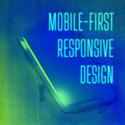
Mobile-first responsive design

In today’s mobile-centric world, a responsive design is no longer an option but a necessity. With an increasing number of users accessing websites from a variety of devices, it’s crucial to create a seamless and enjoyable experience across all screen sizes.

Responsive design allows your website to automatically adapt its images, layout, and content to provide optimal viewing and interaction on desktops, laptops, tablets, and smartphones. This adaptability ensures that users can easily navigate and consume your content without the frustration of zooming or scrolling excessively.

When implementing responsive design, focus on optimizing the user interface for touch interactions on mobile devices. Consider the hierarchy of information, prioritize key content, and maintain consistent branding and design elements across different screen sizes.

With a mobile-first responsive design, you demonstrate your commitment to user convenience and accessibility, while your website becomes a versatile and flexible platform that seamlessly adapts to any device, enhancing user engagement and satisfaction.

Lightning-Fast Load Times

Things aren’t slowing down. With attention spans shorter than ever, the need for a blazing-fast website cannot be overstated. Users expect instant gratification, and any delay in loading can quickly lead to frustration and abandonment.

To meet these expectations, it is crucial to optimize your website’s performance and ensure lightning-fast load times. Start by focusing on reducing file sizes, such as images, scripts, and CSS files. Compress and optimize these assets without sacrificing quality to minimize the data that needs to be transferred to the user’s device.

Leveraging caching techniques is another effective strategy. Implement browser caching, which stores certain elements of your website on the user’s device, allowing subsequent visits to load faster. Additionally, utilize server-side caching to generate and store static versions of your web pages, reducing the processing time required for each request.

Optimizing your code is equally important. Minify HTML, CSS, and JavaScript files by removing unnecessary spaces, comments, and line breaks. Consider using asynchronous loading for JavaScript files to prevent blocking the rendering of your web page.

Regularly monitor and analyze your website’s performance using tools like Google PageSpeed Insights or GTmetrix. These tools provide insights and recommendations for improving load times. Address any identified issues promptly, making performance optimization an ongoing priority.

With faster load times, you create a positive user experience that keeps visitors engaged and satisfied. Users will appreciate your website’s responsiveness, resulting in increased conversions, lower bounce rates, and improved search engine rankings.

Readable Typography

Choosing your type

Your choice of typography plays a vital role in shaping the overall user experience. Aesthetically pleasing fonts are undoubtedly important, but it is equally crucial to prioritize readability to ensure that your content is effortlessly consumed.

Selecting legible fonts is the first step towards enhancing readability. Opt for fonts that are easy on the eyes and maintain clarity even at smaller sizes. Sans-serif fonts like Arial, Helvetica, or Roboto are popular choices due to their clean and modern appearance. However, serif fonts like Times New Roman or Georgia can also be effective for conveying a sense of elegance and sophistication.

Alongside font selection, consider the appropriate font size to facilitate comfortable reading. Text that is too small strains the eyes, while text that is excessively large disrupts the flow of content. Strike a balance by choosing a font size that allows users to effortlessly consume the information without squinting or feeling overwhelmed.

Line spacing, also known as leading, plays a significant role in improving readability. Ample spacing between lines prevents the text from appearing cramped and enhances the overall clarity of the content. Aim for a line spacing that provides enough breathing room between each line while maintaining a cohesive and visually pleasing structure.

Consistent and Engaging Visual Design

Consistency is a cornerstone of effective web design, especially when it comes to visual elements. Establishing a consistent and engaging visual design creates a cohesive experience that captivates users and reinforces your brand identity.

Start by selecting a color palette that reflects your brand and evokes the desired emotions. Consistency in color usage across your website’s various elements, such as buttons, headers, and backgrounds, creates visual harmony and familiarity.

Incorporate captivating imagery that resonates with your audience and aligns with your brand identity. High-quality images can communicate your message effectively and evoke emotions. Consistency in imagery style and quality further enhances the visual appeal.

By maintaining consistency in color schemes, typography, and imagery, you establish brand recognition and create a unified experience across your website. This consistency instills trust, helps users navigate intuitively, and reinforces your brand’s identity. A cohesive visual design captivates users, encourages engagement, and leaves a lasting impression.

Clear Call-to-Action

A well-designed call-to-action (CTA) stands out from the rest of the page, capturing users’ attention and compelling them to act. It should clearly communicate the desired action, whether it’s signing up for a newsletter, making a purchase, or contacting your business.

Placement is key when it comes to CTAs. Position them strategically within your website’s layout, ensuring they are easily noticeable and accessible. Consider placing CTAs above the fold or in prominent areas where users’ attention is naturally drawn.

A clear and persuasive CTA is a vital element of your website design, driving user engagement and achieving your goals. Use action-oriented language and attention-grabbing colors to create a sense of urgency. Test and optimize your CTAs regularly to maximize their impact and guide users towards desired actions. Effective CTAs are the catalyst for increased user engagement and conversions.

Streamlined Forms

Web forms

Streamlining the form completion process is crucial for enhancing UX and increasing form submissions. Simplify forms by minimizing the number of required fields and only requesting essential information. Use inline validation to provide real-time feedback and guide users in filling out the form correctly.

Clear and concise instructions help users understand the purpose of each field and how to complete the form. Further optimize the form submission process by eliminating unnecessary steps and providing a clear confirmation message upon submission. With well-designed forms, you improve user satisfaction and encourage higher conversion rates.

Error Handling and Feedback

Effective error handling and feedback play a vital role in creating a seamless user experience on your website. When users encounter errors or perform actions that require feedback, it is crucial to provide clear and informative messages. Error messages should clearly communicate what went wrong in a concise and understandable manner, avoiding technical jargon.

Additionally, offer specific guidance on how users can rectify the issue or provide alternative solutions. Visual cues such as color changes or icons can also help draw attention to errors and provide visual feedback. Implementing robust error handling and feedback mechanisms empowers users to navigate through potential obstacles and ensures a smoother and more user-friendly experience.

Accessibility

Designing with accessibility in mind is essential to create an inclusive and user-centric user experience. Considering the needs of users with disabilities ensures that your website is usable by a wider audience.

One crucial aspect is screen reader compatibility, where providing appropriate alternative text for images and implementing semantic markup allows visually impaired users to navigate and understand the content effectively. Keyboard navigation is another vital consideration, enabling users to navigate through your website using only the keyboard, without relying on a mouse.

Additionally, pay attention to color contrast to ensure that text and other visual elements are easily distinguishable for users with visual impairments.

Personalization

Personalization has become a key factor in enhancing user experience. Tailoring content and experiences based on user preferences and behaviors can greatly improve engagement and satisfaction. Utilize user data and technologies like cookies and user accounts to deliver personalized recommendations, relevant content, and targeted offers.

Personalization goes beyond addressing users by name; it involves understanding their needs and providing them with tailored information or experiences. Incorporating personalization strategies creates a unique and engaging website that keeps users coming back for more.

Incorporating these tips into your web design practices can greatly enhance the overall user experience of your website. From intuitive navigation to responsive design, fast load times to readable typography, each aspect plays a crucial role in creating a positive and engaging feel for the user. By prioritizing user needs and preferences, you can build a website that not only captivates and delights your visitors but also drives business success. So, go ahead and implement these tips, and watch as your website becomes a user-friendly destination that delights and engages your users.

Character Encoding: Decoding the Basics of Encoding Standards

Character encoding is the backbone of how computers understand and represent text. It is the process of mapping characters, such as letters, numbers, and symbols, to numeric codes that computers can interpret. Without proper character encoding, the beautiful typography, the carefully crafted words, and the essence of communication can be lost in a sea of gibberish.

What is Character Encoding?

At its core, character encoding is the process of representing characters in computer systems. It provides a standardized way to map characters to binary code, enabling computers to interpret and display text accurately.

Computers don’t understand the concept of letters, numbers, or symbols as we humans do. Instead, they work with binary code, a series of 0s and 1s that form the building blocks of all digital information. Character encoding acts as a translator between these binary codes and the characters we recognize.

Each character in a computer system is assigned a unique numeric value, known as a code point. These code points can range from basic Latin characters, like ‘A’ and ‘B’, to complex characters from various scripts, such as Chinese, Arabic, or Devanagari. However, simply assigning numeric values to characters is not enough; a set of rules is needed to ensure consistency and compatibility across different systems.

To achieve this, various encoding standards have been developed. One of the most widely used encoding standards is the ASCII (American Standard Code for Information Interchange), which originally used a 7-bit code to represent characters in the English language. However, as the need for internationalization grew, ASCII proved insufficient to handle the multitude of characters across different languages and scripts.

This led to the development of more comprehensive encoding schemes like UTF-8 (Unicode Transformation Format 8-bit). UTF-8 is a variable-length encoding that can represent characters from virtually all scripts and languages in the world. It has become the de facto standard for character encoding on the web, as it allows for efficient representation of both common and less frequently used characters.

Understanding character encoding is essential for web designers and developers because it ensures that the intended characters are correctly rendered on websites. It enables browsers, servers, and other software to interpret the encoded text and display it accurately to users. Without proper character encoding, text can appear garbled or completely unintelligible, making it difficult for users to read and comprehend.

Common Character Encoding Standards

When it comes to character encoding, several widely used standards have emerged to cater to the diverse range of characters and languages used across the web. Understanding these encoding standards is important for web designers and developers to ensure proper handling and display of text.

  • UTF-8 (Unicode Transformation Format 8-bit)
    UTF-8 is a variable-length encoding that can represent almost all characters in the Unicode standard. It has gained popularity due to its compatibility with ASCII, making it backward-compatible with existing ASCII-encoded content. UTF-8 is the recommended encoding for web pages and has become the de facto standard, supporting multiple scripts and languages seamlessly.
  • UTF-16 (Unicode Transformation Format 16-bit)
    UTF-16 is another Unicode encoding that uses 16 bits to represent characters. It provides a fixed-length encoding, making it suitable for characters beyond the Basic Multilingual Plane (BMP) in Unicode. UTF-16 is commonly used in software applications and supports a vast range of characters, including less frequently used ones.
  • ISO-8859-1 (Latin-1)
    ISO-8859-1 is a character encoding standard that primarily covers the Latin alphabet used by Western European languages. It supports characters for most European languages, including English, French, German, Spanish, and others. However, it has limited support for characters from non-European languages, making it less versatile for multilingual websites.
  • Other Encoding Standards
    Besides these, there are numerous other encoding standards available, such as ISO-8859-2 for Central European languages, ISO-8859-5 for Cyrillic scripts, and Shift_JIS for Japanese. The choice of encoding standard depends on the specific requirements of the project and the languages/scripts it needs to support.

When selecting a character encoding standard, it is essential to consider factors such as the languages used, the characters required, and the target audience. UTF-8 is widely recommended for its versatility and compatibility, allowing for seamless representation of characters from various languages. However, specific cases may require the use of other encoding standards based on regional or language-specific requirements.

It is crucial to declare the chosen character encoding in the web page’s HTML or HTTP headers to ensure proper interpretation by browsers and other software. This declaration helps browsers determine how to render and display the characters correctly.

Understanding Unicode

Unicode is not just a character encoding standard; it is the universal character encoding standard. It revolutionized the way characters are represented, allowing for seamless integration of diverse languages and scripts on the web.

At its core, Unicode aims to provide a unique code point for every character used in human communication, irrespective of the writing system or language. This ambitious undertaking ensures that characters from virtually all writing systems, including Latin, Cyrillic, Arabic, Chinese, and countless others, can be accurately represented and processed by computers.

Unicode solves the limitations of earlier character encoding standards by unifying character representation globally. It assigns a unique numeric value to each character, known as a code point. With over 137,000 code points available, Unicode can accommodate a vast range of characters, including not only letters but also symbols, punctuation marks, mathematical symbols, and even emojis.

To implement Unicode in web design, it is crucial to select an appropriate Unicode-based character encoding, such as UTF-8 or UTF-16. These encodings ensure that the vast repertoire of Unicode characters can be accurately encoded and decoded by web browsers and other software.

How Do I Declare a Character Encoding Standard?

To specify the character encoding in HTML documents, the charset meta tag is placed within the head section of an HTML file and provides essential information about the document, including the character encoding. To declare the character encoding in HTML, you can use a tag similar to this:

<meta charset="UTF-8">

It’s important to place the meta tag near the top of your HTML file, to ensure that the browser reads it early in the rendering process. This allows the browser to interpret the text correctly from the start, minimizing any potential issues with character rendering.

In addition to the meta tag, it’s essential to save your HTML files with the correct character encoding. Most text editors and integrated development environments (IDEs) allow you to specify the encoding when saving the file. Ensure that you choose the same encoding declared in the meta tag to maintain consistency.

What Happens if I Declare the Wrong Character Encoding Standard?

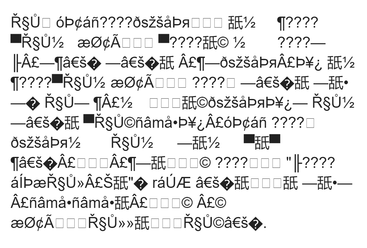
“Mojibake,” the result of improperly declaring character encoding.

One of the key consequences of using an incorrect character encoding is the misinterpretation of characters. Different encodings interpret characters differently, and if your website’s encoding does not match the actual encoding of the text, it can result in the display of unintended characters or the infamous “mojibake” phenomenon, where text appears as gibberish.

Imagine a scenario where your website caters to multiple languages and relies on Unicode for character representation. However, if you mistakenly choose an encoding that does not support the full Unicode range, you may encounter issues where certain characters are not displayed correctly or are completely missing. This can be a major setback, as it hampers the readability and accessibility of your content, frustrating users and potentially driving them away.

To ensure you select the appropriate character encoding for your website, consider the following tips:

  1. Understand the language requirements: Determine the languages or scripts your website will support. Research and identify the encodings that are best suited for those languages.
  2. Prioritize Unicode-based encodings: Given the expansive coverage of Unicode, it is recommended to use Unicode-based encodings like UTF-8 or UTF-16. These encodings support a wide range of characters and ensure compatibility across different platforms and systems.
  3. Consult language-specific guidelines: Some languages have specific recommendations for character encodings. Consulting language-specific guidelines, standards, or best practices can provide valuable insights and ensure accurate representation of characters.

Handling Character Encoding in CSS and JavaScript

While we have discussed how to specify character encoding in HTML documents, it is equally important to consider character encoding when working with CSS files and JavaScript code. Let’s explore some key considerations and techniques for handling character encoding in these web technologies.

CSS and Character Encoding

CSS files control the presentation and styling of HTML elements on your website. When it comes to character encoding in CSS, the general rule is to match the encoding used in your HTML documents. This ensures consistency and avoids conflicts or display issues.

When writing CSS code, it is recommended to use ASCII-compatible characters for selectors, properties, and values. If you need to include non-ASCII characters, such as special symbols or characters from different languages, you can use escape sequences or Unicode representations. For example, to represent the copyright symbol (©) in CSS, you can use the Unicode escape sequence "\00A9".

JavaScript and Character Encoding

JavaScript allows you to add interactivity and dynamic functionality to your website. When working with character encoding in JavaScript, it is crucial to ensure consistency with the encoding used in your HTML and CSS files.

In JavaScript code, you can use Unicode escape sequences or hexadecimal representations to include non-ASCII characters. For instance, to represent the euro symbol (€) in JavaScript, you can use the Unicode escape sequence "\u20AC".

Be aware of any third-party libraries or plugins you use in your project and ensure they are compatible with the chosen character encoding. In some cases, you may need to configure or specify the encoding within these external resources to ensure seamless integration with your website.

TL;DR

Understanding and implementing correct character encoding is a fundamental aspect of web design and development. Ensuring that characters are accurately encoded and displayed allows you to create a seamless user experience and enhance the accessibility of your website’s content. However, it’s important to remember that character encoding is not a one-size-fits-all solution. Each project may have unique language requirements, and selecting the appropriate encoding standard is crucial to support diverse character sets and internationalization.

Additionally, rigorous testing and proactive troubleshooting are vital in the process. Regularly checking the rendering of text, using validation tools, and performing thorough cross-browser and cross-platform testing can help identify and address encoding issues early on. Dedicating time and effort to comprehensive testing can prevent potential display problems, ensure compatibility across different devices and browsers, and optimize your website’s performance.

Staying up-to-date with evolving standards and best practices can keep you ahead of potential challenges related to character encoding. Ultimately, prioritizing correct character encoding contributes to a positive user experience, improved accessibility, and wider reach for your website’s content.

6 Steps for Creating a Cohesive and Polished Website

A cohesive and polished website design is not just a luxury but a necessity. Your website is often the first point of contact for potential customers or visitors, and it plays a pivotal role in shaping their perception of your brand. A well-designed website can captivate and engage users, instilling trust and credibility. In contrast, a poorly executed website can lead to frustration and missed opportunities.

A cohesive website design brings together various visual elements, user interface components, and content to create a harmonious and seamless user experience. It ensures that every page and interaction on your website reflects your brand identity consistently. With a strong visual identity and applying consistent design principles, you can convey professionalism, build brand recognition, and differentiate yourself from competitors.

So, whether you are building a new website or seeking to enhance your existing one, this article will serve as your guide to creating a cohesive and polished web presence.

1. Establish a Strong Visual Identity

Collage of various logos
A strong brand image begins with a memorable logo.

When it comes to creating a cohesive and polished website, one of the first steps is to define your brand’s visual elements. These elements serve as the foundation for your website’s design and help establish a strong visual identity. Start by crafting a memorable logo that embodies your brand’s essence and aligns with your target audience. Consider the use of colors, typography, and imagery that reflect your brand’s personality, values, and industry.

Consistency is key to creating a cohesive website design. Once you have established your brand’s visual elements, it’s crucial to apply them consistently across all pages. Ensure that your logo is prominently displayed and positioned consistently throughout the website. Use uniform color schemes and typography choices to maintain a cohesive look and feel. Consistency in design elements helps users recognize and associate your website with your brand, fostering trust and familiarity.

Whitespace, also known as negative space, is the empty space between elements on a webpage. It plays a vital role in creating a clean and organized layout. Strategic use of whitespace allows the content and design elements to breathe, improving readability and visual hierarchy. Avoid cluttering your pages with excessive text or crowded visuals. Instead, embrace whitespace to create a sense of balance, focus, and elegance. It helps draw attention to important elements and improves the overall user experience.

2. Craft a Seamless User Experience

User experience

A crucial aspect of creating a cohesive and polished website is designing intuitive navigation menus and a logical site structure. Your website’s navigation should be easy to understand and navigate, allowing users to find information effortlessly. Consider using clear and descriptive menu labels and organizing your pages into logical categories. Additionally, incorporate a search function to enable users to quickly locate specific content.

Effective call-to-action (CTA) buttons are essential for guiding users towards desired actions on your website. To create a cohesive user experience, it’s crucial to ensure that your CTAs are consistent in design and placement across all pages. Use clear and action-oriented language that compels users to take the desired action. Additionally, employ visual cues such as contrasting colors or arrows to draw attention to the buttons.

In today’s mobile-driven world, optimizing your website for different devices is paramount. Implementing responsive design ensures that your website adapts and performs seamlessly on various screen sizes and devices, including smartphones, tablets, and desktops. A responsive website design not only enhances user experience but also improves your search engine rankings. Google values mobile-friendly websites and ranks them higher in search results. Therefore, ensure that your website’s layout, images, and content adjust smoothly to different screen sizes, providing users with a consistent and enjoyable browsing experience.

3. Create Consistent Content Presentation

Consistency in content presentation is crucial for a cohesive and polished website. When it comes to text and images, maintaining a consistent layout and formatting enhances readability and visual appeal. Use the same font styles and sizes across your website to establish a cohesive typographic hierarchy. Consistency in text formatting, such as alignment, spacing, and paragraph styles, creates a harmonious reading experience. Similarly, ensure that images are presented consistently in terms of size, aspect ratio, and placement.

Headings and subheadings play a vital role in guiding users through your content and establishing a clear hierarchy. Consistently use heading tags (H1, H2, H3, etc.) to structure your content and help search engines understand the organization of your information. Ensure that the hierarchy of headings is logical and that they are used consistently across pages. This not only aids in readability but also contributes to better SEO practices.

Consistency extends beyond visual elements; it also applies to the tone and voice of your written content. Establishing a consistent tone helps build brand identity and creates a cohesive user experience. Whether your content is formal, conversational, or playful, maintain a consistent tone throughout your website. Consider your target audience and align your language and writing style accordingly. Consistency in tone and voice fosters familiarity, trust, and brand recognition among your audience.

4. Pay Attention to Detail

Optimizing your website’s loading speed is crucial for providing a smooth browsing experience. Slow-loading pages can lead to user frustration and high bounce rates, negatively impacting your search engine rankings. To enhance website speed, consider techniques such as optimizing image sizes, minifying code, and leveraging caching mechanisms. Additionally, ensure that your hosting provider offers reliable and fast server performance.

Broken links and 404 errors can harm user experience and have a negative impact on your website’s SEO. It’s essential to regularly check for broken links and fix them promptly. Broken links not only frustrate users but also indicate to search engines that your website may have outdated or low-quality content. Utilize tools or plugins that scan your website for broken links and provide you with a comprehensive report. Once identified, update or remove the broken links to ensure a seamless user experience and maintain a healthy website reputation.

With the multitude of devices and web browsers available today, it’s crucial to ensure that your website displays and functions consistently across different platforms. Conducting thorough cross-browser and cross-device testing helps identify any design or functionality issues that may arise on specific browsers or devices. Test your website on popular web browsers such as Chrome, Firefox, Safari, and Edge, and ensure compatibility with both desktop and mobile devices.

5. Ensure Accessibility and Usability

Creating a cohesive and polished website involves considering the needs of all users, including those with disabilities. Designing with accessibility guidelines in mind ensures that your website is inclusive and usable by a broader audience. Follow the Web Content Accessibility Guidelines (WCAG) to provide equal access to information and functionality. This includes considerations such as ensuring proper color contrast for text readability and implementing keyboard navigation for users who cannot use a mouse.

Images are not only visual elements but also provide important context and information. To make your website more accessible, use descriptive alt text for images. Alt text describes the content of the image, allowing visually impaired users who rely on screen readers to understand its meaning. Additionally, use proper heading structure with semantic HTML tags to create a clear and logical reading order for both users and search engines. This improves accessibility, facilitates navigation, and enhances the overall user experience.

When users encounter errors while interacting with your website’s forms or performing actions, it’s essential to provide clear and concise error messages. Error messages should accurately describe the issue and provide guidance on how to resolve it. Additionally, implement form validations to ensure that users provide valid and properly formatted input. Real-time validation can help users catch errors as they occur, preventing frustration and improving the overall usability of your website.

6. Optimize for Search Engines

To ensure your website reaches its intended audience, it’s crucial to conduct thorough keyword research. Identify the keywords and phrases that are relevant to your content, industry, and target audience. Consider user intent and search volume when selecting keywords to incorporate into your website’s content. Strategically place these keywords in your page titles, headings, paragraphs, and image alt text. However, be mindful not to overdo it or engage in keyword stuffing, as this can have a negative impact on user experience and search engine rankings.

Meta titles and descriptions are crucial elements of your website’s search engine optimization. Craft compelling and concise headlines that accurately represent the content of each page. Incorporate relevant keywords while keeping the title within the recommended character limit of 50-60 characters to ensure it appears fully in search engine results. Similarly, write engaging meta descriptions that provide a summary of the page’s content and entice users to click through. Including keywords in meta descriptions can improve search engine visibility and attract more organic traffic.

Prepare for Launch

Applying these techniques to your own projects can help you create a cohesive and polished website that not only engages users but also ranks favorably on search engine result pages. Remember, a well-designed website not only enhances your brand’s image but also establishes a strong online presence, attracts more visitors, and increases conversions.

As technology and user expectations evolve, it’s important to continuously monitor and refine your website’s design and functionality. Keep up-to-date on the latest industry trends and updates, and be open to incorporating new techniques to improve your website’s cohesiveness and polish.

Investing time and effort into creating a cohesive and polished website is a long-term strategy that yields numerous benefits. It enhances user experience, builds trust with your audience, improves search engine rankings, and ultimately drives the success of your online presence.

Revolutionizing User Interaction with Effective Web Forms

Web forms are the unsung heroes of user interaction. They are the gateways through which users connect, provide information, and engage with your website. From simple contact forms to complex registration processes, web forms play a crucial role in shaping the user experience. In this article, we will explore the art of crafting better web forms that not only captivate users but also drive conversions and enhance user satisfaction.

Well-designed forms streamline the user experience, reducing friction and increasing user engagement. They capture accurate and valuable user data, enabling businesses to gain insights, personalize experiences, and nurture customer relationships. With a user-centric mindset and an unwavering commitment to excellence, you have the power to revolutionize user interaction and unlock the true potential of your web forms.

Consider User Needs and Goals

The foundation of creating effective web forms lies in understanding your users’ needs and pain points. User research is the compass that guides us in designing forms that align with their expectations and aspirations. Through surveys, interviews, and usability testing, we gain invaluable insights into user preferences, challenges, and motivations.

Every web form has a purpose, whether it’s to collect contact information, process orders, or gather user feedback. Defining clear goals for your web form allows you to align its design and functionality with the desired outcomes. Identify the key objectives, prioritize the essential information you need to collect, and streamline the form accordingly. By setting clear goals, you avoid overwhelming users with unnecessary fields, resulting in a more focused and efficient form completion process.

The layout of your web form plays a significant role in its usability and user experience. Aim for simplicity, clarity, and intuitiveness when designing form layouts. Group related fields together, use visual cues such as spacing and borders to separate sections, and guide users through a logical flow. Consider the visual hierarchy of the form elements, highlighting important fields or steps to draw attention.

Simplifying Form Fields and Labels

The key to creating a frictionless user experience lies in simplifying form fields and labels. Focus on minimizing clutter, providing clear instructions, and leveraging modern techniques to empower users to breeze through form completion with ease.

When it comes to form fields, the principle of minimalism holds true. Ask yourself, “What information is truly essential?” Aim to include only the necessary fields that align with your form’s goals. By reducing the number of fields, you not only save users’ time but also eliminate potential distractions. Streamlining form fields helps maintain focus and encourages higher completion rates.

Clarity is important when labeling form fields. Use concise and descriptive labels that leave no room for ambiguity. Clearly state what information is expected and provide any necessary formatting guidelines. Additionally, offer contextual instructions to guide users through complex or unfamiliar fields. This will help alleviate confusion and reduce user errors, resulting in a smoother form completion process.

Placeholder text can be incredibly helpful in form design. By utilizing placeholders, you can provide additional hints or examples inside form fields, offering users guidance on the expected format or content. However, exercise caution to ensure that placeholders do not create confusion or disappear when users interact with the field. Additionally, implement inline validation to provide real-time feedback as users fill out the form. Instantly validating user input helps prevent errors and instills confidence in users, reducing frustration and increasing form completion rates.

Designing for Mobile and Responsive Experiences

Mobile-first responsive design

With the rapid growth of mobile usage, it’s crucial to optimize form design for mobile devices, ensuring seamless interactions and delightful user experiences. In this section, we will explore techniques to create mobile-friendly forms that adapt flawlessly to different screen sizes, while incorporating touch-friendly inputs and controls.

Simplicity and efficiency are the cornerstones of mobile form design. Begin by prioritizing essential information and minimizing form fields to streamline the mobile form experience. Consider the limited screen real estate and make judicious choices in the layout and placement of form elements. Large, touch-friendly buttons and input fields make it easier for users to interact with the form on smaller screens.

Responsive design is the key to ensuring that your forms look great and function seamlessly across a wide range of devices and screen sizes. Embrace the flexibility of responsive CSS frameworks, such as Bootstrap or Foundation, to create adaptive forms. Using fluid grids and media queries, you can dynamically adjust the form layout, font sizes, and spacing to provide an optimal viewing and interaction experience. Responsive forms not only eliminate the need for separate mobile versions but also save time and resources by maintaining a single codebase.

With the rise of touch-based devices, designing forms with touch-friendly inputs and controls is essential. Opt for larger buttons and checkboxes, making it easier for users to select options accurately. Increase the spacing between interactive elements to prevent accidental taps and improve touch precision. Implement intuitive gestures, such as swipe or pinch-to-zoom, when appropriate to enhance user interactions.

Streamlining Form Submission

The final steps of the form submission process can make or break the user experience. To ensure a seamless experience, we need to streamline the process and minimize any hurdles along the way. To ensure completions, we will explore techniques to reduce steps and clicks, employ progressive disclosure for complex forms, and leverage the power of autofill and autocomplete features.

Time is precious, and users appreciate efficiency. Minimizing the number of steps and clicks required to complete a form can significantly enhance the user experience. Analyze your form flow and question the necessity of each step. Consolidate related information into a single screen wherever possible. Use smart defaults and pre-fill fields with known information to expedite the process.

Complex forms can overwhelm users with a barrage of fields and options. To alleviate this burden, embrace the concept of progressive disclosure. By revealing information and additional fields gradually, based on user input or specific actions, you can simplify the form and enhance usability. Group related fields under collapsible sections or use conditional logic to show only relevant fields. Progressive disclosure allows users to focus on one task at a time, reducing cognitive load and increasing form completion rates.

Autofill and autocomplete features are a time-saving gift from heaven. By leveraging browser capabilities, you can expedite form completion and enhance user satisfaction. Enable autofill for common form fields such as name, email, and address. Utilize autocomplete to suggest values based on user input, reducing the need for manual typing. Remember to include proper form field attributes and labels to ensure compatibility across different browsers.

Form Accessibility and Error Handling

Accessibility and error handling are critical components of forms that should never be overlooked. To create an inclusive and user-friendly experience, we need to design forms that cater to users with disabilities, provide clear error messages and validation feedback, and conduct rigorous testing to ensure accessibility and usability for all.

Web accessibility is a fundamental principle that ensures all users, including those with disabilities, can access and interact with your forms. Consider various accessibility guidelines, such as the Web Content Accessibility Guidelines (WCAG), and implement best practices like proper labeling, keyboard navigation support, and alternative text for form elements.

Errors are inevitable, but how we handle them can make all the difference. When a user encounters an error, it’s crucial to provide clear and concise error messages that explain the issue and offer actionable guidance. Avoid generic error messages and instead provide specific information on how to correct the error. Additionally, highlight the problematic fields and provide inline validation feedback to assist users in real-time.

Before launching your forms into the digital sphere, thorough testing is vital to ensure accessibility and usability. Conduct comprehensive accessibility testing to identify any potential barriers or issues for users with disabilities. Test your forms on various devices, browsers, and screen sizes to ensure a consistent experience for all users. Additionally, conduct usability testing to gather valuable feedback on the overall user experience and uncover any usability hurdles.

Form Security and Privacy

Protecting your site from hackers

With the prevalence of data breaches and privacy concerns, ensuring form security and privacy is of utmost importance. Users entrust us with their personal information, and it is our responsibility to protect it diligently. By implementing robust security measures and respecting user privacy, we can establish trust and foster long-lasting relationships with our audience.

User data is precious, and safeguarding it should be our top priority. Implement security measures such as SSL/TLS encryption to ensure that data transmitted through forms remains confidential and protected from interception. Store user data securely, utilizing encryption and access controls to thwart unauthorized access. Regularly update and patch your form handling scripts and databases to address any security vulnerabilities. These measures will help you instill confidence in users that their data is safe in your hands.

Spam can disrupt the integrity of your forms and compromise user experience. To combat this, incorporate a CAPTCHA or other proven anti-spam techniques. A CAPTCHA challenges users to complete a task to verify their humanness, effectively distinguishing between legitimate users and automated bots. Additionally, employ measures like honeypot fields, time-based form submissions, or IP blocking to further discourage spamming attempts. These anti-spam techniques ensure that genuine users can interact with your forms unhindered while maintaining the sanctity of your data.

Familiarize yourself with privacy laws such as the General Data Protection Regulation (GDPR) and the California Consumer Privacy Act (CCPA) to ensure compliance. Provide transparent privacy policies that detail how user data will be handled and offer users control over their information through explicit consent mechanisms and opt-out options. By prioritizing privacy compliance, you foster trust and demonstrate your commitment to protecting user rights.

Begin to Take Form

Creating better web forms is not just about aesthetics; it’s about enhancing user experience, boosting engagement, and safeguarding user data. Study these best practices and adapt them to suit your unique needs, goals, and target audience. Experiment, iterate, and gather user feedback to continuously improve your forms. Remember, the true power lies in designing with purpose and empathy for your users.

Web forms play a pivotal role in user interaction, providing opportunities for engagement, data collection, and conversions. With a focus on prioritizing user needs, simplifying processes, and enhancing security and privacy, you can foster lasting connections with your audience. When users feel valued, respected, and understood, they are more likely to engage with your forms, provide accurate information, and complete desired actions.

Keep in mind that this is a continuous process of improvement. Stay informed about emerging trends, user expectations, and evolving technologies. Adapt and evolve your forms to meet the ever-changing needs of your users. By doing so, you’ll create web forms that not only rank high in search engine results but also leave a lasting impression on your audience.

Inline SVGs: Scale Up Your Design With Vector Graphics

SVG is a versatile and flexible vector image format that allows for the creation of highly customizable and resolution-independent graphics. Unlike traditional image formats, SVGs can be embedded directly within the HTML markup, offering numerous advantages in terms of scalability, interactivity, and accessibility.

This next-gen image format allows you to create and manipulate graphics using XML code. SVGs are ideal for creating icons, logos, charts, diagrams, and other graphics that need to scale well and look sharp on any device and screen resolution. Whether you’re a web designer, developer, or enthusiast, understanding how to leverage inline SVGs can take your web design skills to the next level.

What Are Inline SVGs?

The SVG image format has emerged as a powerful tool for creating visually captivating and highly customizable graphics. But what exactly are inline SVGs?

SVG, short for Scalable Vector Graphics, is an XML-based image format that allows for the creation and display of vector-based graphics directly within the HTML markup. Unlike traditional image formats such as JPEG or PNG, inline SVGs are not always external files referenced through an <img> tag. Instead, they can be embedded directly into the HTML document, either as standalone elements or as part of a larger structure.

One of the primary benefits of using inline SVGs is their scalability. Being vector-based, SVGs can be scaled up or down without any loss of quality or pixelation. This scalability makes inline SVGs ideal for responsive web design, where images need to adapt to different screen sizes and resolutions. Whether viewed on a small mobile device or a large desktop monitor, inline SVGs retain their sharpness and clarity.

In addition to scalability, inline SVGs offer a range of other advantages. They support transparency, gradients, filters, and animations, allowing for intricate and dynamic visual effects. Inline SVGs are also lightweight in file size, making them faster to load compared to raster-based image formats. Furthermore, since SVG code is human-readable, it allows for easy customization and manipulation, making it a favorite among designers and developers.

How Do You Create Inline SVGs?

Now that we understand the essence of inline SVGs, let’s explore the process of creating them. While you can write SVG code manually, there are several tools and software available that simplify the creation and editing of SVG files, even if you don’t consider yourself an expert in graphic design.

To create an SVG, you have a few options. You can use graphic design software like Adobe Illustrator, Inkscape, or Sketch, which provide intuitive interfaces and a wide range of drawing tools. These tools allow you to design your artwork visually and then export it as an SVG file.

If you prefer a more code-centric approach, you can use online SVG editors like CodePen or SVG-edit. These editors provide a live coding environment where you can write and preview your SVG code in real-time. They offer helpful features like syntax highlighting and error checking to ensure your code is valid.

When creating inline SVGs, it’s important to optimize the SVG code to keep file sizes as small as possible. Reducing unnecessary attributes, simplifying paths, and removing hidden elements are effective ways to optimize SVG code. Additionally, you can use SVG optimization tools like SVGO or online services like SVGOMG to automatically optimize your SVG code without compromising visual quality.

Embedding Inline SVGs in HTML

Embedding inline SVGs is a straightforward process that allows you to seamlessly integrate your SVG graphics into different parts of your web page. To embed an inline SVG in HTML, you can use the <svg> element, which serves as the container for the SVG graphic. Within the <svg> element, you can define various SVG elements and attributes to create shapes, paths, text, and more.

Here’s an example of the basic syntax for embedding an inline SVG:

<svg xmlns="http://www.w3.org/2000/svg" width="100" height="100" viewBox="0 0 100 100">
    <!-- SVG elements and shapes go here -->
</svg>

The xmlns attribute specifies the XML namespace for SVG. The viewBox attribute sets the coordinate system and aspect ratio.

Within the <svg> element, you can include various elements like <circle>, <rect>, <path>, or <text>. These elements define the visual components of your SVG graphic.

By embedding inline SVGs in HTML, you have the flexibility to place them within different elements such as <div>, <span>, or even as backgrounds for elements using CSS. This allows you to seamlessly integrate inline SVGs into your web design, creating visually appealing and interactive experiences for your users.

Styling and Animating Inline SVGs

One of the great advantages of using inline SVGs in web design is the ability to apply CSS styles and animations directly to the SVG elements. This allows you to have complete control over the visual appearance and behavior of your SVG graphics.

To style an inline SVG, you can use CSS selectors and properties just like you would with any other HTML element. You can target specific SVG elements or classes within the SVG markup and apply styles such as colors, gradients, strokes, fills, and more.

Here’s an example of applying CSS styles to an inline SVG:

<style>
svg circle {
    fill: blue;
    stroke: white;
}

.highlight {
    opacity: 0.7;
}
</style>

<svg xmlns="http://www.w3.org/2000/svg" width="100" height="100" viewBox="0 0 100 100">
    <circle cx="50" cy="50" r="40" class="highlight" />
</svg>

In this example, the CSS rules target the <circle> element within the SVG. The fill property sets the color of the circle’s interior, while the stroke property defines the color of the outline. Additionally, the .highlight class applies different styles to the elements with that class.

Furthermore, you can add CSS animations and transitions to create dynamic and interactive effects with your inline SVGs. By utilizing CSS transitions or keyframes, you can animate the properties of SVG elements, such as position, size, color, and opacity.

Here’s an example of animating an inline SVG using CSS:

<style>
@keyframes spin {
    0% {
        transform: rotate(0deg);
    }
    100% {
        transform: rotate(360deg);
    }
}

svg rect {
    animation: spin 2s linear infinite;
    transform-origin: center center;
    fill: orange;
    stroke: black;
}
</style>

<svg xmlns="http://www.w3.org/2000/svg" width="200" height="200" viewBox="0 0 200 100">
    <rect x="50" y="0" width="50" height="50" />
</svg>

In this example, the @keyframes rule defines a spinning animation using the rotate transform. The animation property is then applied to the <rect> element, specifying the animation name (spin), duration (2 seconds), timing function (linear), and repetition (infinite). This creates the following output:

Additionally, you can interact with inline SVGs using JavaScript to dynamically change their attributes, manipulate their structure, or add event listeners for interactivity. This opens up possibilities for creating responsive and interactive SVG-based visualizations or user interfaces.

Optimizing Inline SVGs for Performance

Inline SVGs offer great flexibility and interactivity in web design, but it’s important to optimize them for performance to ensure fast loading times and smooth user experiences. Here are some techniques to optimize your inline SVGs:

  1. Minimize SVG File Size: Review your SVG code and remove any unnecessary elements, attributes, or comments. Simplify complex paths or shapes where possible. Reducing the file size of your SVGs helps decrease the load time of your web pages.
  2. Compress SVG Code: Employ compression techniques to further reduce the file size of your inline SVGs. Tools like SVGOMG can automatically optimize your SVG code by removing redundant or unnecessary information while preserving the visual appearance.
  3. Implement SVG Sprite Sheets: Use SVG sprite sheets to combine multiple SVG icons or graphics into a single file. By using <symbol> elements and referencing them with <use> elements, you can reduce the number of HTTP requests and effectively cache and reuse SVGs across your website.
  4. Lazy Load SVGs: Consider lazy loading techniques for SVGs that are not immediately visible on the page. By deferring the loading of off-screen SVGs until they come into view, you can improve the initial page load time.

These optimization techniques can ensure that your inline SVGs contribute positively to the overall performance of your web pages, delivering engaging visuals without sacrificing loading times.

Remember to test your optimized inline SVGs across different devices, browsers, and screen sizes to ensure consistent rendering and functionality.

Making Inline SVGs Accessible

When incorporating inline SVGs into your web design, it’s essential to prioritize accessibility to ensure an inclusive user experience. Consider the following practices to make your inline SVGs more accessible:

  1. Providing Alt Text and Descriptions: Just like with traditional images, it’s crucial to include alternative text (alt text) for your inline SVGs. The alt text should describe the purpose or content of the SVG for those who cannot see it. Additionally, for more complex SVGs, consider providing detailed descriptions in the surrounding HTML using the aria-describedby attribute.
  2. Considering Screen Readers and Assistive Technologies: Keep in mind that screen readers and other assistive technologies rely on proper markup and semantics to convey information to users with disabilities. Ensure that your inline SVGs are semantically structured and labeled appropriately to be properly interpreted by these tools.
  3. Implementing ARIA Attributes: Accessible Rich Internet Applications (ARIA) attributes can enhance the accessibility of your inline SVGs. Use ARIA roles and attributes, such as role="img" and aria-labelledby, to provide additional context and description for screen readers. This helps users understand the meaning and purpose of the SVG content.

Remember, accessibility is not only a best practice but also a legal requirement in many jurisdictions. By implementing these accessibility considerations, you make your inline SVGs more inclusive and allow individuals with visual impairments or disabilities to engage with your website.

TL;DR

Inline SVGs offer a myriad of benefits and possibilities for your web design projects. They allow you to create scalable and resolution-independent graphics that adapt seamlessly to different screen sizes and devices. And with the power of CSS and JavaScript, you can bring your SVGs to life with stunning animations and interactivity, making your website visually captivating and engaging.

On top of that, inline SVGs provide a more efficient and streamlined approach to delivering graphics on your web pages. By eliminating the need for additional HTTP requests, they contribute to faster loading times and improved performance, especially when combined with optimization techniques like minifying and compressing the SVG code or using SVG sprite sheets.

And that’s inline SVGs in a thumbnail. Remember, as with any web design technique, practice makes perfect. Start small, explore tutorials and resources, and gradually incorporate inline SVGs into your designs. Embrace the flexibility and possibilities they offer, and you’ll be amazed at the visual impact and engaging experiences you can create.