Cascading Style Sheets (CSS) is a fundamental technology of web design. It is used to define the presentation of a web page, including colors, fonts, layout, and more. With the introduction of CSS3, web designers have gained access to a wealth of new tools and features that allow for more creative and efficient designs, while greatly improving page load speeds. Read on to explore some of the things you can do with CSS3 that used to require heavy images or complex JavaScript.
Gradient Backgrounds
CSS3 makes it possible to create gradient backgrounds with just a few lines of code. This means that designers no longer need to use large images to achieve gradient effects. Using the “background-image” and “linear-gradient” properties, designers can create smooth and stylish gradient backgrounds that are customizable and responsive.
Rounded Corners
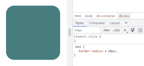
Previously, rounded corners could only be achieved with multiple images and complex table layouts, but CSS3 now allows designers to create rounded corners with a single property. The “border-radius” property allows designers to easily add rounded corners to any element, from containers to buttons and images and more.
Box Shadows
Box shadows are a popular design element that used to require images or JavaScript to achieve. With CSS3, designers can create box shadows with the “box-shadow” property. This property allows designers to add shadows to elements such as boxes, buttons, and images, creating a subtle and stylish effect.
Animations
CSS3 allows designers to create animations without the need for JavaScript or Adobe Flash. The “animation” property allows designers to define keyframes that specify the animation’s behavior, including timing, duration, and style. This makes it possible to create animated elements such as looping animations, hover effects, and more, all with pure CSS.
Transitions
CSS transitions are another popular design element that can now be achieved with CSS3. The “transition” property allows designers to specify the transition effect between two states of an element, such as changing its color or opacity. This makes it possible to create subtle and smooth state changes that enhance the user experience.
Custom Fonts
Not long ago, custom fonts on the web meant typing your text into a graphics editor and saving it as an image. True text was limited to the standard fonts that come with a user’s computer or device. The “@font-face” rule changes that. With a simple style sheet, designers can specify custom fonts to be used on their website, giving them more flexibility and creative control over typography.
So Much More
In addition to these exciting and useful features, CSS3 has many other tools that allow designers to create more dynamic and visually appealing web designs. Here are just a few other things you can do with CSS3:
- Flexbox Layout: Flexbox is a new layout mode introduced in CSS3 that allows designers to create complex layouts with ease. With the “display: flex” property, designers can create responsive layouts that adjust to different screen sizes and orientations. Flexbox is particularly useful for creating layouts with dynamic content, such as image galleries, product listings, and more.
- Media Queries: CSS3 introduced media queries, which allow designers to specify different styles for different screen sizes and orientations. With CSS media queries, designers can create responsive designs that adapt to different devices, from desktop computers to smartphones and tablets. This allows designers to create a consistent user experience across all devices.
- Transformations: CSS3 allows designers to transform elements on their web pages with the “transform” property. This property can be used to rotate, scale, skew, and translate elements, creating dynamic and engaging effects. Transformations can be applied to a wide range of elements, from images to text and more.
- Filters: CSS filters are a powerful tool that allow designers to apply visual effects to HTML elements. Designers can apply effects such as grayscale, sepia, blur, and more, without the need for additional images or JavaScript. This makes it easy for designers to create dynamic and engaging visual effects.
- Custom Properties: CSS custom properties, also known as CSS variables, allow designers to define reusable values in their CSS code. This can make it easier to maintain a consistent design across a website by allowing designers to use the same values in multiple places without having to update each instance individually. Custom properties also make it easier to change the values of a design element, as the variable can be updated in one place and the change will be reflected across the entire website. This can save time and reduce the likelihood of errors and inconsistencies in the design process.
We’ve come a long way since the early days of web design! CSS3 has revolutionized web design by providing designers with new a range of new tools and features that eliminate the need for images, JavaScript, or slow and insecure plug-in’s. With CSS3, designers can create gradients, rounded corners, shadows, and animations with just a few lines of code. This makes it easier and more efficient to create beautiful and responsive web designs that enhance the user experience. By staying up-to-date with the latest CSS3 trends and techniques, designers can take their web design skills to the next level and create truly exceptional web designs.