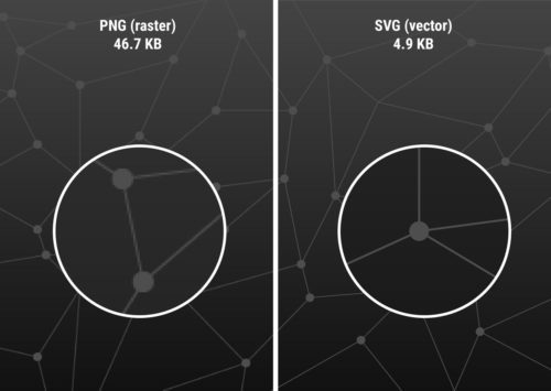
SVG is a versatile and flexible vector image format that allows for the creation of highly customizable and resolution-independent graphics. Unlike traditional image formats, SVGs can be embedded directly within the HTML markup, offering numerous advantages in terms of scalability, interactivity, and accessibility.
This next-gen image format allows you to create and manipulate graphics using XML code. SVGs are ideal for creating icons, logos, charts, diagrams, and other graphics that need to scale well and look sharp on any device and screen resolution. Whether you’re a web designer, developer, or enthusiast, understanding how to leverage inline SVGs can take your web design skills to the next level.
What Are Inline SVGs?
The SVG image format has emerged as a powerful tool for creating visually captivating and highly customizable graphics. But what exactly are inline SVGs?
SVG, short for Scalable Vector Graphics, is an XML-based image format that allows for the creation and display of vector-based graphics directly within the HTML markup. Unlike traditional image formats such as JPEG or PNG, inline SVGs are not always external files referenced through an <img> tag. Instead, they can be embedded directly into the HTML document, either as standalone elements or as part of a larger structure.
One of the primary benefits of using inline SVGs is their scalability. Being vector-based, SVGs can be scaled up or down without any loss of quality or pixelation. This scalability makes inline SVGs ideal for responsive web design, where images need to adapt to different screen sizes and resolutions. Whether viewed on a small mobile device or a large desktop monitor, inline SVGs retain their sharpness and clarity.
In addition to scalability, inline SVGs offer a range of other advantages. They support transparency, gradients, filters, and animations, allowing for intricate and dynamic visual effects. Inline SVGs are also lightweight in file size, making them faster to load compared to raster-based image formats. Furthermore, since SVG code is human-readable, it allows for easy customization and manipulation, making it a favorite among designers and developers.
How Do You Create Inline SVGs?
Now that we understand the essence of inline SVGs, let’s explore the process of creating them. While you can write SVG code manually, there are several tools and software available that simplify the creation and editing of SVG files, even if you don’t consider yourself an expert in graphic design.
To create an SVG, you have a few options. You can use graphic design software like Adobe Illustrator, Inkscape, or Sketch, which provide intuitive interfaces and a wide range of drawing tools. These tools allow you to design your artwork visually and then export it as an SVG file.
If you prefer a more code-centric approach, you can use online SVG editors like CodePen or SVG-edit. These editors provide a live coding environment where you can write and preview your SVG code in real-time. They offer helpful features like syntax highlighting and error checking to ensure your code is valid.
When creating inline SVGs, it’s important to optimize the SVG code to keep file sizes as small as possible. Reducing unnecessary attributes, simplifying paths, and removing hidden elements are effective ways to optimize SVG code. Additionally, you can use SVG optimization tools like SVGO or online services like SVGOMG to automatically optimize your SVG code without compromising visual quality.
Embedding Inline SVGs in HTML
Embedding inline SVGs is a straightforward process that allows you to seamlessly integrate your SVG graphics into different parts of your web page. To embed an inline SVG in HTML, you can use the <svg> element, which serves as the container for the SVG graphic. Within the <svg> element, you can define various SVG elements and attributes to create shapes, paths, text, and more.
Here’s an example of the basic syntax for embedding an inline SVG:
<svg xmlns="http://www.w3.org/2000/svg" width="100" height="100" viewBox="0 0 100 100">
    <!-- SVG elements and shapes go here -->
</svg>
The xmlns attribute specifies the XML namespace for SVG. The viewBox attribute sets the coordinate system and aspect ratio.
Within the <svg> element, you can include various elements like <circle>, <rect>, <path>, or <text>. These elements define the visual components of your SVG graphic.
By embedding inline SVGs in HTML, you have the flexibility to place them within different elements such as <div>, <span>, or even as backgrounds for elements using CSS. This allows you to seamlessly integrate inline SVGs into your web design, creating visually appealing and interactive experiences for your users.
Styling and Animating Inline SVGs
One of the great advantages of using inline SVGs in web design is the ability to apply CSS styles and animations directly to the SVG elements. This allows you to have complete control over the visual appearance and behavior of your SVG graphics.
To style an inline SVG, you can use CSS selectors and properties just like you would with any other HTML element. You can target specific SVG elements or classes within the SVG markup and apply styles such as colors, gradients, strokes, fills, and more.
Here’s an example of applying CSS styles to an inline SVG:
<style>
svg circle {
    fill: blue;
    stroke: white;
}

.highlight {
    opacity: 0.7;
}
</style>

<svg xmlns="http://www.w3.org/2000/svg" width="100" height="100" viewBox="0 0 100 100">
    <circle cx="50" cy="50" r="40" class="highlight" />
</svg>
In this example, the CSS rules target the <circle> element within the SVG. The fill property sets the color of the circle’s interior, while the stroke property defines the color of the outline. Additionally, the .highlight class applies different styles to the elements with that class.
Furthermore, you can add CSS animations and transitions to create dynamic and interactive effects with your inline SVGs. By utilizing CSS transitions or keyframes, you can animate the properties of SVG elements, such as position, size, color, and opacity.
Here’s an example of animating an inline SVG using CSS:
<style>
@keyframes spin {
    0% {
        transform: rotate(0deg);
    }
    100% {
        transform: rotate(360deg);
    }
}

svg rect {
    animation: spin 2s linear infinite;
    transform-origin: center center;
    fill: orange;
    stroke: black;
}
</style>

<svg xmlns="http://www.w3.org/2000/svg" width="200" height="200" viewBox="0 0 200 100">
    <rect x="50" y="0" width="50" height="50" />
</svg>
In this example, the @keyframes rule defines a spinning animation using the rotate transform. The animation property is then applied to the <rect> element, specifying the animation name (spin), duration (2 seconds), timing function (linear), and repetition (infinite). This creates the following output:
Additionally, you can interact with inline SVGs using JavaScript to dynamically change their attributes, manipulate their structure, or add event listeners for interactivity. This opens up possibilities for creating responsive and interactive SVG-based visualizations or user interfaces.
Optimizing Inline SVGs for Performance
Inline SVGs offer great flexibility and interactivity in web design, but it’s important to optimize them for performance to ensure fast loading times and smooth user experiences. Here are some techniques to optimize your inline SVGs:
- Minimize SVG File Size: Review your SVG code and remove any unnecessary elements, attributes, or comments. Simplify complex paths or shapes where possible. Reducing the file size of your SVGs helps decrease the load time of your web pages.
- Compress SVG Code: Employ compression techniques to further reduce the file size of your inline SVGs. Tools like SVGOMG can automatically optimize your SVG code by removing redundant or unnecessary information while preserving the visual appearance.
- Implement SVG Sprite Sheets: Use SVG sprite sheets to combine multiple SVG icons or graphics into a single file. By using
<symbol>elements and referencing them with<use>elements, you can reduce the number of HTTP requests and effectively cache and reuse SVGs across your website. - Lazy Load SVGs: Consider lazy loading techniques for SVGs that are not immediately visible on the page. By deferring the loading of off-screen SVGs until they come into view, you can improve the initial page load time.
These optimization techniques can ensure that your inline SVGs contribute positively to the overall performance of your web pages, delivering engaging visuals without sacrificing loading times.
Remember to test your optimized inline SVGs across different devices, browsers, and screen sizes to ensure consistent rendering and functionality.
Making Inline SVGs Accessible
When incorporating inline SVGs into your web design, it’s essential to prioritize accessibility to ensure an inclusive user experience. Consider the following practices to make your inline SVGs more accessible:
- Providing Alt Text and Descriptions: Just like with traditional images, it’s crucial to include alternative text (alt text) for your inline SVGs. The alt text should describe the purpose or content of the SVG for those who cannot see it. Additionally, for more complex SVGs, consider providing detailed descriptions in the surrounding HTML using the aria-describedby attribute.
- Considering Screen Readers and Assistive Technologies: Keep in mind that screen readers and other assistive technologies rely on proper markup and semantics to convey information to users with disabilities. Ensure that your inline SVGs are semantically structured and labeled appropriately to be properly interpreted by these tools.
- Implementing ARIA Attributes: Accessible Rich Internet Applications (ARIA) attributes can enhance the accessibility of your inline SVGs. Use ARIA roles and attributes, such as
role="img"andaria-labelledby, to provide additional context and description for screen readers. This helps users understand the meaning and purpose of the SVG content.
Remember, accessibility is not only a best practice but also a legal requirement in many jurisdictions. By implementing these accessibility considerations, you make your inline SVGs more inclusive and allow individuals with visual impairments or disabilities to engage with your website.
TL;DR
Inline SVGs offer a myriad of benefits and possibilities for your web design projects. They allow you to create scalable and resolution-independent graphics that adapt seamlessly to different screen sizes and devices. And with the power of CSS and JavaScript, you can bring your SVGs to life with stunning animations and interactivity, making your website visually captivating and engaging.
On top of that, inline SVGs provide a more efficient and streamlined approach to delivering graphics on your web pages. By eliminating the need for additional HTTP requests, they contribute to faster loading times and improved performance, especially when combined with optimization techniques like minifying and compressing the SVG code or using SVG sprite sheets.
And that’s inline SVGs in a thumbnail. Remember, as with any web design technique, practice makes perfect. Start small, explore tutorials and resources, and gradually incorporate inline SVGs into your designs. Embrace the flexibility and possibilities they offer, and you’ll be amazed at the visual impact and engaging experiences you can create.


