
Imagine walking into a library where all the books are stacked in one giant heap. Chaos, right? That’s what a website without well-styled lists feels like. Lists are the librarians of web design, organizing content and guiding users through the maze of information. For creating clear navigation paths or breaking down complex ideas into bite-sized nuggets, lists are essential for a seamless and enjoyable user experience.
Think about it: lists help break down information into digestible chunks, making it easier for users to scan and find what they’re looking for. Navigation menus rely on lists to create a coherent and intuitive structure, ensuring that visitors can effortlessly explore your site.
Basics of HTML Lists
Before we dive into the wonders of CSS, let’s start with the first “order” of business. There are three main types of lists you need to know:
- Unordered Lists (
<ul>): Think of these as the bullet points of your website. They’re perfect for items that don’t need a specific order. - Ordered Lists (
<ol>): Use these when you need to count your items or show them in a specific sequence. Think top ten lists, step-by-step instructions, or rankings. - Definition Lists (
<dl>): These are like the glossary section of your website. Use them for terms and their corresponding definitions, making your content more organized and easy to understand.
See what we did there? We used a list to organize the types of lists!
Now let’s take a look at some basic HTML code for each type of list:
Unordered List (<ul>):
<ul>
  <li>Item 1</li>
  <li>Item 2</li>
  <li>Item 3</li>
</ul>
Ordered List (<ol>):
<ol>
  <li>First item</li>
  <li>Second item</li>
  <li>Third item</li>
</ol>
Definition List (<dl>):
<dl>
  <dt>Term 1</dt>
  <dd>Definition for term 1</dd>
  <dt>Term 2</dt>
  <dd>Definition for term 2</dd>
</dl>
Default Styling
By default, HTML lists come with a few built-in styles that can be, well, a bit basic.
- Unordered Lists (
<ul>): Items are marked with bullet points. - Ordered Lists (
<ol>): Items are numbered, typically with Arabic numerals (1, 2, 3, …). - Definition Lists (
<dl>): Terms (<dt>) are typically bolded, while definitions (<dd>) are indented.
These default styles are functional, but they’re not exactly jaw-dropping. That’s where CSS comes in! With a few styling tricks, you can transform these lists from plain to dazzling. Ready to give your lists a makeover? Let’s get started!
Basic CSS for Lists
First things first: we need to learn how to target our list elements with CSS selectors. You can target lists and their items using their HTML tags (ul, ol, li) or by using classes and IDs for more specific styling.
Here’s a quick primer on how to select your list elements:
ul {
  /* Styles for all unordered lists */
}

ol {
  /* Styles for all ordered lists */
}

li {
  /* Styles for all list items */
}

/* Targeting with a class */
ul.fancy-list {
  /* Styles for unordered lists with the class 'fancy-list' */
}
The default styles might not always fit your design vision. If you’d like a reset, here’s how to remove default list styles:
ul,
ol {
  list-style-type: none; /* Remove bullets and numbers */
  padding: 0; /* Remove padding */
  margin: 0; /* Remove margin */
}
Customizing List Markers
CSS offers a variety of list-style-type values that can add some flair to your lists. Let’s explore the options:
- disc: The default solid circle.
- circle: An empty circle.
- square: A solid square.
- decimal: Numbers, perfect for ordered lists.
- lower-alpha: Lowercase letters (a, b, c…).
- upper-roman: Uppercase Roman numerals (I, II, III…).
You can play around with these styles to match your design needs. Here’s an example of how you can apply them:
ul {
  list-style-type: square;
}

ol {
  list-style-type: lower-alpha;
}
Custom List Markers
Want to really impress your visitors? Let’s ditch the standard markers and use custom images or icons instead. You can achieve this with list-style-image or the ::before pseudo-element.
Using list-style-image:
ul.custom-image {
  list-style-image: url('path/to/your/image.png');
}
Using ::before Pseudo-element:
ul.custom-icon li::before {
  content: url('path/to/your/icon.png');
  margin-right: 10px; /* Add some space between the icon and the text */
}
Advanced Styling Techniques
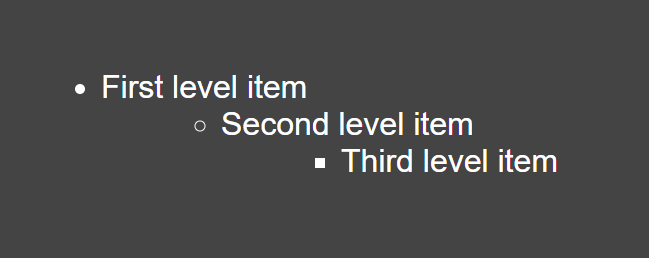
Nested Lists
Nested lists are like the Russian dolls of web design—there’s always another list within. But without proper styling, they can become an unreadable mess. Let’s enhance their readability and make them visually appealing.
ul {
  list-style-type: disc;
}

ul ul {
  list-style-type: circle;
  margin-left: 20px; /* Indent nested lists */
}

ul ul ul {
  list-style-type: square;
  margin-left: 20px; /* Further indent for deeper nesting */
}
<!-- HTML example of a nested list -->
<ul>
<li>First level item
<ul>
<li>Second level item
<ul>
<li>Third level item</li>
</ul>
</li>
</ul>
</li>
</ul>With this CSS, each level of the nested list gets its own marker style and indentation, making it easier for users to follow the hierarchy.
Hover Effects
Adding hover effects to list items can make your website more interactive and engaging. A simple change in color or background can go a long way in enhancing user experience.
ul.hover-effects li {
  transition: background-color 0.3s ease; /* Smooth transition */
}

ul.hover-effects li:hover {
  background-color: #f0f0f0; /* Light grey background on hover */
}
<!-- HTML example for hover effects -->
<ul class="hover-effects">
<li>Hover over me!</li>
<li>Me too!</li>
<li>Don't forget me!</li>
</ul>With these hover effects, your lists will respond to user interaction, making your site feel more dynamic and alive.
Conclusion
Well, we’ve come full circle—or should I say, disc?
Now that you’re armed with all these tricks, it’s time to unleash your creativity. Experiment with different styles, colors, and markers. Try out new hover effects and custom icons. The sky’s the limit! And remember, there’s no one-size-fits-all in web design. So, mix and match until you find the perfect fit for your project.