Responsive Images: Optimizing Web Design With Adaptive Visuals

Have you ever visited a website on your smartphone and found that the images were either too small, too large, or cropped in a weird way? If so, you have encountered a website that does not use responsive images. Responsive images are images that adjust to different screen sizes, resolutions, positions, and other factors. They are essential for creating websites that work well on devices with widely differing screen sizes, resolutions, and other such features.

In this dynamic world where devices come in various sizes and resolutions, incorporating responsive images has become essential. Ensuring that images adapt seamlessly to different screens is not only crucial for a visually appealing website but also for optimal user experience. In this article, we will explore the concept of responsive images and delve into the techniques and best practices for effectively using them in web design. Whether you’re a seasoned developer or just starting with responsive web design, this guide will equip you with the knowledge to create visually stunning and high-performing websites.

Understanding Responsive Images

Responsive images refer to the practice of optimizing and delivering images that adapt fluidly to different viewport sizes, ensuring they look visually appealing and load efficiently across devices.

To comprehend the significance of responsive images, it’s essential to understand the challenges they address. When a non-responsive image is displayed on a smaller screen, it often appears oversized and can cause layout issues or disrupt the overall user experience. Additionally, non-optimized images can significantly impact page load speed, leading to frustrated users and potential loss of visitors.

The impact of images on page load speed cannot be underestimated. Large, unoptimized images can drastically slow down a website’s performance, leading to increased bounce rates and diminished user engagement. Therefore, optimizing images for responsive design involves not only selecting the appropriate format but also minimizing file sizes through compression techniques and employing responsive image solutions.

However, creating responsive images is not as simple as it sounds. There are several challenges that web designers and developers need to overcome, such as:

  • The art direction problem: This is the problem of displaying different cropped images for different layouts, depending on what part of the image is relevant for each device. For example, a header image that shows a group of people may need to be cropped differently for a mobile device than for a desktop device, so that the faces of the people are still visible.
  • The bandwidth problem: This is the problem of serving different image sizes for different devices, depending on their screen resolution and network speed. For example, a high-resolution image that looks sharp on a 2x display may be too large and slow to load on a 1x display or on a slow network.

Fortunately, there are some tools and techniques that can help us create responsive images using HTML and CSS. In this article, we will explore how to use features like srcset and the picture element to implement responsive image solutions on websites. We will also look at how to use vector graphics as an alternative to raster graphics for responsive images that can scale without losing quality.

Implementing Responsive Images in HTML and CSS

To bring responsive images to life in your web design, you’ll need to understand the HTML and CSS techniques that enable their seamless integration. By using the appropriate HTML markup and CSS rules, you can ensure that your images adapt flawlessly to various screen sizes and resolutions.

CSS media queries play a significant role in adjusting image size and resolution based on the viewport dimensions. By defining specific CSS rules within different media query breakpoints, images can be resized proportionally to fit the available space. For example, you can use the “max-width” property to set a maximum image width and ensure that it scales down proportionally as the viewport size decreases. By combining media queries with CSS properties like “max-width,” “width,” and “height,” web designers can create fluid and adaptive image layouts.

The “srcset” attribute is another valuable tool for delivering responsive images. It allows you to provide multiple image sources and resolutions, enabling the browser to select the most appropriate version based on the device’s capabilities. With the “srcset” attribute, you can include different image files with varying resolutions, sizes, and formats. The browser then selects the most suitable image to display, optimizing both the image quality and page load speed. This attribute is particularly beneficial for devices with high-resolution screens like Retina displays, where crisp and clear images are essential.

Additionally, the “sizes” attribute complements the “srcset” attribute by specifying image sizes based on viewport breakpoints. By using the “sizes” attribute, you can indicate the image’s display size relative to the viewport width. This information helps the browser determine the appropriate image source from the “srcset” based on the available space. The “sizes” attribute uses a syntax that includes media queries and descriptors, allowing you to define different image sizes for specific viewport ranges. This flexibility ensures that images adapt precisely to different screen sizes and resolutions.

To put this into practice, we can use the “srcset” attribute directly on the “img” element to provide multiple image sources with their respective resolutions. Additionally, you can use the “sizes” attribute to specify the image’s display size relative to the viewport width. This combination allows the browser to select the most appropriate image based on the available space.

Here’s an example of how the “img” element can be used with the “srcset” and “sizes” attributes:

<img src="image-default.jpg" srcset="image-small.jpg 480w, image-medium.jpg 768w, image-large.jpg 1200w" sizes="(max-width: 768px) 100vw, 1200px" alt="Image Illustration">

In the example above, we have defined different image sources and specified that the image should occupy 100% of the viewport width for screens up to 768 pixels wide and use a fixed width of 1200 pixels for larger screens.

A more modern option for implementing responsive images is the “picture” element. It provides a flexible and powerful way to define multiple sources for an image based on different conditions. Within the “picture” element, you can specify different “source” elements, each with its own “srcset” and “media” attributes. The “srcset” attribute lists the image sources with their respective resolutions and formats, while the “media” attribute defines the media query conditions for each source. This allows the browser to choose the most suitable image based on the viewport size and other specified criteria. To ensure compatibility with older browsers, it’s important to include a fallback “img” element within the “picture” element that specifies a default image source using the “src” attribute.

Here’s an example of how the “picture” element can be used to implement responsive images:

<picture>
    <source srcset="image-small.jpg" media="(max-width: 480px)">
    <source srcset="image-medium.jpg" media="(max-width: 768px)">
    <source srcset="image-large.jpg" media="(min-width: 769px)">
    <img src="image-default.jpg" alt="Image Illustration">
</picture>

In the example above, we define three different image sources with their respective “srcset” attributes and associated media queries. The browser will choose the appropriate image source based on the viewport width. If none of the media queries match, the “img” element’s source specified by the “src” attribute will be used as a fallback.

To complement the HTML markup, CSS plays a crucial role in setting up breakpoints and media queries for different screen sizes. By using CSS media queries, you can define specific styles for various viewport ranges, ensuring that your images adapt elegantly to each scenario. For example, you might adjust the image size, alignment, or visibility based on the viewport width.

@media (max-width: 480px) {
    /* CSS rules for small screens */
}

@media (max-width: 768px) {
    /* CSS rules for medium screens */
}

@media (min-width: 769px) {
    /* CSS rules for large screens */
}

Here we have defined CSS rules for different screen sizes using media queries. Within each media query block, you can apply specific styles to your images or other elements as needed. By combining HTML markup with the appropriate CSS rules, you can create responsive images that adapt beautifully to various devices and screen sizes.

Image Optimization for Responsiveness

Achieving optimal image performance is a critical aspect of creating responsive web designs. As images play a significant role in both visual appeal and page load speed, it’s essential to implement effective image optimization techniques. By reducing file sizes without compromising quality, web designers can ensure that responsive images load swiftly across devices while maintaining their visual integrity.

One of the primary techniques for optimizing image file sizes is compression. Image compression reduces the file size by eliminating unnecessary data while preserving the image’s visual quality. There are two types of compression: lossy and lossless. Lossy compression selectively discards data, resulting in a smaller file size but a slight reduction in image quality. Lossless compression, on the other hand, reduces the file size without sacrificing quality, making it ideal for images where visual fidelity is crucial.

To enhance image optimization further, leveraging modern image formats can significantly impact file sizes and performance. Formats like WebP and AVIF offer superior compression capabilities compared to traditional formats like JPEG and PNG. WebP, developed by Google, provides impressive compression ratios while maintaining high image quality. AVIF (AV1 Image File Format), based on the AV1 video codec, delivers even better compression efficiency. By adopting these modern formats, web designers can reduce file sizes significantly without sacrificing image clarity.

Fortunately, there are numerous tools and plugins available that streamline the image optimization process. These tools automate compression and conversion tasks, making it easier to optimize images for responsiveness. Popular tools like ImageOptim, Kraken.io, and TinyPNG offer user-friendly interfaces and batch processing capabilities, allowing you to optimize multiple images simultaneously. Content delivery networks (CDNs) and caching plugins also play a vital role in optimizing image delivery, ensuring that responsive images are served efficiently to users.

Best Practices for Responsive Images

To ensure an optimal user experience and efficient performance, it’s important to follow best practices when designing responsive images. By considering image resolutions, loading optimizations, and the specific needs of different devices, you can create responsive designs that deliver fast-loading, visually appealing content across various screen sizes.

  • Selecting Appropriate Image Resolutions and Sizes
    When choosing images for your responsive design, consider the resolution and pixel density needed for each device. Provide different image versions for different breakpoints to ensure sharp and clear visuals on all devices. Use high-resolution images for high-density displays and optimize file sizes to balance quality and performance.
  • Optimizing Image Loading
    Load times play a crucial role in user experience, particularly on mobile devices with limited bandwidth. Implement techniques such as lazy loading, which delays the loading of off-screen images until they are about to be viewed. This approach reduces initial page load times and improves performance. Additionally, leverage modern image formats like WebP or AVIF, which provide better compression and smaller file sizes compared to traditional formats like JPEG or PNG. Use responsive image optimization tools or plugins to automatically generate and serve appropriate image formats based on the user’s device capabilities.
  • Considering Needs of Different Devices
    Each device has unique characteristics and display capabilities that should be considered when designing responsive images. For mobile devices, focus on optimizing image sizes to ensure fast loading and minimize data consumption. Consider the impact of network conditions and prioritize essential visual content for smaller screens. For desktop and larger screens, provide higher-resolution images to take advantage of the available screen real estate. Use CSS media queries to define breakpoints and adjust image sizes and resolutions accordingly. Tailor the visual experience to each device category while maintaining consistency in branding and design.

These best practices can help you create responsive image designs that enhance user experience, improve performance, and adapt seamlessly to different devices. Remember to test your designs across various devices and network conditions to ensure optimal results.

Give It A Try

Responsive images are a crucial component of modern web design, allowing websites to adapt seamlessly to different devices and screen sizes. By implementing responsive image techniques, you can deliver an enhanced user experience, improve page load times, and optimize your website for search engine visibility.

By incorporating these techniques and adhering to best practices, you can ensure a visually appealing and seamless browsing experience for your users across a variety of devices. Responsive images not only enhance user satisfaction but also contribute to improved search engine rankings, as search engines prioritize websites that provide a responsive and mobile-friendly experience.

Embracing responsive image design is essential for staying ahead in the ever-evolving digital landscape. By optimizing image display, loading times, and accessibility, you can create engaging websites that captivate users and drive meaningful interactions. Start implementing responsive image techniques today to unlock the full potential of your web design and provide a superior user experience.
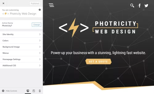
Converting an HTML Page to a WordPress Theme

Are you looking to take your website development skills to the next level and build your own WordPress theme? If you’ve already created an HTML prototype page, you’re halfway there! In this guide, we will walk you through the process of converting your static HTML prototype into a fully functional and customizable WordPress theme. By harnessing the flexibility and extensibility of WordPress, you’ll be able to create stunning and dynamic websites with ease. Whether you’re a seasoned developer or just starting out, this article will provide you with the knowledge and tools to craft your very own WordPress theme. Get ready to embark on an exciting journey where your HTML prototype evolves into a powerful and engaging website powered by WordPress.

Understanding the Structure of a WordPress Theme

To successfully transform your HTML prototype into a WordPress theme, it’s essential to grasp the structure and components of a WordPress theme to be able to organize your code effectively and leverage the full potential of WordPress.

Basic Components of a WordPress Theme:
At its core, a WordPress theme is build with PHP and consists of various files and directories that define the layout, design, and functionality of your website. The key components include:

  • style.css: This file holds the essential information about your theme, such as its name, author, version, as well as visual styling.
  • index.php: Serving as the main template file, it controls the overall structure of your theme.
  • header.php and footer.php: These files contain the header and footer sections of your theme, providing consistency across multiple pages.
  • functions.php: This file allows you to add custom functions and modify the default behavior of your theme.

File Structure and Hierarchy:
WordPress follows a hierarchical structure for loading template files. Understanding this hierarchy is crucial to ensure that the correct templates are used for different types of content. The primary template file, index.php, serves as the fallback when more specific templates are not available, such as page.php, which would be used to display individual pages instead of the index.php file. Some other commonly used template files include:

  • single.php: Used for displaying individual posts.
  • archive.php: Used for displaying archive pages (dates, authors, and any other archive without a more specific template).
  • category.php: Used for displaying category archive pages.
  • tag.php: Used for displaying tag archive pages.
  • search.php: Used for displaying search results.
  • 404.php: Used for displaying the “Page Not Found” error page.

Take some time to study the default themes included with WordPress to see how a theme can be structured and organized. By comprehending the structure and hierarchy of a WordPress theme, you’ll be able to organize your files efficiently and leverage the flexibility offered by the platform. Now it’s time to dive deeper into the process of converting your HTML prototype into a WordPress theme, taking advantage of this structure and hierarchy.

Analyzing and Preparing the HTML Prototype

Part of the process of creating a WordPress theme is analyzing your existing HTML prototype to ensure its compatibility with the WordPress structure. This step will save you time and effort in the long run. Here are a few key considerations:

  • Review your HTML prototype and identify any WordPress-incompatible elements or features. For example, check if the prototype relies on static file paths or includes hardcoded content that should be dynamic in a WordPress theme. Assessing these factors early on will help you plan the necessary adjustments and modifications.
  • Look for components or sections within your HTML prototype that can be reused across multiple pages or posts. These could include headers, footers, navigation menus, sidebars, and more. Identifying these reusable elements will allow you to create separate template files, making your theme more modular and easier to manage.
  • Take note of any design patterns or recurring elements in your HTML prototype. These could include typography styles, color schemes, button designs, or other visual elements. By documenting these common elements, you can create consistent stylesheets and reusable CSS classes, ensuring a cohesive look and feel throughout your WordPress theme.

Analyzing and preparing your HTML prototype for WordPress compatibility sets the stage for a smoother transition into theme development.

Enqueuing Stylesheets and Scripts

To ensure proper loading and management of stylesheets and scripts in your WordPress theme, it’s a best practice to enqueue them using WordPress functions. Enqueuing allows you to add external stylesheets, custom styles, and JavaScript files in a way that is compatible with WordPress and avoids conflicts with other themes or plugins. Let’s explore the process:

Enqueuing Stylesheets:
If your HTML prototype includes custom CSS styles, you can create a new stylesheet specifically for your WordPress theme. Name it style.css and place it in the root directory of your theme.

Open the functions.php file of your theme and locate the appropriate section for enqueuing stylesheets. Utilize the wp_enqueue_style() function to enqueue your stylesheets. This function takes parameters such as a handle (a unique ID for your stylesheet), the path to the stylesheet file, and any dependencies if needed. For example:

   function enqueue_theme_stylesheets() {
       wp_enqueue_style( 'theme-style', get_stylesheet_uri() );
   }
   add_action( 'wp_enqueue_scripts', 'enqueue_theme_stylesheets' );

This enqueues a stylesheet using the get_stylesheet_uri() function, which automatically retrieves the path to the current theme’s default stylesheet.

Enqueuing Scripts:
If your HTML prototype includes JavaScript functionality, you can enqueue scripts as well.

Similar to enqueuing stylesheets, open the functions.php file and locate the appropriate section for enqueuing scripts. Use the wp_enqueue_script() function to enqueue your scripts. Enter parameters for the handle, the path to the script file, and any dependencies if necessary. For example:

   function enqueue_theme_scripts() {
       wp_enqueue_script( 'theme-script', get_template_directory_uri() . '/js/scripts.js', array( 'jquery' ), '1.0', true );
   }
   add_action( 'wp_enqueue_scripts', 'enqueue_theme_scripts' );

Now we’ve enqueued a script using the get_template_directory_uri() function to retrieve the path to the theme’s directory and concatenating it with “/js/scripts.js”, which specifies the path to the custom JavaScript file. It also specifies “jquery” as a dependency, ensuring that the jQuery JavaScript library is loaded before the custom script. The 1.0 value represents the version number of the script, and the “true” parameter indicates that the script should be placed in the footer for optimal performance.

Properly enqueuing stylesheets and scripts in your WordPress theme ensures that they are loaded efficiently and in the correct order. This practice enhances the performance and compatibility of your theme with various browsers and devices.

Converting HTML Markup into Dynamic WordPress Code

One of the key advantages of WordPress is its ability to dynamically generate and display content. To convert your static HTML prototype into a fully functional WordPress theme, you’ll need to incorporate the WordPress loop and replace static elements with dynamic WordPress functions. Let’s explore the process:

  • Understanding the WordPress Loop:
    The WordPress loop is a fundamental concept that retrieves and displays posts or other content from your WordPress database. It iterates through each post, allowing you to customize the display of individual items. Using the loop, you can easily generate dynamic content for your theme.
  • Replacing Static Elements:
    Identify the static HTML elements in your prototype that should display dynamic content, such as blog posts, comments, or custom post types. Replace these elements with appropriate WordPress functions that utilize the loop to fetch and display the content.
  • Displaying Post Content:
    To display the content of a post, you can use the_content() function within the loop. This function retrieves the main content of the current post and outputs it onto the page. You can place this function within the appropriate location in your theme’s template files to display the post content dynamically.
  • Listing Posts:
    If you want to display a list of posts, such as on a blog page or archive page, you can use the have_posts() and the_post() functions in combination with other template tags. The have_posts() function checks if there are any posts to display, while the_post() function sets up the current post for iteration within the loop. You can then use template tags like the_title() or the_excerpt() to output the relevant information for each post.
  • Customizing Output:
    WordPress offers a wide range of template tags and functions to customize the output of dynamic content. For example, you can use functions like the_permalink() to generate the URL for a post, the_author() to display the post author’s name, or the_time() to show the publication date.

Here’s an example of a simple WordPress loop that you can use as a starting point:

<?php
if ( have_posts() ) { // If posts are found
    while ( have_posts() ) {
        the_post();
        ?>
        <!-- The template for generating each post -->
        <article <?php post_class(); ?>>
            <h2><a href="<?php the_permalink(); ?>"><?php the_title(); ?></a></h2>
            <div class="entry-content">
                <?php the_content(); ?>
            </div>
        </article>
        <?php
    }
} else { // If no posts are found
    echo 'No posts found.';
}
?>

In this example, we first check if there are any posts available using the have_posts() function. If there are posts, we enter the loop and use the the_post() function to set up the current post. Inside the loop, we can access various template tags to display dynamic content.

This example provides a basic foundation for understanding and implementing the WordPress loop. Feel free to customize it further based on your specific requirements and desired design.

Integrating Custom Fields and Theme Options

The WordPress Theme Customizer

On top of the core functionality of WordPress, you can further enhance the flexibility and customization of your theme by integrating custom fields and theme options. These powerful features allow you to add editable content sections and provide additional control over various aspects of your theme. Two key methods for achieving this are the WordPress Customizer and custom fields.

Using the WordPress Customizer for Theme Options
The WordPress Customizer provides a user-friendly interface for managing theme options. It allows users to customize various aspects of the theme, such as site title, logo, colors, and more. By leveraging the Customizer, you can provide users with the ability to personalize their website without touching any code.

To add theme options via the Customizer, you need to register a new section and add controls for each option. The registered options can then be accessed and applied to your theme’s templates. For example, you can create options for selecting a font style, choosing a layout, or even adding custom text.

Implementing Custom Fields for Editable Content
Custom fields offer a powerful way to add editable content sections to your theme. With custom fields, you can define specific areas within your theme where users can input dynamic content, such as a featured image, a banner text, or a call-to-action button. These fields provide a seamless way to update and manage content without modifying the theme’s core files.

To easily implement custom fields, you can use WordPress plugins like Advanced Custom Fields or Meta Box. These plugins provide an intuitive interface for creating and managing custom fields. Once defined, you can retrieve the values of these fields within your theme’s templates and display them dynamically. This level of customization goes a long way in creating a unique and tailored experience for your website visitors.

Implementing Navigation Menus and Widgets

To provide seamless navigation and enhance the user experience, it’s essential to implement navigation menus and widget areas in your WordPress theme. Navigation menus allow users to navigate through different sections of your website, while widget areas provide dynamic content placement options. Let’s explore how to incorporate these elements into your theme.

Adding Custom Navigation Menus
WordPress provides a built-in functionality for creating custom navigation menus. With custom menus, you can define specific menu locations and assign menu items to them. This gives you full control over the structure and arrangement of your theme’s navigation.

To add a custom navigation menu, you need to register a menu location in your theme’s code and assign it to a specific menu location within the WordPress dashboard. You can then style and customize the menu appearance using CSS to match your theme’s design.

Incorporating Widget Areas
Widget areas, or sidebars, are regions within your theme where users can add and arrange various widgets. Widgets are pre-built elements that can display different types of content, such as recent posts, categories, tags, search forms, social media icons, and more.

To incorporate widget areas into your theme, you’ll need to register one or more widget areas in your theme’s functions.php file. Once registered, users can add and customize widgets in these designated areas using the WordPress Widgets settings. Widget areas are often placed in sidebars, footers, or any other section of your theme where you want to provide dynamic content placement options.

Implementing navigation menus and widget areas gives users the ability to navigate your website easily and customize its content placement. This flexibility allows them to personalize their browsing experience and access relevant information efficiently.

Testing and Debugging the WordPress Theme

Browser testing with Chrome’s developer tools

Throughout the development of your WordPress theme, it’s crucial to conduct thorough testing to ensure a seamless user experience across various devices, browsers, and operating systems. Additionally, identifying and resolving any potential issues or bugs will contribute to the overall stability and performance of your theme.

Cross-Device and Cross-Browser Testing
To reach a wide audience, your WordPress theme should be responsive and compatible with different devices, including desktops, laptops, tablets, and smartphones. Test your theme on various screen sizes and resolutions to ensure proper rendering and functionality. Pay attention to navigation menus, content layout, and media responsiveness.

Similarly, testing your theme on different browsers (such as Chrome, Firefox, Safari, and Edge) will help identify any browser-specific issues. Ensure that your theme appears consistent and functions correctly across these browsers, considering differences in rendering and CSS support.

Functionality Testing
Thoroughly test the functionality of your theme by interacting with all its features, including menus, navigation links, search functionality, forms, and any custom functionality or plugins integrated into the theme. Verify that everything works as expected and that user interactions produce the desired results.

Test different scenarios, such as submitting forms, navigating between pages, and accessing various content types (such as blog posts, archives, and custom post types). Validate that all dynamic elements, such as post excerpts, featured images, and custom fields, display correctly and reflect the intended content.

There are some helpful plugins available that can scan your theme to identify issues, and help you to follow coding best practices. “Theme Check” and “Theme Sniffer” are two that I’ve found enormously helpful.

Error Handling and Debugging
During testing, closely monitor for any error messages, warnings, or unexpected behavior. WordPress provides useful debugging tools that can assist in identifying and resolving issues. Enabling WP_DEBUG in your WordPress configuration file (wp-config.php) helps to display error messages and warnings, facilitating the debugging process.

Inspect the browser console for any JavaScript errors and review the PHP error logs to capture any server-side issues. Addressing these errors promptly will ensure a smooth user experience and prevent potential security vulnerabilities.

Launch

Congratulations! You have journeyed through the process of transforming an HTML prototype into a fully functional WordPress theme. Creating your own WordPress theme allows you to unleash your creativity, tailor your website’s appearance and functionality to your specific needs, and provide a unique experience for your visitors. By combining the flexibility of HTML with the power of WordPress, you have the ability to build dynamic, interactive, and personalized websites.

Remember, the key to a successful WordPress theme lies in continuous improvement and refinement. Regularly update and enhance your theme to meet the evolving needs of your website and its users. Stay informed about the latest trends and best practices in WordPress development, and leverage the vast resources and supportive community to expand your knowledge and skills.

Now it’s time to take your newly created WordPress theme and launch your website. Embrace the boundless opportunities that WordPress offers, express your creativity, and make your mark on the world.

The Anatomy of a Website

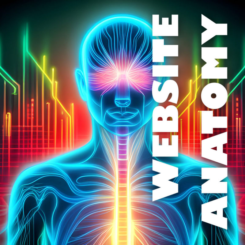
A website is made up of many components that all work together to create a functional and informative whole. Those components can be compared to the anatomy of a human body. Just like a human body is made up of different organs and systems that each perform specific functions, a website consists of various components that work together to deliver content and functionality to users. Let’s take a closer look at the anatomy of a website and how it compares to human anatomy.

Skeletal System

Just like how the skeletal system is the foundation of the human body, HTML (Hypertext Markup Language) serves as the foundation of a website. HTML provides the structure and organization for the content on a web page, defining the different elements and their relationships to each other. Just as the skeletal system provides support for the body, HTML provides the structure that supports the design, functionality, and usability of a website. Without a solid HTML structure, a website would lack the necessary foundation to be easily navigated and displayed across various devices and browsers.

Muscular System

In the analogy of comparing the parts of a website to human anatomy, the web server can be thought of as the muscular system. Just as the muscles provide movement and structure to the human body, web hosting provides the support and structure for a website to function. It is responsible for delivering the content of a website to its visitors and ensuring that it is always available and accessible. Without web hosting, a website cannot exist and function properly, just as the human body cannot function without its muscles. Therefore, it is crucial to choose a reliable and trustworthy web hosting provider to ensure the smooth functioning of a website.

Nervous System

Just as the nervous system is responsible for controlling and coordinating the body’s responses to stimuli, JavaScript plays a vital role in web development by controlling and coordinating the behavior of a website in response to user interactions. JavaScript is a high-level programming language that is often used to add interactivity, animations, and other dynamic features to a website. By manipulating HTML and CSS, JavaScript can create a rich user experience and improve the functionality of a website. This is what makes it the nerves of a website because it allows it to react and respond to the user’s actions, making it an essential part of modern web development.

A Content Management System (CMS) can be compared to the human brain. It is the control center of the website, where content is created, managed, and published. Just as the human brain is responsible for controlling the body’s functions, a CMS like WordPress is responsible for managing a website’s content.

The MySQL database is like the hippocampus of a website because it is responsible for storing and organizing memories, or in this case, website data. The hippocampus is a part of the human brain responsible for long-term memory storage and retrieval. Similarly, the MySQL database stores all the data for a website, such as user information, product details, and website content. It allows the website to quickly retrieve this information and present it to the user. Without the MySQL database, websites would not be able to store and organize large amounts of data efficiently.

The navigation of a website is like the spinal cord of the human body. Just as the spinal cord connects the various parts of the body, the navigation connects the different pages and sections of a website. It serves as a roadmap for users, guiding them to the content they want to find. A well-designed navigation system can make it easy for users to find what they are looking for and explore the website, while a poorly designed one can cause frustration and confusion. It is important to keep the navigation system simple, intuitive, and consistent throughout the website to ensure a smooth user experience.

Cardiovascular System

PHP (Hypertext Preprocessor) is a server-side programming language used to develop dynamic web pages and web applications such as WordPress. It can be considered as the cardiovascular system of a website as it is responsible for handling the flow of data between the server and client. PHP processes and manages requests, accesses and manipulates databases, and dynamically generates web pages. Just like the cardiovascular system carries blood and nutrients to all parts of the body, PHP handles and delivers information to all parts of the website, making it functional and interactive for the user. Without PHP or a similar architecture, a website would be static and lack the necessary functionalities to make it engaging and interactive.

The server CPU is like the heart of a website because it performs essential functions that keep the site running smoothly. The CPU (Central Processing Unit) is responsible for processing all of the requests made to the server, executing scripts, and handling other system-level tasks. Without a properly functioning CPU, a website may run slowly, suffer from errors, or even crash.

Immune System

Just like our immune system protects our body from viruses and diseases, website security protects the website from various cyber threats such as hacking, malware, and phishing attacks. Security measures include installing SSL certificates, implementing strong passwords, two-factor authentication, and regular software updates. Additionally, security plugins can be installed to further enhance website security. A strong immune system keeps us healthy, and a strong security system keeps the website safe and functional. Just as a disease can affect multiple parts of the body, a security breach can affect different areas of a website, including sensitive data, user information, and website functionality. Therefore, it is crucial to prioritize website security as part of website maintenance.

Skin

In comparing the parts of a website to the human body, CSS can be thought of as the skin. Just like how the skin gives a person’s body a certain look and feel, CSS is responsible for the visual appearance and style of a website. It allows web developers to change the color, font, layout, and overall design of a website, making it more appealing and user-friendly. CSS can also be used to create responsive designs that adjust the layout of the website to fit different screen sizes, making it accessible on a wide range of devices. Without CSS, websites would be limited to a default, plain appearance, making them less engaging and less likely to attract visitors.

Additional Components

  • Face: The homepage can be compared to a human body’s face. It is the first thing users see when they visit a website, and it sets the tone for the rest of the site. Just as a human face is the first thing people see and can leave a lasting impression, the homepage is the first thing users see and can determine whether they stay or leave.
  • Torso: The body of a website can be compared to a human body’s torso. It is the main part of the website that contains the content and functionality. Just as the torso contains the vital organs and performs important functions, the body of a website contains the content and performs the primary functions.
  • Arms: The sidebar can be compared to a human body’s arms. It is the part of the website that supports and enhances the body’s main functions. Just as the arms support and enhance the body’s functions, the sidebar supports and enhances the main content of the website.
  • Name: Just as a child is given a name and ID at birth, any new website requires a domain name. Similarly to how you would use your name to identify yourself, a domain name allows users to find and identify your website.

The same way the human body is made up of various parts that work together to create a cohesive and functional whole, a website is composed of different elements that work together to create a complete and effective online presence. By understanding the different parts of a website and how they relate to one another, website owners can create a site that is both visually appealing and user-friendly, and provides visitors with a positive experience.

Browser Testing for Website Compatibility and Consistency

Browser testing is an essential part of web design to ensure that your website looks and works correctly across different web browsers and devices. With so many different browsers and versions available, it can be challenging to create a website that looks and works consistently on all of them. Let’s take some time to explore the importance of browser testing and some best practices to ensure your website performs optimally across different browsers.

It’s important to understand that different web browsers can interpret and display HTML, CSS, and JavaScript differently. This means that a website or web app that looks great in one browser might look completely different in another browser. For example, Google Chrome may render a web page the way you expect, but it may appear broken or out of place in Safari or Firefox. Therefore, it’s crucial to test your website in all the popular browsers, including the latest versions of Google Chrome, Firefox, Safari, and Edge. You can even go the extra mile and test with other lesser used browsers like Brave, Opera, Samsung Internet, Vivaldi, and others.

There are a number of different ways to perform browser testing. The most obvious way is to install several different browsers on your computer and test manually. Or another common method is to use browser emulators or a virtual machine. These tools allow you to test your website in different browsers without having to install them on your own computer.

One of the quickest ways to test your website is to use an automated browser compatibility testing tool. These tools allow you to test your website on multiple browsers and devices, so you can identify any issues that need to be addressed. Some popular browser compatibility testing tools include BrowserStack, LambdaTest, and Sauce Labs.

In addition to using automated testing tools, it’s also essential to test your website on different devices, including desktops, laptops, tablets, and mobile devices. This is because different devices have different screen sizes and resolutions, which can affect how your website is displayed. You can use responsive design techniques to ensure that your website adapts to different screen sizes and resolutions, but it’s still essential to test your website on different devices to ensure that it works correctly.

Another best practice for browser compatibility is to use the latest web standards and coding practices. This can help to ensure that your website is compatible with the latest browsers and devices. For example, using HTML5 and CSS3 can help to ensure that your website is displayed correctly in the latest browsers, while using outdated coding practices can lead to compatibility issues.

Code Validation

Code validation is a helpful step to ensure that your website renders consistently across browsers. Validating your code ensures that your website adheres to the standards set by the World Wide Web Consortium (W3C) and helps identify potential issues that can cause problems for users with different browsers and devices.

There are a variety of online tools available for code validation, such as the W3C Markup Validation Service and the CSS Validation Service. By checking your HTML and CSS code for errors and correcting any issues, you can ensure that your website functions properly across different platforms and provides a consistent user experience for all visitors.

Chrome Inspector

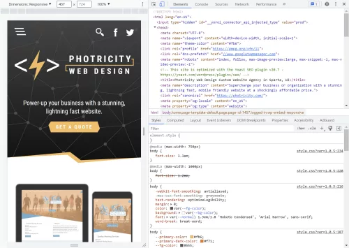
The developer tools in Google Chrome are powerful and helpful with browser testing and debugging. The inspector panel in particular allows you to audit the HTML, CSS, and JavaScript of any webpage and make changes in real-time. You can use it to check the layout of your website, troubleshoot any issues with the code, and see how your site looks on different devices and screen sizes.

To access the Chrome Inspector, simply right-click on any element on your website and select “Inspect” from the menu. This will open up the Inspector panel, which shows the HTML code for the selected element, as well as its styles and any associated JavaScript.

You can use the Inspector to make changes to your code in real-time and see the results immediately. For example, you can change the background color of an element or adjust its padding and margin to see how it affects the layout of the page. You can also use the Inspector to test different screen sizes and devices by selecting the “Toggle Device Toolbar” button in the top-left corner of the panel.

While Google Chrome has led the way in this area, other major browsers now also have similar features. By using the Chrome Inspector or other equivalent tools, you can quickly identify and fix any issues with your website’s code and ensure that it looks and functions properly on all devices and browsers.

Fixing Inconsistencies

After you have run your website through various browser testing tools and code validators, you may find that there are some inconsistencies or errors that need to be fixed. The first step in fixing inconsistencies is to identify the root cause of the issue. This can involve reviewing the code line-by-line and determining where errors may have occurred, as well as checking for missing or incomplete code. Keep an eye out for typos and syntax errors as well.

Once you have identified the root cause, you can begin to make the necessary changes to your code. This may involve rewriting certain sections of the code, removing unnecessary code, or restructuring the code to improve readability and consistency. It is important to test your changes thoroughly to ensure that they have not caused any new issues or introduced additional inconsistencies. You may have to experiment with different workarounds and patches until you arrive at a cohesive balance.

In addition, it is important to establish clear coding standards and guidelines for your development team. This can help to ensure that all members of the team are using consistent coding practices, which can help to minimize inconsistencies and errors. By taking a proactive approach to code consistency and quality, you can help to ensure that your website is as reliable and user-friendly as possible.

The Work Is Never Done

Just because your homepage tested well last month doesn’t mean it won’t have bugs today. It’s important to retest your website periodically, especially when new browser versions are released. Browser updates can cause unexpected changes in how your website displays or behaves. It’s a good idea to test your website with new browser versions and make any necessary updates to ensure compatibility. This can be a time-consuming process, but it’s essential for providing the best user experience and maintaining the integrity of your website. Additionally, it’s a good practice to regularly check browser usage statistics to ensure that you’re testing your website on the most popular browsers used by your audience.

It can be a time consuming process, but it pays to be proactive in fixing things before someone else notices. Here are a few bonus tips to help with your testing endeavors:

  • Test on multiple devices: Just like how browsers can differ in their rendering, different devices can also affect how a website looks and performs. Make sure to test on various devices, such as desktops, laptops, tablets, and smartphones.
  • Test with different user scenarios: Users may access your website in different ways and from different locations. Test with different user scenarios, such as using different browsers, different internet speeds, and even different geographical locations.
  • Test with real users: If possible, test your website with real users. They can provide valuable feedback on usability, accessibility, and user experience.
  • Stay up-to-date with web standards and trends: The web is constantly changing, and it’s important to stay up-to-date with the latest trends and web standards. This can help ensure that your website is accessible and performs well on modern browsers and devices.

Browser testing is an important part of the web development process, as it helps to ensure that users have a consistent experience regardless of the browser they are using. If you are serious about creating a successful website, then it is important to invest some time in browser testing. By using testing tools, testing on different devices, and using the latest web standards and coding practices, you can create a website that looks and works consistently across different browsers and devices.

The Art of Writing Clean and Efficient HTML Code

Writing clean and efficient HTML code is important for the overall quality and functionality of a website. It ensures that the code is easy to read and understand, which makes it easier to maintain and update. Clean HTML code also helps with website optimization for search engines, as it ensures that the code is correctly structured and free from errors.

HTML is a markup language that is used to create web pages. It is a relatively simple language to learn, but it is important to write clean and well-organized code in order to make your web pages more readable and maintainable. To write optimized HTML code, it is helpful to follow a few guidelines. Here we will talk about some best practices and tips to help you turn your spaghetti code into art.

Formatting

It can be hard to understand how HTML hierarchy works, but once you have added a child to an element, it becomes apparent.

Properly formatting your HTML code can make it much easier to read and edit, especially when working with larger files. A best practice is to use indentation to clearly show the hierarchy of elements. For example, when a child element is nested inside a parent element, it should be indented to clearly show the relationship between the two. Some developers use tabs for indentation, others might use two or four spaces. Neither way is wrong, just remember to be consistent.

Another formatting consideration is the use of line breaks and white space to separate different sections of code. Adding line breaks can make the code easier to read, especially when working with long blocks of code. However, be careful not to add too much white space, as this can make the file larger and slower to load.

Semantics

Using semantic tags in HTML is incredibly helpful for creating clean and organized code. These tags have descriptive names that convey the meaning of their content to search engines, web crawlers, and screen readers. Instead of using generic tags like <div> or <span>, semantic tags such as <header>, <nav>, <main>, <article>, <section>, and <footer> allow for more efficient and meaningful markup.

Not only does this improve the accessibility and usability of your website, but it can also positively impact your SEO efforts. By using semantic tags, search engines can better understand the structure of your content and display it more prominently in search results.

Less Is More

Another important aspect of writing efficient HTML is to avoid unnecessary code. Remove any code that is not essential to the structure, content, or functionality of the page. Unnecessary code can slow down the page’s loading time, make it harder to maintain, and create confusion for other developers who may work on the project. Remove any unused CSS or JavaScript files and avoid using inline styles and scripts to keep your HTML document clean and brief.

Note To Self

HTML comments are a great way to leave notes and reminders for yourself or other developers who may be working on the code. Comments are ignored by the browser, so they won’t appear on the website, but they can be helpful in keeping your code organized and easy to understand.

To add a comment in HTML, simply enclose the text or code you want to comment out between <!-- and --> tags. It’s also a good practice to use comments to describe the purpose of each section of your HTML code, making it easier for others to understand and modify the code in the future. However, be careful not to overuse comments, as too many can clutter your code and make it difficult to read.

Leave the Styling to CSS

Using CSS for styling instead of HTML can make your code much cleaner and easier to read. HTML is intended for content and structure, while CSS shines at presentation and styling. By separating these concerns, you can create more maintainable code that is easier to update and modify.

To maximize the benefit of CSS, you can define a separate stylesheet that contains all of your CSS rules. This allows you to apply consistent styles to all elements on your website, and also makes it easier to make global changes to your design. By keeping your styles in a separate file, you can also avoid cluttering up your HTML code with inline styles or repeated style definitions.

Another benefit of using CSS for styling is that it allows you to create more complex and dynamic designs. CSS includes a number of advanced features, such as animations, transitions, and grid layouts that can be used to create engaging and interactive user experiences. By using CSS instead of HTML for styling, you can take advantage of these features and create more engaging and visually appealing websites.

Validate

If you’re trying to step up your HTML game, it’s a good idea to make sure that your code is valid and standards-compliant. This is made easy using helpful tools like the W3C Markup Validation Service. Validating helps to identify any errors or warnings in the code, and ensures that the website is compatible with different browsers and devices. Be sure to identify and fix any errors in your code before they cause problems.

In addition to these essential best practices, here are a few more things to keep in mind when writing HTML:

  • Use a DOCTYPE declaration. This will tell browsers how to render your page.
  • Avoid using deprecated tags and attributes that are no longer supported by modern browsers. This includes tags like <center> and attributes like align=”center”.
  • Use descriptive and consistent naming conventions for your classes and attributes. Using logical names can help you remember what they do and where they are used. This will make your code more self-documenting, and can make it easier to understand the structure of the page and to make changes later on.
  • Break up your code into logical blocks. This will make your code more manageable and easier to maintain.
  • Minimize the use of tables for layout purposes. Instead use CSS grid, flexbox, or other more modern layout methods.
  • Avoid using inline styles. This will make your code much cleaner, and make it far easier to make design changes across your site.

Writing good HTML is indeed an art form. By following these guidelines, web developers can create clean, efficient, and beautiful HTML code that results in improved website performance and user experience. Your future self will thank you for taking the time to craft well-organized HTML code that is easy to read and maintain.

Meta Tags: Which Ones Are Still Relevant for SEO?

Meta tags have long been a core part of SEO (search engine optimization). They are HTML tags that provide information about a web page’s content to search engines and other web crawlers. While there are many meta tags available, not all of them are still relevant to SEO. Let’s take a closer look at the most important meta tags for SEO.

A meta tag is a piece of data that is embedded in the HTML of a web page and provides information about the page to search engines and other web browsers. Meta tags are not visible to users, but they can be very important for SEO.

Not all meta tags are created equal. Some meta tags, such as the title tag and the description meta tag, are still very important for SEO. Others, such as the keywords meta tag, are no longer used by Google and have no effect on SEO.

Title Tag

The title tag is one of the most important meta tags for SEO. It is the text that appears in the title bar of a web browser and in the search engine results pages (SERPs). It tells search engines what the page is about and is often used as the clickable link in search results. The title tag (technically its own HTML element rather than a meta tag, but just as important) should generally stay around 50 to 60 characters so it isn’t truncated and should include the main target keywords for the page.

Title tags have always been the first item to consider when optimizing your site for search engines, and indeed they still are. Make sure your page titles are descriptive and accurate, and feature the key phrases you want to rank for.

META TAG:
A popular alternative to regular tag and freeze tag.

Description Tag

The description tag is also still important for SEO. It provides a brief summary of the page’s content and is often displayed in search results underneath the title tag. The description tag should be between 150 and 160 characters and should include the main keywords for the page. It should briefly summarize the page’s content, and it should be enticing enough to encourage users to click on the link.

While the meta description is still relevant for SEO, using keywords in it excessively doesn’t make much sense anymore. Search engines now place more emphasis on the overall quality and relevance of the meta description tag.

Robots Tag

The robots meta tag tells search engines which pages should be indexed and which ones should not. The two most common values for the robots tag are “index” and “noindex”. The “index” value tells search engines to index the page, while the “noindex” value tells search engines not to index the page. It can be used to prevent certain pages from being indexed, such as pages that are under construction or that are not yet ready for public consumption.

The robots tag can also specify whether crawlers should “follow” or “nofollow” links on the page. By default, links are considered “follow” links, meaning that search engines will follow them and consider them as part of the page’s overall ranking.

However, sometimes there are links on a page that are not necessarily important for SEO or that the site owner doesn’t want search engines to consider when ranking the page. In these cases, “nofollow” can be added to the robots tag, indicating to search engines that they should not follow the links or use them in ranking calculations. This can be useful for links to pages with low-quality content, user-generated content that may contain spam, or paid links that are not editorially endorsed by the site owner.

Canonical Tag

The canonical tag is an essential meta tag that helps search engines understand which version of a web page is the preferred one. This is especially important for e-commerce sites that may have several similar product pages or for sites that have several versions of a page for different languages or regions. By specifying the canonical URL, webmasters can avoid duplicate content issues and ensure that the correct page is indexed in search results.

It’s also worth noting that the canonical tag is a hint, not a directive, so search engines may still choose to index other versions of the page if they deem it necessary.

Open Graph Tags

Open Graph tags are a set of meta tags that help optimize the content of a webpage for social media sharing. These tags allow the web developer to control how a webpage appears when it is shared on social media platforms like Facebook, X (formerly Twitter), LinkedIn, and more. By specifying the title, description, image, and other relevant details of the webpage, the Open Graph tags can help make the content more attractive and clickable when shared on social media.

Open Graph tags are especially important for websites that rely heavily on social media traffic as they can help increase click-through rates and engagement. Additionally, by specifying the correct Open Graph tags, web developers can ensure that their content is presented in the best possible way on social media, which can help build brand awareness and drive more traffic to the website.

Deprecated Meta Tags

We’ve come a long way since the days of meta keyword stuffing and other SEO tricks. Search engines have now become smart enough to figure out much of this on their own. So let’s take a minute to recognize a few of these retired tags for what they once were.

  • Keywords Tag: While the keyword tag used to be an important meta tag for SEO, it is no longer as relevant. This tag was used in the past to include a list of relevant keywords for a page. However, due to spamming and abuse, most search engines no longer consider this tag. Search engines have become more sophisticated and can determine the main keywords for a page based on its content. However, you might still choose to include a few relevant keywords in the keyword tag, as it can still be used by some smaller search engines or directories.
  • Revisit-after Tag: This tag was used to inform search engines when to revisit a page for indexing. However, it is no longer relevant, as search engines now use their own algorithms to determine how often to crawl a page.
  • Author and Copyright Tags: These tags were used in the past to identify the author and copyright holder of a page. However, they do not have any SEO value.
  • Distribution Tag: The distribution meta tag is used to tell search engines where your website is distributed. This tag is no longer necessary, as search engines can find your website through other means.
  • Rating Tag: The rating meta tag was once used to specify the quality rating of the page, but is no longer used by Google and other major search engines.

It’s worth noting that while some meta tags may no longer be relevant for SEO, they may still have other uses, such as providing information to users or other applications.

While there are many meta tags available, only a few are still relevant for SEO. By focusing on the title tag, description tag, and a few others, web developers can ensure that their web pages are optimized for search engines and social media sharing.

Standards Validation: Making Sure Your Code is Up to Snuff

Web development is a constantly evolving field, and there are many standards and best practices to consider when creating a website. One key aspect of web development is standards compliance. This process involves ensuring that a website adheres to established standards and guidelines, such as those put forth by the World Wide Web Consortium (W3C).

Standards validation involves checking the code of a website to make sure it meets the established standards for HTML, CSS, and other web technologies. This process can be done manually, but there are also many automated tools available that can help with this task. By validating a website’s code, developers can ensure that it will work correctly across different devices and browsers, and that it is accessible to all users, including those with disabilities.

One important aspect of standards validation is ensuring that a website’s code is semantically correct. This means using HTML elements in a way that accurately describes the content they contain. For example, using <h1> tags for headings and <p> tags for paragraphs. This not only makes the code easier to read and understand, but also helps with accessibility and search engine optimization.

Another important aspect of standards validation is ensuring that a website is compatible with different browsers and devices. This can be a challenge, as different browsers and devices may interpret code differently. However, by adhering to established standards, developers can help ensure that their websites work correctly across a variety of platforms.

There are a number of benefits to validating your web pages against web standards. These benefits include:

  • Improved accessibility: Ensure that your pages are accessible to all users, regardless of their device or abilities.
  • Greater compatibility: Increase your website’s compatibility with all major browsers and operating systems.
  • Increased performance: Validating your web pages can help to improve page load times and reduce lagginess.
  • Higher search engine ranking: Search engines like Google use standards compliance as a factor in their ranking algorithm.
  • Fewer errors: Greatly lower the number of errors and bugs that occur.
  • Reduced development time: Reduce development time by catching errors early on. This is because standards-compliant code is typically easier to debug and maintain.
  • Stronger website security: Improve the security of your website by identifying potential security vulnerabilities. Standards-compliant code is typically more secure than non-compliant code.
  • Future-proof: Reduce the likelihood of your pages breaking over time.

Validate your code early and often in the development process. This will help to catch any errors early on, before they become more difficult to fix. Of course, no single validation tool is perfect. It is a good idea to use a variety of tools to get a comprehensive view of your code.

In addition to adhering to established standards, there are also best practices that developers can follow to improve the overall quality of their websites. These may include using responsive design to ensure that a website looks good on all devices, optimizing images and other media to reduce load times, and using clear and concise code that is easy to read and maintain.

By validating your code against established web standards and best practices, you can help to ensure that your sites are accessible, compatible, performant, and error-free. This can lead to a better user experience for all of your visitors.

Exploring Navigation: Best Practices for Website Menus

Website navigation is a crucial aspect of web design that can make or break a user’s experience. When done correctly, it helps users find what they are looking for quickly and efficiently. However, when done poorly, it can frustrate users and drive them away from your website. Well formatted navigation is important for search engine optimization, to help web crawlers navigate the flow of your site. In this article, we will discuss website navigation best practices and common mistakes to avoid.

Menu Locations and Their Uses

  • Top navigation: The top global navigation is the most common type of navigation bar. It is typically located at the top or bottom of the website header and contains links to the most important pages on the site. The top navigation is a great way to provide users with quick and easy access to the most important content on your website.
  • Sidebar navigation: The side navigation is a great way to provide users with a more detailed view of the website’s structure, and can help users find specific content on your website. It’s sometimes used to show links related to the main content on the current page.
  • Footer navigation: The footer navigation is located at or near the bottom of the website and contains links to important pages such as the contact page, privacy policy, and terms of service. The footer navigation is a great way to provide users with quick and easy access to this important information.

Website Navigation Best Practices

  • Keep it Simple: One of the key navigation best practices is to keep it simple. Your website’s navigation should be easy to understand and use to improve your UX. Avoid using complex menus or confusing labels. The fewer navigation options you have, the easier it will be for users to find what they are looking for.
  • Be Consistent: Consistency is key when it comes to website navigation. Use the same navigation structure and terminology throughout your website, so users know where they are and how to get where they want to go.
  • Make it Easy to Find: Your website’s navigation should be easy to find and accessible from every page. A common location for navigation is at the top of the page, but you can also include it in the footer or sidebar.
  • Use Descriptive Labels: Use clear and concise labels for your navigation links. Avoid using generic labels like “Links” or “Pages” and instead use more specific and descriptive labels, so that users know what to expect when they click on them.
  • Prioritize Important Pages: Promote the most important pages in your navigation by placing them first or highlighting them with a different color or style.
  • Group Related Items: Placing similar links together can make it easier and quicker for users to find the information they are looking for.
  • Use a Logical Hierarchy: The navigation system should be organized in a logical hierarchy of pages, subpages, and categories. This will help users to understand the relationships between the different pages on the website.
  • Icons: Simple and recognizable icons can help to make your navigation system more visually appealing and easier to use. Just be sure to use images and icons that are relevant to your content and that are easy to understand.
  • Breadcrumbs: Breadcrumb trails are a line of text or links that shows users the hierarchy of the page they are on. Breadcrumbs are a great way to help users understand where they are on a website and how to get back to where they started.
  • Search: If your website has a lot of content, it is important to make it easy for users to search for what they are looking for. Search is also a great way to help users find content that they may not be able to find through the regular navigation system.

Common Mistakes to Avoid

Your navigation is only as strong as your weakest link.

  • Too Many Options: Too many options in your website’s navigation can be overwhelming for users. Limit your navigation options to the most important pages.
  • Poor Organization: Poorly organized navigation can make it difficult for users to find what they are looking for. Organize your navigation based on categories or topics.
  • Hidden Navigation: Hidden navigation, such as hamburger menus, can be confusing for some users. If you use hidden navigation, make sure it is easy to find and use. It should be prominently displayed on all pages of the website.
  • Non-Descriptive Labels: Generic labels like “Click Here” or “Learn More” can be confusing for users. Use clear and descriptive labels for your navigation links.
  • Broken Links: Broken links in your navigation can lead to frustration for users. Regularly check all the links in your navigation for 404 errors or other problems.

By following these tips and avoiding these common mistakes, you can design a website navigation system that is easy to use, intuitive, and consistent. This will help to improve the user experience and make it more likely that users will return to your website.

Get Your App Together with Progressive Web Applications

In the constantly changing world of web development, Progressive Web Apps (PWAs) are becoming increasingly popular. But what exactly are they, and why are they so important? Let’s take a closer look at PWAs and explore their uses and benefits.

What Are Progressive Web Apps?

PWAs are web applications that are designed to work seamlessly across all devices and platforms, from desktop to mobile. They are built using web technologies like HTML, CSS, and JavaScript, and can be accessed through a web browser, just like any other website. They are fast, reliable, and installable on mobile devices, and they can offer a richer user experience than traditional mobile websites.

But what sets PWAs apart is their ability to function like a native mobile app, even without being downloaded from an app store. This is made possible through the use of Service Workers, a powerful web technology that allows PWAs to cache data and work offline, as well as receive push notifications. Combined with other modern web APIs, PWAs can also access device hardware like the camera, microphone, and accelerometer.

Another key advantage of PWAs is their fast and responsive performance. Because they are designed to work offline and load quickly, PWAs can provide a seamless user experience even on slow or unstable network connections.

But perhaps the most compelling reason to consider building a PWA is their ability to engage and retain users. PWAs can be installed directly onto a user’s home screen, just like a native app, and can offer features like push notifications and offline functionality that keep users coming back.

How Do You Develop a PWA?

  1. Start with a responsive web design: Before you can create a PWA, you need to have a responsive web design that works well on all devices and platforms. This means designing your website to automatically adapt to different screen sizes, whether on a desktop, tablet, or mobile device.
  2. Use a Service Worker: A Service Worker is a JavaScript file that runs in the background of a PWA and enables offline functionality, push notifications, and other features. You’ll need to write a Service Worker script that can cache key files, so the app can still function even if the user loses internet connection.
  3. Implement an App Shell: The App Shell is a lightweight HTML, CSS, and JavaScript framework that loads quickly and serves as the foundation of the PWA. It provides the basic layout and design of the app, which can then be updated dynamically with content.
  4. Use HTTPS: HTTPS is required for PWAs to ensure secure and encrypted data transfer. Make sure to install an SSL certificate on your website to enable HTTPS.
  5. Add a Web App Manifest: The manifest is a JSON file that provides metadata about the PWA, including its name, icons, and launch settings. This file helps the browser understand that the app is a PWA and enables installation to the user’s home screen.
  6. Test and Optimize: Finally, you’ll want to test your PWA across different devices and platforms to ensure it works properly and delivers a great user experience. Use tools like Lighthouse or WebPageTest to analyze your app’s performance and identify areas for improvement.

Building a PWA requires a combination of web development skills, including HTML, CSS, JavaScript, and web APIs. However, there are also many frameworks and tools available, such as Google’s Workbox, that can simplify the process and help you create a PWA more quickly and easily.

Overall, PWAs are a powerful and flexible tool in web development, providing the best of both worlds when it comes to web and mobile app functionality. Whether you’re building a new web application or looking to improve an existing one, considering a PWA could be a great way to enhance your user experience and engagement.

The Importance of Accessibility and Usability in Web Design

Web design accessibility is a crucial aspect of creating websites that can be accessed and enjoyed by everyone, including people with disabilities. Making your website accessible means that it can be used by those with visual, auditory, physical, and cognitive disabilities. Not only is it the right thing to do, but it also makes good business sense. An accessible website can increase your audience and improve the user experience for all visitors.

Accessibility is something not typically considered by novices trying to build a DIY website. This is why it’s important to hire an experienced web designer, or to do the research and learn how to implement these concepts.

There are several steps that can be taken to make a website accessible. One important step is to use descriptive alt text for all images, which helps screen readers and visually impaired users understand the content of your website.

When it comes to design, high-contrast color schemes are essential for making your website accessible to users with visual impairments. This means using colors that have a significant difference in brightness between light and dark areas, so that text and other important elements stand out clearly.

HTML5 is the foundation of web accessibility. By using semantic HTML tags, you can provide context and meaning to your content, making it easier for assistive technologies like screen readers to understand. This includes using headings to structure your content, and using labels and input types to make forms and interactive elements more accessible.

Another important consideration is the use of ARIA (Accessible Rich Internet Applications) attributes. These attributes can be used to provide additional context and information for screen readers, and can help make complex web interfaces more accessible.

In addition, it’s important to consider the usability of your website. This includes making sure that users can navigate your website easily using a keyboard, rather than just a mouse, and ensuring that your website is responsive and works well on different devices and screen sizes. This is especially important for users with physical disabilities that may make using a mouse difficult or impossible.

Lastly, it’s important to test your website for accessibility. There are a variety of tools and resources available that can help you identify areas of your website that may be difficult for users with disabilities. By taking the time to make your website accessible, you can ensure that everyone can enjoy your content and benefit from your website. Focusing on these improvements will also give you an added SEO benefit, as search engines can more easily understand the structure of your site.

Overall, web design accessibility requires a combination of thoughtful design and technical implementation. By focusing on these key factors, you can create a website that is accessible to everyone, regardless of their abilities or disabilities.