
Ever wonder why some websites just feel right, effortlessly guiding your eyes from one section to the next? The secret ingredient is often typography. Good typography can transform a mundane webpage into a delightful reading experience, while bad typography… well, let’s just say it’s like reading a ransom note.
Typography is the unsung hero of web design, playing a crucial role in readability, aesthetics, and branding. It’s not just about choosing pretty fonts—it’s about creating a seamless visual journey for your users. The right typography can make your content more engaging and easier to digest, reinforce your brand identity, and even influence how users perceive your message. In web design, typography is more than just letters on a screen; it’s a powerful tool that shapes the entire user experience.
Understanding Typography Basics
Typography is the art and science of arranging text on a page. It’s about making your content not only legible but also visually appealing. Think of typography as the way you dress your text—it can be as casual as jeans and a t-shirt or as formal as a three-piece suit. In web development, typography ensures that your message gets across in the clearest and most attractive way possible.
Anatomy of Type
Let’s break down the anatomy of type, because just like humans, letters have body parts too! Here are some basic terms to get you started:
- Baseline: The line upon which most letters sit. Think of it as the floor for your text.
- X-height: The height of the lowercase ‘x’ in a typeface. It’s a good measure of the legibility of a font.
- Ascenders: The parts of lowercase letters (like ‘b’ and ‘d’) that extend above the x-height.
- Descenders: The parts of lowercase letters (like ‘p’ and ‘q’) that drop below the baseline.
Understanding these terms helps you choose and manipulate typefaces more effectively, ensuring your text looks polished and professional.
Font vs. Typeface
Here’s where things get a bit geeky. A typeface is like a family name, encompassing all the styles and variations of a particular design (e.g., Arial, Times New Roman). A font is like a specific family member—it’s the size, weight, and style of a typeface (e.g., Arial Bold, Times New Roman Italic). So, while a typeface might have numerous fonts under its umbrella, each font is a distinct expression of that typeface.
In short, you choose a typeface for its overall look and feel, and you select a font to fine-tune your text’s appearance for specific purposes. Think of it as choosing an outfit from your wardrobe—you start with the type (like “formal” or “casual”), and then you pick the exact pieces (like “that snazzy blue blazer” or “those comfy sneakers”).
Choosing the Right Typeface
Consider Your Audience
Selecting the right typeface is a bit like choosing an outfit—you want to make a great impression. The typeface you pick should resonate with your target audience. Are you designing for a tech-savvy crowd? A sleek, modern sans-serif might be your best bet. Catering to a literary audience? A classic serif might evoke the right mood.
Think about your audience’s expectations and preferences. If you’re creating a site for children, playful and whimsical fonts can engage young readers. For a corporate site, stick to something clean and professional. The key is to know your audience and choose a typeface that speaks their language—literally and stylistically.
Serif vs. Sans-Serif
Time to dive into the age-old debate: serif versus sans-serif. Here’s a quick rundown:
- Serif Fonts: These fonts have little strokes or “feet” at the ends of letters. Think Times New Roman or Georgia. Serifs are often associated with tradition, reliability, and formality. They’re great for print materials, long-form content, and anything that needs a touch of sophistication.
- Sans-Serif Fonts: These fonts lack the extra strokes. Examples include Arial and Helvetica. Sans-serif fonts convey modernity, simplicity, and clarity. They’re perfect for digital content, headings, and anything that benefits from a clean, minimalist look.
In a nutshell, use serif fonts when you want to convey a sense of tradition and formality, and sans-serif fonts when you aim for a modern, straightforward vibe.
Combining Typefaces
Combining typefaces is like mixing flavors in a gourmet dish—you want them to complement each other without clashing. Here are some guidelines to ensure your typeface pairings are as harmonious as a well-conducted orchestra:
- Contrast is Key: Choose typefaces that are different enough to create visual interest but not so different that they compete for attention. Pairing a serif with a sans-serif is a classic approach.
- Establish Hierarchy: Use one typeface for headings and another for body text. This helps create a clear visual hierarchy, guiding the reader’s eye through the content.
- Limit Your Choices: Stick to two or three typefaces at most. Too many fonts can make your design look cluttered and unprofessional.
- Consider Context: Ensure the typefaces you choose align with the tone and purpose of your content. A quirky font might work for a fun blog post but would be out of place in a formal business report.
- Test Readability: Always prioritize readability. Your combination might look fantastic, but if it’s hard to read, it’s a miss. Test your font choices on different devices and screen sizes to ensure they work well everywhere.
Hierarchy and Structure
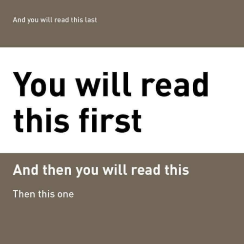
Creating a visual hierarchy with typography is like being a conductor of a symphony, ensuring that every instrument plays its part in harmony. In the world of web design, your headings, subheadings, and body text are the instruments. Here’s how to make them sing:
- Headings: These are your leading soloists, grabbing attention and guiding users through your content. Use larger, bolder fonts for headings to make them stand out. Think of them as the headlines in a newspaper—they should be unmissable.
- Subheadings: These are the supporting actors, providing structure and breaking down content into digestible sections. Subheadings should be distinct but not overshadow the main headings. A slightly smaller size or a different style, like italic or underline, works well here.
- Body Text: This is the chorus, delivering the main message in a clear and readable manner. Keep your body text simple and legible. The goal is to ensure users can easily read and understand the content without straining their eyes.
Establishing a clear hierarchy creates a roadmap for your readers, making it easy for them to navigate and comprehend your content.
Line Height and Spacing
Line height and spacing are the secret ingredients to readable text. Too tight, and your text feels cramped; too loose, and it looks disjointed. Here’s how to get it just right:
- Line Height: Also known as leading, line height is the space between lines of text. A good rule of thumb is to set your line height at 1.5 times your font size. This provides enough space for the eye to move comfortably from one line to the next without getting lost.
- Paragraph Spacing: Add extra space between paragraphs to separate blocks of text. This helps to break up long passages and makes your content more digestible. Typically, setting the spacing equal to your line height works well.
- Letter Spacing: Adjust the space between characters (tracking) to improve readability. Tightening letter spacing slightly can make headings look more cohesive, while loosening it can help body text feel more open and inviting.
Advanced Typography Techniques
Responsive Typography
When it comes to fonts, one size definitely does not fit all. Enter responsive typography—a technique that ensures your text looks fabulous on screens big and small. Imagine your typography as an accordion, elegantly expanding and contracting to fit any device.
To make your typography responsive, start by using relative units like em or rem instead of fixed units like px. This way, your text can scale smoothly across different devices. Media queries are your best friend here, allowing you to tweak font sizes at various breakpoints. Here’s a simple example:
body {
    font-size: 1rem;
}

@media (min-width: 768px) {
    body {
        font-size: 1.2rem;
    }
}

@media (min-width: 1024px) {
    body {
        font-size: 1.4rem;
    }
}
With these tweaks, your text can be an appropriate and readable size on all devices, from smartphones to widescreen monitors.
Variable Fonts
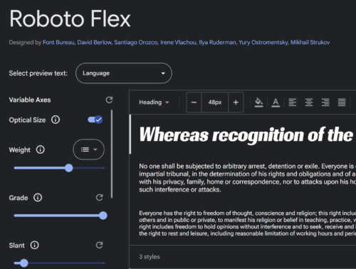
Variable fonts are the new cool kids on the block, bringing a whole new level of flexibility to your typography game. Unlike traditional fonts that come in fixed weights and styles, variable fonts allow you to adjust a single font file along a continuum of weights, widths, and other attributes. Think of it as a font with a built-in gym membership, capable of bulking up or slimming down as needed.
Here’s a quick example of how to use a variable font in CSS:
@font-face {
    font-family: 'YourVariableFont';
    src: url('your-variable-font.woff2') format('woff2');
    font-weight: 100 900;
}

body {
    font-family: 'YourVariableFont', sans-serif;
    font-weight: 400; /* Adjust this value to change the weight */
}
With variable fonts, you can create smoother, more nuanced typography transitions, and reduce the number of font files your site needs to load—win-win!
Web Font Optimization
Now, let’s talk performance. Fancy fonts are great, but not if they slow down your site. Web font optimization ensures your text looks stunning without making visitors wait.
- Choose Wisely: Not all fonts are created equal. Some are more optimized for the web than others. Stick with fonts designed for digital use, like those from Google Fonts or Adobe Fonts.
- Subset Your Fonts: Only include the characters you need. If your site is in English, you probably don’t need glyphs for every language. Subsetting your fonts can significantly reduce file sizes.
- Preload Fonts: Use the
rel="preload"attribute to load your fonts early, so they’re ready when the text renders.
<link rel="preload" href="your-font.woff2" as="font" type="font/woff2" crossorigin="anonymous">- Font Display: Use the
font-displayproperty to control how fonts are loaded and displayed.font-display: swap;is a good choice, ensuring text remains visible during loading.
@font-face {
    font-family: 'YourFont';
    src: url('your-font.woff2') format('woff2');
    font-display: swap;
}
Additional Resources
To help you on your typographic journey, here are some fantastic tools and resources that can elevate your designs from good to great:
- Google Fonts: A vast library of free, high-quality fonts that are easy to integrate into your projects. Plus, the user-friendly interface makes finding the perfect typeface a breeze.
- Adobe Fonts: If you’re looking for something more premium, Adobe Fonts offers a rich collection of professional typefaces, with seamless integration into Adobe Creative Cloud.
- Type Scale Calculator: This handy tool helps you establish a harmonious typographic scale, ensuring your text is both readable and aesthetically pleasing. Perfect for nailing that visual hierarchy.
- FontPair: Stuck on which fonts to pair? FontPair helps you find beautiful Google Font combinations that work well together, taking the guesswork out of the equation.
- WhatFont: A tool that allows you to easily identify fonts on any webpage or image. Great for inspiration and discovering new typefaces.
Now that you’re armed with a treasure trove of typography tips, it’s time to unleash your inner typographic artist. Don’t be afraid to mix things up and try different styles—after all, the best way to find out what works is through a bit of creative experimentation. Play with different typefaces, tweak your font sizes, and adjust your line heights until your text looks just right. Remember, good typography is as much about function as it is about flair. So go ahead, take some typographic risks, and watch your web designs come to life.