The Future of Web Design: Mobile-First Responsive Design Explained

With more and more people accessing the internet on their mobile devices, it has become essential for website owners to design websites that are optimized for mobile. Mobile-first responsive web design is a design approach that prioritizes designing for the smaller screens of mobile devices first, and then scaling up to larger screens like desktops and laptops.

Mobile-first responsive design involves creating a website layout and content structure that is optimized for small screens, with features like easy-to-tap buttons, large fonts, and concise content. This approach ensures that the website is user-friendly and easy to navigate on mobile devices, where users are often on-the-go and looking for quick access to information.

Once the mobile design is established, the layout and content can be scaled up for larger screens using responsive design techniques. Responsive design involves using flexible grid layouts and scalable images and fonts that adjust to fit different screen sizes. This means that the website can be accessed and navigated on a variety of devices without compromising the user experience.

By designing for mobile first, website owners can ensure that their website is accessible to the widest possible audience, including those who primarily access the internet on their mobile devices. Additionally, mobile-first design can improve website loading times and reduce bounce rates, as mobile users are more likely to leave a website that takes too long to load or is difficult to navigate.

Mobile-first design can also improve website search engine rankings. Google’s algorithm prioritizes mobile-friendly websites, meaning that sites that are optimized for mobile are more likely to rank higher in search results.

Before the rise of mobile-first responsive design, web developers often created a separate mobile website to accommodate users accessing their website on mobile devices. However, this approach had several drawbacks. Having a separate mobile website meant that site owners had to maintain two separate websites, which was time-consuming and expensive. Additionally, mobile websites often had limited functionality and content compared to their desktop counterparts, leading to an inconsistent user experience. With mobile-first responsive design, website owners can create one website that is optimized for all devices, providing a consistent user experience and simplifying website maintenance. This approach is much more efficient and effective than creating a separate mobile website, and has become the industry standard for designing websites that work seamlessly across all devices.

Mobile-first responsive web design is a design approach that prioritizes creating a user-friendly and accessible website for mobile devices first, and then scaling up for larger screens. This approach offers numerous benefits, including improved user experience, faster loading times, and improved search engine rankings. By adopting a mobile-first approach, website owners can ensure that their website is optimized for the increasingly mobile-centric online world.

Why would I need HTTPS for a static website?

You might be thinking, “My website doesn’t collect users’ credit cards or other sensitive information, so why is it so important to have SSL/TLS encryption?”

Static websites, also known as flat-file websites, are a popular choice for businesses and individuals looking to create a simple and cost-effective online presence. However, even though static websites may not have complex functionality or collect user data, they can still benefit greatly from the use of HTTPS security.

HTTPS, or Hypertext Transfer Protocol Secure, is a protocol that encrypts data as it travels between a user’s web browser and a website’s server. This encryption makes it much more difficult for third parties to intercept or tamper with data, helping to ensure the privacy and security of user information.

One of the most important reasons to use encryption on static websites is to protect user privacy. Even if a website doesn’t gather personal user data, unsecured connections can still expose information such as IP addresses and browsing history. Additionally, unsecured connections are vulnerable to interception and tampering, which can result in serious security breaches.

Using HTTPS can also help to build trust with website visitors. When users see a secure connection in their browser (and no “Not secure” warning), they know that their data is being protected and that the website they are visiting takes their security seriously. This can help to improve user engagement and conversions, as well as reduce bounce rates and increase user retention.

Furthermore, HTTPS is increasingly becoming a standard for web browsing. Major web browsers such as Google Chrome and Mozilla Firefox are now flagging unsecured connections as “not secure,” which can deter users from visiting a website. By using HTTPS security on static websites, website owners can ensure that their website is accessible to all users, regardless of their browser preferences.

In addition to its security benefits, HTTPS can also offer a speed benefit for static websites. This is because browsers only support the faster HTTP/2 (and newer HTTP/3) protocols over HTTPS, which allows for faster and more efficient communication between the user’s web browser and the website’s server. HTTP/2 supports multiplexing, meaning that multiple requests and responses can be sent simultaneously over a single connection, reducing the amount of time it takes to load a webpage. (HTTP/2 also introduced server push, but major browsers have since removed support for it in favor of preload hints and 103 Early Hints, which help the browser fetch key resources sooner, further improving page load times.

So, while static websites may not have complex functionality or user data, they can still benefit greatly from the use of HTTPS security. By protecting user privacy, building trust with visitors, and keeping up with changing browser standards, website owners can ensure that their static websites are secure, accessible, fast, and trusted by users.

Speed Matters: How to Optimize Your Website for Lightning-Fast Page Load Times

The importance of website page speed cannot be overstated. Users expect websites to load quickly and smoothly. A slow loading website can lead to frustrated users, increased bounce rates, and lower search engine rankings. Research has shown that even a one-second delay in page load time can result in a significant decrease in conversions and user engagement. Therefore, it’s crucial to optimize your website’s page speed to ensure that it loads quickly and efficiently. The good news is that recent advances in web technology have made it much easier to build clean and fast websites. By investing time and effort into optimizing your website’s page speed, you can improve user experience, increase engagement and conversions, and ultimately achieve greater success online.

Minimize and Optimize Code

Writing more efficient code can improve page load speed by reducing the size of files that need to be downloaded by the user’s browser. This might involve minifying your HTML, CSS, and JavaScript files, removing unnecessary white space and comments, and using CSS instead of images wherever possible. One of the key principles of writing efficient code is to keep it simple and concise. Avoid using unnecessary code or scripts that can slow down your website. Make sure to test your code thoroughly to identify any performance bottlenecks or errors, and make the necessary optimizations to ensure that your website is running at its best. By writing efficient code, you can ensure that your website is delivering the best possible user experience to your visitors.

Optimize Images

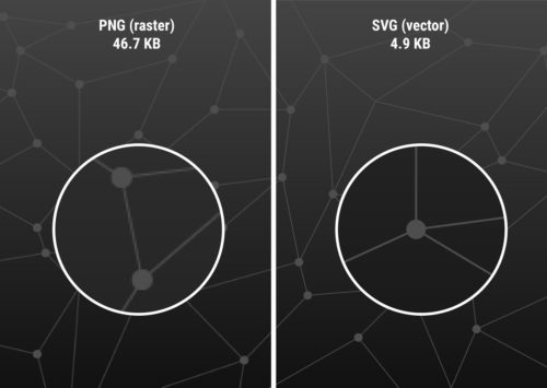
PNG vs SVG
PNG vs SVG file sizes

Images are often one of the biggest contributors to slow page speed. To optimize images, reduce their file size without sacrificing quality. You can do this by compressing images, reducing their dimensions, and using an efficient image file format. Use tools like Photoshop or online image editors to find the right balance of compression and image quality.

WebP is a modern image format (now supported by every major browser) designed specifically for the web and offers superior compression compared to JPEG and PNG. WebP supports both lossy and lossless compression, as well as transparency, making it a versatile option for web developers looking to optimize page speed without sacrificing image quality. Even better yet, certain types of graphics can be displayed in SVG format. SVG is a vector format (as opposed to raster) with unlimited resolution, razor sharp edges, and extremely small file size.

Minimize HTTP Requests

HTTP requests are made when a browser requests a resource from your server, such as an image or script. Minimizing the number of HTTP requests can significantly improve page speed. You can do this by reducing the number of resources on a page, combining multiple scripts and stylesheets into one file (less critical on modern HTTP/2 and HTTP/3 servers), merging images into a sprite, or using browser caching to store static resources locally.

Use a Content Delivery Network (CDN)

A Content Delivery Network (CDN) is a network of servers that are distributed around the world to deliver content to users more quickly. By using a CDN, your website’s static resources (such as images, scripts, and stylesheets) are cached on multiple servers around the world. This reduces the distance between your server and the user, resulting in faster load times.

High Performance Web Hosting

Your website’s hosting provider can also make a huge impact on page speed. Choose a web host that offers fast and reliable hosting, with servers located close to your target audience. Consider upgrading to a Virtual Private Server (VPS) or a dedicated server if you’re experiencing slow page speed on shared hosting.

Optimizing your website’s page speed is essential for improving user experience, reducing bounce rates, and increasing search engine rankings. Use the strategies outlined above to ensure that your website is lightning fast and worth visiting. Remember that page speed is a critical factor in the success of your website, and investing time and effort in optimizing it will pay off in the long run.

The Basics of Search Engine Optimization (SEO)

So you have a website, but can your potential customers find it? Having a website is a great start, but it’s not enough to reach your audience. You need to ensure that your site is optimized for search engines, so that people can easily find you online. Search engine optimization (SEO) is the process of optimizing your website to improve its visibility and ranking on search engine results pages (SERPs). Search ranking is a competitive space, so it will take some time and work. Let’s talk a bit about the fundamentals of how to improve your online search presence.

Keyword Research

Keyword research is the foundation of any SEO strategy. It involves identifying the keywords and phrases that your audience is using to search for information related to your business or organization. Once you have identified these keywords, you can use them strategically in your website’s content, including page titles, headlines, body content, image alt text, and meta descriptions. This will help search engines understand the relevance of your website to the keywords your audience is searching for.

KEYWORD STUFFING:
Not a Thanksgiving dish

On-Page Optimization

On-page optimization refers to the process of optimizing individual pages on your website. This includes evaluating and tweaking your website’s content, titles, meta tags, headings, images, and URLs. Ensure that your website’s content is relevant, high-quality, and engaging for your audience. Use keywords naturally throughout your content and optimize your titles, meta descriptions, and headings to include relevant keywords. Use alt tags to describe images, and optimize your URLs for readability and relevance.

Mobile Optimization

With more people using mobile devices to access the internet, mobile optimization is crucial for SEO. Ensure that your website is optimized for mobile devices, with a responsive design that adapts to different screen sizes. A mobile-friendly website will improve your website’s user experience and make it more accessible to your audience, which can lead to improved rankings on search engine results pages. Google now uses mobile-first indexing for the whole web, meaning it primarily looks at the mobile version of your site when deciding how to rank it.

Page Speed

Page speed is another important factor in SEO. Ensure that your website loads quickly, with a page speed of three seconds or less. A website that takes forever to load can easily turn people away. Use tools such as Google’s PageSpeed Insights to identify areas where you can optimize your website for faster loading times. Optimizing images, using a content delivery network (CDN), and minimizing HTTP requests are just a few ways to improve your website’s page speed.

Link Building

Link building is the process of getting other websites to link back to your website. Search engines consider backlinks to be a signal of a website’s authority and relevance. However, it’s important to focus on quality over quantity when it comes to link building. Aim to get links from reputable websites in your industry, and avoid spammy or low-quality links.

White Hat vs Black Hat

White hat and black hat SEO are two very different approaches to search engine optimization. White hat SEO refers to techniques that are approved by search engines and focus on improving website rankings through high-quality content, keyword research, and user experience. Examples of white hat SEO include optimizing website content, conducting keyword research, and building high-quality inbound links.

On the other hand, black hat SEO refers to techniques that aim to manipulate search engine algorithms in order to achieve higher rankings, often using techniques that are against search engine guidelines. Examples of black hat SEO include keyword stuffing, cloaking, and link farms. These techniques can result in short-term gains in search engine rankings, but they carry significant risks, including being penalized or banned by search engines.

While black hat SEO techniques may offer quick results, they are not sustainable in the long term, and they can harm your website’s reputation and online presence. It is important for website owners to focus on using white hat SEO techniques that prioritize creating quality content and a positive user experience, while also complying with search engine guidelines.

Optimizing your website for search engines is a crucial component of any digital marketing strategy. By using these strategies, you can improve your website’s visibility, ranking, and ultimately, drive more traffic to your homepage. Remember to keep your audience in mind, and create high-quality, relevant content that meets their needs. With a little effort and attention, you can achieve great results with SEO.