Have you ever struggled with designing a responsive layout for your website? If so, CSS Grid might just be the solution you’re looking for! Here we’ll explore what the CSS grid system is, how it works, and why it’s such a powerful tool for web designers.
CSS Grid is a two-dimensional layout system that allows you to create complex, responsive layouts with ease. Part of the CSS3 standard, it allows you to define a grid of columns and rows, and then place elements anywhere within that grid. This means you can create layouts that adapt to different screen sizes, without having to write complicated media queries or rely on other layout systems.
One of the biggest advantages of CSS Grid is its flexibility. You can define a grid with any number of columns or rows, and you can even define different sized columns and rows. This means you can create layouts that are truly unique, and that stand out from the crowd.
Another plus of CSS Grid is its simplicity. Once you understand the basics of how it works, creating complex layouts becomes much easier. You no longer have to worry about floats, clears, tables, libraries, or other CSS hacks that were necessary in the past.

So how does CSS Grid work? There’s a lot to it, but it’s actually quite simple. First, you define a grid container by setting its display property to “grid”. Then, you define the columns and rows of the grid using the “grid-template-columns” and “grid-template-rows” properties. Finally, you place elements within the grid using the “grid-column” and “grid-row” properties.
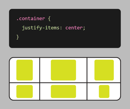
Grid also comes with a number of other useful features, such as the ability to span elements across multiple columns or rows, and the ability to align elements within the grid.
Here’s an example of using CSS grid to create a responsive layout:
.container {
    display: grid;
    grid-template-columns: repeat(auto-fit, minmax(250px, 1fr));
    grid-gap: 20px;
}
In this example, we first define a container element with the display property set to grid. We also set the grid-template-columns property to create a grid with columns that will automatically adjust based on the available space, with a minimum size of 250px and a maximum size of 1fr (which means the column will take up as much available space as possible).
We also use the grid-gap property to add some spacing between the boxes.
With these styles in place, the grid will adjust and reflow as the browser window is resized, ensuring that the items are always displayed in an organized, responsive manner.
It’s worth noting that CSS Grid is different from CSS Flexbox, another popular layout system. While Flexbox is great for laying out elements in a single row or column, Grid is more suited for creating complex, two-dimensional layouts. With Flexbox, you define a row or column, and then place elements within that row or column. With Grid, you define a grid of rows and columns, and then place elements anywhere within that grid. This makes it more powerful for complex layouts, while Flexbox is better suited for simpler, one-dimensional layouts.
CSS Grid is a powerful tool that allows you to create complex, responsive layouts with ease. Its flexibility and simplicity make it an essential tool for any web designer looking to create beautiful, responsive websites. So why not give CSS Grid a try? Your website (and your users) will thank you!
