CSS Variables: The Power of Custom Properties in Web Design

CSS custom properties, also known as CSS variables, were introduced in CSS3 as a way to make it easier to reuse and maintain styling across a website. With CSS custom properties, you can define a value once and use it throughout your stylesheet, making it easier to make global changes to your website’s design without having to edit multiple places. In this article, we’ll explore how to use CSS custom properties and some of the benefits they provide.

To create a custom property, you simply define it with a double hyphen prefix, followed by a name and a value:

:root {
    --primary-color: #0088cc;
}

In this example, we’ve defined a variable named “--primary-color” and given it a value of “#0088cc“. We’ve placed this definition in the :root selector to make it global to the entire document.

Once you’ve defined a custom property, you can use it throughout your stylesheet by referencing its name with the var() function:

a {
    color: var(--primary-color);
}

In this example, we’re setting the color of all anchor tags to the value of our custom property, “--primary-color“. This makes it easy to change the color of all links on our website by simply changing the value of the custom property. You can also use this same variable to color other highlighted elements like buttons, borders, and backgrounds.

One of the key benefits of CSS custom properties is that they make it easier to maintain a consistent design across your website. By defining global values in custom properties, you can make sure that your colors, fonts, and other design elements are consistent across all pages.

Custom properties can also make it easier to create responsive designs. Let’s say you have a navigation menu on your website that collapses into a hamburger menu on smaller screens. You want to change the background color of the navigation menu when it’s in its collapsed state to make it more visible. You can use CSS variables to define the background color for different screen sizes.

First, define a custom property for the background color:

--menu-bg-color: #ffffff;

Next, use media queries to change the value of the custom property for different screen sizes:

@media screen and (max-width: 768px) {
    :root {
        --menu-bg-color: #333333;
    }
}

Finally, use the custom property to style the navigation menu:

.nav-menu {
    background-color: var(--menu-bg-color);
}

In this example, the background color of the navigation menu will be white by default, but will change to dark gray when the screen width is 768px or less. This makes the menu more visible and easier to use on smaller screens. By using CSS custom properties and media queries, you can create responsive designs that adapt to different screen sizes and provide a better user experience.

In addition to making it easier to maintain a consistent design and create responsive layouts, CSS custom properties can also help reduce the size of your stylesheets. By using custom properties to define global values, you can avoid repeating the same values throughout your stylesheet, which can help reduce the file size and make your site faster. This is especially beneficial when using long values like gradients and clip paths.

Here’s an example where CSS variables can save a considerable amount of time and file size. Instead of defining your font families on each element, you can define custom properties for each style:

--title-font: Impact, 'Helvetica Neue Condensed', 'Arial Narrow', sans-serif;
--body-font: Helvetica, Tahoma, Arial, sans-serif;

Now you can use the title font variable to style each of your headings, and the body font property to style your paragraphs and list items.

So, instead of entering a long list of font families dozens of times throughout your document, you can define one list to be used any number of times throughout your document. Any time you decide to change your title font or body font, you only have to enter it once.

CSS custom properties can be used to save values for any property, from simple margins, to binary images. They can also be used to store complex values, such as the results of CSS calculations. Here’s an example of using the calc() function in a variable:

--box-width: calc(100vw - 20px);

This custom property can then be used to set the width of any element:

.box {
    width: var(--box-width);
}

This would set the width of all .box elements to 20 pixels smaller than the width of the viewport.

Here are some additional tips and techniques for using CSS custom properties:

  • Use descriptive names. This will make your code more readable and easier to understand down the road.
  • Use consistent naming conventions. This will help you to keep track of your custom properties and make it easier to find them when you need them.
  • Group related variables together. This will help to keep your code organized and easier to read.
  • Use custom properties to store complex values. This can be useful for things like storing the results of calculations or storing data that needs to be reused throughout a stylesheet.
  • Combine with other CSS features. CSS custom properties can be used in conjunction with other advanced CSS features such as calc(), media queries, and animations to create complex and dynamic designs.
  • Use custom properties to create accessible designs. You can use custom properties to store values that can be used to make your designs more accessible, such as the color of text or the contrast between text and background. This can help people with disabilities to use your website more easily.
  • Use fallback values. CSS custom properties can be nested, so it’s possible to set a fallback value for a property in case the browser doesn’t support custom properties. This ensures that the website will still be functional and styled even on browsers that don’t support CSS custom properties.

CSS custom properties are a hugely powerful new web technology that changes the game for web designers. They make it easier to create consistent designs and responsive layouts, as well as reducing the size of your stylesheets. By using custom properties to define global values, you can make it easier to maintain and update your website’s design, saving you time and effort in the long run.

The Art of Writing Clean and Efficient HTML Code

Writing clean and efficient HTML code is important for the overall quality and functionality of a website. It ensures that the code is easy to read and understand, which makes it easier to maintain and update. Clean HTML code also helps with website optimization for search engines, as it ensures that the code is correctly structured and free from errors.

HTML is a markup language that is used to create web pages. It is a relatively simple language to learn, but it is important to write clean and well-organized code in order to make your web pages more readable and maintainable. To write optimized HTML code, it is helpful to follow a few guidelines. Here we will talk about some best practices and tips to help you turn your spaghetti code into art.

Formatting

It can be hard to understand how HTML hierarchy works, but once you have added a child to an element, it becomes apparent.

Properly formatting your HTML code can make it much easier to read and edit, especially when working with larger files. A best practice is to use indentation to clearly show the hierarchy of elements. For example, when a child element is nested inside a parent element, it should be indented to clearly show the relationship between the two. Some developers use tabs for indentation, others might use two or four spaces. Neither way is wrong, just remember to be consistent.

Another formatting consideration is the use of line breaks and white space to separate different sections of code. Adding line breaks can make the code easier to read, especially when working with long blocks of code. However, be careful not to add too much white space, as this can make the file larger and slower to load.

Semantics

Using semantic tags in HTML is incredibly helpful for creating clean and organized code. These tags have descriptive names that convey the meaning of their content to search engines, web crawlers, and screen readers. Instead of using generic tags like <div> or <span>, semantic tags such as <header>, <nav>, <main>, <article>, <section>, and <footer> allow for more efficient and meaningful markup.

Not only does this improve the accessibility and usability of your website, but it can also positively impact your SEO efforts. By using semantic tags, search engines can better understand the structure of your content and display it more prominently in search results.

Less Is More

Another important aspect of writing efficient HTML is to avoid unnecessary code. Remove any code that is not essential to the structure, content, or functionality of the page. Unnecessary code can slow down the page’s loading time, make it harder to maintain, and create confusion for other developers who may work on the project. Remove any unused CSS or JavaScript files and avoid using inline styles and scripts to keep your HTML document clean and brief.

Note To Self

HTML comments are a great way to leave notes and reminders for yourself or other developers who may be working on the code. Comments are ignored by the browser, so they won’t appear on the website, but they can be helpful in keeping your code organized and easy to understand.

To add a comment in HTML, simply enclose the text or code you want to comment out between <!-- and --> tags. It’s also a good practice to use comments to describe the purpose of each section of your HTML code, making it easier for others to understand and modify the code in the future. However, be careful not to overuse comments, as too many can clutter your code and make it difficult to read.

Leave the Styling to CSS

Using CSS for styling instead of HTML can make your code much cleaner and easier to read. HTML is intended for content and structure, while CSS shines at presentation and styling. By separating these concerns, you can create more maintainable code that is easier to update and modify.

To maximize the benefit of CSS, you can define a separate stylesheet that contains all of your CSS rules. This allows you to apply consistent styles to all elements on your website, and also makes it easier to make global changes to your design. By keeping your styles in a separate file, you can also avoid cluttering up your HTML code with inline styles or repeated style definitions.

Another benefit of using CSS for styling is that it allows you to create more complex and dynamic designs. CSS includes a number of advanced features, such as animations, transitions, and grid layouts that can be used to create engaging and interactive user experiences. By using CSS instead of HTML for styling, you can take advantage of these features and create more engaging and visually appealing websites.

Validate

If you’re trying to step up your HTML game, it’s a good idea to make sure that your code is valid and standards-compliant. This is made easy using helpful tools like the W3C Markup Validation Service. Validating helps to identify any errors or warnings in the code, and ensures that the website is compatible with different browsers and devices. Be sure to identify and fix any errors in your code before they cause problems.

In addition to these essential best practices, here are a few more things to keep in mind when writing HTML:

  • Use a DOCTYPE declaration. This will tell browsers how to render your page.
  • Avoid using deprecated tags and attributes that are no longer supported by modern browsers. This includes tags like <center> and attributes like align=”center”.
  • Use descriptive and consistent naming conventions for your classes and attributes. Using logical names can help you remember what they do and where they are used. This will make your code more self-documenting, and can make it easier to understand the structure of the page and to make changes later on.
  • Break up your code into logical blocks. This will make your code more manageable and easier to maintain.
  • Minimize the use of tables for layout purposes. Instead use CSS grid, flexbox, or other more modern layout methods.
  • Avoid using inline styles. This will make your code much cleaner, and make it far easier to make design changes across your site.

Writing good HTML is indeed an art form. By following these guidelines, web developers can create clean, efficient, and beautiful HTML code that results in improved website performance and user experience. Your future self will thank you for taking the time to craft well-organized HTML code that is easy to read and maintain.

Meta Tags: Which Ones Are Still Relevant for SEO?

Meta tags have long been a core part of SEO (search engine optimization). They are HTML tags that provide information about a web page’s content to search engines and other web crawlers. While there are many meta tags available, not all of them are still relevant to SEO. Let’s take a closer look at the most important meta tags for SEO.

A meta tag is a piece of data that is embedded in the HTML of a web page and provides information about the page to search engines and other web browsers. Meta tags are not visible to users, but they can be very important for SEO.

Not all meta tags are created equal. Some meta tags, such as the title tag and the description meta tag, are still very important for SEO. Others, such as the keywords meta tag, are no longer used by Google and have no effect on SEO.

Title Tag

The title tag is one of the most important meta tags for SEO. It is the text that appears in the title bar of a web browser and in the search engine results pages (SERPs). It tells search engines what the page is about and is often used as the clickable link in search results. The title tag (technically its own HTML element rather than a meta tag, but just as important) should generally stay around 50 to 60 characters so it isn’t truncated and should include the main target keywords for the page.

Title tags have always been the first item to consider when optimizing your site for search engines, and indeed they still are. Make sure your page titles are descriptive and accurate, and feature the key phrases you want to rank for.

META TAG:
A popular alternative to regular tag and freeze tag.

Description Tag

The description tag is also still important for SEO. It provides a brief summary of the page’s content and is often displayed in search results underneath the title tag. The description tag should be between 150 and 160 characters and should include the main keywords for the page. It should briefly summarize the page’s content, and it should be enticing enough to encourage users to click on the link.

While the meta description is still relevant for SEO, using keywords in it excessively doesn’t make much sense anymore. Search engines now place more emphasis on the overall quality and relevance of the meta description tag.

Robots Tag

The robots meta tag tells search engines which pages should be indexed and which ones should not. The two most common values for the robots tag are “index” and “noindex”. The “index” value tells search engines to index the page, while the “noindex” value tells search engines not to index the page. It can be used to prevent certain pages from being indexed, such as pages that are under construction or that are not yet ready for public consumption.

The robots tag can also specify whether crawlers should “follow” or “nofollow” links on the page. By default, links are considered “follow” links, meaning that search engines will follow them and consider them as part of the page’s overall ranking.

However, sometimes there are links on a page that are not necessarily important for SEO or that the site owner doesn’t want search engines to consider when ranking the page. In these cases, “nofollow” can be added to the robots tag, indicating to search engines that they should not follow the links or use them in ranking calculations. This can be useful for links to pages with low-quality content, user-generated content that may contain spam, or paid links that are not editorially endorsed by the site owner.

Canonical Tag

The canonical tag is an essential meta tag that helps search engines understand which version of a web page is the preferred one. This is especially important for e-commerce sites that may have several similar product pages or for sites that have several versions of a page for different languages or regions. By specifying the canonical URL, webmasters can avoid duplicate content issues and ensure that the correct page is indexed in search results.

It’s also worth noting that the canonical tag is a hint, not a directive, so search engines may still choose to index other versions of the page if they deem it necessary.

Open Graph Tags

Open Graph tags are a set of meta tags that help optimize the content of a webpage for social media sharing. These tags allow the web developer to control how a webpage appears when it is shared on social media platforms like Facebook, X (formerly Twitter), LinkedIn, and more. By specifying the title, description, image, and other relevant details of the webpage, the Open Graph tags can help make the content more attractive and clickable when shared on social media.

Open Graph tags are especially important for websites that rely heavily on social media traffic as they can help increase click-through rates and engagement. Additionally, by specifying the correct Open Graph tags, web developers can ensure that their content is presented in the best possible way on social media, which can help build brand awareness and drive more traffic to the website.

Deprecated Meta Tags

We’ve come a long way since the days of meta keyword stuffing and other SEO tricks. Search engines have now become smart enough to figure out much of this on their own. So let’s take a minute to recognize a few of these retired tags for what they once were.

  • Keywords Tag: While the keyword tag used to be an important meta tag for SEO, it is no longer as relevant. This tag was used in the past to include a list of relevant keywords for a page. However, due to spamming and abuse, most search engines no longer consider this tag. Search engines have become more sophisticated and can determine the main keywords for a page based on its content. However, you might still choose to include a few relevant keywords in the keyword tag, as it can still be used by some smaller search engines or directories.
  • Revisit-after Tag: This tag was used to inform search engines when to revisit a page for indexing. However, it is no longer relevant, as search engines now use their own algorithms to determine how often to crawl a page.
  • Author and Copyright Tags: These tags were used in the past to identify the author and copyright holder of a page. However, they do not have any SEO value.
  • Distribution Tag: The distribution meta tag is used to tell search engines where your website is distributed. This tag is no longer necessary, as search engines can find your website through other means.
  • Rating Tag: The rating meta tag was once used to specify the quality rating of the page, but is no longer used by Google and other major search engines.

It’s worth noting that while some meta tags may no longer be relevant for SEO, they may still have other uses, such as providing information to users or other applications.

While there are many meta tags available, only a few are still relevant for SEO. By focusing on the title tag, description tag, and a few others, web developers can ensure that their web pages are optimized for search engines and social media sharing.

Standards Validation: Making Sure Your Code is Up to Snuff

Web development is a constantly evolving field, and there are many standards and best practices to consider when creating a website. One key aspect of web development is standards compliance. This process involves ensuring that a website adheres to established standards and guidelines, such as those put forth by the World Wide Web Consortium (W3C).

Standards validation involves checking the code of a website to make sure it meets the established standards for HTML, CSS, and other web technologies. This process can be done manually, but there are also many automated tools available that can help with this task. By validating a website’s code, developers can ensure that it will work correctly across different devices and browsers, and that it is accessible to all users, including those with disabilities.

One important aspect of standards validation is ensuring that a website’s code is semantically correct. This means using HTML elements in a way that accurately describes the content they contain. For example, using <h1> tags for headings and <p> tags for paragraphs. This not only makes the code easier to read and understand, but also helps with accessibility and search engine optimization.

Another important aspect of standards validation is ensuring that a website is compatible with different browsers and devices. This can be a challenge, as different browsers and devices may interpret code differently. However, by adhering to established standards, developers can help ensure that their websites work correctly across a variety of platforms.

There are a number of benefits to validating your web pages against web standards. These benefits include:

  • Improved accessibility: Ensure that your pages are accessible to all users, regardless of their device or abilities.
  • Greater compatibility: Increase your website’s compatibility with all major browsers and operating systems.
  • Increased performance: Validating your web pages can help to improve page load times and reduce lagginess.
  • Higher search engine ranking: Search engines like Google use standards compliance as a factor in their ranking algorithm.
  • Fewer errors: Greatly lower the number of errors and bugs that occur.
  • Reduced development time: Reduce development time by catching errors early on. This is because standards-compliant code is typically easier to debug and maintain.
  • Stronger website security: Improve the security of your website by identifying potential security vulnerabilities. Standards-compliant code is typically more secure than non-compliant code.
  • Future-proof: Reduce the likelihood of your pages breaking over time.

Validate your code early and often in the development process. This will help to catch any errors early on, before they become more difficult to fix. Of course, no single validation tool is perfect. It is a good idea to use a variety of tools to get a comprehensive view of your code.

In addition to adhering to established standards, there are also best practices that developers can follow to improve the overall quality of their websites. These may include using responsive design to ensure that a website looks good on all devices, optimizing images and other media to reduce load times, and using clear and concise code that is easy to read and maintain.

By validating your code against established web standards and best practices, you can help to ensure that your sites are accessible, compatible, performant, and error-free. This can lead to a better user experience for all of your visitors.

Create Immersive and Interactive Experiences with WebGL

WebGL is a JavaScript API that allows you to create interactive 2D and 3D graphics in a web browser. It’s a powerful tool that allows for the creation of interactive and visually stunning website experiences. With WebGL, developers can leverage the power of 3D graphics hardware to create dynamic and engaging websites, web apps, and games that draw visitors in and keep them engaged, right in their browser.

One of the key benefits of using WebGL in web design is the ability to create a variety of interactive experiences, such as games, simulations, and data visualizations. By using the power of 3D graphics, designers can create dynamic and responsive websites that engage users on a whole new level. For example, an e-commerce website could use WebGL to allow customers to view products in 3D and even interact with them, giving them a much more realistic sense of what the product looks like and how it functions.

WebGL can truly give you the ability to create visually stunning websites that stand out from the crowd. By using advanced lighting and shading techniques, web designers can create websites that are both beautiful and functional. This can be especially useful for industries such as gaming, where the visuals are an important part of the overall experience.

Here are a few things to keep in mind when creating an interactive website experience with WebGL:

  • Start with a clear idea of what you want to create. What kind of experience do you want your users to have? Once you know what you want to create, you can start planning your project.
  • Use simple shapes and textures to create your objects. WebGL is a powerful tool, but it’s important to use it wisely. If you try to create too much detail, your website will slow down.
  • Use animations to make your objects move. Animations can add a lot of life to your website. There are a variety of different ways to create animation for the web, so experiment and find what works best for you.
  • Use interactivity to engage your users. Interactivity is what makes WebGL so powerful. There are a variety of different ways to add interactivity to your website. You can use buttons, sliders, and other controls to let users interact with your objects.
  • Sometimes less is more. Too much visual and audible stimulation can be overwhelming. So make sure it’s tasteful and doesn’t annoy your users.
  • Use a framework. A framework can save you a lot of time and effort. It provides you with a set of pre-built tools and libraries that you can use to create your interactive experience.
  • Optimize your code. WebGL can be computationally expensive, so it’s important to optimize your code to make sure that your website loads quickly.
  • Test your website on different devices. Make sure your website looks good and works well on all devices, including desktops, laptops, tablets, and smartphones.
  • Keep your website up-to-date. WebGL is a constantly evolving technology, so it’s important to keep your website up-to-date with the latest features and bug fixes.

Unity is a popular game development engine that can be used to create immersive web experiences with WebGL. It allows developers to create 3D models, animations, and physics simulations for the web. Unity can also be used to build virtual and augmented reality experiences that can be accessed through a web browser. With the help of plugins like WebGL for Unity, developers can easily publish their Unity projects to the web and make them available to a wide audience.

Without a doubt, WebGL is a powerful tool for creating dynamic and engaging website experiences. By leveraging the power of 3D graphics, designers can create websites that stand out and engage users in a whole new way. With the right skills and techniques, designers can use WebGL to take their web design to the next level.

Supercharging Web Design with JavaScript

JavaScript is a powerful tool that can be used to add interactivity and dynamic functionality to web design. It is a programming language that is widely used in web development, and has become an essential tool for creating engaging, interactive websites. JavaScript can be used to create animations, add form validation, create responsive designs, and much more.

One of the most common uses of JavaScript in web design is for creating animations and effects. This can include scrolling effects, hover effects, and other dynamic animations that can make a website more visually appealing and engaging. JavaScript can also be used to create responsive designs that adjust to different screen sizes and orientations.

Another important use of JavaScript in web design is for form validation. JavaScript can be used to validate user input on web forms, ensuring that data is entered correctly and preventing errors that could cause frustration for users. This can include checking for required fields, validating email addresses and phone numbers, and ensuring that passwords meet certain requirements.

JavaScript can also be used to create interactive elements on a website, such as sliders, tabs, lightboxes, and other types of user interface elements. This can make it easier for users to navigate a website and find the information they need. JavaScript can even be used to build web apps, browser-based games, and other interactive experiences on a website, making it possible to create engaging and entertaining content that keeps users coming back.

Here are some additional tips for using JavaScript in web design:

  • Use JavaScript sparingly. Too much JavaScript can slow down your website and make it less user-friendly.
  • Use JavaScript to add value to your website. Don’t use JavaScript just for the sake of using it. Make sure that the JS you add is actually adding value to your website.
  • Use progressive enhancement: Progressive enhancement is a technique that involves using JavaScript to add features to a web page, but not requiring it for the site to function properly. This ensures that users who do not have JavaScript enabled can still view and use the web page.
  • Test your JavaScript thoroughly. Make sure that your code is working properly without any errors before you publish your website.
  • Keep your JavaScript up-to-date. JavaScript is constantly evolving, so make sure that you are using the latest version of JavaScript.
  • Use a JavaScript framework. A JavaScript framework is a collection of pre-written code that can help you to create interactive web pages more quickly and easily. Some popular JavaScript frameworks include jQuery, React, Angular, and Vue.
  • Document your JavaScript with instructional comments. This will make it easier for you to maintain your code in the future.

Overall, JavaScript is an incredibly versatile tool that can be used in many different ways in web design. Whether you’re looking to create animations, add form validation, or create interactive elements, JavaScript can help you achieve your goals and create websites that are engaging, interactive, and easy to use. With its broad range of capabilities, it’s no wonder that JavaScript has become such an essential part of modern web design.

Modernize Your Website Layouts With CSS Grid

Have you ever struggled with designing a responsive layout for your website? If so, CSS Grid might just be the solution you’re looking for! Here we’ll explore what the CSS grid system is, how it works, and why it’s such a powerful tool for web designers.

CSS Grid is a two-dimensional layout system that allows you to create complex, responsive layouts with ease. Part of the CSS3 standard, it allows you to define a grid of columns and rows, and then place elements anywhere within that grid. This means you can create layouts that adapt to different screen sizes, without having to write complicated media queries or rely on other layout systems.

One of the biggest advantages of CSS Grid is its flexibility. You can define a grid with any number of columns or rows, and you can even define different sized columns and rows. This means you can create layouts that are truly unique, and that stand out from the crowd.

Another plus of CSS Grid is its simplicity. Once you understand the basics of how it works, creating complex layouts becomes much easier. You no longer have to worry about floats, clears, tables, libraries, or other CSS hacks that were necessary in the past.

It’s hard to justify not using CSS Grid

So how does CSS Grid work? There’s a lot to it, but it’s actually quite simple. First, you define a grid container by setting its display property to “grid”. Then, you define the columns and rows of the grid using the “grid-template-columns” and “grid-template-rows” properties. Finally, you place elements within the grid using the “grid-column” and “grid-row” properties.

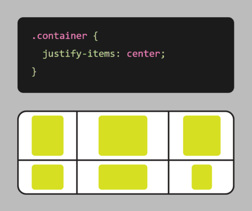
Grid also comes with a number of other useful features, such as the ability to span elements across multiple columns or rows, and the ability to align elements within the grid.

Here’s an example of using CSS grid to create a responsive layout:

.container {
    display: grid;
    grid-template-columns: repeat(auto-fit, minmax(250px, 1fr));
    gap: 20px;
}

In this example, we first define a container element with the display property set to grid. We also set the grid-template-columns property to create a grid with columns that will automatically adjust based on the available space, with a minimum size of 250px and a maximum size of 1fr (which means the column will take up as much available space as possible).

We also use the grid-gap property to add some spacing between the boxes.

With these styles in place, the grid will adjust and reflow as the browser window is resized, ensuring that the items are always displayed in an organized, responsive manner.

It’s worth noting that CSS Grid is different from CSS Flexbox, another popular layout system. While Flexbox is great for laying out elements in a single row or column, Grid is more suited for creating complex, two-dimensional layouts. With Flexbox, you define a row or column, and then place elements within that row or column. With Grid, you define a grid of rows and columns, and then place elements anywhere within that grid. This makes it more powerful for complex layouts, while Flexbox is better suited for simpler, one-dimensional layouts.

CSS Grid is a powerful tool that allows you to create complex, responsive layouts with ease. Its flexibility and simplicity make it an essential tool for any web designer looking to create beautiful, responsive websites. So why not give CSS Grid a try? Your website (and your users) will thank you!

Get Your App Together with Progressive Web Applications

In the constantly changing world of web development, Progressive Web Apps (PWAs) are becoming increasingly popular. But what exactly are they, and why are they so important? Let’s take a closer look at PWAs and explore their uses and benefits.

What Are Progressive Web Apps?

PWAs are web applications that are designed to work seamlessly across all devices and platforms, from desktop to mobile. They are built using web technologies like HTML, CSS, and JavaScript, and can be accessed through a web browser, just like any other website. They are fast, reliable, and installable on mobile devices, and they can offer a richer user experience than traditional mobile websites.

But what sets PWAs apart is their ability to function like a native mobile app, even without being downloaded from an app store. This is made possible through the use of Service Workers, a powerful web technology that allows PWAs to cache data and work offline, as well as receive push notifications. Combined with other modern web APIs, PWAs can also access device hardware like the camera, microphone, and accelerometer.

Another key advantage of PWAs is their fast and responsive performance. Because they are designed to work offline and load quickly, PWAs can provide a seamless user experience even on slow or unstable network connections.

But perhaps the most compelling reason to consider building a PWA is their ability to engage and retain users. PWAs can be installed directly onto a user’s home screen, just like a native app, and can offer features like push notifications and offline functionality that keep users coming back.

How Do You Develop a PWA?

  1. Start with a responsive web design: Before you can create a PWA, you need to have a responsive web design that works well on all devices and platforms. This means designing your website to automatically adapt to different screen sizes, whether on a desktop, tablet, or mobile device.
  2. Use a Service Worker: A Service Worker is a JavaScript file that runs in the background of a PWA and enables offline functionality, push notifications, and other features. You’ll need to write a Service Worker script that can cache key files, so the app can still function even if the user loses internet connection.
  3. Implement an App Shell: The App Shell is a lightweight HTML, CSS, and JavaScript framework that loads quickly and serves as the foundation of the PWA. It provides the basic layout and design of the app, which can then be updated dynamically with content.
  4. Use HTTPS: HTTPS is required for PWAs to ensure secure and encrypted data transfer. Make sure to install an SSL certificate on your website to enable HTTPS.
  5. Add a Web App Manifest: The manifest is a JSON file that provides metadata about the PWA, including its name, icons, and launch settings. This file helps the browser understand that the app is a PWA and enables installation to the user’s home screen.
  6. Test and Optimize: Finally, you’ll want to test your PWA across different devices and platforms to ensure it works properly and delivers a great user experience. Use tools like Lighthouse or WebPageTest to analyze your app’s performance and identify areas for improvement.

Building a PWA requires a combination of web development skills, including HTML, CSS, JavaScript, and web APIs. However, there are also many frameworks and tools available, such as Google’s Workbox, that can simplify the process and help you create a PWA more quickly and easily.

Overall, PWAs are a powerful and flexible tool in web development, providing the best of both worlds when it comes to web and mobile app functionality. Whether you’re building a new web application or looking to improve an existing one, considering a PWA could be a great way to enhance your user experience and engagement.

The Power of CSS3: Creating Stunning Web Designs Without Images or JavaScript

Cascading Style Sheets (CSS) is a fundamental technology of web design. It is used to define the presentation of a web page, including colors, fonts, layout, and more. With the introduction of CSS3, web designers have gained access to a wealth of new tools and features that allow for more creative and efficient designs, while greatly improving page load speeds. Read on to explore some of the things you can do with CSS3 that used to require heavy images or complex JavaScript.

Gradient Backgrounds

CSS3 makes it possible to create gradient backgrounds with just a few lines of code. This means that designers no longer need to use large images to achieve gradient effects. Using the “background-image” and “linear-gradient” properties, designers can create smooth and stylish gradient backgrounds that are customizable and responsive.

Rounded Corners

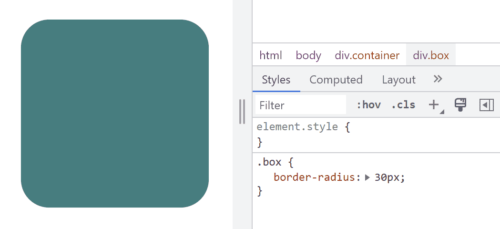
Example of border-radius CSS code
Border control… Get it?

Previously, rounded corners could only be achieved with multiple images and complex table layouts, but CSS3 now allows designers to create rounded corners with a single property. The “border-radius” property allows designers to easily add rounded corners to any element, from containers to buttons and images and more.

Box Shadows

Box shadows are a popular design element that used to require images or JavaScript to achieve. With CSS3, designers can create box shadows with the “box-shadow” property. This property allows designers to add shadows to elements such as boxes, buttons, and images, creating a subtle and stylish effect.

Animations

CSS3 allows designers to create animations without the need for JavaScript or Adobe Flash. The “animation” property allows designers to define keyframes that specify the animation’s behavior, including timing, duration, and style. This makes it possible to create animated elements such as looping animations, hover effects, and more, all with pure CSS.

Transitions

CSS transitions are another popular design element that can now be achieved with CSS3. The “transition” property allows designers to specify the transition effect between two states of an element, such as changing its color or opacity. This makes it possible to create subtle and smooth state changes that enhance the user experience.

Custom Fonts

Not long ago, custom fonts on the web meant typing your text into a graphics editor and saving it as an image. True text was limited to the standard fonts that come with a user’s computer or device. The “@font-face” rule changes that. With a simple style sheet, designers can specify custom fonts to be used on their website, giving them more flexibility and creative control over typography.

So Much More

In addition to these exciting and useful features, CSS3 has many other tools that allow designers to create more dynamic and visually appealing web designs. Here are just a few other things you can do with CSS3:

  1. Flexbox Layout: Flexbox is a new layout mode introduced in CSS3 that allows designers to create complex layouts with ease. With the “display: flex” property, designers can create responsive layouts that adjust to different screen sizes and orientations. Flexbox is particularly useful for creating layouts with dynamic content, such as image galleries, product listings, and more.
  2. Media Queries: CSS3 introduced media queries, which allow designers to specify different styles for different screen sizes and orientations. With CSS media queries, designers can create responsive designs that adapt to different devices, from desktop computers to smartphones and tablets. This allows designers to create a consistent user experience across all devices.
  3. Transformations: CSS3 allows designers to transform elements on their web pages with the “transform” property. This property can be used to rotate, scale, skew, and translate elements, creating dynamic and engaging effects. Transformations can be applied to a wide range of elements, from images to text and more.
  4. Filters: CSS filters are a powerful tool that allow designers to apply visual effects to HTML elements. Designers can apply effects such as grayscale, sepia, blur, and more, without the need for additional images or JavaScript. This makes it easy for designers to create dynamic and engaging visual effects.
  5. Custom Properties: CSS custom properties, also known as CSS variables, allow designers to define reusable values in their CSS code. This can make it easier to maintain a consistent design across a website by allowing designers to use the same values in multiple places without having to update each instance individually. Custom properties also make it easier to change the values of a design element, as the variable can be updated in one place and the change will be reflected across the entire website. This can save time and reduce the likelihood of errors and inconsistencies in the design process.

We’ve come a long way since the early days of web design! CSS3 has revolutionized web design by providing designers with new a range of new tools and features that eliminate the need for images, JavaScript, or slow and insecure plug-in’s. With CSS3, designers can create gradients, rounded corners, shadows, and animations with just a few lines of code. This makes it easier and more efficient to create beautiful and responsive web designs that enhance the user experience. By staying up-to-date with the latest CSS3 trends and techniques, designers can take their web design skills to the next level and create truly exceptional web designs.