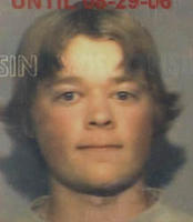
 I went in to get my driver’s license renewed not long ago. As you can see, and no doubt have known from your own experience, the people who take the infamous license mug-shots need some serious help. To all the DMV photographers who read my blog, please take notes. First of all, I will say that my new picture isn’t quite as bad as my old one, but that’s mostly on my part. My old one was just pathetic, and it looked like a drunk squirrel. But no matter how good I can look on my own, their current lighting techniques, compositional elements, white balance metering, and just plain image quality, simply don’t meet my standards. If I use too many big, technical words in this post, I apologize.
I’ll start with the lighting techniques. One of my biggest complaints about the way they take the photos is that they use a single incandescent light source directly in front of the subject and a little bit higher than the camera lens. This greatly flattens the subject’s facial features and creates a very uneven light cast across the face with dark shadows and overexposed areas. It puts a very strong glare on glasses, and also creates an ugly shadow on the background behind the subject that is often mistaken for long hair. I would suggest using at least two soft lights of about 3400 degrees K. The main light should be a 600 watt lamp with a lightbox diffuser, placed at about a 45 degree angle. A secondary 250 watt light also with a diffuser should be placed at roughly the same angle on the opposite side. This will give the photo a much more natural look with a softer and more even light cast.
Now for the composition, I realize that you can’t really do anything too dramatic for a license photo, but they still could use some help. For a background they use a flat grey sheet, which is a large contributing factor to making the photos look so ugly. I would definitely use something with more contrast to help define the edges of the subject better. Another problem with the background is that it is placed too close behind the subject, which causes the shadows to be cast onto it.
Not to be too picky, but the color balance could use some adjusting. I would pull out some red and yellow, and add some blue and magenta. As far as the focus, the image is considerably blurry. I suggest using a wider aperture, and pay more attention to focus. It’s also underexposed, although washed out in places from the harsh lighting. I would like to see all these modifications implemented by no later than 2013 (when my license expires). Please, just get it over with and let me take my own picture so I don’t have to yell at you.

ha…the infamous license mug-shots!
funny entry!
i have been told by several people that i look like an alien in mine. fun.
the dmv-ers definitely have a lot to learn in the area of photography.