CSS Gradients: Elevate Your Web Design with Visual Depth

Imagine a world of vibrant and captivating web designs, where instead of flat solid solid colors with no depth, colors seamlessly blend and transition, evoking emotions and engaging users. In the modern web, this is made possible and easy with CSS gradients. From subtle fades to bold color combinations, CSS gradients offer endless possibilities for creating visually stunning and dynamic web experiences.

Get ready to dive into the world of colors and gradients as we explore the principles, techniques, and creative applications of CSS gradients. We’ll cover everything from linear and radial gradients to gradient angles and color stops. Discover how CSS gradients can elevate your web designs to new heights.

What Are CSS Gradients?

CSS gradients are powerful tools that allow web designers to create smooth and seamless color transitions within their websites. By specifying a starting and ending color, gradients enable the blending of colors in a gradient pattern, resulting in visually appealing backgrounds and elements. Whether you want to achieve a subtle fade or a striking color combination, CSS gradients provide the means to accomplish it.

Linear gradient, Radial gradient, Conic gradient

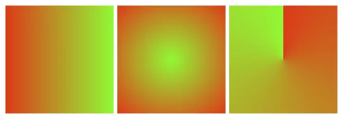
There are various types of CSS gradients at your disposal. Linear gradients create a transition along a straight line, allowing you to control the angle and direction of the gradient. Radial gradients, on the other hand, radiate from a central point and create a circular or elliptical color transition. Conic gradients, the newest addition to CSS, produce a radial-like gradient that wraps around a center point, resembling a color wheel. Each gradient type offers unique possibilities for creating captivating visual effects.

The benefits of using CSS gradients extend beyond their aesthetic appeal. Utilizing gradients instead of background images can significantly reduce file sizes, leading to faster loading times and improved website performance. Additionally, CSS gradients provide unparalleled flexibility in design, as they can be easily customized and adjusted to achieve the desired visual effect. With CSS gradients, you have the freedom to experiment with colors, angles, and opacity, allowing for endless creativity and innovation in your web designs.

Creating CSS Gradients

To create CSS gradients, you’ll need to utilize specific properties and syntax. The primary property for applying gradients is background-image, which allows you to specify the gradient type and color stops. Additionally, the background-gradient property can be used for certain gradient variations. By understanding and utilizing these properties effectively, you can bring your gradient visions to life.

Let’s walk through the step-by-step process of creating different types of CSS gradients. To create a linear gradient, you’ll need to specify the gradient angle or direction using the “to” keyword or precise degrees. Radial gradients require defining the shape, size, and position of the gradient. For conic gradients, you can set the starting angle and control the number of color stops.

Let’s start with a basic example:

background-image: linear-gradient(to right, red, green);

This creates a simple linear gradient that transitions horizontally from red to green.

Defining color stops is a crucial aspect of CSS gradients. Color stops determine the transition points between colors in the gradient. You can specify color stops using various formats, such as hexadecimal, RGB, HSL, or even color keywords. Additionally, you can use techniques like color interpolation and transparency to achieve more intricate effects within your gradients. Experimentation with color stops and formats will allow you to achieve the desired visual outcome.

Advanced Gradient Techniques

CSS gradients offer a vast array of possibilities beyond basic linear and radial color transitions. With advanced techniques, you can take your gradient game to the next level and create visually stunning and engaging effects. Let’s explore some of these techniques and unleash your creativity in web design.

Creating Gradient Overlays and Blend Modes

One way to enhance the visual impact of gradients is by applying them as overlays on images or other elements using the background-blend-mode property. This allows you to blend gradients with other backgrounds or images to achieve captivating effects. Experiment with different blend modes like overlay, multiply, or screen to create unique and eye-catching compositions.

Gradient Transitions and Animations

Transitions and animations breathe life into web designs, and gradients are no exception. By utilizing CSS transitions and animations, you can smoothly transition between different gradients, creating dynamic and captivating visual effects. For example, you can animate color stops or the direction of gradients to add movement and depth to your designs. These subtle yet engaging transitions can greatly enhance the user experience.

Gradient Patterns and Multiple Gradients

Gradient patterns open up a world of possibilities for creating intricate and complex background designs. With repeating gradient patterns, you can achieve stunning visual effects that go beyond simple linear or radial gradients. Additionally, multiple gradients allow you to layer or blend gradients together, creating unique and visually appealing compositions. These techniques give you the freedom to experiment and create backgrounds that are truly one-of-a-kind.

Future Trends and Innovations

As web design continues to evolve, so do the possibilities and innovations surrounding CSS gradients. Let’s explore some emerging trends and advancements that are shaping the future of gradients in web design.

Gradient Generators and Advanced Effects

With the rise of online gradient generators, creating complex and visually appealing gradients has become more accessible than ever. These tools allow designers to experiment with various color schemes, angles, and shapes to generate unique gradient combinations effortlessly. Furthermore, advancements in CSS and browser capabilities have paved the way for advanced gradient effects, such as animated gradients, gradient transitions, and even 3D gradients. These cutting-edge techniques add a new dimension to the visual storytelling potential of gradients.

Gradient Libraries and Frameworks

To streamline the process of implementing gradients, developers and designers can take advantage of gradient libraries and frameworks. These resources offer pre-designed gradient styles, reusable code snippets, and convenient utilities for easy integration into web projects. Leveraging these libraries and frameworks can save time and effort while maintaining consistency and enhancing productivity in gradient implementation.

As technology advances and creativity knows no bounds, CSS gradients will continue to evolve and inspire new possibilities in web design.

CSS gradients have revolutionized the way we design and style websites, offering a wide range of possibilities for creating visually stunning and engaging user experiences. With the power of CSS gradients, web designers and developers can add depth, richness, and dynamism to their designs.

However, it is important to consider the performance implications of using CSS gradients. While gradients can greatly enhance the aesthetic appeal of a website and are more performant than background images, they can still impact page load times and page rendering, especially if they are complex or used excessively. It is crucial to optimize gradients by keeping them as lightweight as possible, using appropriate color stops, and considering the overall impact on website performance.

As with any design element, it is essential to strike a balance between visual impact and performance. Optimizing gradients and taking performance into consideration can ensure that your website not only looks stunning but also performs optimally across various devices and network conditions.

So, as you dive into the world of CSS gradients, remember to be mindful of performance considerations and strive to find the perfect harmony between creativity, aesthetics, and optimal website performance. With a careful approach, CSS gradients can elevate your web designs to new heights, providing memorable and engaging experiences for your users.

Lazy Loading: Optimizing Website Speed and User Experience

In today’s fast-paced world, where instant gratification is the norm, the need for blazing-fast websites has never been greater. Picture visiting a website, eagerly awaiting its content, only to be greeted by a loading spinner that seems to take ages. Frustrating, right? Well, say goodbye to those days of waiting, because lazy loading is here to save the day!

Lazy loading is like having a personal assistant who knows exactly what you need and delivers it right when you need it. It’s a clever technique that ensures your website loads lightning-fast by loading only the essential content first and deferring the rest until later. With lazy loading, images, videos, and other resource-heavy elements are loaded on-the-fly as users scroll down the page or interact with specific sections. This means your visitors get to experience your website’s magic instantly, without any annoying delays.

But lazy loading isn’t just about speed. It’s a game-changer for user experience. Imagine a seamless browsing experience where your website adapts to the user’s behavior, revealing content precisely when they want it. It’s like unveiling a treasure trove of information as users explore your site, keeping them engaged and hungry. Get ready to transform your website into a nimble and captivating experience that will leave your users craving for more.

What is Lazy Loading?

Lazy loading is a technique in web development that delays the loading of certain website elements, such as images, videos, and scripts, until they are needed. Unlike traditional loading methods where all content is loaded upfront, lazy loading focuses on loading content progressively as users interact with the page. This is achieved by dynamically loading content only when or just before it becomes visible within the user’s viewport.

The primary advantage of lazy loading is its ability to significantly reduce initial page load time. By deferring the loading of non-essential content, lazy loading allows the critical elements of a page to load quickly, providing users with a faster and more responsive browsing experience. This improved performance is particularly noticeable on bandwidth-limited connections or when accessing websites on mobile devices.

Lazy loading also has positive implications for SEO and user engagement. Search engines consider page load time as a ranking factor, and by implementing lazy loading, you can enhance your website’s performance, leading to improved search engine visibility. Additionally, lazy loading can enhance user engagement by allowing users to consume content immediately, without waiting for all elements to load. This can lead to increased page views, longer visit durations, and lower bounce rates, ultimately improving the overall user experience.

Types of Content Suitable for Lazy Loading

When it comes to lazy loading, the possibilities are endless. You can apply this technique to various types of content that tend to slow down page loading times. Let’s explore some of the content types that can benefit from the magic of lazy loading:

  1. Images: Images are often the largest and most resource-intensive elements on a webpage. Lazy loading images ensures that only the images within the viewport or those about to come into view are loaded, while the rest patiently await their turn. This significantly reduces initial page load times and helps conserve precious bandwidth.
  2. Videos: With the popularity of videos skyrocketing, lazy loading them has become essential. Instead of loading all the videos on a page at once, you can lazily load them as users scroll, saving bandwidth and reducing the initial load time. Users can enjoy a seamless video-watching experience without any buffering interruptions.
  3. Iframes: Iframes are commonly used to embed external content like maps, social media feeds, or advertisements. Lazy-loading iframes can prevent them from slowing down the initial page load. Users will only experience the loading delay when they interact with the specific iframe, ensuring a smoother overall browsing experience.

Best Practices for Lazy Loading Different Content Types

The Website Weight Loss Guide

While lazy loading offers tremendous benefits, it’s important to implement it correctly for each content type. Here are some best practices to consider:

  • Images: Optimize your images for the web by compressing them without compromising quality. Use the appropriate image format (e.g., JPEG, PNG, or SVG) based on the content. Consider using placeholder images to maintain the layout before lazy loading the actual images.
  • Videos: Choose a reliable video hosting platform that supports lazy loading. Use the appropriate video format and ensure the videos are optimized for web playback. Consider adding thumbnail images or placeholders to provide visual cues and improve the overall user experience.
  • Iframes: Evaluate the necessity of each iframe and consider lazy loading them only when they come into view or when users interact with relevant triggers. Ensure that the iframes are responsive and adjust well to different screen sizes.

Real-World Examples and Use Cases

Let’s explore some real-world examples to showcase the power of lazy loading:

  • Image Galleries: In a photography portfolio website, lazy loading can be applied to image galleries. As users scroll through the gallery, the images load dynamically, creating a smooth and immersive browsing experience.
  • News Websites: On news websites, lazy loading can be implemented for articles’ featured images. Only the images in the viewport or those near it are loaded, allowing for faster load times and a seamless reading experience.
  • Social Media Feeds: Social media platforms often use lazy loading to optimize the loading of images, videos, and iframes within users’ feeds. This ensures that the content loads progressively, providing a seamless scrolling experience.

Implementing Lazy Loading

Implementing lazy loading can be achieved through various methods, including utilizing JavaScript libraries and frameworks specifically designed for this purpose. Additionally, modern browsers provide a native lazy loading attribute, loading="lazy", which offers a simple and efficient way to implement lazy loading without external dependencies.

  1. Intersection Observer API: The Intersection Observer API is a built-in JavaScript API that allows you to efficiently track when an element enters or exits the viewport. It provides a native way to implement lazy loading, making it lightweight and performant.
  2. LazyLoad: LazyLoad is a lightweight JavaScript library that simplifies the process of lazy loading images, videos, and iframes. It offers an easy-to-use implementation, enabling you to add lazy loading functionality to your website with minimal code changes.
  3. lozad.js: lozad.js is another lightweight and dependency-free library specifically designed for lazy loading images. With its simple syntax, you can easily apply lazy loading by adding a specific class to the elements you want to lazily load.
  4. Native lazy loading attribute: Modern browsers support the loading="lazy" attribute, which can be added to image and iframe elements. Adding this attribute tells the browser to automatically lazy load the specified content as it comes into view, without the need for any additional JavaScript or libraries.

Optimizing Lazy Loading Configurations

While implementing lazy loading, it’s essential to optimize the configurations for improved performance and user experience:

  1. Prioritize critical content: Ensure that the essential content is loaded immediately, even before users start scrolling. This guarantees that vital information is promptly displayed to your users.
  2. Fine-tune thresholds: Experiment with the intersection thresholds to determine the ideal point at which lazy loading should initiate. Adjust these thresholds to strike a balance between loading elements in advance and conserving resources.
  3. Consider preloading: Combine lazy loading with preloading techniques, such as using the “preload” attribute, to further optimize the loading process. Preloading hints the browser to fetch the lazy-loaded resources in advance, reducing any potential delay.

Lazy Loading Best Practices

Enhancing Lazy Loading with Placeholders and Loading Animations

To enhance the visual experience during lazy loading, consider the following techniques:

  1. Placeholder images: Use lightweight placeholder images as temporary placeholders while lazy-loaded images are loading. These placeholders provide a visual cue to users and help maintain the overall layout and design of the webpage.
  2. Loading animations: Implement loading animations to provide feedback to users during the lazy loading process. These animations can be simple spinners or progress bars that indicate the loading progress, keeping users engaged and informed.

Testing and Monitoring Lazy Loading Implementations

To ensure optimal performance and identify any potential issues with lazy loading, follow these practices:

  1. Performance testing: Regularly conduct performance tests to measure the impact of lazy loading on page load times. Use tools like Lighthouse, WebPageTest, or Chrome DevTools to assess the performance improvements and identify areas for optimization.
  2. Cross-browser and device testing: Test your lazy loading implementation across various browsers and devices to ensure compatibility and consistent behavior. Pay particular attention to older browsers and devices with limited resources to ensure a seamless experience for all users.
  3. Monitor user feedback and behavior: Analyze user feedback and behavior using tools like Google Analytics to identify any issues or areas for improvement. Monitor metrics such as bounce rate, session duration, and conversion rates to gauge the impact of lazy loading on user engagement.

Implementing lazy loading on your website offers numerous benefits, including improved page load times, enhanced user experience, and reduced bandwidth usage. Selectively loading content as users interact with the page ensures a faster initial load and allows for a smoother browsing experience.

Not only does lazy loading positively impact performance and user engagement, but it also has implications for SEO. By reducing page load times and improving user experience metrics, such as bounce rate and time on page, lazy loading can indirectly contribute to better search engine rankings.

Accessibility is another important consideration when implementing lazy loading. It is crucial to ensure that all users, including those with disabilities, can access and interact with the lazy-loaded content. Implementing appropriate fallback mechanisms and providing alternative access options is essential for inclusive web design.

Looking ahead, the future of lazy loading holds promising advancements. As technologies continue to evolve, we can expect further improvements in lazy loading techniques, including more efficient algorithms and native browser support. Additionally, innovations such as predictive lazy loading, where content is loaded in anticipation of user actions, may further enhance the user experience.

To stay at the forefront of lazy loading trends and advancements, it is essential to keep up with industry developments and explore new tools and techniques. Regularly evaluate your lazy loading implementation, considering performance, SEO, and accessibility factors, and make adjustments as necessary to ensure optimal results.

Wield the power of lazy loading to create websites that not only deliver exceptional performance and engage users effectively but also remain adaptable to the ever-evolving web landscape. Embrace lazy loading as a valuable tool in your web design toolkit, and unlock the potential to create stunning, high-performing websites that leave a lasting impact.

Designing for Touch: Creating an Intuitive Touch-friendly User Experience

As touch devices continue to dominate the digital landscape, it has become more important than ever for web designers to create touch-friendly websites that provide seamless and intuitive experiences for users. Gone are the days when websites were primarily accessed through desktop computers with a mouse and keyboard. Today, smartphones and tablets have become the go-to devices for browsing the web, making touch interactions a fundamental aspect of user engagement.

Touchscreen-friendly web design requires attention to detail on every aspect of a website, including layout and navigation optimization, enhancing user interaction and feedback, considerations for touch accessibility, testing and optimization, and future trends to keep in mind. Read on to build a solid understanding of the key elements that contribute to a touch-friendly website and the actionable steps you can take to create a more engaging and intuitive user experience.

What is Touch-Friendly Web Design?

Touch-friendly web design refers to the practice of creating websites that are optimized for touch-based interactions on smartphones, tablets, and other touch-enabled devices. Unlike traditional mouse and keyboard interactions, touch-based interactions rely on users’ fingers and gestures to navigate and interact with the website’s content.

In a touch-friendly design, elements such as buttons, menus, and links are thoughtfully sized and spaced to accommodate finger taps and swipes accurately. Additionally, touch-friendly websites offer smooth and responsive feedback to users’ touch inputs, ensuring a seamless and intuitive user experience.

Differences Between Touch and Mouse Interactions

Designing for touch interactions requires a shift in mindset compared to traditional mouse-driven interfaces. While a mouse cursor offers precise pointing and clicking, fingers have a larger contact area, which may lead to accidental taps or touches if the design isn’t touch-friendly.

The lack of hover state on touch devices is another critical difference. Hovering with a mouse can trigger dropdown menus or reveal additional information, but on touch devices, users need a clear and intuitive way to access the same content without relying on hover.

Considering the variations in touch gestures, such as taps, double-taps, swipes, and pinch-zooms, designers must account for different touch actions to ensure a seamless experience across various touch devices.

The Benefits of Touch-Friendly Design

Embracing touch-friendly web design offers several advantages, especially in the context of the growing mobile user base:

  1. Improved Mobile Accessibility: Touch-friendly design enhances accessibility for users with mobility impairments, making it easier for them to navigate and interact with the website using touch gestures.
  2. Enhanced User Engagement: With touch interactions feeling more natural and immediate, users are more likely to engage with your website’s content and spend more time exploring its offerings.
  3. Consistency Across Devices: By designing with touch in mind, you create a consistent experience for users across devices, irrespective of whether they’re using a smartphone or a tablet.
  4. Better User Experience: A touch-friendly website provides a smooth and intuitive user experience, reducing frustration and abandonment rates, which can lead to increased conversions and customer satisfaction.

Optimizing Layout and Navigation for Touch

Embracing Responsive Design and Fluid Layouts

Responsive design and fluid layouts are essential elements in creating touch-friendly web experiences. They enable your website to seamlessly adapt and adjust its layout, ensuring optimal viewing and interaction across different touch devices. Implementing responsive design principles allows your site to dynamically respond to varying screen sizes and orientations, delivering a consistent and user-friendly experience on any device. With fluid layouts, the content can flexibly fill available screen space, maintaining visual appeal and functionality across different touch devices.

Fluid layouts, which use percentages and relative units for sizing elements, allow content to flexibly fill available screen space. This approach ensures that your website’s layout remains visually appealing and functional, regardless of the screen size, whether it’s a small smartphone or a larger tablet.

Designing Touch-Friendly Navigation Menus

When it comes to touch-friendly navigation menus, several techniques can enhance usability and improve the overall touch experience:

  1. Larger Buttons: Opt for larger button sizes to accommodate finger taps accurately. Small, tightly packed links can be challenging to tap accurately, leading to frustration for touch users. Providing ample touch target sizes helps prevent accidental clicks and improves the overall usability.
  2. Ample Spacing: Increase the spacing between menu items to avoid unintended taps. Sufficient spacing between buttons ensures that users can easily distinguish and tap on the desired navigation option without accidentally activating adjacent links.
  3. Intuitive Gestures: Incorporate intuitive touch gestures into your navigation design. For example, implementing swipe gestures to reveal hidden menus or incorporating horizontal swiping to navigate between sections can enhance the user experience and make navigation feel more natural and seamless.

Utilizing Touch-Specific Controls and Interactions

To fully optimize your website for touch, consider implementing touch-specific controls and interactions that take advantage of the unique capabilities of touch devices:

  1. Swipe Gestures: Incorporate swipe gestures for tasks such as scrolling through image carousels, switching between tabs, or navigating through content-rich pages. Swipe gestures offer a familiar and intuitive way for touch users to interact with your website.
  2. Pinch-to-Zoom: Enable pinch-to-zoom functionality for websites that contain images or interactive elements that benefit from zooming in or out. Pinch-to-zoom allows users to have finer control over the content they’re viewing, enhancing the overall browsing experience.
  3. Long-Press Actions: Take advantage of long-press actions to provide additional functionality or context-specific options. For example, long-pressing on an item in a touch-friendly gallery could trigger a preview or reveal a context menu with relevant actions.

Implementing these touch-specific controls and interactions can create an immersive and engaging touch experience that goes beyond simple taps and scrolls, enhancing the overall usability and user satisfaction.

Enhancing User Interaction and Feedback

Providing visual feedback is crucial in touch-friendly web design as it helps users understand and validate their actions. Highlighting tapped elements or displaying loading indicators can provide immediate visual cues that enhance the user’s perception of touch interactions.

Touch gestures and animations can greatly enhance the user experience on touch devices. Incorporating swipe gestures, pinch-to-zoom functionality, and smooth animations can make interactions more intuitive and engaging. These gestures can enable users to navigate through content, zoom in on images, and reveal hidden menus, creating a more immersive and enjoyable touch experience.

Optimizing touch responsiveness is essential for creating a seamless and satisfying user experience. Minimizing the perceptible delay between touch input and system response is crucial. This can be achieved by optimizing code execution, reducing unnecessary animations, and employing hardware acceleration when possible. Ensuring fast and responsive touch interactions can significantly improve user satisfaction and perceived performance of your touch-friendly website.

Future Trends and Considerations

As touch technologies continue to advance, new possibilities are emerging to enhance touch-friendly web design. Technologies such as haptic feedback, which provides tactile sensations in response to touch interactions, can create a more immersive and engaging user experience. Gesture-based interfaces, where users can interact with the website using natural hand movements, offer an intuitive and futuristic way of navigating and interacting with content.

The rise of voice assistants and other non-touch inputs introduces additional considerations for touch-friendly web design. Integrating voice interactions seamlessly into touch interfaces can offer users more flexibility and accessibility options. Designing for multi-modal experiences, where users can switch between touch and voice inputs, can further enhance the usability and convenience of your website.

Creating a touch-friendly website is essential in today’s mobile-driven world. Understanding the principles and best practices of touch-friendly web design enables a seamless and intuitive user experience for touch device users. Remember to optimize your layout and navigation, enhance user interaction and feedback, and prioritize touch accessibility to ensure inclusivity for all users.

Testing plays a crucial role in the touch-friendly design process. Regularly test your website on a variety of touch devices to ensure optimal performance and usability. Pay attention to touch responsiveness and reduce any perceptible delays between touch input and system response.

Additionally, ongoing optimization is key to keeping your touch-friendly design up to date. Stay informed about emerging touch technologies and trends, adapt to changing user expectations, and continually refine your design based on user feedback.

Implementing these strategies and continuously optimizing your touch-friendly design creates a website that delights touch device users and provides them with a seamless and enjoyable browsing experience.

Cinematic Parallax 3D Background Effect

Imagine a website where the background subtly responds to your every move, creating a captivating and immersive experience. As you navigate the page, the background image gracefully pans and follows your mouse cursor or device orientation, adding a touch of cinematic magic to the overall design. This is the power of the cinematic parallax background effect.

Here you will find a step-by-step process of implementing this epic JavaScript effect, as well as the full source code. From understanding the core concepts to the implementation details, this article will provide you with a comprehensive understanding of how to create a cinematic parallax background effect that will leave your visitors in awe.

Here’s what we’re going to create:

What is the Cinematic Parallax 3D Background Effect?

This smooth mouse-following background effect is a visually captivating technique that adds a layer of dynamism and interactivity to web design. It involves the background image of a website smoothly panning and following the movement of the user’s mouse cursor or device orientation. This effect creates a sense of depth and immersion, drawing the user’s attention and enhancing their engagement with the website.

One of the key advantages of this effect is its ability to elevate the overall aesthetic appeal of a website. Incorporating this effect creates a visually stunning experience that leaves a lasting impression on visitors. The subtle movement of the background image adds a touch of elegance and sophistication to the design, making it stand out from static and conventional websites.

This epic background effect is incredibly versatile and can be applied to a wide range of websites and projects. Whether you’re designing a portfolio website, an e-commerce store, a creative agency site, or a blog, this effect has the potential to enhance the user experience and bring a unique element of interactivity. Its adaptability makes it suitable for various design styles, from minimalistic and modern to bold and artistic.

Implementing the Cinematic Mouse-Following Background Effect

To bring the effect to life, you’ll need to follow a few steps to set up the HTML, CSS, and JavaScript components.

Create the HTML structure
To begin, you’ll need to add a couple of container elements in the HTML to hold the background image. These containers can be divs with a class or ID that will help you target it in CSS and JavaScript.

<div class="background-container">
	<div class="background"></div>
</div>

Next, you’ll want to style the containers in CSS to define the dimensions, position, and overflow properties. This will ensure that the background image stays within the boundaries of the container and doesn’t affect the rest of your web page layout.

body {
	margin: 0;
}

.background-container {
	position: relative;
	width: 100vw;
	height: 100vh;
	overflow: hidden;
}

.background {
	width: 104vw;
	height: 104vh;
	position: absolute;
	top: -2vh;
	left: -2vw;
	right: -2vw;
	bottom: -2vh;
	background-image: url(background.jpg);
	background-size: cover;
	background-position: center center;
	transition: transform 1.5s ease-out;
}

@media (pointer:none), (pointer:coarse) {
	.background {
		width: 130vw;
		height: 130vh;
		top: -15vh;
		left: -15vw;
		right: -15vw;
		bottom: -15vh;
	}
}

Write the JavaScript code
Now that you have the HTML structure in place, it’s time to add the JavaScript code that will capture the mouse movement and adjust the background position accordingly.

document.addEventListener("DOMContentLoaded", function() {
	var background = document.querySelector(".background");
	var initialTiltX = null;
	var initialTiltY = null;
	var isMobile = /iPhone|iPad|iPod|Android/i.test(navigator.userAgent);

	if (isMobile && window.DeviceOrientationEvent) {
		window.addEventListener("deviceorientation", handleOrientationEvent);
	} else {
		window.addEventListener("mousemove", handleMouseEvent);
	}

	function handleOrientationEvent(event) {
		if (initialTiltX === null || initialTiltY === null) {
			initialTiltX = event.gamma;
			initialTiltY = event.beta;
			return;
		}

		var tiltX = event.gamma - initialTiltX;
		var tiltY = event.beta - initialTiltY;

		var tiltScale = isMobile ? 0.7 : 0.05; // Adjust the strength on mobile

		var offsetX = tiltX * tiltScale;
		var offsetY = tiltY * tiltScale;

		background.style.transform = "translate(" + offsetX + "px, " + offsetY + "px)";
	}

	function handleMouseEvent(event) {
		var mouseX = event.clientX;
		var mouseY = event.clientY;

		var windowCenterX = window.innerWidth / 2;
		var windowCenterY = window.innerHeight / 2;

		var mouseOffsetX = (mouseX - windowCenterX) * -0.04; // Adjust the values to control the mouse parallax effect
		var mouseOffsetY = (mouseY - windowCenterY) * -0.04;

		background.style.transform = "translate(" + mouseOffsetX + "px, " + mouseOffsetY + "px)";
	}
});

Set up and integrate the code snippets
To integrate the necessary code snippets into your web project, follow these steps:

  1. Copy and paste the HTML structure into your HTML file at the desired location.
  2. Add the CSS styles to your CSS file or within a <style> tag in the <head> section of your HTML file.
  3. Copy and paste the JavaScript code into a JavaScript file or within a <script> tag before the closing </body> tag of your HTML file.
  4. Save your HTML, CSS, and JavaScript files and open the HTML file in a web browser.

Note: Remember to replace the class name ‘background’ with the appropriate class or ID you’ve chosen for your container element.

Customization and Enhancements

Now that you have the basic cinematic parallax background effect in place, let’s explore some customization options and additional techniques to take it to the next level:

One way to customize the effect is by adjusting the speed and range of the background movement. This allows you to control how responsive and pronounced the background follows the mouse.

To modify the speed, you can adjust the transition duration. The longer the duration, the slower and smoother the effect.

To adjust the range of the background movement, you can modify the values of the background class. Increasing the values will expand the range, allowing the background to move further, while decreasing them will restrict the movement to a smaller area.

This effect can give a strong immersive and interactive feel to any website or web app. If you’re looking for something to give your site that “wow” factor, give it a try, customize it, make it your own, and buckle up for the “oohs” and “ahhs”.

Using em and rem Relative Units in Web Design

Typography plays a vital role in web design, shaping the visual appeal and readability of content. As websites continue to evolve and adapt to various devices and screen sizes, the need for flexible and scalable typography becomes increasingly crucial. This is where em and rem relative units come into play.

Em and rem units are relative units of measurement that offer a powerful way to size elements, margins, and typography in a flexible and scalable manner. While both units have their unique characteristics, they share a common goal: to provide a more adaptable and user-friendly experience across different devices.

What Are em and rem Units?

Typography and layout elements on a webpage often require flexible sizing to adapt to different screen sizes and user preferences. Em and rem units offer a dynamic approach to achieve this flexibility, allowing designers to create responsive and accessible designs.

Defining em and rem Units

Em and rem units are relative units of measurement in CSS that enable designers to specify sizes and dimensions relative to other elements. While they share similarities, they have distinct characteristics.

Em units (short for “emphatic”) are relative to their parent element. When you assign a font size or any other property using em units, the value is calculated based on the font size of the element’s parent. For example, if an element has a font size of 1em and its parent has a font size of 16 pixels, the element’s font size will be 16 pixels.

Rem units (short for “root emphatic”) differ from em units in that they are relative to the root element of the HTML document, typically the <html> tag. This means that when you assign a font size or any other property using rem units, the value is calculated based on the root element’s font size. This allows for more consistent sizing across the entire document, regardless of nesting levels.

What’s the Difference Between em and rem?

The key distinction between em and rem units lies in their relative reference points. Em units are influenced by the font size of the parent element, which can lead to compounding effects when nesting elements with different font sizes. On the other hand, rem units provide a more straightforward and predictable approach as they are based on the root element’s font size.

Advantages of Using em and rem Units

  • Scalability: Em and rem units excel in creating scalable designs. Defining sizes in relation to parent or root elements allows you to easily adjust the size of entire sections or even the entire website by modifying a single value. This scalability is particularly valuable for responsive designs that need to adapt across various devices and screen sizes.
  • Accessibility: Em and rem units contribute to improved accessibility by allowing users to adjust font sizes according to their preferences. Users with visual impairments or those who prefer larger or smaller text sizes can rely on browser settings or custom stylesheets to scale the content appropriately.
  • Consistency: Rem units, in particular, promote consistency throughout a website. Since they are based on the root element’s font size, changes to the root font size will uniformly affect all elements that use rem units, ensuring a harmonious typographic hierarchy.

Practical Applications of em and rem Units

Responsive Typography
  • Flexible Typography with em Units
    Em units shine when it comes to creating flexible and adaptable typography. Setting font sizes using em units establishes a typography system that scales seamlessly with its parent element. This enables text to adjust proportionally across different screen sizes, making it more readable and user-friendly. Whether it’s the body text, headings, or any other text elements, utilizing em units allows for more fluid and responsive typography.
  • Consistent Spacing with rem Units
    Rem units offer a straightforward and consistent approach to managing spacing within a design system. By setting margins, padding, and other spacing-related properties using rem units, you can establish a consistent rhythm and spacing hierarchy throughout your website. Changes made to the root font size will cascade down and proportionally adjust all rem-based measurements. This ensures a cohesive and harmonious visual experience, irrespective of the device or screen size.
  • Sizing Elements, Margins, and Padding
    Em and rem units can be applied to various aspects of web design, such as sizing elements, defining margins, and setting padding. When it comes to sizing elements, using em units allows for relative sizing based on the parent element, making it easier to create responsive and scalable designs. Similarly, applying em or rem units to margins and padding ensures consistent spacing around elements, even as the layout adjusts to different viewport sizes.

Best Practices for Using em and rem Units

To make the most of em and rem units in your web design projects, it’s essential to follow some best practices. These guidelines will help you leverage the power of these relative units effectively and ensure a consistent and accessible user experience across different devices and browsers.

Establishing a Baseline Font Size and Using Units Appropriately

Before diving into using em and rem units, it’s crucial to establish a baseline font size for your design. This baseline font size serves as a reference point for all other font sizes defined using em and rem units. Setting the baseline font size using an absolute unit like pixels (px) or points (pt) provides a fallback option and maintains control over the overall visual hierarchy of your design. From there, you can use em and rem units to scale the typography and other elements proportionally.

Handling Nested Elements and Compounding Effects

Nested elements pose a challenge when using em units. To prevent compounding effects and maintain a predictable sizing behavior, it’s recommended to establish a clear structure and limit the use of em units within nested elements. Instead, consider using rem units within nested components to maintain a consistent size relative to the root element.

For example, suppose you have a card component with nested elements like headings and paragraphs. To avoid unintended resizing, set the font sizes of the nested elements using rem units based on the root font size. This ensures that the text within the card maintains a consistent size, regardless of its nesting level.

Considerations for Accessibility and User Experience

When using em and rem units in web design, it’s crucial to consider accessibility and prioritize the user experience. Let’s explore some key considerations to ensure that your designs are accessible and provide an optimal experience for all users:

Impact on Readability and Accessibility

One of the advantages of using em and rem units is their ability to create flexible and scalable designs. However, it’s important to strike a balance between flexibility and readability. Font sizes that are too small or too large can negatively impact the readability of your content, especially for users with visual impairments or those viewing your website on small screens.

Ensure that the font sizes defined using em and rem units are accessible and meet the WCAG (Web Content Accessibility Guidelines) requirements for contrast and legibility. Aim for a minimum font size that allows users to comfortably read the text without straining their eyes. Conduct user testing and gather feedback to validate the readability of your designs across different devices and user scenarios.

Relationship with Responsive Design

Em and rem units play a significant role in creating responsive designs that adapt seamlessly to different devices and screen sizes. By using these relative units, your design elements can scale proportionally, providing a consistent user experience across various devices, from mobile phones to large desktop screens.

When implementing responsive design with em and rem units, consider the breakpoints and media queries that define the layout changes at different screen sizes. Ensure that the font sizes and other elements adapt appropriately to maintain readability and usability on all devices. Testing your designs on various devices and screen sizes can identify any issues and make necessary adjustments to optimize the user experience.

Using em and rem units in web design offers numerous benefits, including flexibility, scalability, and improved user experience. By understanding the differences between em and rem units and applying best practices, you can create designs that adapt seamlessly to different devices and screen sizes while maintaining readability and accessibility. Remember to prioritize the needs of all users, test your designs for keyboard accessibility, and follow established guidelines to ensure an inclusive and engaging experience. Embrace the power of relative units to create visually appealing and responsive designs that captivate and cater to your audience.

Keyboard Accessibility: Navigating Beyond the Mouse

Imagine navigating a website without a mouse or touch screen. For individuals with disabilities or those who rely solely on keyboard input, this is their reality. Keyboard accessibility plays a vital role in ensuring equal access to web content and creating a seamless user experience for all.

Keyboard accessibility refers to designing and developing websites in a way that allows users to navigate, interact, and access content using only their keyboard. This accessibility feature is particularly important for individuals with motor impairments, visual impairments, or those who prefer keyboard-based interactions.

What is Keyboard Accessibility?

Keyboard accessibility is the design and implementation of web content that allows users to navigate, interact, and access all functionalities using only their keyboard. It ensures that individuals with disabilities, motor impairments, or those who rely on keyboard-based interactions can fully engage with and enjoy the digital experience.

Keyboard navigation is particularly crucial for individuals who are unable to use a mouse or other pointing devices, as well as those who prefer using keyboard-only interactions for efficiency or personal preference. Providing robust keyboard support makes websites become more inclusive, enabling a diverse range of users to access and interact with the content.

Various guidelines and standards have been established to ensure keyboard accessibility in web design. One prominent standard is the Web Content Accessibility Guidelines (WCAG) 2.1, which sets forth criteria and techniques to ensure accessibility for individuals with disabilities. WCAG 2.1 places specific emphasis on keyboard accessibility as a fundamental aspect of inclusive design. Adhering to these guidelines helps web designers meet legal requirements and create websites that are accessible to all users, regardless of their input method.

Keyboard Navigation Techniques

Keyboard navigation forms the foundation of a user’s ability to interact with web content using only their keyboard. Understanding the basic keyboard navigation techniques is essential for creating an accessible and user-friendly experience. The primary keys involved in keyboard navigation include the tab key, enter key, and arrow keys. The tab key allows users to navigate between interactive elements, such as links, buttons, and form fields. The enter key is used to activate or submit a selected element. The arrow keys enable users to navigate within menus, dropdowns, and other navigational elements.

In addition to proper key functionality, providing clear visual indications of focused elements is crucial for users who rely on keyboard navigation. Highlighting or outlining the focused element helps users understand their current location and aids in orientation within the web page. This visual focus indicator should be distinct enough to be easily identifiable, ensuring that users can navigate through the website confidently.

Proper keyboard navigation order is essential to maintain a logical and intuitive flow for keyboard users. Elements should be structured in a sequence that makes sense and follows the natural reading order of the content. Using skip links allows users to jump directly to specific sections or areas of the page, bypassing repetitive navigation links. Skip links are particularly useful for users who navigate using screen readers, as they provide shortcuts to essential sections of the page.

Access keys are keyboard shortcuts that provide quick access to specific elements on a webpage. While access keys can enhance keyboard accessibility, their implementation requires careful consideration. It is crucial to avoid conflicts with browser or assistive technology shortcuts, as they can interfere with the user’s ability to navigate effectively. Providing clear instructions and documentation on how to use access keys is also important for users to utilize this functionality efficiently.

Designing for Keyboard Accessibility

Inclusive design is at the core of creating an accessible and user-friendly web experience for all individuals. When it comes to keyboard accessibility, inclusive design principles emphasize the need to consider diverse user needs from the beginning of the design process. Focusing on keyboard accessibility ensures that everyone, regardless of their input method, can navigate and interact with the website effectively.

Visible focus state
Visible focus state

Providing visible focus states is crucial for keyboard users. When an element receives keyboard focus, it should be visually distinguishable from surrounding elements. Clear and prominent focus indicators, such as highlighting or outlining, help users understand which element they are currently interacting with. Proper focus management is equally important, ensuring that focus is transferred in a logical and predictable manner as users navigate through the site.

Semantic HTML and ARIA (Accessible Rich Internet Applications) attributes play a significant role in enhancing keyboard accessibility. Semantic HTML tags, such as <nav>, <main>, and <button>, provide built-in keyboard accessibility features and convey meaning to assistive technologies. ARIA attributes allow for additional customization and refinement of the accessibility properties of elements. Using ARIA attributes, such as aria-label and aria-expanded, provides additional context and information to assistive technologies, making the website more accessible to keyboard users.

Responsive design, which ensures that websites adapt and respond to different screen sizes and devices, also impacts keyboard accessibility. With the increasing use of mobile devices and touchscreens, it’s crucial to consider the needs of users who rely on keyboard navigation. Responsive design should prioritize touch-friendly targets and maintain a consistent and intuitive navigation structure across different screen sizes. Considering the limitations and requirements of keyboard users creates a seamless and accessible experience regardless of the device being used.

Common Challenges and Best Practices

Designing for keyboard accessibility can present challenges, particularly when dealing with complex interactions and custom user interface (UI) components. These elements often require special attention to ensure that keyboard users can navigate and interact with them effectively.

One common challenge is handling complex interactions that rely heavily on mouse-based actions, such as drag-and-drop or hover effects. In these cases, it is crucial to provide alternative keyboard-based methods for performing the same actions. For example, allowing users to move through items and activate them using the keyboard’s arrow keys and enter or spacebar.

Custom UI components, such as sliders, carousels, and dropdown menus, can also pose challenges for keyboard accessibility. It is important to ensure that these components are fully operable using the keyboard alone. This involves providing proper keyboard focus management, allowing users to navigate and interact with individual elements within the components, and providing clear instructions or cues for keyboard interactions.

Accessibility and Usability

To overcome these challenges and ensure keyboard accessibility, several best practices can be followed:

  • Proper Focus Management: Ensure that interactive elements receive keyboard focus and provide clear visual indications of focus states. This helps keyboard users understand their current location within the page and enhances their overall navigation experience.
  • Handling Dynamic Content: When content is dynamically loaded or updated without page refresh, ensure that keyboard focus is appropriately managed and users are notified of the changes. This allows keyboard users to stay aware of content updates and navigate through them seamlessly.
  • Clear and Consistent Keyboard Navigation: Maintain a logical and consistent keyboard navigation order throughout the website. Ensure that keyboard users can navigate through interactive elements, such as links and form controls, in a predictable and intuitive manner.
  • Design for Keyboard Accessibility from the Start: Incorporate keyboard accessibility considerations into the initial design phase of a website or application. Planning and implementing keyboard accessibility early on makes it easier to address potential challenges and ensure a smoother user experience.

Keyboard accessibility is an ongoing effort that requires regular maintenance and audits. As websites evolve and new features are added, it is essential to conduct regular accessibility checks to ensure continued compliance with keyboard accessibility standards. Regular audits help identify any new accessibility issues that may arise and provide an opportunity to make necessary improvements.

Furthermore, staying up to date with evolving web standards and accessibility guidelines is crucial. Web Content Accessibility Guidelines (WCAG) and other relevant accessibility standards continue to evolve, and it is important to incorporate any updates or changes into the design and development process.

Optimizing Website Crawlability with XML Sitemaps

Imagine having a beautifully designed website with valuable content, but struggling to attract organic traffic from search engines. For many of us, it doesn’t take much of an imagination. In the ever-evolving world of web design and search engine optimization, it’s crucial to equip your website with the right tools to enhance its visibility and ensure it gets noticed by search engines. One such essential tool is the XML sitemap.

XML sitemaps are like the roadmaps of your website, guiding search engines through its intricate web of pages and content. By providing search engines with a structured and comprehensive overview of your website, XML sitemaps enable them to understand and index your content more effectively. They act as a bridge between your website and search engine crawlers, helping to boost your website’s discoverability and visibility in search results.

What Are XML Sitemaps?

XML sitemaps serve as a map that guides search engines through your website’s content. They act as a structured blueprint, presenting information about your website’s pages, their relationships, and their importance. XML sitemaps provide a concise and organized representation of your website’s architecture, ensuring that search engines can easily navigate and comprehend your content.

Sitemaps adhere to a specific structure and format. They are written in XML (Extensible Markup Language), a language that allows for the structured representation of data. XML sitemaps consist of various elements and tags that convey crucial information to search engines. These include the URL of each page, the date it was last modified, the frequency of changes, and the priority of each page relative to other pages on your website. While some tags are required, such as the <url> and <loc> tags, others are optional, allowing for additional details to be included, such as images, video content, or alternate language versions.

The benefits of using XML sitemaps are numerous. First, they facilitate the discovery and crawling of your website by search engine bots. By providing a comprehensive list of URLs, XML sitemaps ensure that no valuable pages are missed during the crawling process. This is particularly beneficial for large websites with complex structures, as it helps search engines efficiently navigate through the content hierarchy. Additionally, XML sitemaps enable search engines to understand the freshness of your content by indicating the last modification date, thus improving the indexing of your updated pages. And with priority information, you can also guide search engines to prioritize specific pages, emphasizing their importance within your website’s context. Overall, XML sitemaps serve as a powerful tool in enhancing the visibility and accessibility of your website’s content in search engine results.

Here’s an example of what an XML sitemap looks like:

<?xml version="1.0" encoding="UTF-8"?>
<urlset xmlns="http://www.sitemaps.org/schemas/sitemap/0.9">
  <url>
    <loc>https://www.example.com/</loc>
    <lastmod>2023-06-01</lastmod>
    <changefreq>weekly</changefreq>
    <priority>1.0</priority>
  </url>
  <url>
    <loc>https://www.example.com/about</loc>
    <lastmod>2023-06-02</lastmod>
    <changefreq>monthly</changefreq>
    <priority>0.8</priority>
  </url>
  <url>
    <loc>https://www.example.com/products</loc>
    <lastmod>2023-06-03</lastmod>
    <changefreq>daily</changefreq>
    <priority>0.6</priority>
  </url>
  <url>
    <loc>https://www.example.com/contact</loc>
    <lastmod>2023-06-04</lastmod>
    <changefreq>yearly</changefreq>
    <priority>0.4</priority>
  </url>
</urlset>

In this example, we have a basic XML sitemap that includes four URLs. Each URL is enclosed within <url> tags, and within each <url>, we have the following elements:

  • <loc>: This element specifies the URL of the page.
  • <lastmod>: This element indicates the last modification date of the page in YYYY-MM-DD format.
  • <changefreq>: This element defines how frequently the page is expected to change. Possible values include “always”, “hourly”, “daily”, “weekly”, “monthly”, “yearly”, and “never”.
  • <priority>: This element represents the priority of the URL relative to other URLs on the website. The value ranges from 0.0 to 1.0, with 1.0 being the highest priority.

Creating an XML Sitemap

Generating XML sitemaps can be done through various methods, depending on your website’s complexity and your preferred approach. One option is manual creation, where you construct the XML sitemap file from scratch using a text editor or XML editor. This method allows for complete control and customization, but it can be time-consuming and prone to errors, especially for larger websites.

Another approach is to utilize content management system plugins or extensions that automatically generate XML sitemaps for you. Many popular CMS platforms, such as WordPress, Joomla, and Drupal, offer plugins specifically designed for XML sitemap generation. These plugins simplify the process by dynamically generating and updating the XML sitemap based on your website’s content and structure.

For those who prefer an online tool, there are several XML sitemap generators available. These tools typically require you to provide your website’s URL or XML feed, and they will crawl your site to generate the XML sitemap file. Online sitemap generators are especially useful for websites with dynamic content that changes frequently or for large websites that have numerous pages and complex structures. They can handle the task efficiently, ensuring that all relevant pages are included in the XML sitemap.

Considerations for large websites and dynamically generated content should not be overlooked. If your website has a large number of pages, it may be necessary to split the XML sitemap into multiple files to accommodate the search engine’s limitations on file size. Additionally, if your website generates content dynamically or includes pages that are not easily discoverable through regular crawling, such as JavaScript-generated content or paginated pages, you should ensure that these pages are included in your XML sitemap.

XML Sitemap Best Practices

Google Search Console

Keeping your XML sitemaps up to date with the latest website content is crucial for maintaining their effectiveness. As you add or remove pages from your website, it’s important to update your XML sitemap accordingly to ensure that search engines have the most accurate and comprehensive view of your website’s structure and content.

Prioritizing and including relevant web pages in your sitemap is another best practice. Focus on including your most important and valuable pages, such as your homepage, key landing pages, and pages with unique or high-quality content.

Including metadata in your XML sitemap, such as last modification dates and change frequencies, provides valuable information to search engines. Specifying when a page was last modified helps search engines understand when to revisit and reindex that page. Similarly, indicating the change frequency (e.g., daily, weekly, monthly) helps search engines understand how often a particular page’s content is likely to change. While these metadata elements are not directly used for ranking purposes, they contribute to search engines’ crawl and indexing strategies.

Submitting your XML sitemaps to search engines is an essential step in ensuring their visibility and accessibility. Most search engines, such as Google and Bing, provide webmaster dashboards where you can submit your sitemap. Submitting your sitemap through these tools notifies search engines of its existence and encourages them to crawl and index your web pages more quickly and effectively.

Remember to update your XML sitemaps whenever significant changes occur on your website, such as the addition of new pages, removal of outdated content, or modifications to existing pages. Regularly reviewing and optimizing your XML sitemap contributes to better search engine visibility, indexing efficiency, and overall website performance.

Advanced XML Sitemap Techniques

Enhancing XML sitemaps with additional features and techniques can further optimize their effectiveness. Consider adding alternate language versions to your XML sitemap to help search engines understand and index your content for different language audiences. Including image and video annotations within your XML sitemap can also improve the visibility of multimedia content in search results, providing an opportunity to attract more targeted traffic.

For large and multi-section websites, XML sitemap index files can be employed to manage the complexity. An XML sitemap index file acts as a directory that references multiple XML sitemaps, each representing a section or category of your website. This technique allows for better organization and scalability, making it easier for search engines to crawl and index your website’s extensive content.

Handling different types of web pages requires careful consideration. When dealing with paginated content, such as articles or product listings spread across multiple pages, it’s important to use pagination markup to indicate the relationship between the pages. This helps search engines understand the structure and order of the paginated content.

Canonical URLs, which are used to address duplicate content issues, should be handled appropriately in XML sitemaps. Ensure that the canonical URLs included in the XML sitemap point to the preferred version of the duplicated pages, consolidating their visibility and avoiding content dilution.

Dynamically generated URLs, often seen in websites with user-generated content or personalized experiences, require special attention. You can use techniques such as parameter handling, URL rewriting, or custom scripts to generate dynamic URLs for inclusion in your XML sitemap. It’s essential to ensure that these dynamic URLs are search engine-friendly and provide accurate and relevant content.

TL;DR

XML sitemaps play a vital role in web design and search engine optimization. They serve as a valuable tool for organizing and presenting website content to search engines, improving visibility, indexation, and crawling. With these best practices, you can create effective XML sitemaps that enhance your website’s performance in search results.

However, it’s crucial to remember that XML sitemaps require regular testing and validation. Ensuring the accuracy and completeness of your sitemaps is essential to maximize their effectiveness. Use online tools and search engine console features to verify the integrity of your XML sitemaps and address any issues that arise.

XML sitemaps should be considered as part of a broader SEO strategy. They work in conjunction with canonical tags, helping consolidate duplicate content and direct search engines to the preferred versions of your web pages. Integrating structured data markup into your XML sitemaps further enhances the understanding and visibility of your content in search results.

Remember to keep your XML sitemaps up to date, monitor search engine console reports for any errors or warnings, and stay informed about the latest developments in XML sitemap best practices. With this knowledge, you can harness the full potential of XML sitemaps to improve your website’s search engine performance, user experience, and overall online visibility.

Responsive Typography: Creating Stunning Designs for Every Screen

Today with websites being accessed on a plethora of devices with varying screen sizes, the need for responsive web design has never been more crucial. One vital aspect of responsive design is responsive typography, which plays a pivotal role in delivering an optimal user experience across different devices. It ensures that text remains legible, visually appealing, and accessible, regardless of the screen size or orientation.

Responsive typography goes beyond simply adjusting font sizes. It involves understanding the principles of typography and implementing techniques that allow text to adapt and flow seamlessly within different layouts. With responsive typography, web designers can create websites that not only look stunning but also provide an exceptional reading experience for users on smartphones, tablets, laptops, and desktops.

Follow as we unravel the principles and best practices that empower designers to craft flexible and visually appealing typographic systems. We will explore the challenges and benefits of responsive typography, delve into the techniques for implementing it effectively, and discuss the accessibility considerations that should underpin every typographic decision. Whether you’re a seasoned designer or new to the field, this article will equip you with the knowledge and tools to optimize your typography for responsiveness and create remarkable user experiences.

What is Responsive Typography?

Responsive typography is the art and science of creating typography systems that seamlessly adapt to different devices and screen sizes. It involves implementing design principles and techniques that allow text to adjust dynamically, ensuring optimal legibility, readability, and aesthetics across various viewing contexts.

In a responsive environment, typography faces unique challenges. Traditional approaches to typography may not suffice when text needs to accommodate different screen resolutions, orientations, and viewing distances. Maintaining legibility and readability becomes crucial, as text must remain clear and easy to consume on devices ranging from small smartphones to large desktop monitors.

Legibility, readability, and aesthetics are key considerations when dealing with typography in a responsive design. Legibility refers to the ease with which individual characters can be distinguished, while readability focuses on the overall comprehension of written content. Achieving these factors across devices requires careful attention to font selection, size, spacing, line length, and contrast.

Additionally, responsive typography must consider the aesthetic aspect, ensuring that the visual harmony of the design is preserved at various screen sizes. Typography plays a significant role in establishing the tone and personality of a website, and it should maintain its visual appeal while adapting to different contexts.

From a design perspective, responsive typography allows for greater flexibility and creativity. It enables designers to experiment with font sizes, line spacing, and typography styles to achieve the desired impact on different screen sizes. Furthermore, responsive typography contributes to the accessibility of a website, ensuring that individuals with varying abilities can access and engage with the content.

Principles of Responsive Typography

Fluid typography is a fundamental principle of responsive design that ensures text scales proportionally with the viewport size. It allows typography to adapt seamlessly to different devices and screen sizes, maintaining optimal legibility and readability. With percentage-based font sizing and viewport-relative units, such as viewport width (vw) or viewport height (vh), typography can dynamically resize based on the available space, creating a harmonious and flexible reading experience.

The concept of a modular scale is key to establishing a consistent typographic hierarchy across various breakpoints. A modular scale is a sequence of harmonious font sizes based on a defined ratio, such as the golden ratio or the Fibonacci sequence. By following a modular scale, designers can create a set of type sizes that maintain visual harmony and hierarchy, regardless of the screen size. This approach ensures a cohesive and balanced typographic system throughout the responsive design.

Breakpoints and media queries play a vital role in responsive typography by enabling different typographic styles to be applied at specific screen sizes. Defining breakpoints in the CSS code enables designers to target different screen widths and adjust typography accordingly. This allows for tailored typography styles, such as font sizes, line heights, and even font choices, to be optimized for specific breakpoints, enhancing legibility and visual impact.

Relative units, such as em (relative to the font size of the parent element) and rem (relative to the font size of the root element), offer advantages in creating scalable and responsive typography. Using relative units can ensure that typography adapts proportionally to changes in the parent or root font size. This allows for more consistent and flexible typography across different elements and breakpoints, as the relative units adjust based on the font size context.

As technology continues to advance, new trends and advancements in responsive typography are shaping the future of web design. One notable development is the emergence of variable fonts. Unlike traditional fonts that offer a fixed set of styles, variable fonts provide a range of adjustable attributes, such as weight, width, and slant, all within a single file. This flexibility allows designers to create dynamic typographic systems that adapt seamlessly to different screen sizes and user preferences. Variable fonts offer the potential for greater efficiency in delivering typographic variety and optimizing performance, ultimately enhancing the responsive nature of typography.

Put Your Type to Work

Responsive typography plays a vital role in creating engaging and accessible web experiences across various devices and screen sizes. By understanding the principles and best practices of responsive typography, designers can ensure their content remains legible, aesthetically pleasing, and adaptable. Remember to consider accessibility guidelines, such as providing sufficient contrast and using appropriate font sizes, to ensure inclusivity for all users.

Testing is also crucial in the implementation of responsive typography. Be sure to examine your typography across different devices, browsers, and screen resolutions to ensure consistent readability and optimal user experience. Conduct user testing and gather feedback to fine-tune your typographic choices and make necessary adjustments.

As web design continues to evolve, staying up to date with emerging trends and advancements in responsive typography will be essential. Embrace new technologies, explore dynamic typographic systems, and continually seek innovative ways to enhance your typographic designs.

Consider prioritizing responsive typography and incorporating it into your web design workflow to create visually stunning and user-friendly experiences that captivate and engage your audience across all devices.

Schema Markup: Enrich Your Search Engine Appearance With Structured Data

Web designers and SEO professionals are constantly seeking ways to optimize websites for search engines. One powerful technique that has gained significant traction is the implementation of schema markup and structured data. These innovative concepts not only enhance the way search engines understand and index web content but also improve the overall user experience.

Imagine if search engines had a better understanding of your website’s content, allowing them to display rich snippets, knowledge panels, and other visually appealing elements in search results. This is where schema markup comes into play. It provides search engines with structured information, making it easier for them to interpret and present your web content accurately.

What is Schema Markup and Structured Data?

Schema markup is a specific vocabulary or code language that allows webmasters to provide structured information about their web content. It helps search engines understand the meaning and context of the data on a webpage. With it web designers can classify and organize their content into specific categories or types, making it easier for search engines to interpret and present relevant information to users.

Structured data refers to the actual content that is marked up using schema markup. It provides additional context and details about various elements on a webpage, such as products, articles, events, recipes, and more. This data helps web designers supply search engines with specific information about their content, such as titles, descriptions, ratings, prices, and dates, enriching search results with relevant and visually appealing elements.

Implementing structured data brings several advantages. First, it enhances visibility in search results by enabling search engines to display rich snippets, knowledge panels, and other visually appealing elements. This improved visibility can significantly increase click-through rates and drive more targeted traffic to your website. Schema markup also contributes to a better user experience by providing users with accurate and detailed information directly on the search engine results page. Users can quickly find what they’re looking for without having to navigate through multiple web pages.

Types of Schema Markup

Schema markup offers a wide range of types that cater to various formats of web content. Let’s explore some of the most commonly used types:

  1. Organization: This type allows you to provide detailed information about your organization, such as its name, logo, contact details, social media profiles, and more. Implementing organization structured data helps search engines accurately represent your business in search results and knowledge panels.
  2. Local Business: If you have a physical location or operate locally, local business schema markup is crucial. It enables you to provide specific details about your business address, opening hours, phone number, and other relevant information. This helps local searchers find your business more easily.
  3. Product: Product markup allows you to showcase your products with rich snippets in search results. You can provide product details like name, description, price, availability, and even customer reviews. Implementing product schema markup can increase the visibility of your products and improve their chances of appearing in product-related search results.
  4. Article: Article schema markup is ideal for publishers and bloggers. It allows you to provide structured data about your articles, including the headline, author, publication date, and a brief summary.
  5. Review: Review markup helps you display customer reviews and ratings in search results. You can provide information such as the reviewer’s name, rating, review text, and even the product or service being reviewed. This type of data adds credibility to your business and can influence user decisions.

Each type of schema markup comes with its own set of properties and attributes. For example, product markup includes properties like brand, SKU, aggregateRating, and offers, while article schema markup uses properties such as headline, author, datePublished, and articleBody. Understanding these properties and attributes is essential for correctly implementing Schema Markup and ensuring that search engines interpret your data accurately.

Let’s consider some practical examples of structured data implementation. For a business website, you can apply organization markup to provide your company’s name, logo, and contact information. If you offer products, incorporating product schema enables you to display product details like name, price, and availability directly in search results. If you publish articles, utilizing article markup allows search engines to present your article’s headline, author, and publication date in a visually appealing manner. And if your website includes customer reviews, you can implement review markup to allow search engines to display star ratings and review snippets, boosting the credibility of your business.

Implementing Schema Markup

There are several methods you can use to implement schema markup on your website. Let’s explore two common approaches:

  1. Manual Coding: This method involves manually adding structured data to your HTML code. You can insert the appropriate schema markup tags and attributes directly into the relevant sections of your HTML markup. While this method offers more control and customization options, it requires a solid understanding of schema markup syntax and HTML coding.
  2. Schema.org’s Structured Data Tools: Schema.org provides structured data tools that simplify the process of adding schema markup. These tools offer user-friendly interfaces where you can input your data and generate the necessary code. This method is especially helpful if you’re new to schema markup or prefer a more guided and automated approach.

Here’s an example of structured data using schema markup for a business website:

<script type="application/ld+json">
{
  "@context": "http://schema.org",
  "@type": "LocalBusiness",
  "name": "Example Business",
  "address": {
    "@type": "PostalAddress",
    "streetAddress": "123 Main Street",
    "addressLocality": "Cityville",
    "addressRegion": "State",
    "postalCode": "12345",
    "addressCountry": "United States"
  },
  "telephone": "+1-555-123-4567",
  "url": "https://www.example.com",
  "openingHours": "Mo-Fr 09:00-18:00",
  "image": "https://www.example.com/logo.png",
  "priceRange": "$$",
  "description": "Example Business is a leading provider of quality products/services in the industry."
}
</script>

In this example, we’re using the LocalBusiness type to represent a local business entity. The structured data includes the business name, address, telephone number, website URL, opening hours, image/logo, price range, and a brief description.

After implementing your schema markup, it’s essential to validate your markup to ensure it’s correctly structured and error-free. One popular tool for this is Google’s Structured Data Testing Tool. Follow these steps to validate your code:

  1. Open the Google Structured Data Testing Tool in your web browser.
  2. Enter the URL of the page containing the schema markup or paste the markup code directly into the tool.
  3. Click on the “Run Test” button to analyze the markup.
  4. The tool will provide feedback on the validity of the markup, highlighting any errors or warnings that need attention.

The Future of Structured Data

The landscape of structured data continues to evolve, with exciting advancements and emerging trends shaping the future of these technologies:

  • Expanded Schema Types: As the demand for structured information grows, Schema.org continues to expand its vocabulary with new schema types. These additions cater to specific industries, niches, and emerging technologies, allowing website owners to provide more precise and detailed information to search engines.
  • Voice-Activated Assistants: The proliferation of voice-activated assistants presents new opportunities for schema markup. As voice search becomes increasingly prevalent, schema markup will play a vital role in optimizing content for voice queries. Future developments may include schema enhancements specifically tailored to voice search, enabling websites to provide even more contextually relevant information.
  • Artificial Intelligence (AI) Integration: As search engines become more sophisticated with AI and machine learning, schema markup could play a crucial role in helping algorithms better understand and interpret web content. AI-driven algorithms can leverage structured data to improve search relevance, enhance user experiences, and deliver more accurate and personalized results.

Schema markup and structured data offer significant benefits for web designers and SEO professionals. It empowers websites to provide search engines with structured information about their content, leading to improved visibility, higher click-through rates, and enhanced user experiences. Understanding different types of schema markup, implementing it correctly, and staying updated with the latest developments are crucial for harnessing the full potential of structured data. Embrace the power of schema markup and structured data to optimize your website for search engines and deliver exceptional user experiences.

Building a Lightweight and Versatile CSS Grid System

Are you tired of struggling with rigid and inflexible layouts in your web design projects? Do you wish there was an easier way to create visually stunning and adaptable grids that seamlessly respond to different screen sizes? Look no further! In the dynamic world of web design, the use of a minimal and versatile grid system can be a game-changer.

CSS grid, the cutting-edge layout module in CSS, empowers web designers to craft flexible and responsive grid-based layouts with ease. Gone are the days of relying on cumbersome frameworks or convoluted workarounds. With CSS grid, you have the power to create sophisticated grid structures that adapt flawlessly to various devices and screen resolutions.

What is CSS Grid?

CSS grid is a powerful layout module in CSS that allows designers to create grid-based layouts with precision and flexibility. Unlike older layout methods, such as floats and positioning, CSS grid offers a more intuitive and declarative approach to building grids. It consists of two essential components: the grid container and grid items.

The grid container serves as the parent element that holds the grid items. By applying the display: grid property to the container, we establish a grid context. This allows us to define the structure and behavior of our grid system. We can specify the number of rows and columns, set their dimensions, and create space between them using the grid-template-rows, grid-template-columns, and grid-gap properties, respectively.

CSS grid works by dividing the grid container into a grid of intersecting horizontal and vertical lines, forming a series of cells. Each grid item is placed within these cells, and designers have granular control over their positioning and sizing. Using properties like grid-row, grid-column, and grid-area, we can precisely determine where each item should appear in the grid.

CSS grid also provides powerful alignment and distribution capabilities. We can align items vertically and horizontally using properties like justify-items, align-items, justify-content, and align-content. These properties enable us to control the placement and spacing of items within the grid.

The advantages of using CSS grid for building versatile and adaptable grids are numerous. Firstly, CSS grid offers a high degree of flexibility, allowing us to create complex layouts with ease. Its ability to handle both rows and columns independently gives us the freedom to design grids that adjust dynamically to different screen sizes and orientations.

Moreover, CSS grid simplifies the process of creating responsive designs. With features like media queries, we can modify the grid structure, rearrange items, or change their sizing based on specific breakpoints. This flexibility ensures that our layouts remain visually appealing and functional across a wide range of devices.

Additionally, CSS grid promotes clean and maintainable code. It eliminates the need for excessive markup or reliance on external libraries, as we can achieve complex grid layouts with minimal code. This results in improved performance and easier maintenance, enhancing the overall development process.

Designing a Minimal Grid Structure

To create a minimal grid structure, we start by defining the grid container and setting up the necessary CSS properties, then define the rows and columns of our grid. These properties accept values that determine the size and behavior of the rows and columns. We can specify fixed lengths, percentages, or even use the fr unit to distribute available space proportionally.

Two Column Grid

For example, we can set up a basic two-column grid with equally sized columns like this:

.grid-container {
  display: grid;
  grid-template-columns: 1fr 1fr;
}

Once we have defined the grid structure, we can specify the size and alignment of our grid items within the grid. We achieve this using the grid-row and grid-column properties. By assigning values to these properties, we can position items in specific cells of the grid.

For instance, to place an item in the first row and the second column, we can use the following code:

.grid-item {
  grid-row: 1;
  grid-column: 2;
}
Row Span

We can also span items across multiple rows or columns by specifying the desired range. For example, to make an item span three rows, we can use:

.grid-item {
  grid-row: 1 / 4;
}

Designing a versatile grid structure provides us with immense flexibility in creating various layouts. By adjusting the number of rows and columns and manipulating the placement of items, we can achieve different grid structures with unique impacts on layout flexibility.

For instance, a grid with a single row and multiple columns allows for a horizontally oriented layout where items flow sequentially. On the other hand, a grid with multiple rows and a single column enables a vertically oriented layout with items stacking on top of each other.

Responsive Grid Design

Creating a responsive grid is essential for ensuring that our grid system adapts seamlessly to different screen sizes and devices. CSS grid provides powerful tools to achieve responsiveness, such as the auto-fit and minmax functions.

The auto-fit function allows the grid items to automatically adjust and fit into the available space while maintaining their specified dimensions. By combining auto-fit with the minmax function, we can set a minimum and maximum size for grid items, creating a flexible and responsive grid.

For example, we can create a responsive grid with a minimum width of 200 pixels and a maximum width of 1fr (i.e., filling the available space) using the following CSS:

.grid-container {
  display: grid;
  grid-template-columns: repeat(auto-fit, minmax(200px, 1fr));
}

Media queries play a crucial role in adapting the grid layout for different screen sizes. With media queries, we can define specific rules that apply only when certain conditions are met, such as the width of the viewport.

For instance, we can modify the grid structure for smaller screens by adjusting the number of columns or changing the layout altogether. By targeting specific breakpoints with media queries, we can create a more optimized and tailored grid design for different devices.

@media (max-width: 768px) {
  .grid-container {
    grid-template-columns: repeat(2, 1fr);
  }
}

When designing a responsive grid system, it’s crucial to follow best practices to ensure a seamless user experience across various devices. Here are some key tips to consider:

  • Keep the grid structure simple and flexible, allowing for easy rearrangement of items on smaller screens.
  • Use relative units like percentages or fr to ensure the grid adapts proportionally to the available space.
  • Test and iterate your grid design across different devices and screen sizes to ensure optimal responsiveness.
  • Consider the content hierarchy and prioritize important elements for smaller screens to maintain readability and usability.

Adding Flexibility and Versatility

To enhance the flexibility and control of our grid layout, we can utilize grid areas and named grid lines. Grid areas allow us to designate specific regions within the grid to place our content. By assigning names to these areas, we can easily position and rearrange items across the grid.

Named Grid Areas

For example, we can define named grid areas for the different sections of a website using the grid-template-areas property:

.grid-container {
  display: grid;
  grid-template-areas:
    "header header"
    "sidebar content"
    "footer footer";
  grid-gap: 20px;
}

.header {
  grid-area: header;
}

.sidebar {
  grid-area: sidebar;
}

.content {
  grid-area: content;
}

.footer {
  grid-area: footer;
}

With these techniques, we can create highly adaptable and versatile grid layouts. Grid areas and named grid lines give us precise control over the positioning of our content, while the grid-gap property adds visual breathing space between items.

When customizing your grid system to meet specific design requirements, consider the following tips:

  • Experiment with different grid configurations to find the most suitable layout for your content.
  • Use the grid-template-areas property to create complex grid structures by assigning multiple areas to a single grid cell.
  • Combine CSS grid with other layout techniques, such as flexbox, to achieve even more versatile and dynamic designs.
  • Consider using CSS variables to define reusable values, such as grid gap sizes or color schemes, making it easier to adjust and maintain your grid system.

With CSS grid, you have full control over the structure and layout of your web pages, allowing you to achieve the desired visual hierarchy and user experience. By harnessing that power, you can unleash your creativity and design beautiful, functional, and responsive websites. Whether you’re building a portfolio, blog, e-commerce site, or any other type of web application, incorporating a minimal and versatile grid system using CSS grid will undoubtedly enhance the visual appeal and user experience.